
Fine line work and compact Japanese motifs read especially tidy on the wrist, but trends and reality do not always match. The pieces that still look intentional at year five are often the ones that gave the line room to breathe from the start. These twenty-one small wrist ideas focus on spacing, contrast, and wearable pairings so what you pick now still flatters your wardrobe and skin after multiple summers.
1. Fine Line Koi on Inner Wrist
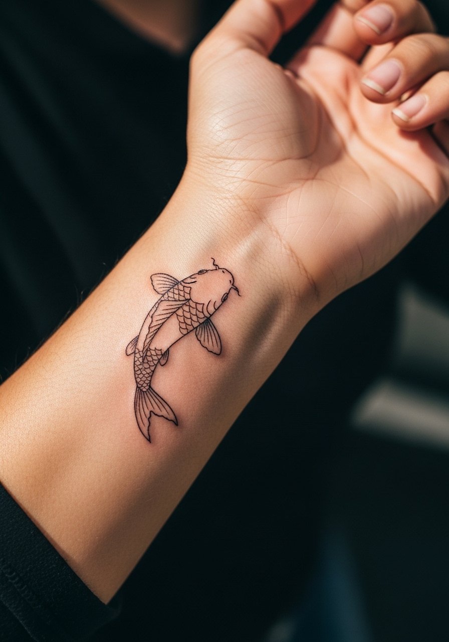
I suggest this if you want Japanese symbolism without heavy saturation. Tell your artist to keep the scales implied with light stipple shading and a slightly thicker outline where the tail meets the wrist. Common mistakes here are asking for too many tiny details that merge after a year, or placing the head too close to the crease where blowout risk is higher. Expect mild tenderness during the session and a 45 to 90 minute appointment depending on size. For showing it off, stacked dainty bracelets frame an inner wrist koi without covering the curve. Dainty stackable bracelets sit well and do not compete with the linework.
2. Minimal Sakura Branch, Side Wrist Wrap
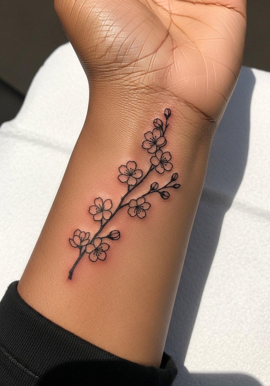
I've seen this style work best when artists leave negative space between blooms. In consultation, ask for each blossom to be slightly separated so the petals do not merge with time. The side wrist sees friction from watches, so expect touch-up timelines earlier than inner wrist pieces. A common aging issue is saturation that loses contrast where bracelets hit. For session comfort, wear a loose sleeve you can roll up easily. Pair the finished piece with a thin chain bracelet to echo the branch without crowding it.
3. Micro Hannya Mask at the Wrist Corner
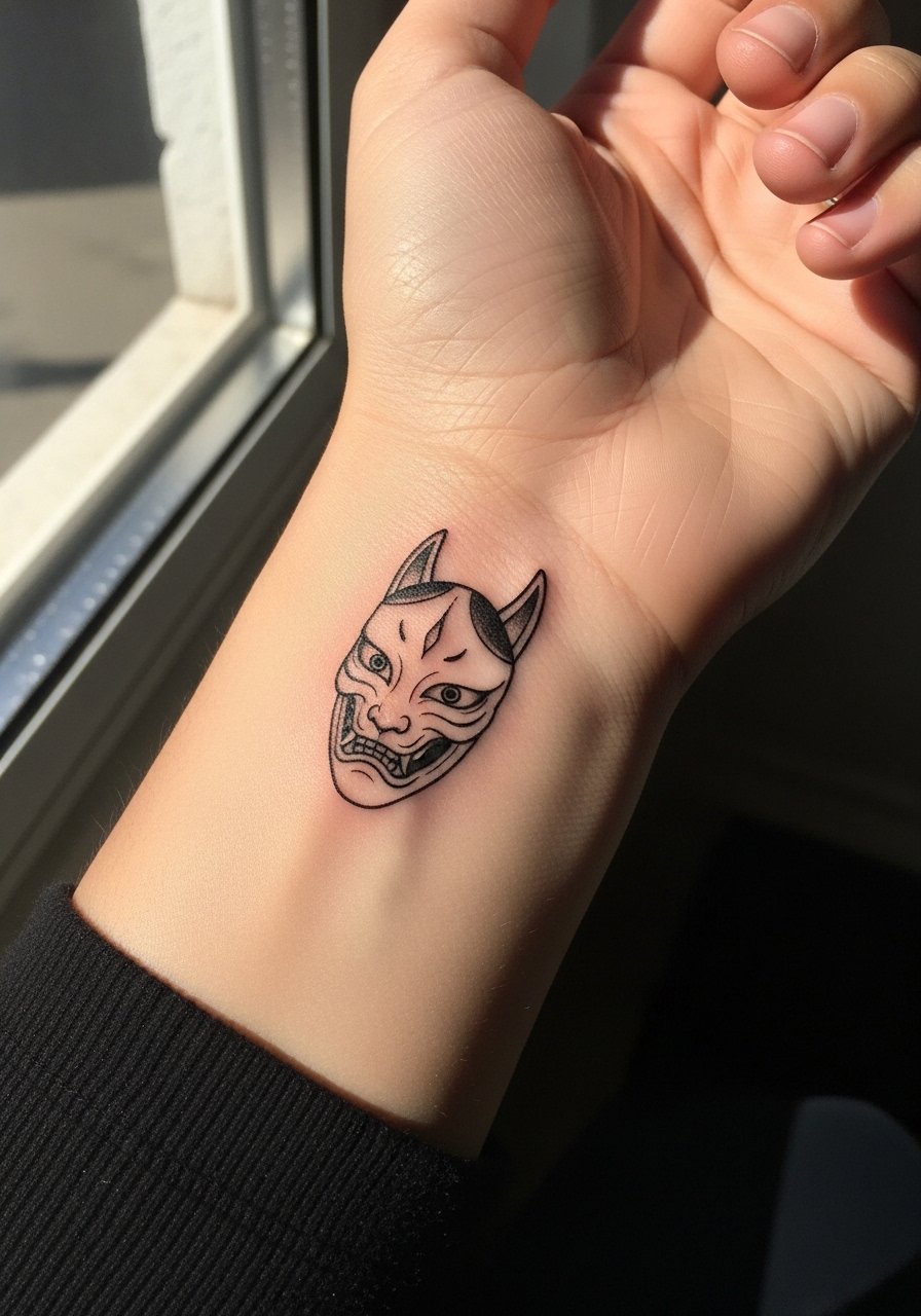
Fair warning, tiny masks can read muddled if done too small. The Hannya design splits people into two camps on cultural respect. One camp treats traditional masks as cultural motifs to adapt. The other camp advises reserving certain iconography for practitioners of the culture. If you go forward, ask for a simplified, stylized Hannya rather than a photocopy. During the session the area near the wrist joint can be jumpy so expect short breaks. For showing it off, a minimalist watch complements the tiny mask without obscuring it. Minimalist watch choices keep attention on the art.
4. Wave Band in Traditional Linework
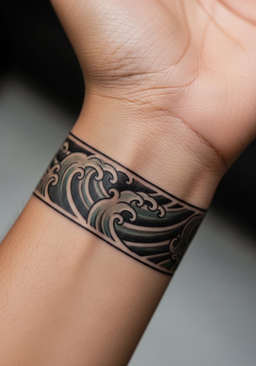
There is something about bold black outlines that age into a strong graphic statement. For a wrist band, ask your artist for slightly heavier outer linework and controlled saturation in the wave curls. The biggest mistake is packing dense shading into a narrow band. That can blur by year two. This design feels more solid at six months and will read bold at two years if the negative space was preserved. For the session wear a short sleeve you can roll up, and for styling a rolled-up linen shirt works well with a cuffed wave band. Rolled linen shirt keeps the wrist visible without looking contrived.
5. Chrysanthemum Cuff, Blackwork Accents
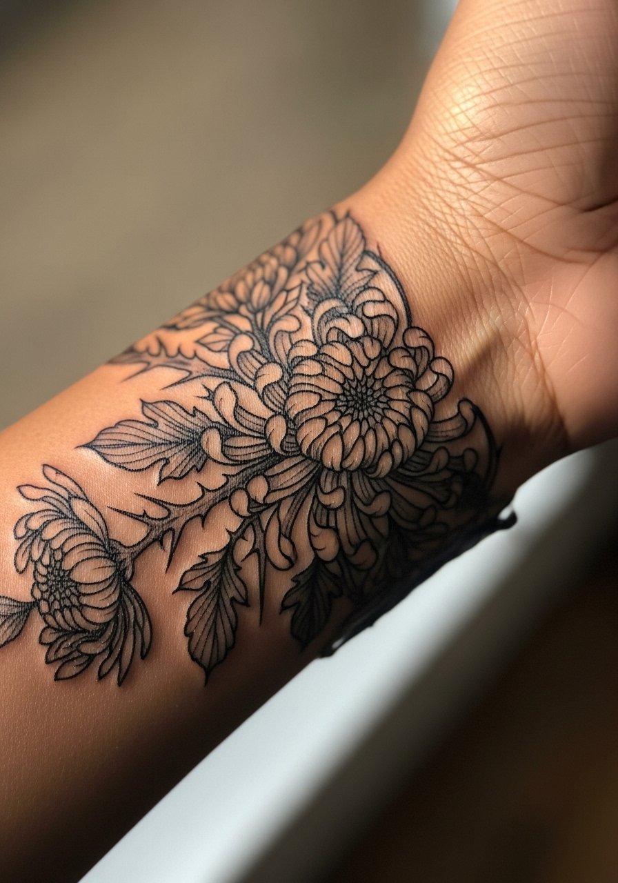
Most chrysanthemum cuffs that age poorly are tight compositions that lose petal definition. I recommend a layered approach with a mix of thin linework and stipple shading so petals keep edges as the ink settles. Expect higher saturation needs if you want the petals to pop now. The wrist cuff can feel sensitive where skin wraps over bone, so your artist may space sessions. For showing it off, a single cuff bracelet in matte metal sits under the floral without competing. Try a matte cuff bracelet that frames the design and stays out of the healing zone.
6. Crane Silhouette with Negative Space
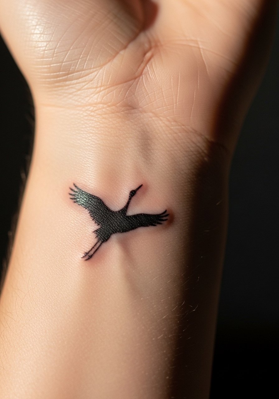
When you step into the chair for a silhouette piece, ask for crisp outer contour and a clear field of negative space. A common error is filling in too much tiny texture that approaches the silhouette edge and compromises clarity. The inner wrist will scab differently than the outer wrist. At two years a clean silhouette still reads well if the lines were spaced correctly. This placement pairs beautifully with thin pendant necklaces that draw the eye upward. Consider a thin pendant necklace for evenings when you want the wrist and collarbone to read together.
Before You Book
The wrist pieces above vary in how they heal and how much friction they face from daily life. A small set of tools and prep items smooth the session and protect fine line detail in the first week.
-
Stencil transfer paper kit. Lets you preview line placement on skin before the needle hits, helpful for asymmetrical koi and wrap bands discussed above.
-
Topical numbing cream. Applied as your artist recommends, it softens wrist sensitivity for denser sessions without dulling the proportions.
-
Thin protective film roll. Keeps wrist pieces cleaner through hand washing and friction from watches or bracelets during the first week.
-
Fragrance free gentle body wash. Cleanses the area without stripping pigments that fine line work depends on.
-
Aquaphor healing ointment. A thin layer in the first days can guard delicate lines and soothe the area without clogging needle channels.
7. Tiny Torii Gate with Subtle Shadow
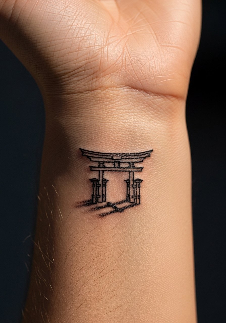
When you want a symbol that reads at a glance, a simplified torii gate works well. Tell the artist to place the crossbar slightly above the wrist crease so the gate reads without distortion when you move your hand. A frequent mistake is rendering too many wood grain details that become muddled. For aging, keep the gate bold but leave shadow minimal so the silhouette holds. For showing it off, bracelets that sit below the gate keep attention on the symbol. Pair with a thin leather bracelet for casual looks.
8. Maple Leaf on the Outer Wrist
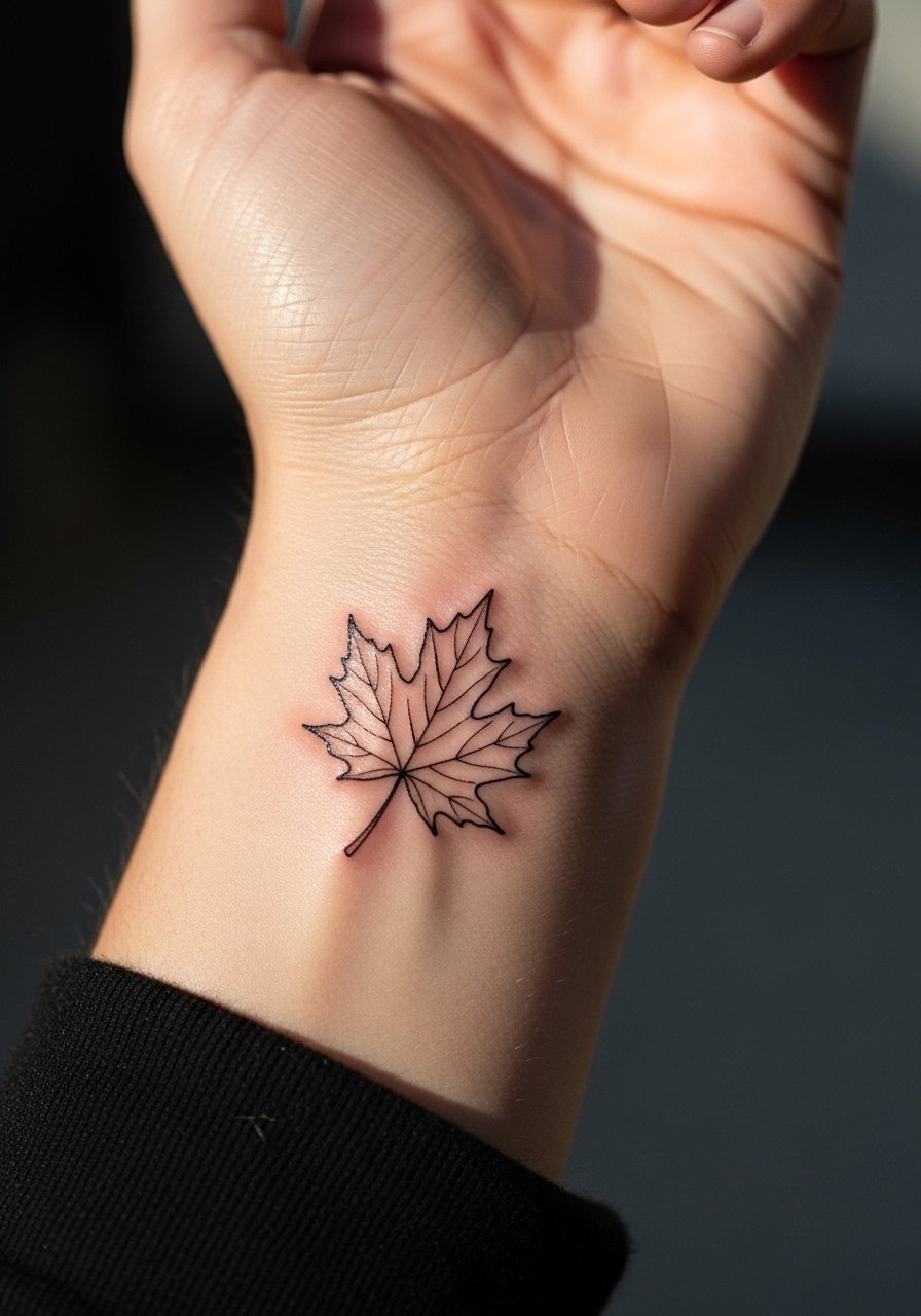
Most people pick maple for seasonal meaning. The outer wrist tolerates slightly bolder linework than the inner wrist, but remember the leaf veins should be suggested rather than painstakingly carved. Overly intricate veins collapse first. Session time is short, often under an hour for a small leaf. For the first shower after the session, plan clothing that will not rub the area. An open cuff watch sits well with a single outer wrist leaf. Consider a slim cuff watch if you regularly wear timepieces.
9. Mini Peony Petal Cluster, Side Wrist
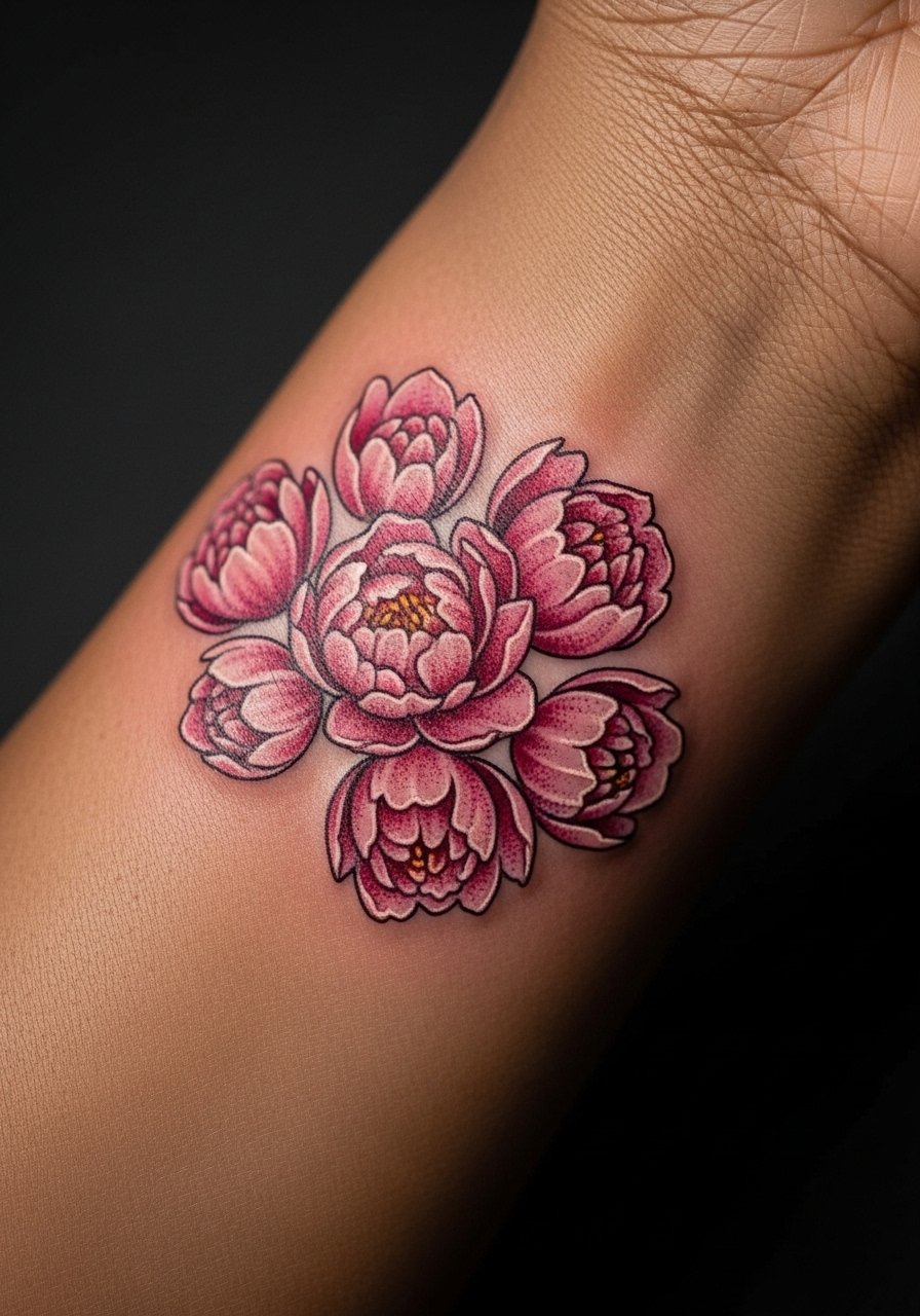
Peony petals need breathing room to keep definition. Ask for a staggered petal layout so each has its own negative space. A common error is compressing petals into a tiny mass that blurs after sun exposure. Expect light tenderness during the session and a touch-up window around year two for fine details. For showing it off, a soft fabric sleeve rolled to the elbow frames the side wrist peony without covering the petals. Try a soft ribbed sleeve top for balanced visibility.
10. Dragon Coil, Tiny Wrap-Around
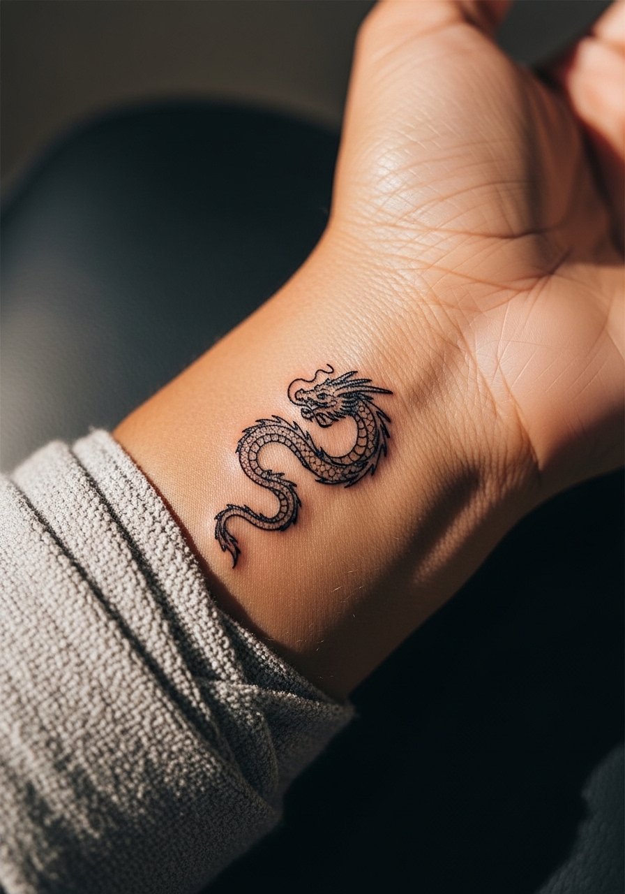
Visual impact leads this one. A micro dragon can be dramatic if the head placement avoids creases and the tail tapers thin. Consult on how much curve you want so the coil sits naturally with your wrist motion. The mistake is over-detailing scales in a very small band. That can age into a gray smudge. Water exposure from washing can lighten edges, so expect a realistic touch-up timeline at year three for crisp scales. For styling, a set of thin stacking rings or bracelets on the opposite hand balances the coil. Stacking rings set keeps the look cohesive without adding bulk.
11. Geisha Profile in Micro-Realism
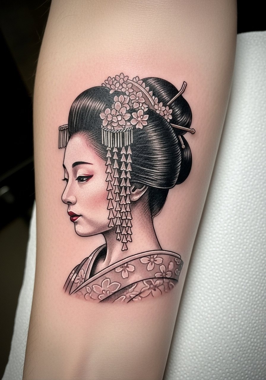
A micro-realistic profile is riskier than a stylized silhouette. Artists split on whether tiny photorealism holds on the wrist. One camp says fine shading can scale down safely with high contrast. The other camp warns that tiny micro shading fades into a flat tone. Ask your artist how they handle micro shading on skin that moves a lot. Sessions are detail-focused and might need more time than a simple line piece. For showing it off, a delicate chain bracelet on the same wrist draws attention without hiding the face. Delicate chain bracelet pairs well for evenings.
12. Maneki Neko Mini Near Thumb Base
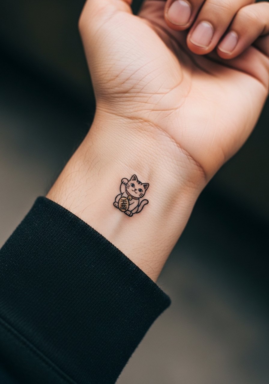
Hand and thumb-adjacent placements age differently and can affect career impressions in some industries. If that matters for you, weigh visibility against symbolism. The main mistake is choosing heavy color in a high-movement area. Colors can fade faster where skin flexes. Expect more frequent touch-ups than inner wrist pieces. For the session wear something comfortable that lets your hand rest naturally. For styling, a thin leather wrap worn on the opposite wrist balances a playful maneki neko without overwhelming the hand. Leather wrap bracelet stays casual and adjustable.
13. Bamboo Sprig, Vertical Side Wrist
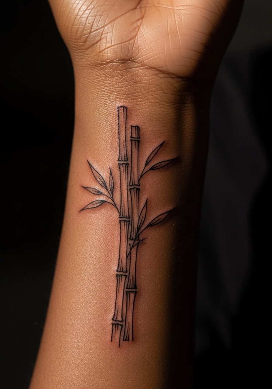
A vertical sprig benefits from deliberate spacing between nodes. The error I see most is compressing several nodes into a tiny strip that loses rhythm. During consultation, ask for node spacing to follow the wrist length so it breathes as you move. The wrist flex will soften some lines by year two, but a disciplined layout holds its silhouette. For showing it off, rolled-up sleeves in neutral linens let the vertical line stand out. Try rolled sleeve linen shirt that you can push up without rubbing the area.
14. Pagoda Silhouette Over the Wrist Crease
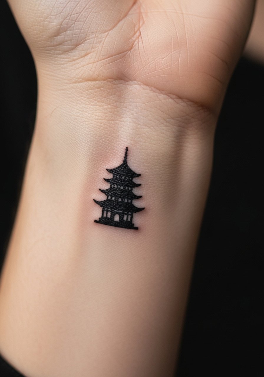
Placement is everything here. Set the pagoda slightly above the crease so when your hand flexes the silhouette remains intact. The frequent mistake is centering on the crease where movement disrupts the geometry. Expect modest tenderness during the sit and a clear silhouette at six months if spacing was respected. For a simple outfit pairing, a thin watchband worn slightly higher helps the pagoda sit in view when you gesture. Thin watchband choices stay subtle and complementary.
15. Matsu Pine Needle Band with Negative Space
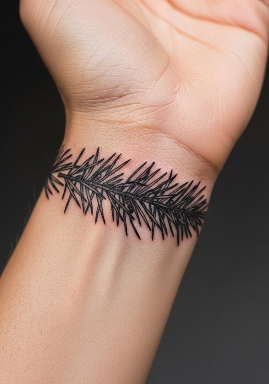
Personal observation shows that texture holds best when negative space separates clumps of needles. Ask your artist to alternate dense and airy groups so the band keeps depth over time. The error is a uniformly dense band that turns into a gray belt. The wrist is exposed to sun a lot, so plan a touch-up in the first few years if you want it to remain crisp. For styling, thin bangles that sit on the forearm rather than the wrist let the pine band breathe visually. Thin bangle set creates a layered look without smothering the negative space.
16. Komainu Guardian Gem, Tiny Accent
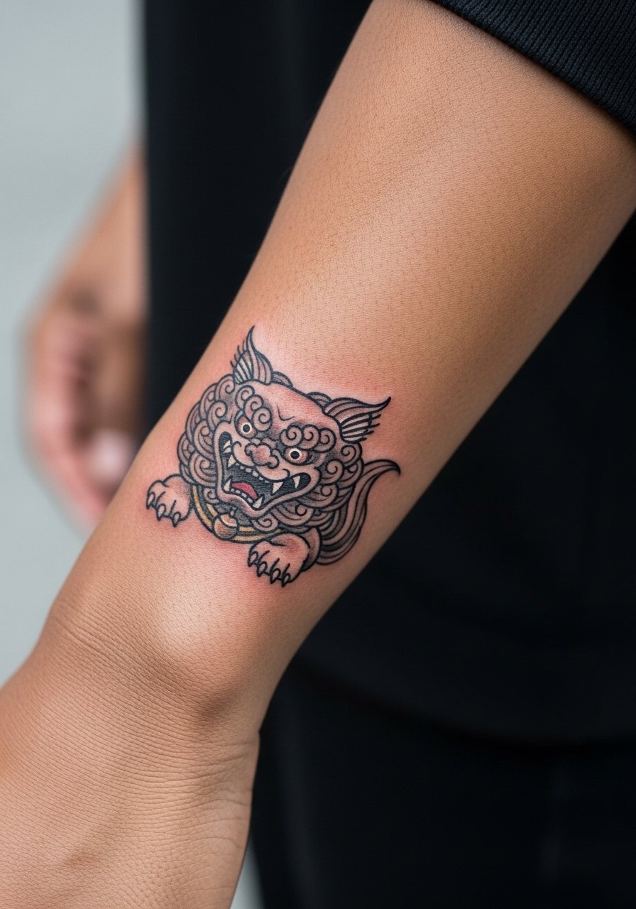
The komainu feels protective in small scale if the silhouette is clear. The mistake people make is adding too much facial micro detail. That can blur into a single gray spot. During consultation, discuss which features are essential so the artist can simplify while keeping character. This spot handles lineweight okay, but the radial bone can increase sensitivity. For showing it off, match with a matte finish bracelet on the same wrist to create an understated pairing. Matte finish bracelet provides a textural contrast without competing.
17. Crescent Moon Over Ocean Wave
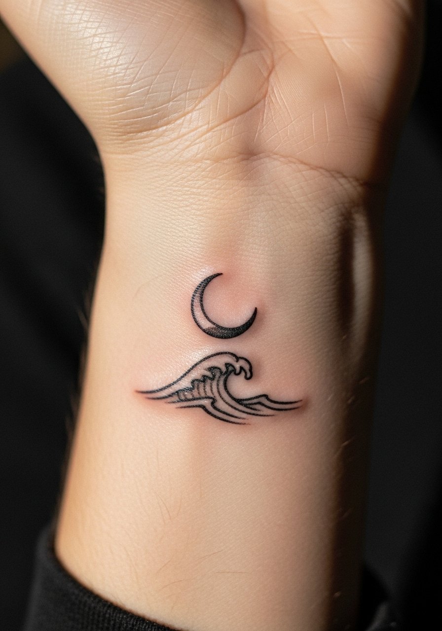
Visual balance is key. Ask for the moon slightly offset from the crest so neither element crowds the other as lines soften. A common aging issue is the wave losing its curl if the lines are too thin. For durability, discuss small increases in line weight on the wave itself. Sessions are comfortable and usually under an hour for small compositions. For evenings, a thin chain bracelet worn beside the design makes the moon and wave feel like a curated set. Thin chain bracelet gold complements evening wear.
18. Rising Sun Cuff with Rays
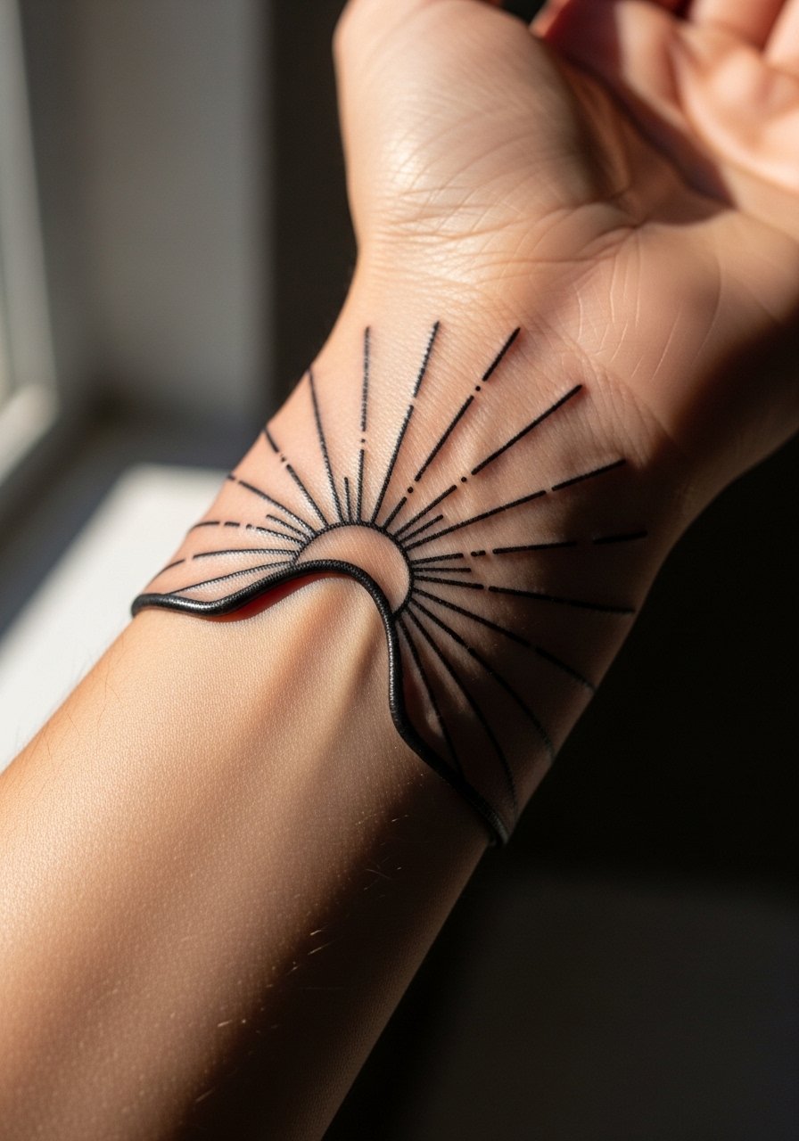
The radial nature of sun rays needs spacing to avoid a muddled center. The biggest mistake is adding too many rays in a confined band. Ask for fewer, cleaner rays and leave breathing room in the center. As it heals the contrast between rays and skin carries the motif. The wrist cuff can be shown with shorter sleeves for a bold statement. Pair with a rolled sleeve button down for casual outfits where the cuff is visible.
19. Single Kanji Word, Side Wrist Script
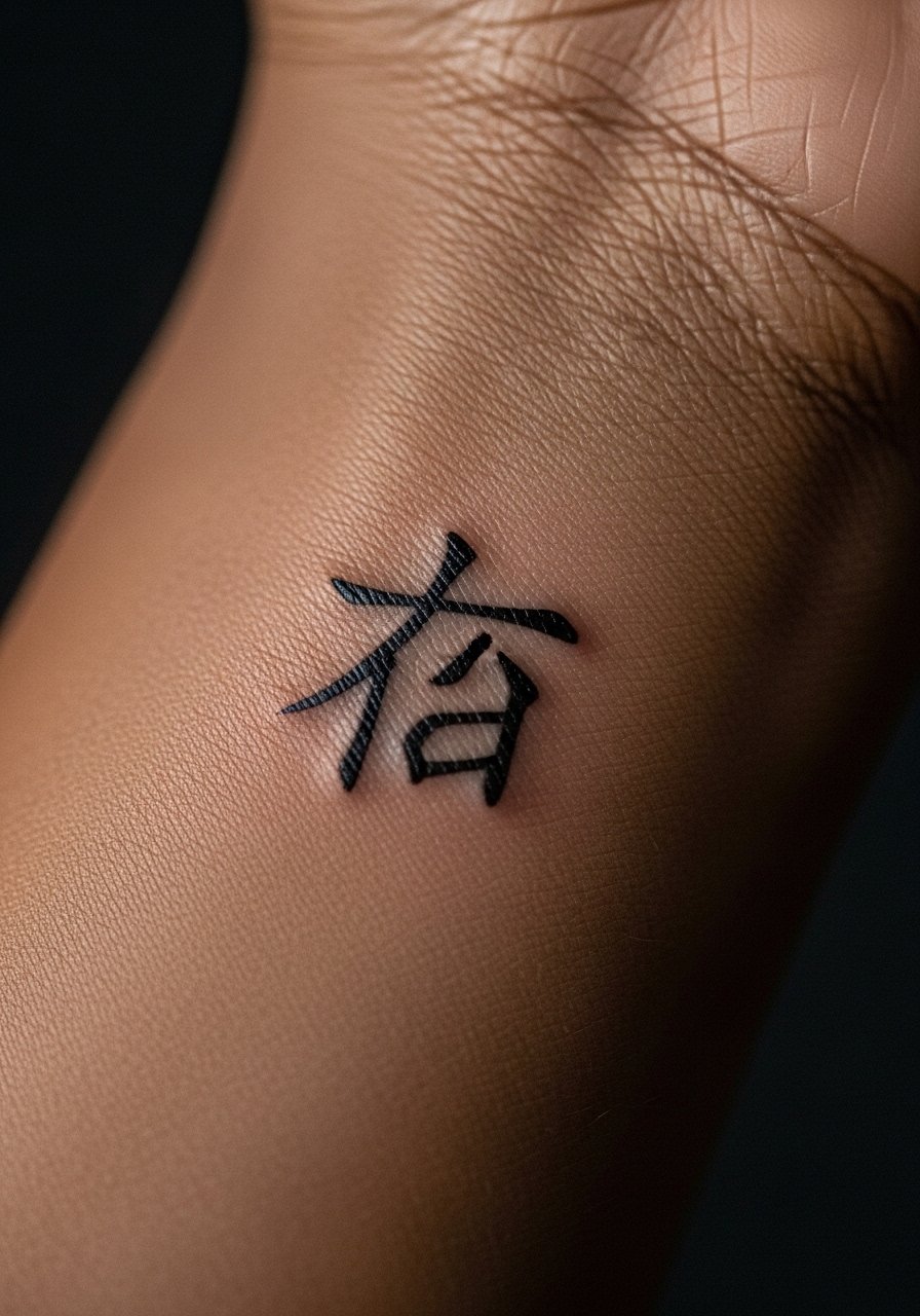
Text accuracy matters. If you choose a kanji, pick the exact character and ask your artist to confirm line weight and spacing. The common mistake is copying low-quality references that produce incorrect strokes. This placement is visible and reads clearly when strokes are clean. Expect minor scabbing along linear strokes and plan for a touch-up if strokes soften. For showing off the script, a thin watch or a bracelet on the opposite wrist balances the visual weight. Minimal slim leather watch works well.
20. Bold Peony with Traditional Saturation
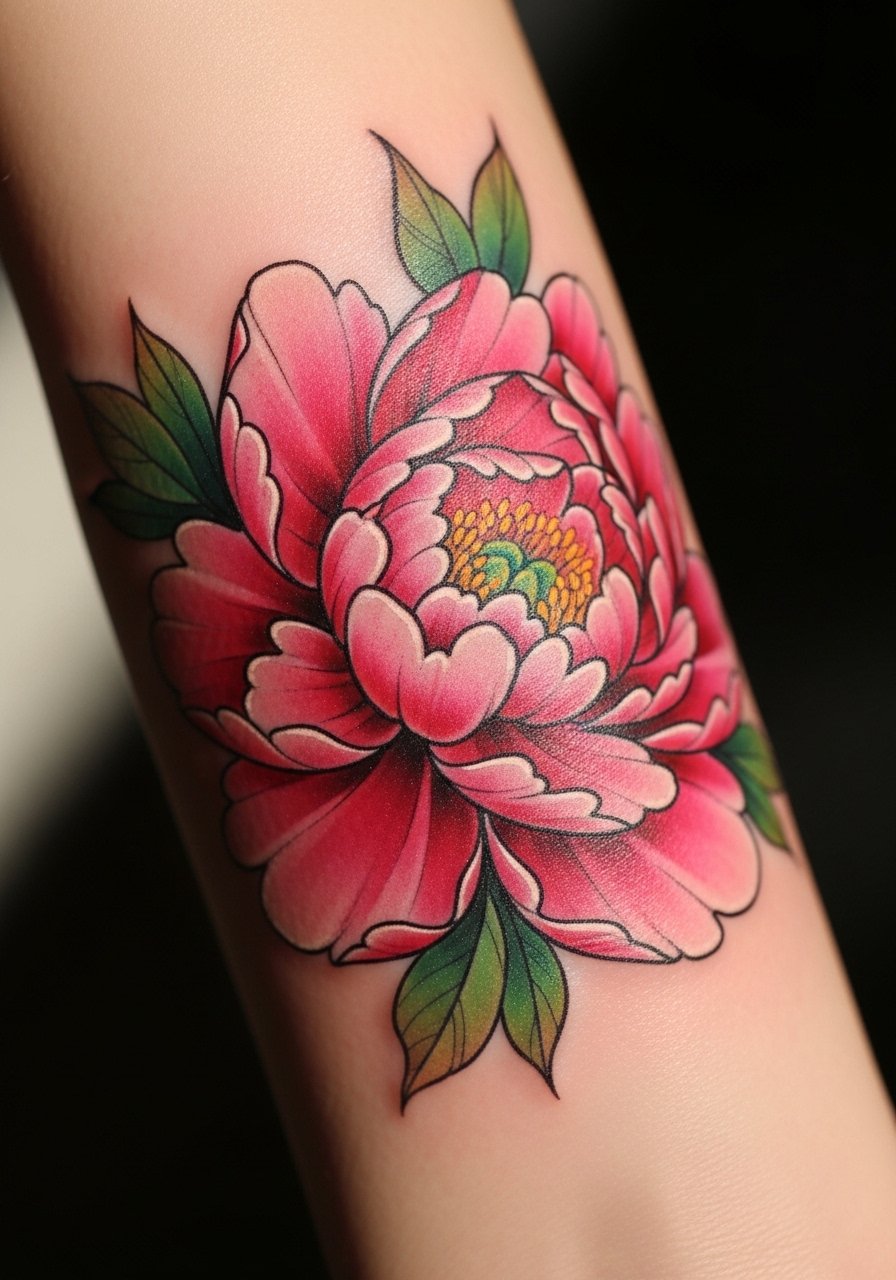
A bolder peony brings traditional Japanese feel to a small canvas. Artists split on saturation at this scale. One camp favors bright saturation that ages into accomplished color. The other recommends muted saturation to avoid early fading. Talk through the expected color maintenance and touch-up timeline with your artist. The outer wrist tolerates this work better than the inner wrist because it sees less constant rubbing. For showing it off, consider stacked beaded bracelets that echo the petal colors. Stacked beaded bracelets creates a lively pairing.
21. Family Mon, Simplified Kamon on Inner Wrist
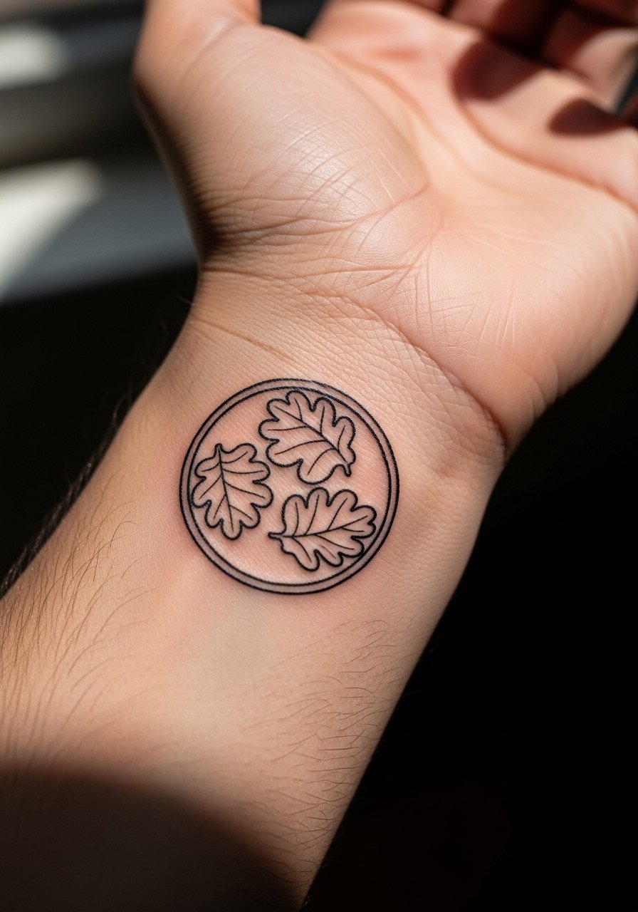
A kamon is personal and steeped in history. If you adapt a family emblem, keep the lines bold and avoid tiny inner flourishes that will blur. A common error is turning a complex crest into an overly intricate wrist mark. For cultural respect, consider subtle alteration so it reads as homage rather than a copy. The inner wrist offers intimacy, and this placement is perfect for something you want to see often. For showing it off, a thin chain bracelet that does not cross the emblem keeps the design readable. Thin chain bracelet silver keeps the focus on the kamon.
Frequently Asked Questions
Q: Will fine line Japanese motifs on the wrist need touch-ups more often than bolder work?
A: In my experience fine line work often needs touch-ups earlier because the wrist sees a lot of movement and sun. Bold outlines and reserved negative space extend the readable life of a piece, but plan on a realistic touch-up window around years two to five depending on how exposed the wrist is to sunlight and wear.
Q: Are there specific clothing choices for the session when getting a wrist tattoo that make the process smoother?
A: Yes, wear something with sleeves you can roll comfortably without constricting the arm. For most wrist pieces a loose button-down or a short sleeve tee works best because the artist needs clear access and you want the area to rest naturally. A loose button-down shirt is a practical pick.
Q: Is it culturally insensitive to get traditional Japanese imagery like koi or peony on a small wrist piece?
A: People split on this. One camp treats these motifs as global symbols open to adaptation. The other cautions about borrowing sacred or culturally specific symbols without understanding their meaning. A respectful approach is to learn the background, adapt subtly, and be ready to explain why the symbol matters to you.
Q: How does healing feel on the inner wrist compared with the outer wrist?
A: The inner wrist can scab more noticeably because skin there is thinner and moves against clothing. The outer wrist usually handles scabs with less friction. Either way expect mild tenderness and keep the area protected from tight bands and watches during the first week.
Q: I want a small kanji on my wrist. How do I avoid mistakes?
A: Bring a high-quality reference and confirm the exact character with the artist. Ask them to show you the stencil on skin before any needle work so you can verify strokes and placement. Avoid copying images from low-resolution sources that can obscure stroke order and meaning.
Q: Will hand or thumb-adjacent wrist tattoos affect my job prospects?
A: Some industries remain conservative about visible hand and wrist tattoos. Think about how often your hands are in view at work and whether you can cover the area with sleeves or accessories if needed. If that is a concern, consider the inner wrist or a placement that is easier to conceal.
