
Fine line tattoos dominate feeds right now, and watercolor "perfectly imperfect" pieces are everywhere, but trendy photos and long-term wear tell different stories. What looks like light washes on a phone can turn into soft smudges on moving skin, or keep surprising clarity when spaced and saturated correctly. Read these 17 design ideas with notes on longevity, what to ask your artist, and how to dress the piece so it reads like art for years.
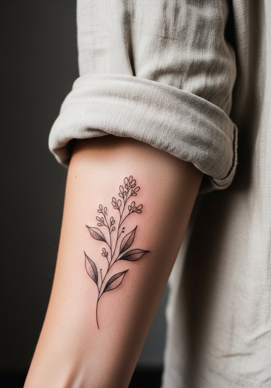
1. Delicate Botanical Wash on Inner Forearm
I've seen small botanical washes on inner forearms hold beautifully when artists pair looser color washes with crisp linework around the stems. Ask your artist for spaced stems and stipple shading between color blobs so the wash has breathing room, and expect a low to moderate pain level for the forearm and a one to two hour session for a compact piece. A common mistake is packing color too tightly close to the linework, which causes the watercolor to bleed into the lines after healing. At six months the colors soften into the skin, at two years the washes mute slightly, and a touch-up at three to five years is normal. For showing it off, roll up sleeves and try a rolled linen shirt in a neutral tone to frame the forearm without competing with the pigments.
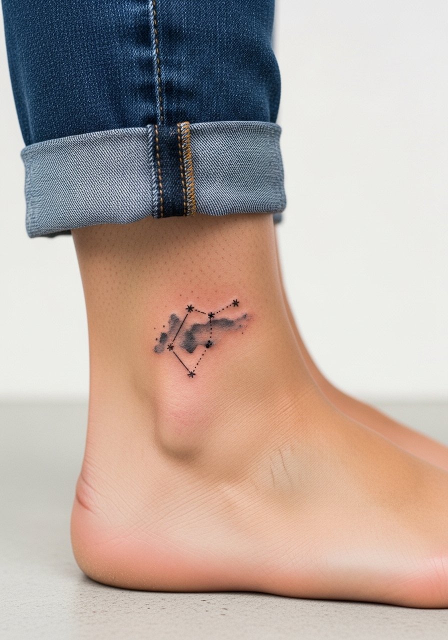
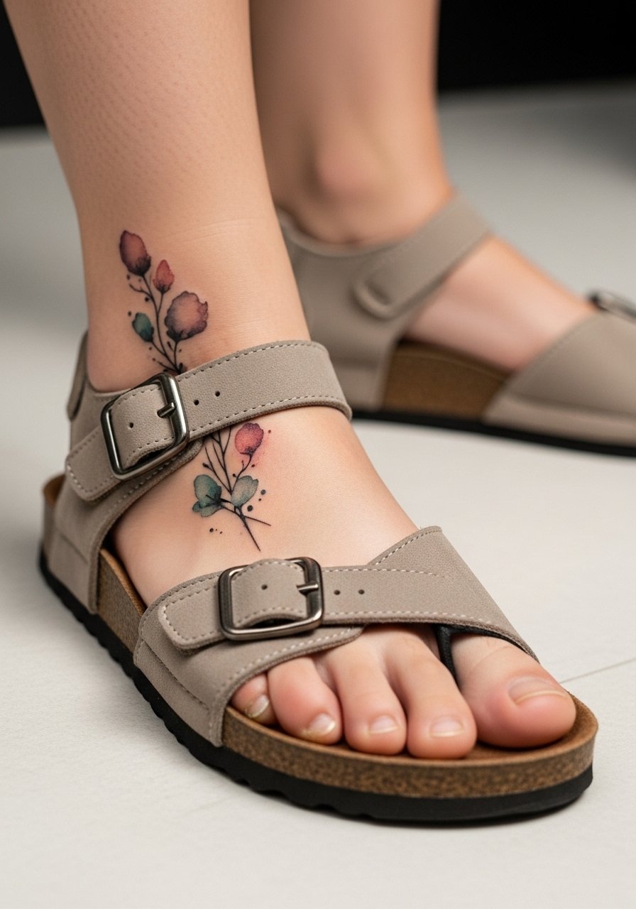
2. Tiny Constellation at the Ankle
Ankle constellations age differently than larger leg pieces because they face constant rubbing from socks and shoes. For this tiny cluster, tell your artist to keep the dots spaced and avoid ultra-fine single-needle work close to the ankle bone. Expect a quick session under an hour and a stingy pain level because of the thin skin there. A common mistake is asking for minuscule stars packed tightly together, which often results in dot merging over time. At two years light touch-ups might be needed where friction occurs. For session comfort and display, wear jeans you can roll up easily so the area is exposed without dragging fabric over the fresh ink.
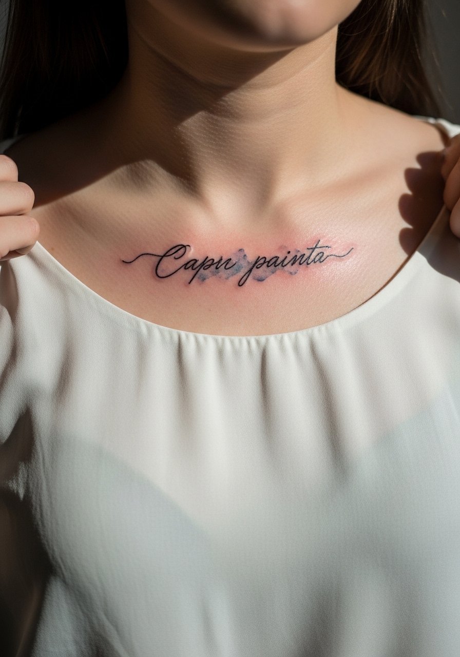
3. Loose Watercolor Script by the Collarbone
The collarbone reads like a frame when script sits just above the bone, and watercolor splashes can make letters feel integrated rather than pasted on. For this one, tell your artist the exact script weight you want and request the pigment sit slightly away from the letter edges to prevent color bleed into thin strokes. Pain is moderate because the area is bony and sessions run around an hour for short phrases. A common version that ages poorly uses tiny, ultra-thin script with saturated color touching each letter; that tends to blur. For showing it off, pair with a wide-neck blouse so the collarbone sits visible and the watercolor has space to read against skin.
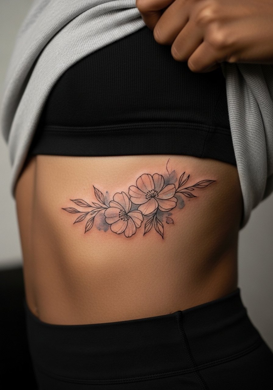
4. Flowing Floral Ribcage Piece
Fair warning: ribs are high on many pain charts, but a flowing watercolor floral suits curvature there because the color can follow the body's motion. Artists split into two camps on ribs. One camp argues that the skin stretches and causes fine line to blur quickly. The other camp says proper depth and spacing keep fine line readable for years. Ask your artist which camp they fall into and request slightly bolder contour lines with airy color fields between them. Sessions can be long and may require breaks, so plan for reclining comfort and loose clothing. A common mistake is packing too many tiny details into a tight rib panel. Expect the washes to become softer at six months and to need a touch-up by year three if you want high fidelity.
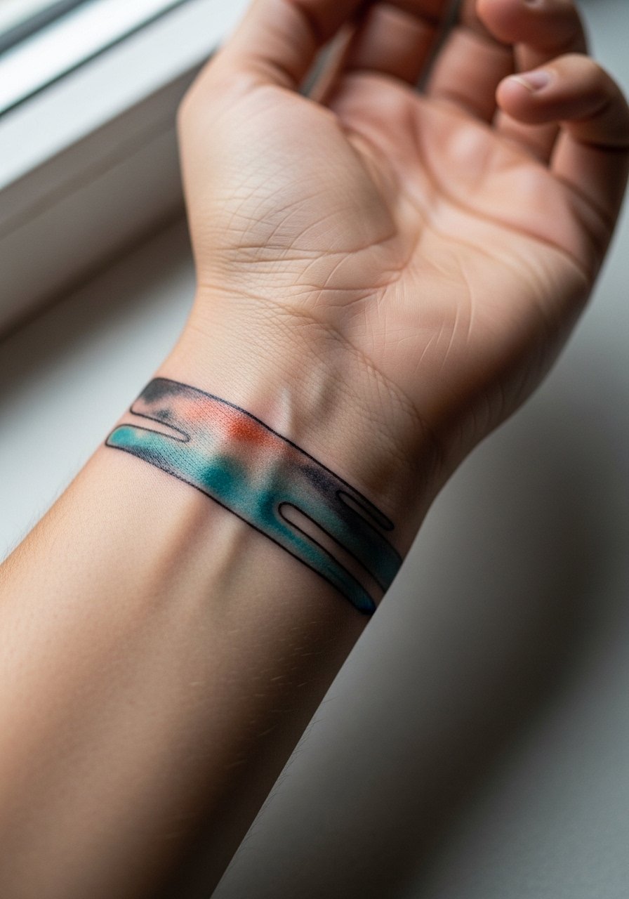
5. Brushstroke Ring Around the Wrist
A watercolor ring around the wrist reads like jewelry when kept bold enough to resist friction from daily hand use. Tell your artist you want a slightly higher saturation near the center of each brushstroke and a clean negative-space buffer where the skin shows. Wrist tattoos face constant washing and movement so blowout risk is higher if lines are too fine. Plan for a short but sensitive session and possibly touch-ups at year two. The mistake I see most is demanding ultra-thin ornamental strokes that vanish under skin motion. For immediate display, stack with a thin chain bracelet that sits next to the wash without covering it.
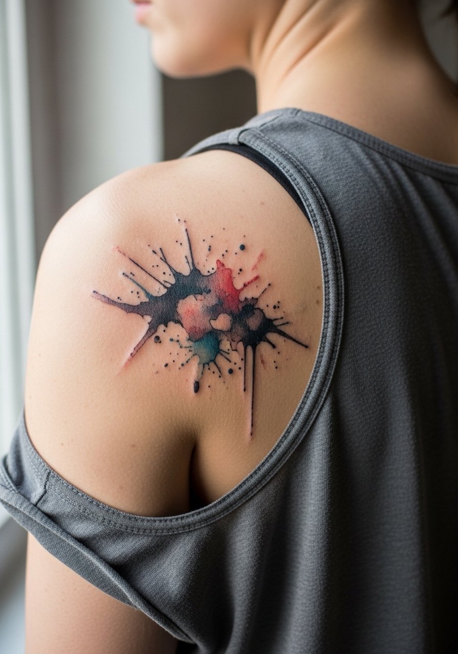
6. Abstract Splash on the Shoulder Blade
Shoulder blade washes age well when placed over flatter skin and given open negative space to breathe. When you consult, ask for a loose composition that follows the bone while avoiding dense color blocks that can mat down. Session time is moderate and the area is forgiving pain-wise, but reachability can complicate solo aftercare. A frequent mistake is cramming detailed elements into the shoulder blade, which reads muddled at a distance after healing. For the session, wear a loose tank top you can pull aside so the artist has unobstructed access and you stay comfortable.
Studio Day Picks
The shoulder blade, wrist, and ribcage pieces above ask for different prep and first-week care, and these five items smooth the session and the early healing window.
- Sterile stencil transfer sheets. Handy for rehearsing placement at home so you arrive confident about scale and flow for collarbone and forearm pieces.
- Low-residue topical numbing cream. Useful for high-sensitivity rib sessions to make long passes more manageable without upsetting pigment saturation.
- Thin protective film roll. Keeps wrist and ankle tattoos cleaner during the first week of friction from clothing and daily washing.
- Fragrance-free gentle body wash. Cleans healing shoulder and forearm work without stripping color or irritating delicate watercolor washes.
- Aquaphor healing ointment. Light application in the first days helps retain moisture over thin-line and watercolor areas while you follow your artist's guidance.
7. Soft Watercolor Back-of-Neck Accent
Neck accents are subtle and sit at the edge of visibility, which makes them excellent for people who want art that peeks out when hair is up. For behind-the-neck pieces be explicit about exact placement because hairline coverage changes the look. Pain is moderate and sessions tend to be short. A common mistake is asking for too-dense color near the hairline, which can cause uneven fading where the scalp oils and sun exposure differ. This placement needs a specialized touch for even saturation. For appointments, wear a wide-neck shirt you can pull to one side so the artist has clear access.
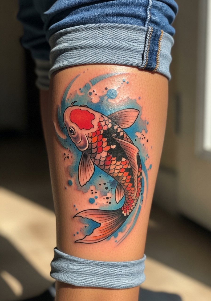
8. Painterly Koi on the Calf
Calf canvases let watercolor pieces spread naturally along muscle, and a koi with gradient washes suits that flow. Tell the artist to use gradient saturation from the center outward so the edges fade softly rather than sitting as hard lines. The calf is moderate in pain with sessions lasting one to two hours depending on size. A common mistake is compressing too many tiny details into a small calf area; the result blurs as muscle tone changes. At two years the deeper saturations still read well, while outer washes soften. Pair this with mid-calf boots or rolled trousers when you want the piece visible without interruption.
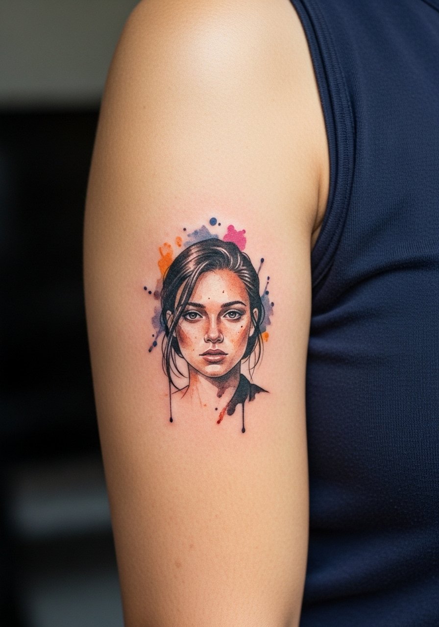
9. Mini Watercolor Portrait on the Inner Bicep
Inner bicep pieces sit flat and feel private until you lift your arm, which is why small watercolor portraits work well there. For portraits, bring high-contrast photo references and ask the artist to set darker contour notes around facial features so the portrait reads after the washes soften. The inner bicep is tender but shielded from friction, and sessions vary by detail level. A common mistake is requesting a hyper-detailed mini portrait without planning for a touch-up; the soft washes will fade faster than the contour. Mention touch-up plans in your consultation. For the session, wear a sleeveless top you can lift comfortably to expose only the inner arm.
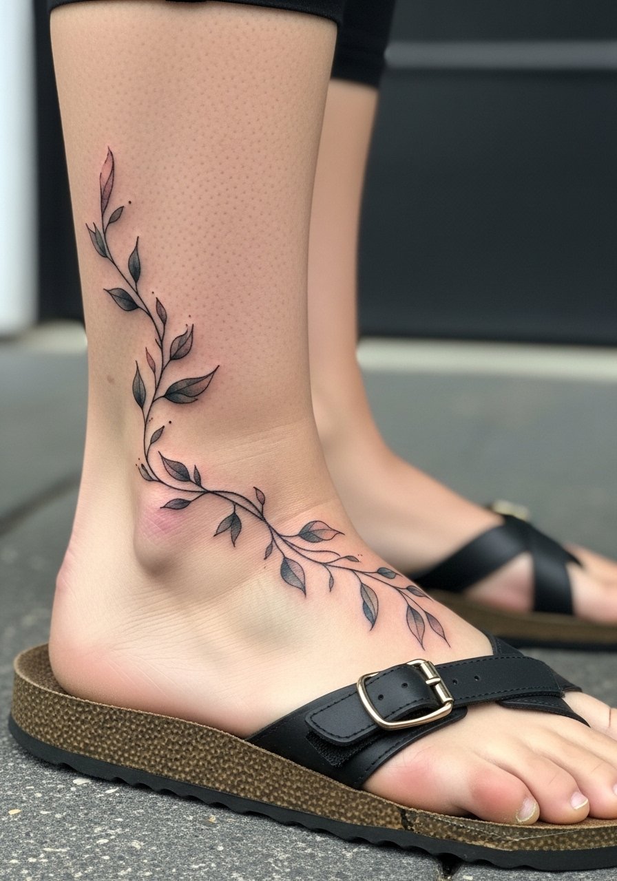
10. Trailing Vine Over the Ankle and Foot
A trailing vine that crosses from ankle to the foot needs special placement notes because the foot end faces heavy abrasion from shoes. Ask for slightly higher saturation and a bit more spacing on the foot side so the design can survive the wear. Foot tattoos sting and sessions are often split into shorter sittings because of the sensitivity. A common mistake is extending the most delicate linework onto the sole-facing areas that always rub. Expect more frequent touch-ups near the toes. For the day of, choose sandals or shoes that open at the toe so the artist can work without fabric interference.
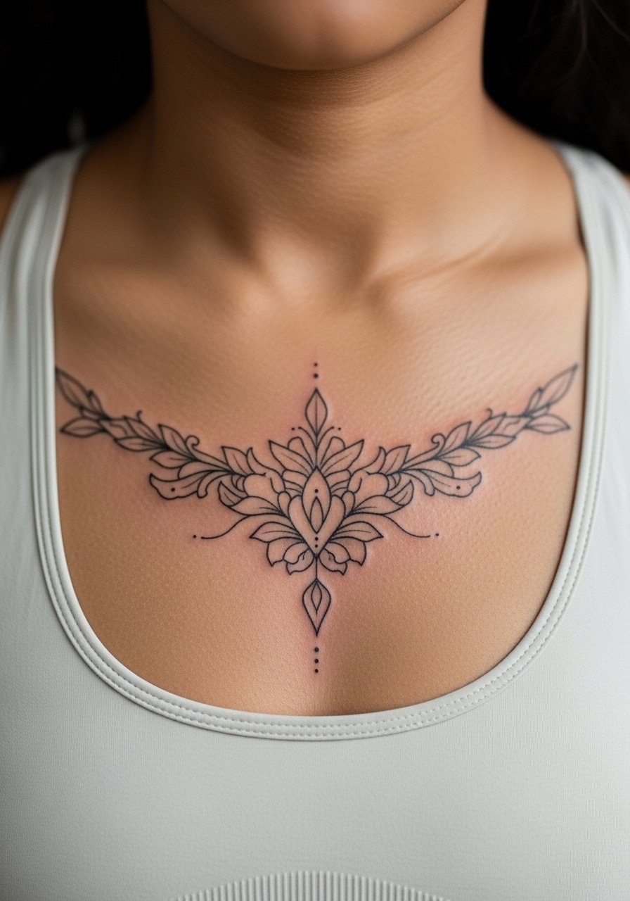
11. Centered Sternum Wash
Sternum washes look intentional when centered above or below the bra line and when color sits clearly away from thin script. For sternum pieces request that your artist test saturation near the fabric line so the healed edge looks natural. The sternum is sensitive and often takes longer to tattoo because of breathing and chest movement. Artists disagree on whether fine line works well here for the long term, so ask for examples of healed sternum pieces in their portfolio. A typical mistake is over-detailing in a narrow sternum band, which compresses and softens unpredictably. Wear a fitted sports bra to the appointment so the artist can expose only the area needed.
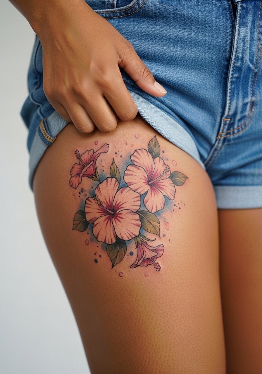
12. Loose Hibiscus on the Upper Thigh
Upper-thigh watercolor allows you to go bigger and keep the piece private. Ask for broad washes and sparing linework to keep the flower readable when clothing covers it daily. Sessions are longer and pain varies, often manageable because the area has more padding. A common mistake is crowding the hibiscus with tiny accents that get lost when the piece is not on show. Expect durable central saturation with outer fades that mellow over time. For the session, wear high-waisted shorts or a wrap skirt you can shift to reveal the upper thigh without exposing other areas.
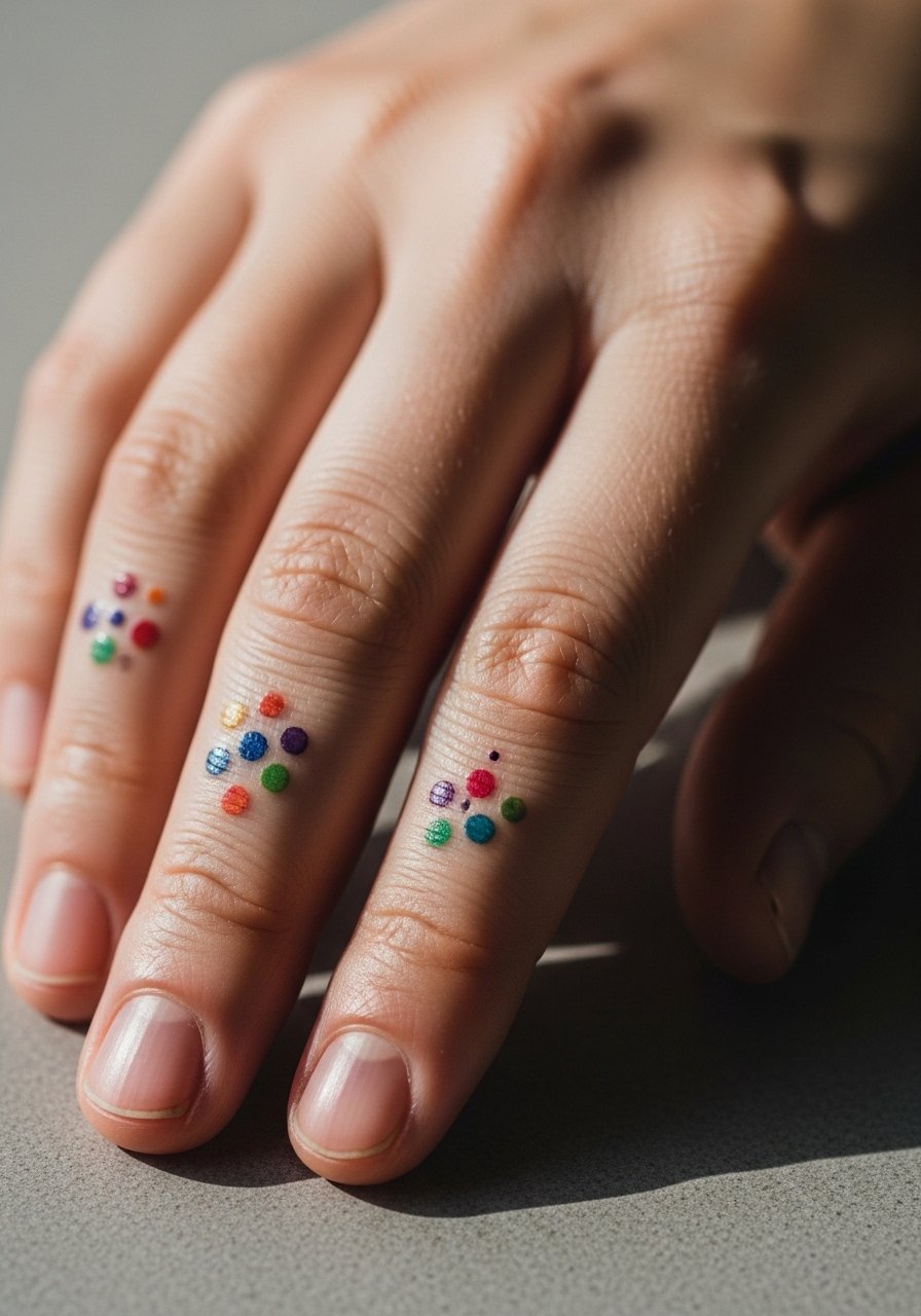
13. Watercolor Dot Finger Cluster
Finger tattoos are divisive because of skin type and frequent washing, and watercolor adds another layer of risk. One camp says finger work fades fast and rarely holds fine color. The other camp points to careful saturation and frequent touch-ups as the way to keep them sharp. If you want a finger cluster, request slightly bolder dots and accept a higher likelihood of maintenance. Sessions are quick but painful and touch-ups are common around year one or two. Also consider career implications because hand visibility still affects some industries. For casual shows, stack with a thin ring or midi band that complements the dots without covering them.
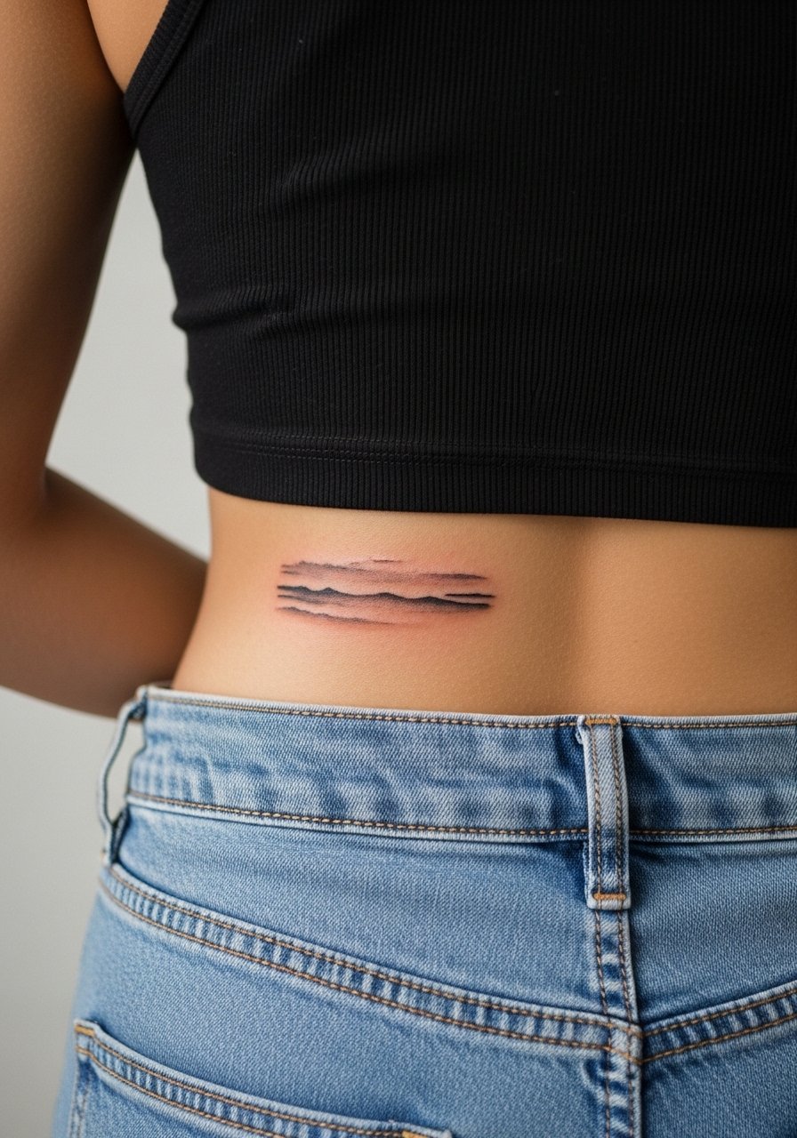
14. Soft Horizon Across the Lower Back
A low horizontal wash across the lower back reads like a horizon and travels well with clothing choices. For this placement require the artist to keep central saturation lighter and edges feathered so the wash fades gracefully under waistbands. Sessions are comfortable for most people and pain is typically low, but avoid tight waistbands during early healing. A mistaken approach is packing heavy pigment right where elastic sits, which accelerates fading. Expect even fading in the midline and more wear near seams. Pair with low-rise jeans or a cropped top when you want to show the line without pulling too much attention.
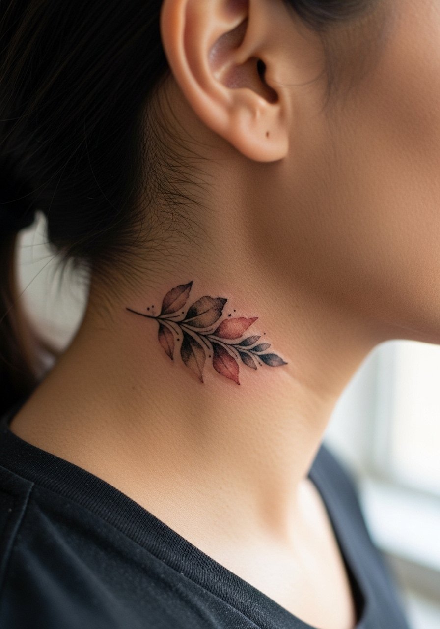
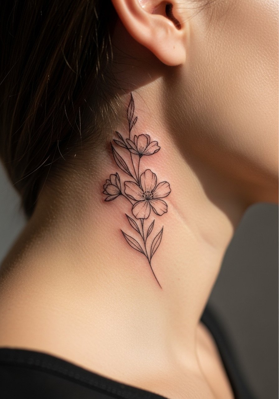
15. Tiny Bloom Behind the Ear
Behind-the-ear accents are charming because they peek out when hair is up, but placement must be precise since the area sits near a hairline. Ask for the motif to be set on the skin below the hairline and not on the ear itself to avoid odd wrapping. Sessions are quick and mildly uncomfortable. The common mistake is requesting dense color that conflicts with scalp oil and hair contact, leading to uneven healing. This spot requires an artist comfortable with small, delicate placements. For showing it off, put hair in a loose updo and wear a lightweight hair claw so the area is visible without strain.
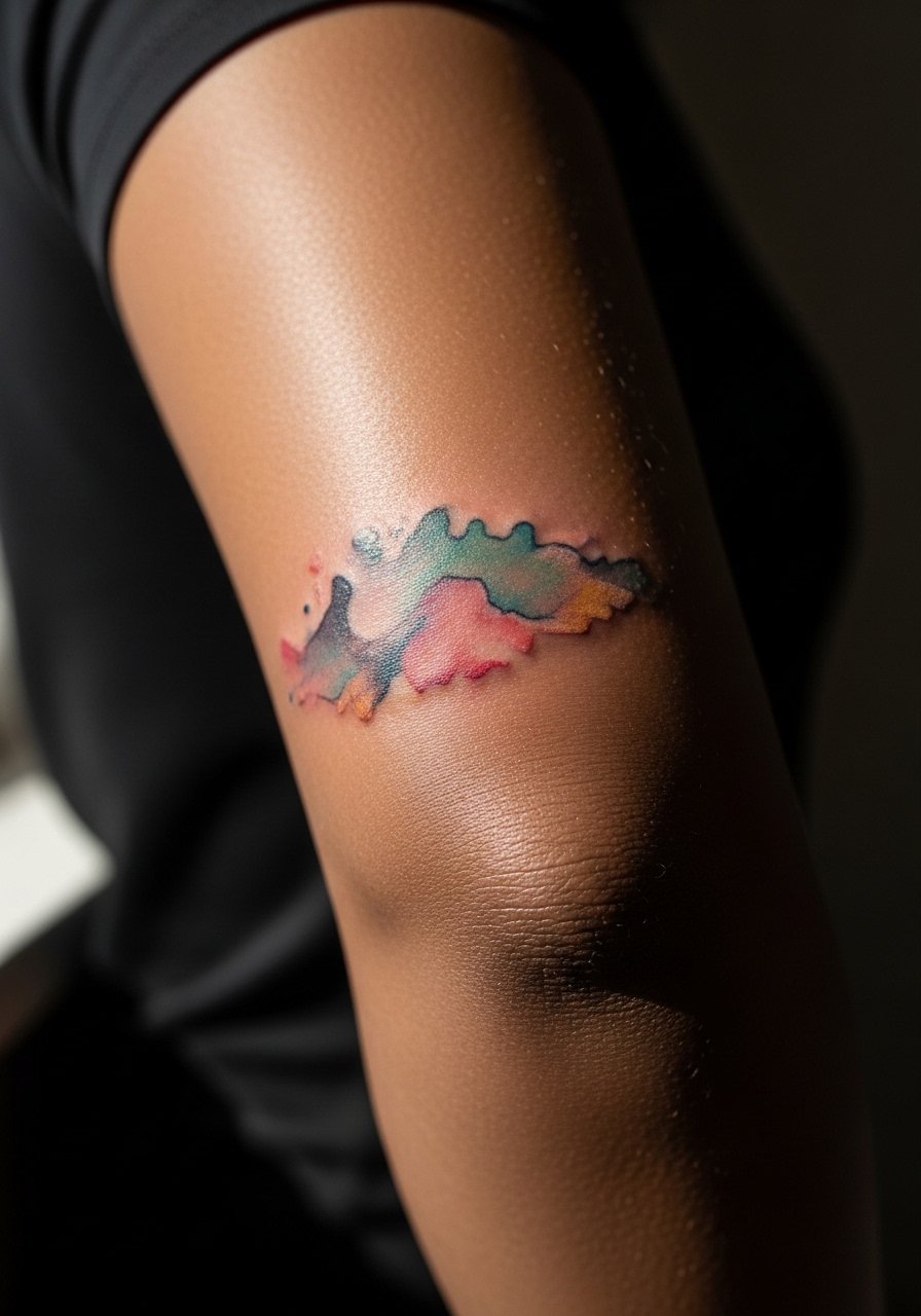
16. Accent Over the Elbow Cap
Elbow-cap watercolor accents are attractive when they respect the joint's motion. Because this area bends constantly, ask your artist for thicker contour notes and softer internal washes so the design remains readable when the arm flexes. Pain is higher exactly on the bone and sessions tend to be short but sharp. A common error is requesting delicate internal detail that bursts into a blur with repeated bending. Expect the outer washes to fade faster than central marks. For easy access on session day, wear a short-sleeve button-down you can pull aside without tugging the fabric over the elbow.
17. Arch Motif on the Foot
The foot arch is a tucked place for small watercolor motifs, but constant pressure from shoes shortens color life. For arch work ask your artist to concentrate pigment toward the central arch and leave soft fades toward the edges that face shoe contact. The area is painful and often requires multiple short passes. A frequent mistake is choosing dense outer washes that sit under shoe seams and vanish quickly. Plan for touch-ups if you want long-term color. For sessions and recovery, bring open-toe sandals so you avoid pressure on the fresh ink for the first week.
Frequently Asked Questions
Q: How does watercolor "perfectly imperfect" pigment hold compared with traditional saturated work on forearms and calves?
A: From what I've seen, traditional saturated pieces usually keep edge definition longer, while watercolor relies on spacing and selective saturation to stay readable. On forearms and calves, give the artist room between color fields and consider slightly stronger contour notes so the washes don't merge into a single tone over time.
Q: Do ribcage watercolor pieces require special touch-up plans?
A: Yes, ribcage pieces often need touch-ups sooner than an arm piece because of skin movement and thinner tissue. Talk to your artist about expected timelines and plan for a light touch-up around year two to three if you want the original intensity back.
Q: Are hand and finger watercolor tattoos worth the maintenance?
A: Hand and finger work comes with higher maintenance because those zones see constant washing and friction. If you accept touch-ups and possible color loss, the aesthetic can be worth it. Ask the artist to show healed examples and discuss a realistic maintenance plan.
Q: What should I wear to a sternum or rib appointment to make the session easier?
A: Wear a fitted sports bra or a zip-up hoodie so you can expose only the area being tattooed without risking wardrobe-caused movement. A zip-up lets you stay covered and comfortable while giving the artist clean access.
Q: How do I find an artist who understands watercolor that heals well without naming specific shops?
A: Look for healed-photo portfolios on community directories and hashtag searches, and check convention lineups for artists listing watercolor or painterly techniques. Spend time in forums and local directories, and ask to see healed work that matches your skin tone and desired placement before booking.
Q: Can clothing choices help watercolor tattoos look better over time?
A: Yes, styling matters. Neutral, breathable fabrics reduce sun exposure and friction, and showing pieces with open collars or rolled sleeves helps the design read without competing patterns. For collarbone and forearm work, a wide-neck blouse or rolled linen sleeves keeps attention on the watercolor rather than the outfit.

