
Fine line and bold chest work read very differently once healed, and the look you chase in photos is not always the one that lasts. Think about how your shirt sits, how the sun hits the collarbone, and how often you want to schedule a touch-up. Below are 17 chest-focused drawings that read strong on men now and hold presence over time, with practical notes for consultation, aging, and what to wear the day of your session.
1. Bold Blackwork Crest Across the Sternum
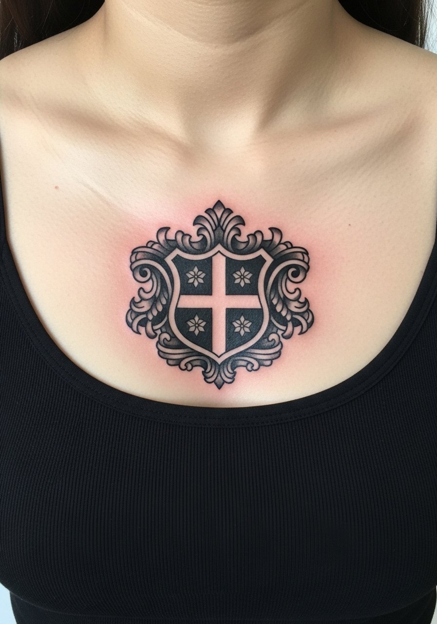
A saturated black crest sitting across the sternum reads authoritative from a distance and keeps graphic integrity as it ages. I recommend asking for slightly thicker linework than you might pick on the arm, because the central chest moves with breathing and small gaps help prevent early merging. Fair warning, sternum sessions sting more than pectoral runs, so plan for short breaks during a single two to three hour appointment. The most common mistake is shrinking the crest to fit a photo reference cropped on a model. Tell your artist to scale to chest width and keep negative space inside the design. For the session wear a zip-up hoodie you can pull down or a tank top so the artist has clear access without you feeling exposed.
2. Classical Pectoral Eagle with Flowing Wings
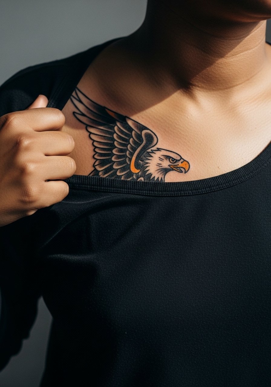
A single pectoral piece that follows muscle contours looks strong and dynamic when inked with confident linework and classic saturation. On darker skin tones, solid blackwork gives the best contrast and age resilience. During consultation bring reference photos showing the chest from several angles so the wings can be traced along muscle movement. Expect a medium pain level and a session that can run three to five hours depending on fill. A common error is crowding the wings with tiny details that disappear after a year. Ask for clean fields and hold small flourishes for the shoulder or arm if you want them to remain readable.
3. Symmetrical Geometric Plate Across the Upper Chest
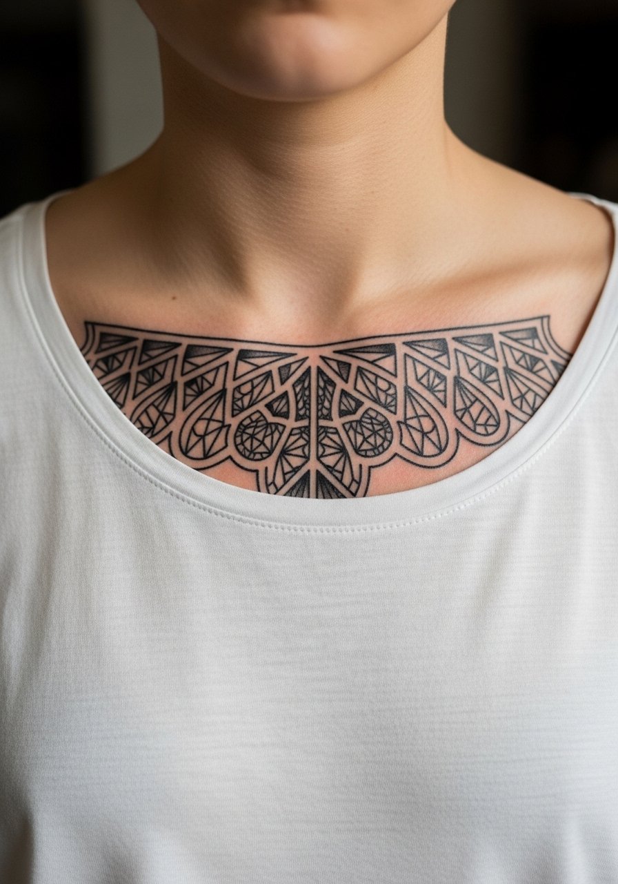
There is a tactile clarity to symmetrical geometry sitting on the upper chest, because the collarbone frames it naturally. If you want long-term crispness, scale the shapes so negative space breathes. Most artists split on how tight to make inner lines. One camp says tighter grids read sharp initially but blur on textured skin. The other camp argues that with correct needle depth and spacing the grid holds. Name the debate to your artist and ask which approach they have success with on similar skin. For showing it off, a wide-neck shirt frames the plate without competing.
4. Script Banner That Follows the Pectoral Curve
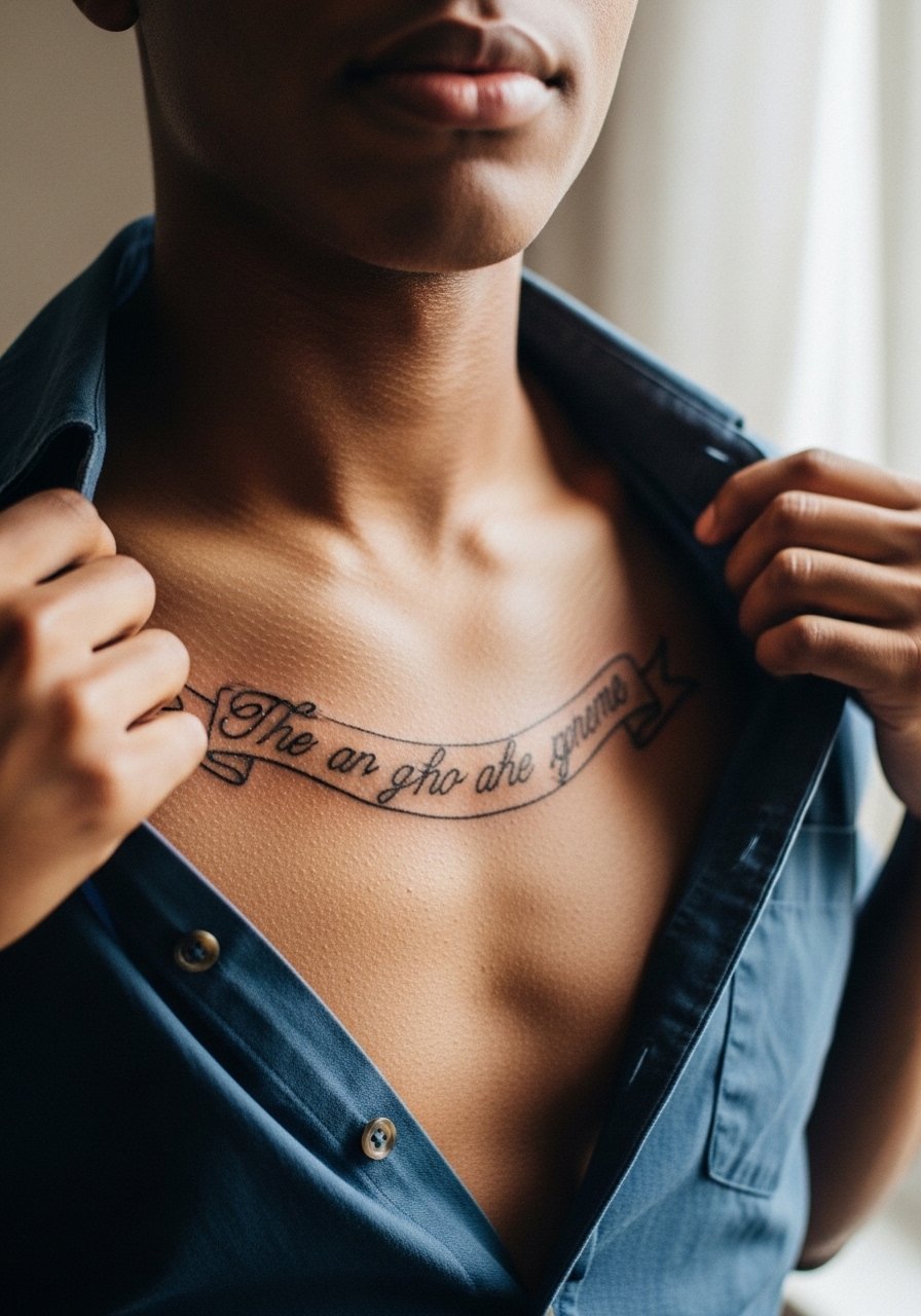
Curved script laid across the pectoral looks personal and intentional when the lettering follows muscle flow. The trick is size. Too small and the letters blur into a single line after a few years. Tell your artist you want legible lowercase spacing and show examples of font weight you like. Session time is usually one to two hours for short phrases. A real mistake is demanding ultra-delicate lettering on chest skin that lives under daily friction from collars. If you plan to wear button-ups, consider slightly bolder script. Also think about placement in relation to nipple position to avoid awkward reads when you change poses.
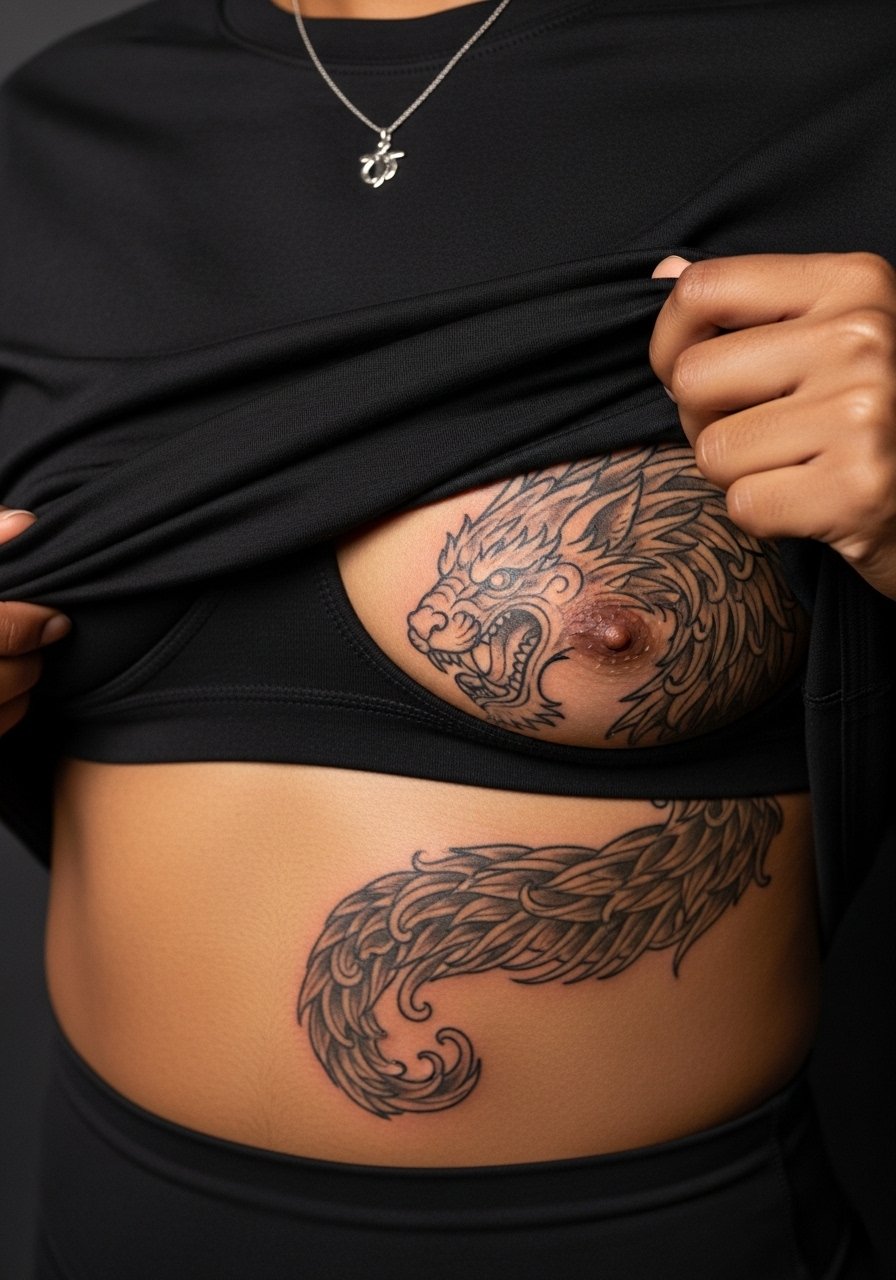
5. Neo-Traditional Lion Centered on the Chest
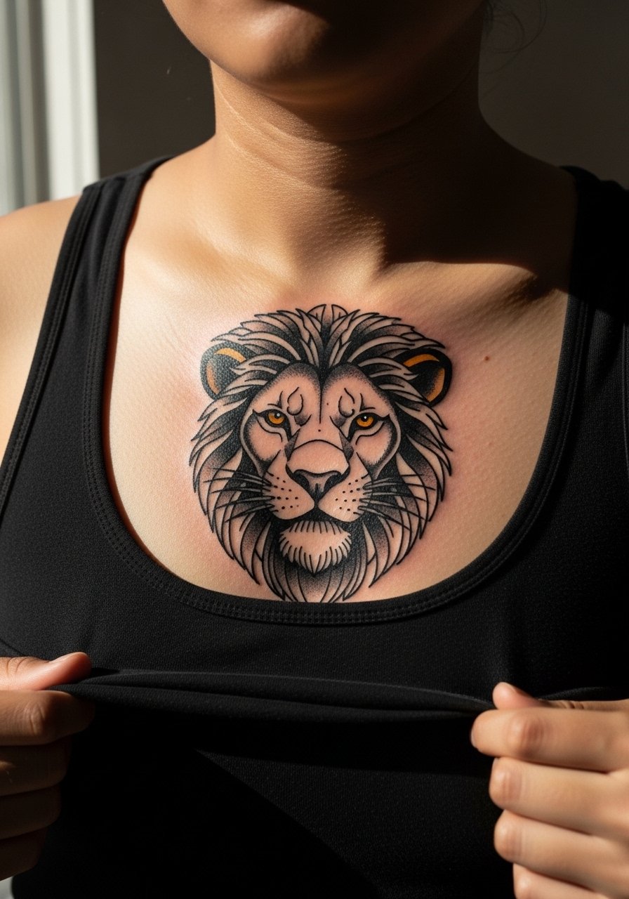
A centered lion with strong outlines and controlled color saturation makes a statement and ages predictably if the fills are not overblended. Bring photos that show the exact jawline and mane density you want, and ask the artist to map the composition to your sternum and clavicles. The session often splits into two appointments when color is involved, so expect a touch-up for saturation after healing. The common mistake is packing too many tiny color gradients into the mane. Simpler planes of color stay clearer at year four and beyond. For the appointment, wear a tank top you can pull down slightly to expose the center chest.
6. Collarbones Linked by a Chain-Line Motif
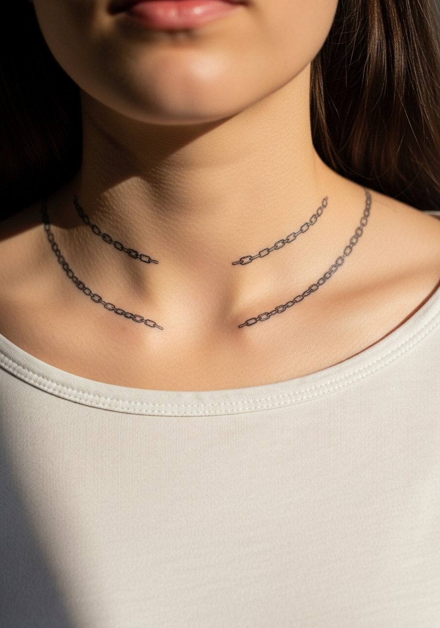
A delicate linked motif spanning the collarbones reads refined when the artist spaces each link with modest breathing room. Collarbone skin is thin and sits close to bone, so expect sharper pain but excellent line visibility if done well. The frequent error is going too thin with lineweight. If you want longevity, request slightly reinforced linework with even spacing. In my experience, a simple protect-and-avoid-friction routine during the first two weeks keeps the links crisp. Pair this look with open collars or button-downs when you want to show it off.
Studio Day Picks
The upper chest, sternum, and pectoral pieces above have different access needs and healing friction than arm work, so a few targeted items smooth the session and the first week.
-
Stencil transfer paper kit. Lets you preview how linework will sit across the sternum and collarbone before the needle touches skin.
-
Topical numbing cream stick. Helps with sensitivity during long pectoral fills when applied according to shop guidance.
-
Breathable protective film roll. Useful for central chest pieces that rub against shirts in the first 48 hours.
-
Fragrance-free body wash. Cleans the area gently after showers without stripping pigment from fine line edges.
-
Aquaphor healing ointment. Thin application in the first days helps keep saturation stable for bold fills.
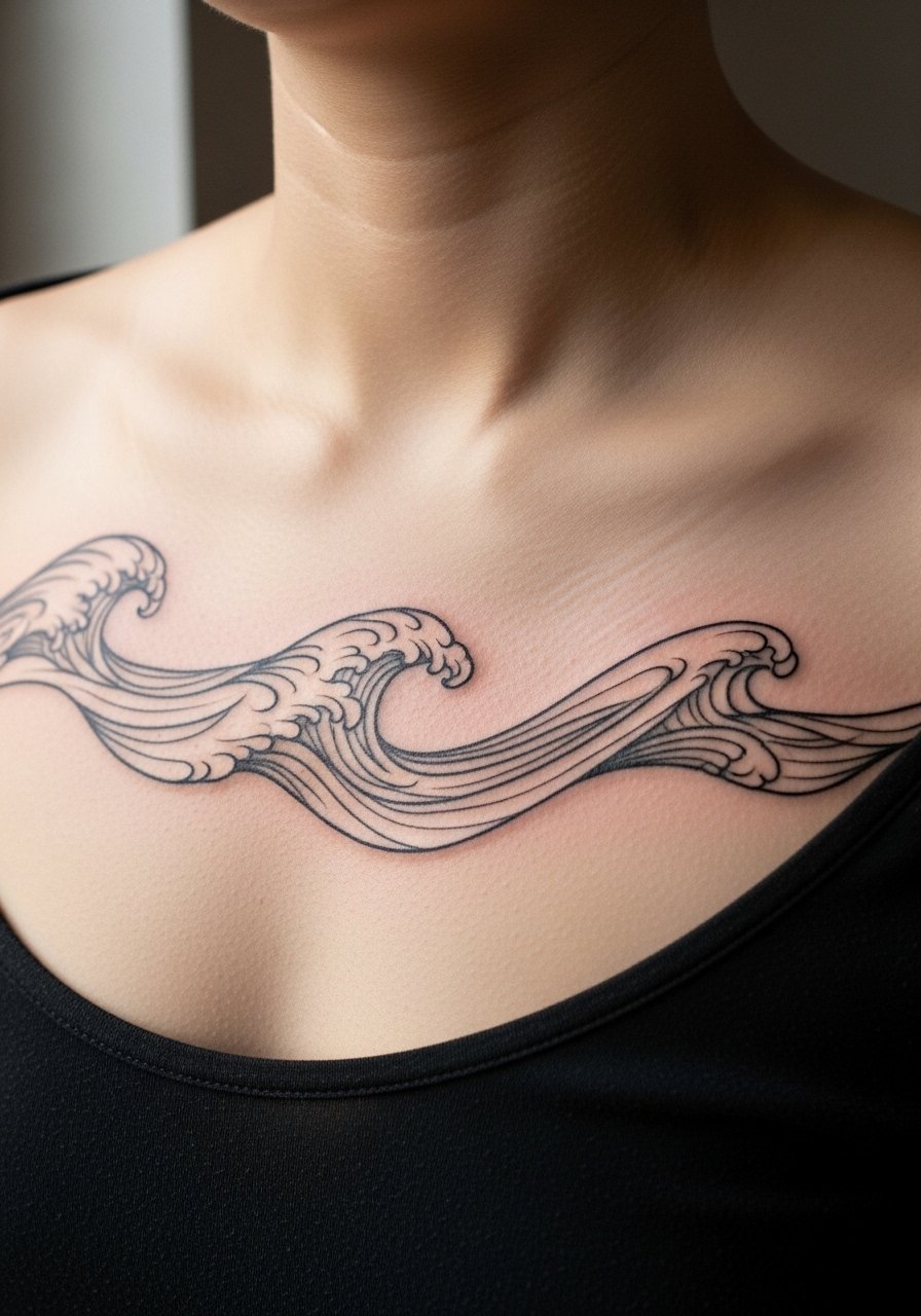
7. Rib-to-Chest Organic Wave
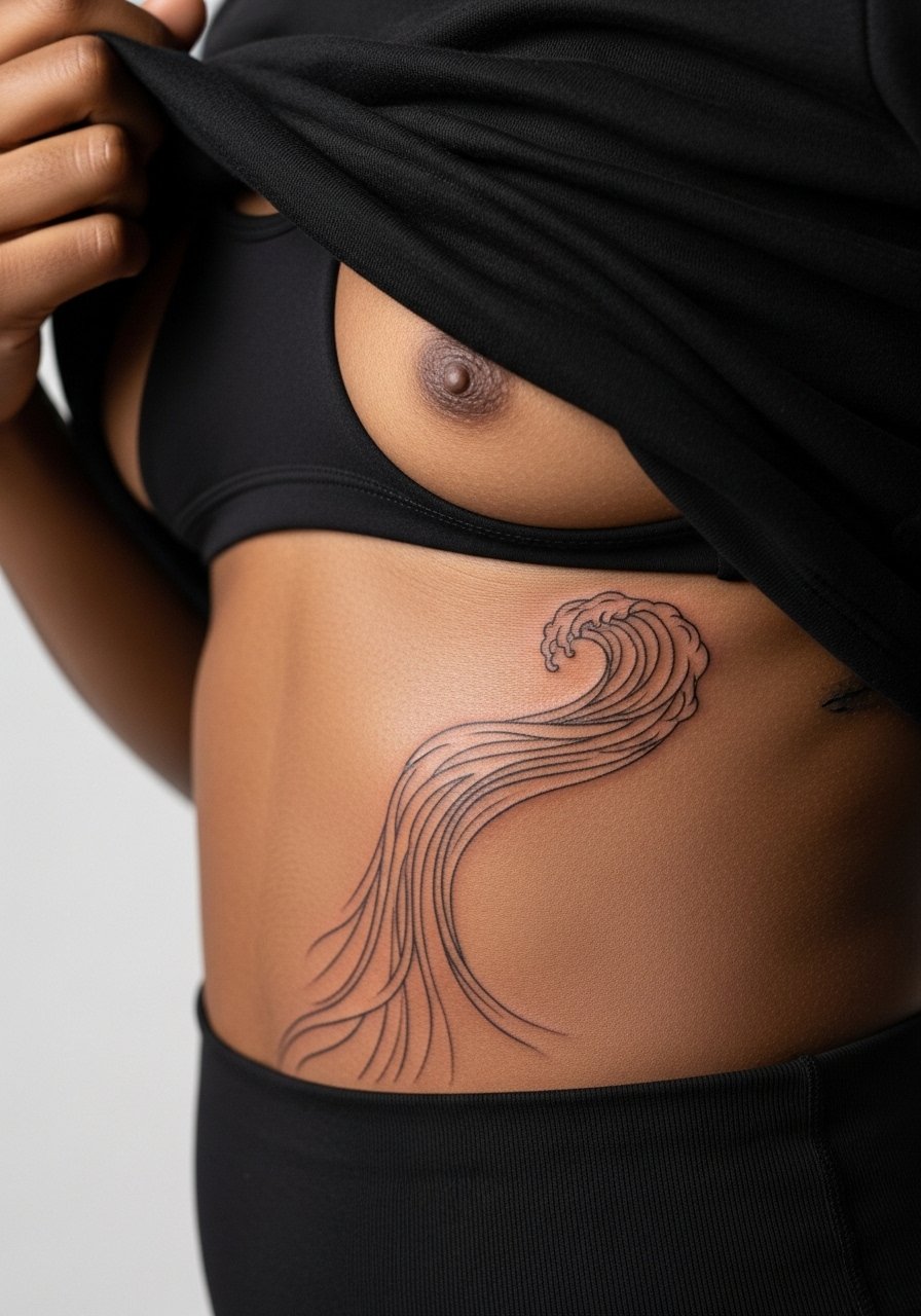
A ribbon or wave that climbs from ribs into the chest reads like motion when given breathing room and gradual line weight. Rib skin stretches and compresses with breathing, so the controversy is real. One group of artists warns that fine line on ribs blurs quickly. The other group says careful depth and spacing can preserve the design. Be explicit in consultation about which method the artist prefers. Expect higher pain and longer healing on the rib portion. The mistake I see is trying to cram detailed shading into the rib area. Keep the ribs simpler and let the chest carry the visual detail.
8. Half-Pectoral Samurai Mask with Negative Space
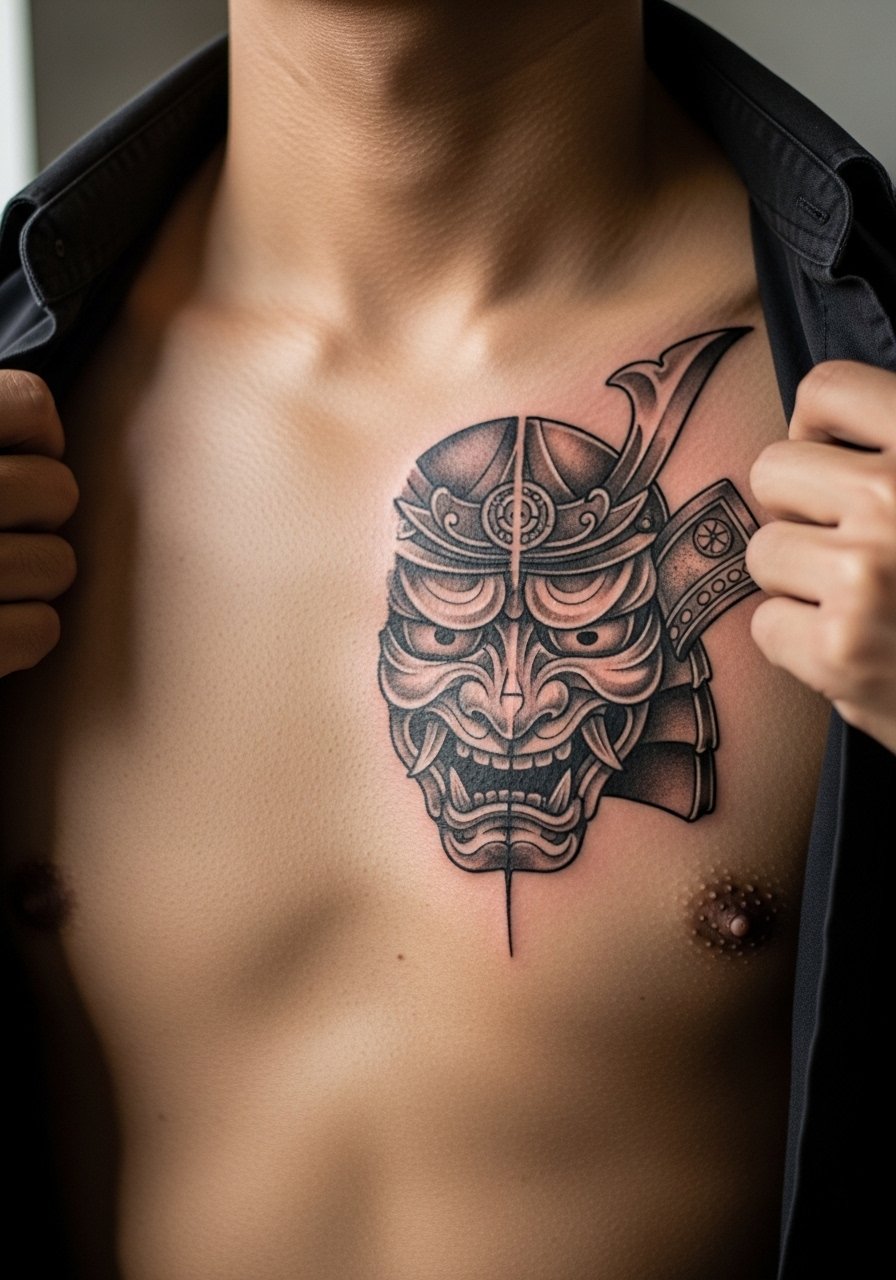
Using negative space inside a bold mask silhouette gives the piece drama without depending on tiny shading that fades. For this placement you will want the mask to interrupt along the pectoral curve so movement animates the image. During the consult ask the artist to show a mockup on your chest flattened and angled. Sessions can run three to six hours when stipple shading is included. Common mistakes include over-texturing inside small negative zones. Keep stipple work larger and bolder so dot work reads after healing.
9. Radiant Sunburst Centered Over the Sternum
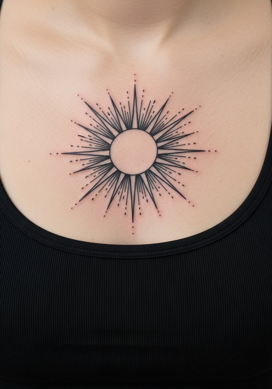
A sunburst can be minimal or ornate. For longevity pick thicker rays with spacing rather than a maze of micro rays. The chest spreads slightly with breathing, and overly dense rays tend to merge. I tell clients to choose a central focal point and keep the radial elements bold and evenly spaced. This placement is visible in T-shirts, so think about how the top of the graphic sits relative to shirt necklines. A studio tip is to bring a T-shirt you plan to wear on the way home so you can test neckline alignment before the final stencil is applied.
10. Anatomical Heart with Script Ribbon
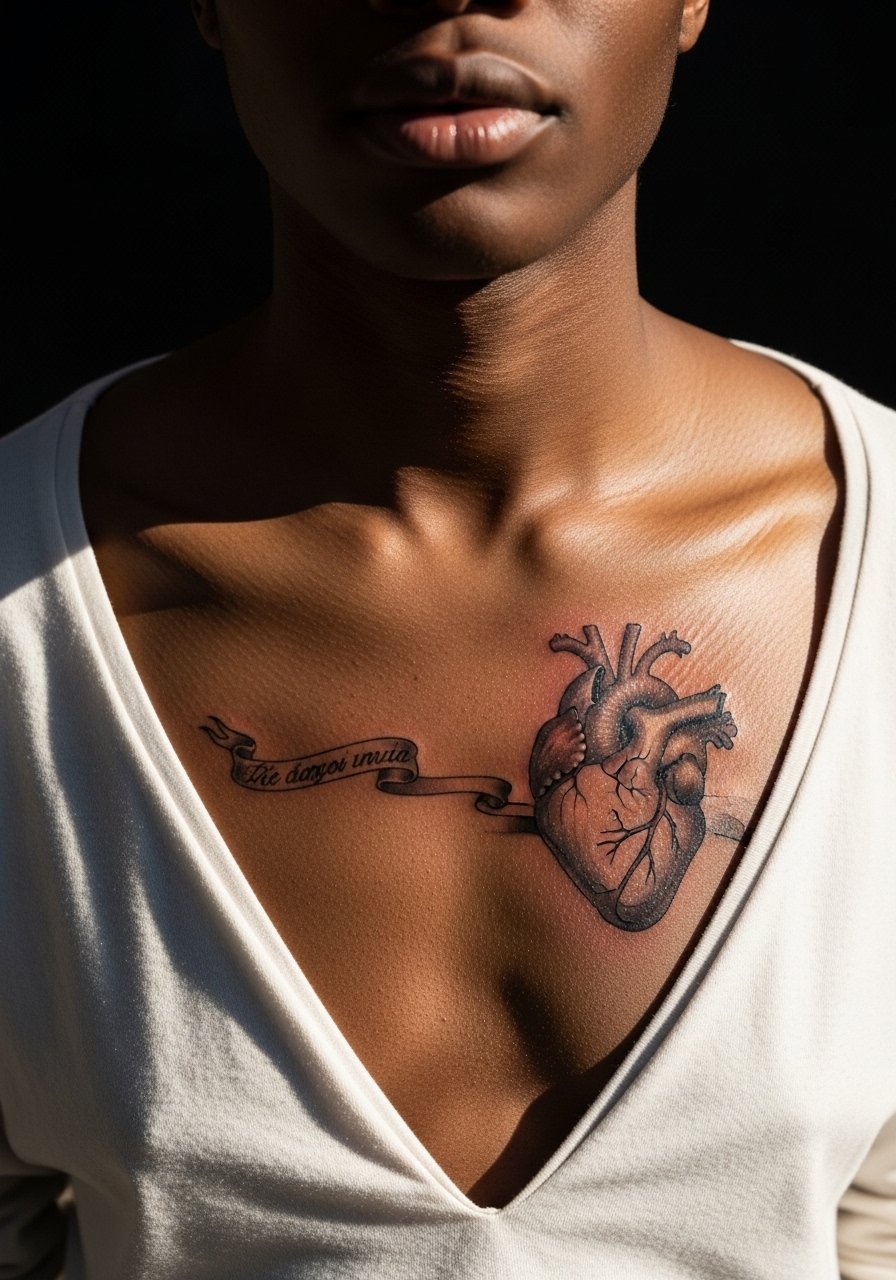
Micro-realism on the chest reads intimate and detailed, but the fine shaded transitions need room to age. If the heart has tiny veins or thin script, expect touch-up at year two or three. Tell your artist you prefer slightly stronger shading stops where the skin creases with movement. Session time varies but plan for multiple passes if you want depth. A common error is insisting on tiny micro details that the chest cannot hold long term. Keep the ribbon script bold enough to remain legible as the tonal shading softens.
11. Chest-to-Shoulder Anchor with Rope Detail
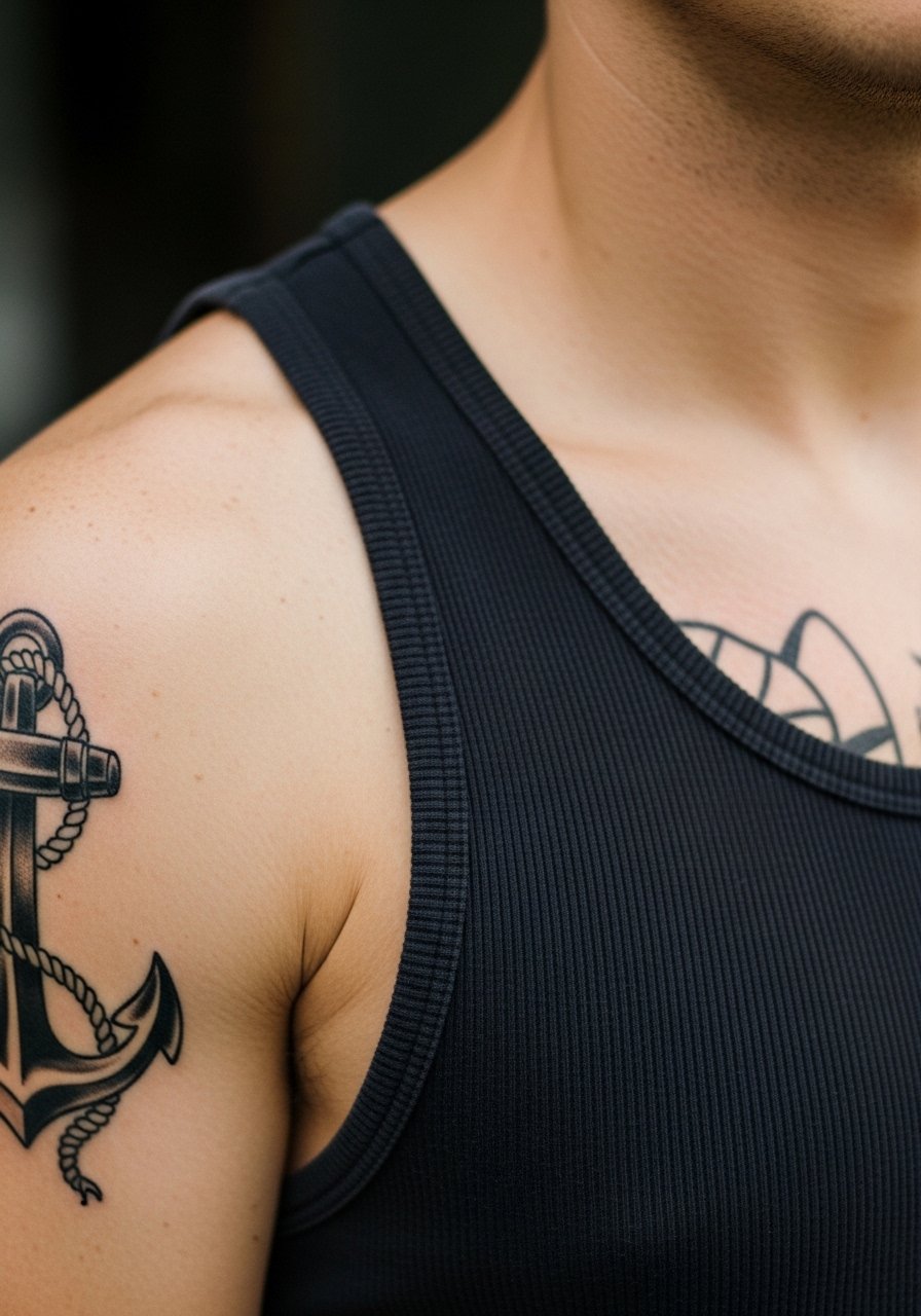
Anchors that bridge chest and shoulder take advantage of the shoulder's flatter canvas for detail and the chest for visual mass. Pain is moderate on the pectoral and lighter on the deltoid. For a clean result ask the artist to place the rope so it crosses muscle seams at flatter angles. The real mistake I see is over-detailing the rope on the chest portion where the skin moves more. For showing off, short sleeve shirts with rolled cuffs keep attention on the shoulder line without covering the chest anchor. Try a short-sleeve button shirt when you want casual framing.
12. Minimalist Constellation Cluster on the Upper Chest
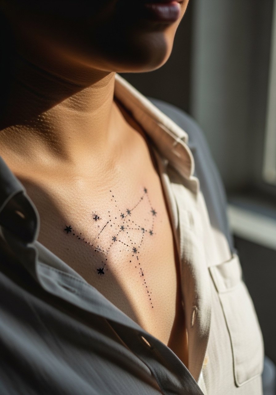
Tiny dot work and subtle connecting lines can be elegant on the chest when spaced intentionally. The age risk lies in placing dots too close together. If the cluster is meant to stay minimal, tell your artist to treat each dot like a small island with a buffer. Expect a short session but plan for a touch-up if you want the dots to remain crisp beyond year two. The session is quick enough to schedule as a single appointment. For the day of, an open collar shirt makes access easy and reveals the design without feeling staged.
13. Mythic Beast Wrapping from Sternum to Rib
A wrap that threads from sternum to rib uses the chest as a storytelling center. The rib portion will be more painful and prone to blurring if fine detail is pushed too far. For longevity, ask the artist to reserve dense texturing for the chest face of the beast and simplify the rib scales into larger shapes. Sessions are often split with an initial outline and at least one shading visit. The common mistake is trying to cram facial micro-detail into the rib section. Scaling the design to body curves keeps the beast readable for years.
14. Split Mirror Wings Across the Upper Chest
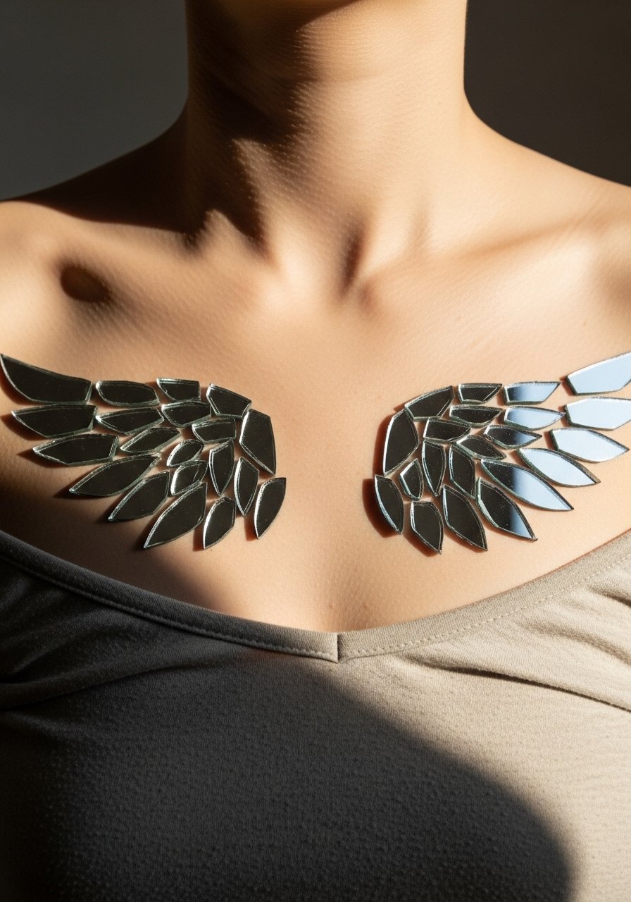
Pairing two mirrored wings across the chest feels balanced and holds presence when the primary feathers are bold. Avoid tiny feather lines packed densely near the sternum. Ask for a hierarchy where major feathers are visibly thicker and secondary lines are broader than you might choose on an arm piece. Sessions run two to four hours depending on scale. The most common mistake is insisting on identical micro-detail on both sides without accounting for slight anatomical asymmetry.
15. Blackwork Mandala Nestled Under the Collarbone
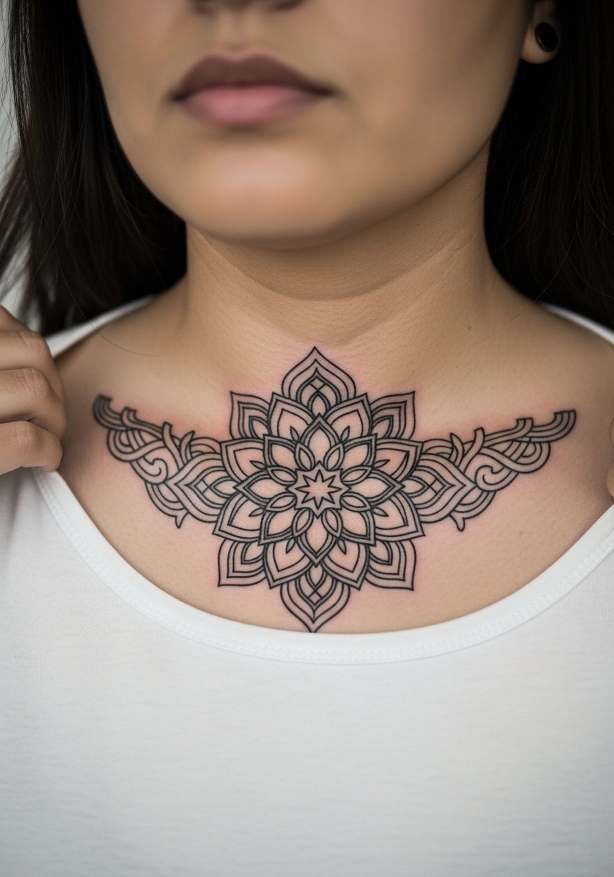
Mandala work near the collarbone needs space and deliberate negative areas. Dense inner detail can read beautifully fresh and then merge if the pattern is too tight. I advise scaling the center open enough to keep the geometry readable at year three. The appointment will be precise and may require a touch-up session. For showing off, a wide-neck shirt or a v-neck layer makes the mandala peek out without feeling overloaded.
16. Heraldic Shield With Subtle Stipple Shading
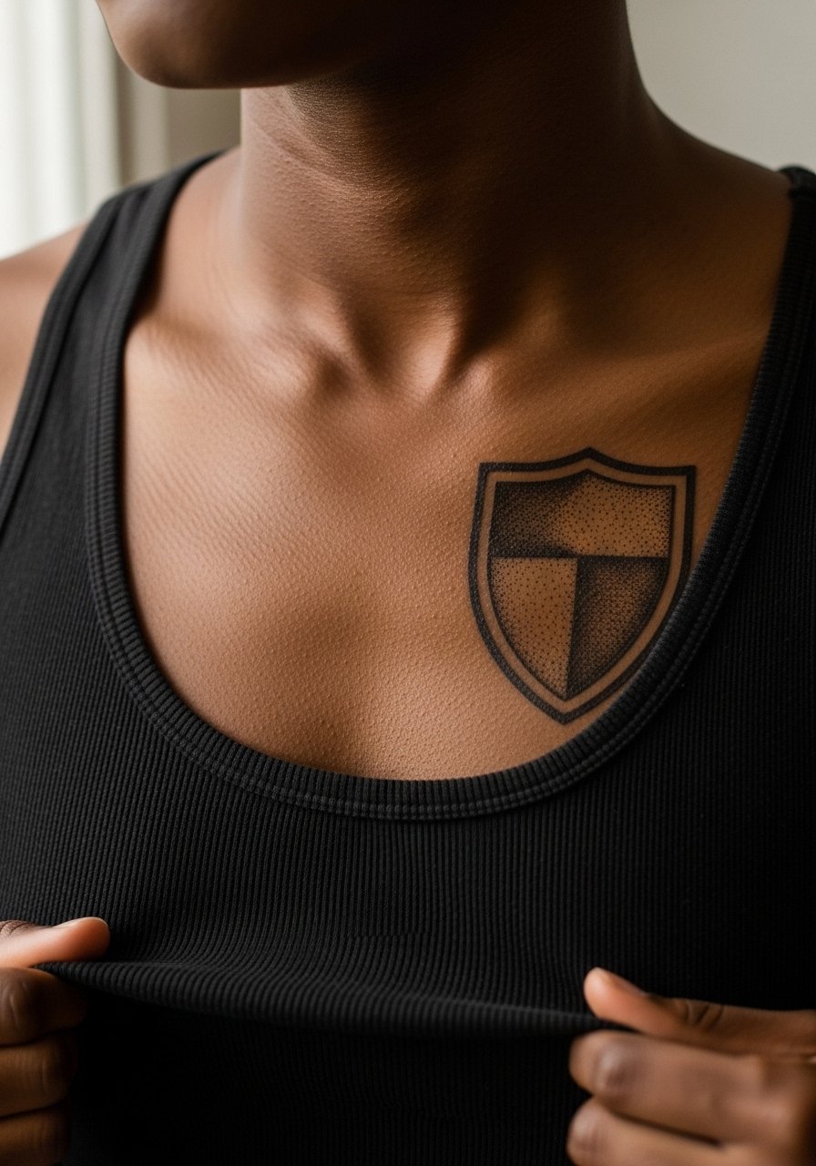
A shield design with stipple shading gives texture without relying on heavy gradients that can pool in chest creases. Discuss with your artist where stipple will be dense and where it will be airy. Dense stippling in thin skin areas tends to merge, so direct the artist to favor broader stipple strokes on ribs and denser points on the pectoral. Sessions are moderate in length and can be scheduled in one or two visits. The most frequent error is shading too tightly near seams where shirts apply pressure.
17. Abstract Wave of Lines That Follow Muscle Flow
An abstract directional wave that traces muscle fibers looks modern and strong when the artist respects flow and spacing. The aging behavior depends on spacing more than style. Tight parallel lines placed over a moving muscle blur faster. Ask for intentional gaps and varied line weight so the wave reads at distance and close up. Session time varies with scale. For the appointment, wear something that gives the artist unimpeded access to the chest without forcing you to be shirtless.
Frequently Asked Questions
Q: Will fine line chest pieces blur faster than bold blackwork on my skin type?
A: From what I have seen, fine line tends to soften sooner than bold blackwork, especially on areas of the chest that move or rub against collars. It depends on your skin texture and sun exposure. If you want a fine look that lasts, ask for slightly larger spacing and plan on a touch-up at year two or three.
Q: How should I prepare clothing-wise for a sternum or upper chest session?
A: Wear a zip-up hoodie, a wide-neck shirt, or a tank top you can pull down to expose only the area the artist needs. That way the artist has clean access and you stay comfortable on the way home. Try a wide-neck shirt that you can test with the stencil before the needle.
Q: Do symmetrical chest pieces require special placement checks during consultation?
A: Yes. Symmetry is about how the piece sits on your body, not just how it looks on a flat photo. Ask to see the stencil on your chest in standing and slightly turned positions so the artist can adjust for natural asymmetry.
Q: If I want color on my pectoral, what should I expect for sessions and touch-ups?
A: Color usually needs at least two passes for good saturation on chest skin. Expect an initial session for outlines and base color, then a second for layering and blending. A touch-up at year one or two is common to refresh saturation if you wear low-neck shirts or spend a lot of time in the sun.
Q: Are there career risks with visible chest tattoos under shirts?
A: Chest tattoos are often hidden by shirts but visible when wearing open collars or low necklines. Hand and neck work carry higher hiring risk than chest pieces. Think about how often you will reveal the chest in professional settings before committing to very visible designs.
Q: Where do I find artists who handle chest work well if I want a confident hand and good results?
A: Look through studio directories, local convention lineups, and community threads on Reddit to find artists known for chest commissions. Also search hashtags for chest-specific portfolios and check shop portfolios for healed photos. That combination of discovery pathways helps you find someone who has proven results on the chest.
