
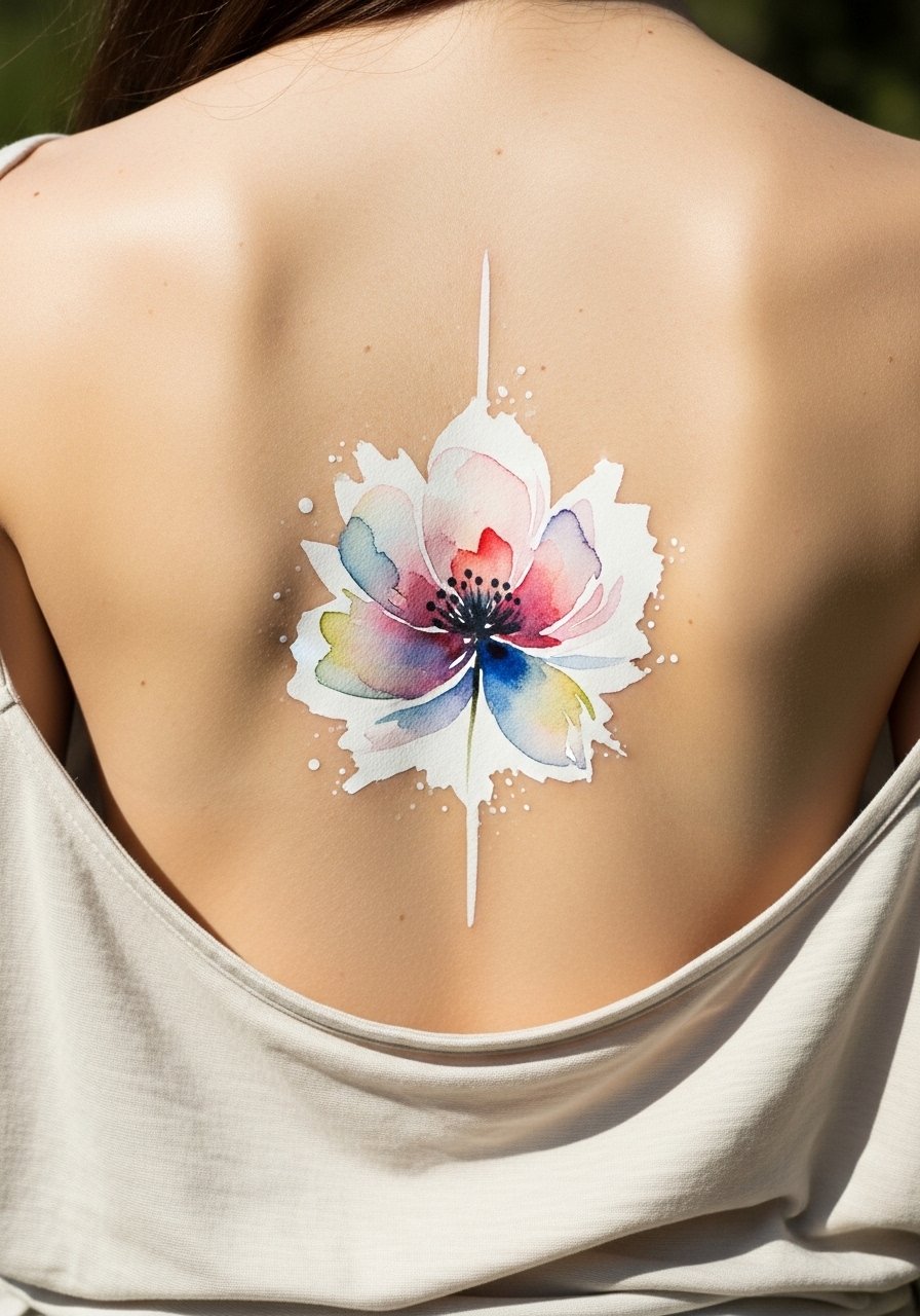
Fine line watercolor along the spine looks effortless in photos, but the real test is what it looks like after sun, sweat, and two summers. I have noticed that the motifs that still read crisp after three years are the ones with thoughtful spacing, controlled saturation, and a clear plan for touch-ups. Below are 21 spine-focused watercolor flower ideas, with what to ask your artist, styling tips, and realistic aging notes to help you pick a design you will keep wanting to show.
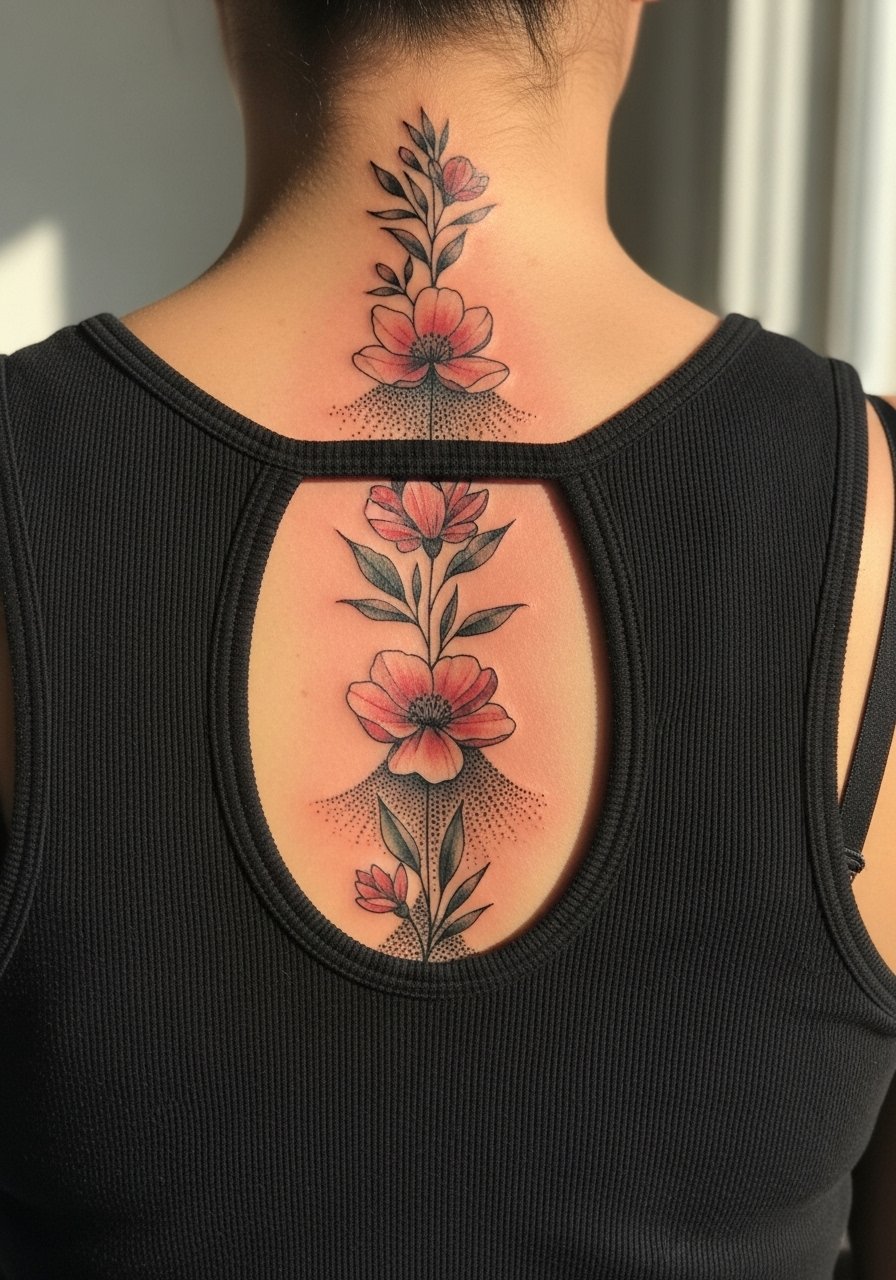
1. Cherry Blossom Trail Up the Cervical Spine
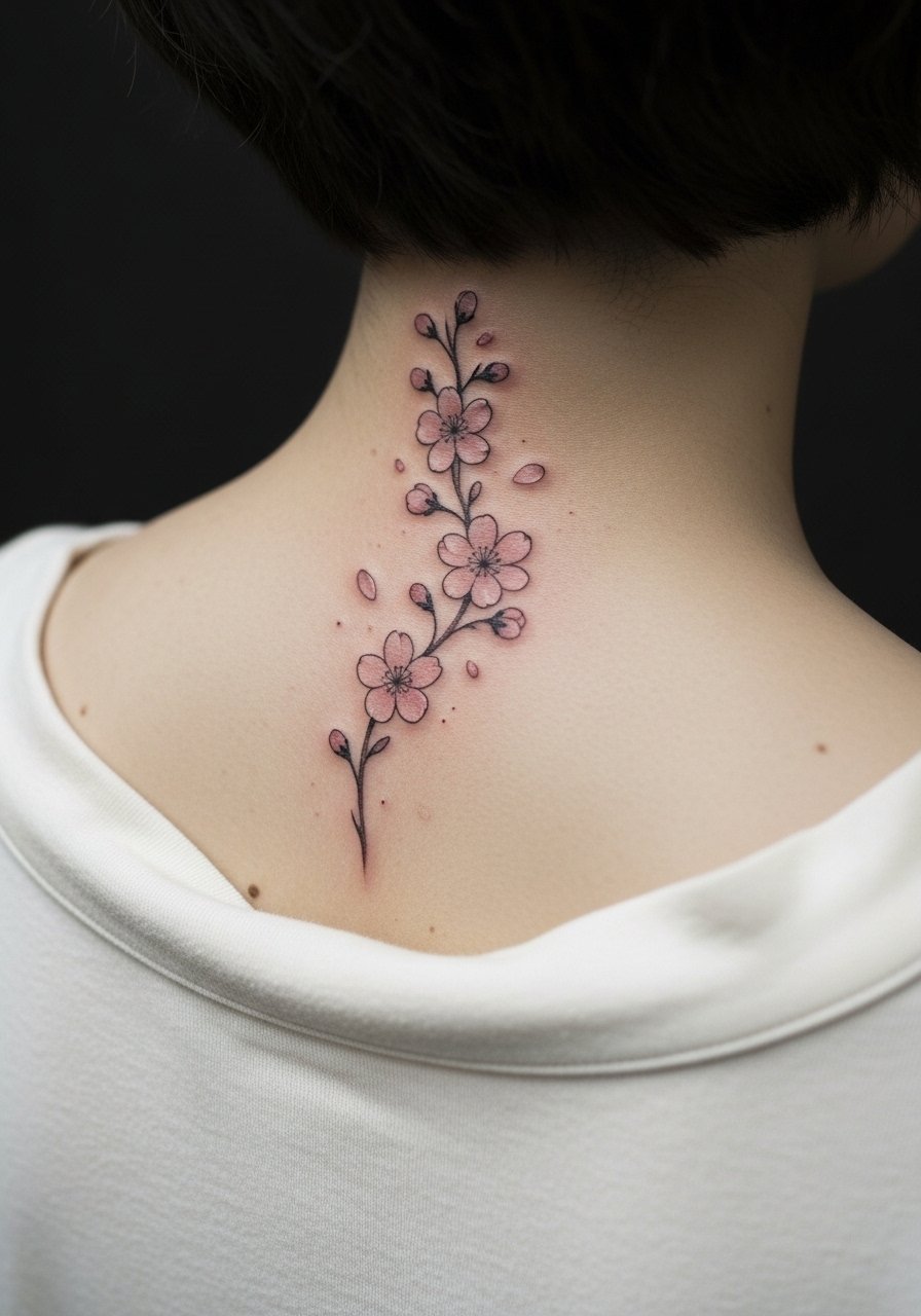
Start this as a column of small blooms spaced along the cervical spine for movement without crowding. In consultation, ask for slightly larger petal spacing than your reference so the blossoms do not merge as the skin settles. Fair warning, the neck moves a lot and thin linework can soften fast, so expect a touch-up window at around year two to three. For the session, bring a button-down you can unbutton and drape, or wear a wide-neck shirt so the artist has clean access. Most people report the neck is a 6 to 7 on pain scales, but short runs of color make the session easy to manage.
2. Tiny Wildflower Spine in Pastel Watercolor
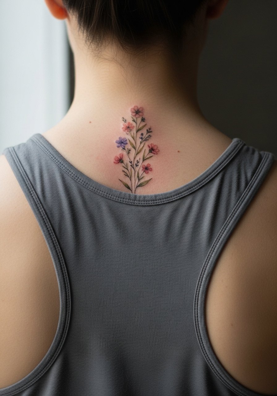
This minimalist chain of wildflowers works well if you want a subtle column rather than a single large piece. When you sit down with your artist, ask for slightly diluted saturation in the first pass so the wash reads soft healed rather than a solid patch. A common mistake is packing too many tiny blooms in one session, which causes blurring between flowers. Plan for two short sessions rather than one long marathon. For showing it off, an open-back midi dress frames the column without covering the soft color.
3. Bold Sunflower Spine with Saturated Center
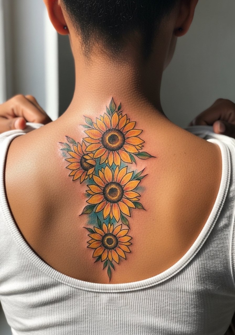
If you prefer more saturation that still reads like watercolor, ask the artist to anchor each bloom with a slightly heavier black linework around the center. That keeps the composition readable as washes fade. Expect a higher touch-up need at year three because saturated pigments can shift under heavy sun exposure. The lumbar and thoracic spine handle color differently. The upper spine tends to hold linework better because it sees less friction from clothing. Session time is medium for a column of large flowers, and the pain sits around 5 to 7 depending on proximity to the shoulder blades. For session comfort, wear a loose button-down shirt you can slide aside without tugging on the skin.
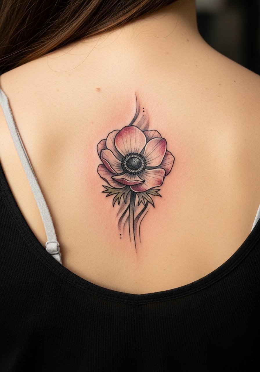
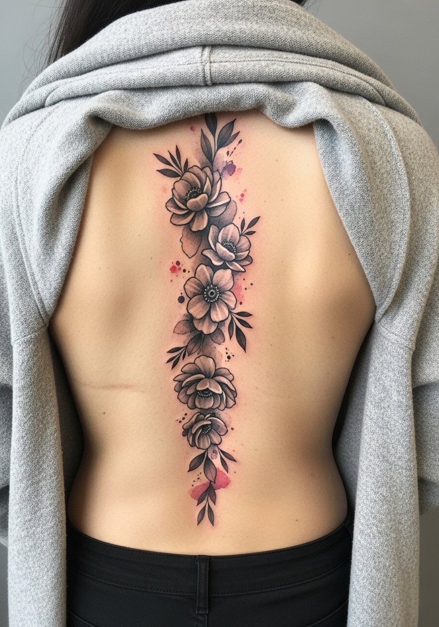
4. Watercolor Peony with Blackwork Outline
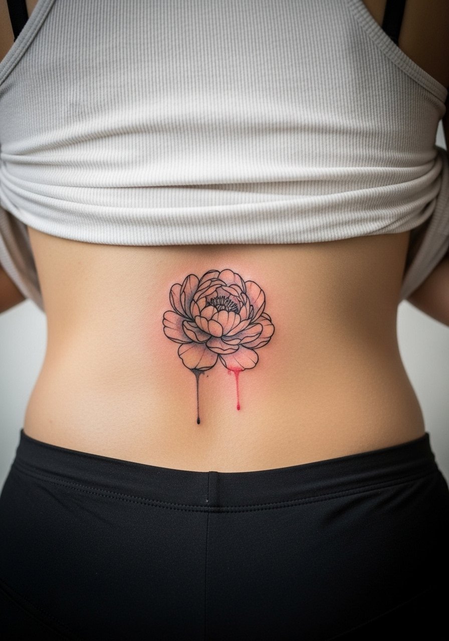
Pairing watercolor fills with a restrained black outline gives the piece longevity. One controversy in the community is whether outlines defeat the watercolor look. One camp says outlines keep the image readable as color fades. The other camp argues that outlines make the piece feel less painterly. I find outlines help preserve composition without killing the soft aesthetic. Tell your artist you want the outline light, not heavy, so it reads like a frame. Expect modest pain on the mid-spine and a two-session plan if you want layered color and outline work.
5. Cascading Lotus in Pale Blues and Greens
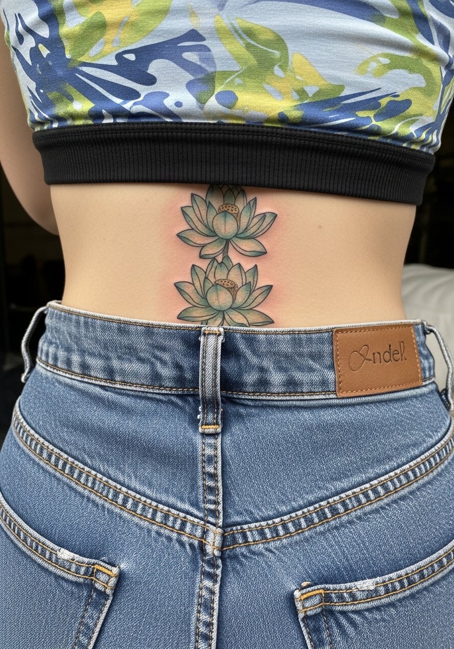
Lotus motifs adapted to the spine work well when each flower has breathing room. The biggest mistake is starting with too much packed color in the first pass. Ask for a staged saturation plan and expect a follow-up session to deepen hues. The lower spine can be a 6 on pain scales but tolerable in shorter passes. For the appointment, wear high-waisted bottoms and a cropped athletic top so the artist can roll fabric without you getting cold. After one year healed the washes will soften, and by year three pale blues often need a gentle refresh to avoid muddying.
6. Stipple-Shaded Rose Spine with Watercolor Washes
Combining stipple shading with watercolor washes keeps texture in the healed piece. Tell your artist to use stipple for the shadow areas rather than solid gray wash so the tattoo retains depth as color fades. A real mistake is asking for too smooth a gradient at very small scales, which can blur. The thoracic spine tolerates stipple well and blowout risk is lower than on the lower back. Sessions can feel repetitive due to dot work, so expect moderate chair time and bring a playlist. For showing it off, a racerback tank keeps the flow visible without distraction.
Pre-Session Essentials
The upper and lower spine pieces above need different prep, and a short kit makes the session easier for both the client and the artist.
-
Stencil transfer paper kit. Lets you preview how the floral column sits along the spine so you can check symmetry before ink hits skin.
-
Topical numbing cream. Applied per instructions about 45 minutes before the session relieves edge pain on the lower spine without changing how the artist layers color.
-
Thin protective film roll. Useful for covering the lower back pieces that get friction from waistbands during the first week.
-
Fragrance-free gentle body wash. Cleanses the healing spine area without stripping color or irritating sensitive linework.
-
Aquaphor healing ointment. Thin application for the first few days locks in moisture for watercolor areas without suffocating the needle channels.
7. Lavender Sprigs with Vertical Negative Space
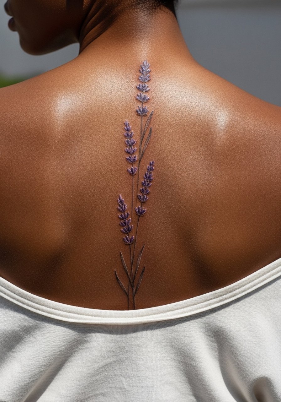
This design leans into negative space to keep the column airy. When you consult, request clear gaps between sprigs and ask the artist to map the spacing on your back with a washable marker before committing. The common mistake is compressing elements for impact, which causes the piece to read muddy after a few years. The session feels like repeated short passes, and pain is usually moderate. For show-off outfits, an open-back blouse complements the vertical rhythm without covering the negative spaces. Trust your artist on placement and mapping, and ask for the preview in several standing positions.
8. Sun-Kissed Marigolds with Subtle Glow
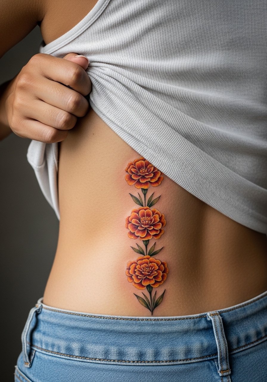
Marigolds with warm pigments age into a soft patina that can look cohesive even as saturation fades. Tell your artist you want a warmer undertone in the washes to avoid greenish shifts that sometimes occur as yellows age. Watch for over-saturation early on because dense yellow can oxidize on some skin types. The lumbar spine sees friction from waistbands, so expect areas closest to the belt to need gentle sun protection and a possible touch-up at year two. Sessions are moderate in length and the pain depends on how close you are to the posterior iliac crest.
9. Watercolor Anemone with Whip Shading Accents
Whip shading paired with watercolor keeps petal edges lively while preserving soft transitions. Ask the artist to use whip shading for petal depth and to avoid heavy gray fills that can flatten the watercolor. A common mistake is overworking the same area in one sitting to get color saturation. Stagger the work so pigment layers settle between sessions. The mid-spine holds detail better than lower spine because of skin tension differences. For the session, bring a loose drawstring linen pant if you prefer to sit up for part of the time and need comfort when getting off the table.
10. Fern and Blossom Column with Negative Ink
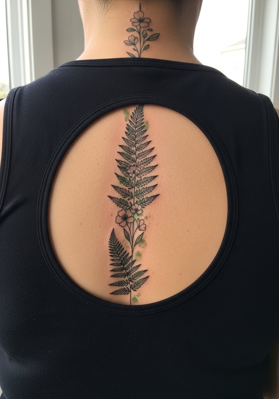
Negative ink and fern fronds create a graphic rhythm that stands up to fading because of the clear contrasts. During consultation, request negative ink sparingly so the live-skin highlights remain visible as color softens. The biggest mistake is underestimating how texture will show as color blurs. Expect the piece to mellow at six months then soften further by year three, with linework staying the main anchor. Pain is moderate and the session time can be longer if many fronds are involved. If you want to showcase this column, a halter top draws attention to the center spine without competing with the design.
11. Hibiscus Spine with Tropical Palette
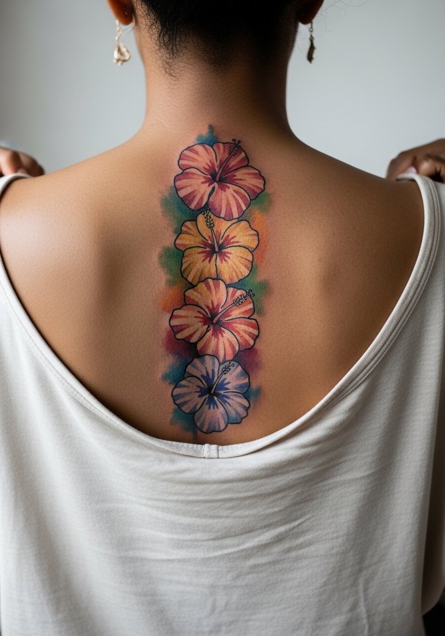
Tropical colors can sing on darker skin tones when the artist chooses pigments with strong base tones. Ask for a saturation test patch or small sample to see how the colors heal on your skin type. A mistake people make is assuming every pigment heals the same across tones. Touch-up timelines vary, and warm pigments often need a gentle refresh at year three for vibrancy. The thoracic area is forgiving for large petals, but the lower spine can be trickier due to movement. For showing it off, a strappy sundress frames the column well.
12. Minimalist Single Stem with Soft Bloom
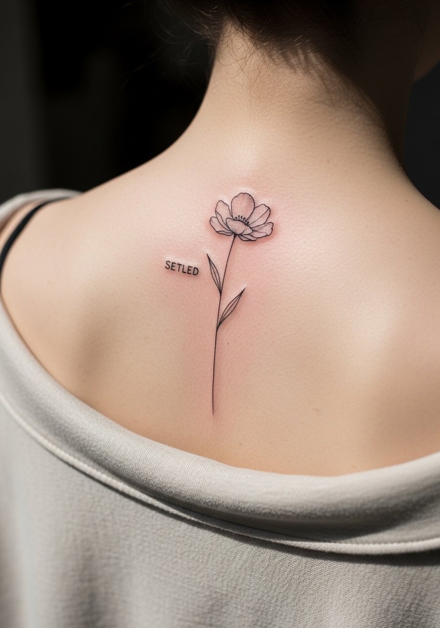
A single stem is a low-commitment way to get spine placement with fewer long-term maintenance needs. The consultation should include scale checks because too-small stems blur. The most common mistake is asking for a very fine single stem without enough contrast. Expect the single-stem approach to need a smaller touch-up than packed columns because there is less area to fade. Pain is usually mild to moderate on the upper spine. For the session, wear a wide-neck shirt you can easily shift aside so the artist has a clean field.
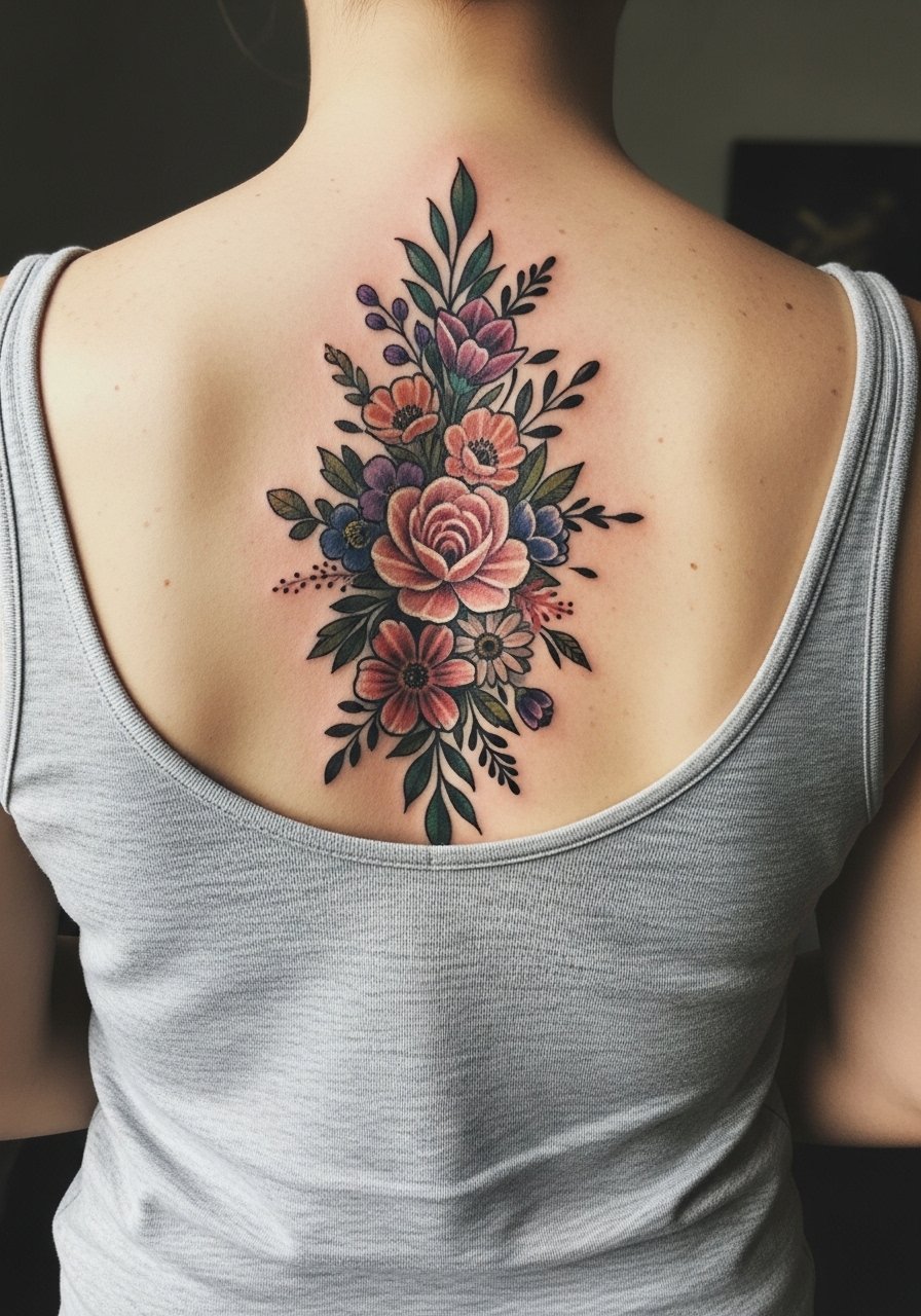
13. Mixed Bouquet with Script Ribbon
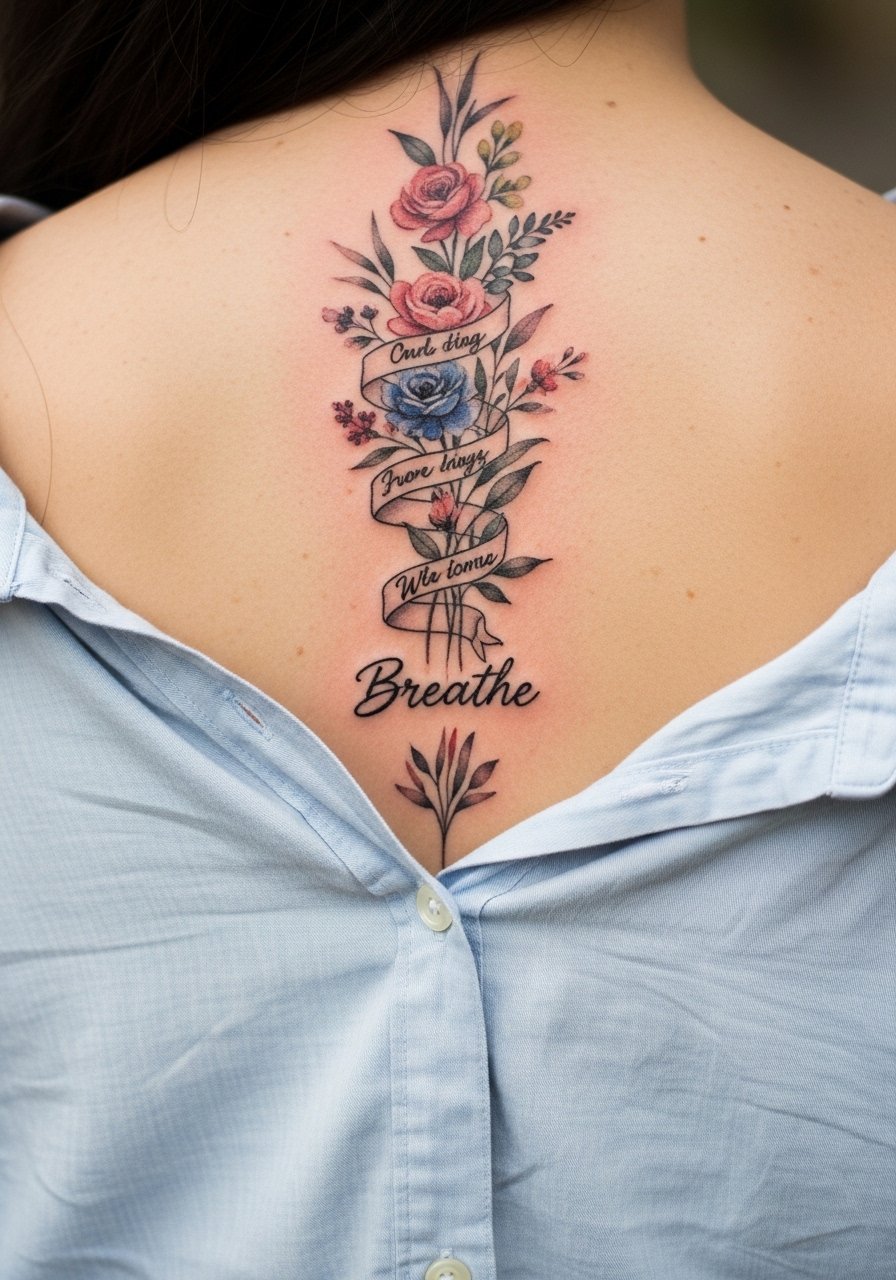
Adding script as a ribbon through flowers personalizes the column, but text on the spine must be planned carefully. Text reads best when slightly bolder than the thinnest floral line because the spine sees movement. The community divides on script placement on curved areas. One camp says small script always softens into illegibility. The other camp says properly spaced script with a slight increase in line weight holds. Ask your artist to write the exact font size on skin before inking. Sessions are moderate and script areas may need a touch-up at year two depending on exposure.
14. Iris Column with Deep Indigo Wash
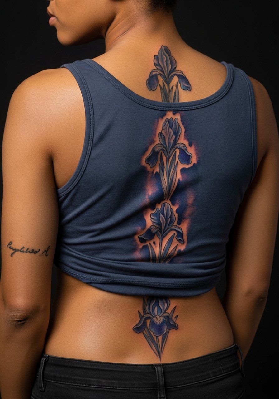
Deep indigo can age beautifully when applied with gradual layering. Tell your artist to build the indigo in stages and to avoid laying a dense block of pigment in the first session. The mistake is asking for an instant jewel-tone finish, which often requires overworking and risks blowout. The lumbar region takes color well but friction from waistlines can dull indigo faster. Plan your wardrobe accordingly after healing and consider a touch-up at the two to three year mark. For the session, wear high-waisted bottoms and a cropped tee to avoid fabric rubbing on the fresh ink.
15. Peony and Vine Column with Faint Gold Accents
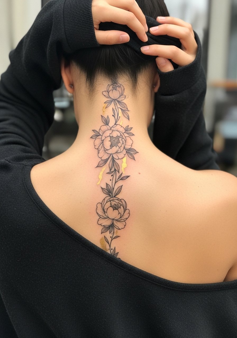
Metallic or gold-look accents are achieved with warm tones rather than actual metallic ink. Ask for warm ochre or amber washes to simulate gold so you are not relying on pigments that do not age well. The real mistake is requesting metallic inks without discussing longevity. Floral columns with warm accents often mellow into a cohesive palette, but expect the gold-look to need a softer touch-up at year three. Pain and session time are moderate. For showing it off, an open-back dress keeps the vertical line visible and elegant.
16. Botanical Spine with Dot Work Grounding
Dot work beneath watercolor elements offers visual anchors that age predictably. Tell your artist to use dot work for shadows and grounding so that when washes fade you still have structure. A frequent error is relying on color alone to create form. Expect dot work to retain contrast longer than pigment washes, and plan for touch-ups focused on the watercolor areas. The thoracic spine is friendly to dot work because skin tension helps keep points crisp. For session comfort, a loose button-down you can drape works well.
17. Abstract Watercolor Bloom with Faded Edges
Abstract blooms focus on wash and negative shape rather than literal petals. The consultation should include clarity on how much blur you want because artists vary in how much edge definition they preserve. The mistake is asking for "max blur" without realizing it can read like a stain over time. Plan for a lighter initial pass, then a session to refine edges after the first healing. This approach ages well when intentional gaps and soft boundaries are part of the design. Session pain is moderate and sessions are often shorter but more frequent.
18. Gardenia Column with Fresh White Highlights
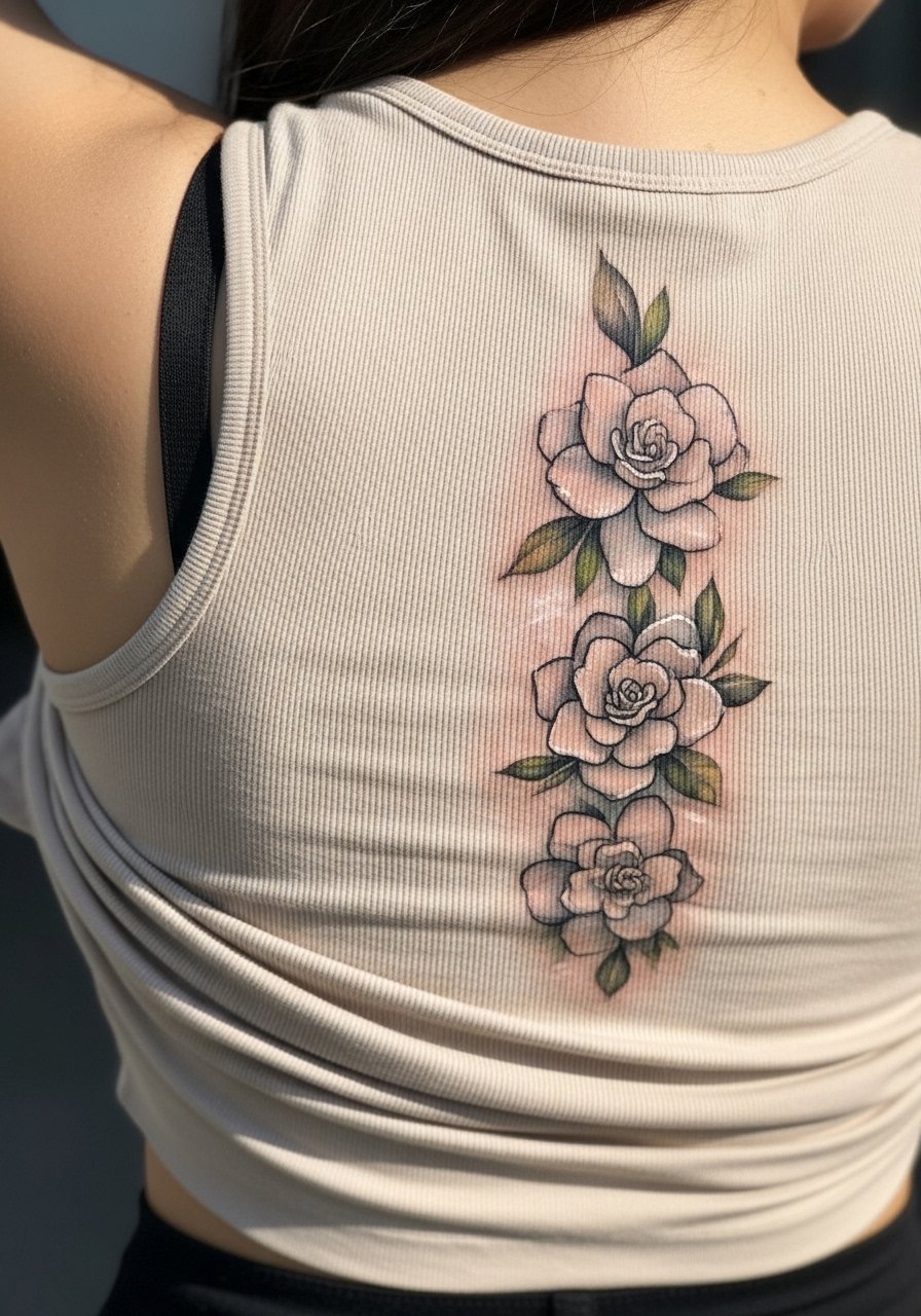
White highlights are applied subtly and are not true pigments that stay bright forever. Ask for white only as a temporary highlight so you are not surprised when it fades. One common mistake is depending on white for long-term definition. Expect highlights to fade within the first year and to use darker pigments for structural definition if longevity matters. The mid-spine handles white accents better than the lower spine because of less friction. For showing this off, pair with an open-back top that keeps the column visible without overexposure.
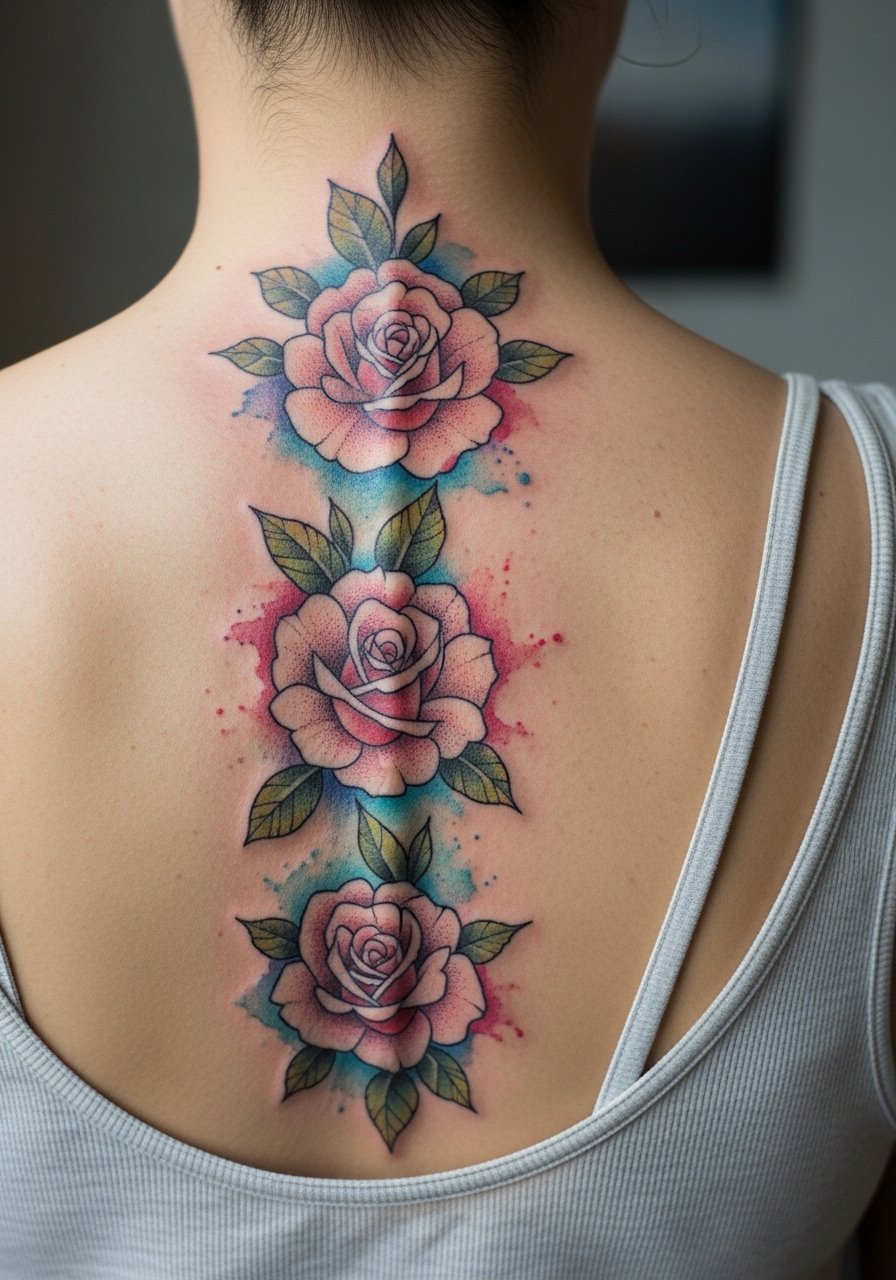
19. Vintage Rose Column with Muted Palette
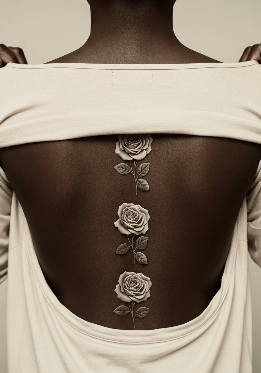
Muted palettes read as intentionally aged even when fresh, which can be helpful if you like a soft vintage look. Tell your artist you want pigments that sit warm in tone so they age into the intended sepia rather than green. The main mistake is picking pigments that oxidize poorly on your skin tone. Expect this style to mellow gradually while keeping the vintage voice intact, and plan for a subtle touch-up at year three if you want to keep the sepia depth. Sessions are moderate in length and pain varies by exact placement.
20. Multi-Species Bouquet with Asymmetrical Spacing
An off-center approach can feel dynamic and wearable. During consultation ask the artist to stencil the off-center column and check it while standing and while bending so you are happy with the flow. The common mistake is choosing an off-center placement without trying multiple stencils. Asymmetry can show more clearly as you move, so map it carefully. The lumbar area can feel more sensitive when work crosses the posterior hip line. For the session, wearing high-waisted jeans that you can lower slightly for access keeps you comfortable.
21. Monochrome Ink Wash Flowers with Sparse Color Pops
Combining monochrome grounding with a few color pops gives you the drama of gray work and the life of watercolor in small places. Tell your artist where you want the color pops before the session so the gray wash does not overpower them. A frequent mistake is adding too many color pops which dilutes the intended focal points. Grayscale holds up very well on the spine and often needs fewer touch-ups than full-color pieces. The session can feel longer because the artist may switch between needle groupings for gray and color work.
Frequently Asked Questions
Q: How long will watercolor flower spine tattoos stay readable before needing a touch-up?
A: It depends on placement, sun exposure, and skin type. In my experience, lighter washes often need a gentle touch-up by year two to three on high-friction zones like the lower back. Mid and upper spine pieces with strong linework can go longer between touch-ups. Plan for a refresher at year three if you care about vibrancy.
Q: Are there spine placements I should avoid if I want watercolor to hold up?
A: The area closest to the beltline and the posterior hip sees more friction and tends to fade faster. The cervical and upper thoracic spine usually keep detail longer. If you are unsure, ask your artist to mock the stencil and wear the clothes you normally would to see how fabric sits on the planned spot.
Q: Do watercolor-style tattoos need different aftercare than traditional pieces?
A: The steps are similar but watercolor areas benefit from shorter initial abrasion and thin layers of healing ointment so pigments do not saturate into a single block. Follow your artist's instructions. The right protective film in the first week helps watercolor washes avoid early blending from friction.
Q: Can I wear specific clothes during the session to make spine work easier?
A: Yes. Bring tops that can be shifted without being removed, like a wide-neck shirt or a loose button-down you can drape. For lower spine pieces, high-waisted bottoms make access easier without exposing you to cold. Planning clothing reduces session adjustments.
Q: How do I find an artist who understands watercolor on the spine without naming anyone?
A: Look for portfolios from shops listed on local convention rosters, browse shop directories, and check community hashtags for recent healed work. Ask to see healed photos on people with skin tones similar to yours. Most artists will be clear about their digital and healed examples.
Q: Will the spine placement affect my work or parental responsibilities?
A: Spine tattoos are mostly private unless you choose clothing that shows them. Some employers have conservative dress codes that might include visible back tattoos. Think about how often you plan to show the piece in professional settings before committing.
Q: What should I ask during consultation to reduce the chance of regret?
A: Ask to see healed photos on similar placements, request a skin mapping with the stencil in multiple positions, and discuss realistic touch-up timelines. If longevity is your priority, ask how the artist spaces elements to avoid early blending. Trust your artist when they explain spacing and needle depth, and ask for specifics about their approach.
