
Trend cycles and reality do not always match when it comes to watercolor back tattoos. The airy washes that look weightless on a phone screen need the right placement and saturation to age cleanly. Pick a panel that avoids constant friction, ask for slightly bolder transitions than your reference image, and plan a realistic touch-up window. The first idea below shows a version of this approach that holds well over time.
1. Upper-Back Watercolor Floral Mural

Most people pick the upper back for a large watercolor because it gives the artist room to breathe and it avoids waistband friction. I tell clients to ask the artist for a mix of diluted color fills and defined line anchors so the piece reads from a distance and keeps shape as the pigments settle. Pain is moderate for this placement and sessions can run two to four hours depending on coverage. A common mistake is asking for extremely pale washes only, which often fade into blotchy patches at year two. For the session, bring a loose button-down shirt you can pull aside so the artist has clean access.
2. Scapula Watercolor Bird with Negative Space

This scapula placement shows well with watercolor because the shoulder blade gives subtle curvature that animates the washes. Expect a one to two hour session for a medium-size piece. I advise saying "leave the wing tips with negative space" during consultation so the artist plans skin breaks that keep the bird readable as saturation drops. The main aging issue is sun exposure if you wear low-back tops often. For the session, pick a racerback tank you can easily shift without rubbing the fresh ink. Some artists argue watercolor lacks longevity on the scapula. One camp says it fades fast there because of movement. The other camp says proper saturation and placement solve that. Ask where the artist stands.
3. Spine Watercolor Wash with Fine Line Script
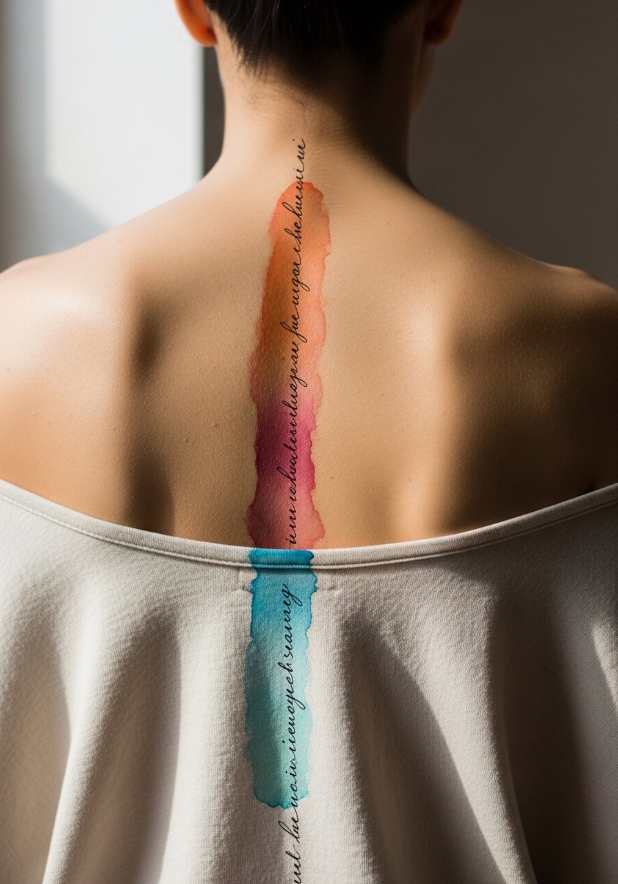
A spine piece reads architectural and elegant, but the skin along the vertebrae moves a lot during healing. Pain is higher on the spine than on the shoulder blade. Expect shorter sessions focused on linework first, then color fills in a follow-up. Tell your artist to space the script lettering slightly wider than your phone reference so the letters do not merge after healing. From what I have seen, color along the spine tends to soften between six months and two years. A common mistake is requesting tiny script that looks delicate fresh but becomes illegible after a year. For showing it off, pair this placement with an open-back midi dress for evenings.
4. Watercolor Mandala Halo over the Shoulder Blade

Mandala geometry and watercolor washes can be friends when the artist balances dot work and color saturation. I suggest asking for stipple shading around the mandala edges so the pattern holds without relying entirely on color contrast. Pain is moderate and session time depends on complexity. The mistake I see most often is packing too much tiny geometry into a small area. That causes lines to blur with age. At six months the dot work will look crisp, at two years the color will have softened and the stipple will still provide the design's skeleton. Pair this with a loose linen button-down you can slide aside for the session.
5. Half-Back Watercolor Wave Panel

Half-back panels let you keep one side private and the other visible in open-back garments. I recommend telling the artist to anchor the composition with a thin black outline or darker saturation at transition points so the wave does not bleed into the surrounding skin tone over time. Session time is usually three to five hours. The tip to avoid is asking for uniformly soft edges across the entire piece. If everything is soft, the design can lose its focal point after a year. Expect touch-ups at year three to refresh saturation if you are outdoors a lot. For the appointment, a loose tank top that you can lift without tugging is ideal.
6. Full-Back Watercolor Landscape with Horizon Line

Full-back watercolor is dramatic and requires planning. I usually tell clients to split the work into two sessions, one for the main washes and one for the foreground detail. Pain varies but the lower back sections are more tender. A common mistake is trying to cram photoreal detail into a wash-based approach. Ask your artist to plan for bold focal points that will age into the wash. Over five years the wash will soften but the darker foreground strokes and horizon line will keep the composition readable. For showing it off at special events, an open-back evening top highlights the full piece without constant sun exposure.
Studio Day Picks
Those upper-back, scapula, and full-back pieces above ask for different prep than a wrist or ankle tattoo, and a few specific items smooth the session and the first week.
-
Stencil transfer paper kit. Lets you preview the composition on the skin before the first needle, which is useful for asymmetrical full-back or half-back layouts.
-
Thin protective film roll. Helps cover lower-back areas that rub against waistbands during the first days of healing.
-
Fragrance-free gentle body wash. Cleanses wide sessions without stripping color or irritating delicate watercolor washes.
-
Foldable neck pillow with removable cover. Supports your head during long full-back sessions to reduce tensing and help the artist keep a steady hand.
-
Aquaphor healing ointment. Thin layers during the initial days lock in moisture over large watercolor areas without clogging the skin.
7. Watercolor Spine-to-Scapula Floral Vine
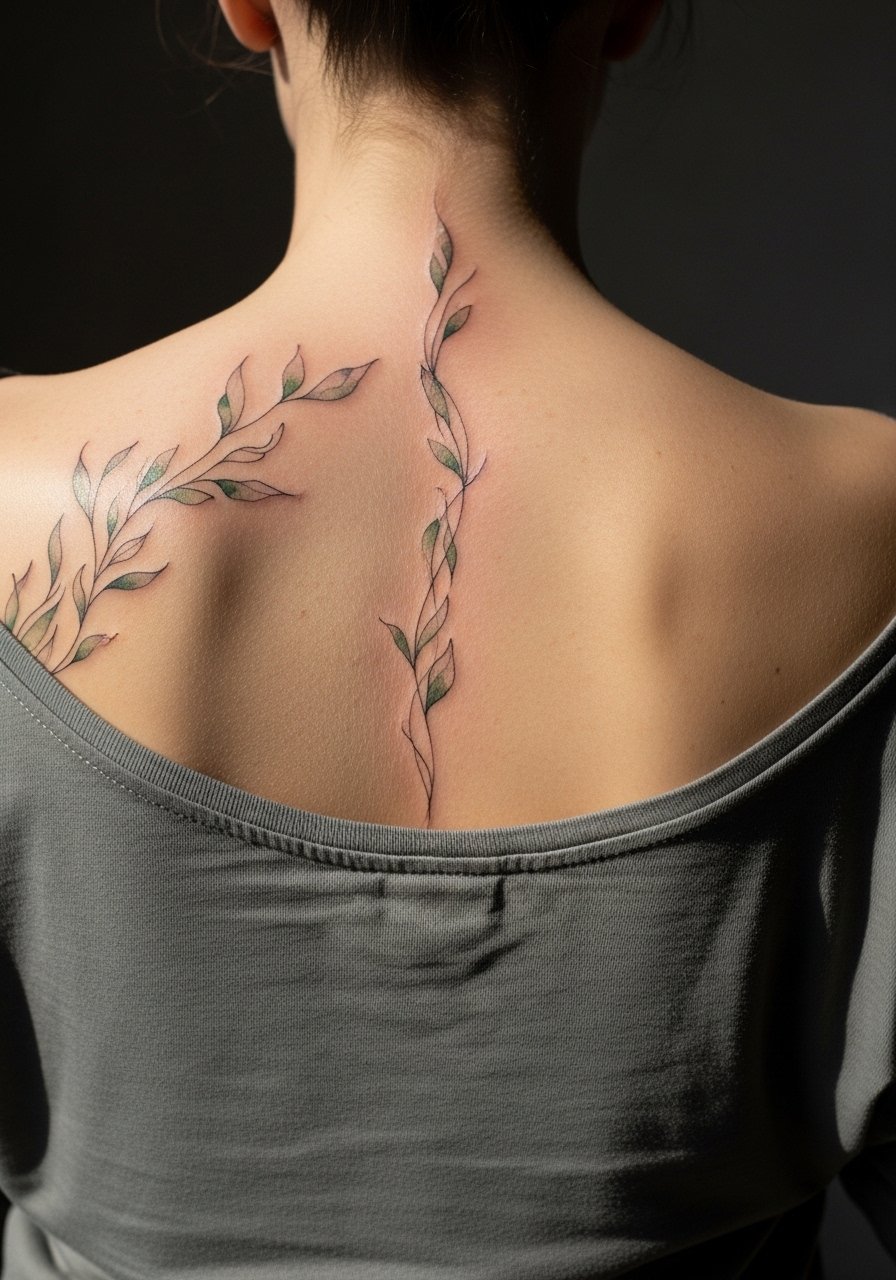
This diagonal composition gives motion to a back piece and works well for those who like something subtle but large. Sessions split between linework and color help manage pain and swelling. I tell artists to keep the vine nodes slightly bolder so they register as anchors when the washes fade. A real mistake is asking for near-invisible color transitions with no structural lines. That tends to look like patchiness at two years. Expect the vine to hold shape better if you keep one side of it darker. For the session wear a loose tank top with adjustable straps so you can shift fabric without irritating the fresh ink.
8. Watercolor Moon Phases across the Upper Back
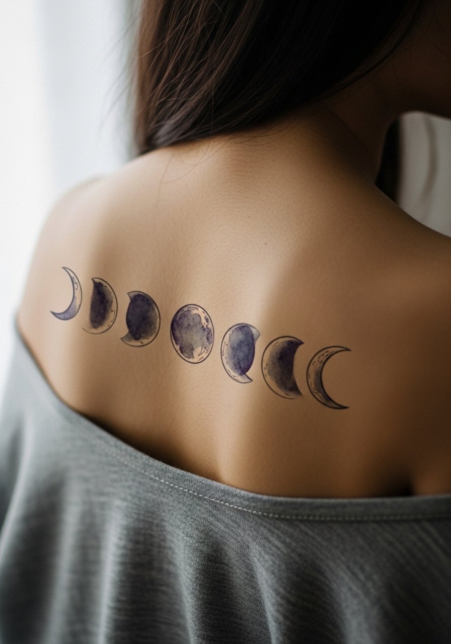
A sequence of moon phases translates well to the upper back since the spacing prevents crowding. I recommend asking for slightly stronger outlines on the moon crescents to prevent blurring between phases over time. Pain is moderate and one session often covers this layout. A common error is packing too many small moons into a narrow horizontal band. That leads to loss of definition after a couple of years. For show, this reads nicely with an open-back blouse that gives just enough exposure.
9. Lower-Back Watercolor Koi School

Lower-back watercolor can be gorgeous but it faces friction from waistbands and chairs. I advise clients to request bolder contrast in the koi fins and slightly higher saturation at focal points so the fish keep shape as pigments settle. Pain is usually lower in the lower back but healing requires attention to clothing. The typical mistake is choosing a design that crosses the waistband without planning for the friction zone. Expect touch-ups at year two or three if you sit for many hours daily. For the session wear high-waisted bottoms you can lower slightly so the artist can work without pressure on the area.
10. Watercolor Abstract Wash with Blackwork Anchors

Pairing blackwork anchors with watercolor fills adds longevity to any back panel. I often recommend designers blend a few bold black strokes into the composition so the eyes have reference points as the color softens. Pain varies with placement and session length. The usual misstep is asking for an all-wash treatment without any darker structure. That makes conservation of the image over time nearly impossible. Expect the black anchors to hold well at five years while the washes mellow. For a casual reveal, a button-down shirt worn backwards creates a clean frame.
11. Small Mid-Back Watercolor Motif with Metallic Ink Accent
Small motifs on the mid back can be a smart choice if you want a larger piece later. I suggest asking for a small metallic accent rather than full metallic coverage so the piece keeps contrast without rapid fading. Sessions are short and pain moderate. A mistake is expecting metallic ink to behave like standard pigments. It may fade faster and needs contrast nearby to remain visible. Plan a touch-up window at year two to refresh the metallic spot. For the session, pick a wide-neck tee you can shift aside easily.
12. Watercolor Sunburst Anchored at the Nape
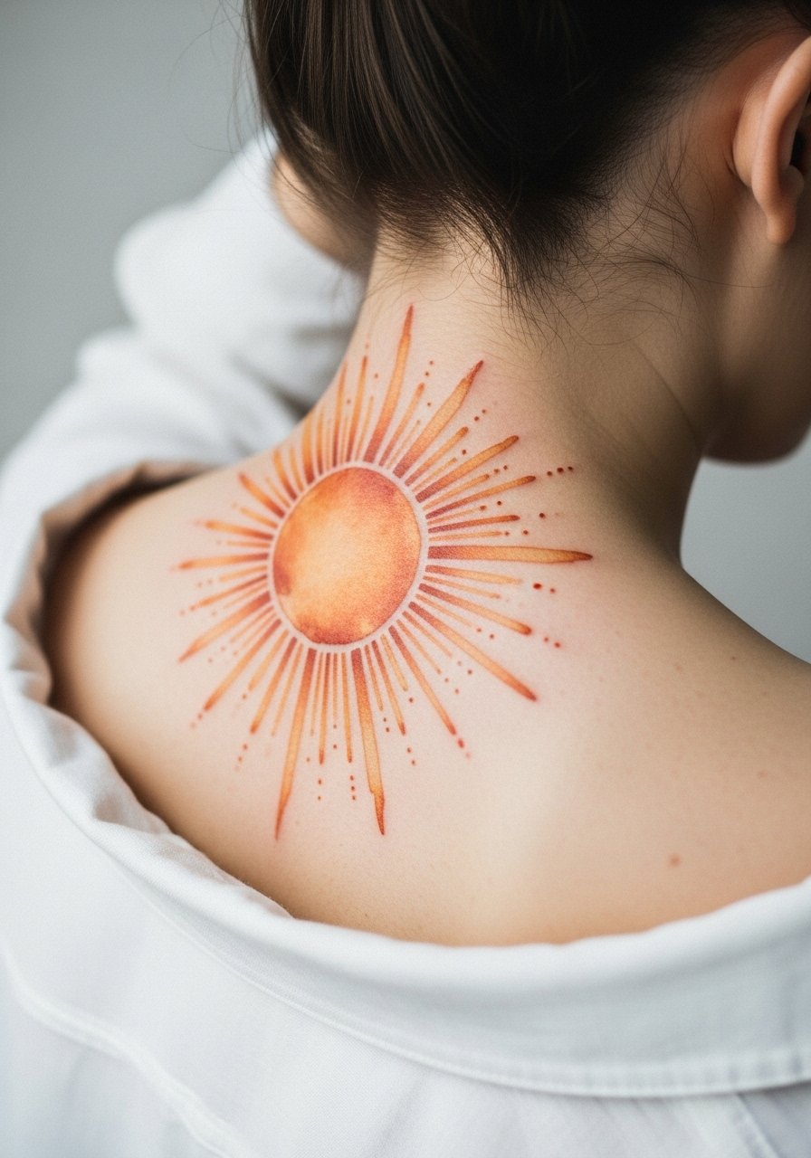
A sunburst at the nape uses vertical negative space to great effect. Be aware that the skin there moves with neck rotation which can affect fine details. I tell people to favor broader strokes and stipple shading around the rays to maintain texture as the piece heals. Pain at the nape is variable and sessions are usually short. The common error is requesting intricate tiny rays that blur. Over two to five years the broad strokes remain legible while thin details may need touch-up. For showing it off, a wide-neck sweater that dips low in back provides a clean reveal.
13. Watercolor Botanical Spine Column

Botanical columns play with the spine’s natural line and make movement a compositional asset. I advise spacing the leaves so each has breathing room. During consultation say "give each leaf a 5 mm gap" so the artist plans negative space. Pain is higher on the spine and sessions may split across two appointments. A frequent mistake is compressing too many leaves into a short vertical. That makes the column read as a blur after a couple of years. Expect lighter touch-ups to keep leaf tips crisp. For the session, wear a loose button-down shirt you can pull aside.
14. Watercolor Galaxy across the Shoulder Blades

Galaxy pieces look striking because they rely on color gradient rather than crisp edges. I suggest asking the artist to include micro white highlights over darker patches to keep points of contrast. Sessions vary by size and detail. A common error is requesting an ultra-fine starfield without sufficient dark contrast nearby. Those tiny white specks can disappear as the color softens. Over time the gradients mellow but the dark pockets maintain structure. For an event-ready look, wear an open-back dress that frames both blades.
15. Watercolor Single-Pane Portrait Back Panel

Watercolor portraits on the back are ambitious. I always recommend combining subtle linework with the wash so facial features hold as pigments settle. Tell the artist you want the eyes and jaw defined with thin black anchors. Sessions are long and usually split across days. The typical mistake is asking for a wash-only portrait with no anchor points. That approach often blurs the face into an unreadable form after healing. Expect the portrait to need touch-ups to keep facial detail intact at year three. For the session wear a wide-neck top that is easy to shift.
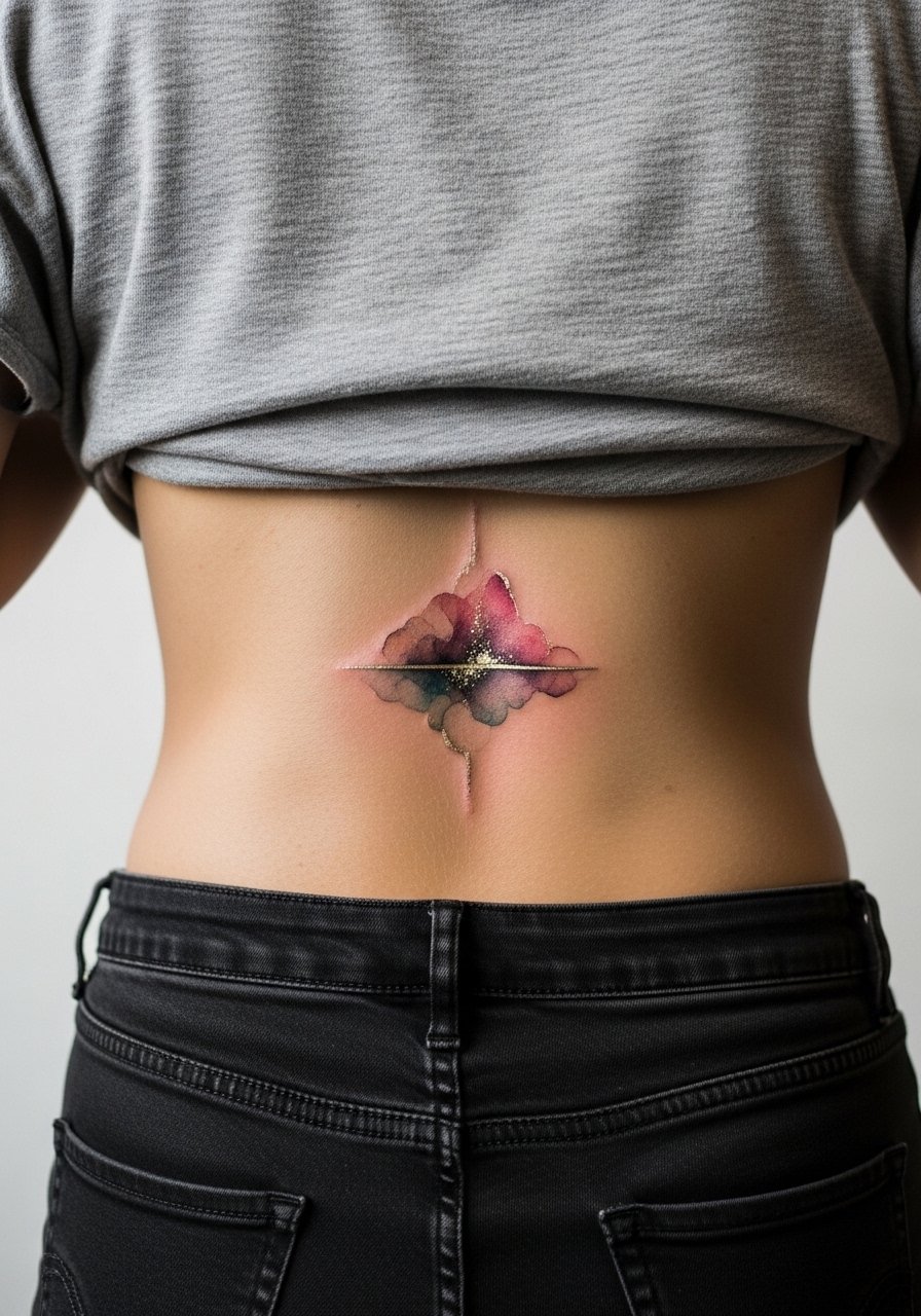
16. Watercolor Minimalist Crescent over the Lower Thoracic Spine

Small, minimalist elements on the back are low commitment but still need planning. I recommend asking for slightly increased saturation in the crescent so it survives five years of wear and UV exposure. Sessions are short and pain moderate. A mistake I see is requesting a near-invisible wash that dissolves into the skin tone with time. Over two to five years a slightly stronger pigment at the center keeps the shape readable. For the session pick a tank top you can pull aside.
17. Watercolor Floral Half-Moon Nestled at the Lower Back
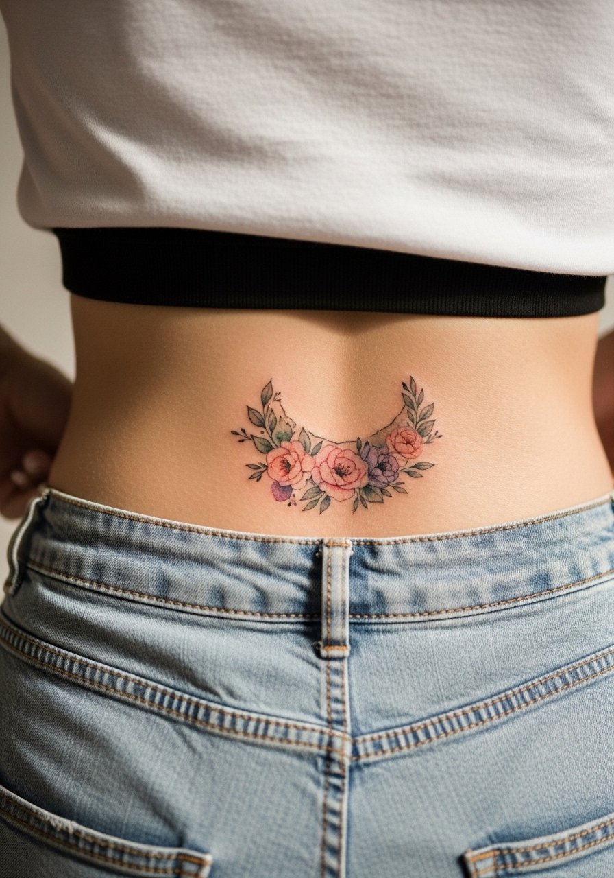
Tucking a floral half-moon right above the waistband calls for specific planning around clothing. I tell clients to expect that waistband rubbing accelerates fading there. A good artist will advise slightly bolder edge work on the outer petals to prevent loss of shape. Pain is lower in that zone but healing needs mindful clothing choices. Common mistakes include choosing very pale washes that vanish against frequent friction. If you sit often, plan a touch-up at year two. For the session wear high-waisted shorts you can lower slightly.
18. Watercolor Ornamental Crest across the Upper Back
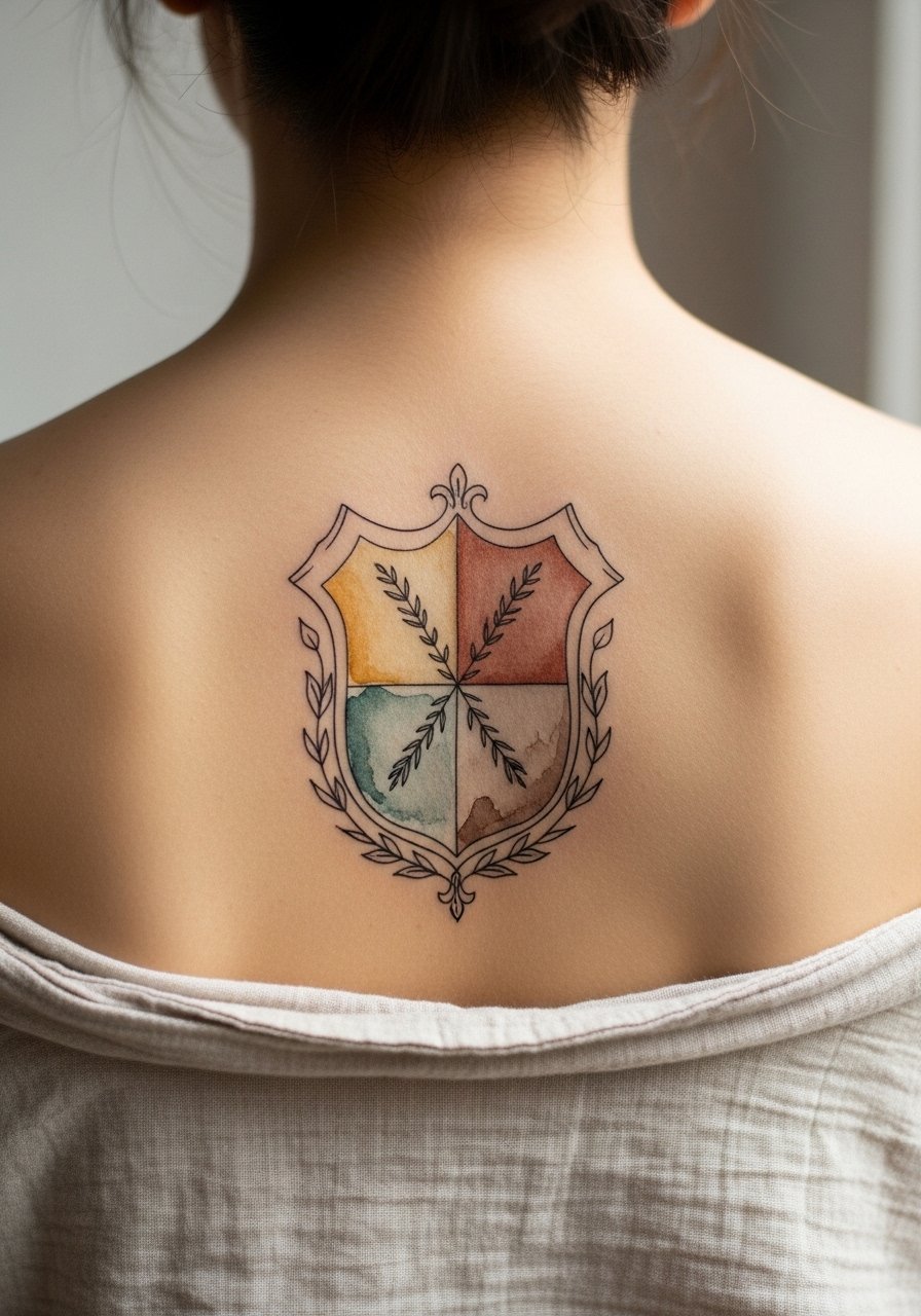
Ornamental crests mix decorative linework and soft fills to create a formal statement. I advise clients to request crisp black anchors around the crest's edges so the ornament maintains its silhouette when the color fades. Sessions can be lengthy. A common misstep is asking for all-soft edges, which leads to the crest bleeding into the surrounding skin. Anchors preserve the crest through five years and beyond. For a neat reveal, a button-down shirt worn backwards frames the upper back elegantly.
19. Watercolor Folded Map Across the Mid and Lower Back

A map motif looks great on the back because it uses the horizontal space to tell a story. I recommend asking for fine line "roads" spaced generously and for slightly stronger pigment in the coastline areas to maintain contrast. Sessions often split into two to handle the detail work. A mistake I see is requesting ultra-faint roads that become indistinct after healing. With proper spacing and darker coastlines the map remains legible for years. For the session, wear a wide-neck tee you can shift easily.
20. Watercolor Palm Forest Across the Lower Back to Flank

Flank and lower-back combinations must account for movement and clothing friction from waistbands. I tell clients to have the artist reinforce trunk lines so the palms read as trees rather than smudges after healing. Pain on the flank is a bit higher and sessions may be split. The common error is asking for entirely soft washes down the flank. That configuration can lose definition quickly. Expect touch-ups if you regularly wear tight waistbands. For the session wear high-waisted swim bottoms or shorts you can lower easily.
21. Watercolor Constellation Panel Framed by Linework
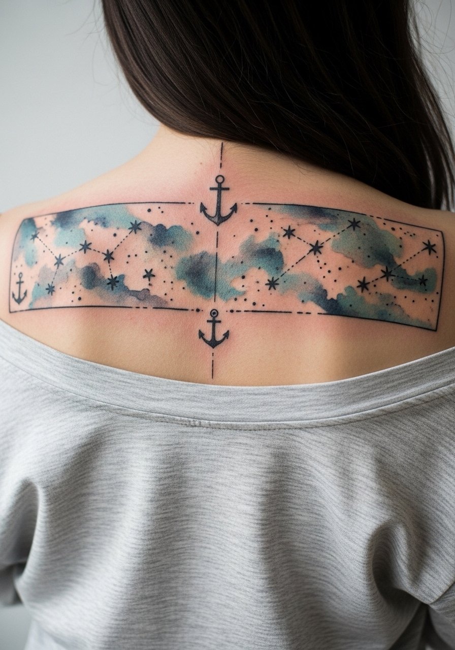
Constellation panels pair tiny bright points with soft color fields and benefit from linework that holds the shapes. I advise asking for slightly larger star anchors than the smallest dot you like so they stay visible after healing. Pain is moderate and sessions are usually efficient. A common mistake is requesting ultra-tiny stars that blur together over time. With planned anchors and moderate saturation, constellations age gracefully. For a show-off look, an open-back top frames the panel while limiting daily sun exposure.
Frequently Asked Questions
Q: Do watercolor back tattoos need different touch-up timelines than traditional back pieces?
A: From what I have seen, watercolor pieces usually need attention sooner because their defining contrast is softer. Expect a possible touch-up between two and four years depending on placement and sun exposure. Keeping darker anchor points in the composition delays the need for refreshes.
Q: Can I get a watercolor piece over an old faded tattoo on my back?
A: You can, but the underlying pigment changes how the watercolor sits. Discuss covering or incorporating the old work with your artist. Many artists plan slightly bolder anchors and more opaque fills to mask older color while keeping the watercolor feel.
Q: How does placement on the lower back affect healing and clothing choices?
A: Lower-back tattoos sit in a high-friction zone. During the first two weeks avoid tight waistbands and pick loose, high-waisted bottoms you can lower slightly for the session. The friction speeds fading, so plan for touch-ups if you wear fitted clothes often.
Q: Are metallic inks safe for watercolor back work and do they last?
A: Metallic inks can add a subtle pop but they tend to degrade faster than standard pigments. If you want metallic accents, ask for them sparingly and near darker anchors so the contrast remains as the metallic wears down.
Q: How do I find an artist comfortable with large watercolor back pieces without naming specific studios?
A: Look for artists who list watercolor or painterly work in their portfolios, search regional directories, check convention lineups, and read client threads on community forums. Ask about healed photos and how the artist plans for long-term saturation.
Q: What should I wear to the studio for a full-back session?
A: Wear easy-to-shift tops like a loose button-down shirt or a tank you can pull aside without rubbing the area. Comfort matters during long sessions and clothing that allows clean access reduces the risk of irritation.
