
Fine line watercolor pieces look impossibly soft in photos, but they ask a lot from placement and aftercare. Expect a decision moment in the chair when the stencil reads larger than on screen, and plan for touch-ups a few years out if you hate blurring. Pick placement, spacing, and whether to pair color with a crisp outline before booking and the rest of these ideas will make more sense.
1. Cherry Blossom Trail on the Back of the Upper Arm
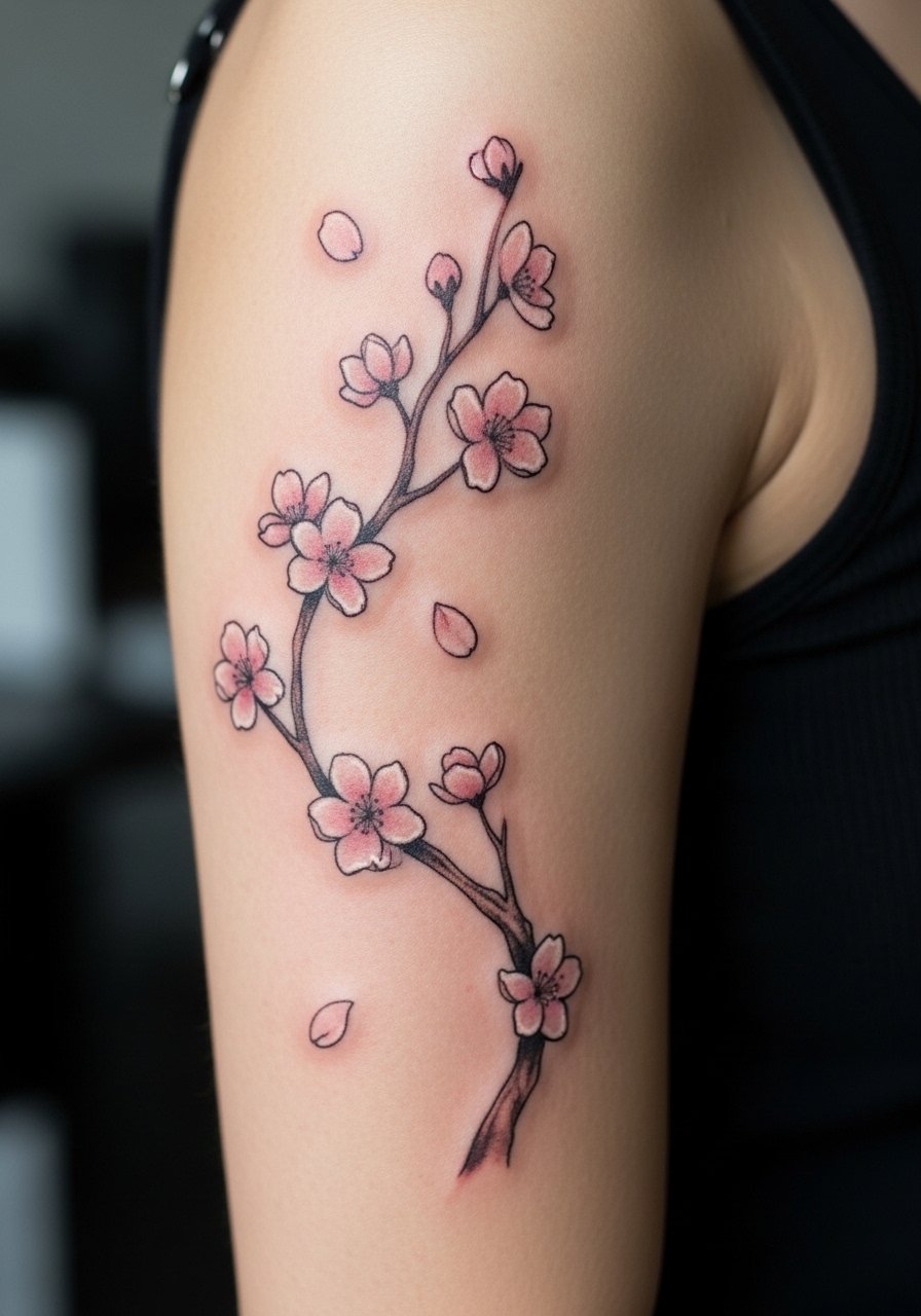
I recommend this when you want movement without heavy linework. Tell your artist you want pale petal washes with slightly darker centers and just a hint of stipple shading to keep petals from turning into a single soft blur. The common mistake is asking for pastel petals with no anchor points, and those versions can look like faded bruises at year two. Expect a gentle seven out of ten for pain on the back arm and a single two-hour session for a mid-sized trail. For showing it off, roll sleeves up or opt for a loose button-down shirt that you can pull aside without rubbing the area.
2. Painterly Hummingbird with Splash

I've seen this one read beautifully from across a room because the tiny beak and eye use crisp micro linework while the wings melt into watercolor washes. In consultation ask for a dark dot for the eye and a narrow outline around the beak so key details stay legible at year three. The session feels quick but fussy, as the artist alternates small needles for detail then magnums for saturation. Blowout risk is low on the back arm when the design keeps some linework. Pair with a simple thin chain pendant necklace when wearing short sleeves so the piece fits an understated look.
3. Abstract Color Field with Negative Space

The visual impact of this approach comes from leaving skin as part of the composition. Tell your artist you want clear gaps of negative space and not everything washed together. A mistake I see is asking for an all-over wash in a small area, which tends to blur into a muddied spot after a few years. Expect moderate pain and a session that can run two to three hours depending on coverage. This style pairs well with summer tops that expose the back arm, so consider an open-back midi dress for evenings out if you plan to show it off.
4. Watercolor Mandala Accent
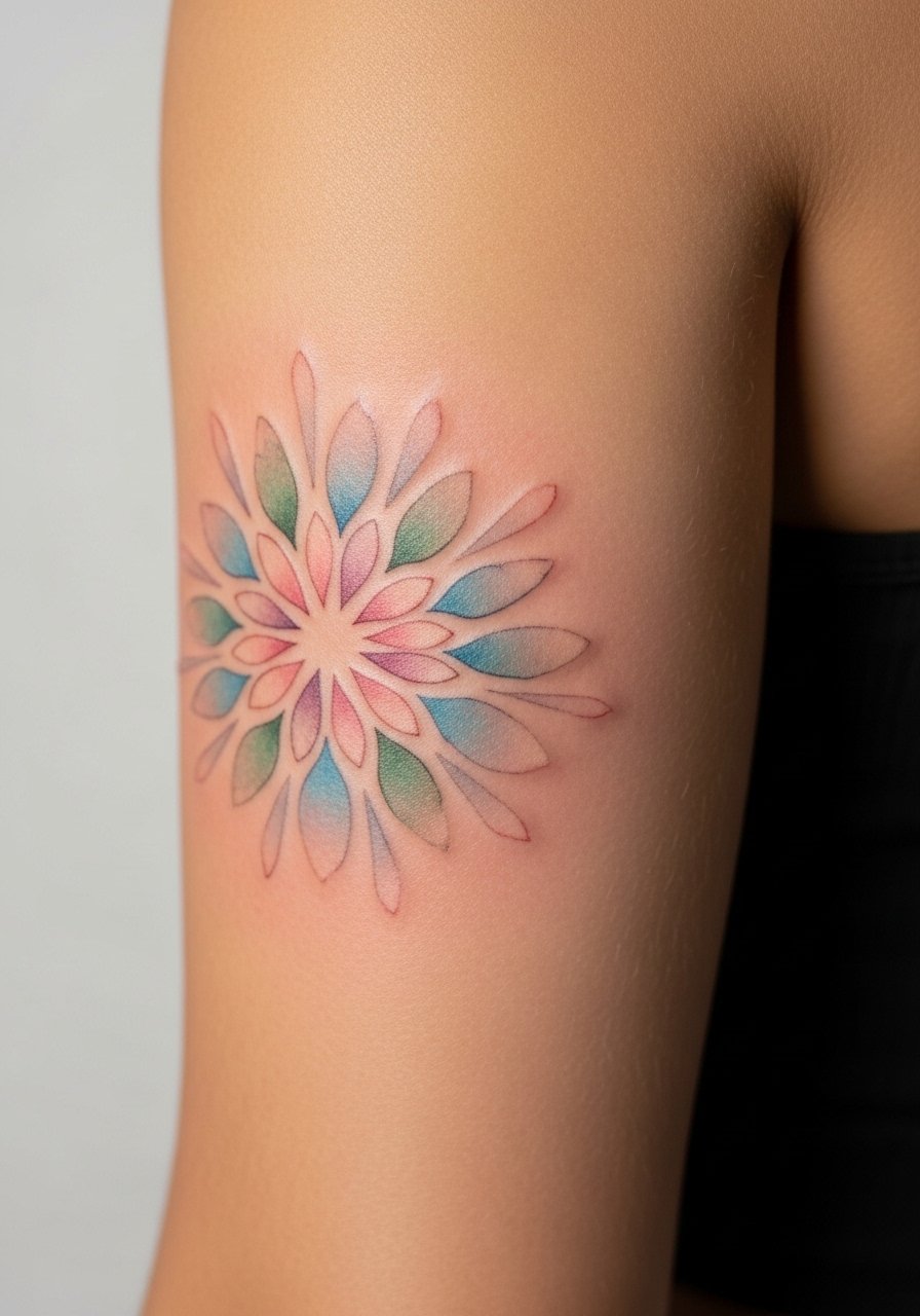
Controversy shows up here because some artists insist mandalas need crisp black outlines to last, and others avoid outlines to keep the watercolor feel. One camp argues outlines anchor the design and prevent bleeding. The other camp says careful spacing and saturated color can hold without black lines. When you talk to an artist, ask which camp their portfolio reflects and why. This piece works best when slightly scaled up rather than tiny, and the session is detail-heavy so expect touch-up at year three. For session comfort, wear a racerback tank top so the artist has clear access without you being uncomfortable.
5. Soft Peony Cluster with Light Outlines
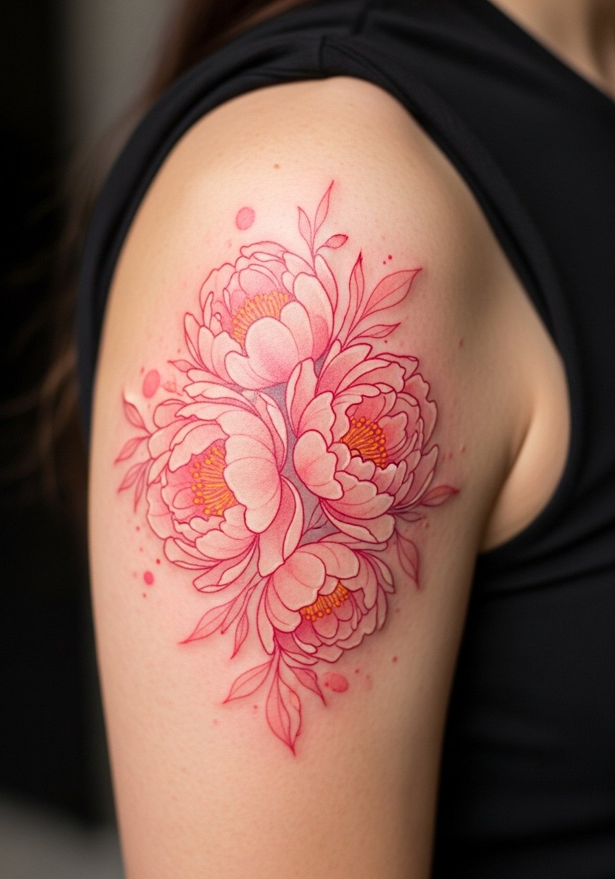
Most peony watercolors that hold their shape combine pale washes with thin contour lines. The common error is asking for no outline at all, which can let petals merge into one indistinct mass in two to three years. For the consultation, bring photos that show how much outline you want, and ask the artist to preserve the petal centers with slightly darker saturation. Pain is moderate and sessions typically split into two if you want deep saturation. For showing this one off pair it with rolled-up sleeves and lightweight knit tops. Try a rolled+up+sleeve+linen+shirt to frame the floral sweep.
6. Tiny Watercolor Script with Color Wash
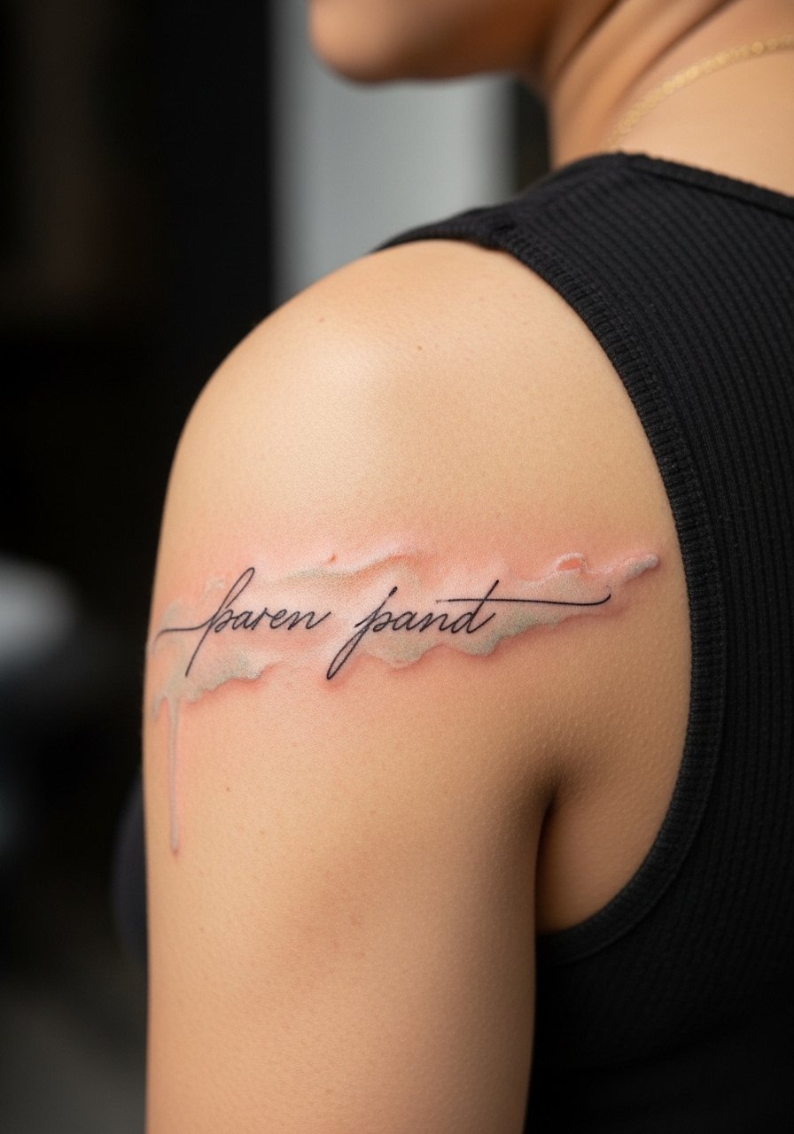
Script over watercolor can read poetic or sloppy depending on spacing. The biggest mistake is tight cursive set over a soft wash with no contrast. Ask for slightly bolder lettering or a faint shadow line so the words remain legible after a couple of years. A short phrase here usually takes under an hour and is lower on the pain scale. For the appointment wear a loose drawstring linen pant if you plan to sit for longer; comfort helps reduce movement. When showing it off a short-sleeve tee keeps attention on the script without competing.
Studio Day Picks
These small conveniences smooth out sessions for the back-arm pieces above and make the first week of healing easier.
-
Stencil transfer paper kit. Lets you preview the exact placement on the back arm before the needle touches skin, which is helpful for the cherry blossom and mandala ideas.
-
Topical numbing cream. Apply as directed for nerve-sensitive areas on the back arm if you are anxious about the session length.
-
Thin protective film roll. Useful for keeping color field and script tattoos clean during the first few days, especially when clothing might rub the area.
-
Fragrance-free gentle body wash. A mild wash soothes the healed area without stripping the softer watercolor pigments.
-
Aquaphor healing ointment. A thin layer in the first 48 hours helps lock in moisture for fine wash areas without clogging delicate channels.
7. Koi Swim with Ripple Wash

Visual storytelling is the strength of a koi piece, and the back arm gives enough sweep for a sense of motion. Tell the artist you want directional brush strokes that follow muscle contour so the koi reads naturally when the arm moves. A mistake people make is compressing too much detail into a small area. At six months the scales look lively, at two years the pale highlights may need a touch-up. Sessions can run three to four hours if the colors are saturated. For wardrobe, short sleeves and light bracelets keep the attention on the curve of the koi.
8. Minimalist Watercolor Crescent Moon
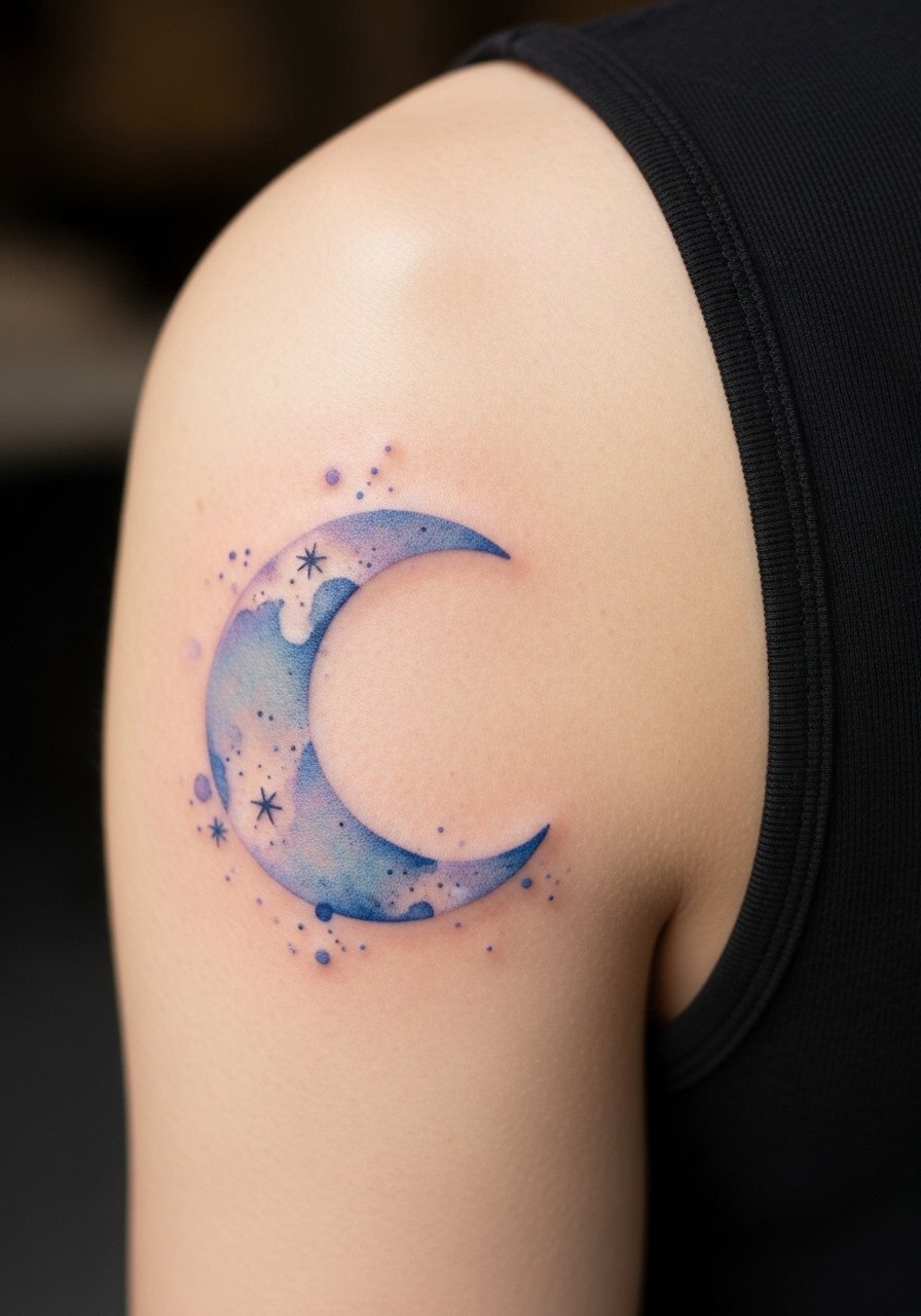
If you want something small and quiet, this is the pick. In consultation say you want a pale gradient and a tiny black dot for the moon's tip so the silhouette reads from year two. The usual mistake is asking for a ghostly wash with no anchor, which will look like a faint smudge after frequent sun exposure. The session is brief and low pain. Pair it with a fitted tee or a short-sleeve tee for everyday wear that keeps the arm in view without over-accessorizing.
9. Watercolor Wave with Fine Black Crest

This combines soft washes with a fine black crest to keep energy in the design. Artists split on whether the black line is necessary; one camp says it gives form and the other values an unlined wash. Ask the artist for a faint black contour only where form matters and not around the whole piece. The wave ages better with that selective contour. Sessions are moderate and you should expect re-saturation if you want ocean-bright blues after a few years. For showing it off, short sleeves or a cropped tank reveal the sweep nicely.
10. Delicate Botanical Sprig in Watercolor

I've noticed botanical sprigs hold up when the stems use steady linework with color as a secondary element. Say to your artist you want the stem in steady linework and the leaf color applied lightly so the stem remains the reading line. A common version that ages poorly uses color only with no linework and fades into a soft stain. This placement is lower on the pain scale and session time is short. For the appointment wear a tank top so the arm is easy to expose without tugging at fabric.
11. Watercolor Sunrise Horizon
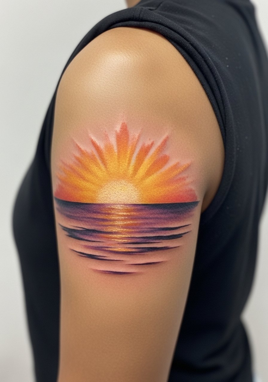
The horizon reads best when the composition respects muscle flow. Tell your artist you want the brightest colors at the top and softer blends underneath so the piece keeps depth as it ages. The mistake is packing every color into a tight band which often softens into one tone after a couple of years. Expect a medium pain level and a session that may be split to let layers settle. For showing it off choose sleeveless tops that reveal the arm curve.
12. Portrait Accent with Watercolor Halo
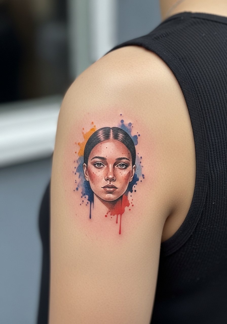
Micro-portraiture over watercolor asks for high detail in a small zone. When you consult, bring head-on, well-lit reference photos and be explicit about size limits so the face does not lose clarity. The common mistake is requesting a large amount of facial detail at a tiny scale and expecting it to age well. The session is detail-oriented and the artist may recommend a touch-up at year two for any lost highlights. This placement helps because the back arm has stable skin compared with hands and keeps blowout risk lower.
13. Geometric Watercolor Patch
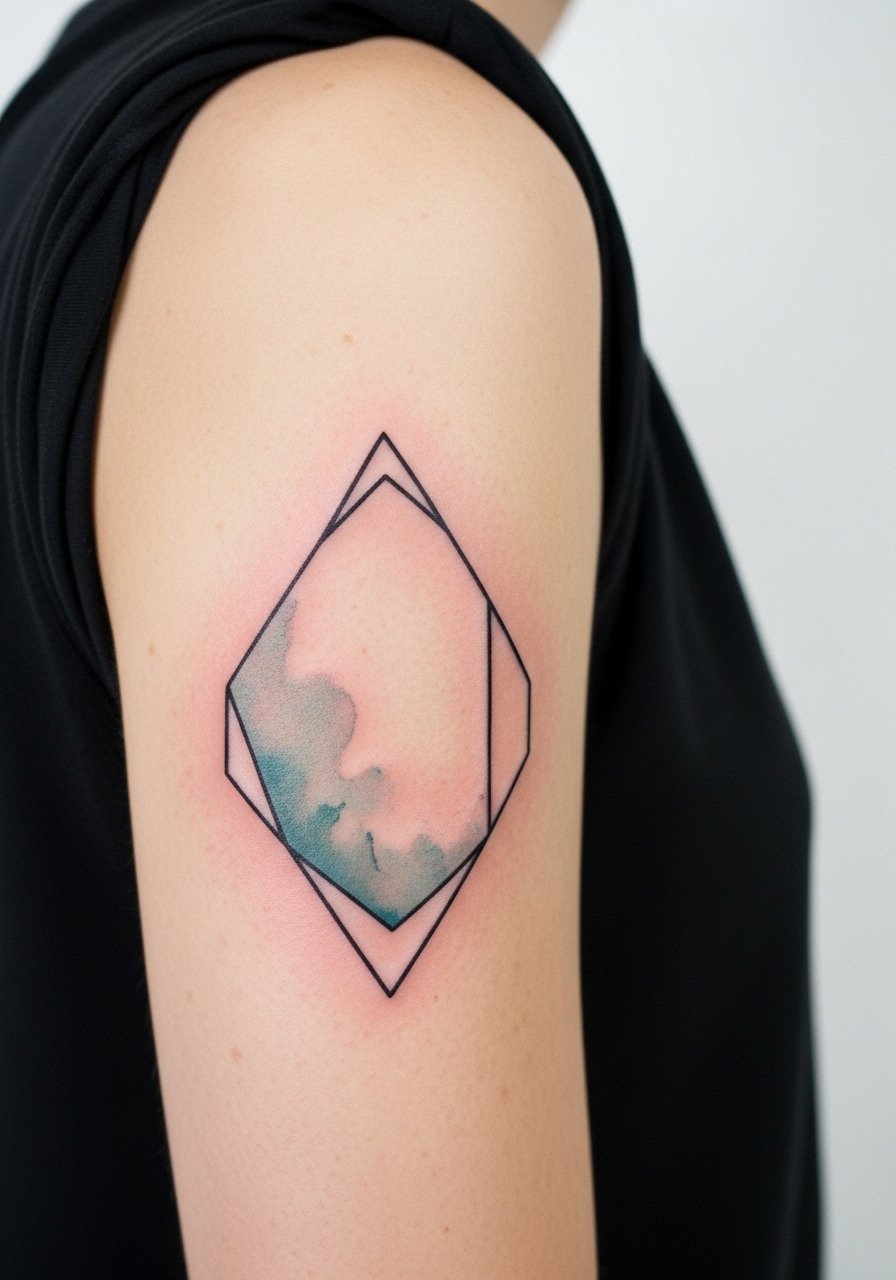
There are two camps on geometry plus watercolor. One favors precise black edges to protect shapes over time. The other says clean spacing and slightly bolder wash saturation keep shapes distinct without outlines. I recommend asking your artist how they plan to maintain crisp edges and whether they will leave a thin margin of uninked skin for breathing room. Sessions are moderate and may involve both fine line and magnum work. Wear a loose button-down shirt during the appointment to make access easy without the fabric rubbing the fresh ink.
14. Watercolor Galaxy Wrap
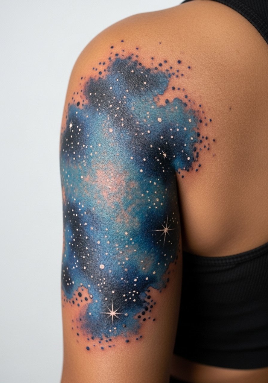
Galaxy pieces age with sun exposure as the main enemy. Tell your artist you want denser pigment at the core and softer outer blends to reduce early fading. A frequent mistake is asking for very pale stars that vanish by year two. Expect a slightly longer session because layering benefits this motif. For evenings out a black or navy open-back top highlights the wrap without distracting from the color work.
15. Single-Line Black Outline with Watercolor Fill

Combining a single crisp outline with a watercolor interior gives a readable silhouette and painterly interior. In consultation, request the outline to be slightly bolder than you think you need to counteract softening over time. The usual error is choosing a hairline outline with a heavy wash, which tends to blend into the fill. Sessions are efficient and touch-ups are reasonable at year three. For showing this design, a short-sleeve tee keeps the silhouette visible and casual.
16. Watercolor Mountain Range Band
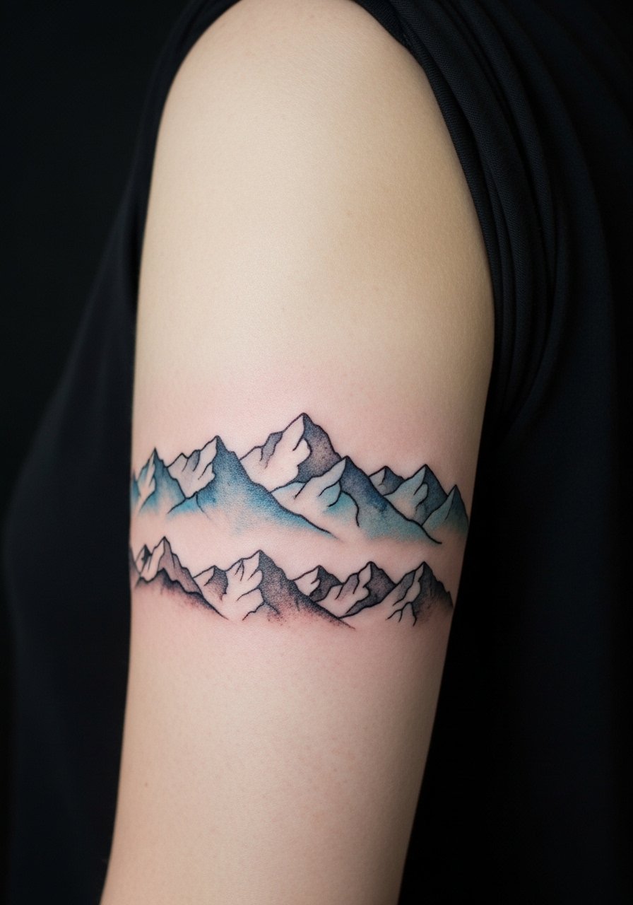
The band format plays well with the arm's curve when peaks follow muscle lines. Tell the artist you want negative space between ridges so the mountains keep definition as the colors age. A mistake I see is compressing peaks too close together which leads to muddied massing. Pain is moderate and the session can be split if you want darker saturation. For travel days to the studio wear comfortable layers so you can adjust coverage without smudging the stencil.
17. Watercolor Bouquet with Dot Work Anchors
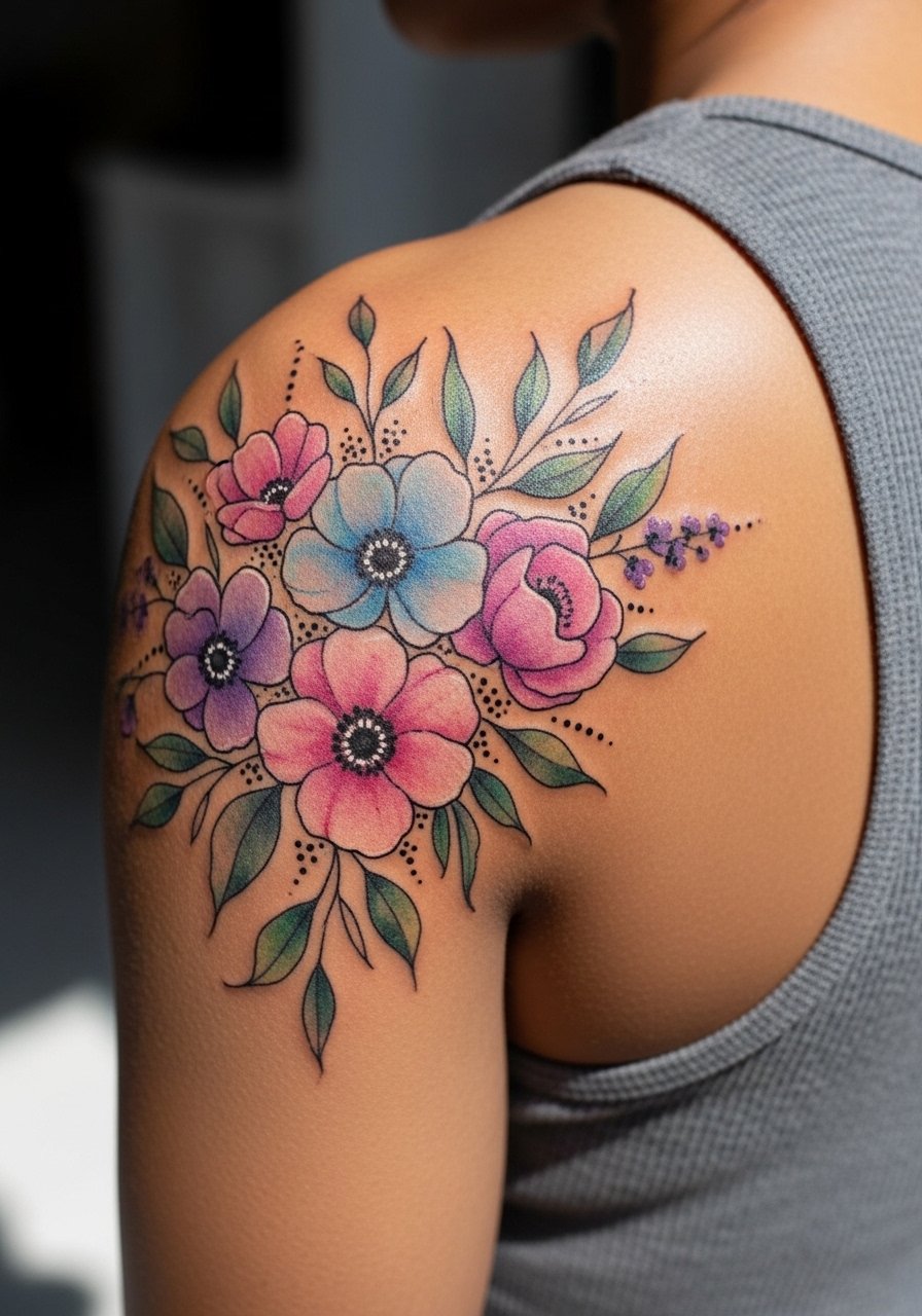
Pairing dot work anchors with watercolor gives the piece longevity through micro contrast. In the consultation ask for stipple shading in key shadow zones and keep the washes lighter to prevent early bleed. The common error is too much wet-on-wet color with no textural anchor, which often appears as a single faded spot later on. Sessions are medium in length and the dot work adds time but helps the piece keep shape. For showing this bouquet consider a fitted tank or a racerback tank top so the arrangement reads cleanly.
Frequently Asked Questions
Q: Do watercolor back arm tattoos fade faster than outlined pieces?
A: From what I've gathered, watercolor pieces can fade more quickly because they rely on soft saturation rather than dense black. The good news is selective outlining or heavier pigment at focal points slows that process. Location matters too, and the back of the upper arm is generally kinder than hands or fingers.
Q: How long should I expect between touch-ups for vibrant watercolor washes?
A: Expect realistic touch-ups around year three to five depending on sun exposure and how saturated you want the colors to stay. Lighter palettes need more frequent refreshes than concentrated jewel tones.
Q: Can I get a watercolor portrait on the back arm and have it stay legible?
A: You can, but scale matters. Bring clear reference images and agree on a minimum size so facial features do not lose definition. Many artists recommend a slightly larger portrait than you think to avoid blurring.
Q: What should I wear to the studio for a back-arm session?
A: Choose clothing that gives easy access without rubbing the area when you leave. A loose tank or a loose button-down shirt you can slip off gently works well. Comfortable layers help if the session runs long.
Q: Are there artist search tips for finding someone who specializes in watercolor back arm work?
A: Search local hashtags, browse directory sites that list shop portfolios, and check thread recommendations on relevant forums. Attend conventions when possible and look for portfolios that show healed photos of watercolor work on arm placements.
Q: Will the motion of my arm distort a large watercolor piece over time?
A: Movement influences how ink settles, but the back upper arm has stable skin compared with joints. Ask your artist how the composition follows muscle lines and whether they plan spacing to prevent merging as your body moves.
