
Fine line name tattoos are everywhere online right now, and the ones that still read crisp after two years are rarely the skinniest scripts. I pulled ideas that balance sentiment with staying power, offer placement options for different pain tolerances, and include wardrobe notes so the ink looks intentional, not accidental. First up is a wrist script that reads like a tiny signature and wears like jewelry.
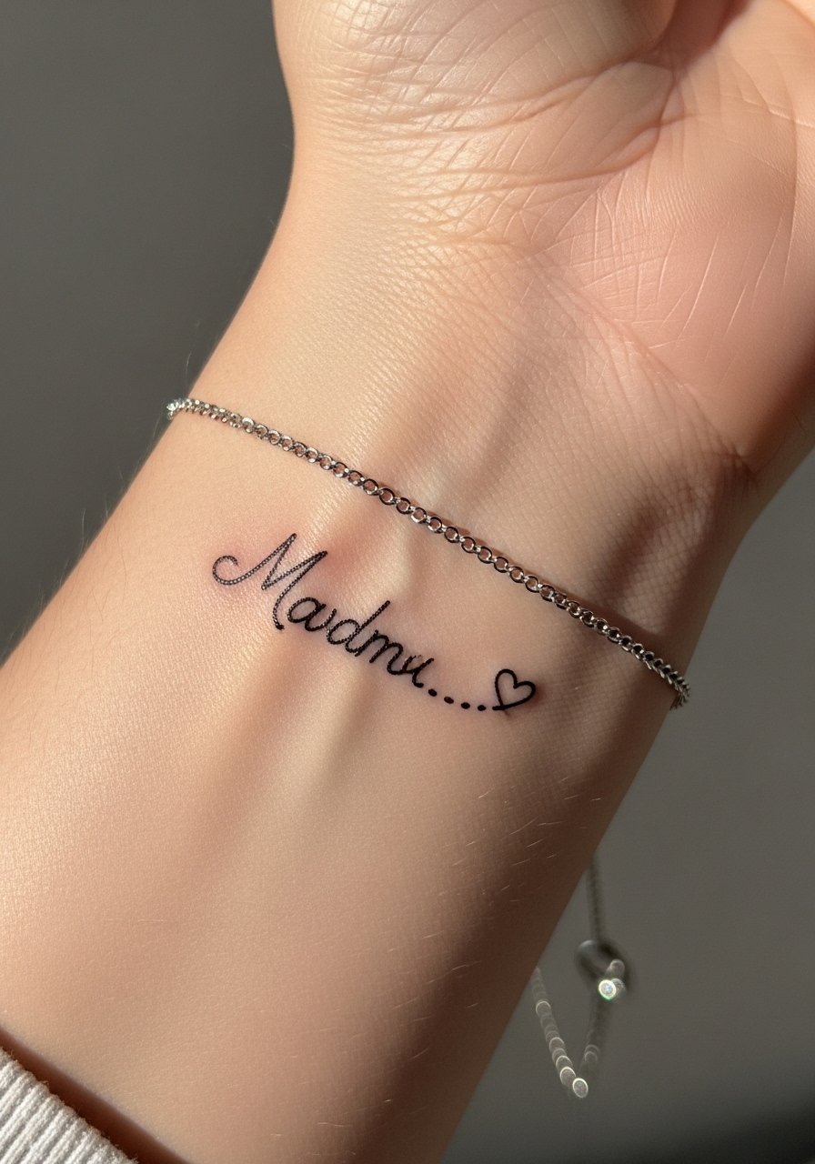
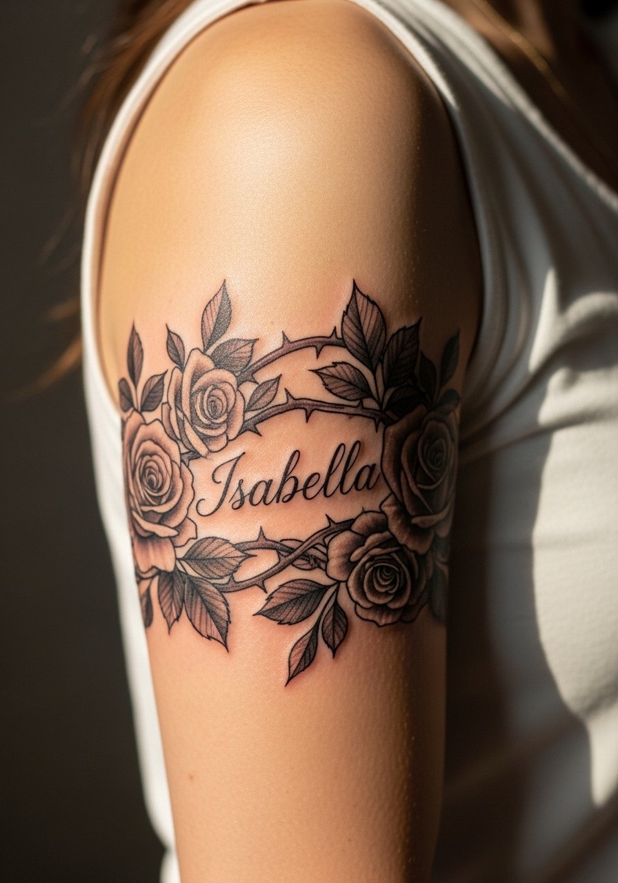
1. Cursive Baby Name with Heart Trail on Inner Wrist
I see this one a lot, and my rule is simple: make the script bold enough to survive daily washing but keep the heart delicate so it reads like a charm. Tell your artist you want medium linework, not the whisper-thin script that looks fragile after a year. The wrist is a 4 to 6 on most pain scales. Session time is short, often under 30 minutes, which is great for a first mom tattoo. Common mistake is asking for too-small loops that merge with time. For showing it off, wear a thin chain bracelet on the opposite wrist so the script reads like jewelry rather than a random mark.
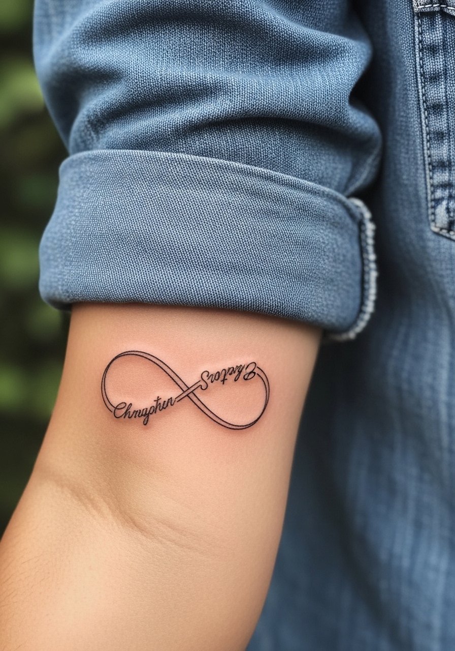
2. Infinity Symbol with Embedded Kid Names on Inner Forearm
This design hides multiple names inside a flowing symbol so the composition stays balanced. I recommend a medium-thickness line and a slight gray fill so each name keeps contrast as the skin stretches. Forearm sessions are comfortable and usually take 45 to 90 minutes for a medium-size piece. Artists split on infinity customization. One camp prefers keeping the symbol pure to avoid dating the tattoo, the other camp argues personalization is what makes it personal. Ask which approach your artist prefers and why. For casual wear, roll up a chambray button down women sleeve to frame the forearm and let the curve show without competing patterns.
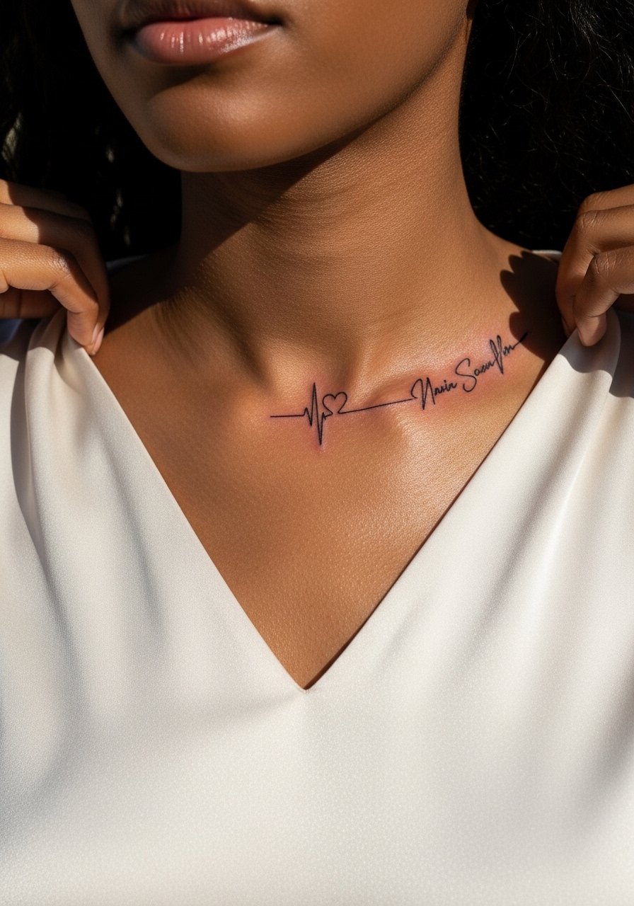
3. Heartbeat Line Morphing into Name Along the Collarbone
The collarbone gives motion a place to breathe, and a heartbeat morphing into a name looks like a tiny signature across the collar. Healed, the short peaks age into a gentle line if spaced properly. Pain here is moderate because of bone proximity, and a 1 to 2 session plan works depending on length. A frequent mistake is compressing peaks too tight, which leads to merging in two years. When you consult, show wrist and collarbone references so your artist gets the rhythm right. Pair it with a v neck silk blouse for evenings, the neckline mirrors the line without choking it.
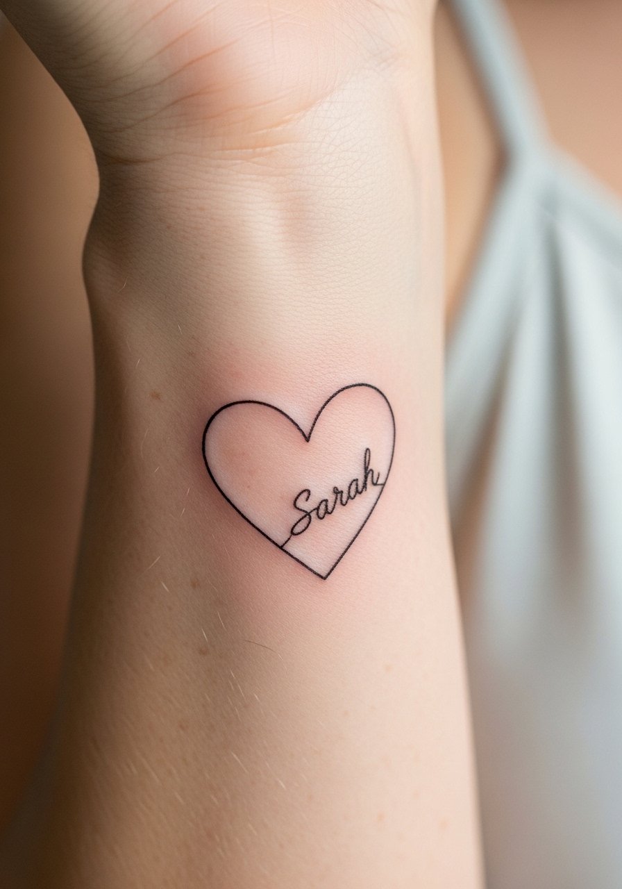
4. Simple Script Name Inside Thin Outline Heart on Inner Wrist
This micro option reads like a secret and is low-commitment visually. I advise a slightly thicker outline heart with a clear negative space for the name, which helps the lettering avoid smudging with time. Inner wrist work is a short session and can sting more during the last ten minutes. The most common error is choosing hairline outlines that fade out. If you want privacy, go with initials inside the heart instead of the full name. For the appointment wear, a sleeveless top or loose short sleeves makes access easy and keeps the artist from tugging at clothing.
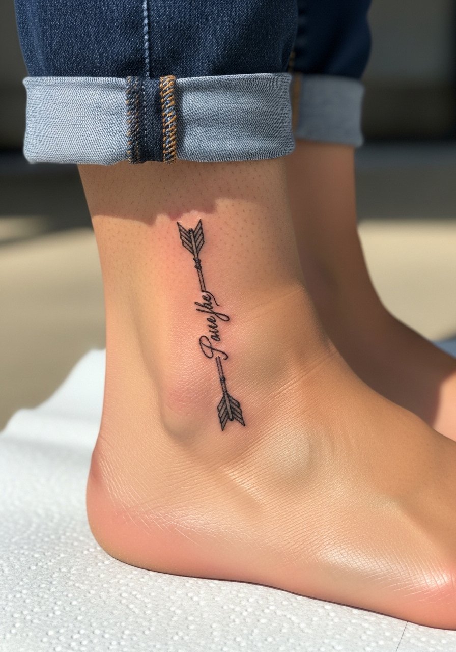
5. Arrow with Name Along the Shaft, Ankle or Outer Forearm
Arrows help line up multiple names cleanly while keeping each one readable. On the ankle the session is brief but expect more tenderness from bone proximity, on the forearm it is easier to space names and less likely to blowout. A common mistake is packing too many names into one short shaft. Book a slightly longer canvas if you have more than two names. For showing it off in summer, cuffed denim works well. Try pairing with cuffed boyfriend jeans and strappy sandals so the ankle piece reads like an intentional accessory.
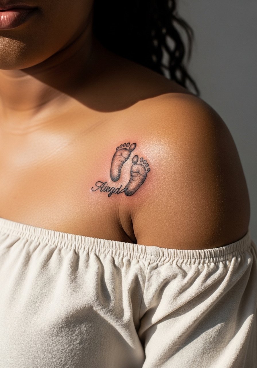
6. Footprint with Name Below on Shoulder or Ribcage
A tiny footprint feels literal without being saccharine when done in soft black and gray. Shoulder placement softens the portrait, ribcage gives privacy and scale. Fair warning, ribcage is a tougher heal and rates high on the pain scale. If you want longevity, avoid ultra-fine shading inside the print that can fill in later. During the session wear a loose tank so the artist can shift fabric and keep the area dry. For outfits that reveal the shoulder piece, an off shoulder blouse frames the work and keeps it looking like a thoughtful accent.
Studio Day Picks
The wrist, ankle, and collarbone pieces above heal differently from larger shoulder and ribcage work, so a few compact items smooth both the session and the first week.
-
Stencil transfer paper kit. Lets you preview exact placement and script size on skin before the needle arrives, especially useful for wrist and collarbone pieces.
-
Topical numbing cream. Apply as directed before the session for sensitive ankle or ribcage spots so discomfort stays manageable.
-
Thin protective film roll. Ideal for finger and wrist work that sees constant friction during the first few days.
-
Fragrance free gentle body wash. Cleans healing skin without irritation and helps preserve fine line contrast.
-
Aquaphor healing ointment. Thin layers for the earliest days lock in moisture without smothering tiny line channels that fine scripts depend on.
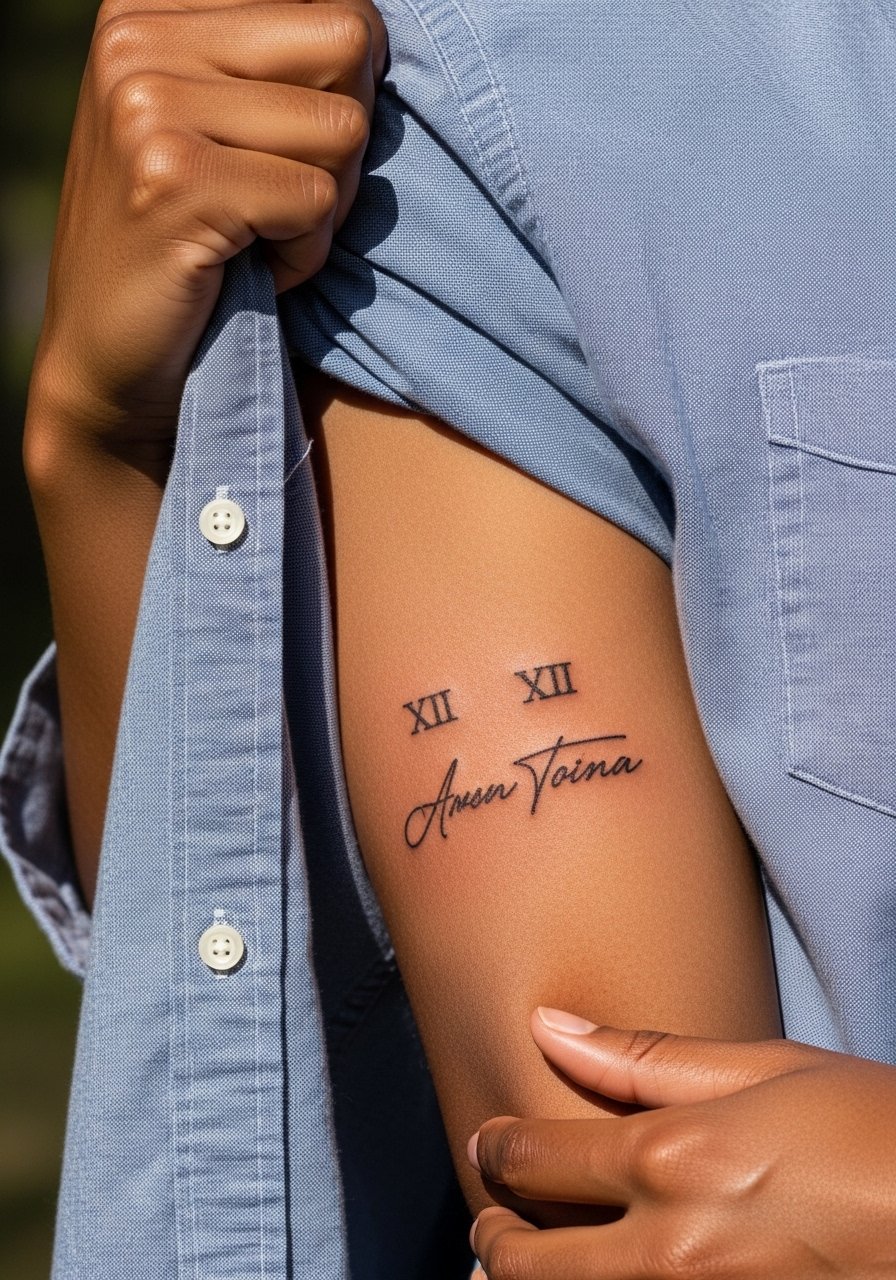
7. Roman Numeral Birthdate Above Name on Inner Arm
Roman numerals keep private dates readable as they age, and placing them above a name breaks the line visually so the script does not run into contour changes. Inner arm sessions are moderate and usually complete within 30 to 60 minutes. A mistake is asking for tiny numerals that blur into a bar after a few years. For consultation, ask to space numerals with a slightly larger serif so the shapes hold. During sessions wear a loose button-down shirt you can pull aside for clean access to the inner arm.
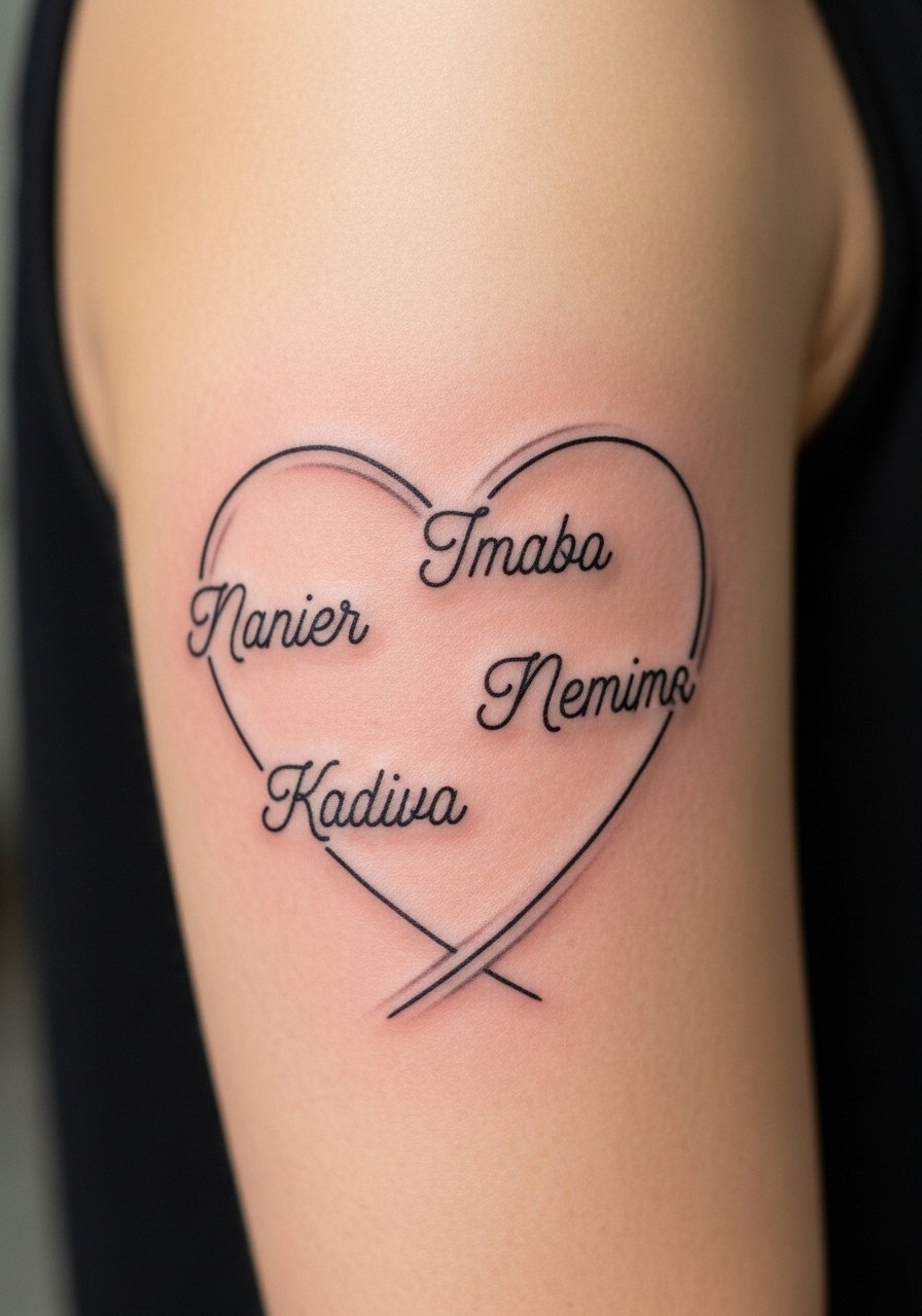
8. Three Names Curved into a Heart on Upper Arm
When spacing matters, curve names into a balanced heart to avoid clutter. The upper arm gives room for gentle shading and makes touch-ups easier because the skin is stable. Avoid stacking names too tightly along the curve, which is a common layout error. Expect a single session for a medium-size composition. If you have larger scripts, the upper arm lets you add subtle gray shading for depth without compromising legibility. For career-sensitive visibility, the upper arm sits well under a sleeve until you choose to show it.
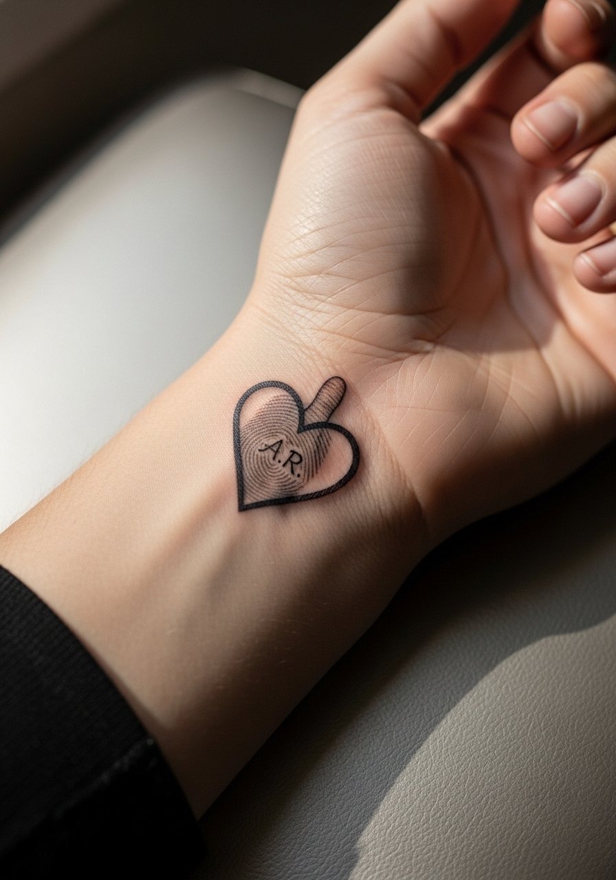
9. Thumbprint Heart Outline with Initials on Wrist
A thumbprint heart turns biometric details into graphic form and resists being fudged by trend cycles. Wrist placement is high-contact, so choose a bold enough line for the print pattern to remain distinct after lots of hand washing. The session is short but precise; the artist will trace the print carefully. A mistake is asking for microscopic fingerprint lines that fill in. For showing it off, a cropped sleeve or rolled linen shirt gives the wrist a clean frame, and a crop top high waist silhouette pairs well if the print is near the ribcage alternative.
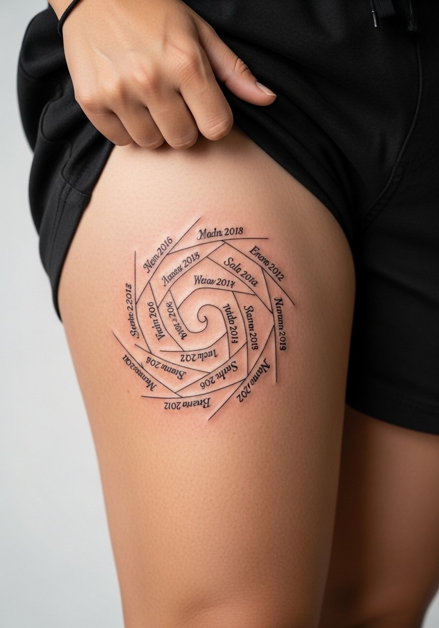
10. Spiral of Names and Birthdates on Back or Thigh
A spiral layout solves clutter when you have several names or long names, because the eye moves inward rather than along a single line. Back placement keeps scale generous, thigh placement is private and less prone to blowout. Tight spirals age poorly, so I recommend at least 0.08 to 0.12 inch spacing between lines depending on font size. Session time can be 1 to 2 hours for a medium spiral. If you choose thigh, wear shorts on appointment day for easy access and a loose sports bra or cropped tee so the artist can position you comfortably.
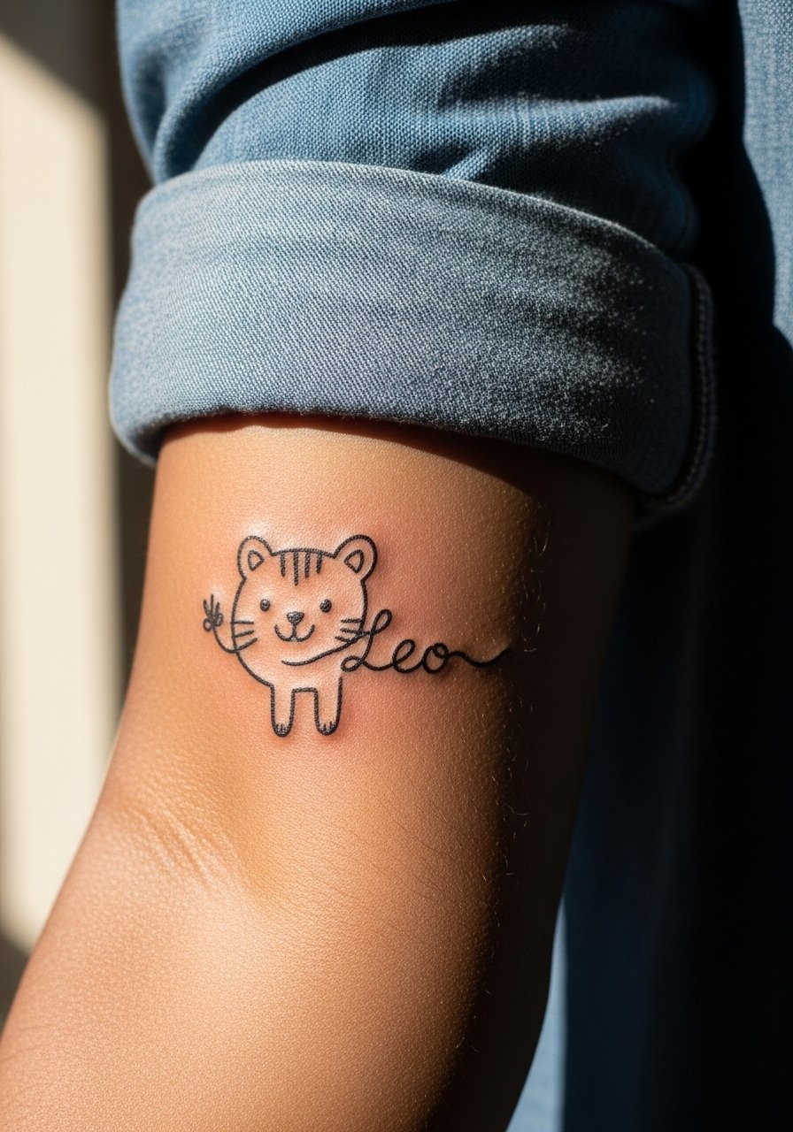
11. Kid’s Hand-Drawn Art with Name Integrated on Outer Forearm
Turning a child's drawing into a tattoo keeps the original whimsy while letting an artist clean up proportion and durability. I suggest vectorizing the sketch slightly so the major strokes stay strong as the piece heals. Outer forearm sessions are lower pain and offer great visibility. Common error is demanding exact crayon textures that do not translate well to skin. During consultation, bring the original drawing and a photo of the child for scale decisions. For daily wear, roll a sleeve or wear a chambray button down women to let the forearm peek out like a casual statement.
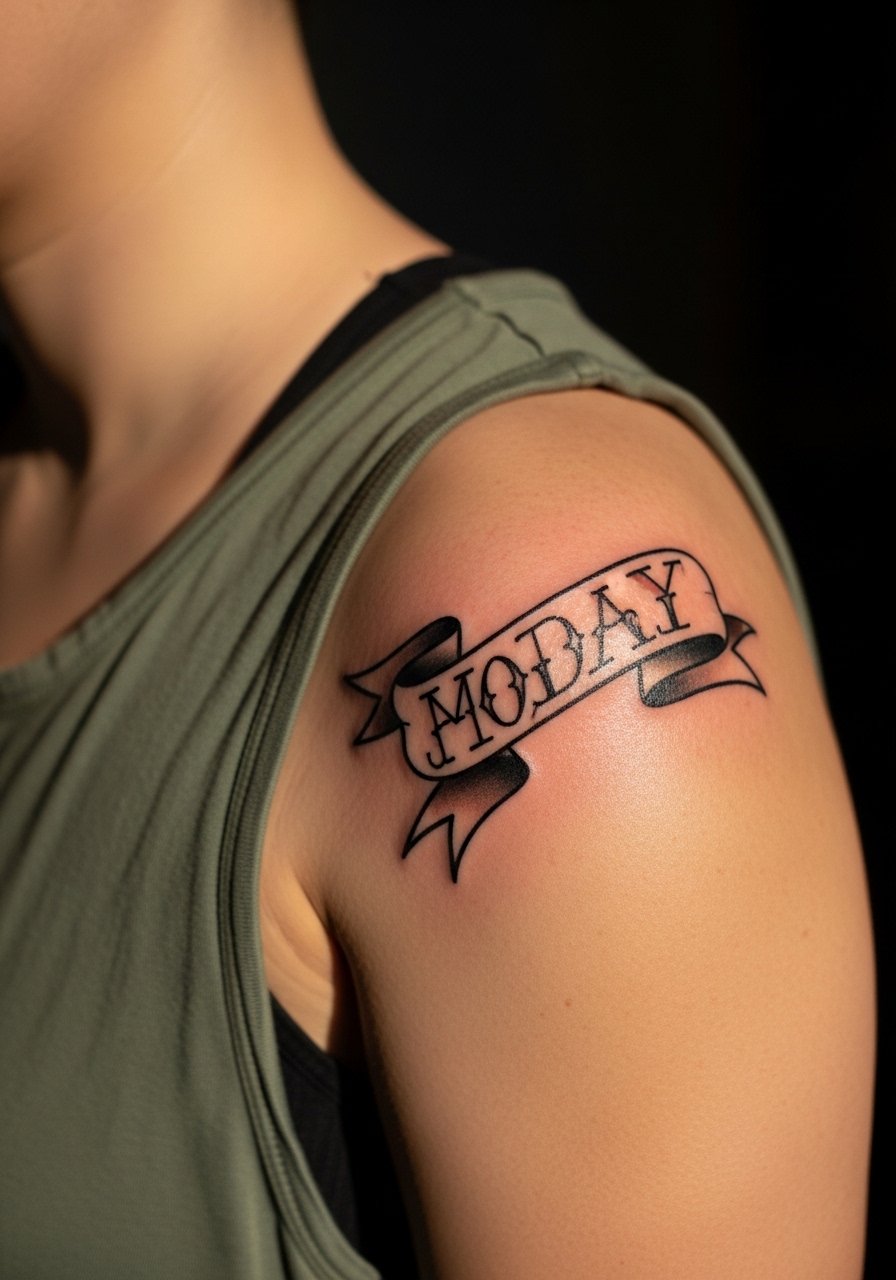
12. Name in Banner on Shoulder, Neo-Traditional Accent
A banner gives name tattoos a classic frame and reads well from a distance because of the bold outline. Shoulder skin holds ink steadily so saturation ages predictably. The usual mistake is using a script too ornate for the banner width, which crowds the composition. Session length is moderate and may include a color fill if you like. For the appointment throw on a loose tank so the artist can move fabric without friction on the area.
13. Minimal Ankle Script Mimicking an Anklet
A tiny cursive name wrapping the ankle reads like jewelry and has a low visibility footprint for workplaces that matter. Ankle sessions can be tender near the bone but are short. The main mistake is choosing script with heavy loops that snag on socks and footwear during healing. Tell your artist you want horizontal flow and ask about a slightly raised line to preserve contrast. For styling, cuffed denim and sandals show off the line, and a pair of cuffed boyfriend jeans frames the ankle piece well.

14. Name as Negative Space Floral Wrap on Upper Arm
Using negative space for a name inside a floral band creates a readable silhouette that does not rely on tiny strokes. Upper arm skin keeps the floral detail crisp and the negative script clear. A common error is over-detailing the flower petals which competes with the name. Session time can be longer because of shaded petals, and touch-ups around thin negative edges are normal at year two. For show, an off-shoulder or sleeveless top complements the wrap without covering the band.
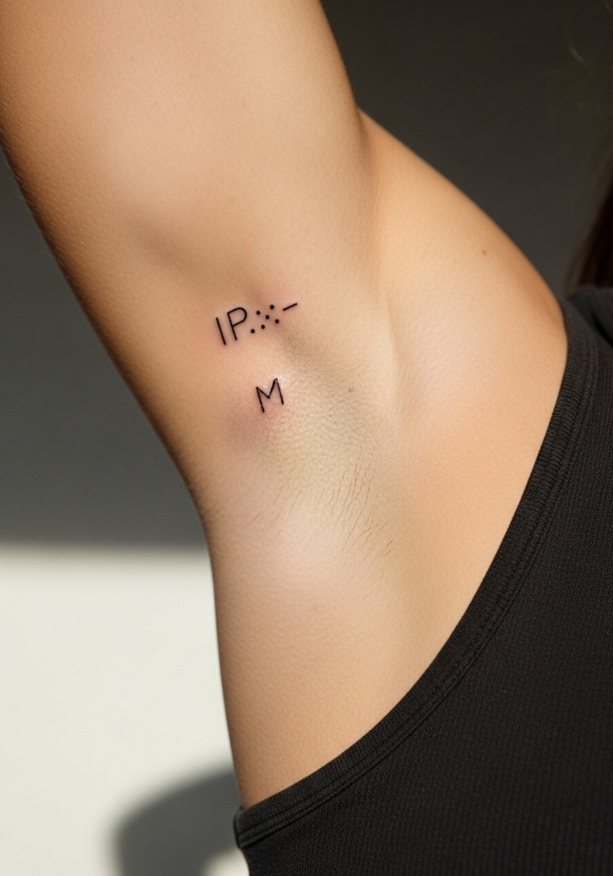
15. Morse Code Line with Name Initials on Inner Bicep
Morse code translates letters into dot and dash clusters for a discreet read that still feels special. Inner bicep placement is intimate and can be tender but heals cleanly if spacing is respected. The main mistake is clustering signals too close so they blur on healing. Tell your artist you want at least a small gap between elements and to avoid dots that are under 1.5 millimeters. For session wear, a tank with a loose fit and raised arm access works best. Note that inner arm skin can stretch with weight changes, so plan touch-ups at year three if you expect fluctuations.
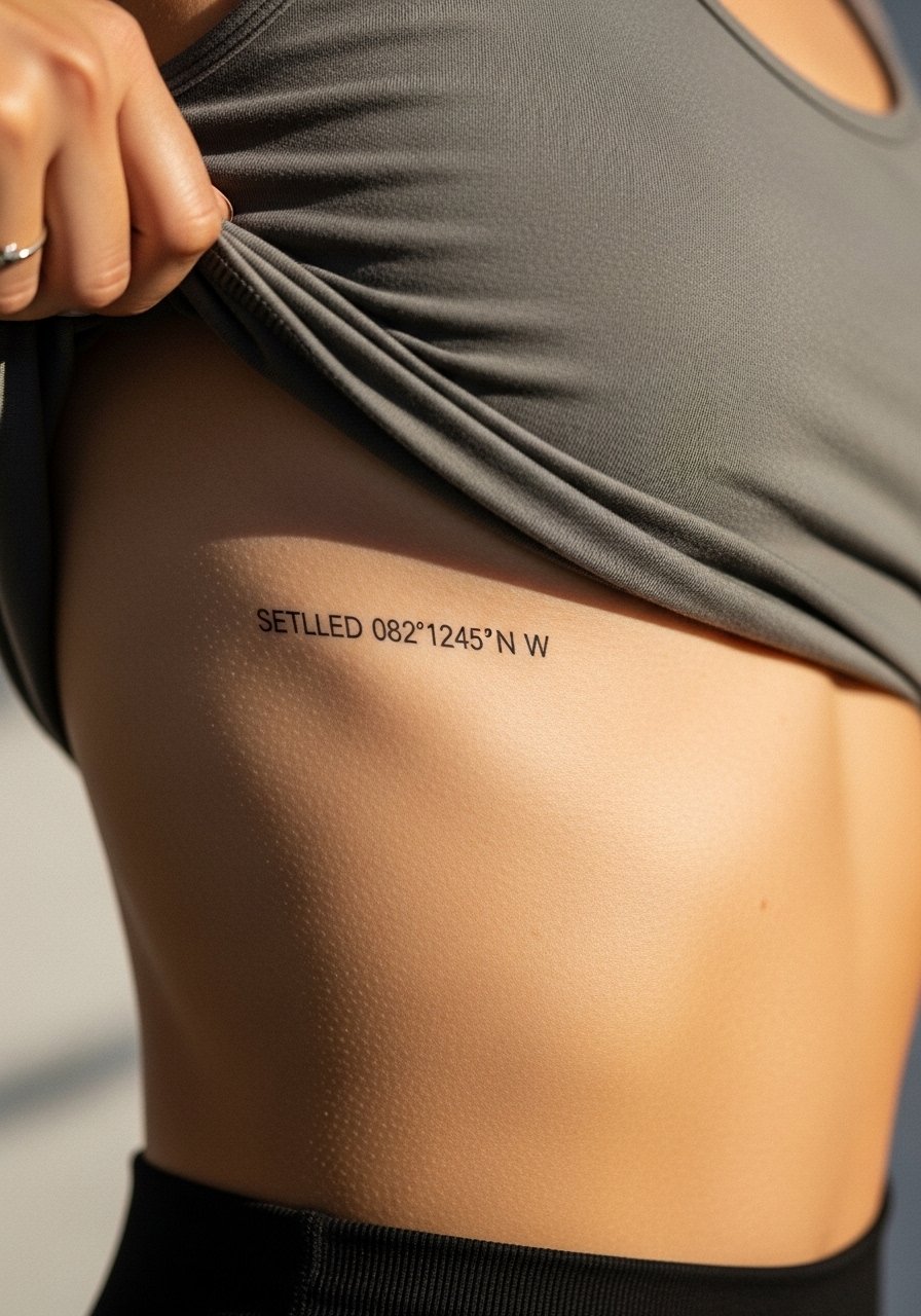
16. Coordinates with Name in Small Serif Along the Ribcage
Coordinates give the date-place a quietly private read and pair well with a small name in serif type above or below. Ribcage work is sensitive and rates high on the pain scale, but the canvas is forgiving for subtle type. Avoid tiny serif sizes that spread into a smudge after a year. Ask for slightly wider spacing and a touch-up plan at booking. For the session, wear a cropped top or sports bra so the artist can work without fabric tugging and you stay comfortable during longer stretches.
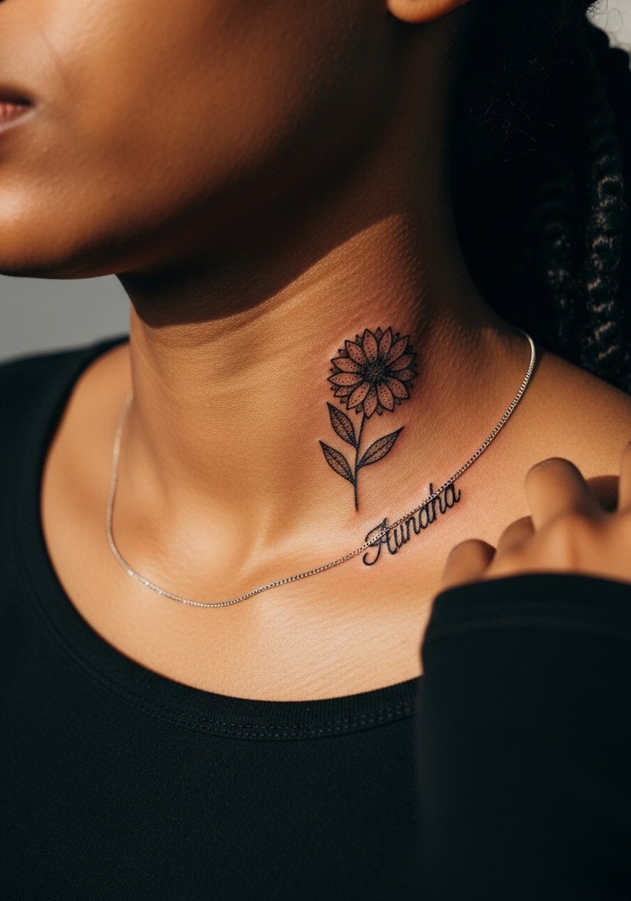
17. Tiny Dot-Work Birthflower with Name Below on Collarbone
Combining dot-work for a birthflower outline with a small name beneath gives texture without relying on heavy ink. Collarbone pieces should avoid ultra-dense dot clusters because they can coalesce as they heal. The session is brief and the sensitivity is moderate. The usual error is asking for a dense stipple that looks great fresh and reads muddy after six months. For evening looks, pair with a slim chain pendant so the collar area reads intentional and layered without choking the tattoo.
Frequently Asked Questions
Q: Will a fine line script on the wrist blur faster than a bolder script on the forearm?
A: From what I have seen, fine line scripts on high-friction zones like the wrist do tend to soften sooner than bolder scripts on the forearm. The fix is twofold. Ask for slightly heavier linework up front and plan for a touch-up around year two or three if you want crisp legibility.
Q: How should I bring my child’s drawing to a consultation so the tattoo reads like art and not a doodle?
A: Bring the original drawing and a clear photo of how big you want the piece. Ask the artist to keep the major strokes intact but to simplify texture so the lines hold as the skin moves. A good consult will show a cleaned stencil on your body before any needle work.
Q: If I want multiple kids’ names without clutter, what layout works best?
A: Linear elements like arrows and spirals work best because they give each name breathing room. Curved hearts and banners also help if you want symmetry. Discuss spacing and overall scale with the artist so each name remains readable at year three and five.
Q: Are color name tattoos worth it or should I stick with black and gray?
A: Color can be beautiful but it demands more upkeep because pigments fade unevenly. Black and gray keeps contrast stronger as the years pass. If you really want color, consider using it as a tiny accent rather than the main letter color.
Q: Where can I find an artist who specializes in fine scripts and name work without guessing names?
A: Search hashtags like #KidsNameTattoo and #MomTattoo on social platforms, check local tattoo directories for "fine line" or "script specialist," and read recent client photos in portfolio galleries. Reddit threads and booking apps help find guest spots if shop minimums are a concern.
