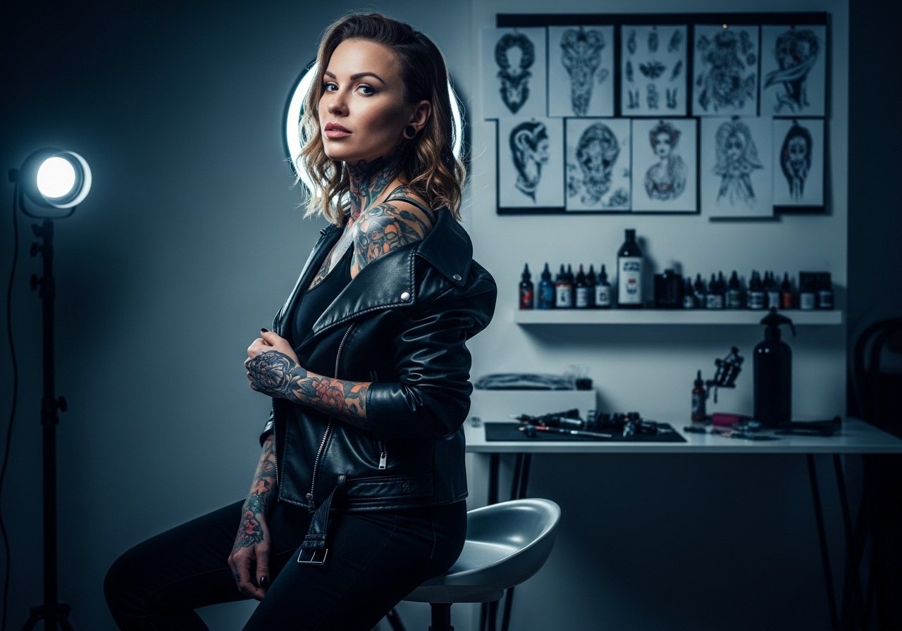
Fine line name scripts are everywhere on feeds right now, and they look effortless when fresh. The reality is finger skin eats ink, and delicate scripts often need touch-ups or a bolder pass to stay readable past a year. Read this list for name tattoo options that work on the finger, what to ask your artist in consultation, and how to dress for the session so the placement and lineweight age better.
1. Fine line script name on the side of the finger
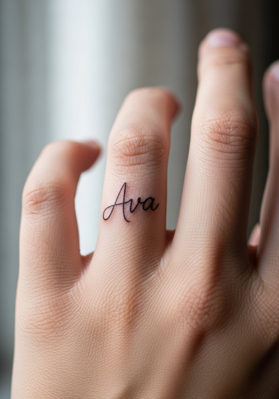
Fine line cursive along the finger side is the go-to for discreet name ink. I recommend asking for 1–2mm line thickness and a single-session layout so the artist can gauge depth on curved skin. Expect a low to moderate pain level and a short session under 30 minutes. The common mistake is asking for the same screen-sized script without accounting for finger movement, which leads to blown linework. Fine line fans argue the look is elegant and worth touch-ups. Other artists push bolder lines for longevity on hands and say they hold better. Plan a touch-up around 6 to 12 months and wear a nude nail polish set when showing it off so the ink reads clearly next to clean nails.
2. Minimalist cursive name across multiple fingers
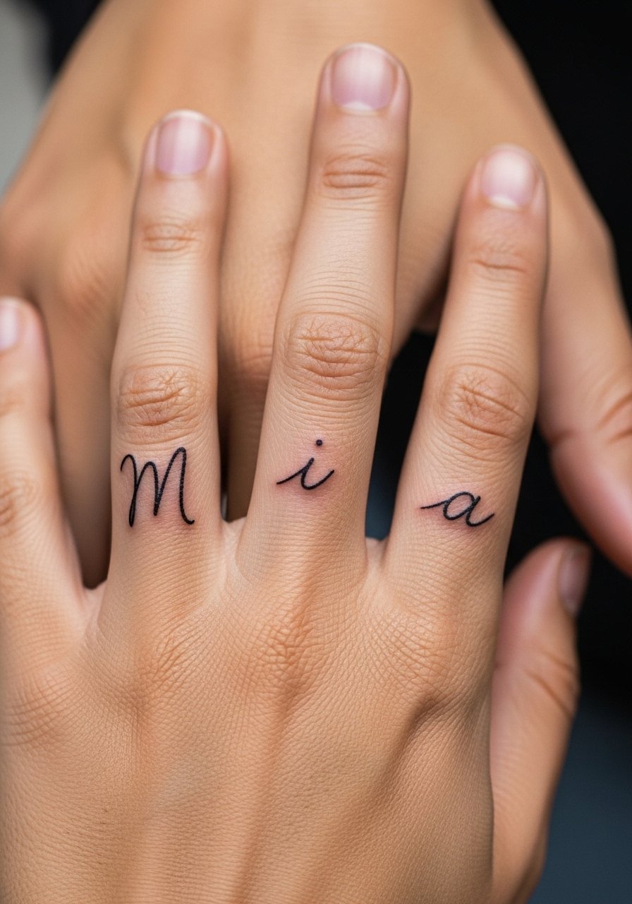
Running a cursive name across three or four finger tops creates an elongated script that reads only when fingers are apart. Tell your artist you want consistent letter height and spacing across knuckles so the word does not compress when you make a fist. Blowout risk is higher on knuckles and tops because of thin tissue and constant movement. Session time is short but precise stencil placement matters, so allow the artist to reposition. For showing it off, stack thin rings on other fingers and keep the tattoo hand clean. Try a thin silver ring stack to frame the design without crowding it.
3. Micro block letter initials on the knuckle

Initials on knuckles are bold and readable, and often the most fade-resistant text on fingers because artists can punch slightly deeper for saturation. Ask for 1mm letter height and blocky letterforms so the characters do not melt together as the skin settles. Expect a quick 20-30 minute session and medium pain at the knuckle. A frequent error is requesting ultra-tiny serif lettering which blurs into a smudge. Knuckle pieces pair well with statement rings on surrounding digits. If you like contrast, wear a knuckle ring set to make the initials pop against metal.
4. Morse code name dots on the inner finger
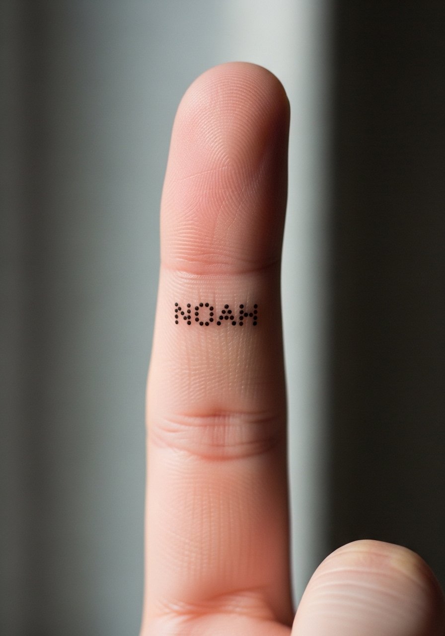
Morse code names are low-key and read like a private puzzle. Ask for precise dot spacing and consistent dot size so the pattern does not blur into a line. The inner finger heals awkwardly due to moisture from washing, so expect itchiness in the first week and a touch-up window around 6 to 12 months. A common mistake is making the dots too tiny, which speeds up fading on this busy surface. For a subtle reveal, pair the piece with linen shirts and rolled cuffs. Bring a linen button down shirt to the appointment so you can cover and reveal comfortably during healing.
5. Symbolic icon representing a name on the finger pad

Using a tiny icon instead of text lets you honor a name without literal letters. Pick a clear symbol that scales to about 5–8mm so the icon retains shape. Tell your artist what the name evokes and show two reference icons so they can simplify for the finger pad canvas. The pad takes friction from phones and keys, so stipple shading holds better than solid fills for texture longevity. Session time is short, but the pad may need a touch-up within a year. For an outfit that keeps focus on a palm-side icon, neutral tops and stacked midi rings work well. Try pairing the look with a cream blouse and a midi ring stack for gentle contrast.
6. White ink name script on the finger ridge

White ink on the finger ridge is chosen for near-invisible personalization that fades on purpose. Test a small patch first, because one camp praises white ink for a ghosted look and coverability. The other camp warns white vanishes quickly on medium and dark skin tones. Ask your artist to add a fine black outline or UV-visible check if you want a faint contrast that lasts longer. The ridge placement is less abrasive than pads, but white still needs specialist inks and careful depth control. Session time is brief. For showing it off subtly, a minimalist hand chain complements the pale script without competing. Consider a minimalist hand chain to keep attention on the ridge.
Pre-Session Essentials
The first six ideas above are all finger-focused and benefit from a few specific prep and healing solutions that address stencil hold, friction, and fine line longevity.
- indie thin tattoo balm. A lighter formula soothes finger sites that must stay pliable during healing without clogging pores from frequent hand washing.
- uv protective hand lotion. Regular UV protection reduces sun-driven fading on exposed finger ink, especially for shallow linework.
- finger stencil transfer spray. Curved tenon and tight edges on fingers need a transfer that grips the skin so the artist can line up text precisely.
- thin protective film roll. A breathable film helps shield fresh finger tattoos from friction during the first 48 hours when scabbing is most fragile.
- Aquaphor healing ointment. A thin layer for the first few days keeps fine line work moist while still allowing the skin to breathe on heavily used fingers.
7. Wedding ring name band around the base of the finger
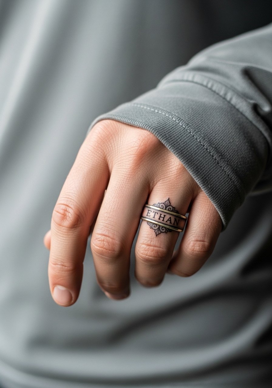
A name incorporated into a ring band is a modern alternative to jewelry. Ask for curved lettering mapped to the band arc so the name reads when the hand sits naturally. The base of the ring finger sees less constant contact than knuckles, but rings and gloves can rub the area during healing. The session may take longer if the band wraps fully around, and plan for a touch-up in 6 to 18 months depending on daily wear. Many couples choose this to avoid tan lines, but remember ink can still shift over years. For flat-front styling, skip a ring on that finger and match the look with a thin gold band on the opposite hand. A gold thin band ring complements the tattoo without competing.
8. Binary code name sequence on finger knuckles
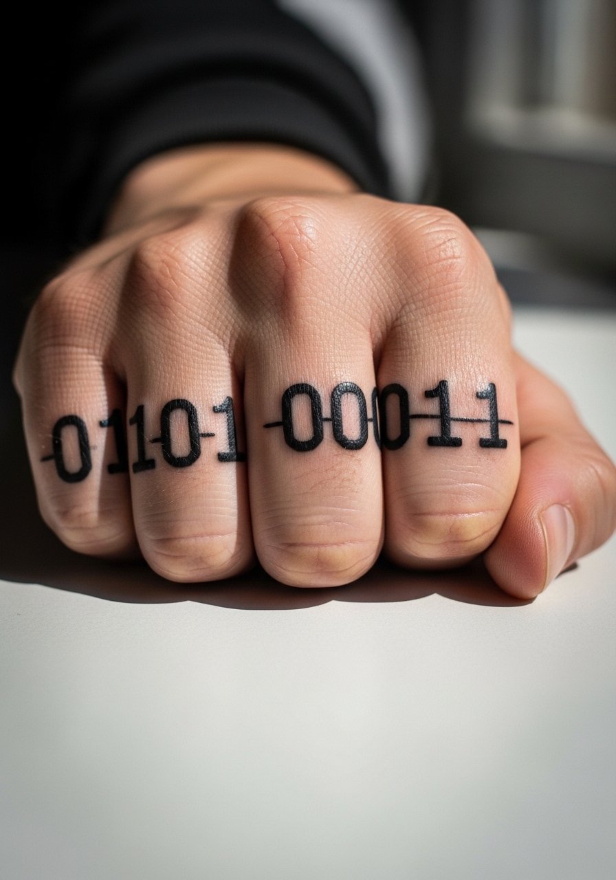
Binary or machine-code renditions of a name give a tech-savvy private message that still reads like pattern to strangers. Request consistent spacing and slightly larger digits so the zeros and ones do not merge as the skin ages. Knuckles tolerate bolder marks, so this is a longevity-leaning option compared with fine script. The session is quick and the pain is moderate. A common mistake is arranging the sequence too tightly without breathing room. Pair this with chunkier rings to match the graphic energy. A knuckle ring set keeps the aesthetic coherent.
9. Fine line nickname initials stacked vertically on the finger
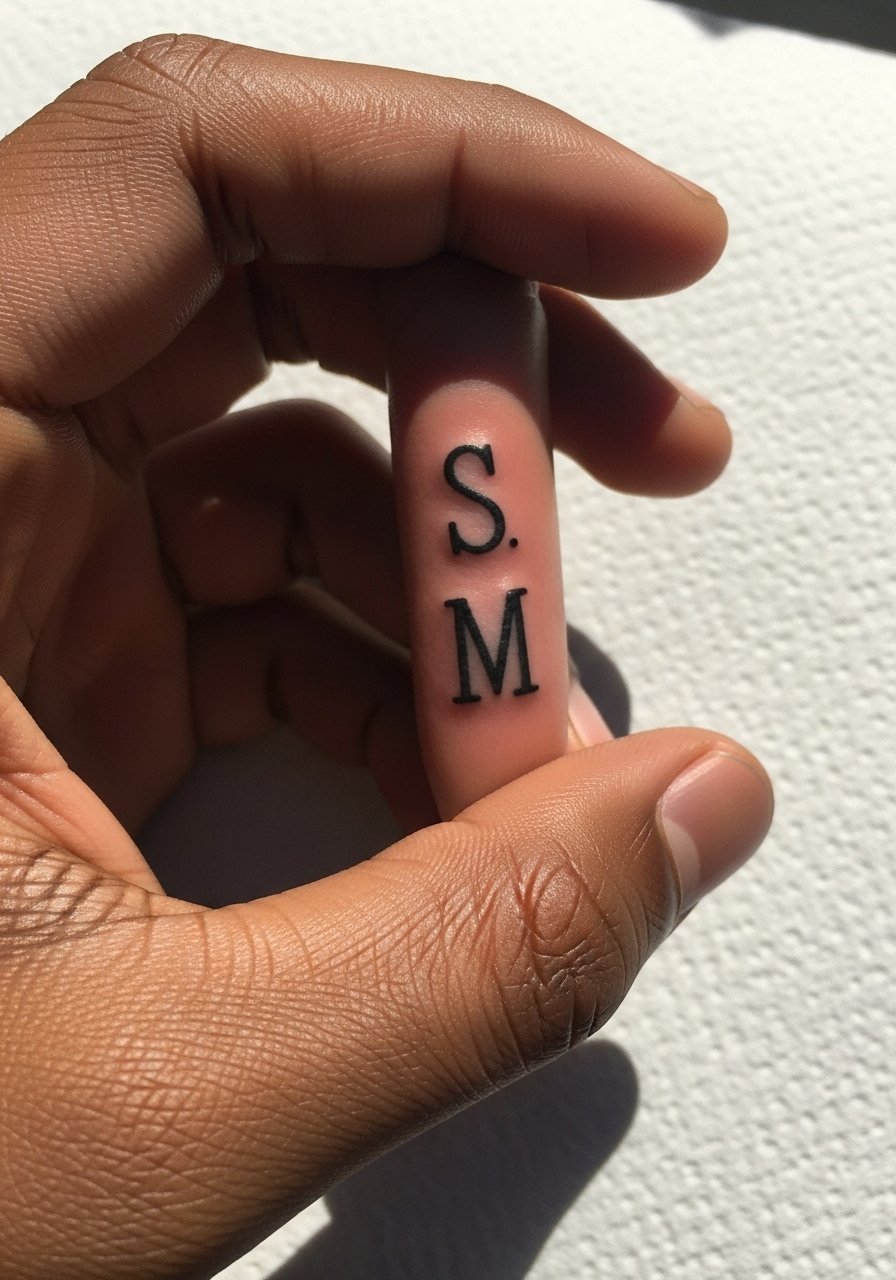
Stacked initials save space and read modern on thin digits. Tell your artist you want single-needle precision and even vertical gaps so letters do not visually collide when the finger flexes. Expect a small session time and a low pain rating. The biggest mistake is squeezing letters too close together to appear compact, which speeds up merging. This approach is efficient for those who want a shorthand name marker without full words. It also keeps options open for future additions like a tiny icon above or below the stack. No accessory is necessary, but dainty rings on adjacent fingers keep the focus on the vertical mark.
10. Heart-enclosed name micro on the ring finger
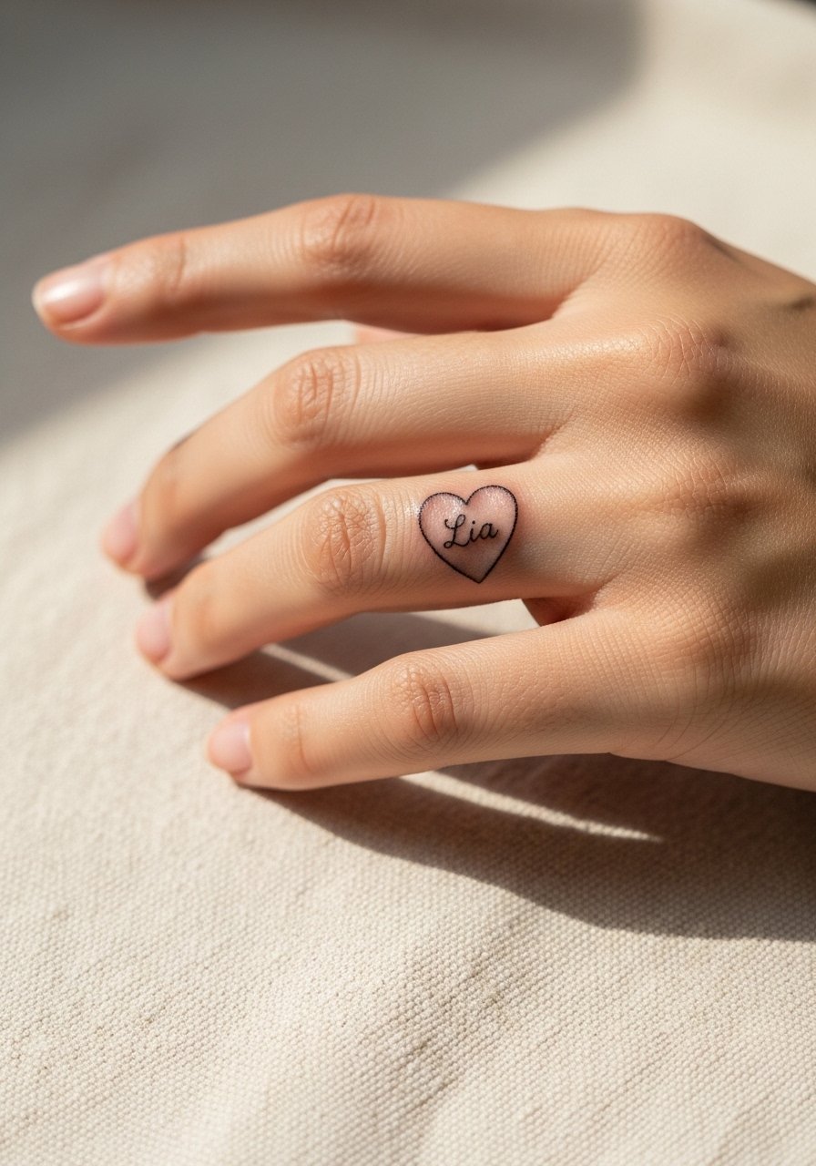
A micro heart surrounding a name adds iconography that reads clearly even as lines soften. Ask for a thin black outline and a small gray wash to retain contrast over time. The ring finger side tolerates this style well, though the heart needs room so the interior letters stay legible. Sessions are short but careful placement prevents the heart from looking lopsided. Common mistakes include over-shading the heart, which fills in as it heals. For a romantic reveal, pair with minimal jewelry like dainty bands or a stacked midi ring set. Try a dainty finger rings look to keep attention balanced.
11. Dotwork name outline on the outer finger edge
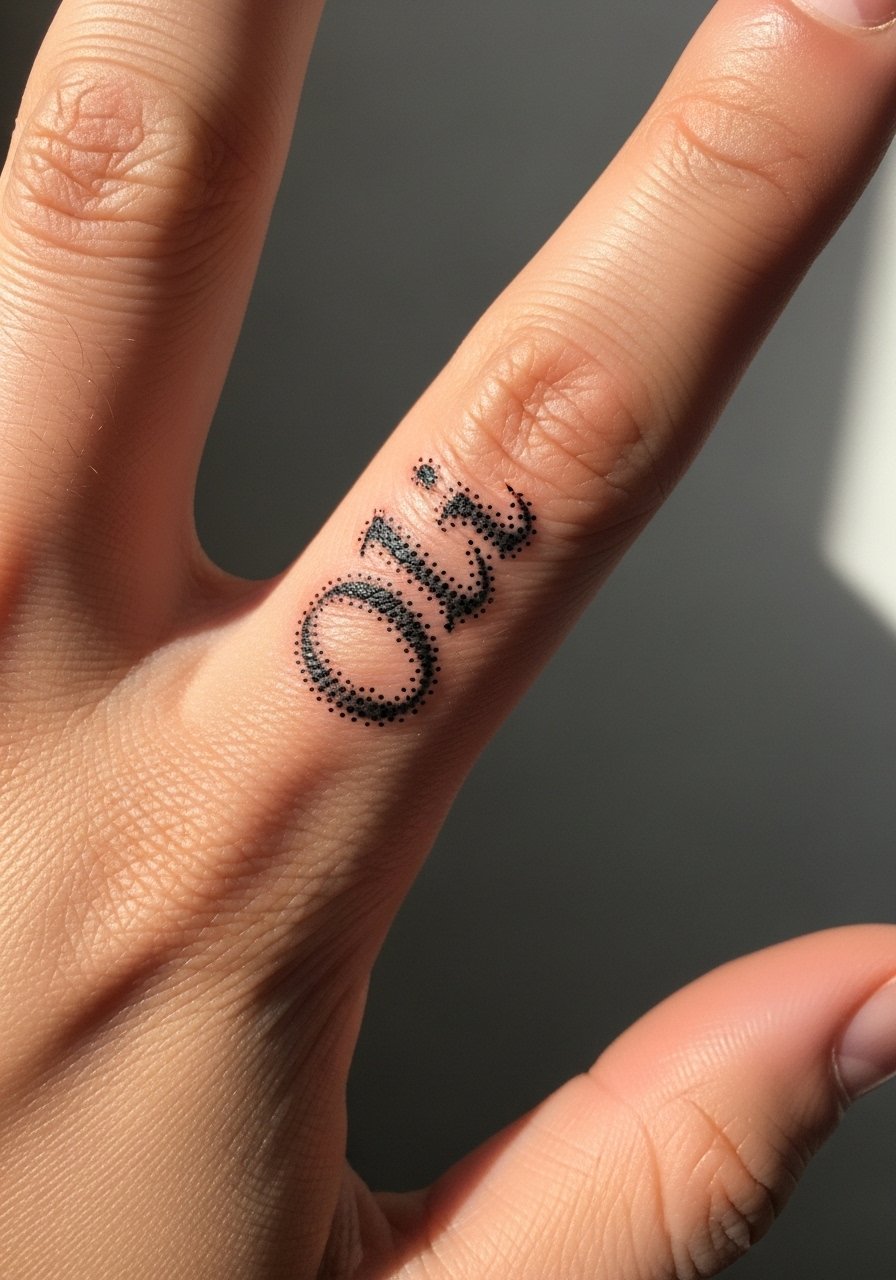
Dotwork outlines use stippling to suggest letters without heavy fill, which can age more gracefully on hands. Request consistent dot size and spacing so the outline holds its intended silhouette as the skin stretches. The outer edge sees scuffing, so dotwork adds texture that blurs more pleasantly than solid strokes. This technique takes a bit more time than a single pass script but often needs fewer aggressive touch-ups. A common error is placing dots too densely. Keep nails neutral to avoid distraction and wear a nude nail polish set to keep the stipple visible next to clean nails.
12. Negative space name letters carved by border lines
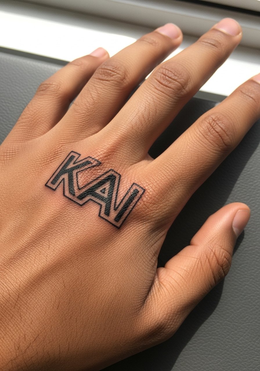
Negative space lettering uses black borders to let the skin form the actual letter shapes, which can help lighter inks or skin tones keep the name readable with less pigment inside the letters. Tell the artist you want hollow shapes and ask to see stencil contrast before the needle meets skin. This approach reduces the amount of ink sitting inside very small letterforms and may lower blowout risk. The session requires careful linework and a slightly longer appointment. Be mindful that negative space depends on skin contrast, so test how the outlines read on your tone. Expect touch-ups within a year if you use a lot of hand sanitizer.
13. Sign language finger spelling as tiny glyphs
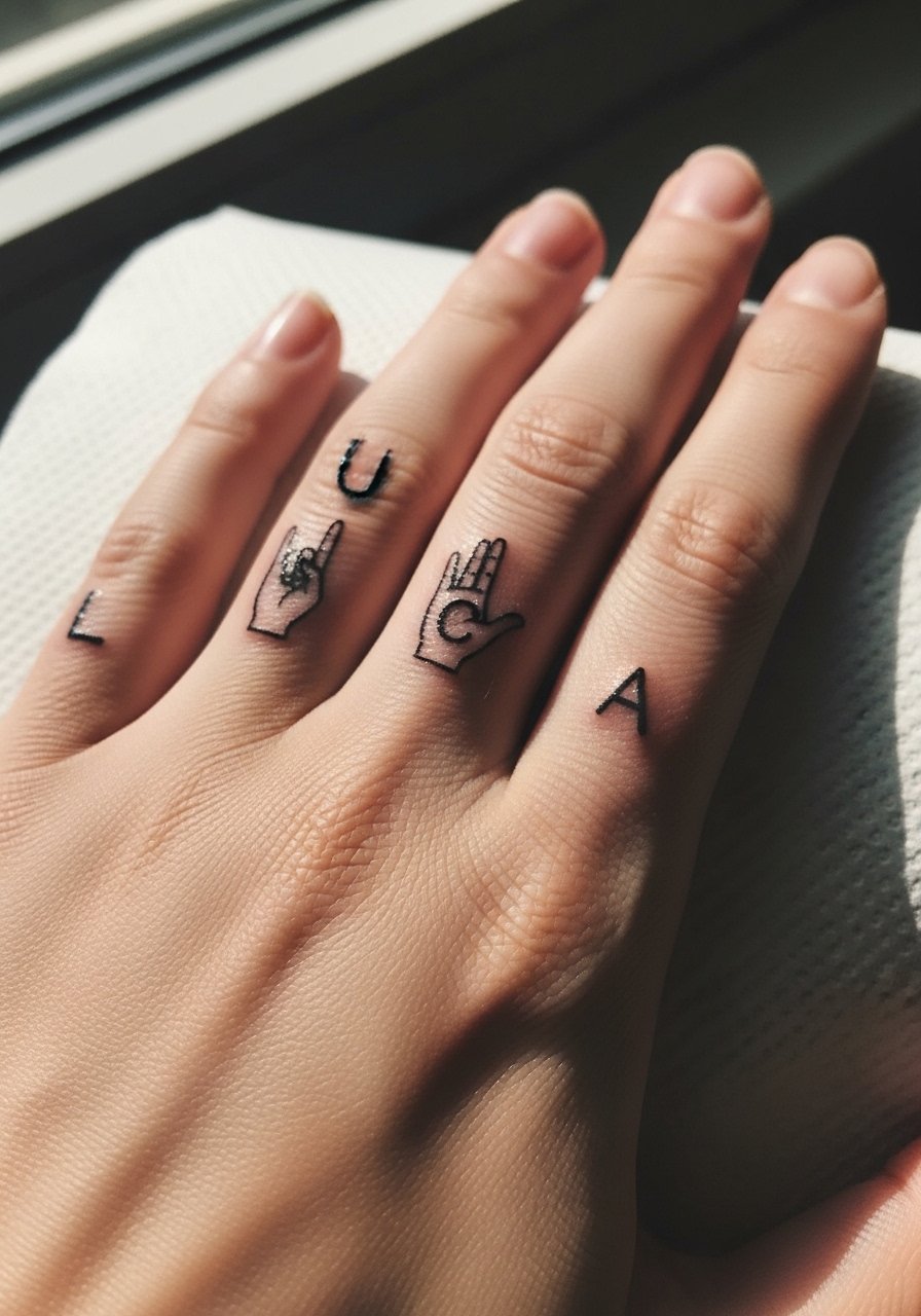
Translating a name into small sign language glyphs gives you a readable code to those familiar with the signs and an appealing abstract rhythm to others. Ask your artist to simplify the handshape into a glyph that reads at 5–8mm, and check that it scales cleanly. The main mistake is over-detailing each glyph, which becomes mush on fingers. Sessions are short and low to moderate pain. For casual styling, rolled-up sleeves or short-sleeve shirts put the glyphs on display. Bring a fitted crewneck tee to the appointment so your arm stays free and comfortable.
14. Micro portrait silhouette that represents a name
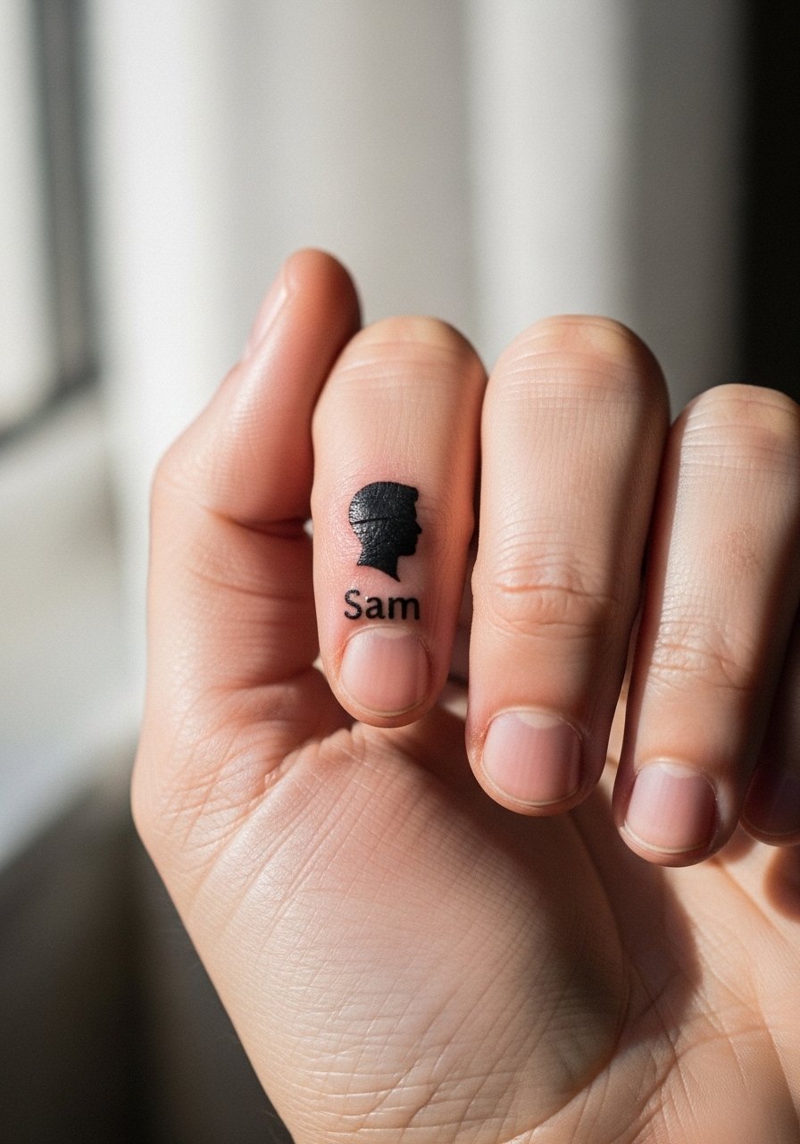
A tiny silhouette is an indirect way to represent a person without lettering, useful if you prefer imagery to text. Choose a high-contrast simplified profile so the silhouette reads at 5–8mm. Tell your artist to avoid internal detail and to focus on a clean outer contour. Pad placements require extra caution because of friction, so expect a touch-up timeline similar to other small pad icons. Common mistakes include asking for too much facial detail which disappears during healing. Pair the look with neutral palettes and minimal rings to let the tiny portrait breathe visually.
15. Script in a contrasting language or alphabet
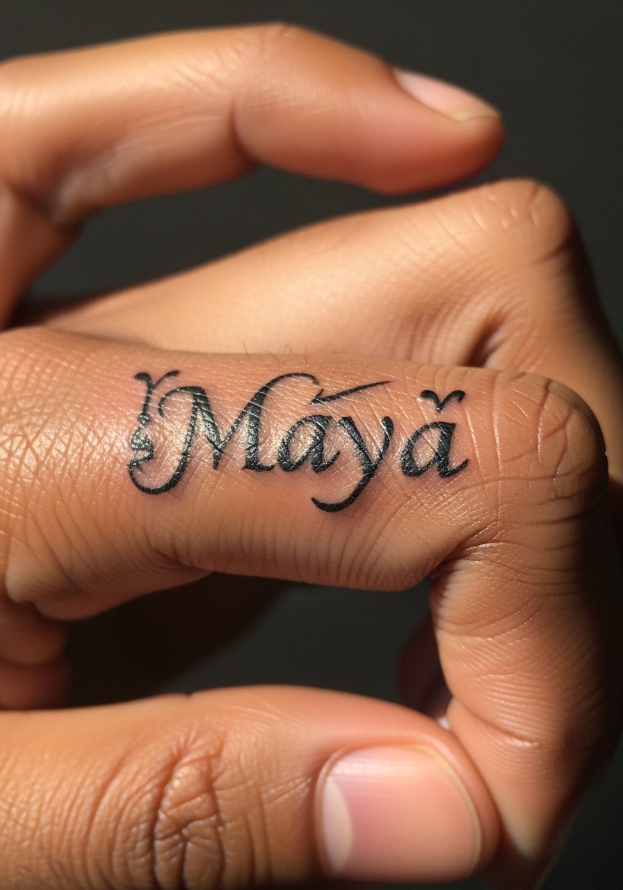
Names in non-Latin scripts can be elegant, but cultural sensitivity matters. If choosing a script like Arabic or Devanagari, confirm the translation and context with a native speaker and ask the artist to simplify for the small canvas. The main mistake is copying decorative fonts that do not scale to finger size. Sessions are short, but the artist needs a vetted stencil because letterforms can look incorrect at tiny scales. For workwear considerations, this style reads like jewelry and pairs well with simple stacked bands. Be mindful of origin and avoid sacred or religious phrases without understanding the meaning.
16. Tiny coordinate or date that encodes a name memory
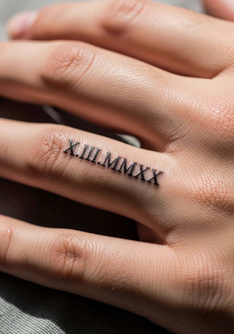
Coordinates or meaningful dates are a compact way to memorialize a name without using the name itself. Exact typography matters because numerals and coordinates can blur if too small. Ask for slightly larger numerals and monospaced spacing so each character holds. The session is quick and the pain is low. A common error is cramming long coordinates onto a short finger span. For a clean look, keep the digits minimal and pair the piece with a thin chain pendant when it sits near the wrist.
17. Interlocking monogram with tiny botanical accents
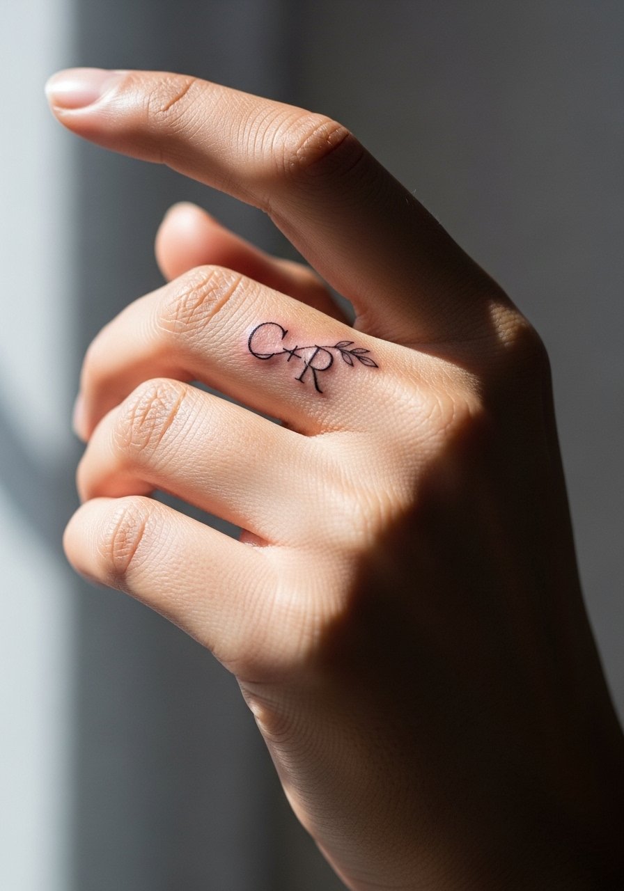
Interlocked initials with a small botanical flourish add ornament without heavy ink. Tell the artist you want open counters and light negative space so the letters remain distinct as the skin settles. The risk is over-ornamenting at micro scale which leads to smudging. Sessions take slightly longer for careful linework. This style ages well if outlines are confident rather than overly hairline. For evenings out, an open-back blouse or simple bracelets on the opposite wrist keep attention on the hands.
18. Tiny foreign-character monogram with respectful adaptation
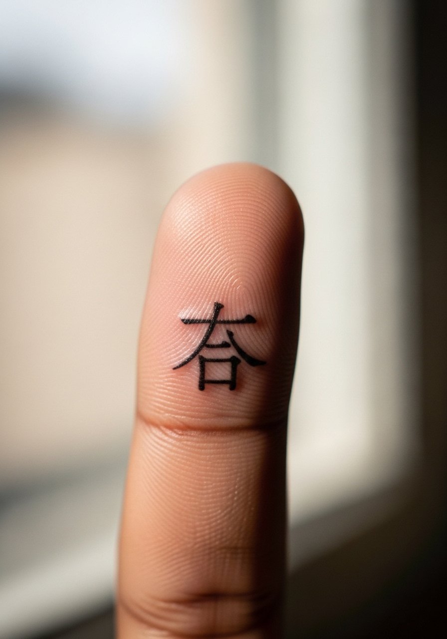
Foreign characters can be beautiful but require respectful adaptation. Before booking, confirm the exact characters and then ask the artist to simplify strokes for a 6–8mm scale so the glyphs do not close up. One common error is copying ornate calligraphy that has hairlines unsuitable for fingers. Sessions are short, and a test stencil helps ensure the silhouette reads. If the script has cultural weight, consider minor stylistic changes rather than exact replicas. Matching this with neutral nail tones keeps the characters legible in photos.
19. Tiny soundwave of a spoken name on the finger side
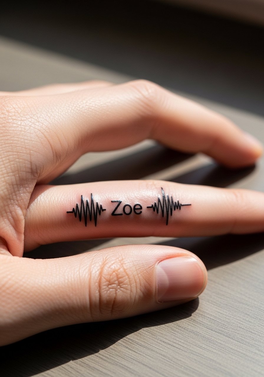
A single-line soundwave is modern and reads as abstract art until you explain it. Provide the WAV or high-quality file to your artist so they can smooth the waveform into a clean, repeatable line that scales to the finger. The mistake people make is pasting a raw, jagged waveform which translates poorly to hand motion. Expect a short session and a moderate chance of needing a touch-up if the waveform has many micro peaks. For showing it off, rolled sleeves and minimal bracelets make the waveform the focal point.
20. Tiny floral script hybrid where petals form letters
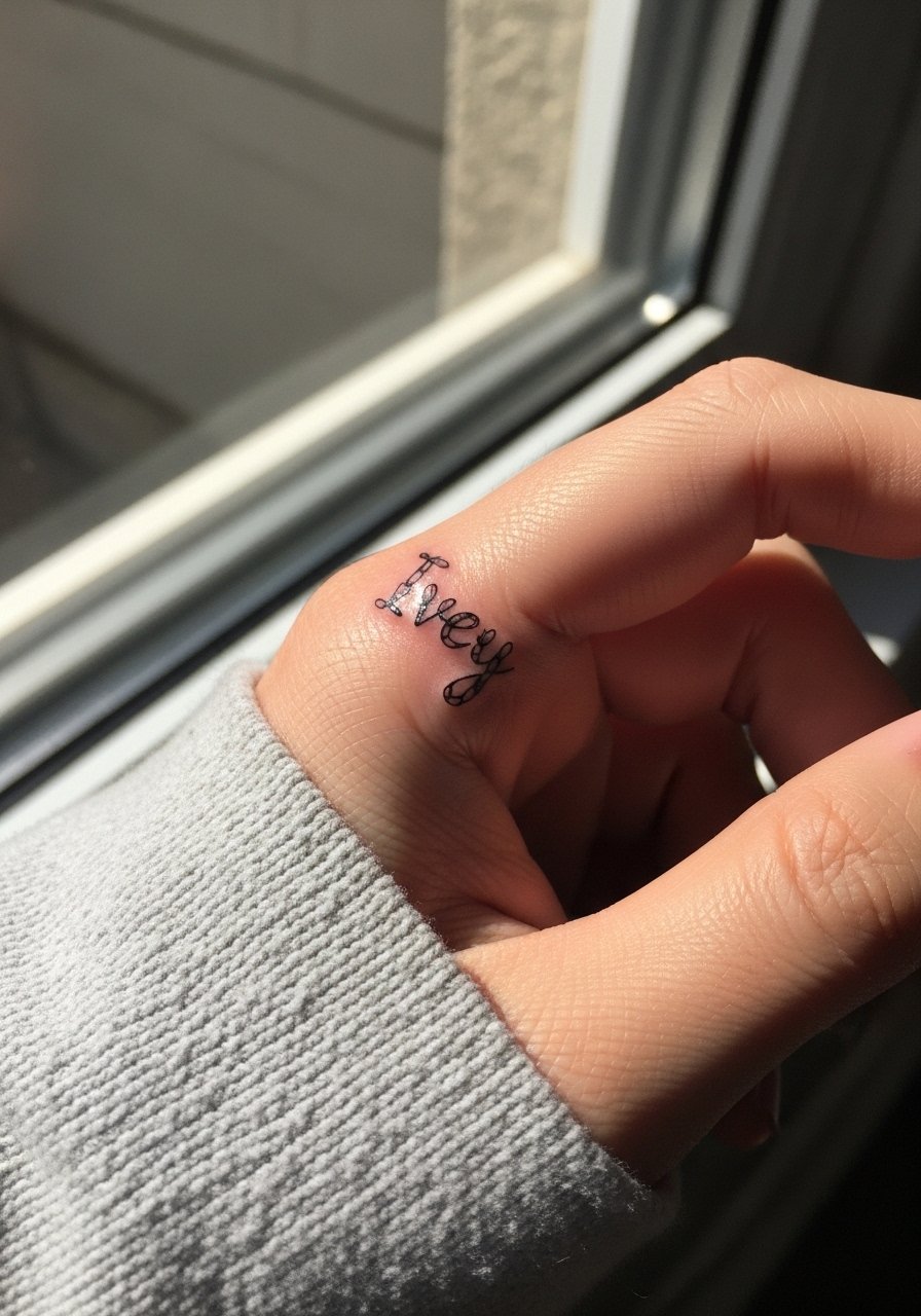
Combining florals with letterforms gives you symbolism and text in one micropiece. Ask for simplified petals rather than detailed blooms so the silhouette reads at micro scale. The aging problem comes from tiny petal strokes filling in, so favor fewer petals and clearer letter negative space. Sessions are slightly longer for careful linework and positioning. This works well on the finger top and pairs with rolled-up linen sleeves when you want to show it off.
21. Cover-friendly code icon that doubles as an initial

If you worry about future regrets, pick a design that reads as an abstract icon now and can expand into a larger piece later. Ask your artist for a shape that contains a clear initial but also looks geometric enough to be built into a larger cover if needed. The session is short and forgiving. A common mistake is choosing an overly literal name mark that resists adaptation. This approach keeps options open for future sleeve work or cover-ups while still letting you wear a name marker now.
Frequently Asked Questions
Q: Will a fine line name on a finger really blur within a year?
A: It often does if the line is hair-thin and placed on high-friction zones like knuckles or pads. From what I've seen, thicker line weight or slight bolding helps, and planning a touch-up around 6 to 12 months is realistic for most hands.
Q: Is white ink worth it for finger names on medium or dark skin tones?
A: Opinions split. Some people like the ghosted look and treat it as intentionally temporary. Other people find white disappears quickly. Test a small patch or ask the artist to combine white with a fine black border for longer readability.
Q: How do I avoid blowouts on finger script during consultation?
A: Ask to see healed finger work in the artist's portfolio and insist on a repositioned stencil preview. Request slightly larger letter spacing and check that the artist is comfortable doing micro work on fingers specifically.
Q: Can I pair a ring-finger name band with a real ring later?
A: Yes, many people skip jewelry on the tattooed finger or wear matching thin bands on the opposite hand to balance the look. If you plan to wear rings, discuss how metal will rub the band during healing and consider longer healing windows.
Q: Which clothing should I wear to a finger tattoo session to make the artist's job easier?
A: Wear a short-sleeve or a loose sleeve you can roll up easily so the hand and wrist are free. Bring a fitted crewneck tee if you want something simple and comfortable to get through the appointment.
Q: How can I hide a finger name tattoo if I change careers or need to be discreet?
A: Small cover-ups with geometric glyphs or iconography often work because they start as compact shapes. Negative space or bolder graphic shapes provide better options for later adaptation than thin script.