
Fine line bracelet tattoos are the ones that force choices. They can read razor-sharp in photos and then blur into a gray band if the spacing was too tight or the placement sees constant friction. I prefer designs that leave room for the ink to breathe. The list below runs from feather-light single lines to bold blackwork cuffs, with notes on aging, what to tell your artist, and how to dress the piece so it shows off the way you want.
1. Single Fine-Line Chain Around the Wrist
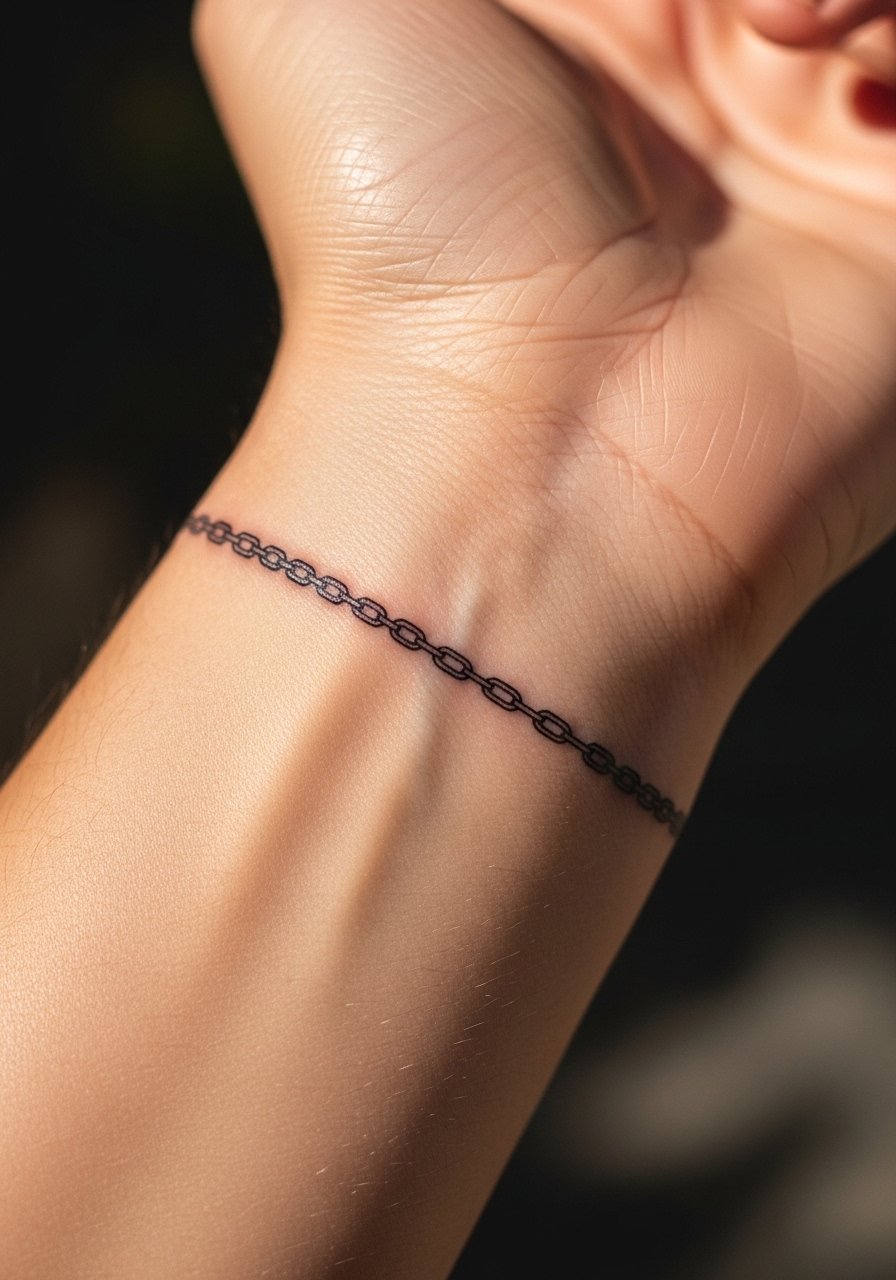
I've seen this one age well when artists leave tiny gaps between links so the chain never reads like a solid band. Tell your artist you want each link distinct and ask them to show a scaled stencil on the wrist before the needle touches skin. Fair warning, the wrist is a high-motion area and feels like a 5 out of 10 on most pain scales, especially over the bone. Small chains tend to need a touch-up at year two if you wear tight watches or bracelets that rub. For showing it off, roll sleeves and pair the piece with a minimalist watch so both elements frame the wrist without crowding the linework.
2. Thin Geometric Band on Inner Forearm

I've noticed forearm bands keep their shape longer than wrist work when the lines are spaced and the pattern avoids dense fills. During consultation, bring photos of the exact line weight you like and point out how bold or airy you want the negative space. Expect a moderate session time because the artist will need steady handwork to keep the geometry even. Common mistake is making the repeat motif too small, which causes merging in two to five years. Pair this with rolled short sleeves and a linen shirt to show the band in warm weather.
3. Micro-Dot Stipple Band Around the Bicep

Dot work holds up nicely when executed at a consistent depth. The bicep is forgiving on blowout risk because the skin there is thicker. Tell the artist you want visible separation between dots and to avoid packing too many in a tight area. Sessions can run longer because stippling is meticulous. At six months the texture reads soft and tonal, and at three years the dots keep form if not over-saturated. For sessions, wear a loose tank top so the artist can access the upper arm without you tugging at fabric.
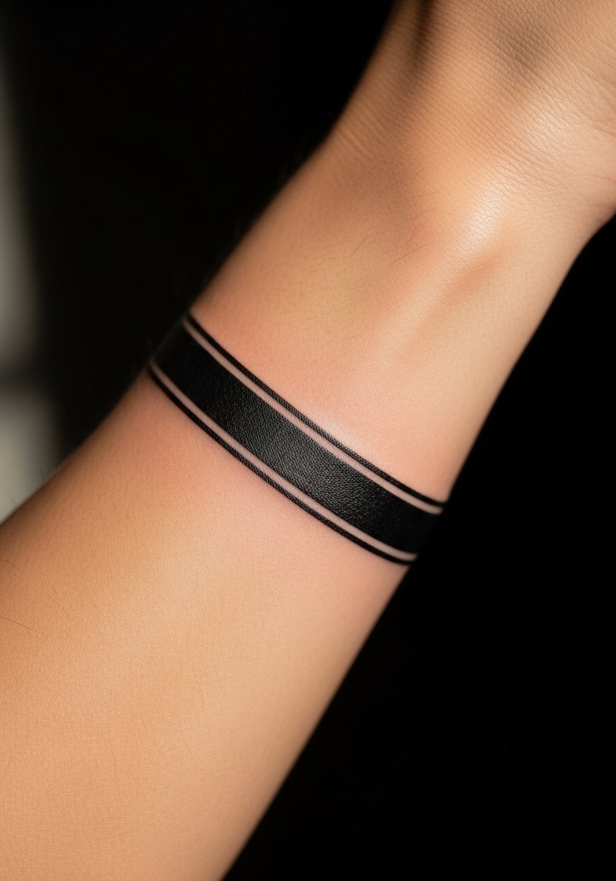
4. Minimalist Broken Line Bracelet on the Wrist

The broken line reads modern because the gaps keep the band from feeling heavy. In my experience the biggest mistake is requesting a single continuous stroke at too small a scale. Ask for slightly wider breaks and a test stencil that shows negative space. The session is short but can feel sharp near the radial bone. This style usually needs touch-ups sooner than solid bands, especially if the hand sees constant water and soap. Style it with thin stacking bracelets or a braided leather cuff so the tattoo reads as part of an intentional wrist stack.
5. Blackwork Cuff With Negative Space Motifs
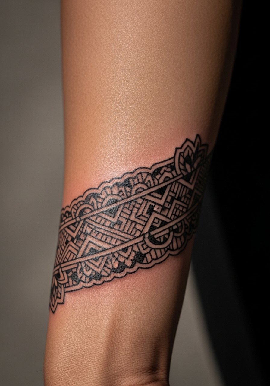
There are two camps on blackwork cuffs. One camp says heavy saturation is the most durable route, and it ages into a bold statement. The other camp warns that large solid fills can be painful and take longer to fully heal. Both are valid. Be explicit about how solid you want the black areas and expect longer session time for saturated work. Touch-ups are common around edges after healing because the skin can settle differently across the wrap. For a clean reveal, wear a short-sleeve tee and pick sleeves that end just above the band.
6. Interlocking Knot Bracelet, Fine Line
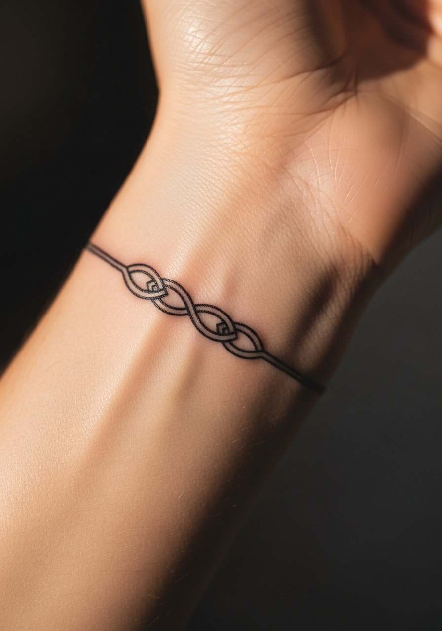
When someone asks for Celtic-style knots as a band, the usual failure is asking for ultra-small knots that later blur. Ask the artist to scale each knot so the negative spaces persist. The wrist placement makes the session a little edgy but quick. Expect a touch-up at year two if you frequently type or wash hands often. A simple styling move is to wear a thin chain bracelet on the opposite wrist to balance attention without covering the knot.
Pack Smart
The first wrist and forearm ideas above share friction and visibility concerns, so a compact kit for session day and the first week smooths the experience.
-
Stencil transfer paper kit. Lets you preview the repeat pattern on the skin so scale and spacing match what you expected.
-
Topical numbing cream. Applied before the appointment it takes the edge off wrist sensitivity without dulling the artist's work.
-
Thin protective film roll. Helpful for small wrist bands that see a lot of hand washing and contact during the first days.
-
Fragrance-free gentle body wash. Cleans the area during showers while keeping tight linework calm.
-
Aquaphor healing ointment. Thin application in the early window keeps fine line work hydrated without over-clogging.
7. Dotwork Compass Band on the Wrist

Visual impact matters here because a tiny compass reads delicate but can muddy if dots are too close. I advise asking for larger dot spacing around focal points and for the compass north to align with your arm's natural axis. The wrist may sting more near the bone. Over years the dots keep directional clarity if not overpacked. Wear a vintage-style cuff when you want the tattoo to sit in conversation with metal details.
8. Thin Rope Band on the Upper Forearm
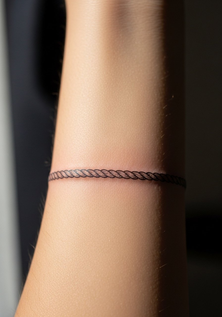
The rope pattern benefits from slight irregularities that read handmade and avoid optical fusion. Tell your artist to avoid identical repeat loops and to prioritize clear negative space. The upper forearm is comfortable during sessions and lower blowout risk exists there. At two to five years the texture softens but keeps a rope-like look if not over-saturated. Pair it with a rolled sleeve oxford to frame the band on casual days.
9. Micro-Realism Laurel Wreath Band

Micro-realism requires restraint. The detail that photographs well can fall apart if placed too tight around the wrist. Ask for slightly larger leaves and soft stipple shading instead of dense gradients. Sessions can take longer because each element is small. At six months the wreath will read crisp, and at three years the tiny veins may blur if the piece was overly detailed. For a clean display wear a button-up with the cuff rolled so the wreath peeks out without competing jewelry.
10. Morse Code Band of Meaning

Morse code is personal and low-visibility. The main mistake is spacing elements too tightly, which leads to dashes merging into long strokes. Tell the artist you want each dot and dash distinct and request a test stencil to check rhythm on the curve of your wrist. This style sessions are short and can feel sharp near the bone. Expect touch-up in a couple of years if you work with your hands much. Style it with a thin leather wrap when you want the idea to read as part of an outfit.
11. Negative Space Wave Band
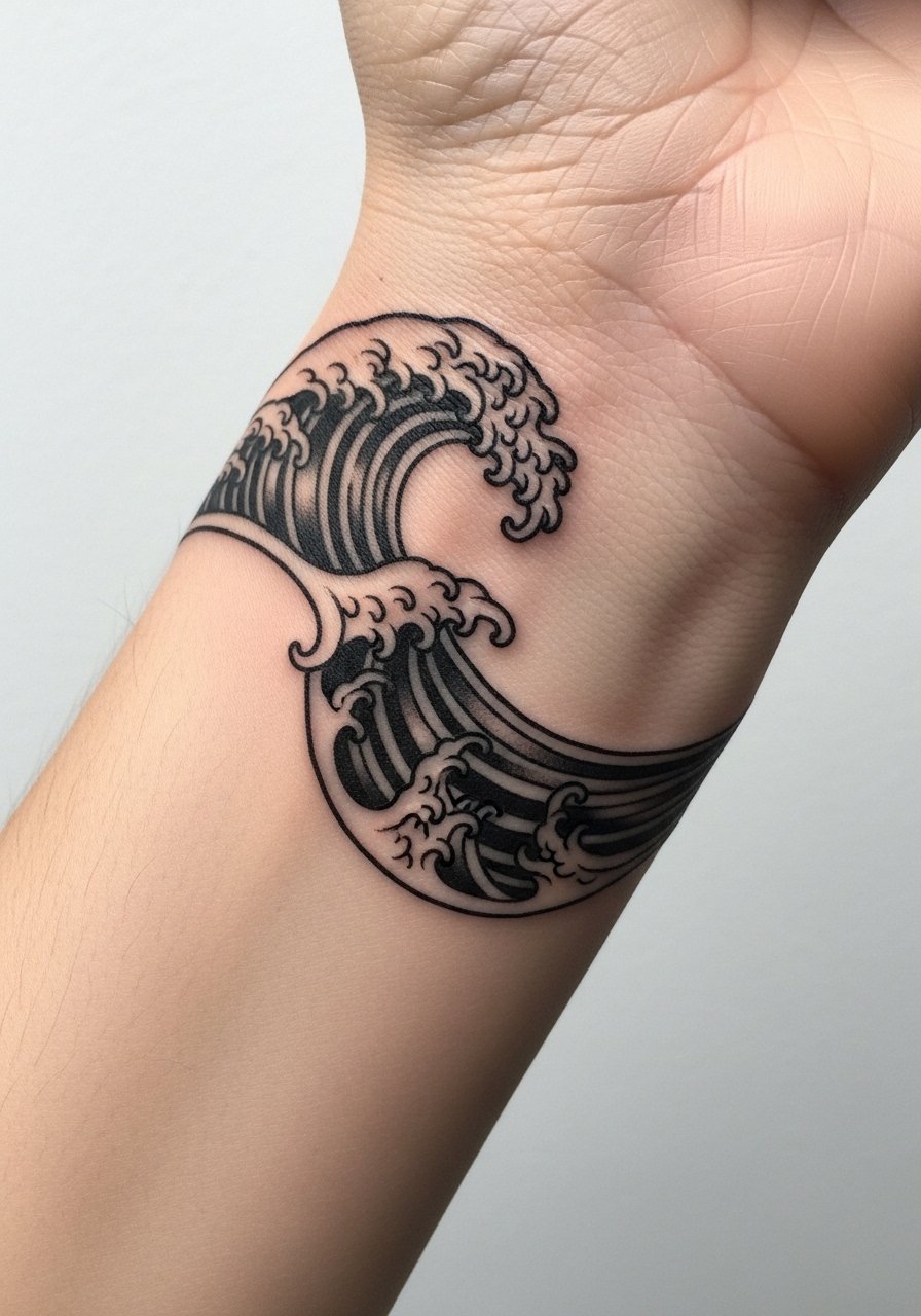
There is a practical debate over negative space bands. One camp says negative space preserves longevity by avoiding dense fills. The other camp says negative space demands precise placement and can look accidental when lines shift. State your preference for crisp margins and ask for a stencil that maps how the skin will sit when your hand is relaxed. The wrist placement makes it visible daily so the styling choice matters. For casual layers try a navy short-sleeve shirt that contrasts softly with the ink.
12. Tiny Script Band Hidden on Inner Wrist
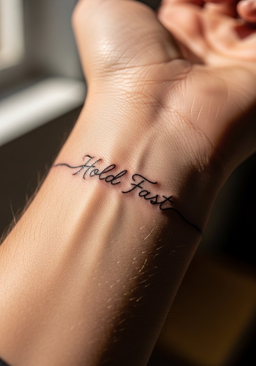
Text bands need exact letter sizing in the stencil or the words will smear over time. Specify the exact font scale and ask to preview the wording curved around the wrist. The inner wrist is more sensitive and feels sharper during the session. Script tends to require touch-ups sooner than larger type because the characters are small. For reveal, wear a rolled-cuff sweater or short sleeves so the script shows without being obvious to everyone.
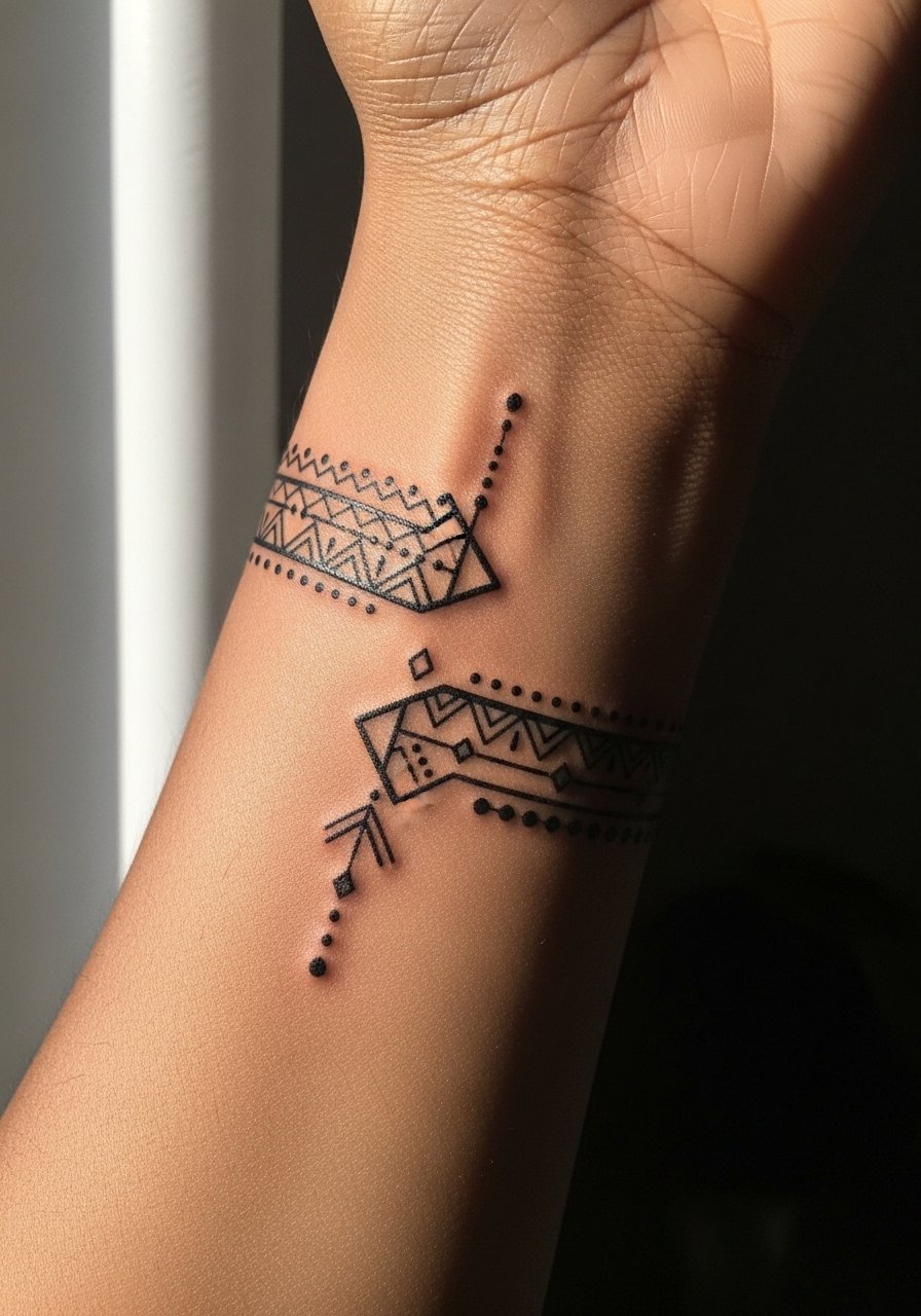
13. Thin Tribal-Inspired Chevron Band

Cultural origins matter here. This chevron pattern nods to broader tribal motifs, so many people choose to adapt elements rather than copy a specific cultural design. Ask your artist for a variation that respects origins while fitting your personal story. The forearm location keeps blowout risk low compared to hands. Over five years the chevrons stay readable if line weight and spacing are generous. Style with a textured tee that picks up the geometric rhythm.
14. Broken Bar Minimal Band Across Knuckles

Hand and knuckle-adjacent bands are high-maintenance. The skin there sheds more and fades faster. If you want the look but worry about longevity, place the band slightly above the knuckle line into thicker skin. The session is more painful and touch-ups are often needed yearly. Also consider career implications in professions with strict appearance policies. For a subtle complement, match the piece with a matte signet ring instead of heavy bracelets.
15. Watercolor Accent Band With Sparse Color
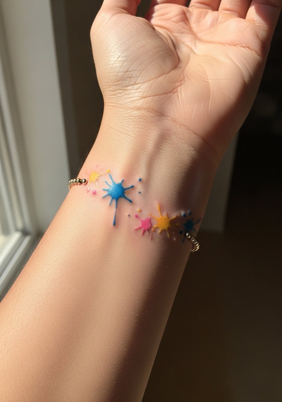
Watercolor techniques for bands are controversial. One camp says color brings a fresh edge but fades unpredictably. The other camp says selective, sparse color placed in negative space can age acceptably. I advise a restrained palette and to place color away from high-friction zones. Sessions are short for the linework and then separate for color. Expect color touch-ups earlier than black line. Wear a white short-sleeve tee to let faint color pops read clearly.
16. Thin Braided Band Circling the Wrist

The braid motif is classic and reads as jewelry mimicry. The most common error is over-detailing. Ask the artist to simplify each strand so the braid keeps separation over time. Wrist work can feel sharp in spots. At year three the braid will soften but still look braided if spacing was planned. Pair with a simple chain bracelet on the opposite wrist for balance.
17. Morse Code With Bead-Like Dots Around the Forearm
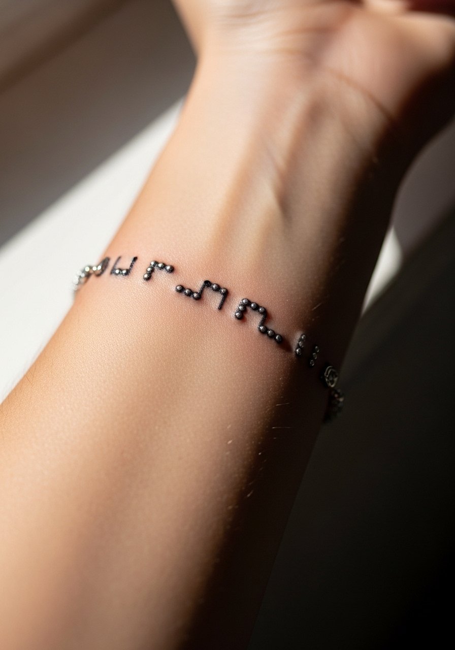
Larger bead-like dots give Morse code more longevity than tiny punctures. Tell the artist you want raised dot size and consistent spacing, and have them show the curve over your forearm before inking. Forearm sessions are comfortable and the thicker skin helps preserve dot integrity. This approach ages better than wrist Morse code for people who work with their hands. Style with a casual denim jacket so the band peeks from under the cuff.
18. Split Band With Two Parallel Lines and Gap

Parallel bands look modern and crisp when the gap is generous. The mistake is making the gap too narrow, which leads to lines visually merging over time. Ask for a measured gap and for the artist to draw the lines straight with a marking pen before committing. This placement is low pain and low blowout risk. At year five the split remains distinct when spacing was prioritized. For daily wear try a rolled-sleeve chambray shirt that keeps attention on the forearm lines.
19. Tiny Floral Chain That Wraps the Wrist

Floral chains are charming but fragile. The tendency to pack petals tightly is the biggest aging mistake. Ask for simplified buds and open negative shapes so the flowers read as motifs rather than blobs later. The wrist session is brief and somewhat sensitive. Expect touch-ups around year two if you often wear physical bracelets. Pair with a linen short-sleeve shirt to accentuate the botanical note.
20. Thin Barcode Band for a Modern Edge

Barcode bands can look graphic and intentional if the bars keep crisp edges. The main mistake is getting bars too thin. Request wider bars and leave space between groups. The wrist placement feels sharp near the bone. At two years the barcode will still read as pattern rather than blur if line weight was prioritized. Style with a black bomber jacket with sleeves that sit above the wrist when you want to show the design.
21. Single Thick Bold Band for Low-Maintenance Wear
Bold single bands age predictably because saturation wins longevity. The trade-off is a longer session and higher initial pain. Discuss edge crispness and whether you want a slightly feathered outer line to avoid a stark boxy look. Touch-ups are common around edges after healing because skin settles. For showing off the bold band go with a short-sleeve henley that keeps the forearm visible without extra jewelry.
22. Asymmetric Band That Stops at the Tendon
I like asymmetry because it avoids the optical trap of a perfect circle that can look off on the wrist. Tell the artist you want intentional stopping points and to mock up how it reads when you bend your hand. The tendon area is more painful and can have slight distortion as you move. Over time that stopping edge reads like a design choice if planned well. Pair with a casual watch with a thin strap to play with negative space.
23. Thin Arrow Band Pointing Around the Wrist

Arrow motifs need consistent direction and spacing so the repetition reads intentional. The main mistake is misaligned arrowheads, which becomes obvious as the piece settles. Ask to confirm arrow direction relative to your dominant hand. Wrist pain is moderate and session time is short. Expect a touch-up if you do a lot of manual labor. Style it with a suede wrist cuff for layered texture without obscuring the arrows.
24. Tiny Gemstone Band in Micro-Realism
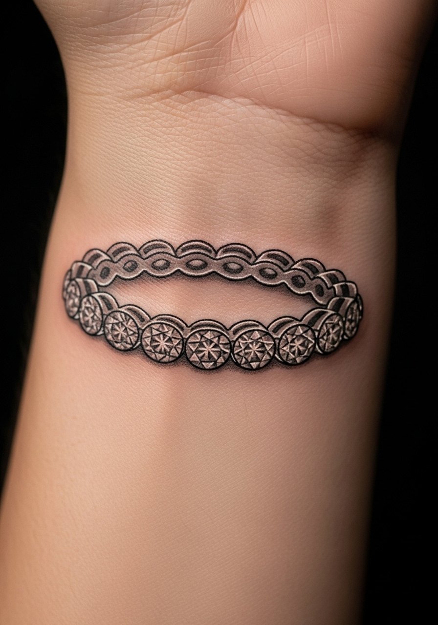
Micro-realism gems look delicate but demand space for facets to remain distinct. The common error is compressing facets into too small an area. Request slightly oversized gems and stipple highlights instead of heavy gradients. Sessions are meticulous and may include a color pass. Over time the highlights soften but the gemstone read holds if not overworked. Pair with a thin pendant necklace that echoes the jewel motif without matching exactly.
25. Intermittent Barbed Wire Band, Subtle Version
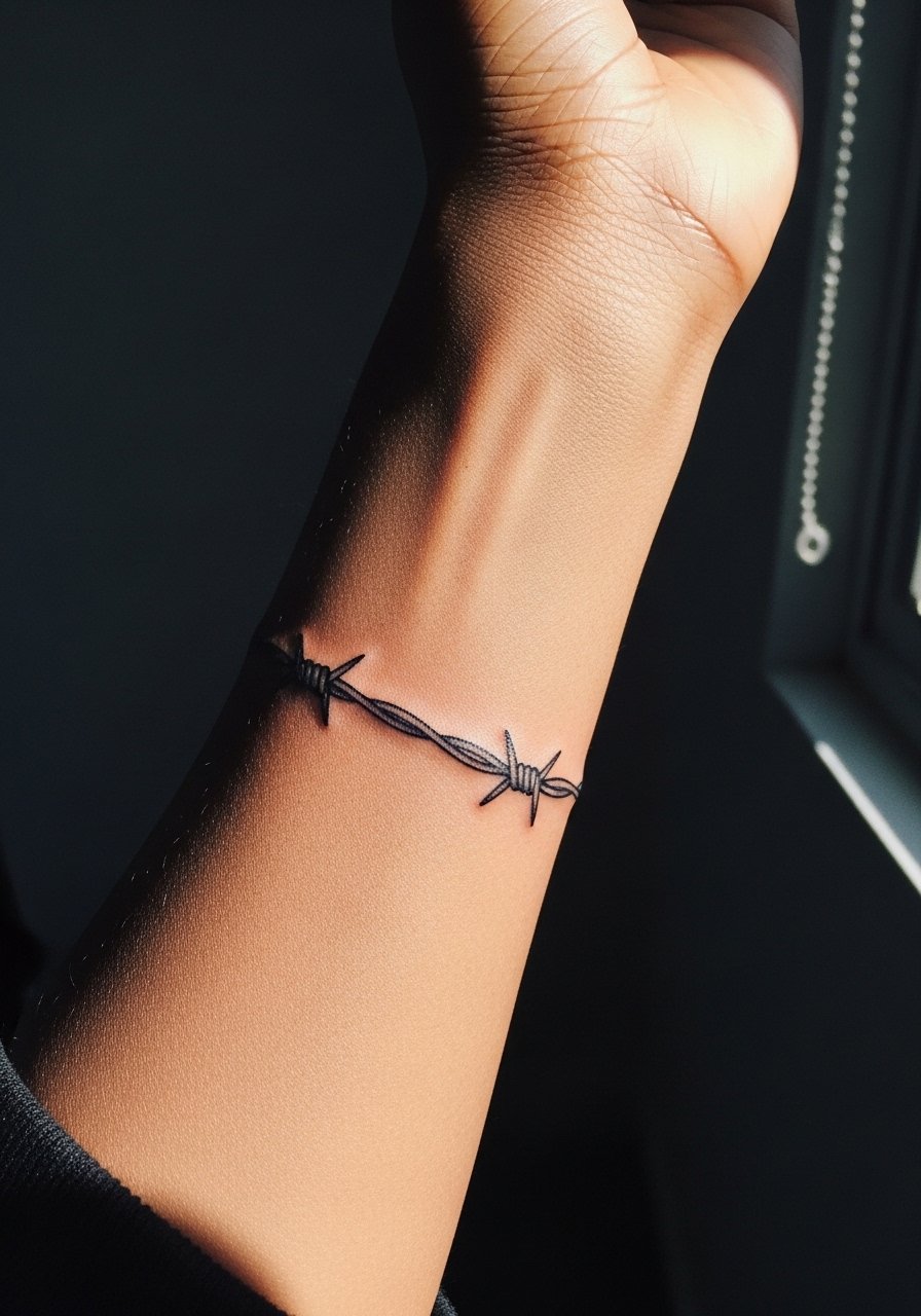
Barbed wire tattoos are polarizing. Some see them as edgy nostalgia, others find them cliché. If you want the aesthetic without overt aggression, ask for softened knots and less aggressive spikes. The forearm placement keeps it readable and less aggressive overall. Sessions feel moderate and need a steady hand for symmetry. Over years the design softens but retains form when negative space is respected. Style it with a distressed denim jacket for a consistent visual language.
26. Thin Film Strip Band With Tiny Frames

A repeating film strip is a playful band that needs larger-than-it-looks frames to avoid blur. Tell the artist you want each frame readable and that you prefer fewer frames with more negative space. The wrist stings in spots and sessions take a little longer because of repeated tiny strokes. This design ages better when frames are spaced. For cinematic flair wear a vintage tee and cuff the sleeve so the strip peeks out.
27. Thin Morse-Style Coordinate Band Around the Wrist

Coordinates are personal and precise. Specify the exact digits and font scale in the consultation so the numbers remain legible over time. The wrist placement is sensitive and the session is short. Small numerals can blur if too small, so plan for hairline size that still reads as numerals in photos. For a discrete reveal pair the piece with a rolled long-sleeve that you can adjust when you want the coordinates to show.
Frequently Asked Questions
Q: How long will a fine line bracelet on the wrist stay crisp?
A: From what I have seen, fine line wrist bands often need a touch-up around year two to three if they are tiny and sit where bracelets rub. If you plan for slightly larger spacing and avoid very thin single-needle lines, the band tends to stay readable longer. Placement and daily friction are the real drivers here.
Q: Are bold black cuff bands less likely to need touch-ups than thin line bracelets?
A: Generally yes. Bold saturated black holds up better because saturation resists early fading. The trade-off is longer sessions and more initial tenderness. Discuss edge sharpness with your artist since edges commonly need refining after the first healing window.
Q: If I want to show a wrist band without it looking like a fashion choice, what should I wear?
A: Wear short sleeves that end just above the band or a rolled-cuff shirt so the tattoo reads as part of your style rather than an accessory. Lighter neutral fabrics tend to make lines pop without competing.
Q: Do bracelet tattoos hurt more on the wrist than the forearm?
A: Yes. The wrist is generally more sensitive because of thinner skin and proximity to bone. The forearm has thicker tissue and will feel easier. Expect sharper stings near tendons and bone and plan accordingly.
Q: Can I get a bracelet band that wraps halfway instead of fully around?
A: Absolutely. Half-wrap or asymmetric bands are a practical choice if you want the look without complete closure. They age differently since the open edge can settle, so plan spacing and ask the artist to show the piece with your hand relaxed and flexed.
Q: Will color in a bracelet band fade faster than black line?
A: Yes. Color, especially light tones, typically requires touch-ups sooner than dense black. If you want color, opt for sparse accents in negative space and discuss fade expectations during the consult.
Q: Should I be worried about work policies for wrist or hand bands?
A: Some industries still restrict visible hand or wrist tattoos, so consider career context. If visibility is a concern, place the band slightly higher on the forearm or choose a design that reads as subtle when sleeves are down.
