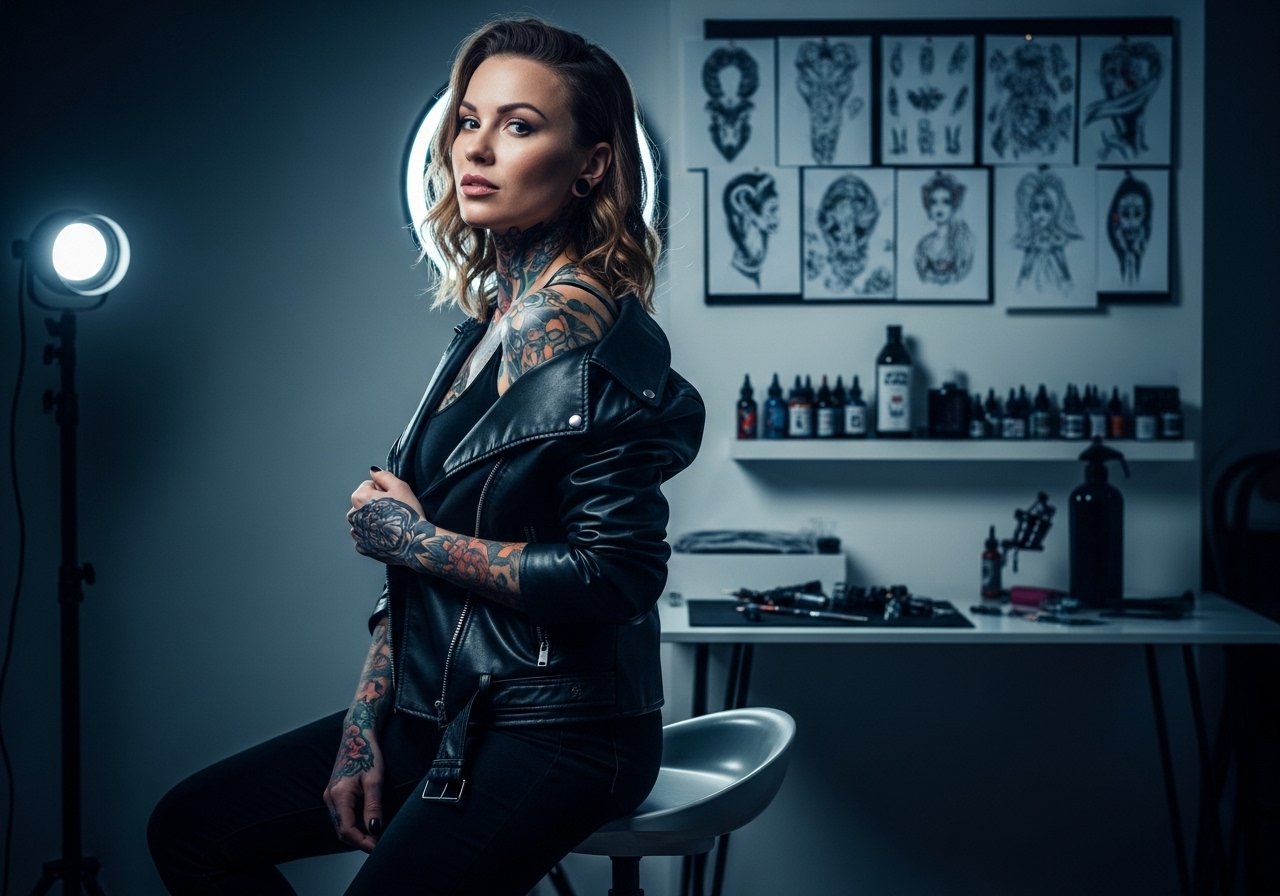
Fine line styles are hot on boards and in saved collections, and they often look flawless in the first few photos. The reality is that some of those pieces soften faster than people expect, especially on hands, ribs, and areas that stretch or get a lot of sun. This gallery leans into Gaga-inspired motifs you can actually wear five years from now, with placement notes, pain expectations, and what to tell your artist before the needle hits skin.
1. Renaissance Cherub on Back of Neck
I've seen neo-traditional cherubs flirt with dramatic collars and still read clean when the linework stays deliberate. Pain is milder on the back of the neck than on ribs, but expect a twitchy spot if the artist works too fast. Ask for 4-6 inch scale, black and gray with fine stipple shading for detail that ages into a soft contour. A common mistake is shrinking the cherub too small, which loses facial detail as the ink settles. For the session wear a loose ponytail and a off shoulder top so the artist can access the area without you sitting shirtless.

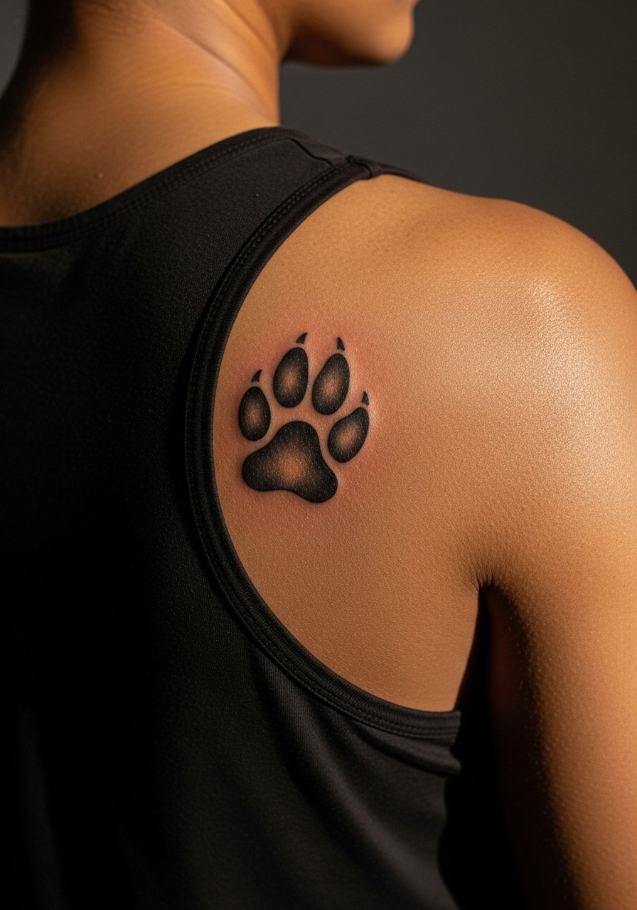
2. Monster Paw Blackwork on Upper Back
Visual impact lead: bold blackwork reads from across the room, which is exactly why the Monster Paw works as a back piece. This placement hurts less than ribs but takes longer because of size, two to three sessions for an 8-10 inch emblem. Ask for solid outlines and saturated fills rather than delicate shading so it holds up longer. One flaw I see often is trying to miniaturize a symbol meant for scale; it loses presence and edge definition over time. To show it off, pair with a backless halter top for nights out, and wear a loose tank for the session so the artist can work unhindered.
3. Mother Monster Lace Along Left Ribcage
Pain warning lead: fair warning, the ribcage is a high-pain zone and lace details demand patience. I recommend a 6-8 inch vertical design that flows toward the armpit, using ornamental script and paisley lace motifs for texture. Tell your artist you want slightly thicker threads in the lace so lines settle instead of breaking up as skin shifts. Portrait-style details on the ribs often blur with weight changes, so this ornamental route future-proofs the idea. For the session wear a strapless crop top you can lift slightly, and bring a spare sports bra for comfort.

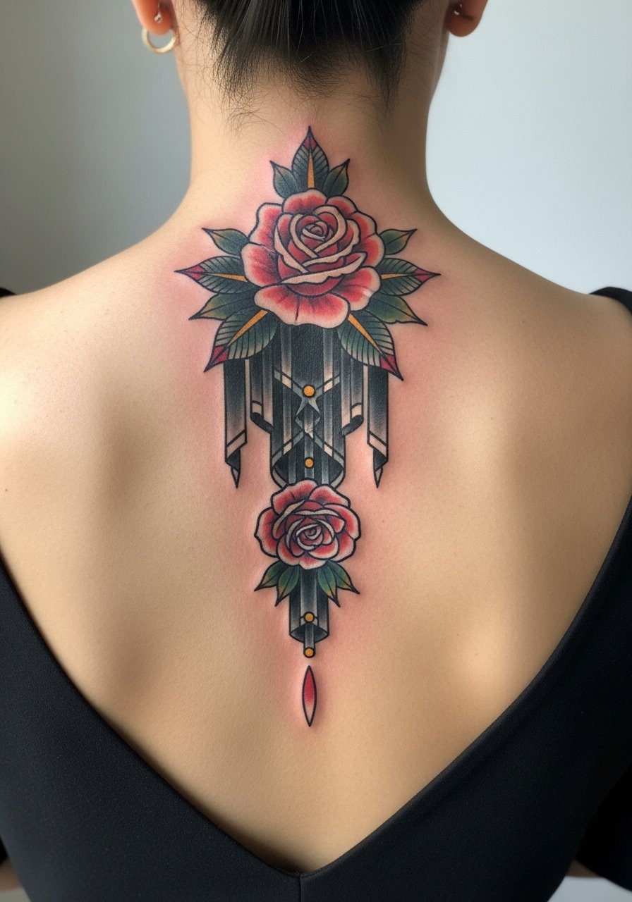
4. La Vie en Rose Spine Cascade
Aging and healing lead: cascading roses down the spine take space to breathe, and that spacing is what keeps petals from merging after a few years. Full-spine neo-traditional pieces usually require three to four sessions for saturation and color accents. If you want reference to a song without copying a celebrity layout, ask for a vertical rose column with negative-space breaks between blooms. Artists split on whether color speeds fading on the spine, so ask about touch-up timelines for pigment refresh. For evenings, this shines with a low back dress or crop top neutral pieces that let the cascade show.
5. David Bowie Micro-Realism on Left Ribs
Consultation lead: when you book a micro-realism portrait for the ribs, bring healed reference photos and ask your artist about touch-up windows. Expect two sessions for a 5-inch square portrait in black and gray. The ribs move with breathing and weight changes, so portraits there can soften or warp if drawn too small. A common mistake is over-detailing at a tiny scale. For longevity, maintain slightly higher contrast and plan a touch-up at year two. Sensitive placement note: ribcage work needs an artist experienced with torso realism.

6. ARTPOP Text in Georgia Font on Forearm
Mistake lead: the biggest misstep with script is mismatched font weight to placement. Georgia-style ARTPOP lettering works best at roughly 4 inches across the left forearm with clear spacing. This is low on the pain chart and a one-session piece if you want plain black linework. Fine line scripts can blur on darker skin tones, so ask for slightly heavier strokes or a bold outline if your skin tone needs contrast. For easy showing, roll up a white button up sleeve and add a thin leather cuff opposite the new ink.

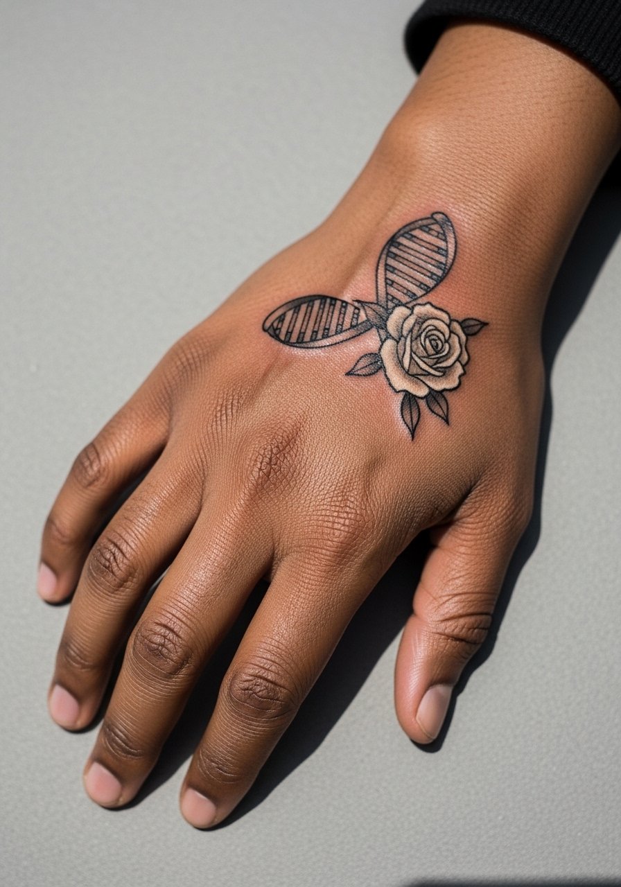
7. Survivor DNA Loop with White Rose on Wrist or Hand
Styling lead: hand and wrist symbols need bold lines to outlast daily washing, and your aftercare plan must include regular touch-ups. The DNA-inspired loop with a white rose works as a small 2-3 inch wrist piece or a tiny back-of-hand emblem. Pain is sharp but brief on the hand. Artists disagree about fine line on hands. One camp says hands fade quickly and need heavier blackwork. The other camp says careful depth and spacing will keep fine line readable. Ask where your artist stands before booking. For showing it off, layer a statement ring set and keep sleeves sheer with a sheer long sleeve top.
8. Joanne Tribute Script on Upper Arm
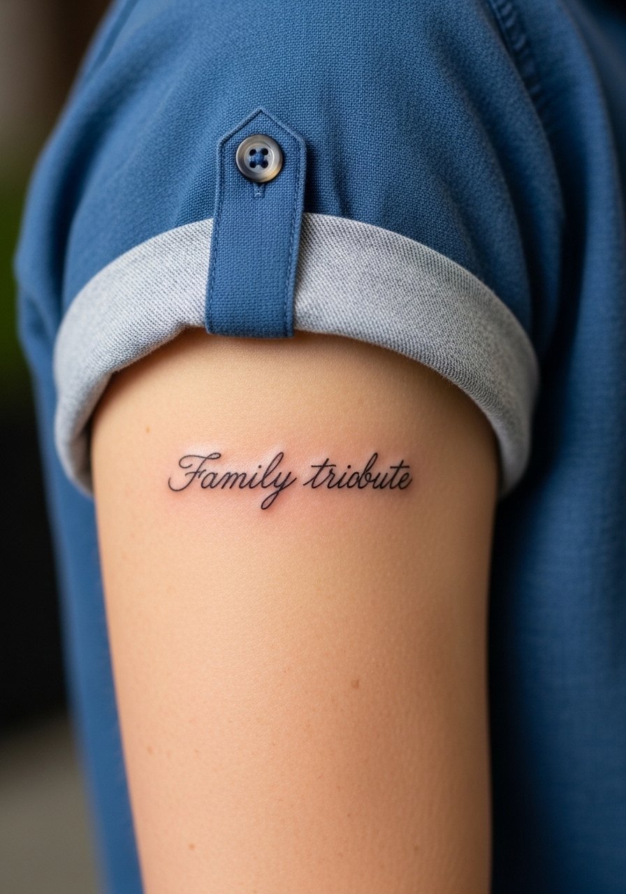
Personal observation lead: I have seen simple family dedications age gracefully when kept to the upper arm with slightly robust linework. Fine line script fits well on the upper left arm and usually finishes in one session. The upper arm experiences minimal daily abrasion, so scripts often need fewer touch-ups than hands or fingers. Avoid extremely thin flourishes that look fragile after a year. Wear a rolled sleeve shirt to frame the piece on casual days and bring a short-sleeve top for the appointment.
9. Haus Laboratories Geometric Emblem on Back of Hand
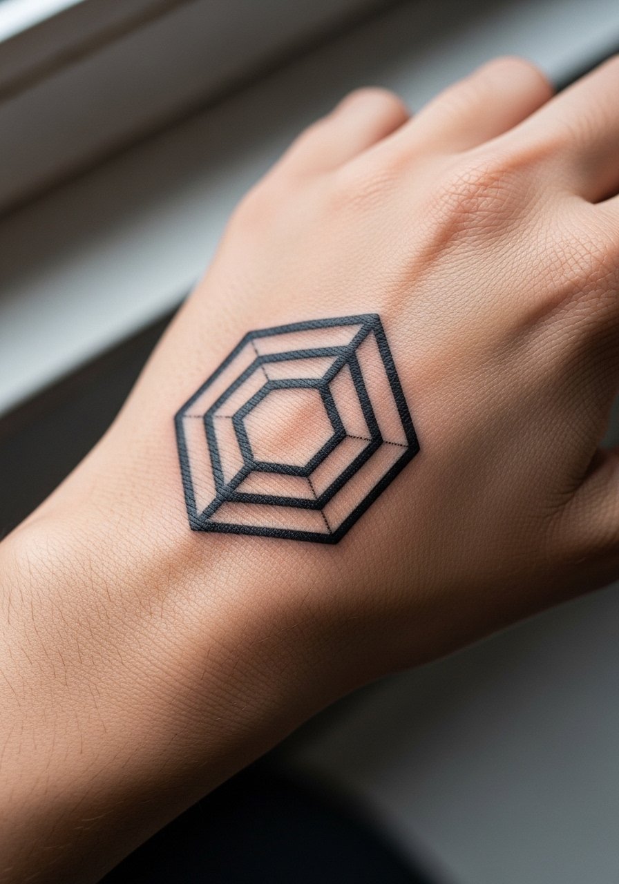
Consultation lead: micro geometric logos on the back of the hand need bold fills and crisp borders to survive washing and friction. A 3-inch solid black emblem holds better than a delicate negative-space design. Expect the session to be quick but plan for a touch-up within the year. For styling, let the hand be visible with a dainty finger rings stack that complements without crowding the blackwork.
10. Anchor on Hip, Nautical Nod
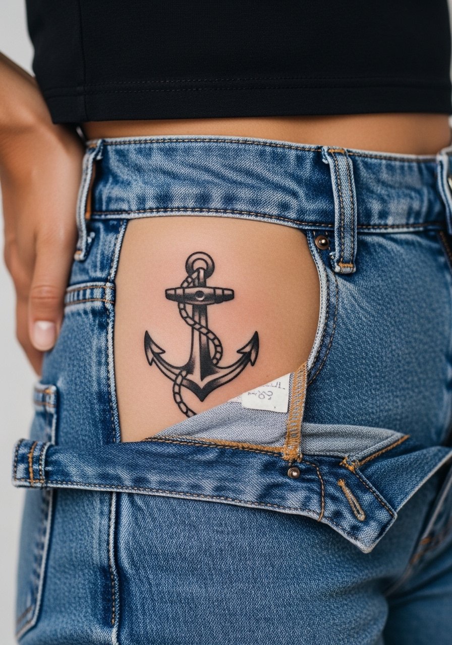
Visual impact lead: a hip anchor reads like a grounding symbol and plays well with midriff or swimwear. Placement is moderately painful and easy to hide under clothing if your job is sensitive to visible ink. Keep the anchor about 4 inches so the bold outline holds through friction from jeans and waistbands. The common error is sinking the design into a crease. During the session wear high-waisted bottoms so the artist can lower the waistband slightly to expose only the target area. For showing off try a side slit dress.
11. R†O Cross on Finger
Mistake lead: fingers are tough on fine script because washing and knuckle movement blur tiny lines. Keep this micro cross ultra-minimal and expect annual touch-ups. Session time is short but the pain is sharp. Ask your artist to use slightly thicker strokes and a tiny halo of negative space so the symbol does not bleed into the finger joints. Hand placement warning: employers in conservative industries may still ask about visible finger ink.

12. Trumpet Instrument on Inner Wrist
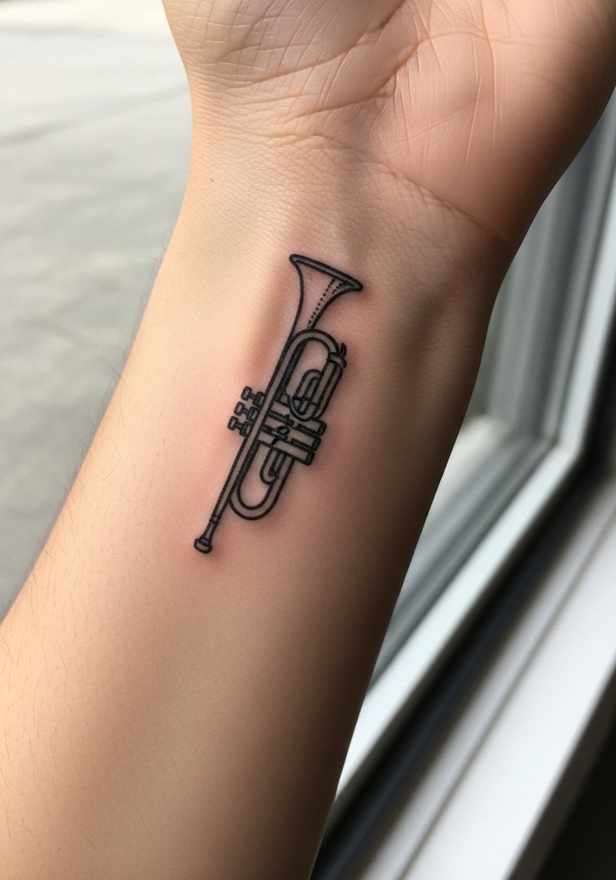
Personal observation lead: music motifs sit naturally on the inner wrist and feel like a personal nod during daily routines. A 3-inch outline of a trumpet is quick and low impact for session time, but the inner wrist sees sunlight, so sunscreen and periodic touch-ups keep the linework readable. Common mistake is over-detailing valves and tubing at small scale. For a tidy look roll up a white button up sleeve or add a thin leather cuff on the opposite wrist.
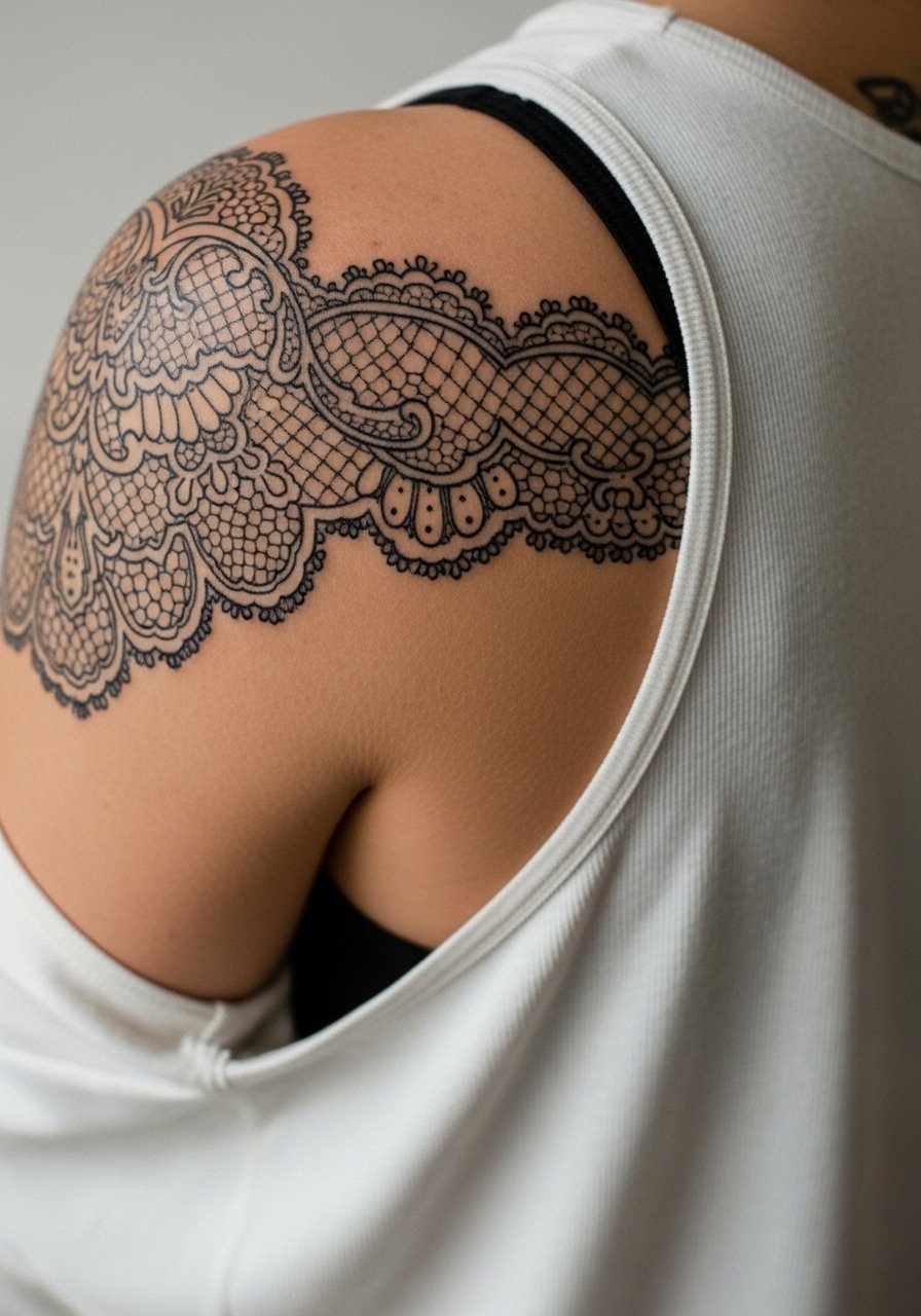
13. Fame Monster Lace Shoulder Blade Accent
Visual impact lead: shoulder blade lace reads dramatic under tank tops and is easier to hide than a full back piece. For a lace accent that references album motifs, plan a 5-7 inch cluster of paisley-style elements with bold outlines and open negative space. Pain is moderate and sessions can be split into outline and fill. A mistake I see is crowding the shoulder blade with too many tiny motifs that merge after a few years. For the session wear a loose tank top so the artist can adjust exposure without you being uncomfortable.
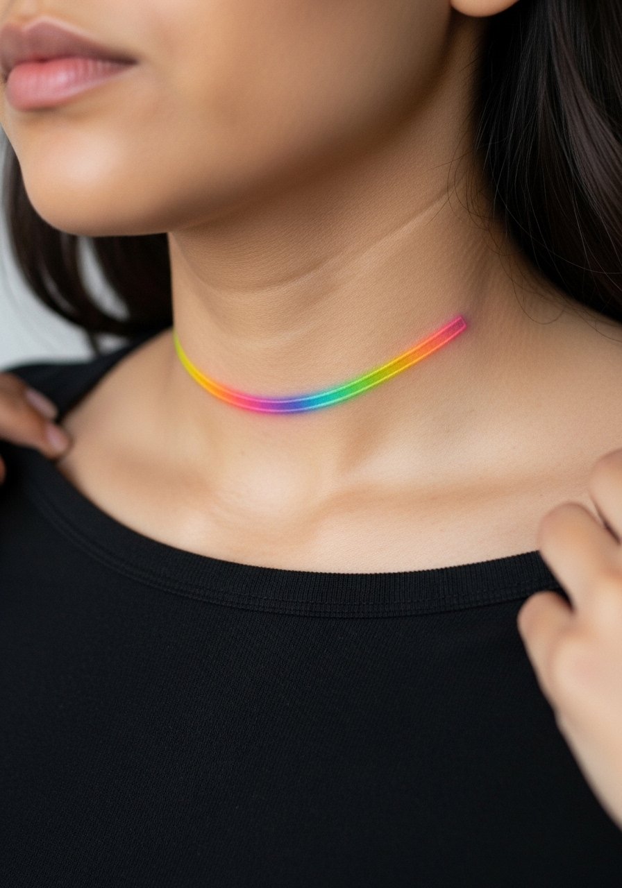
14. Chromatica Neon Bar Accent on Collarbone
Visual impact lead: neon-inspired bars or minimalist color flashes across the collarbone catch light without competing with larger pieces. The collarbone tolerates short sessions well but is boney, so expect sharp sensations. Keep color saturation high and use simple bars rather than gradients that blur over time. For show-off looks pick a thin chain pendant necklace that sits above the color without overlapping the ink.
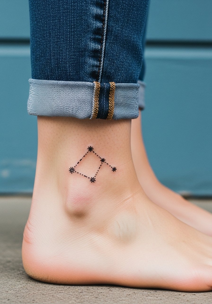
15. Little Monsters Constellation on Ankle
Consultation lead: ankle pieces face daily friction, so solid dots and slightly thicker connecting lines work better than pin-thin star points. A constellation referencing fan community symbolism at ankle size needs careful spacing and usually finishes in one session. Avoid overly complex connector lines or shading too close to the ankle bone. Show it off with jeans rolled up or sandals and plan a quick session day outfit like cropped denim or a rolled sleeve shirt to keep the look casual.
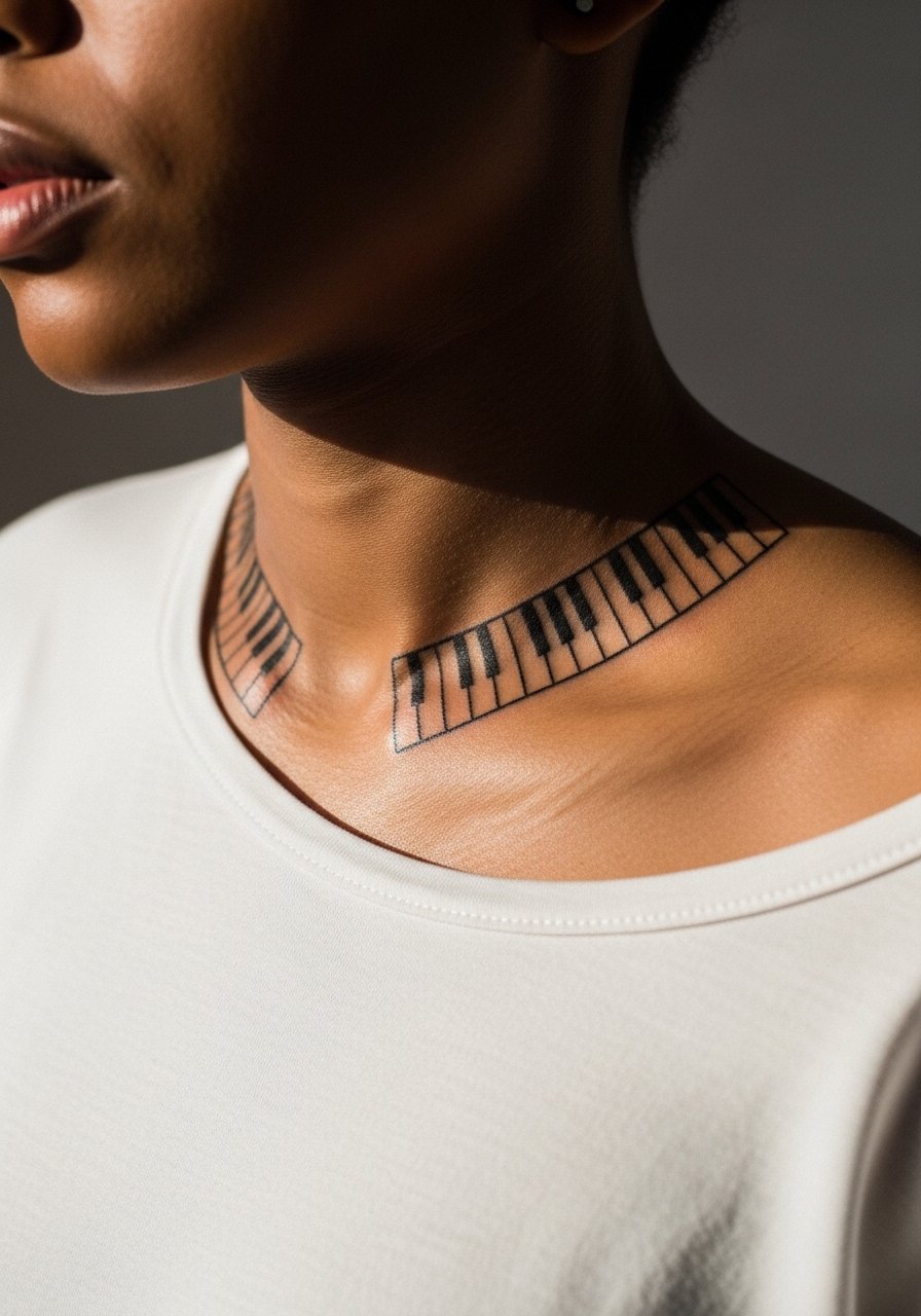
16. Piano Keys Along Collarbone or Rib Edge
Mistake lead: rhythm motifs like piano keys can look too busy when shrunk down. For collarbone or side-rib placement choose spaced keys and subtle negative space to keep readable detail. Pain varies by placement, but small keys on the collarbone finish fast. During consultation request clean black fills and ask the artist to preview the scale on your skin first. Pair with a thin chain pendant necklace that sits just above the keys for a staged look.
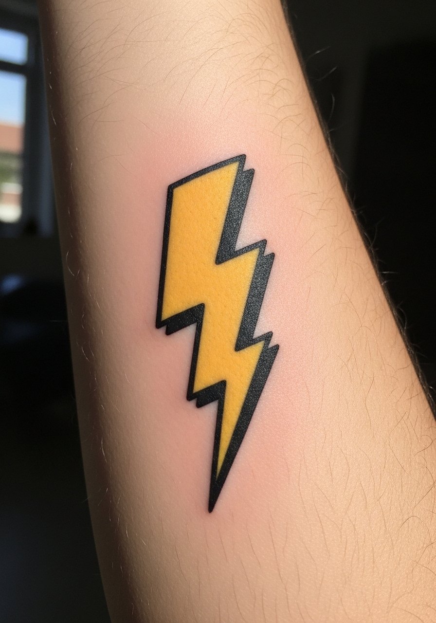
17. Pop Art Lightning Bolt on Forearm
Visual impact lead: a pop art bolt in solid color or black fills well on the forearm and handles everyday wear. Forearm pain is low and a single session can deliver crisp saturation. A common misstep is gradient fills that fade into patchy areas. Ask for a solid graphic and thicker outlines so the bolt keeps its edge as it heals. For casual framing roll sleeves and wear a white button up cuffed just above the tattoo.
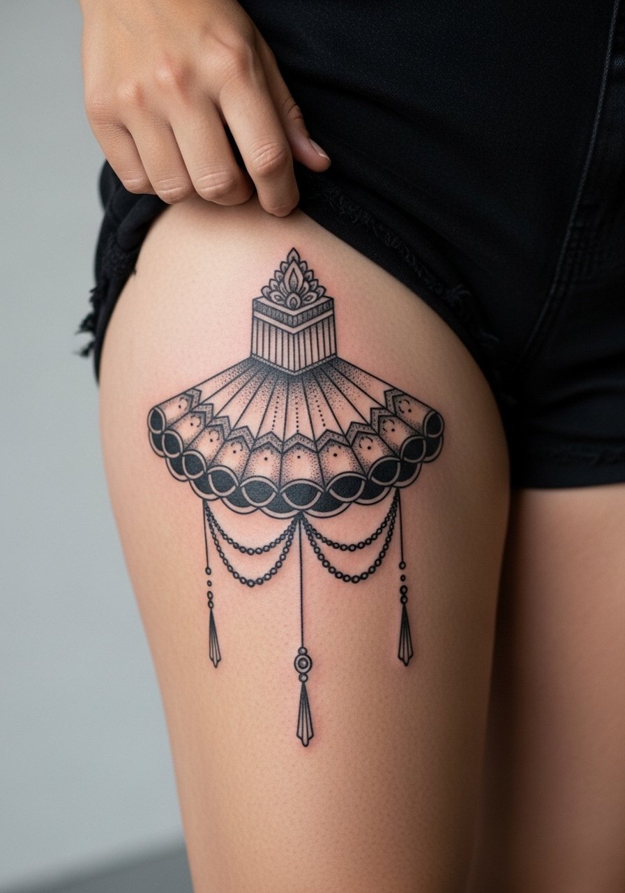
18. Meat Dress Abstract Pattern on Thigh
Consultation lead: thigh panels let you go large without exposing sensitive areas publicly. Abstract meat dress references can become ornamental textures across the outer thigh. Thigh sessions are longer but tend to be less painful than ribs. A mistake is too-small detailing that disappears when the skin settles. For the session wear high-waisted shorts or a wrap so the artist can shift fabric without exposing more than the tattoo zone. Inner thigh or very intimate placements require a different approach and extra discretion.
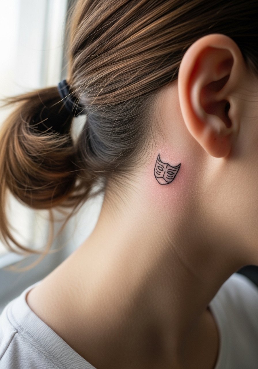
19. Poker Face Mask Micro on Behind the Ear
Decision-pressure lead: behind-the-ear pieces read intimate and pop when hair is up, but they need careful framing to avoid looking pasted on. Describe it as "on the skin behind the ear, below the hairline on the neck" to get the placement right. Pain is brief. The area is small so keep features simplified. For session wear an updo or a loose ponytail and bring a loose ponytail holder to keep hair completely out of the way.
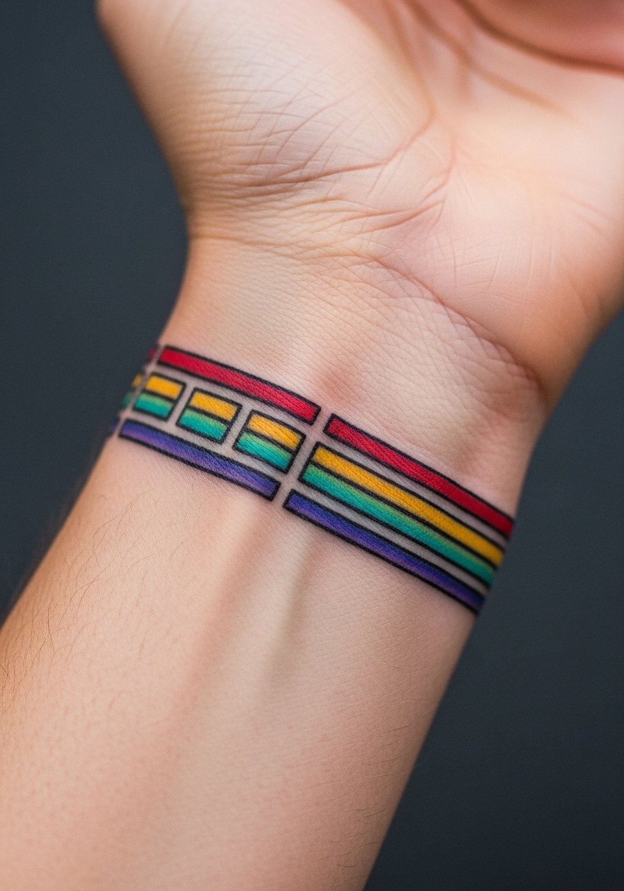
20. Chromatic Bar Wrist Wrap
Aging lead: small color bands circling the wrist can look neat at one year but can blur into a single band if lines are too close. If you want multiple thin bars, space them and ask for saturated pigments with clear breaks. Wrist skin gets frequent washing, so expect minor fading. For a polished look add a thin leather cuff on the opposite arm and roll up to let the bars show.
21. Electric Heart Sternum Accent
Pain warning lead: sternum placements are sensitive but central pieces can be worth the discomfort if you want a design visible in specific tops. Use a fitted sports bra or bandeau for the session and for photos to keep exposure controlled. Keep the heart simple with clean blackline and small color accents so healing is uncomplicated. If you travel for the session plan for a robe or zip-up hoodie to avoid friction on the day home.

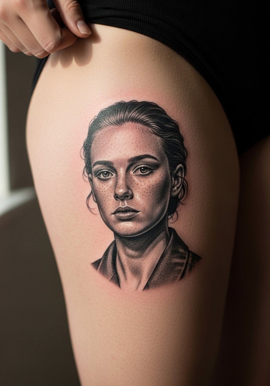
22. Retro Micro Portrait on Upper Thigh
Visual impact lead: the upper thigh is forgiving for micro-realism and holds detail when done at slightly larger sizes. A 4-6 inch portrait in black and gray ages well on the thigh compared with ribs. Sessions can run long but touch-ups are usually rare. A common mistake is shrinking portraits too much to "save on needle time." For the appointment wear high-waisted bottoms you can slide down slightly without full exposure.
23. Minimal Script Behind Collarbone
Personal observation lead: scripts behind the collarbone look intimate and photograph well in editorial shots. Keep the letters spaced and slightly bolder than you think if you want them to read in photos later. Collarbone pain is moderate and session time is short. The biggest mistake is cursive flourishes that stitch into the collarbone's natural shadows. Pair with a thin chain pendant necklace so jewelry frames the script.

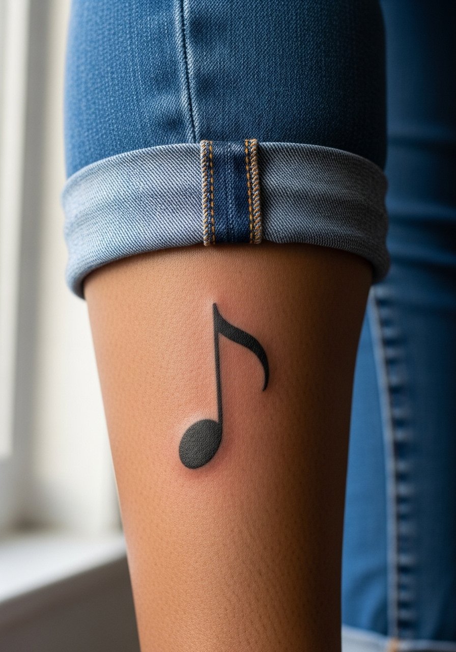
24. Bold Single-Note on Calf
Visual impact lead: a single musical note on the calf makes sense for touring musicians and fans because the calf ages gently and handles larger black fills. The pain is low and sessions are quick. Avoid tiny, overly detailed notes that get lost when the calf is in motion. For styling, pair with midi skirts or cropped pants so the notes show off without being covered.
25. Experimental Flash Collage on Shoulder Cap
Consultation lead: if you like Gaga's theatrical reveals, a shoulder-cap collage of small flash elements gives variety without needing a full sleeve. Request a custom flash session where the artist draws multiple small motifs to fit your shoulder curvature. Pain is moderate and you can spread elements across two sessions. The common mistake is copying a celebrity's exact grid instead of letting the artist compose pieces that flatter your anatomy. For the session wear a loose button-down shirt you can pull aside.

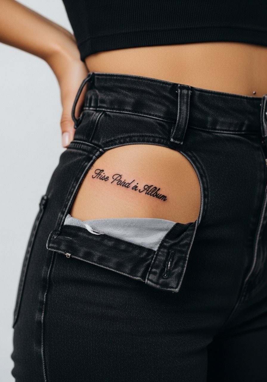
26. Subtle Album Title Script Near Hip Bone
Mistake lead: near-hip script needs spacing and slightly thicker weight to survive waistband friction. Keep the phrase short and the letters spaced by at least a third of the font height. Pain is low and session time is brief. For layout decisions bring placement photos and try temporary transfers. Wear high-waisted bottoms during the session so the artist has clear access without full exposure.
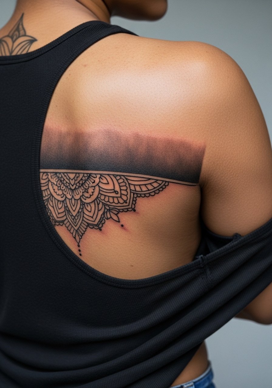
27. Back-to-Rib Flow for Multi-Piece Sleeve
Consultation lead: mapping a back-to-rib flow is about motion. Start with a bold upper back element like a paw or cherub and let the rib pieces tuck into the arc. This approach reduces noticeable seams and gives coherence across body curves. Expect multiple sessions and a realistic touch-up schedule. A real mistake is forcing tight continuity without negative-space breaks. For session ease wear a loose tank top that can be adjusted as you move from back to side work.
Pack Smart
The neck, back, ribcage, spine, and forearm pieces above demand slightly different prep and small kit items to smooth the session and the first week.
-
Stencil transfer paper kit. Lets you preview the design scale on skin before committing, which is handy for portrait and script placements discussed above.
-
Topical numbing cream. Applied about 45 minutes before can reduce sharp sensations for sternum and rib work without affecting line quality.
-
Thin protective film roll. Keeps hand and wrist tattoos cleaner during the first week of frequent washing and friction.
-
Fragrance-free gentle body wash. Mild cleansers help rinse salt and sweat without stripping pigments on delicate script and micro-realism work.
-
Aquaphor healing ointment. A thin layer during the initial 48-72 hours helps seal moisture while you handle aftercare for fine line forearm and ribcage pieces.
Frequently Asked Questions
Q: Will fine line ribcage lace blur faster than a neo-traditional ribcage piece?
A: It depends on spacing and skin movement. Fine line lace on the ribs is at higher risk of softening when the lines are very tight. Neo-traditional lace with slightly thicker contours and more negative space usually keeps definition longer. Ask your artist about healed mockups on skin before you commit.
Q: How often should hand and finger survivor symbols be touched up?
A: From what I have seen, hand and finger micro symbols usually need touch-ups around year one to year two if they were done in a very fine hand. Choosing stronger line weight from the start reduces the frequency, but expect seasonal fading from sun and washing.
Q: Artists disagree about numbing for spine roses. What should I consider?
A: Name both camps and ask your artist where they stand. One side says numbing keeps clients comfortable for long spine sessions. The other side worries it can mask too much sensation and make positioning harder. If you try numbing, test for skin reaction beforehand and discuss how it might change ink depth.
Q: Will a portrait on the ribs distort with weight change more than the thigh?
A: Yes, ribs shift with breathing and weight fluctuations more than the upper thigh. If you want portrait realism and you anticipate body changes, the thigh is a safer long-term canvas for tight facial detail.
Q: What should I wear to a session for back-to-rib flow pieces?
A: A loose tank top or a button-down you can slide aside helps the artist access both back and side work without you being uncomfortable. For show-off days pick a backless halter top that frames the upper back art while keeping the rest covered.
Q: Where can I find artists who do Gaga-inspired custom work without naming names?
A: Search hashtags like #ladygagatattoo and #monstertattoo on social platforms, filter by "gaga inspired" on booking apps, and check guest spot calendars on tattoo directories. Reddit threads and local convention lists also help you spot touring specialists who match the styles in this gallery.