
Fine line upper arm work looks delicate in photos and bold in real life, and that gap matters when you plan placement. Trends push tiny detail toward the bicep, but the skin and movement there change how linework settles. Keep scale, spacing, and touch-up expectations front of mind and you will get a piece that still reads well after a few summers. The first idea below is the kind of starting point that makes those choices obvious.
1. Delicate Botanical on Outer Upper Arm
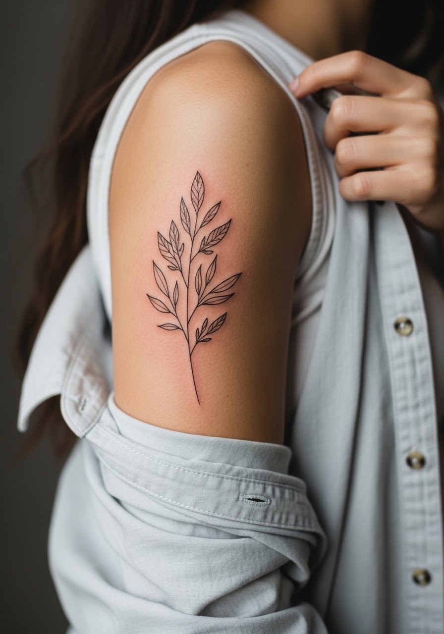
I recommend this when you want something readable from a short distance that still feels airy up close. Tell your artist you want single-needle linework with modest spacing between leaves so the piece does not merge as the skin ages. Common mistakes are asking for the same reference at too small a scale or asking for excessively thin stems. Pain on the outer upper arm is low to moderate and a session usually fits into one two-hour slot. For showing it off, roll the sleeves of a loose button-down shirt so the spray sits in the gap between fabric and sleeve.
2. Bold Neo-Traditional Upper Arm Portrait

There is real visual impact when portraits are given solid outlines and deliberate saturation rather than tiny photoreal detail. Ask for slightly heavier linework around the face and simplified color blocks to avoid muddying over years. The session feels like medium discomfort because the shoulder and tricep can overheat under the machine, and expect a two to three hour block for mid-sized pieces. The controversy here is about detail level. One camp favors micro-realism at any scale and another favors simplified shapes that age into readable forms. If you prefer longevity, side with saturation and clean linework.
3. Inner Bicep Micro-Realism Scene
Fair warning: the inner bicep is one of the more sensitive spots on the upper arm. The delicate dot and whip shading used in micro-realism can look exquisite at six months and softer by year three. A common mistake is placing an overly detailed scene too small. In consultation, specify which areas must keep crisp contrast so the artist can plan punchy highlights. Sessions here can feel sharp in short bursts and often need breaks. Expect a touch-up at year two or three if you care about crisp micro texture. For the appointment, a fitted tank that you can lift slightly makes access straightforward.
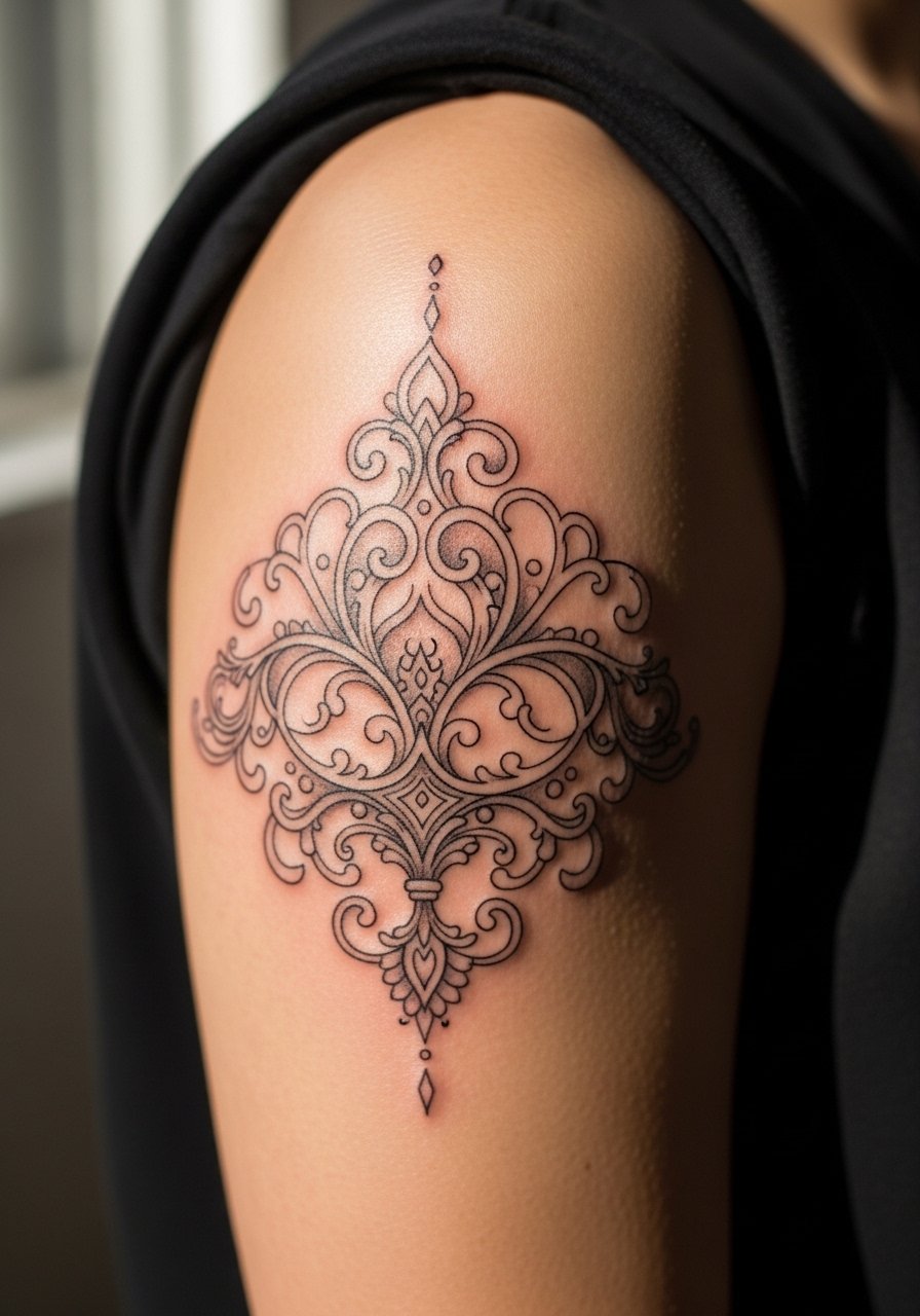
4. Blackwork Band That Wraps the Arm
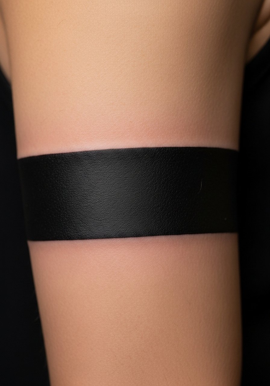
A thick black band ages into a strong graphic element because saturation holds well. Tell your artist you want a few millimeters of breathing room between the band and surrounding skin elements to avoid blowout risk. The biggest mistake is asking for multiple stacked thin bands instead of a single confident width. Pain is low to moderate. This can be done in one long session and rarely needs touch-up if saturation is even. Pair it with short-sleeve shirts that show the break between sleeve fabric and band for impact, like a racerback tank for casual wear.
5. Script Wrap with Negative Space
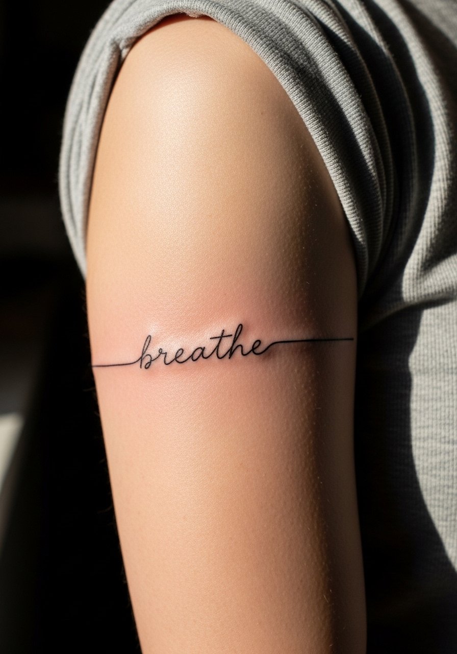
Place actual words carefully. If you want script around the arm, make sure the artist uses a readable typeface and leaves negative space so the letters do not touch after healing. The practical mistake is choosing very narrow letterforms that thicken and blur into one another. For sessions, this tends to be quick but sensitive where the needle passes over bony ridges. Expect touch-ups at year three for very thin script. For everyday wear, a simple short-sleeve tee keeps the text visible without overwhelming.
6. Stipple Shaded Mandala on the Shoulder Cap
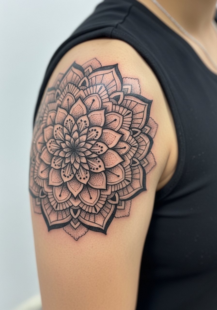
Most mandalas succeed when they are scaled to let the stipple shading breathe. Tell the artist you want dotted gradients rather than continuous graywash in dense areas. The mistake people make is packing too many tiny concentric rings into a small piece. Sessions can be meditative and the shoulder tolerates longer runs of dot work. Expect the piece to soften slightly by year three, but stipple reads as texture rather than muddle if spaced correctly. For the session wear a loose button-down shirt you can pull off one shoulder for clear access.
Studio Day Picks
The first six ideas include delicate lines, dense blackwork, and inner bicep access concerns. A small kit can make the chair day and the first week easier to manage.
-
Stencil transfer paper kit. Lets you test placement on the skin before committing, which is useful for wrapped scripts and mandala centers.
-
Topical numbing cream. Applied as directed before the appointment eases inner bicep and shoulder cap sensitivity without changing the artist's approach.
-
Thin protective film roll. Keeps friction zones like the arm band and script tidy during the first few days of movement.
-
Fragrance-free body wash. A gentle wash prevents irritation around detailed linework while you shower.
-
Aquaphor healing ointment. A thin layer for the initial window helps preserve fine single-needle impressions without clogging the skin.
7. Neo-Japanese Upper Arm Koi and Waves

If you like movement and scale, a neo-Japanese koi wraps the upper arm well. The consultation note should emphasize clear black outlines and separate color fields so the orange and blue stay distinct outdoors. Common errors include over-detailing scales in a cramped area. Sessions run longer because of color packing and shading. Expect robust longevity from saturated color but plan for a color-boost touch-up around year three. For evening wear, short sleeves or rolled cuffs let the scene read without competition.
8. Single-Needle Floral Collar That Sits High on the Arm
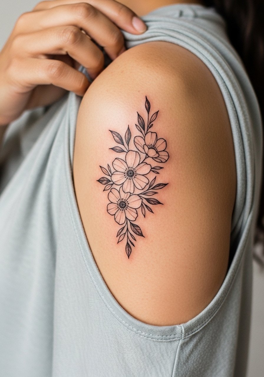
Single-needle florals can read crisp for the first year and then soften gracefully if spaced well. Ask for slightly thicker petal contours than your reference so the linework remains legible over time. A typical mistake is using ultra-thin single-needle across the entire petal, which makes the whole piece fade unevenly. A one to two-hour session is common. For show-off outfits try a wide-neck shirt to reveal the high placement.
9. Minimalist Crescent Moon Stack

Minimal stacks work when scale is honest. My observation is small moons need breathing room between each crescent so they do not merge in the years after. The usual mistake is compacting them to fit a narrow band. Sessions are short and relatively low pain. Expect a touch-up for ultra-thin moons at year two to maintain crisp crescents. For casual wear a thin bracelet or cuff frames the stack without competing for attention.
10. Ornamental Band with Dot Work Accents
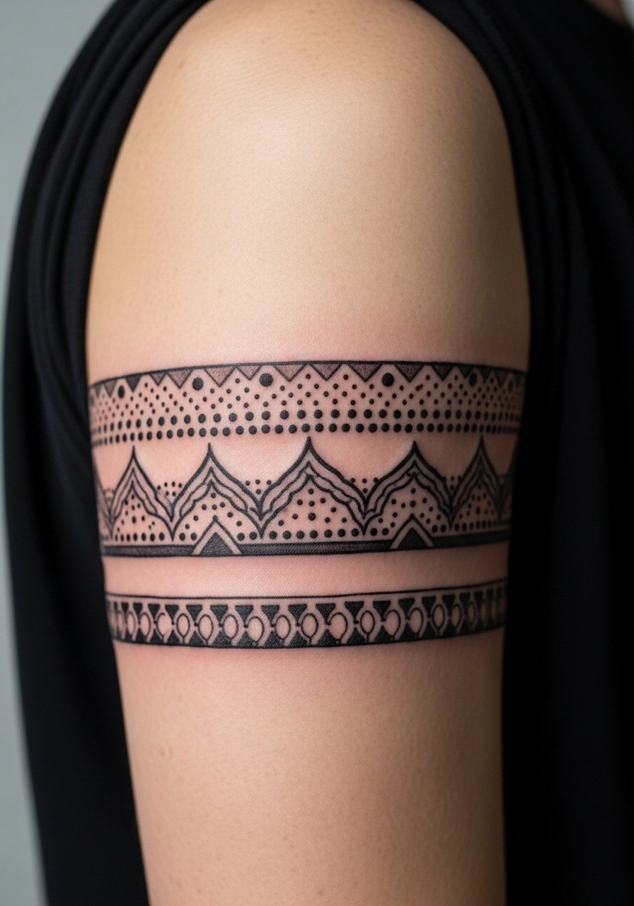
Ornamental bands age well if the negative space is planned. Tell your artist you want alternating dense and airy sections so the eye has places to rest. A frequent mistake is a continuous dense pattern that becomes a single dark stripe over time. This placement is low pain and can be completed in one session. Pair the band with rolled sleeves or a short-sleeve linen shirt for casual framing.
11. Geometric Half-Sleeve Flow

Choose geometric flow when you want a modern sleeve that reads from distance. During the consult, map negative space so the shapes keep definition as the arm moves. The mistake is repeating identical angles without accounting for muscle curvature. Sessions are broken into two or three blocks and can feel repetitive but manageable. Expect the geometry to need minor touch-ups where the skin creases. For finishing looks, sleeveless tops or a linen vest keep the lines visible.
12. Inner Arm Script with Small Icon
The inner arm is sensual and sensitive, so scale matters. One camp of artists says thin script on the inner arm blurs quickly, while another insists careful depth and spacing will keep it readable. Name both camps in your consult so the artist can explain their success rate. The common error is asking for minute cursive in a narrow band. Sessions can be short but sharp. Expect a touch-up if the script is very thin. For the appointment, a racerback tank is convenient and keeps the area accessible.
13. Classic Sailor Anchor with Modern Fill
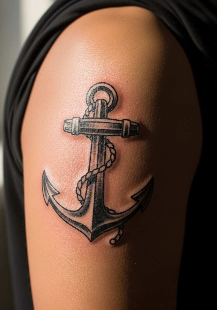
Traditional shapes like anchors still age predictably because the outlines are bold. Ask for slightly heavier outlines and modest color saturation inside the anchor to avoid color bleed over time. A mistake people make is crowding the anchor with tiny decorative details that age differently. Sessions are low to medium pain. Touch-ups are usually unnecessary unless you want color brightening at year three. For nautical looks, rolled sleeves or boatneck tops show off the symbol neatly.
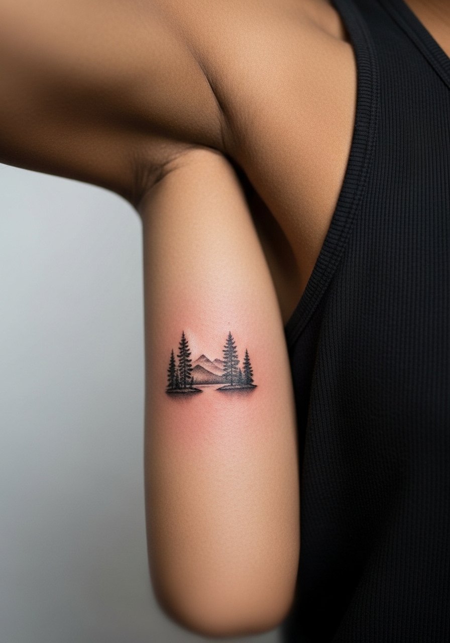
14. Illustrated Animal Portrait in Black and Gray
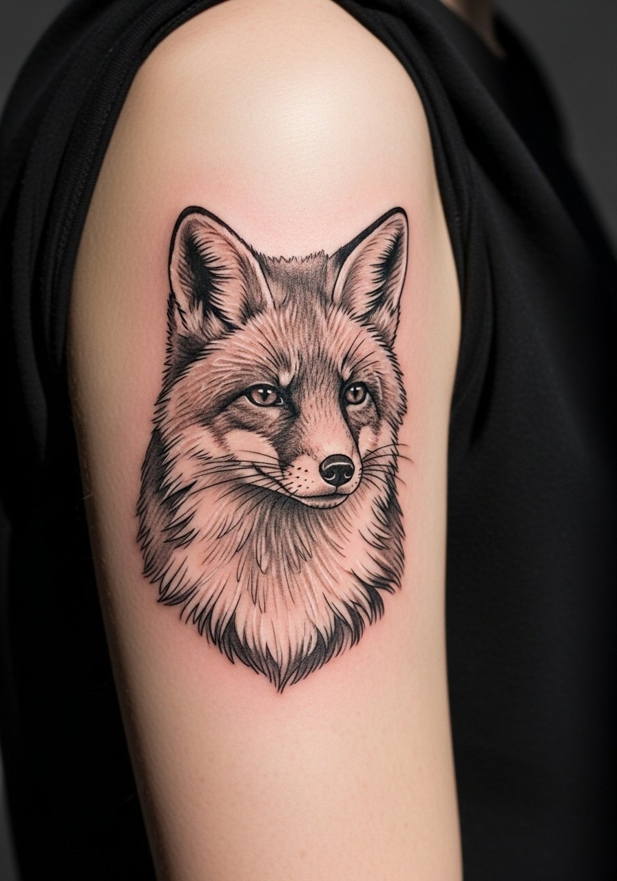
An illustrated animal in black and gray can be expressive without the complexity of true realism. Tell your artist you want definite contrast between darks and lights and modest texture in the midtones. The error to avoid is requesting photographic detail at a size too small for the arm. Sessions vary with size but often run two hours. Artists split on tiny midtone details versus broader shading. If you want longevity, go with clear distinction between black and gray. For evenings wear a thin chain pendant necklace that sits above the arm without drawing eyes away.
15. Botanical Sleeve Fragment with Negative Space

Fragments work when they respect arm anatomy. During consults I advise clients to think in clusters rather than continuous vines. The most common mistake is trying to wrap the whole arm in a single session which kills the breathing room the design needs. Sessions are modular and usually spread across visits. Expect the negative space to soften but still read as separation if spacing is generous. For showing off a fragment, short sleeves or sleeveless dresses help, and a open-back midi dress works well for evening occasions.
16. Single-Needle Constellation with Tiny Stars
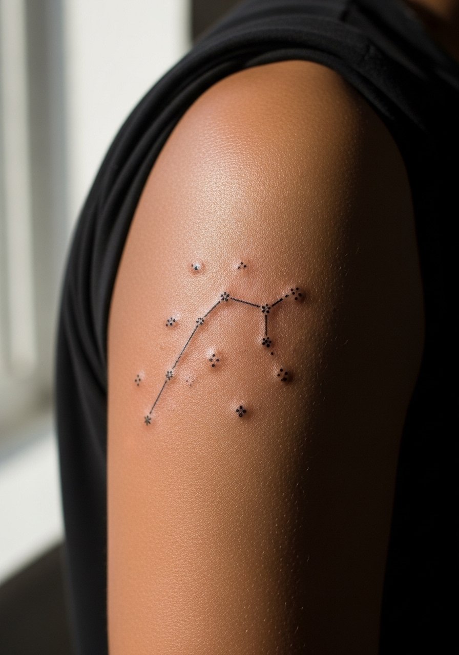
Constellations look neat when dots are spaced and stars are given slight weight variations. Tell the artist to plan slightly heavier anchor points so the pattern keeps a readable shape over time. The mistake is putting all points at identical thinness. Sessions are quick but can feel sharp on thin skin areas. Expect touch-ups after two to three years for the faintest points. For a subtle daily look, pair the constellation with a dainty bracelet that does not crowd the upper arm.
17. Decorative Compass Rose with Fine Line Details
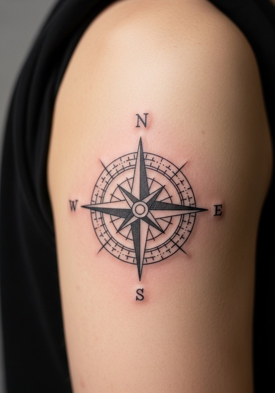
Compasses read as intentional when their points are clean and the central axis stays bold. Tell your artist to punch up the center contrast and make outer points slightly thicker. The common mistake is making all points identical thinness. Sessions are medium in duration. Expect minor softening at year three if tiny spikes are used. For travel-friendly outfits, short sleeves or a lightweight bomber jacket work to reveal the compass when you want.
18. Painterly Watercolor Splash with Line Anchor

Watercolor on the arm must be tied to linework or it will bleed into an indistinct wash over time. Ask your artist for sharp line anchors and intentional color pools. The mistake is asking for diffuse watercolor without anchor lines. Sessions can be lengthy because of layering. Expect more frequent color-touch-ups than for blackwork. For casual outfits, a simple white linen tee lets the color sing without distraction.
19. Chain-Link Pattern That Circles the Arm

Chain patterns feel industrial and hold up if links have clear negative breaks. Common mistakes include too many small interlocking details that blur. Sessions are straightforward and usually one block. Expect durable results thanks to bold linework. For everyday wear, rolled sleeves show the pattern cleanly without competing jewelry. A narrow cuff watch would crowd the look, so keep accessories minimal.
20. Illustrated Floral Portrait with Color Accents

Blending portrait and floral elements benefits from simplified facial detail and saturated florals. Tell the artist which element you want to remain the visual anchor. The common error is insisting on hyper-real faces alongside dense florals at small scale. Sessions run longer. Touch-ups for color may be due at year three. For dates or events, a wrap dress with short sleeves frames the image elegantly.
21. Whip-Shaded Abstract Line Work

Whip shading adds motion and soft texture while keeping a graphic skeleton. Ask your artist for tapered strokes and leave space between arcs. The typical mistake is trying to compress too many strokes into one area which creates muddiness. Sessions are rhythmic and can be longer. Expect a softening of the tapered tips after a few years. For casual framing, a loose drawstring linen pant and short sleeves show the arms without distraction.
22. Botanical Line Sleeve with Intermittent Color

Intermittent color reduces the need for constant saturation while giving pops that last. Tell the artist to separate color islands from thin linework so they do not soak into each other. The mistake is running color through every leaf which increases future maintenance. Sessions are staged. Expect touch-ups focused on the color islands. For events, a sleeveless blouse highlights the sleeve without tugging at the edges.
23. Single Motif Statement Piece

A single motif can be more powerful than many small elements when the scale is honest. During consults I suggest a focal size that reads from arm's length. The common mistake is shrinking a motif to fit other elements. Sessions for a single motif are short and targeted. Expect the motif to remain legible for longer than clusters if outlines are intentional. For an evening look, a thin chain bracelet pairs without crowding the motif.
24. Ornamental Filigree with Soft Shading
Filigree reads best when contrast between outline and fill is deliberate. Ask for midtone shading and avoid ultra-thin inner curls that the skin might not hold. The mistake is over-detailing tiny curls. Sessions vary. Expect the filigree to soften but still read as texture if spacing is planned. For styling, an open shoulder blouse shows just enough skin to frame the filigree.
25. Stylized Animal Silhouette Band

Silhouette bands are graphic and resilient. Tell your artist to keep each silhouette slightly separated by negative space. The mistake is chaining silhouettes closely so they merge after healing. Sessions are quick. Expect strong longevity because of solid black mass. For casual wear, short sleeves reveal the rhythmic band without over-accessorizing.
26. Mini-Realism Flower Cluster with Color

Mini-realism needs scale to read. Ask for emphasized centers and modest color contrasts so petals remain distinct. The error is cramming micro detailing into a tiny space. Sessions can be one to two hours. Expect touch-ups to refresh the pigment and crispness at year three. For showing it off on warm days, a short sleeve linen shirt makes the cluster easy to display.
27. Illustrated Script Banner with Small Icon

Script banners that combine lettering and a small icon look classic when spacing is generous. Specify the exact lettering style and give the artist permission to scale letters slightly wider for longevity. A common mistake is insisting on condensed letterforms that close up as they heal. Sessions are moderate in length. Expect letter touch-ups at year three if you want razor-sharp edges. For a clean look pair with a loose button-down shirt you can roll up to show the banner.
Frequently Asked Questions
Q: Will single-needle fine line on the outer upper arm blur faster than a bold blackwork piece?
A: Fine line tends to soften sooner than bold blackwork because the pigment sits in narrower channels. If longevity matters, ask your artist to increase slightly the line weight and to space elements so you do not rely on micro detail alone. Placement and sun exposure matter more than the brand of ink.
Q: How should I dress for an inner bicep or armpit upper arm session to make the process easier?
A: Wear a tank top or a sleeveless shirt with a slightly wider arm hole so you can lift or shift it easily. A racerback tank works well because it clears the underarm without removing layers.
Q: Do watercolor-style splashes need different upkeep than line-focused designs on the upper arm?
A: Yes. Watercolor splashes rely on subtle color gradients and can fade faster, so expect more frequent color touch-ups. Line-focused pieces usually need less color maintenance if the outlines are bold.
Q: If I want a portrait-style piece on my upper arm, which style choice improves long-term legibility?
A: Simplified illustration with bold contrast holds up better than photo realism at small scales. Ask for clear black anchors around facial planes and controlled saturation in shaded areas. This keeps the portrait readable as the skin texture changes.
Q: Are there placement considerations on the upper arm for someone who works in an office setting?
A: The outer upper arm is easy to conceal with regular short or long sleeves. Inner bicep and very high shoulder pieces are less visible in business attire. Think about how often you want the tattoo seen before you choose exact placement.
