
Fine line spine tattoos are everywhere online, and the gap between how they look fresh and how they wear over time is real. The style reads delicate at first, but placement and spacing determine whether the work softens into a blur or stays readable. Below are carefully chosen spine ideas, what to ask for at the consult, and the wardrobe tips that actually help the pieces age well.
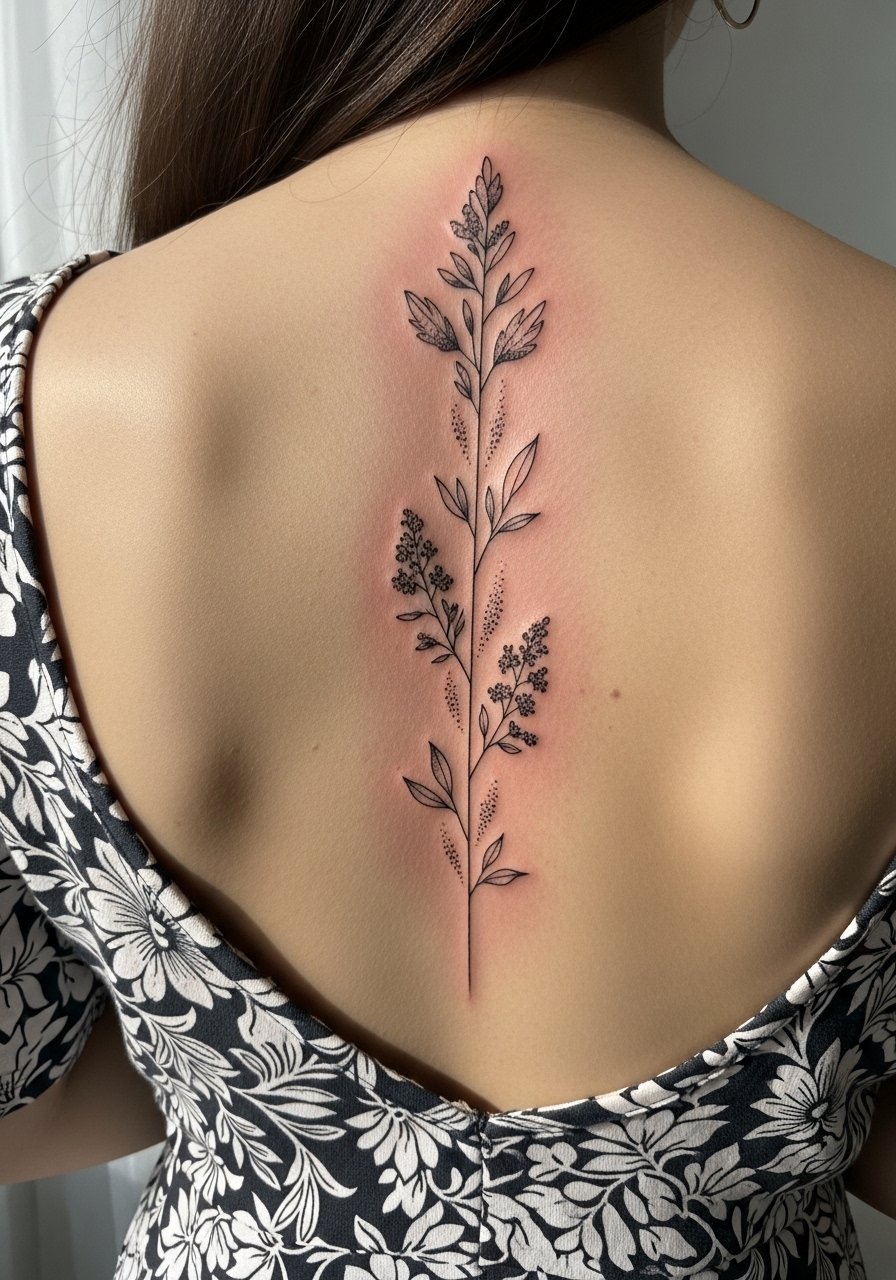
1. Delicate Botanical Runner Down the Spine

I recommend this if you want something readable at long range that still feels intimate. In consults I tell people to ask for slightly increased spacing between leaves so the veins do not merge after a few years. Expect a one to two hour session for a 6 to 8 inch runner, and fair warning the spine can register as a six or seven on common pain scales. Common mistakes are asking for too many tiny leaves and insisting on ultra-thin lines without spacing. For showing it off, an open-back midi dress or a racerback tank frames the central line without cutting into the composition.
2. Single-Word Script Aligned with the Vertebrae

When you want a word that reads like a spine annotation, tell the artist the exact font size and letter spacing you want. Text on the spine ages differently than on the arm because of skin compression during sleep and movement. Expect a shorter session if the script is five words or fewer. The biggest mistake is choosing a font that looks delicate on-screen but becomes illegible as the ink settles. Touch-ups are common around year two or three for tiny letters. For nights out, a thin chain pendant necklace sits just above the script and helps draw the eye upward without fighting the vertical text.
3. Stacked Minimalist Glyphs Along the Spine

I've seen this layout work when each glyph has breathing room. In consultations I suggest avoiding repetitive tiny dots that sit too close together. This style splits artists into two camps. One camp says ultra-fine dots on the spine blur within two years because of skin movement. The other camp argues that proper needle depth and spacing let glyphs stay crisp. Ask your artist which side they fall on before booking. The session feels like repeated light taps, and you should plan for a touch-up in two to four years depending on exposure. Avoid dense clustering near the lower spine where friction from waistbands can dull the marks.
4. Micro-Realism Floral Column

If you like detail but want longevity, ask for tiny stipple shading rather than heavy gray wash. The stipple holds texture without saturating the needle channels, which helps fine line read longer. Expect a longer session because micro-realism demands layered passes. A common mistake is compressing too much detail into a short vertical space. Overly dense shading on the spine can merge by year three. For the appointment, a loose button-down shirt you can pull aside keeps the artist's access clean and reduces fabric rubbing during the session.
5. Geometric Spine Ladder with Negative Space
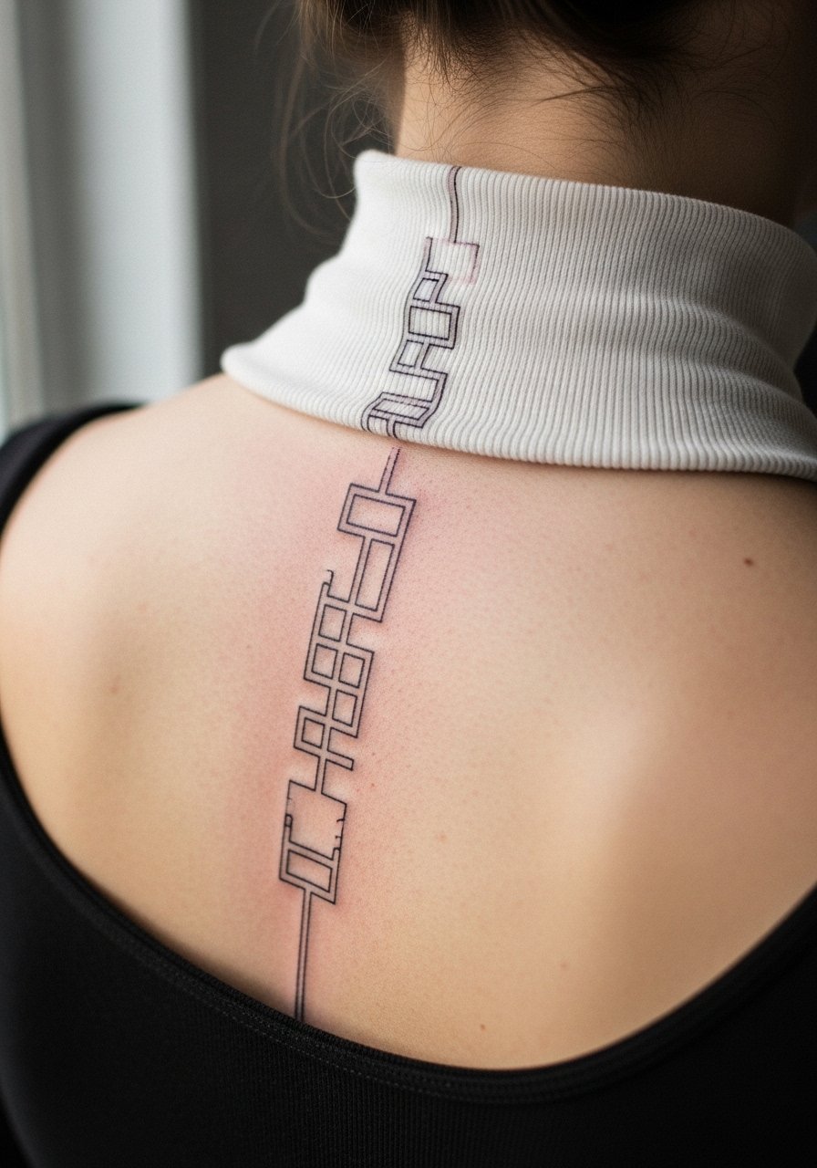
This is a good choice if you want a modern, architectural look that reads well from a distance. During the consult ask for measured gaps between elements so negative space remains obvious as the piece ages. The technique favors single-needle linework and careful spacing. A typical session runs one to two hours, and touch-ups tend to be needed only where the skin flexes most. Mistakes include making the shapes too small for the skin real estate. Pair this design with rolled sleeves or a rolled linen shirt when you want the spine to be visible without stark contrast.
6. Celestial Spine: Stars, Moon, and Constellations
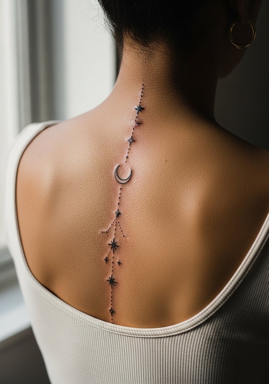
Visual impact is what sells this style initially. For longevity ask the artist to scale the stars so tiny points remain distinct after healing. Expect a multi-pass session if dot work and tiny stars are involved. A mistake I see often is packing too many celestial elements into a narrow strip. That results in crowding when the ink spreads slightly. For showing it off, an open-back midi dress or a simple racerback tank lets the light hit the vertical line and keeps attention on the central motif.
Studio Day Picks
The upper and lower spine pieces above need different prep than wrist or arm work. These picks smooth the session and help protect the fine line during the first week.
-
Stencil transfer paper kit. Lets you and the artist preview exact placement along the vertebrae so the ladder, script, or vine sits where you want it.
-
Topical numbing cream. Applied as directed before the session it can take the edge off spine sensitivity without altering linework when used properly.
-
Thin protective film roll. Useful for the first 24 hours to shield lower spine pieces from waistband friction and for upper back work that might rub against straps.
-
Fragrance free gentle body wash. Cleanses the healing area without stripping the tiny needle channels that fine line relies on.
-
Aquaphor healing ointment. A thin layer in the first days helps keep delicate lines moisturized while you follow the studio's aftercare timing.
7. Minimal Spine Mandala Stack
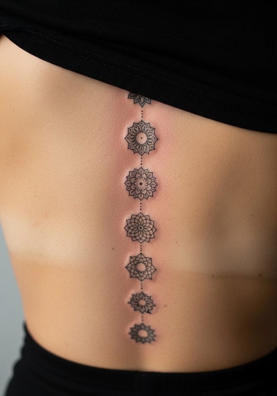
When a mandala is broken into discs down the spine the spacing between discs is critical. In consults I ask artists to show a mockup at scale so you can see negative space. The common mistake is shrinking each mandala so they lose contrast and look like a single blotch after a few years. Plan for touch-ups on the lower discs first because waistband and sitting pressure can affect healing. For sessions, wear high-waisted bottoms and a cropped tank top so the artist can work without fabric obstruction. This layout favors someone who likes symmetric vertical rhythm.
8. Single-Needle Spine Portrait Accent

Fair warning, portraits in single-needle fine line are risky on the spine. The skin there shifts and can soften facial details over time. I have seen portraits that looked crisp at one year and blurred by three. If you insist on a face, scale it larger than you think and ask for stipple shading to preserve contrast. Sessions are long and require patience. Expect a touch-up sooner than for geometric work. Choosing a stylized likeness rather than photorealism usually holds up better on this placement.
9. Ornamental Spine with Metallic Accent Placement

This design adds subtle metallic pigments to highlight key nodes. Artists debate metallic ink use on central back. One camp says metallic particles disturb even settling, causing patchy longevity. The other camp says small, targeted accents can last if placed shallow and sealed properly. Ask about the pigment chemistry during the consult. For sessions avoid tight bras that compress the area. Aftercare for metallic accents may require closer monitoring and an earlier touch-up than plain black linework.
10. Spine Arrow Column That Reads Upward
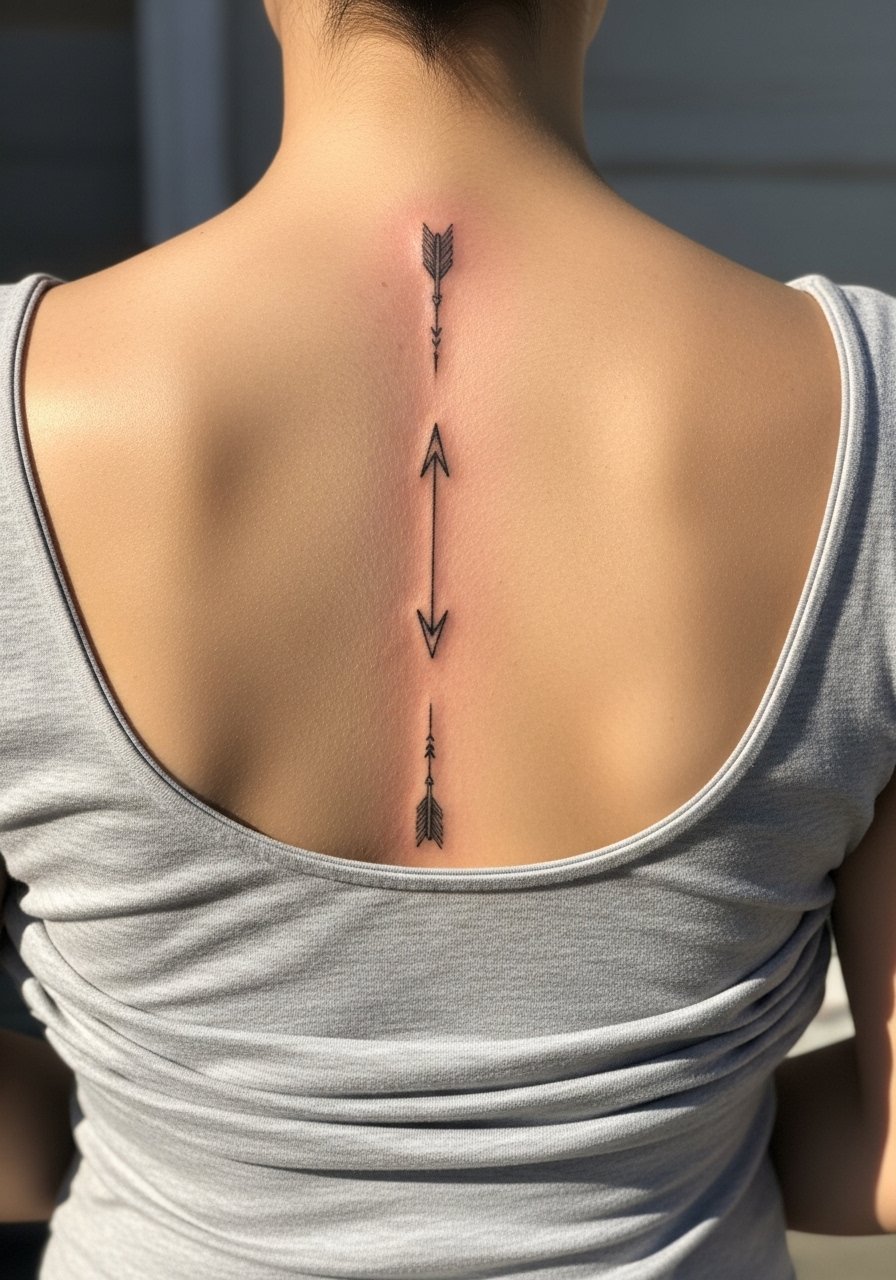
There is a visual momentum when arrows point upward or downward along the vertebrae. Tell your artist whether you want consistent arrowheads or varied shapes because repetition affects aging patterns. This style is forgiving for someone who wants a readable vertical guide without lots of shading. Sessions are moderate in length. A common mistake is making the shafts too fine, which creates long running touch-ups as the shafts blur. Expect the upper arrows to hold better than the lower ones because waistband friction tends to dull lower marks.
11. Negative Space Botanical Spine with Dot Work
Aging and contrast are why I recommend negative space for intricate botanicals. Saying "leave skin between stems" in the consult prevents future merging. Dot work retains texture well if the dots are slightly separated and not packed into a wash. The session will be longer because the artist builds the dots purposefully. The main mistake is requesting a solid gray fill where dot work would have aged better. For styling, an open-back midi dress or a low-back top shows the negative space without competing patterns. This layout suits people who want movement without heavy saturation.
12. Spine Script with Roman Numerals
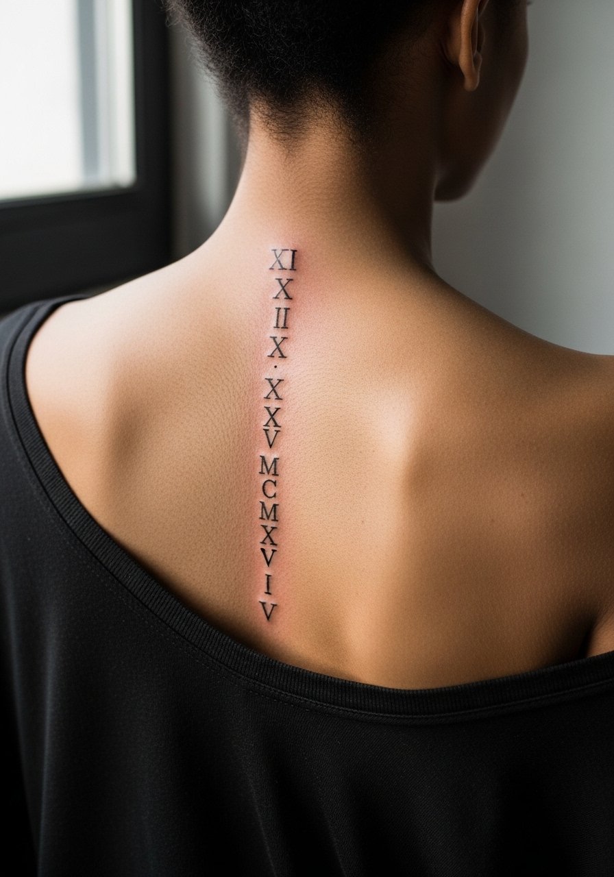
Text with numerals works well on the spine when each character is spaced to allow for minor spreading. Tell the artist you want small gaps between numerals and confirm exact sizing in the stencil stage. The session is short for a simple vertical date, but tiny numerals will almost certainly need a touch-up sooner than larger characters. A common mistake is choosing a condensed typeface that collapses as the ink ages. This format is ideal for someone who wants a clean, chronological marker that sits discreetly beneath clothing.
13. Rib-Adjacent Spine Curve for S-shaped Flow

This design borrows from both spine and rib aesthetics. The consultation should clarify how far the curve approaches the ribs because ribs move a lot and affect fine line longevity. Artists are split on fine line near ribs. One camp says the stretch and thin skin make lines blur quickly. The other camp believes that with slightly bolder initial line weight and careful spacing, the curve can remain clear. Tell your artist which side they lean toward. Session discomfort will be higher when the needles hug rib cartilage, and touch-ups are more common in those transition zones. For the session wear a loose drawstring linen pant so you can move comfortably without abrasive waistbands.
14. Minimalist Spine Compass with Tiny Needle Points
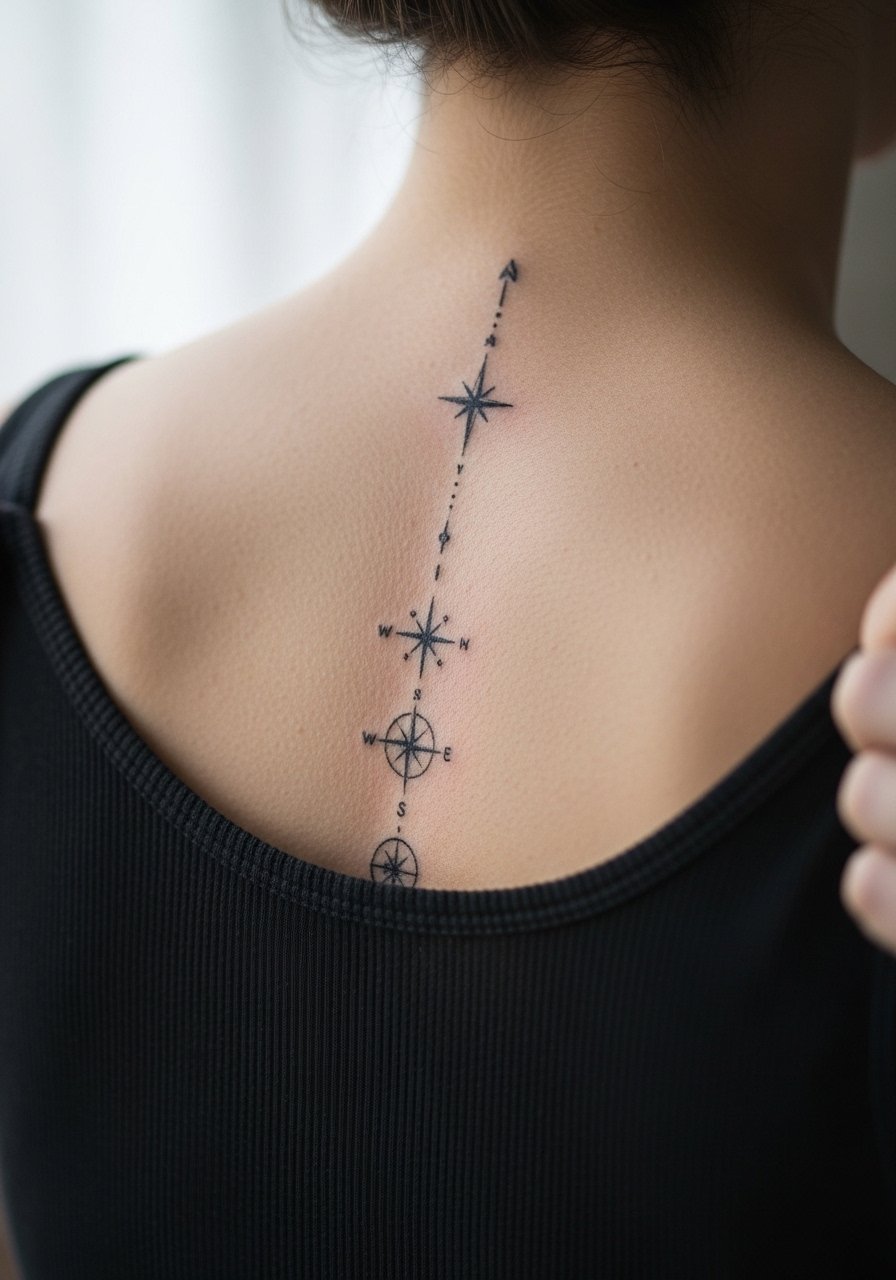
Visual impact comes from contrast between the central compass and surrounding skin. Ask your artist to keep the central point slightly larger than surrounding ticks to preserve readability. Sessions are brief for a small stack, but the spine area will feel more intense than a forearm. The common error is insisting all ticks be identical and minuscule. Those often blend. Plan for a touch-up at two to three years depending on sun exposure and friction from clothing.
15. Abstract Line Art That Mirrors the Spine Curve

This option suits someone who prefers non-literal marks. In consults I recommend mockups overlaid on your back so the flow matches your natural curve. The session feels rhythmic because the artist follows the body's contour. A mistake is asking for too much alternation in line thickness in a single pass. That can create uneven healing. Expect the piece to read differently at six months versus two years as minor spreading evens out the line weight. For showing it off pick tops with subtle open backs that follow the same curve.
16. Floral Spine Anchor with Small Anchor Point at Base
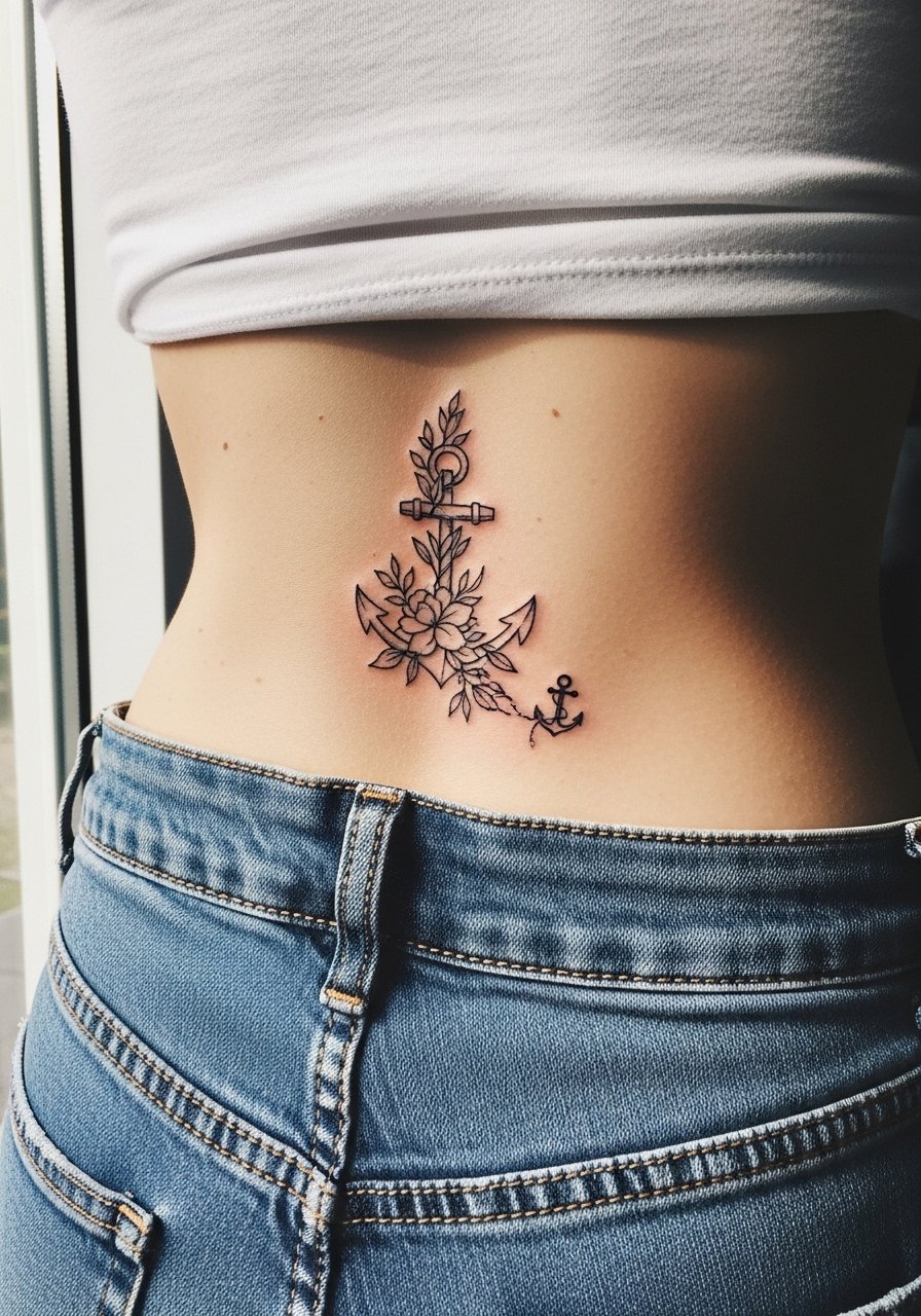
The lower spine sees more pressure from sitting and waistbands, so I suggest placing the anchor point just below where pants sit. During the consult ask the artist to indicate where the waistband will meet the piece. The session can be uncomfortable for the lower spine but short for a compact floral anchor. The frequent mistake is seating the design too low under the belt line. That increases friction and accelerates fading. For appointment day, wear high-waisted bottoms and a top you can shift, like high-waisted jeans, to reduce rubbing during healing.
17. Spine-Bar Code: Thin Parallel Lines as a Graphic Accent

The barcode aesthetic reads modern and minimal when each stripe has deliberate spacing. In consults I ask artists to space the lines to allow for slight spread without losing the graphic rhythm. A common mistake is compressing too many thin lines into a narrow band. Those often become an indistinct block after healing. Session time is moderate, and touch-ups are usually required where the shirt waistband crosses the lower portion. This is a good choice for someone who wants crisp graphic lines rather than botanical detail.
Frequently Asked Questions
Q: Will fine line spine tattoos blur faster than traditional bold spine pieces?
A: From what I've seen, fine line work is more sensitive to placement and movement. The spine's constant flexing and pressure from clothing raise the risk of slight blur. Choosing measured spacing, asking for slightly heavier initial line weight where needed, and planning for a touch-up around year two or three reduces the problem.
Q: How should I dress for a long spine session to make the artist's life easier?
A: Wear something you can pull aside without exposing other areas, such as a loose button-down shirt or a crop top that lets the artist access the midline. Avoid anything tight at the waist so the area around a lower spine piece stays comfortable during and after the session.
Q: Are there spine placements I should avoid if I want the tattoo to stay crisp for five years?
A: Consider the lower spine and rib transition zones as higher risk because of friction and skin movement. If longevity is your priority, avoid packing tiny clustered details into those spots. Ask the artist to show how spacing will look on your specific shape before they apply the stencil.
Q: Do metallic inks and colored accents affect how a fine line spine piece heals?
A: Metallic and pale colors can be more variable in how they settle, especially on the back where sun and friction act. Some artists prefer to skip metallics on the spine. If you want accents, discuss pigment stability and plan for earlier touch-ups.
Q: How often should I expect to get touch-ups on a fine line spine tattoo?
A: It depends on placement and lifestyle, but in my experience a light touch-up at two to four years is common for fine line spinal work. High-friction areas may need refreshes sooner. A consult with your artist will give the best timeline for your design and skin type.
