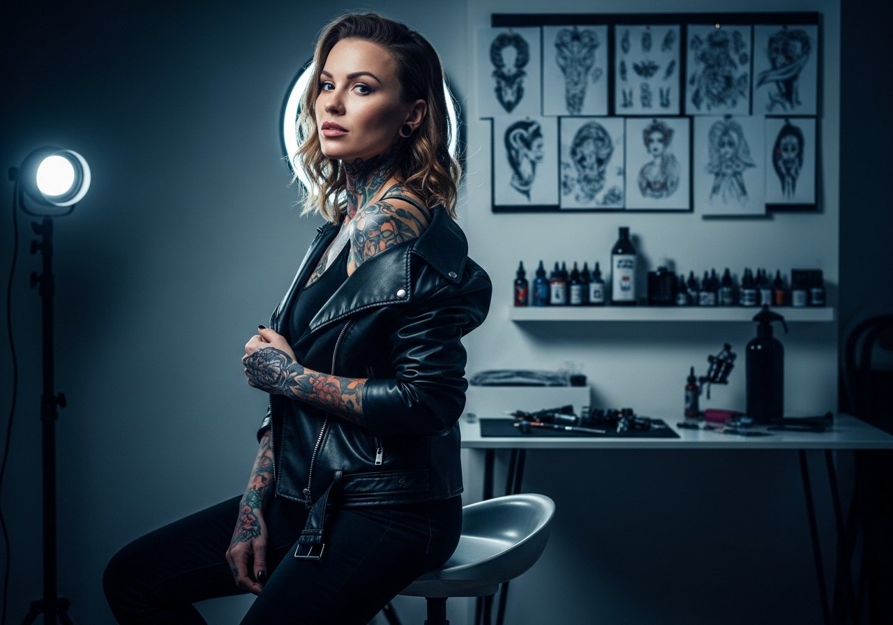
Fine line tattoos look gorgeous fresh, but what matters most is how they read two years from now. Trends push tiny script and hairline details, while longevity lives in careful spacing, steady needle depth, and placement that avoids constant friction. Below are 21 thoughtful fine line ideas that favor lasting linework and wearable styling. The first one explains how to present the phrase clearly to your artist so it still reads five years from now.
1. Curved Script Band on the Inner Forearm
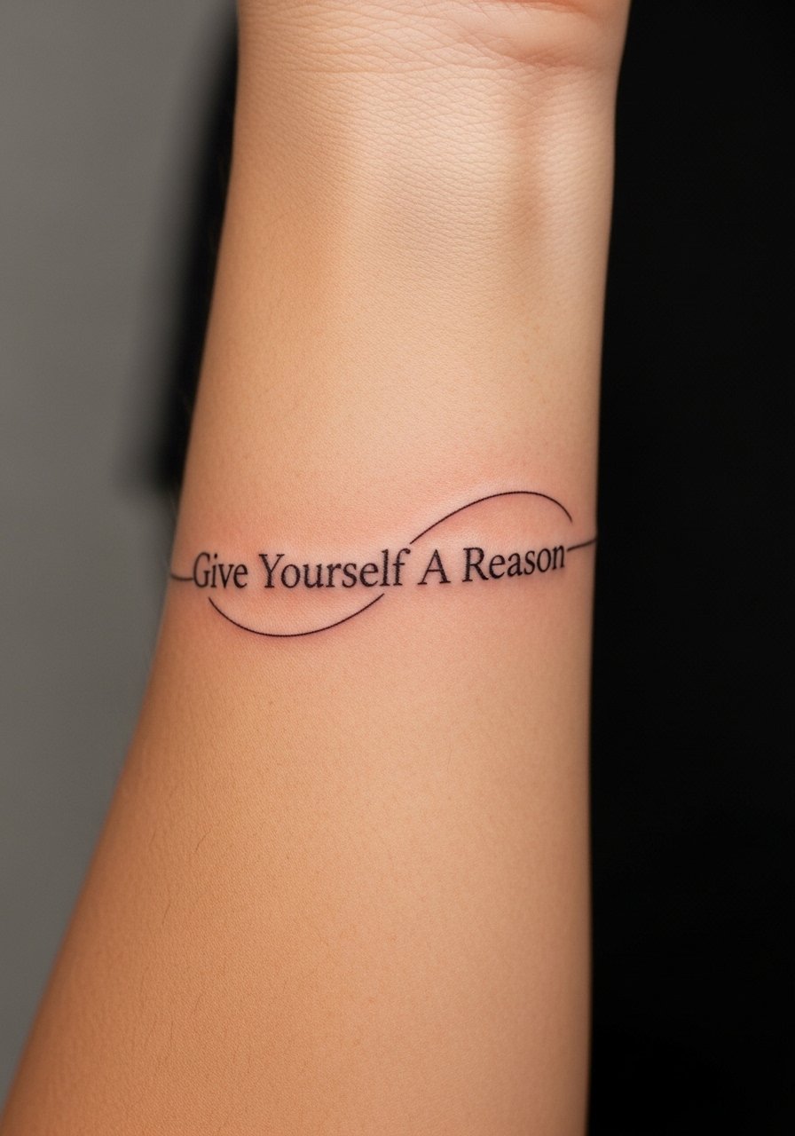
Put the phrase in a single flowing script that follows the arm’s natural curve. I recommend bringing several script samples to your consultation and asking the artist to scale the letters so small counters stay open. The common mistake is shrinking the lettering to fit a narrow wrist band, which causes the thin spaces inside letters to fill with time. Expect light soreness and a one- to two-hour session depending on size. For showing it off, roll up a linen shirt sleeve so the linework sits against neutral fabric and draws the eye. Mention touch-up interest in your consult.
2. Minimal Script Behind the Ear with Tiny Leaf Accent

Fine script behind the ear reads intimate and quiet. Because the area is small, ask for slightly bolder hairlines than you think you need so the counters remain legible as the skin moves. Session feeling is brief but sensitive. This placement needs a pro who knows how to place text along curved skin. For the appointment wear your hair up and bring a soft hair claw clip so the artist has unobstructed access. Expect a touch-up discussion during your follow-up visit.
3. Thin Script Over the Collarbone with Micro-Botanical Frame

A collarbone placement gives the words a slightly elevated presence. The mistake people make is placing dense florals too close to the script. Keep the botanical accents airy and offset so the letters breathe. The session moves fast but expect sensitivity near the bone. For evenings out, the phrase pairs well with an open-back midi dress that frames the upper chest without competing. Ask your artist to show a stencil on the body before committing to spacing.
4. Vertical Rib Script with Stippled Vine
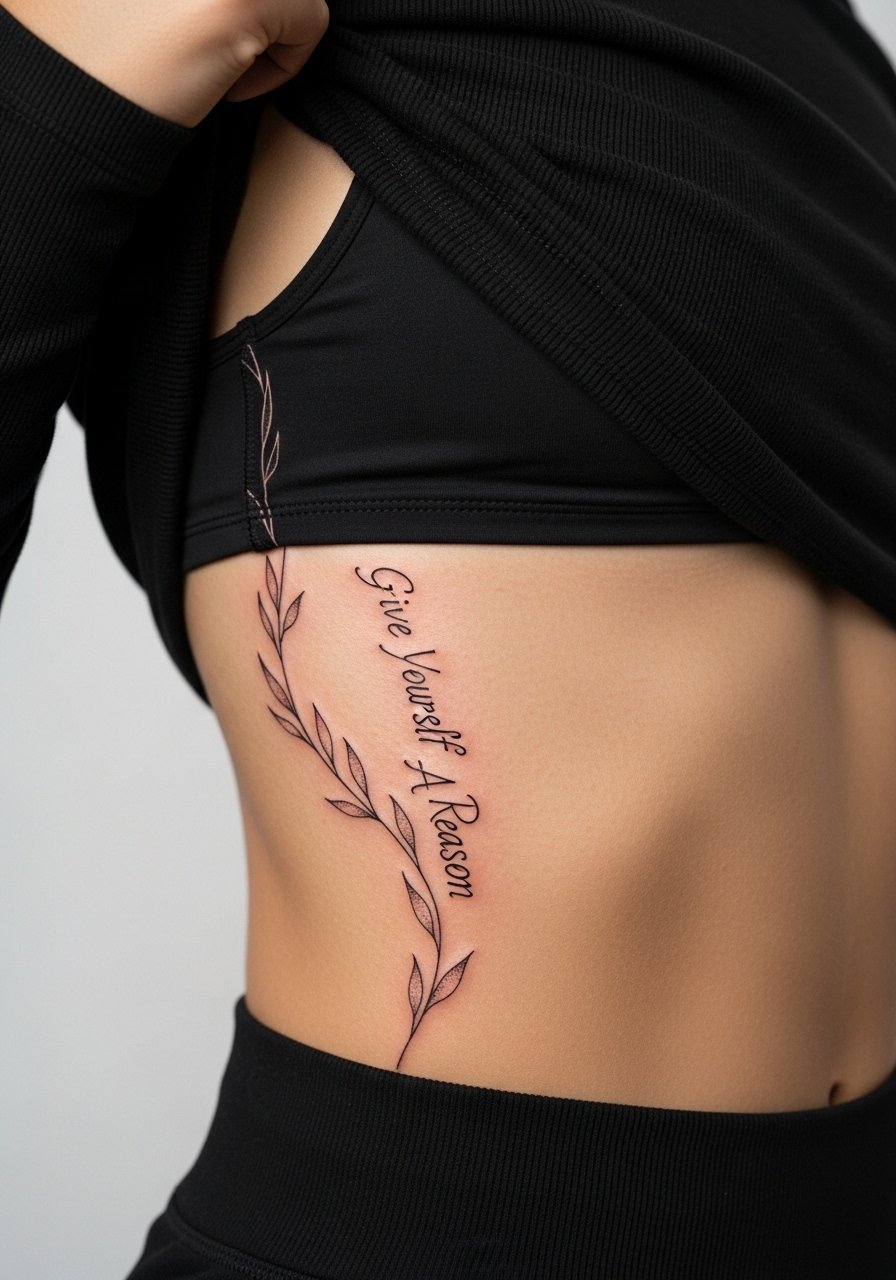
Fine script on the ribcage reads elegant but carries risk. Artists are split on this one. One camp says the stretch and soft tissue on ribs blur hairlines within two years. The other camp argues that with correct depth and slightly wider spacing the script can settle clean. I suggest asking your artist which camp they fall into before booking. Sessions here are slower and more sensitive than arm work. Wear a loose cropped top you can lift easily. Budget for a touch-up in the first two years if your skin tends to stretch.
5. Tiny Script on the Side of the Finger
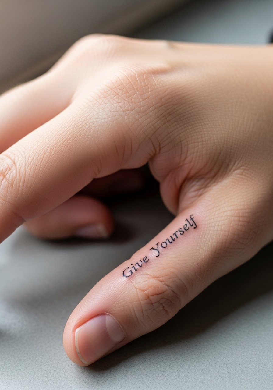
Finger text looks discreet but it is high maintenance. The skin on fingers moves constantly and experiences lots of washing, hand cream, and friction. Ask for slightly heavier linework than you want to start with, and expect the session to sting more than forearm work. In most cases a finger tattoo needs a touch-up within a year. For showing it off, a minimalist thin chain bracelet keeps attention on the hand without rubbing the letters. Think about your job since hand tattoos can still matter in some industries.
6. Script Chest Piece Near the Heart with Micro-Star Accents
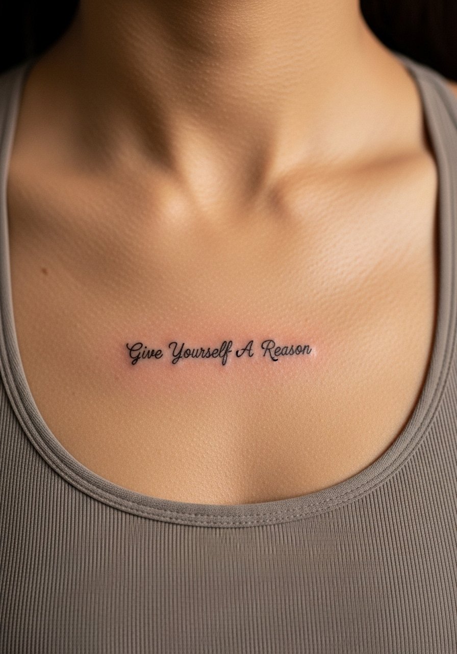
Placing the phrase near the heart makes the sentiment literal and personal. Sternum sessions are sensitive and the skin in that area pulls differently while healing, so ask for airy letter spacing. A common error is putting dense decorative dots too close to letters which then blur into the counters. Wear a fitted sports bra to the appointment for easy access. Many people prefer to schedule this piece when they can rest for 48 hours afterwards because of tenderness. Expect to discuss touch-up plans at your follow-up.
Studio Day Picks
The inner forearm, finger, and chest pieces above demand different prep and a couple of small extras smooth both the session and the first week.
-
Stencil transfer paper kit. Lets you preview the exact script placement on skin before the needle touches down, which matters for curved forearm and chest pieces.
-
Thin protective film roll. Useful for small finger and wrist work that faces constant hand washing and friction.
-
Gentle fragrance-free body wash. Cleanses delicate linework areas without irritating the needle channels or stripping natural oils.
-
Topical numbing cream. Applied per instructions before a sensitive rib or sternum session to ease the pain without affecting the artist’s stencil.
-
Aquaphor healing ointment. A thin coat during the first few days helps lock in moisture for tight linework without clogging the pores.
7. Single-Line Wave Behind the Wrist with Script Accent
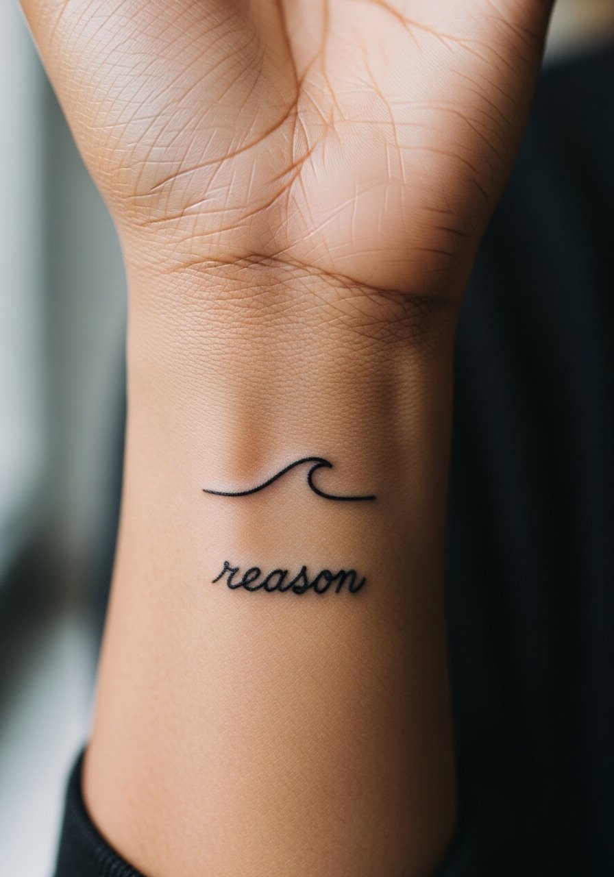
A thin wave line paired with a tiny script word reads like a private token. Wrist skin sees a lot of motion and sunlight, so plan on sun protection long term. The common mistake is squeezing the script too close to the wave, causing visual crowding as the ink fades. Session time is short but the area is sensitive. For the appointment wear a loose button-down shirt you can pull aside easily. For showing it off, stack with a minimalist watch that keeps attention on the wrist without covering the tattoo.
8. Tiny Script on the Inner Bicep with Dot Work Frame
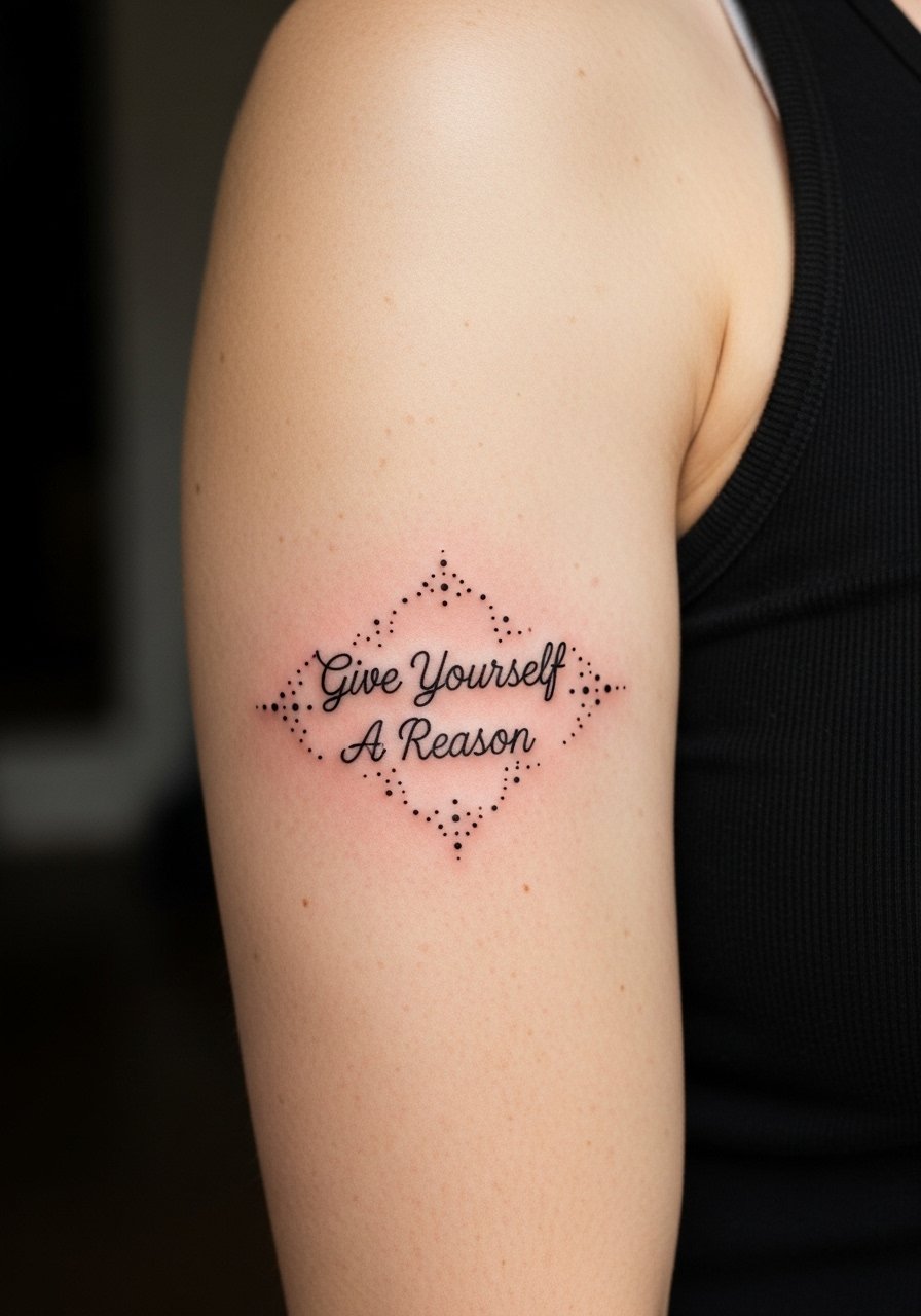
Inner bicep text behaves differently than outer arm work because the skin is softer and stretches with movement. Tell your artist you want slightly more spacing between letters and a delicate dot-work halo rather than dense shading. Session pressure is moderate and you may need to shift position for access. For the appointment bring a loose tank top so the artist can work without fabric tugging. Expect the area to feel tender for a few days.
9. Fine Line Script Along the Spine with Vertical Leaves
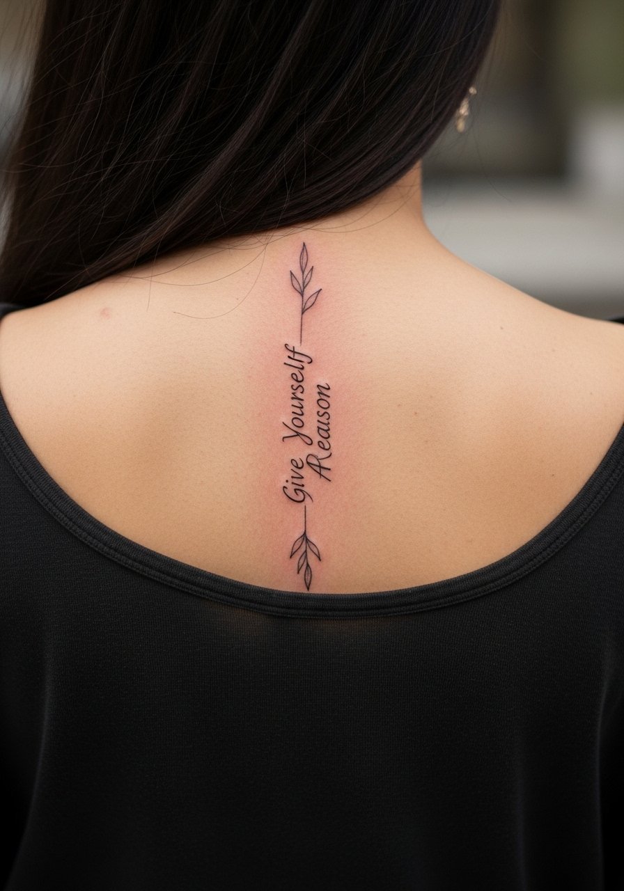
Vertical spine lettering reads clean because the surface is long and flat. The mistake is crowding letters in short vertical stretches which causes blurring as the body moves. Spine sessions can be more intense depending on proximity to bone. For show-off styling, open-back tops or a halter dress highlight the slender line. Ask the artist to place a full-size stencil so you can check the vertical rhythm before inking. Touch-ups are possible but plan conservatively.
10. Tiny Script on the Ankle with Minimal Star Motif
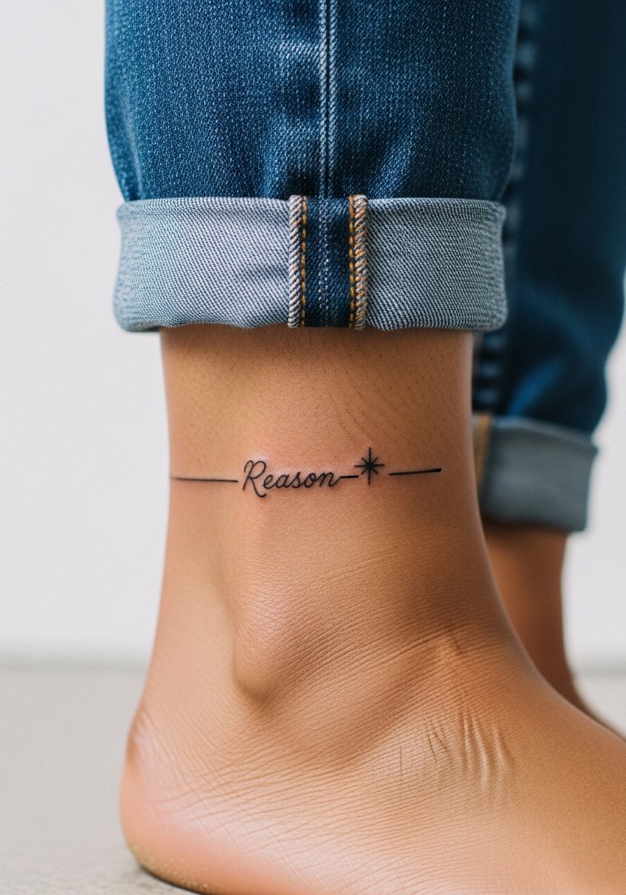
Ankle text faces footwear and pant friction, so expect some early fading along the edges. Ask for slightly bolder initial linework to compensate for wear. The session is quick though the area stings more than the forearm. For the appointment wear pants you can roll up easily like jeans that roll up or slip-on sandals. For show-off moments, low-cut shoes and cropped trousers keep the text visible without compromising healing. Budget for a one-year check if you wear closed shoes often.
11. Micro-Script on the Side of the Rib with Airy Spacing
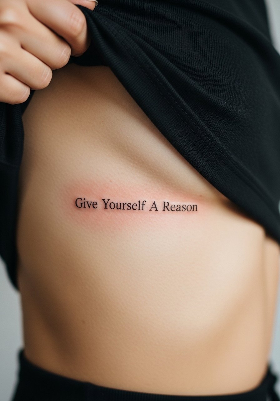
The rib side demands spacing and intentional pacing. The controversy around ribs comes up here again. One camp says fine line blurs too fast on the ribs because of motion and shallow tissue. The other camp says well-spaced letters with slightly stronger line weight can last. I advise discussing both perspectives with your artist and asking to see healed rib examples in their portfolio. Sessions can be long and sensitivity high. Plan recovery time and a loose shirt for the trip home.
12. Script Collarbone Wrap with Tiny Geometric Anchors

A slight wrap across the collarbone reads modern and symmetrical. The mistake is over-decorating with heavy geometry that competes with thin letters. Instead, ask for delicate geometric anchors spaced evenly to frame the phrase. Sessions are straightforward but the bone proximity can make parts feel sharp. For outfits, an open-neck blouse or a delicate chain necklace keeps attention on the collarbone without covering the script. Mention potential touch-up needs during your consult.
13. Small Script on the Side of the Thumb
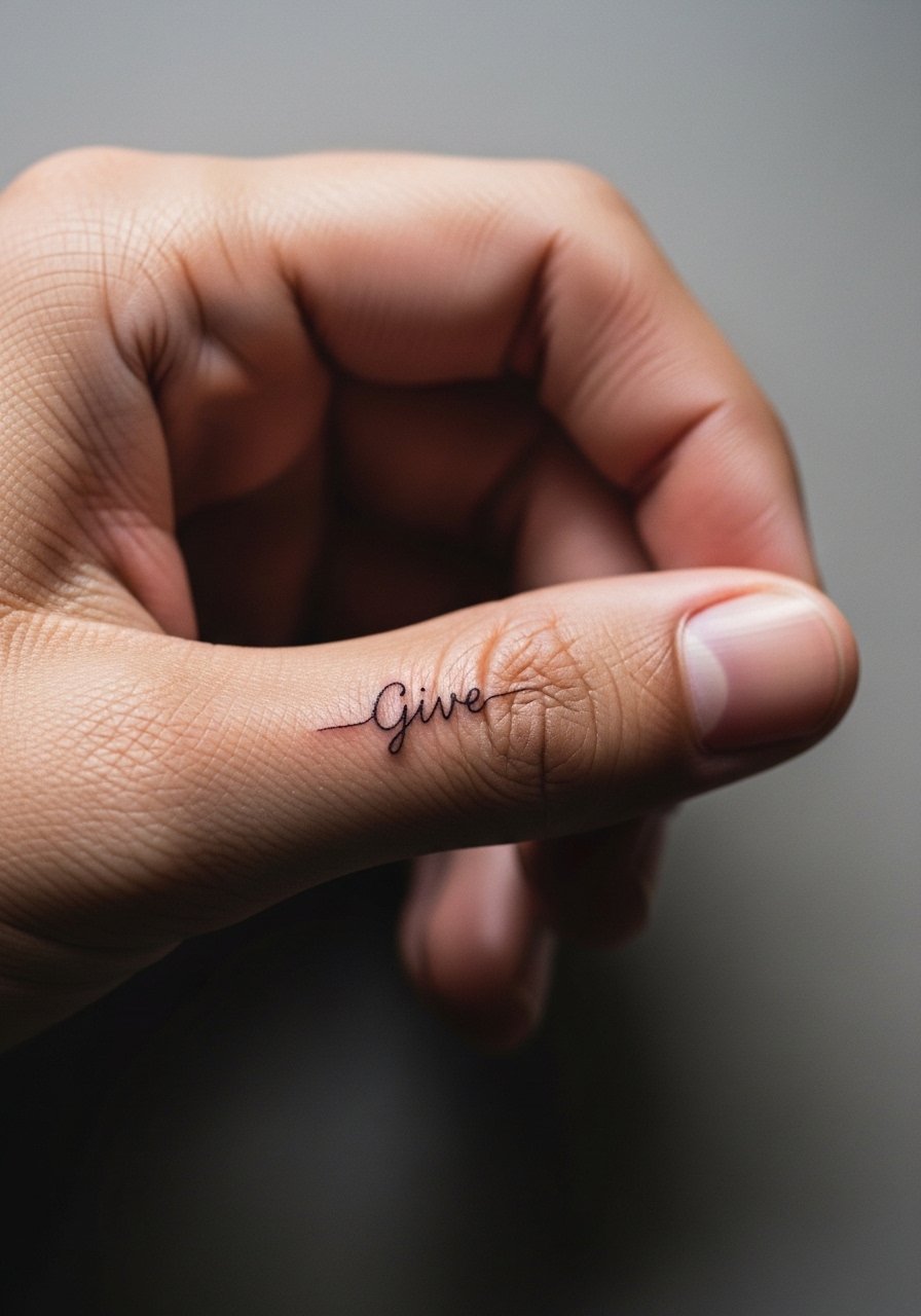
Thumb-side text follows a curved, mobile surface and is among the highest maintenance placements. The common mistake is treating it like forearm skin. Ask your artist for heavier hairlines and plan for a refresh within months rather than years. The session time is short but sharp. For showing it off, dainty rings avoid rubbing the letters. Think about daily hand use and how often the area gets wet and moisturized.
14. Fine Line Script on the Upper Thigh with Floral Border
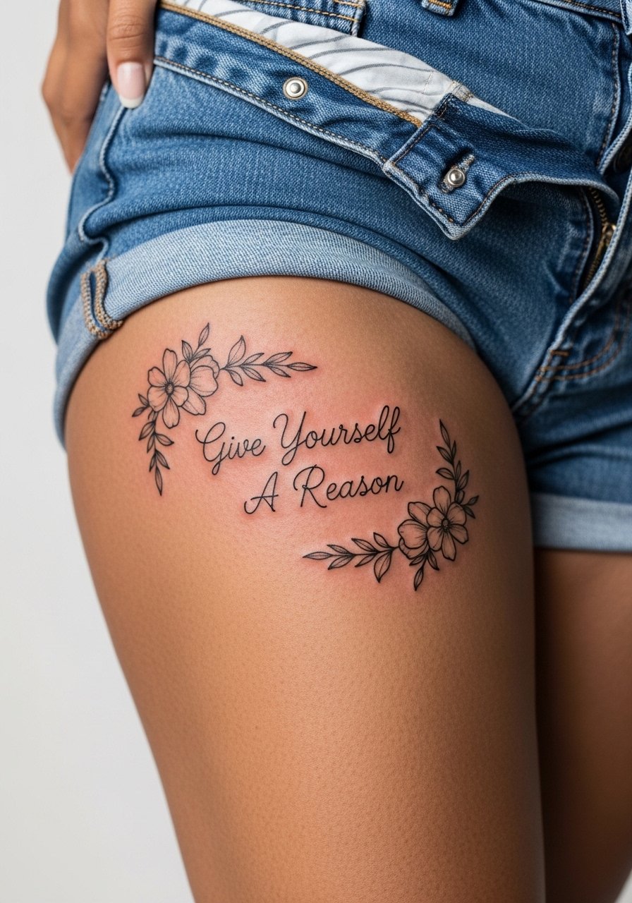
Thigh placements allow slightly larger letters and airy borders that age well. The mistake is compacting tiny letters into a dense vignette, which can soften over time. Sessions are comfortable for most people and healing is straightforward because the area is less exposed. Wear high-waisted shorts you can shift for the session. The skin here tends to hold thin lines better than hands or ribs, so spacing can stay elegant without frequent touch-ups.
15. Micro Script on the Inner Wrist with Single Dot Accent
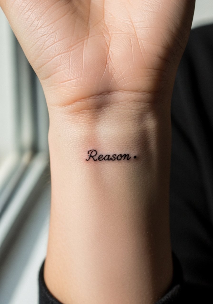
Inner wrist text is high visibility and often photographed, but it faces sunlight and repeated washing. Ask for slightly increased letter spacing and recommend aftercare that emphasizes moisture balance. The session is short but the area can tingle. For the appointment wear a loose sleeve button-down you can roll up. For style, pairing the tattoo with a thin bracelet can highlight the line without rubbing the letters.
16. Script Across the Upper Back with Minimal Crescent Motifs

Upper back script benefits from a flat canvas and tends to age predictably. The typical mistake is cramming too many decorative elements into a central spot. Keep crescents small and spaced so the script remains the focal point. Sessions can be longer if the piece spans widely. For the appointment, wear a button-down you can slip off gently so the artist can access the area without rubbing. Expect minimal early fading if you avoid heavy sun exposure on the back.
17. Micro Script on the Side of the Neck with Simple Dot Line
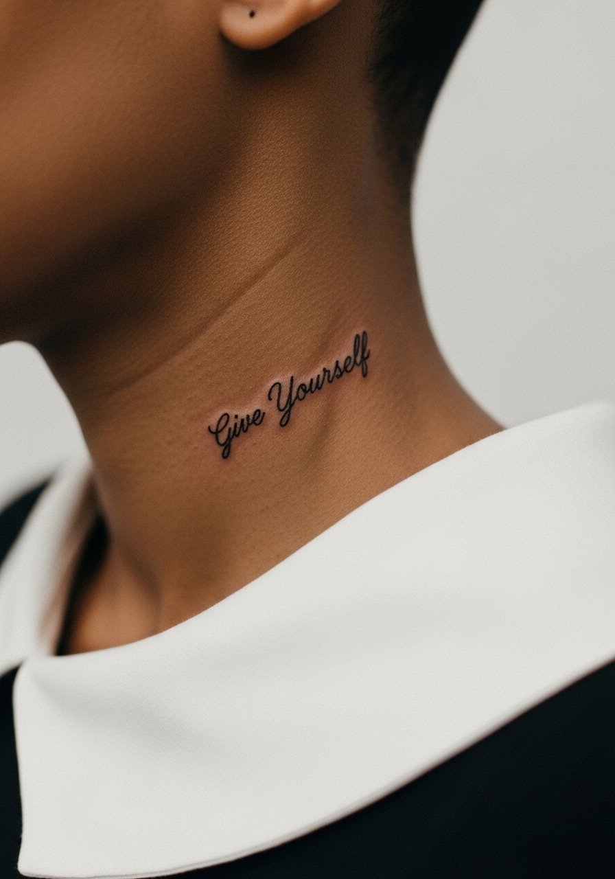
Neck text feels bold and visible. The skin here is thin and mobile which affects how hairlines settle. Ask for slightly thicker hairlines and airy spacing. Sessions near the neck can be tender and require quick breaks. For the appointment wear a wide-neck shirt so collar manipulation is easy. Consider how visible this will be with your daily outfits and any workplace considerations before booking.
18. Fine Line Script on the Calf with Vertical Leaf Accents
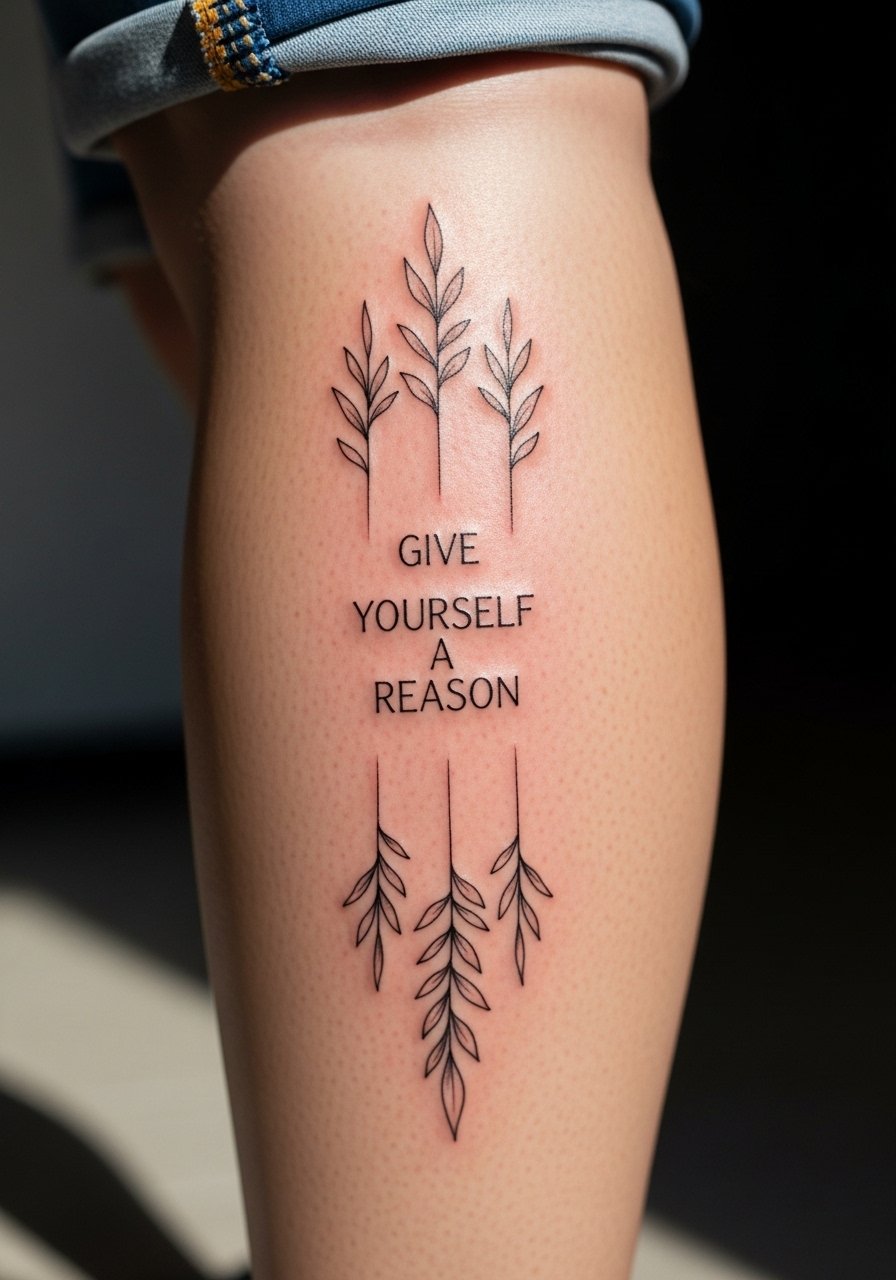
Calf placements allow for taller letterforms and tend to hold fine lines well because the area experiences less friction. A common misstep is adding dense shading that competes with delicate script. Session discomfort is low and healing is simple. For the appointment wear loose drawstring linen pants or shorts you can remove without pulling on the area. The calf is a great spot if you want a readable phrase that still tucks into summer looks.
19. Small Script Near the Anklebone with Wave Motif
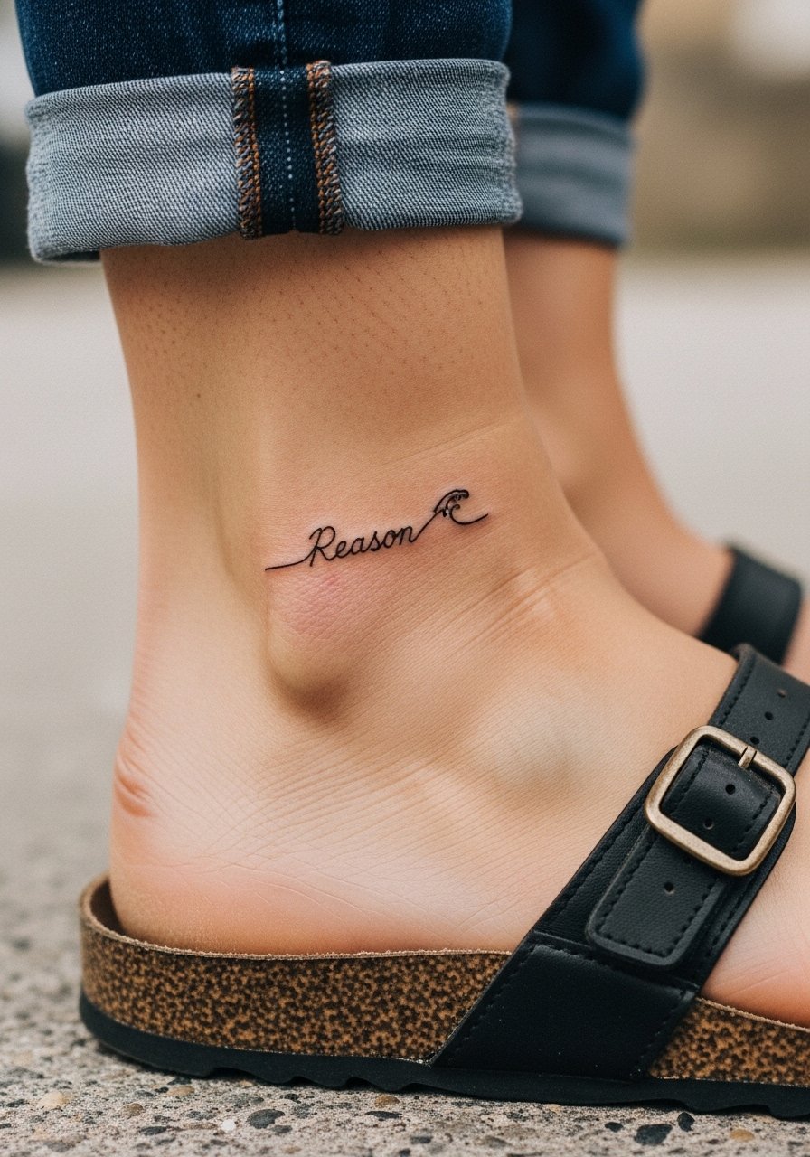
Anklebone placement is intimate and sensitive to footwear. The mistake is placing letters too close to areas that rub by shoes. Ask for slightly heavier initial lines and keep motifs minimal. The session is quick but the spot will feel tender while you break in shoes. For showing it off, cropped pants and sandals highlight the area. Protect the ankle from repeated abrasion during the first few weeks to preserve the fine hairlines.
20. Tiny Script on the Inner Wrist Wrapped by a Delicate Chain Motif
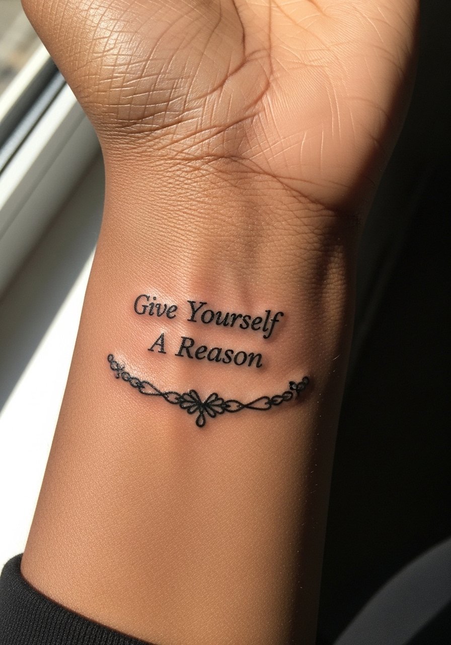
A chain motif around wrist script reads like jewelry and distributes visual weight. Avoid thick links that overpower letters. Ask for open spacing so the chain reads faint and ornamental. Expect a quick session with a sensitive area and plan to avoid heavy lotion immediately after. For outfits, a thin chain pendant necklace or a slim cuff keeps the wrist aesthetic cohesive without rubbing the script. Mention your day-to-day hand habits during the consult.
21. Fine Line Script on the Side Hip with Sparse Floral Dots
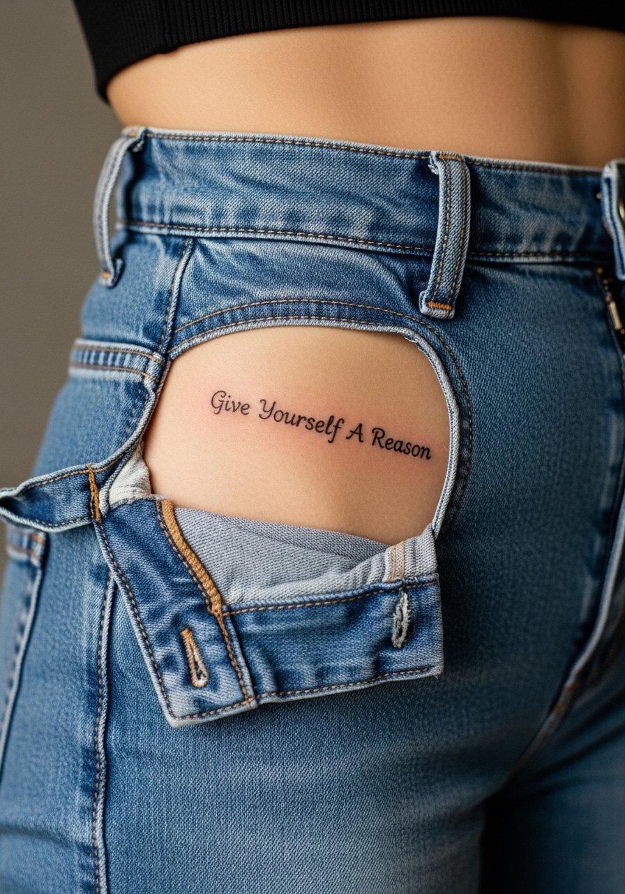
Hip text is a private placement that ages steadily because of minimal sun exposure. The mistake is packing too many dense florals close to the letters which can blur as the skin stretches. Sessions are comfortable and healing is easy if you avoid tight waistbands while the skin seals. Wear high-waisted bottoms you can shift during the session. Consider the long-term visibility you want before placing the phrase here because it will remain mostly hidden.
Frequently Asked Questions
Q: Will fine line script blur faster on the ribs and why do artists disagree?
A: Fine line on ribs blurs faster in some cases because the skin there stretches and the canvas is mobile. Artists split into two camps. One camp avoids tiny hairline work on ribs and suggests larger spacing. The other camp will do ribs if they increase spacing and line weight slightly. It depends on the artist’s experience with healed rib examples and your skin type. Ask to see healed photos of their rib work before booking.
Q: How often should I expect touch-ups for fine line text on high-friction spots like fingers and ankles?
A: Expect touch-ups more frequently on fingers and ankles because of washing and shoe friction. Many people need a touch-up within the first year on fingers. Ankles often stabilize but can require a small refresh if you wear closed shoes a lot. Budget for a one-year check and bring up maintenance in your consult so the artist can plan spacing and line weight accordingly.
Q: What should I wear to a sternum or rib session to make the appointment easier?
A: Comfortable, loose clothing that exposes only the area is best. For sternum work a fitted sports bra or bandeau works well. For ribs a cropped tee or a top you can lift without tugging is ideal. A zip-up hoodie provides coverage you can move aside easily if you need warmth after the session.
Q: Can a tiny script next to a floral or geometric element hold up visually over time?
A: Yes, if you give the script and the decorative element room to breathe. The most common failure is crowding two delicate things together. Ask your artist to show a mock-up with extra spacing and to avoid dense shading next to thin counters. That spacing preserves legibility as the pieces age.
Q: Are there placement-specific career considerations to keep in mind for visible script tattoos?
A: Visible spots like hands, neck, and face still carry career considerations in some fields. If that is a concern, choose collarbone, upper back, or thigh placements which are easier to conceal. Think about future roles and wardrobe needs before committing to something highly visible.