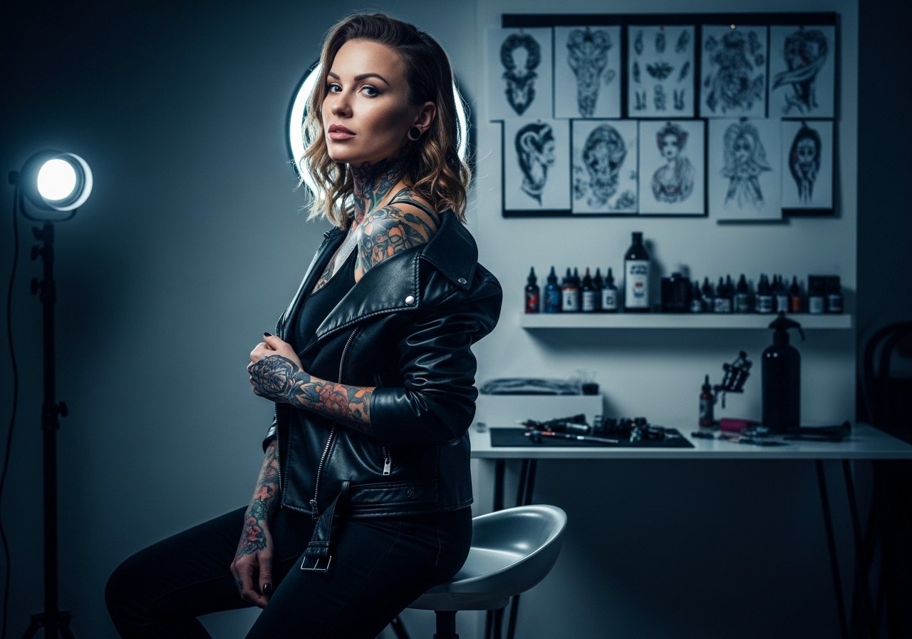
Fine line butterfly stacks and bold neo-traditional wings keep showing up in saved boards, but what holds up on the back is rarely the most re-shared image. Placement, saturation, and how the piece flows with the spine matter more than the initial photo. Below are 21 back-focused butterfly designs that consider aging, session feel, and wardrobe choices so you pick a look that still reads as intended years from now.
1. Vertical Spine Butterfly Chain
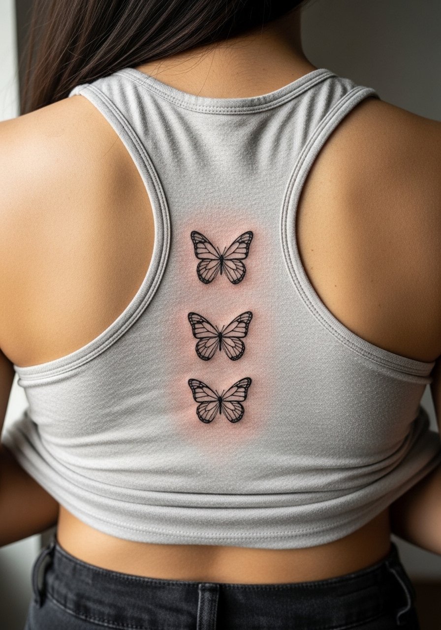
I recommend this when you want a piece that accentuates the spine and moves with posture. Tell your artist you want slightly thicker primary linework near the spine so the central column keeps contrast as the piece heals. The common mistake is requesting ultra-fine lines for the whole chain, which can blur faster on the central spine where motion is constant. Expect a moderate pain level and a session that feels like steady vibration more than sharp stings. For showing it off, pair the area with an open-back midi dress or a racerback tank that frames the vertical flow.
2. Symmetrical Shoulder Blade Duo
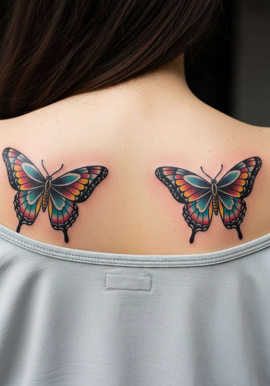
This visually balanced approach works best when you want symmetry without covering the whole back. In consultation, bring photos that show wing span proportions rather than exact colors so the artist can scale for your shoulder width. A frequent error is pushing too much tiny detail inside the wings. That looks great freshly but loses definition as the piece settles. The session feels quick for each blade but can tax the trapezius if the artist needs longer saturation time. Wear a loose button-down shirt you can slide off one shoulder for the appointment and a thin chain pendant necklace to frame the collarbone when showing off.
3. Large Upper Back Monarch
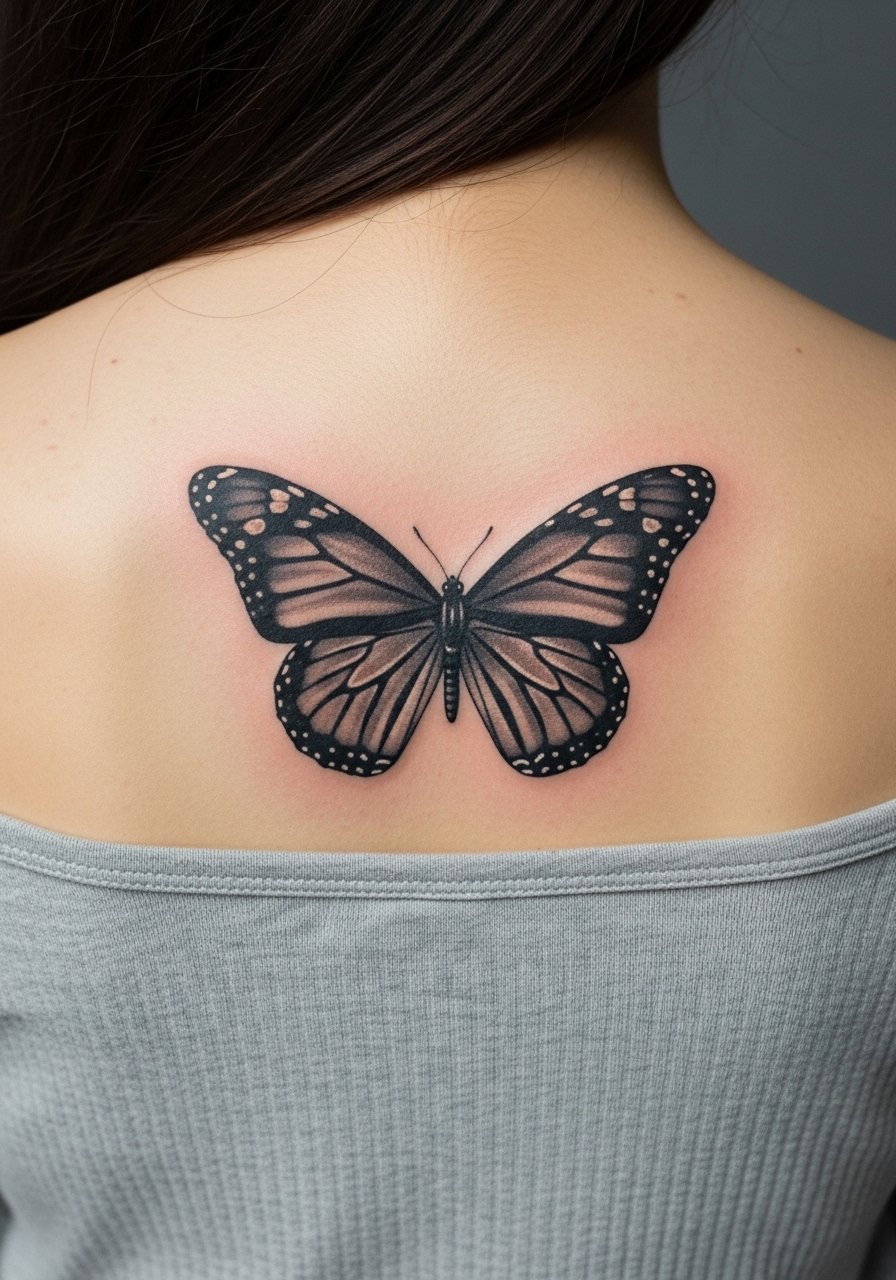
Go for this if you want a statement piece that reads across a distance. Ask the artist for dense wing saturation and layered stipple shading so the pattern keeps contrast as it ages. A common mistake is making the wing veins too thin for such a large piece, which can disappear into shadow over time. Expect a longer session with alternating breaks to manage the upper back tension. The piece ages well when touched up early if you notice softening at year three. Pair with open-back blouses for nights out.
4. Single Micro Butterfly Between Blades
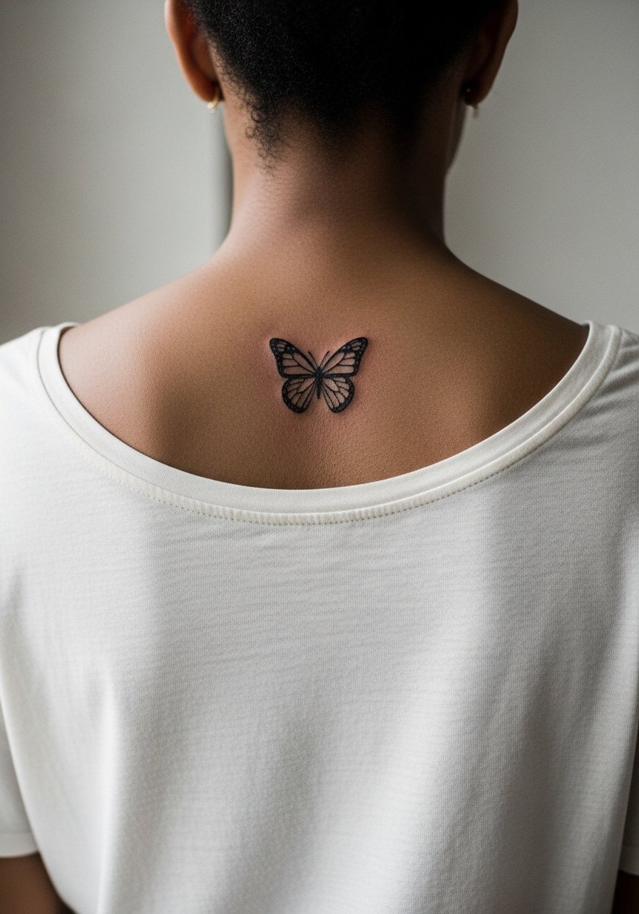
This understated option is for people who want subtlety rather than a large canvas. In the consult, specify exact scale in centimeters so the artist avoids making it too tiny. The most common mistake is choosing ultra-fine single-needle linework without allowance for future spread, which can force early touch-ups. At six months this looks crisp, and by two years the edges will blur slightly depending on sun exposure. For the session, a thin cotton scoop-back works well so the artist can access the area without tugging. Consider a racerback bralette to show the piece when healed.
5. Moth-Inspired Scapula Spread
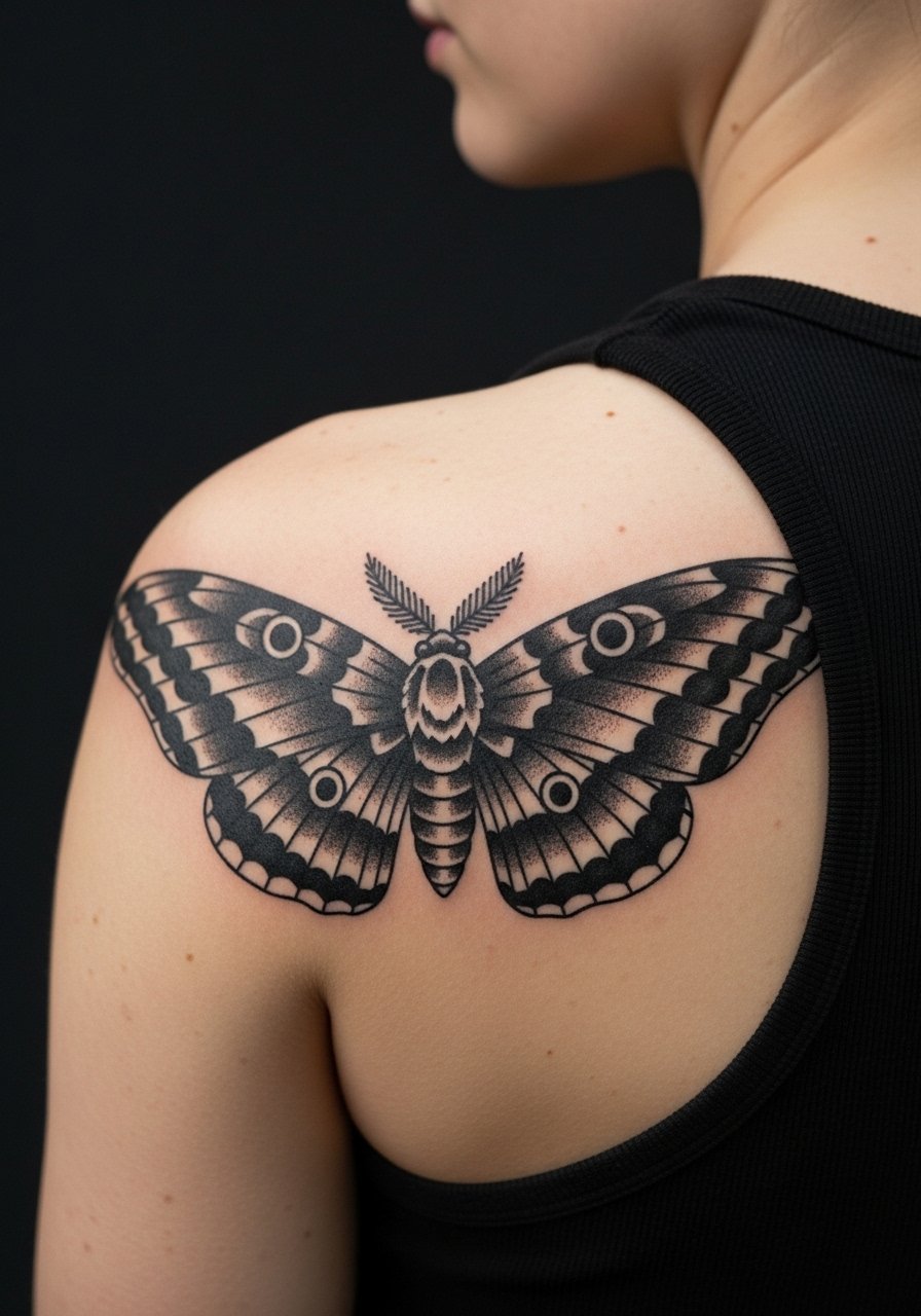
This design reads moody and graphic, and it ages predictably because bold black holds up well. Tell your artist you prefer saturated black fill and crisp negative spaces for the wing patterns. Some clients ask for micro-detail inside the black fields which tends to disappear, so resist tiny interior flourishes. The placement can sting more near the shoulder blade edge because of thin tissue. Wear a loose tank top for the session so the artist has clear access.
6. Watercolor Splash Across the Lower Back

Watercolor techniques are visually fresh but require dense outlines or supporting structure to age well. During consultation, ask for a subtle outline or light black anchor to prevent pigment feathering. The common mistake is purely wash-like color with no structure, which can read like a bruise after a few years. Lower back sessions can be longer and sit differently because you will be lying on the table. For showing the healed piece, pair with high-waisted skirts with low backs.
Before You Book
The upper and lower back placements above demand different clothing access and healing expectations, so a few specific items smooth the session and the first week.
-
Stencil transfer paper kit. Lets you preview exact placement on the back so you can check wing span and spine alignment before the needle touches skin.
-
Topical numbing cream. Applied per instructions before longer upper or lower back sessions takes the edge off during heavy saturation work.
-
Thin protective film roll. Useful for lower back pieces that rub against waistbands and for shoulder blade pieces that meet bra straps.
-
Fragrance-free body wash. Cleanses healing back areas during showers without irritating delicate linework or color.
-
Aquaphor healing ointment. Thin applications in the first days keep moisture balanced for both fine line and saturated back pieces.
7. Geometric Wing Panels Following the Spine
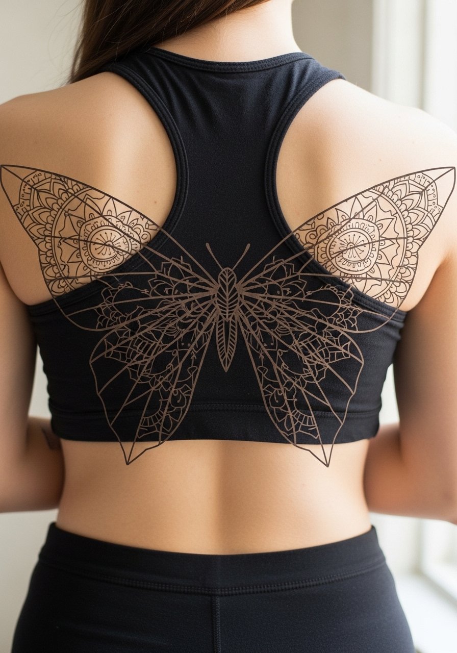
This hybrid of geometry and organic wing shapes is ideal when you want symmetry plus structure. Tell your artist to keep negative space inside the panels so lines do not crowd each other. The main error is compressing too many concentric lines into a small area which causes merging in two to five years. Expect a focused session that may alternate between linework and dot shading. For showing the piece, try an open-back dress that lets the mandala panels breathe.
8. Minimal Single Wing on Upper Back
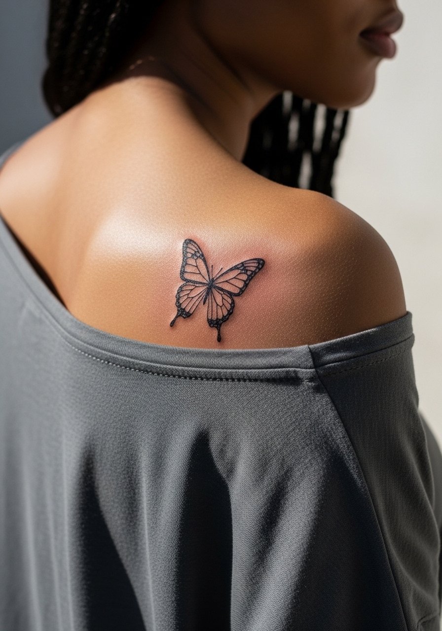
A one-sided wing reads modern and intentional when balanced with the shoulder line. During consultation specify which side your posture favors so the wing complements the shoulder slope. Over-detailing is the frequent mistake for this small placement, so ask for slightly bolder main veins to retain definition over time. Sessions are quick but the area can be sensitive near the scapula edge. This pairs nicely with off-the-shoulder tops to show the asymmetry.
9. Full Upper Back Spread with Floral Accents
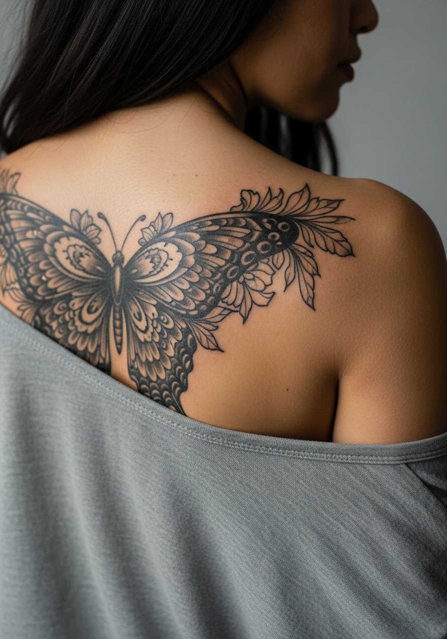
Choose this when you want a piece that can carry additional motifs like roses or vines. Tell the artist which floral elements to keep in negative space to avoid crowding the wings. The common mistake is packing too many tiny flowers into the wing margins. That creates muddiness as the pigments settle. The session length can span multiple appointments if you want layered color. For showing it off pick a halter top with a low back line.
10. Dotwork Mandala Butterfly at Nape
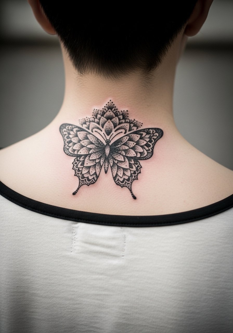
Dotwork rewards patience, and the nape placement reads like jewelry when paired with the right neckline. Ask the artist for graduated dot density so the center keeps contrast. A frequent mistake is making the dots too dense without spacing, which looks heavy later. Expect a session that requires careful positioning with small breaks. For showing, a wide-neck shirt or a low ponytail highlights the nape work.
11. Asymmetrical Butterfly with Script Trail
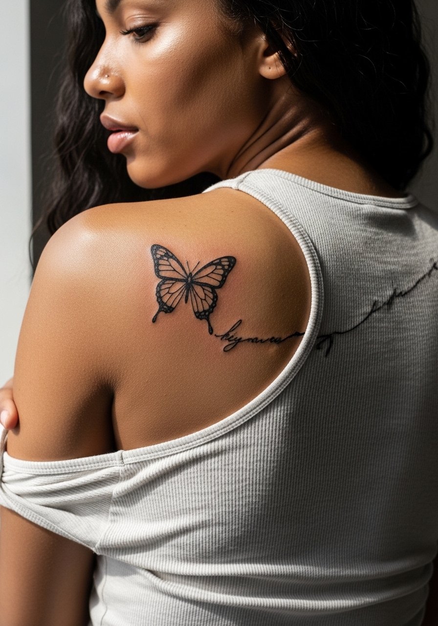
Combining text and imagery needs exact wording and placement decisions. Provide the exact script text and preferred font weight in the consult so the lettering sits cleanly along the wing trail. The error is asking for extremely thin script next to fine wing lines. Those thin scripts can become illegible after healing. Sessions on this zone are moderate pain and require small repositioning. Show-off pairings include an open-back top that lets the script curve show without competing neck jewelry.
12. Gothic Blackwork Across the Lower Back
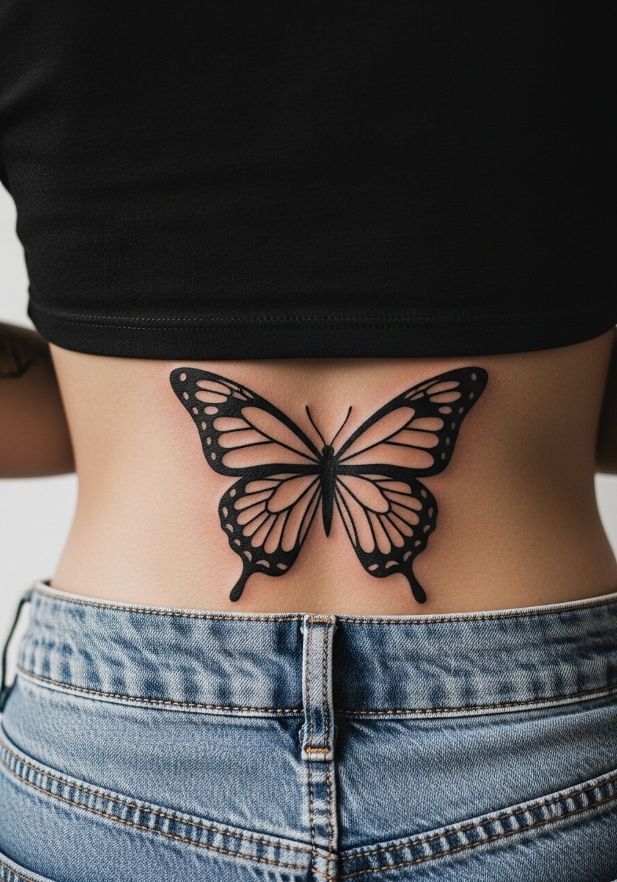
If you want a piece that ages into a graphic silhouette, saturated blackwork is dependable. Ask for packed black with crisp edges and slight negative border around the wings so the shape reads from a distance. The common mistake is expecting delicate detail in a piece that relies on mass. Lower back pieces can rub against waistbands so plan clothing accordingly. For the session bring comfortable bottoms and consider a high-waisted pant that avoids pressure on the fresh ink.
13. Micro-Realism Butterflies along Spine Line
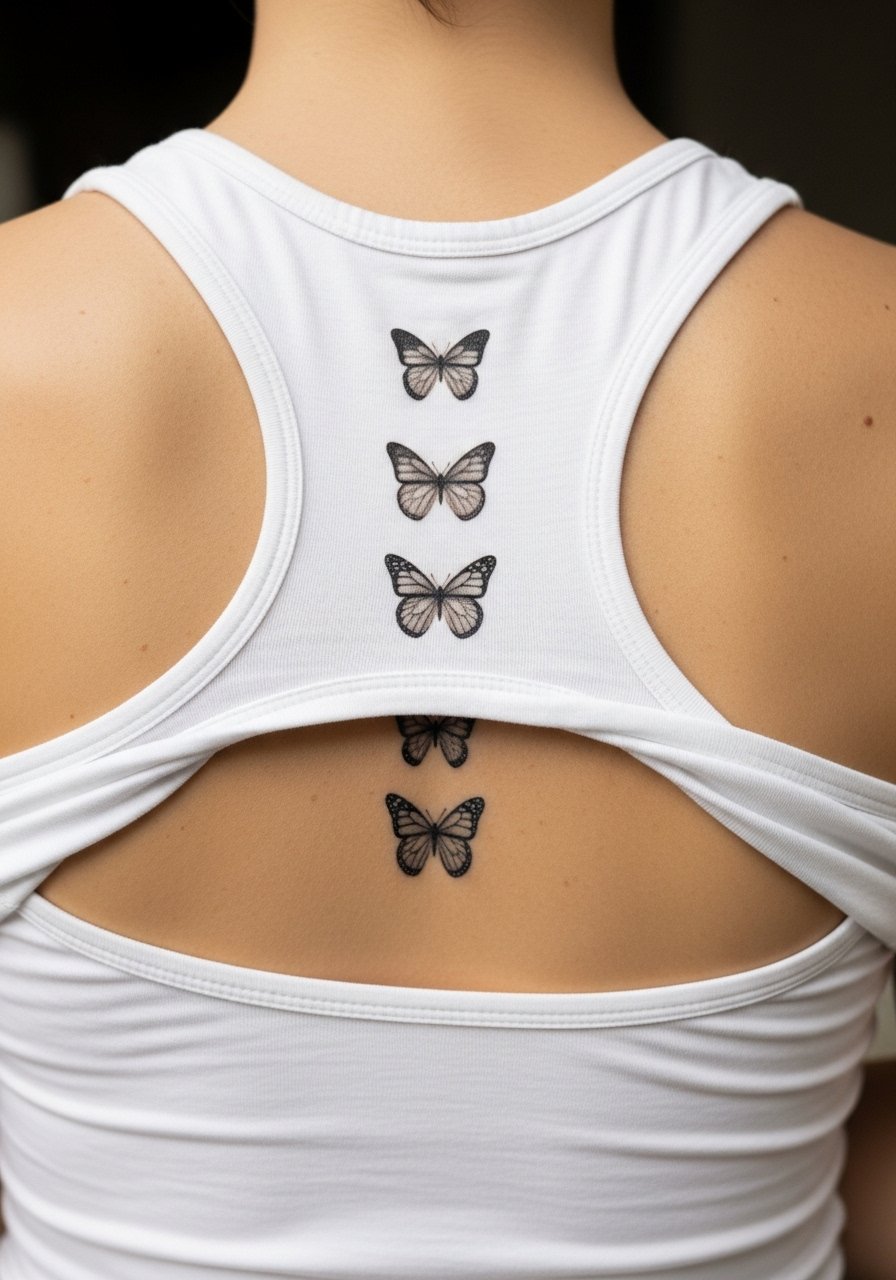
Micro-realism on the spine is delicate and requires a skilled hand to balance detail and longevity. In the consult ask for slightly bolder anchor points in the wing tips to keep features visible as the piece ages. The main mistake is packing lifelike detail into pieces that are too small for the level of realism requested. These sessions include precise machine work and can be slow. For showing the healed line try a strappy dress that exposes the vertebral line.
14. Symmetrical Lace Wing Panel
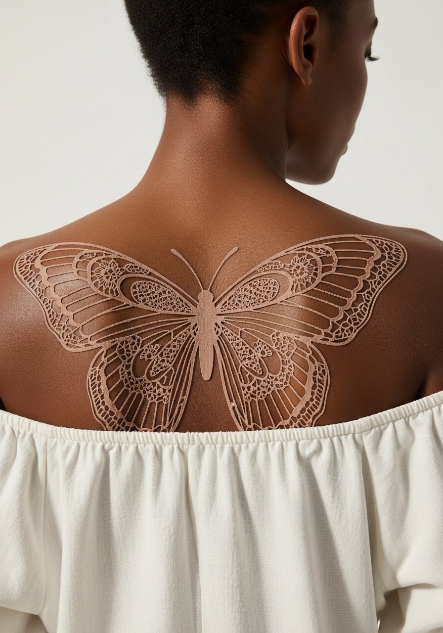
Lace panels read ornate without needing color, but the pattern needs breathing room. Tell your artist you want larger lace holes and fewer micro-threads so the design holds its airy quality as it settles. The mistake is over-filling the lace with tiny lines that collapse into a dark mass. Sessions can be long because of the intricate linework. For showing use a wide-neck blouse or a back-slit dress.
15. Butterfly with Winged Script Across Shoulder Blade

Integrating script into wing shapes needs clear hierarchy between lettering and imagery. Bring the exact phrase and point out which parts should sit on negative space. A common error is choosing a decorative script that competes with wing veins, which makes both unreadable. Expect a moderate session with careful line transitions. Try a strapless top for evening wear that frames the shoulder blade.
16. Watercolor Burst with Fine Line Butterfly Overlay
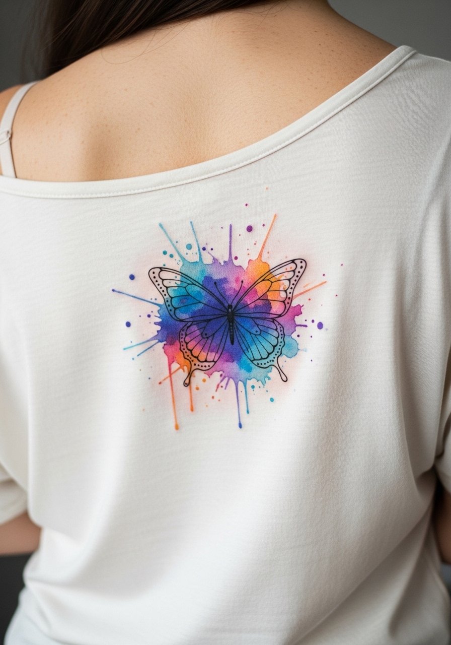
Layering fine line over washy color demands deliberate anchors so the lines remain distinct. Ask the artist to lay color first with a plan for darker anchors under the wings. The mistake is using pale washes without contrast which causes the linework to lose dominance. Sessions will alternate color saturation and crisp line passes. For showing the healed piece, a low-back top highlights the layered effect.
17. Tribal-Inspired Butterfly Across the Lower Back
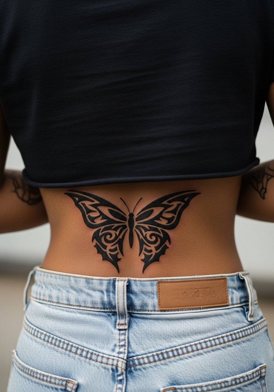
When borrowing tribal motifs be mindful of origins and respectful adaptation. Ask for a design that nods to tribal geometry rather than a direct cultural symbol unless you have cultural ties or explicit permission. The common error is copying specific cultural patterns without context. Lower back tribal pieces are striking and handle touch-ups well because of the bold lines. Pair with mid-rise shorts when wearing low-back styles.
18. Butterfly with Celestial Accents Over Shoulder Blade

Adding celestial dots and moons gives a narrative feel without clutter. Tell your artist which accent should remain in negative space so the wing stays readable. A common mistake is surrounding the butterfly with too many tiny elements that compete visually. Sessions are relaxed and often faster than full shaded work. Show it off with a scoop-back tank for casual looks.
19. Abstract Brushstroke Butterfly Spanning Mid-Back

Abstract strokes read like wearable art, but they need deliberate negative areas to avoid muddiness. In the consult request intentional gaps and a limited palette to maintain contrast. The error is layering too many colors without separators which creates a muddy heal. Sessions might feel like painting with needles so bring breaks. Pair with an open-back blouse to treat it like artwear.
20. Butterfly with Vine Cascade to Lower Back
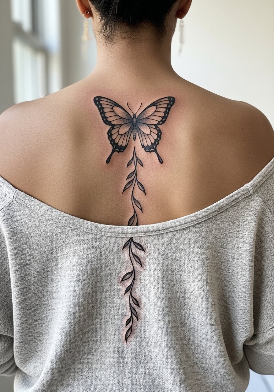
Connecting a central butterfly to a trailing vine creates movement and gives you options to expand later. Ask the artist to plan the vine thickness so it remains visible against skin and does not become a thin line that disappears. Too many tiny leaves cause the trail to look busy later on. Sessions are longer because of the cascade length. For showing pick a backless summer dress when healing has finished.
21. Full Back Butterfly Mosaic
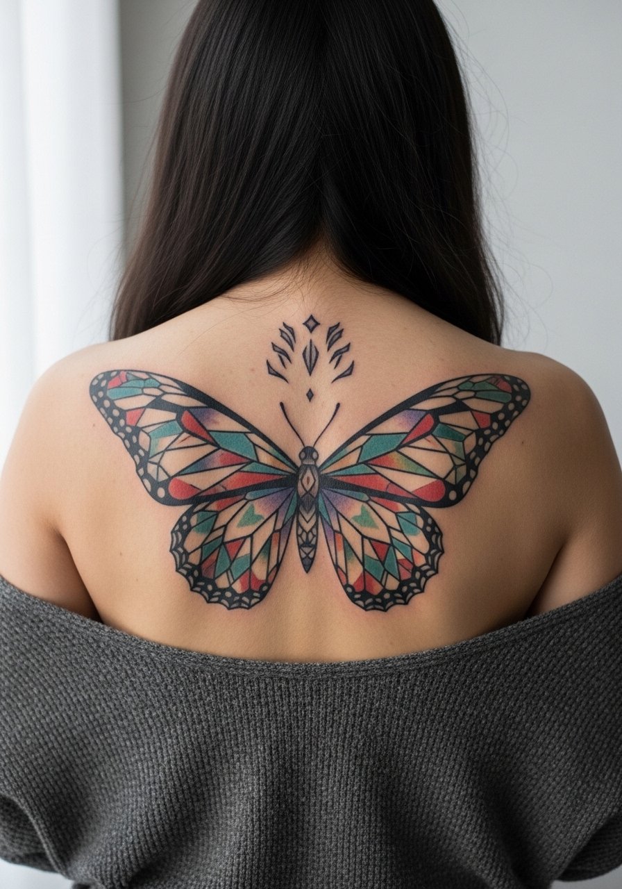
A full back mosaic is a commitment but offers the most canvas for playing with texture and technique. In consults discuss which panels should be bold and which should be delicate so touch-ups later can be targeted rather than global. The major mistake is trying to cram disparate styles into one piece without a unifying motif. Expect multiple sessions and staged healing windows. Choose breathable loose tops for the recovery period and plan your wardrobe changes to avoid abrasion.
Frequently Asked Questions
Q: How well do fine line butterflies hold up on the back compared with bold blackwork?
A: From what I've seen, bold blackwork retains crisp shape longer than ultra-fine lines because the skin movement on the back can blur very thin strokes. Fine line can still work if the artist intentionally thickens key anchor lines and spaces details out. If longevity is a concern ask the artist how they plan to balance line weight.
Q: Will a watercolor butterfly look like a bruise after a few years on the lower back?
A: Watercolor fades more than saturated pigments, especially on areas exposed to friction like the lower back. If you want washy color ask for built-in contrasts or light outlines to prevent the wash from drifting. Periodic touch-ups help, and clothing choice during healing can reduce early abrasion.
Q: Is it risky to include script inside a butterfly wing on the back?
A: It depends on size and script weight. Thin scripts next to detailed wing veins often become illegible over time. The safer route is to increase the script weight or place it on a negative space margin. Provide exact wording and font samples in the consult so the artist can confirm legibility.
Q: How should I dress to the studio for a full upper back session?
A: Wear a loose button-down or a tank that you can slide off one shoulder without pulling over your head. That gives clean access and limits fabric rubbing afterward. One useful option is a loose button-down shirt you can remove or reposition easily.
Q: Are there controversies about fine line vs saturated styles on the back I should know about?
A: Yes, artists are split into two camps on fine line on larger back pieces. One camp says fine line holds up when spaced correctly and anchored with slightly bolder veins. The other camp argues skin movement and occasional stretching make saturated work more reliable long term. Ask your artist which camp they belong to and why before booking.