
Fine line tattoos look effortless on a saved board and fragile on real skin. The reality is the thin strokes that get the most likes need intentional spacing, the right placement, and a plan for sun exposure if you want them to hold. Read these 21 ideas for designs that start bold in the chair and still read clean after a few years, plus what to ask your artist first.
1. Fine Line Arrow on Inner Forearm
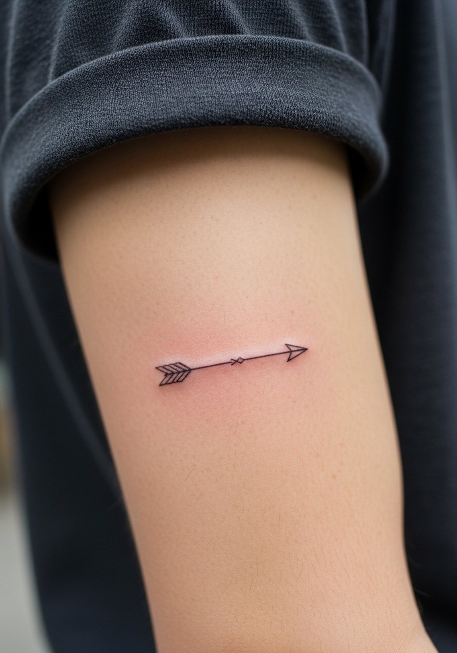
I recommend a bold fine line arrow when you want impact without heavy saturation. Tell your artist you want the shaft slightly thicker than a hairline so the point holds after a few years, and ask for subtle spacing between the barbs to avoid merging. Pain is mild for most people, and a one-hour session usually does it. Avoid asking for micro detail inside the arrowhead, which often blurs in tight placements. For showing it off, roll up sleeves and pair with a minimalist watch or stacked dainty bracelets to frame the forearm without covering the linework.
2. Micro-Realism Wolf Head on the Bicep
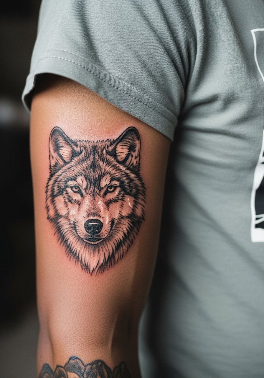
This design uses whisper-thin strokes and tiny stipple shading that reads like a photograph from close up. Say in consultation you want stronger contour lines around the snout so the face keeps shape as stippling softens. Expect a medium pain level for the bicep and a session lasting two hours depending on size. A common mistake is making the piece too small for the detail. At two years the stipple will mellow, so plan for a light touch-up if you want crisp contrast. For appointments, wear a loose tee that you can pull slightly aside so the artist has room to work.
3. Minimalist Constellation on the Wrist
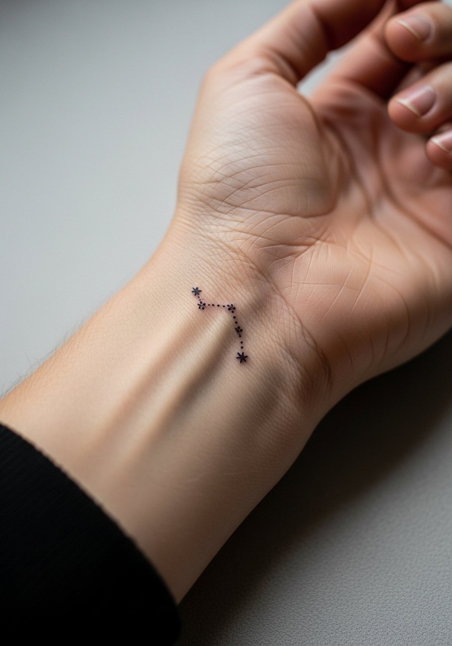
Wrist constellations are a common request yet they live in a high-friction zone. Ask for slightly bolder dots for star points so they resist washing and rubbing. The session is quick and the pain is low to moderate, but the touch-up timeline is sooner than for larger areas. Avoid asking for densely packed stars that create a smudge over time. For showing it off, pair with a thin chain bracelet or a delicate watch, both keep attention on the wrist without crowding the tiny linework.
4. Ribcage Botanical Spray
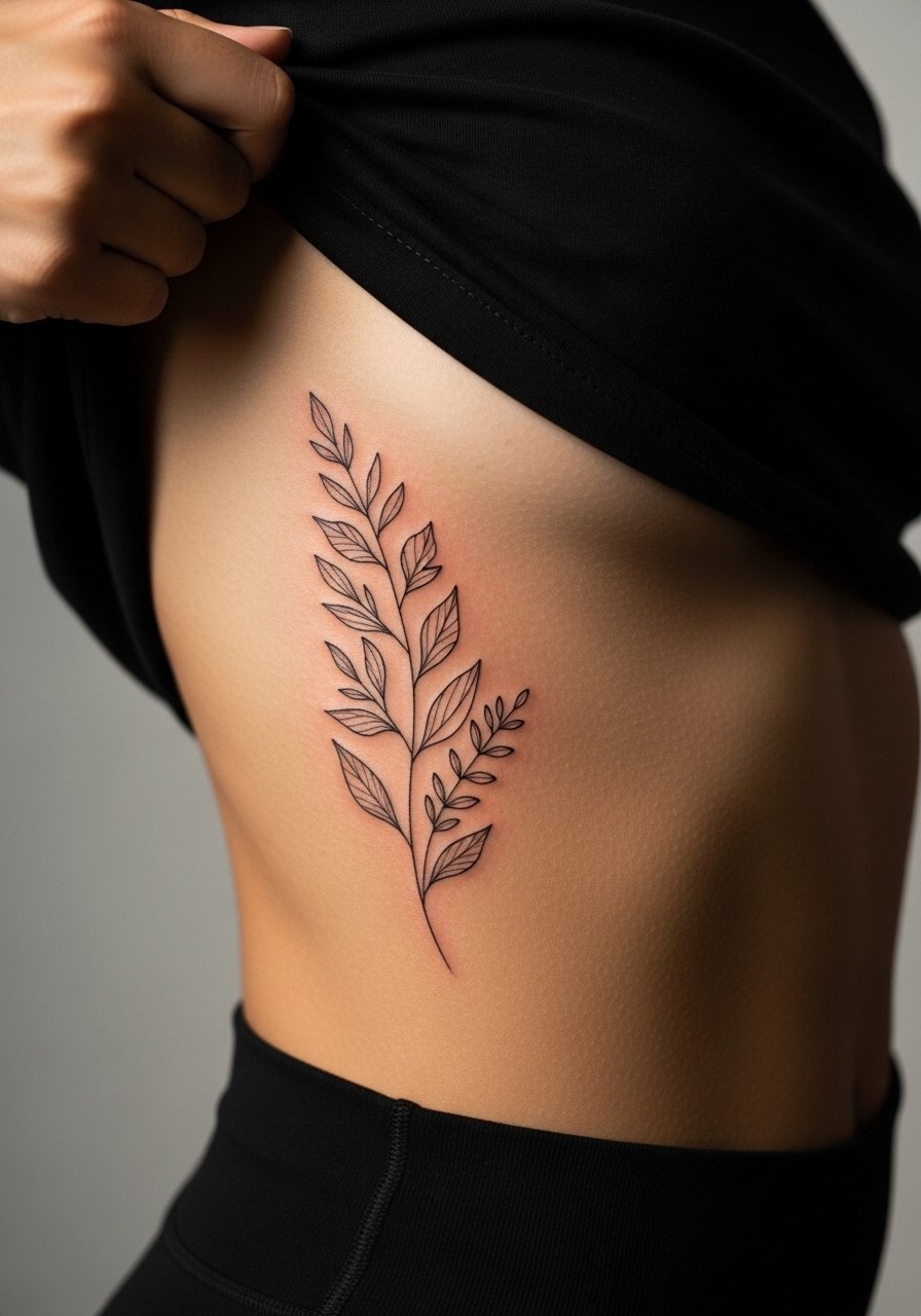
Ribcage botanicals have two camps in the shop. One group avoids fine line there because skin stretch can blur thin strokes within a few years. The other group will do it if you allow slightly thicker stems and more spacing. Name both concerns when booking and ask your artist which approach they prefer. Pain is high on the ribs, and sessions run longer since breathing affects the stencil. Most plants that age poorly on ribs are too crowded. I suggest giving leaves room to breathe and scheduling a rest break in the chair. For sessions wear something cropped or a sports bra that exposes only the side being worked.
5. Tiny Script on the Side of a Finger
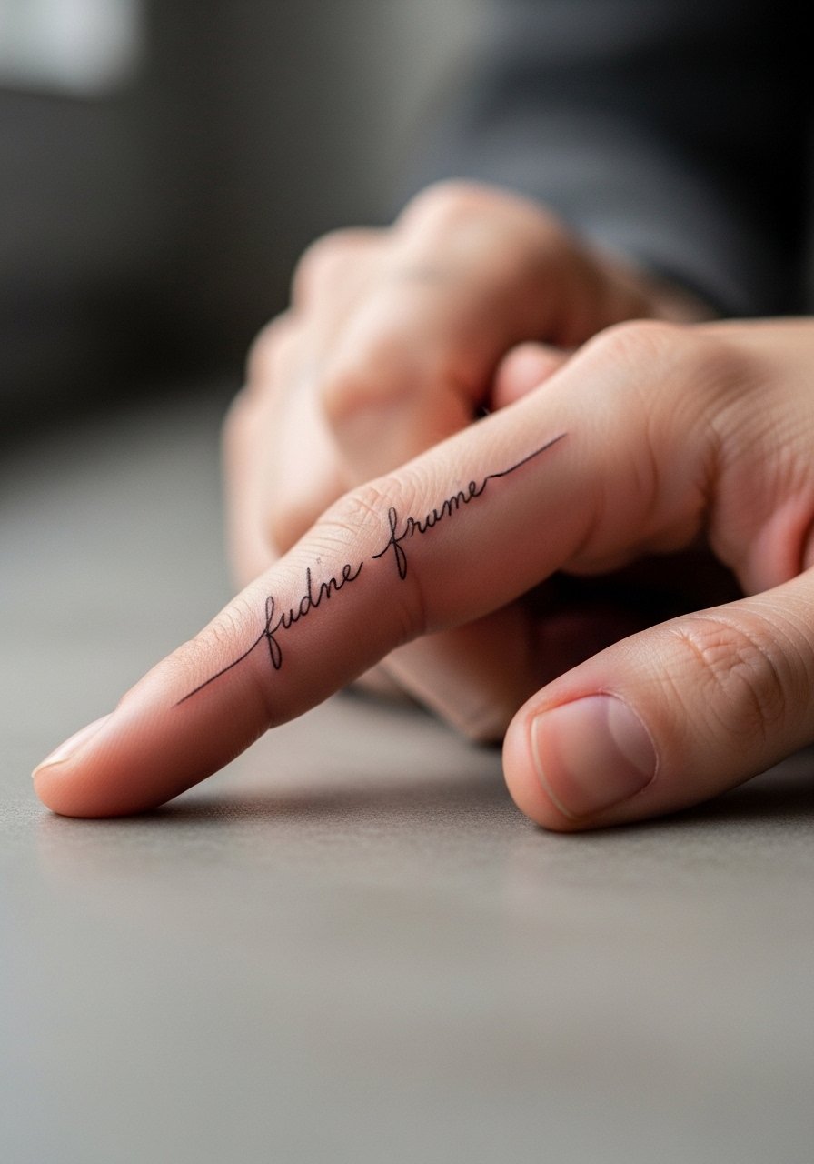
Fingers are notorious for early fading because of constant use and washing. If you want script there, request slightly bolder letterforms and accept that touch-ups are more common. The biggest mistake is demanding hairline strokes in a zone that sees friction from rings and typing. Sessions are brief and the pain is localized but sharp. If you like rings, pick slimmer profiles that do not sit directly over the script. For a show-off pairing try stacked dainty stackable rings that frame the finger without rubbing the letters.
6. Geometric Bar Along the Collarbone
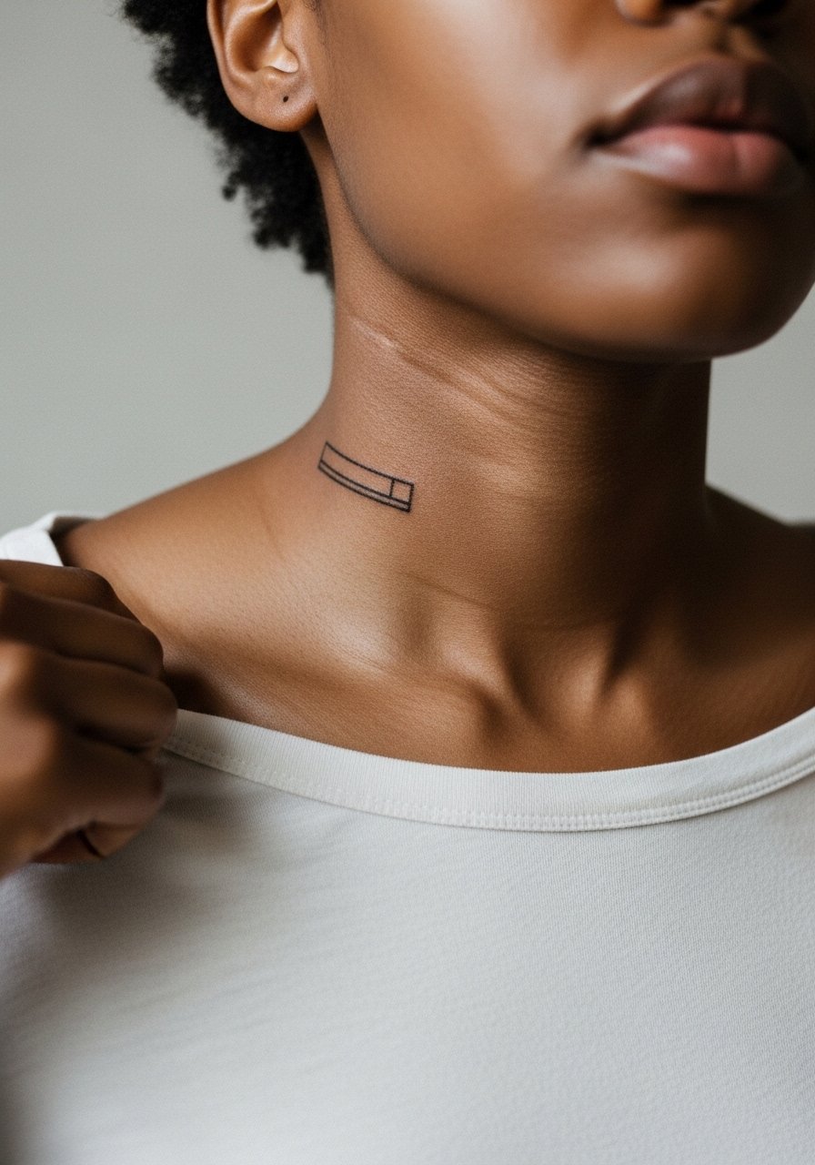
A collarbone bar reads bold because the bone provides contrast. Ask your artist for a faint negative space between the bar and skin lines so the piece keeps definition as the skin shifts. Pain is moderate and sessions are short. Common mistakes include placing the bar too close to the neck where movement warps the line. For showing this placement, wear open-back midi dresses or a thin chain pendant that sits above the piece, both frame the collarbone without covering the linework.
Before You Book
The wrist and finger pieces above heal differently from larger work, and a few targeted items smooth the session and the first week.
-
Stencil transfer paper kit. Lets you preview placement on skin, which matters for the wrist constellation and collarbone bar.
-
Topical numbing cream. Applied as directed it eases the edge on rib and sternum sessions so you can sit through longer stretches.
-
Thin protective film roll. Keeps finger and wrist tattoos cleaner during daily washing and typing.
-
Fragrance-free gentle body wash. Cleanses the healing area without stripping the fine line ink.
-
Aquaphor healing ointment. A thin layer for the early days helps retain moisture around tight needle channels for small fine line pieces.
7. Single Needle Floral on the Shoulder Blade

Shoulder blade work sits flat which helps fine line retain clarity. Tell your artist you want a slightly stronger outline on primary petals so shape survives when stipple shading fades. Pain is low to moderate and sessions can be split if you want a larger composition. A mistake is cramming a full bouquet into a tiny zone. At two years the stipple will soften, but the stronger contour keeps the flower readable. For showing this off, slip into a loose button-down shirt you can move off the shoulder when you want the piece visible.
8. Micro-Lettering Behind the Ear
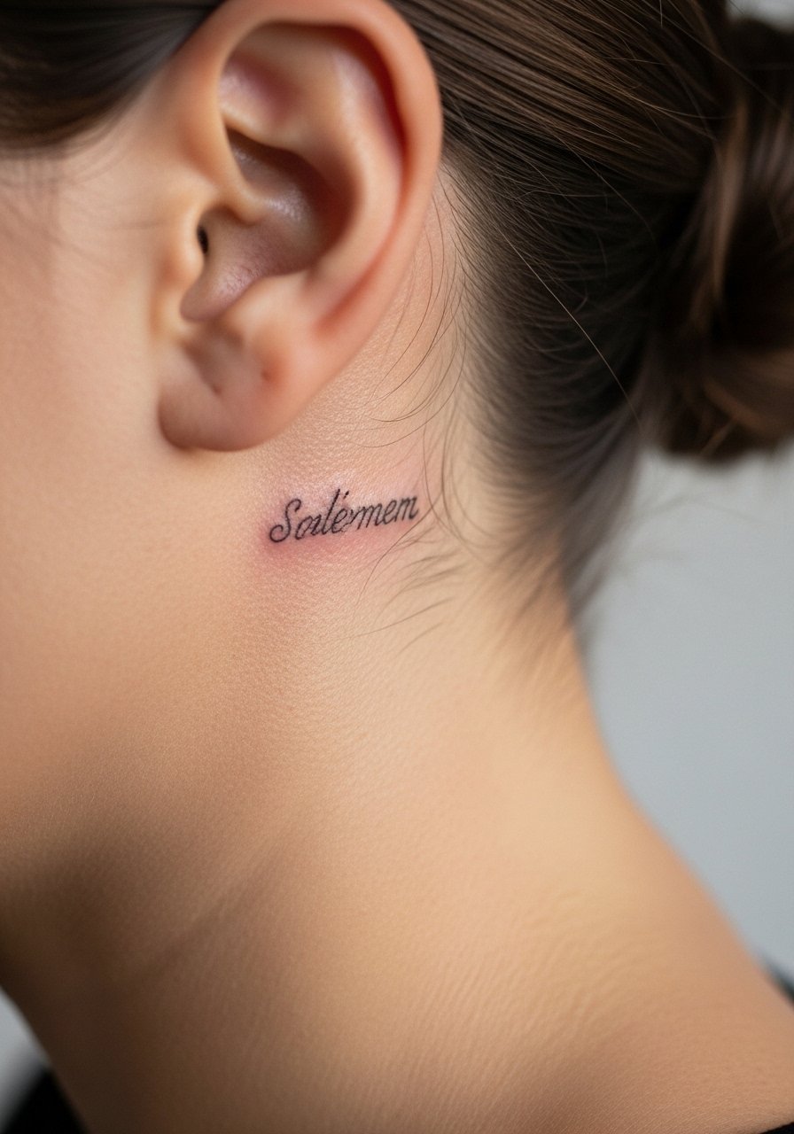
Behind-the-ear text is intimate and subtle. The area requires a careful stencil that follows the curve of the skull. Pain is mild but needle access is tighter, so expect short bursts. A frequent error is choosing too-small type that blurs against the skin texture. If the lettering is meaningful, request a draft placed on the skin to confirm readability. This placement can be concealed by hair when needed, so no heavy wardrobe planning is required beyond bringing a shirt that lets you tilt your head for access.
9. Small Mandala on the Inner Wrist
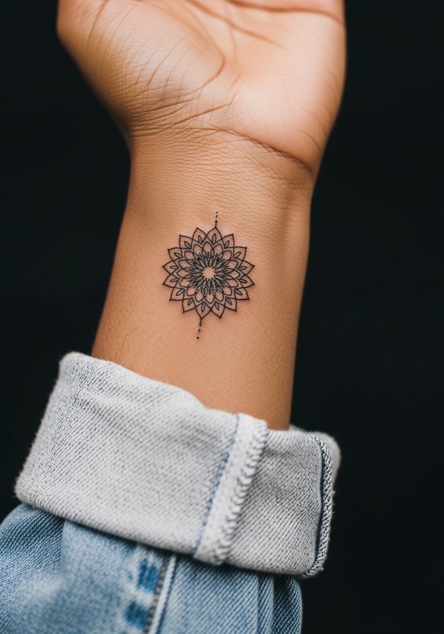
Mandala detail can look gorgeous, but inner wrist is a tight canvas. Ask for open negative space within the pattern so the dense areas do not merge over time. Pain is low to moderate and sessions are short. The common misstep is overloading the mandala with tiny filigree. Over the first two years the central dots may soften, so plan for a small touch-up if you want sharp contrast. For showing it off pair with a thin chain pendant necklace that keeps focus near the wrist without competing.
10. Minimalist Mountain Range on the Outer Calf
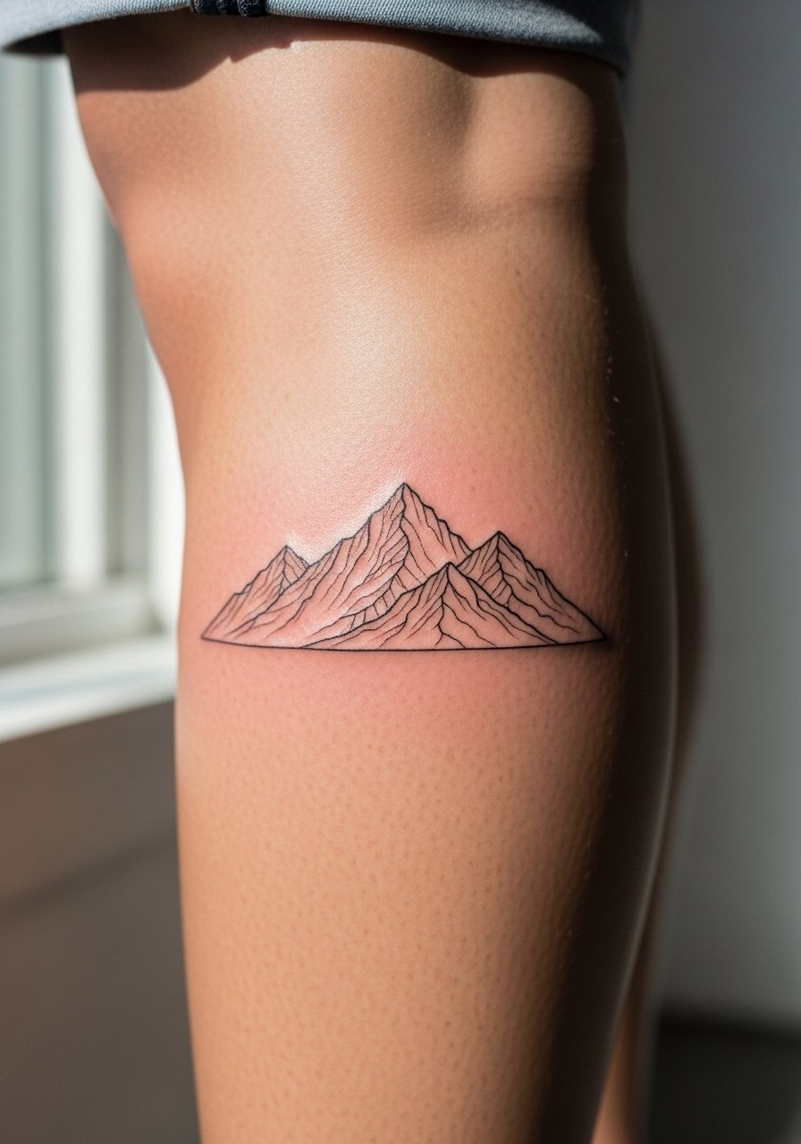
Calf placements give room for horizontal composition. I advise slightly bolder peaks so the silhouette reads from a distance as the thin ridgelines soften. The session is moderate in time and the pain is manageable for most. A mistake is compressing too many peaks into a narrow band which looks cluttered as lines blur. At five years the outline should still read if spacing is generous. For session comfort wear loose drawstring linen pants so you can roll the leg up without pressure on the fresh ink.
11. Single Line Face on the Upper Arm
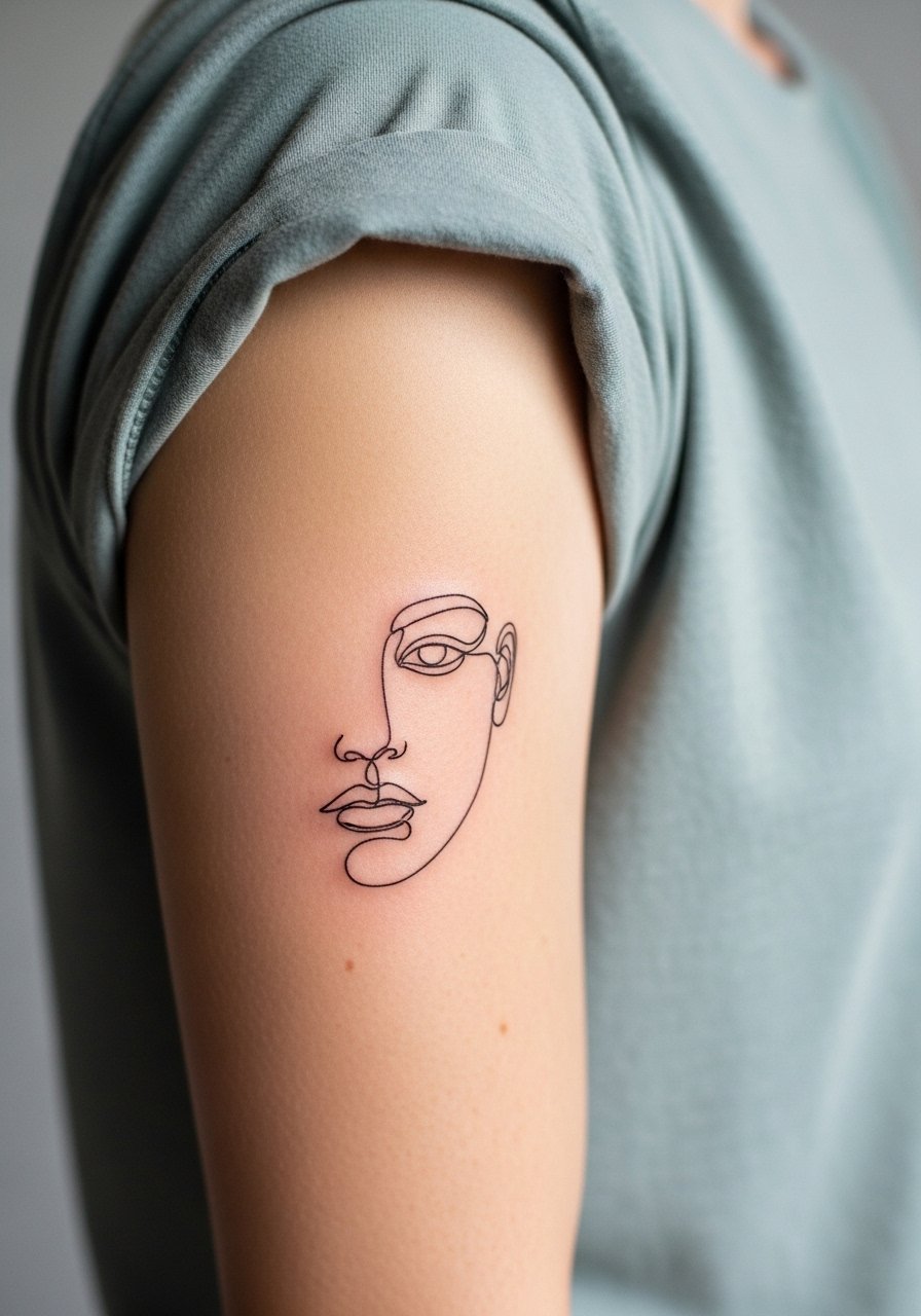
Continuous line portraits depend on deliberate negative space. Tell the artist during consultation that you want defined anchor points, not endless thin detours, so the face keeps form when lines soften. Pain is low and sessions are brief. A typical error is requesting excessive micro detail that complicates the single line concept. Over time the portrait becomes more graphic than delicate, which is fine if you plan it. Pair with short sleeves that sit above the piece to show the art without crowding it.
12. Delicate Spine Script
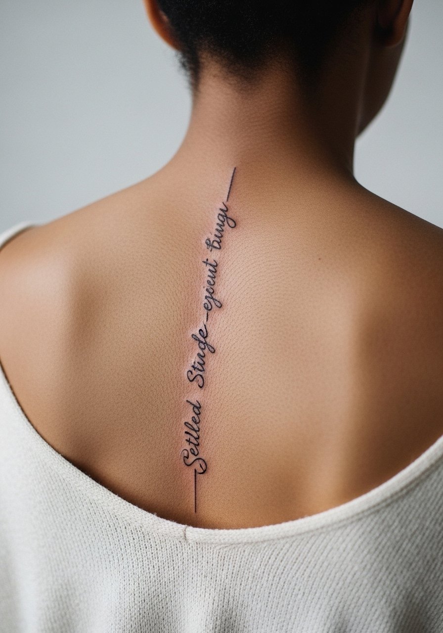
Spine script looks elegant but requires clear lettering and breathing room between lines. The debate among artists is whether the spine's curvature speeds fading in vertical text. Ask how they space letters to account for movement. Pain is moderate to high and sessions are longer. A common mistake is picking overly ornate fonts that collapse in the first year. Choose a clean script and plan for a touch-up at year two to retain crispness. For evenings pair the piece with open-back dresses that highlight the line.
13. Tiny Botanical Ankle Wrap
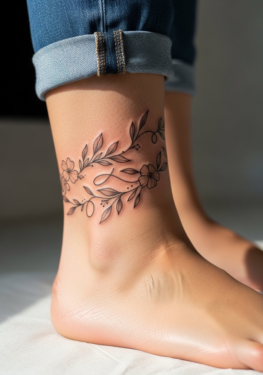
Ankle wraps sit in a friction zone near shoes and socks. Request slightly thicker stems on the wrap so the overall silhouette stays coherent as detail softens. Expect mild pain and a short session. A common error is drawing the wrap too low where shoes rub. For showing it off wear sandals or roll jeans and pair with a thin anklet that complements rather than hides the linework.
14. Micro-Realism Eye on the Wrist Crease
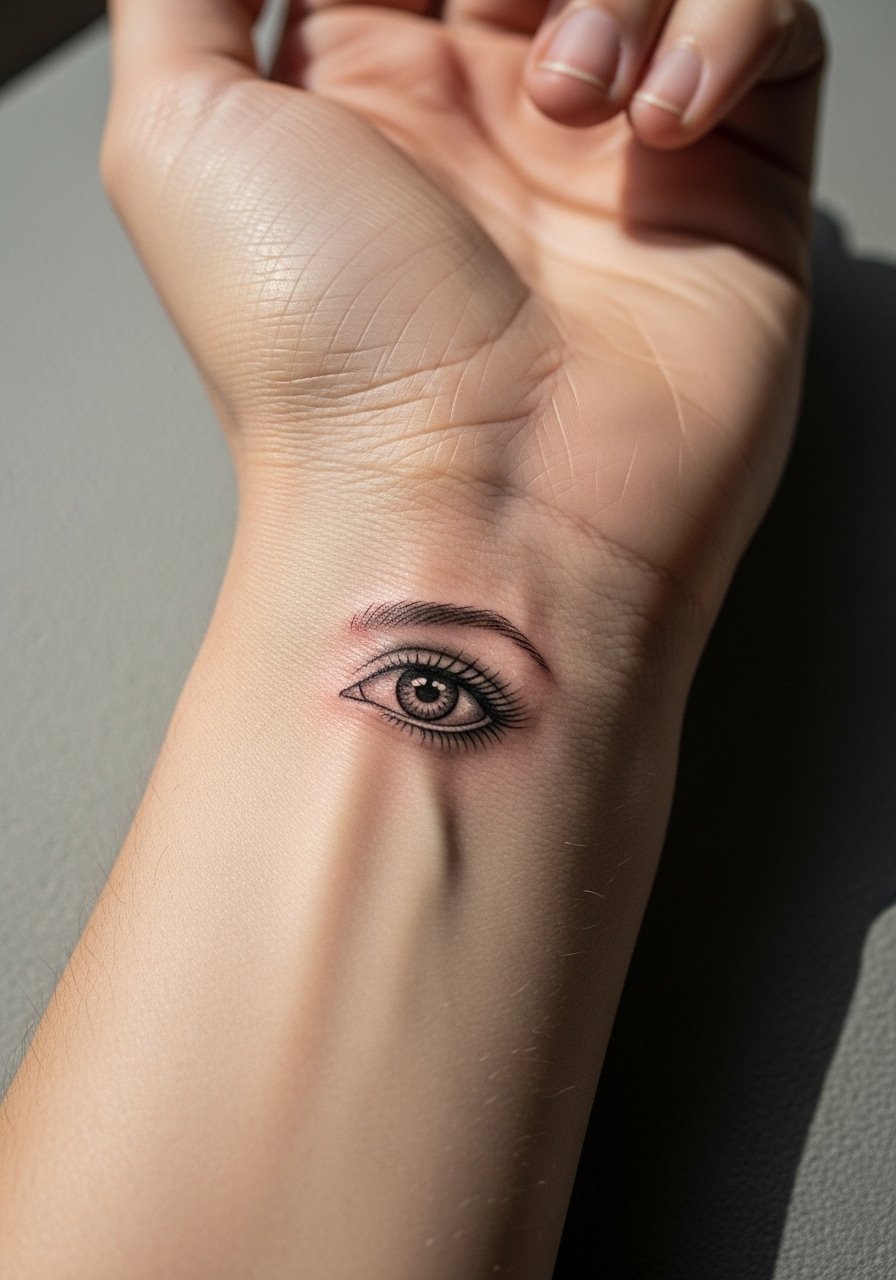
Placing micro-realism near the wrist crease means your design will flex often. Tell your artist you want the pupil and outline slightly emphasized so the gaze remains readable after movement. Pain is low to moderate and the session is short. The mistake is trying to cram tiny lashes that end up as a gray smudge. At six months the shading will mellow, which is normal. Keep the piece visible with rolled sleeves and a minimalist bracelet when you want to show it.
15. Fine Line Compass on the Outer Thigh
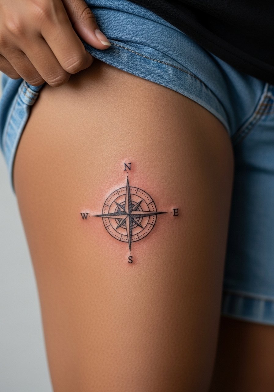
Thigh placements are forgiving for fine line detail because skin there is thicker. Ask for slightly increased negative space in the compass spokes so crisp geometry survives weight changes. Pain is low to moderate and sessions can be a comfortable longer stretch. A common error is centering the compass too close to the hip where fabric rubs. For the session wear loose shorts or a wrap skirt so the artist can access the area without pressure on the skin.
16. Thin Wave Line on the Side of the Foot
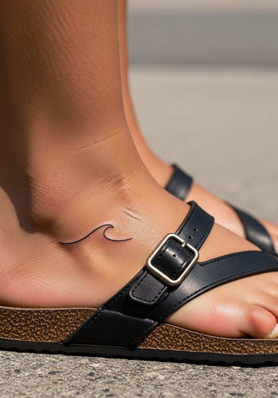
Foot lines are vulnerable to fade from shoes and moisture. Request a slightly stronger baseline so the mood of the design stays intact as fine detail softens. Pain is higher on the foot due to thin padding and the session is short but intense. The mistake is placing the tattoo where standard shoe seams sit. For showing the work, wear sandals or roll pants and consider a small simple woven anklet that does not rub the ink.
17. Back of Neck Script Under the Hairline
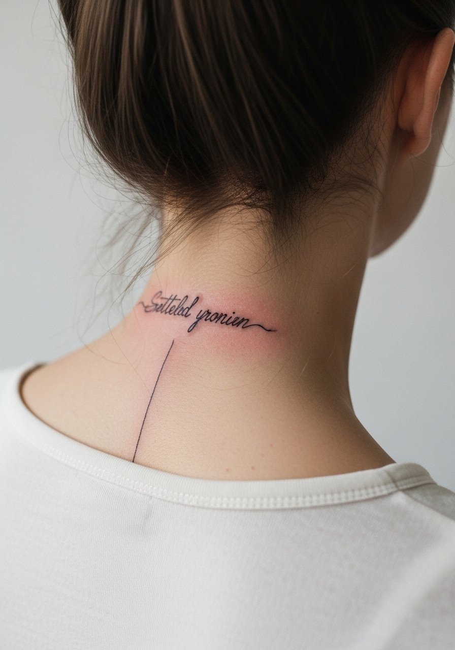
Back of neck script can be discreet or bold depending on font weight. Ask for letter spacing that anticipates hair growth and sun exposure. Pain is low to moderate and sessions are quick. A bad ask is ultra-thin lettering expecting decade-long clarity in a sun-exposed zone. If you work in environments sensitive to visible ink, this placement is easy to conceal. For the session tie your hair up and wear a shirt with a loose collar you can adjust.
18. Fine Line Hummingbird Near the Sternum
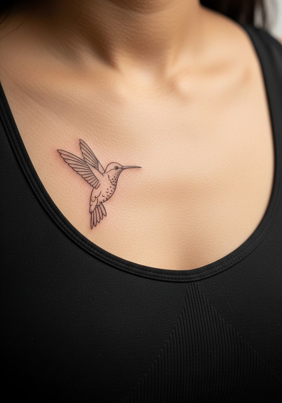
Sternum work divides opinion because movement and curvature can alter thin strokes. One camp says fine line softens too fast there. The other camp will proceed if you accept slightly bolder anchoring lines. Discuss both approaches in consultation so you know the trade-offs. Pain is high in the sternum and sessions are longer. The common mistake is too much filament detail in the wings. For the session wear a sports bra or bandeau that gives the artist clear access while keeping exposure modest.
19. Minimalist Barcode on the Inner Wrist
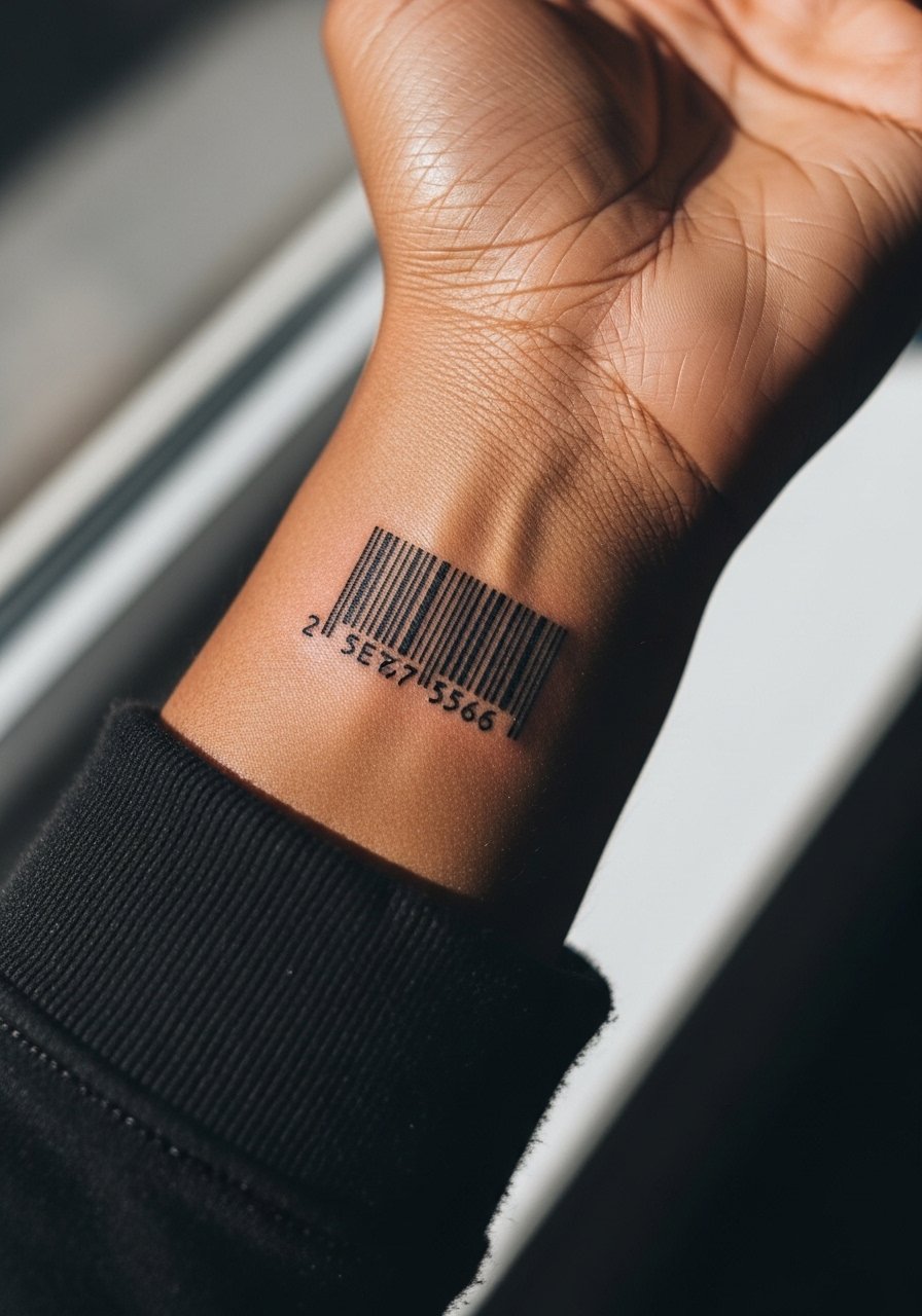
Barcodes rely on consistent spacing so they scan conceptually as design. Ask your artist to keep the bars slightly wider than a hairline so the negative space reads over time. Pain is low and the session is quick. The mistake is cramming too many bars into a tiny area which creates a dense gray strip as it ages. For visibility pair the piece with a minimalist watch worn above or below the tattoo to anchor attention.
20. Single Needle Palm Leaf on the Hip
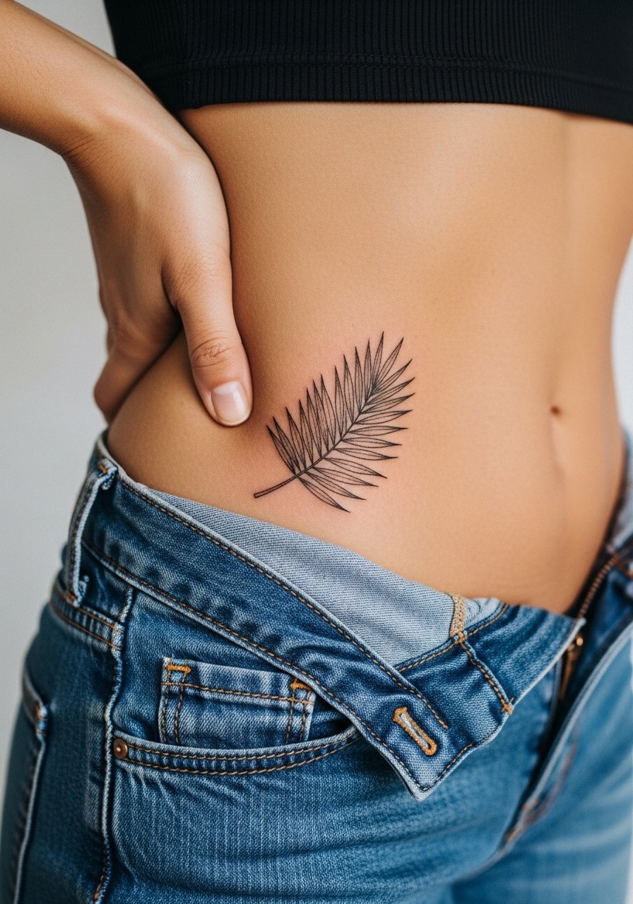
Hip tattoos sit partly under clothing so friction matters. Request slightly bolder midribs on the leaf to survive fabric contact and weight changes. Pain is moderate and session time varies with size. A common error is choosing a piece that extends too far under tight waistbands. For the appointment wear high-cut shorts you can shift so the artist accesses only the area needed without pinching the skin.
21. Fine Line Crescent and Stars Along the Side Torso
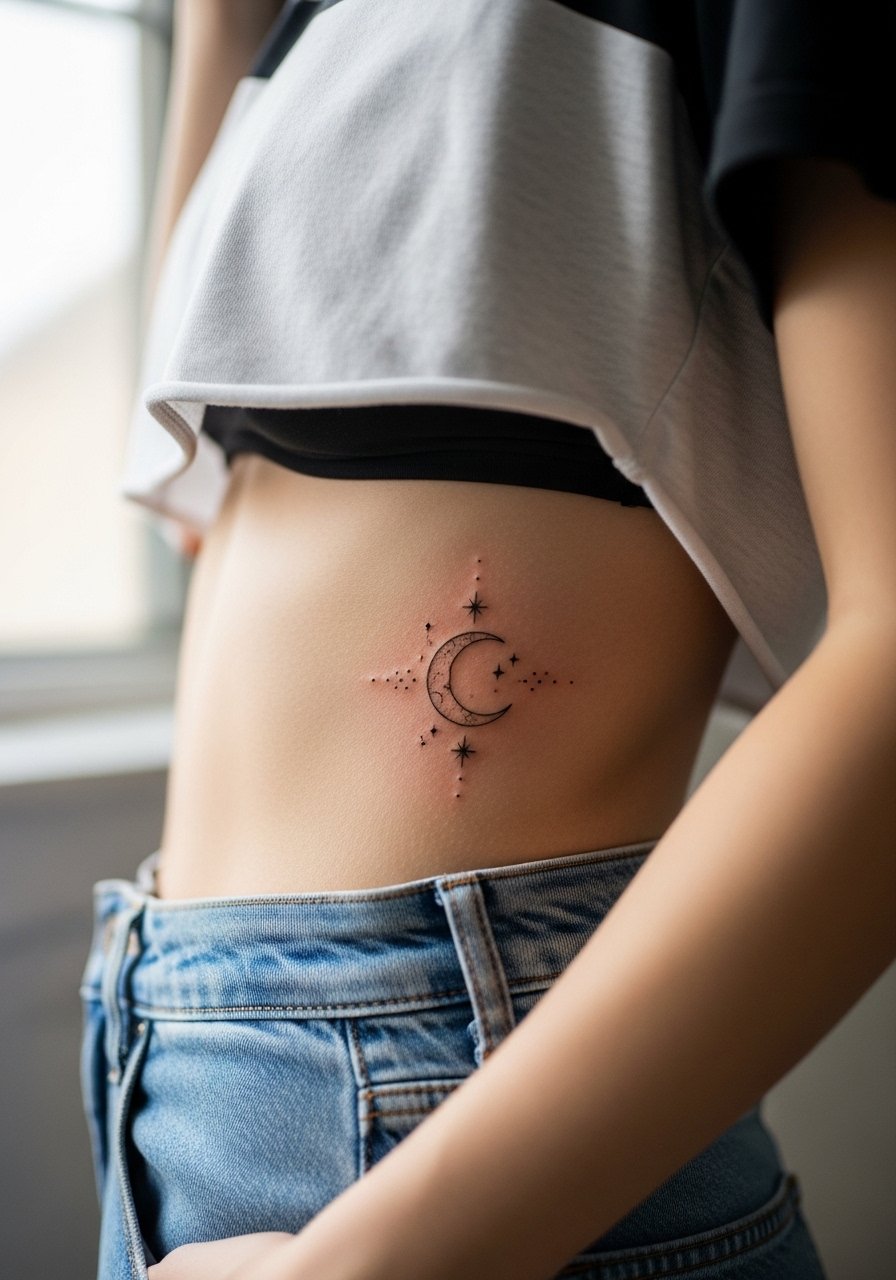
Side torso placements offer a graceful vertical sweep for simple celestial motifs. Ask for spaced stars and a slightly buttressed crescent edge so the moon keeps shape as thin points fade. Pain can be moderate to high depending on rib proximity and sessions can run longer. The mistake is packing the stars too tightly which creates an indistinct patch over time. For the session wear a cropped tee that can be lifted and high-waisted bottoms so the artist has clear access without exposing more skin than necessary.
Frequently Asked Questions
Q: Will fine line tattoos blur faster on darker skin tones?
A: Fine line visibility on darker tones depends on contrast and pigment choice. Some artists prefer slightly bolder anchors on darker skin to preserve shape while others work with ultra-precise dot work to keep the look delicate. Ask how the artist adjusts spacing and pigment for your skin during consultation because that will determine how the piece heals long term.
Q: How soon should I expect to get a touch-up for a wrist or finger fine line piece?
A: Plan for a possible touch-up within one to three years for wrist and finger placements because friction and washing accelerate fading. If your artist intentionally thickens key strokes at the start you may extend that timeline. Touch-up frequency also depends on sun exposure and how you care for the area after healing.
Q: Are there styling choices that make fine line tattoos look more intentional?
A: Yes. Minimal jewelry that frames but does not cover the piece helps, for example a thin chain pendant for collarbone work or stacked dainty rings for finger pieces. Clothing that exposes the design cleanly, like rolled sleeves or an open-back top, keeps attention on the linework instead of hiding it.
Q: Should I avoid fine line on the ribs or sternum entirely?
A: Not necessarily. There is a debate among artists. One camp advises against ultra-fine work there because skin movement can blur lines. The other camp will do it if you accept slightly thicker anchors and spacing. The safe approach is to discuss placement-specific techniques with the artist and review healed photos of similar placements in their portfolio.
Q: How do I pick a font for script that will age well on a wrist or spine?
A: Choose fonts with clear counters and moderate stroke weight rather than ultra-fine flourishes. Ask the artist to stencil the lettering on your skin so you can judge legibility at actual size. Clean, simple scripts with breathing room between letters usually hold up better than ornate cursive in tight placements.
