
Bold blackwork on the tricep can look like a statement now and a regret later if the scale and spacing are off. Heavy saturation and tight negative space age into a solid shape that still reads sharp after years, while tiny details crowd and blur. Start by thinking about line weight and how you want to show the piece when sleeves roll up, then move into the chair with that clarity.
1. Solid Outer Tricep Panel with Negative Space

A broad black panel on the outer tricep reads like armor from across a room and stays bold as it heals. I recommend this when you want a clean, graphic presence rather than a detailed image. Tell your artist you want crisp edges and slightly softened corners so the transition ages without forming harsh blowout lines. Common mistake is shrinking the panel into a tiny patch, which loses the intended visual impact after a couple of years. Session feel is mostly steady pressure and a buzzing that stays constant for 60 to 90 minutes. For showing it off, short-sleeve tees work best, try a loose button-down shirt you can roll up when you want the tricep visible.
2. Geometric Tricep Band with Stipple Gradient

A wrapped band that uses stipple shading instead of solid fill gives motion without a heavy saturation block. I point this out to clients who want pattern without the long-term commitment of a full blackout. Ask for dot work shading and a wider spacing near the edges to avoid dense areas that can merge. Expect the session to be in two passes if the shading requires finesse, and plan a touch-up at year two for stipple density. The biggest aging error is packing dots too close together. For casual nights, a short-sleeve linen shirt frames the band without competing with the pattern.
3. Negative-Space Chevron Stack for Mobility Zones

Chevron stacks that play with bare skin between black shapes work well on the tricep because the area flexes without extreme stretching. I recommend this design for athletic builds since the pattern moves with the muscle. Tell the artist you want crisp negative edges and slightly heavier outer lines so the chevrons keep their silhouette as the skin ages. The common mistake is using too-thin negative veins which close up over time. Expect 60 minutes for a single run and a likely touch-up at year three. For evenings out, pair this with a racerback tank or short sleeves rolled to mid-arm to let the pattern show.
4. Tribal-Inspired Blackwork Armband Reimagined

Modern blackwork tribal bands borrow bold shapes from traditional motifs while avoiding exact cultural replication. If you lean this way, say you want inspiration rather than a direct copy and ask for unique negative breaks so it reads custom. Artists split on direct cultural use, one camp favors preservation of source forms, the other supports respectful reinterpretation. Name both camps and decide where you stand before booking. The session usually runs 45 to 90 minutes depending on wrap complexity, and a common error is matching the band too tightly to muscle creases. For day-of comfort, wear a loose tank top so the artist can slide fabric for clean access.
5. Mandala Slice Sitting on the Upper Tricep
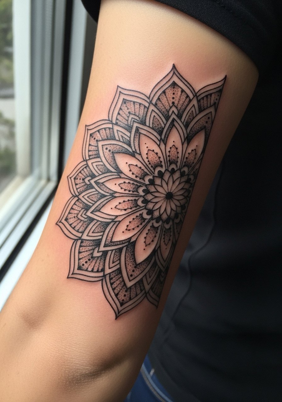
A mandala slice uses radial repetition but trimmed to fit the curve of the tricep. I suggest this for someone who likes symmetry but not a full sleeve. During consultation, bring images that show the exact spacing you want because too-dense petals blur with motion. The aging risk is crowding fine petal lines near the center; asking for more breath between rings preserves clarity at years two and five. Session time is often 90 to 150 minutes if the detail is tight. Pair this with a rolled-sleeve oxford to reveal the arc when you want it visible.
6. Scripted Phrase in Heavy Black Flourish

Script in thick blackwork makes text readable at a distance and resists early blurring, but the trick is sizing and spacing. Tell your artist the exact phrase, the font weight you prefer, and that you want the counters slightly open so letters do not merge as the skin settles. A common mistake is very thin flourishes tucked against solid fills which vanish over time. The session is usually under two hours for a medium-length phrase and touch-ups are rare if spacing is set right. For nights you want to show the lettering, a short-sleeve henley keeps attention on the arm without covering the script.
Studio Day Picks
The tricep pieces above include solid blocks, bands, and detailed mandala slices, and each asks for slightly different prep and first-week care.
-
Stencil transfer paper kit. Lets you preview how a block or script will sit on the curved tricep before the needle touches skin, which matters for round shapes.
-
Topical numbing cream. Useful for outer tricep sessions that run past an hour, it eases the edge without changing how the artist lines the work.
-
Thin protective film roll. Protects tricep designs from friction under shirts during the first days when black saturation can smear if irritated.
-
Fragrance-free body wash. Gentle cleansing during showers helps maintain crisp linework for script and mandala edges without stripping moisture.
-
Aquaphor healing ointment. A thin layer during the initial healing window keeps blackwork from scabbing excessively while letting saturation settle evenly.
7. Interlocking Chain Pattern Around the Tricep

Interlocking chain motifs read mechanical and deliberate. I usually recommend them for folks who want a repeating structure without dense fill. Ask for slightly rounded inner corners so the links do not sharpen into blowout-prone points. The mistake is making each link too small for the machine group used, which encourages blurring. Session time is modular and can be done in blocks of 30 to 45 minutes. For visibility, a muscle-fit tee shows the pattern when sleeves hug the arm and draws eyes to the tricep arc.
8. Floral Silhouette Reduced to Black Shapes

A floral silhouette in blackwork becomes graphic and ages well if petal tips are held open rather than inked into tiny points. I advise clients who want organic forms but clean longevity to pick larger petal shapes and avoid dense inner shading. The common error is micro detailing inside petals that softens quickly as the skin moves. Expect 60 to 120 minutes depending on scale and a touch-up around year two if you want the black to remain saturated. For showing the silhouette, a rolled short-sleeve shirt frames the curve without covering the artwork.
9. Animal Silhouette with Bold Fill
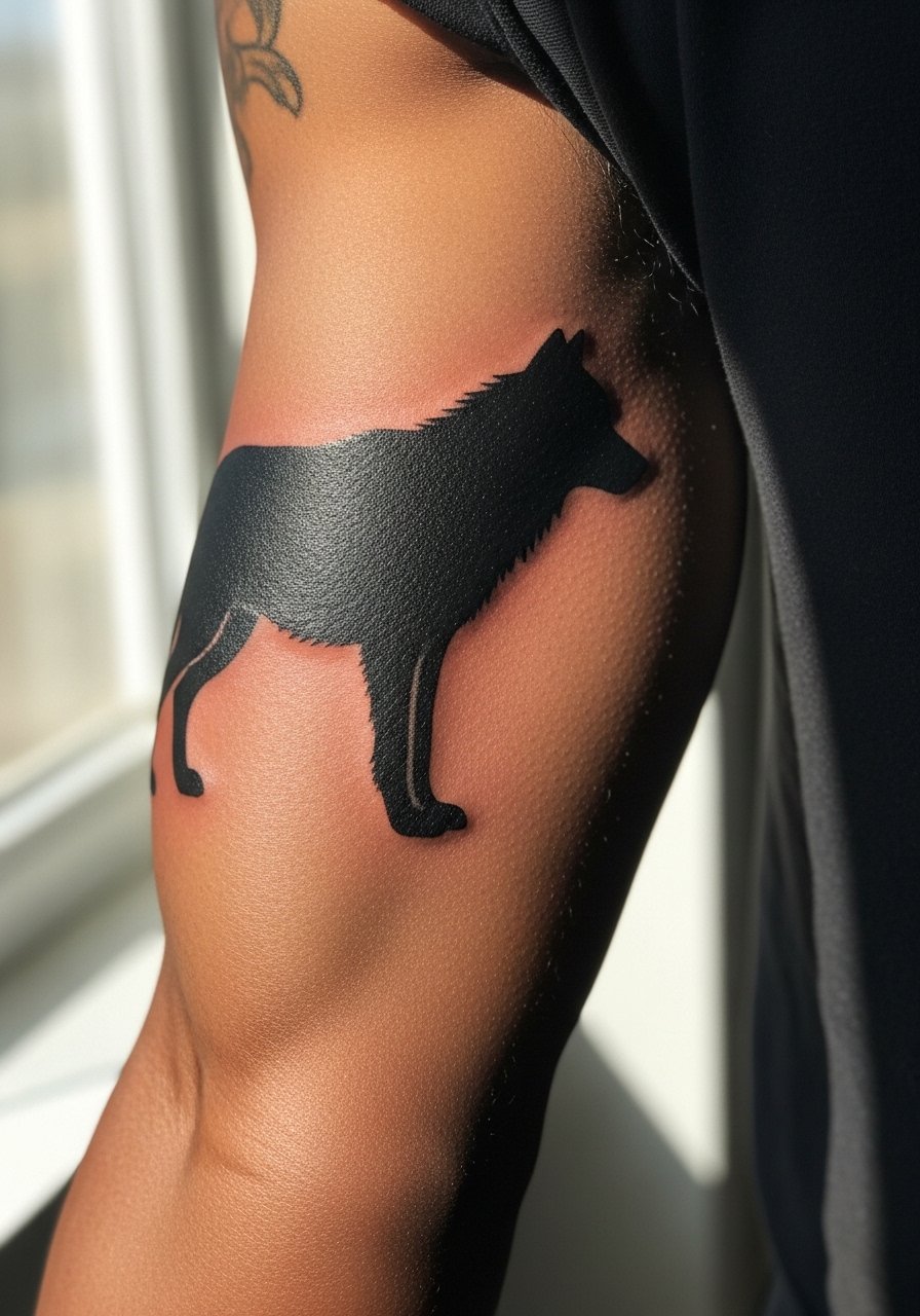
Silhouettes of animals work great in blackwork because they rely on a single read rather than internal detail. Tell your artist the exact stance you want and ask for slightly thicker outer lines to maintain the silhouette as skin ages. One common mistake is packing interior tiny features into a silhouette which invites early loss of shape. Sessions vary by size but generally finish under two hours. This design pairs well with a button-up shirt worn open over a tee so the arm is visible when you want it to be.
10. Abstract Brush Stroke Panel

Brush stroke pieces use irregular edges and uneven saturation to feel organic while staying bold. I suggest this when you want the look of movement and a bit of unpredictability. In consultation, show photos of the exact brush feel you like and agree on where to leave skin breaks. The risk is asking for tiny hairline flicks that disappear; larger, confident strokes age much better. Depending on size, plan for 45 to 120 minutes and expect a minimal touch-up later. For casual wear, a short-sleeve henley exposes the arm without making the piece feel staged.
11. Stippled Portrait Silhouette in Blackwork
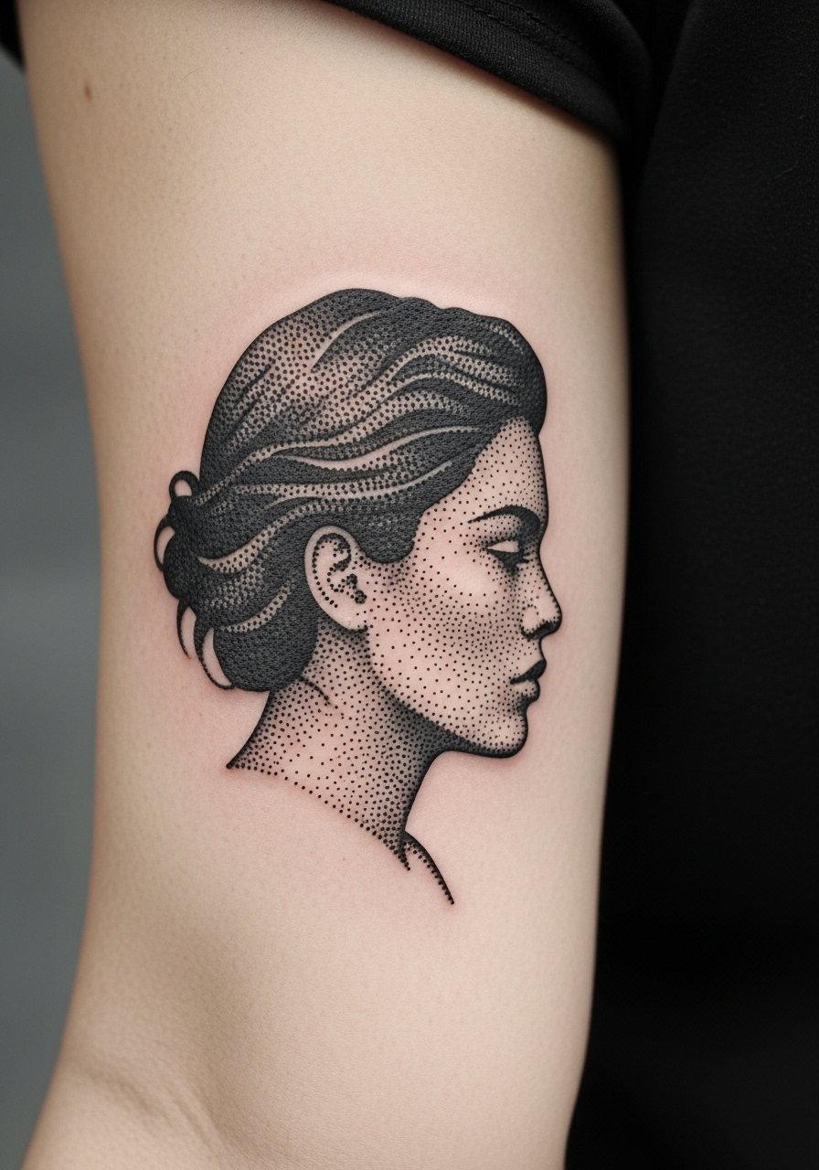
Stipple portraits reduce a face to dots and strong black shapes for a timeless feel. This works best when the reference has clear contrast. Ask for test patches of stippling density so you can preview how the dots will read at different distances. A common mistake is over-detailing facial features with solid fill; the result loses nuance over time. Sessions are longer because stipple is meticulous, so expect two to three hours and likely a touch-up at year two to refresh dot contrast. For subtle presentation, pair with a clean white tee that lets the silhouette hold the eye.
12. Mechanical Linework and Gear Motif

Gear motifs and mechanical linework read technical and graphic on the tricep, which has enough flat area to hold crisp details. I recommend slightly thicker anchor lines around gears so small teeth do not smear into each other as the skin ages. The mistake is packing too many tiny gear teeth into a small space. Expect a focused two-hour session and a touch-up at year two if you want every gear edge to stay sharp. For a look that complements the motif, try a rolled-cuff denim shirt that frames the arm.
13. Bold Compass Rose on the Lateral Tricep
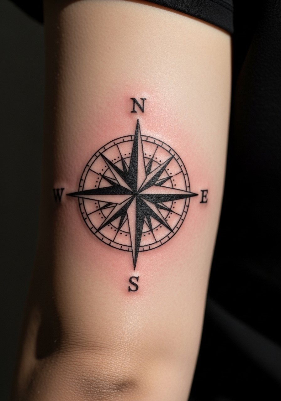
A compass rose in solid blackwork holds orientation and meaning without needing color. Tell the artist you want a strong center point with spaced radial arms to avoid crowding in the core. One camp argues for ultra-fine directional lines, the other for bolder arms for longevity. Name both approaches and pick the finish you can live with for years. Sessions are usually 60 to 120 minutes and a touch-up is common around year three to keep vanes crisp. For outings, a short-sleeve performance tee shows the compass without heavy sleeve interference.
14. Dense Dot-Work Gradient from Tricep to Back

A stipple gradient that fades from a dense black at the tricep to lighter dots toward the back reads like shadow and moves with the shoulder. I recommend this when you want transition without traditional shading. Tell your artist the exact fade point so dots do not create a muddy patch near the curve. The common error is too abrupt a density change. Session often runs long because of dot density and may need a follow-up pass. For showing the fade, a tank top with a low back reveals the gradient without full exposure.
15. Baroque Ornament Panel Curved to Muscle
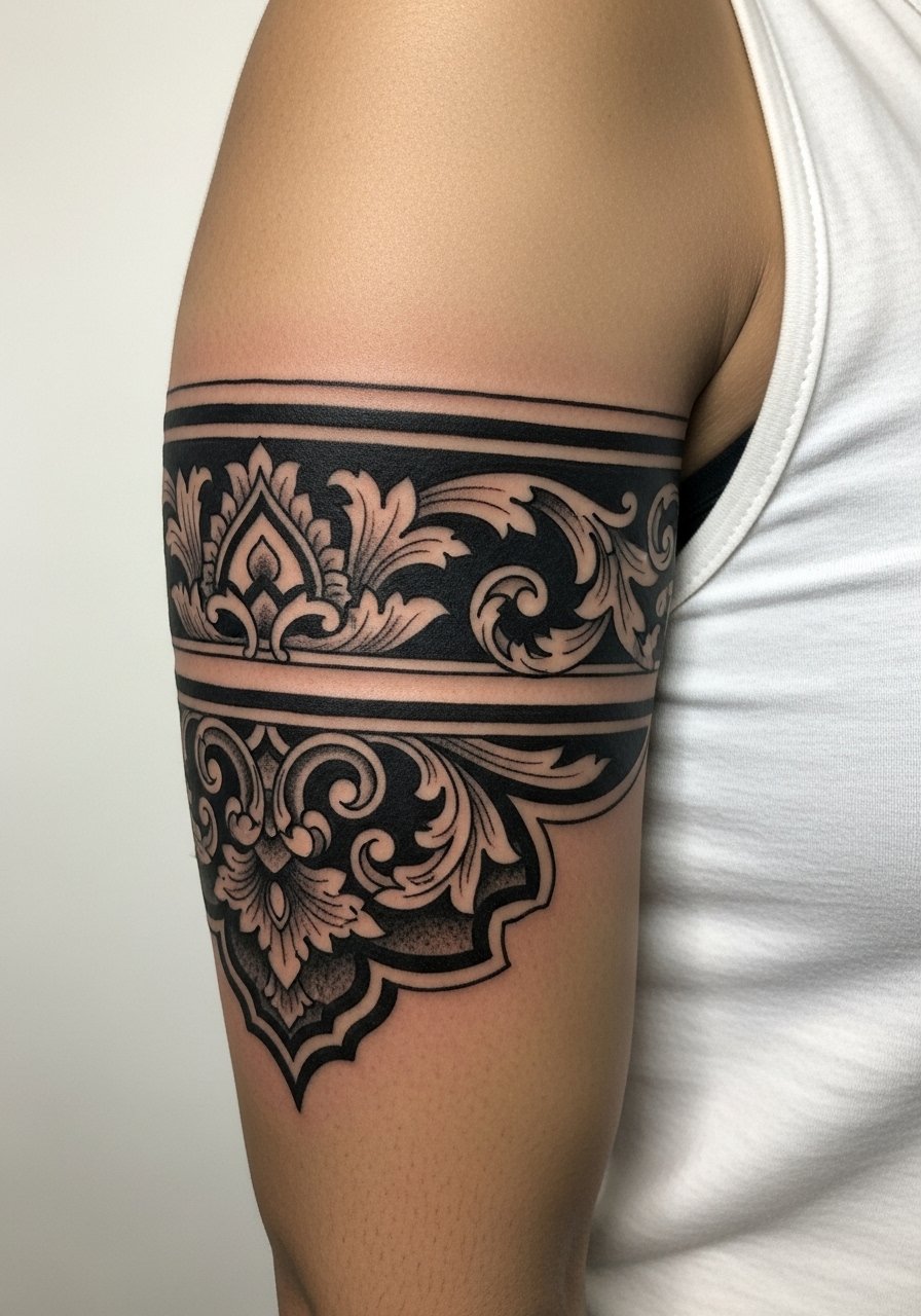
Baroque ornament uses scrolls and fills to create a decorative panel that wraps the tricep elegantly. I suggest asking for simplified scrolls rather than tiny flourishes that disappear with movement. The mistake is over-detailing inner curls which age into indistinct smudges. Plan for 90 to 180 minutes depending on panel size and expect a touch-up if you want deep black to maintain contrast. For events, a short-sleeve blazer over a tee frames the ornament without hiding it.
16. Broken Grid and Plaid Block for a Graphic Read
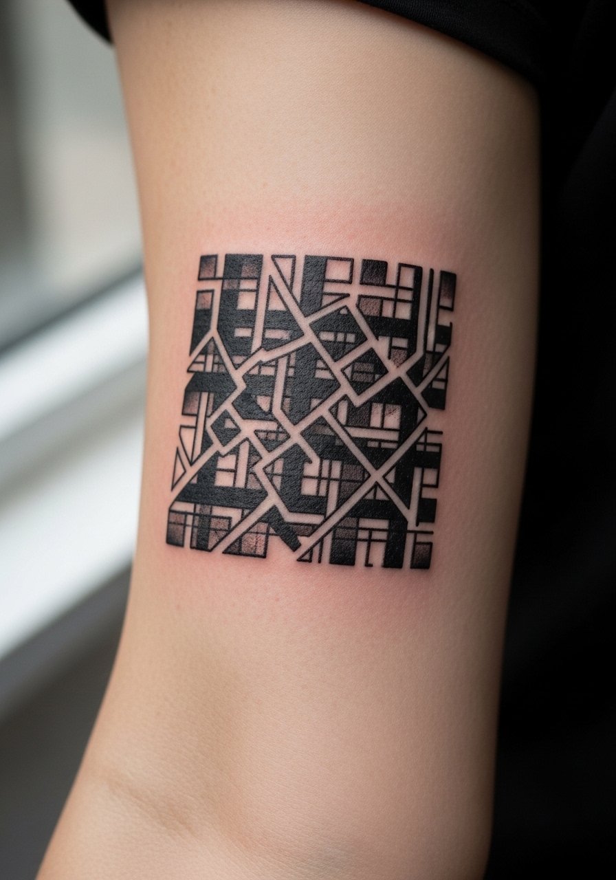
A broken grid plays with alignments and negative breaks to give a plaid-like effect that does not feel traditional. I recommend this when you want pattern that stays readable at a glance. Ask for macro-scale squares so the negative spaces retain definition over time. The common mistake is limiting grid cells to a size too small for the tricep curvature. Sessions are modular and a touch-up at year two helps reestablish crisp borders. For show, a rolled-sleeve chambray shirt keeps the arm visible while matching the graphic feel.
17. Arrow Series Pointing with Black Negative Space

A run of arrows aligned along the tricep creates motion and direction. I prefer slightly bolder shafts with defined negative edges so arrowheads do not blend into each other over time. The usual error is making arrows too skinny and close together. Sessions can be done in short passes and a touch-up at year three is common if you want each arrow crisp. For daytime wear, a short-sleeve cotton tee reveals the line of arrows neatly.
18. Maze or Labyrinth Panel for a Tactile Look

Maze panels demand clear corridors and space so pathways do not collapse into a blob. Tell your artist you want corridors of at least 3 to 4 millimeters so the negative pathway stays visible as the skin moves. The mistake is packing the maze too densely. Sessions tend to be longer because of the precision required and a touch-up at year two is normal if you want the contrast maintained. This pairs with a short-sleeve technical hoodie for a streetwear look that shows the maze when sleeves ride up.
19. Broken Skull Silhouette with Hollow Eyes
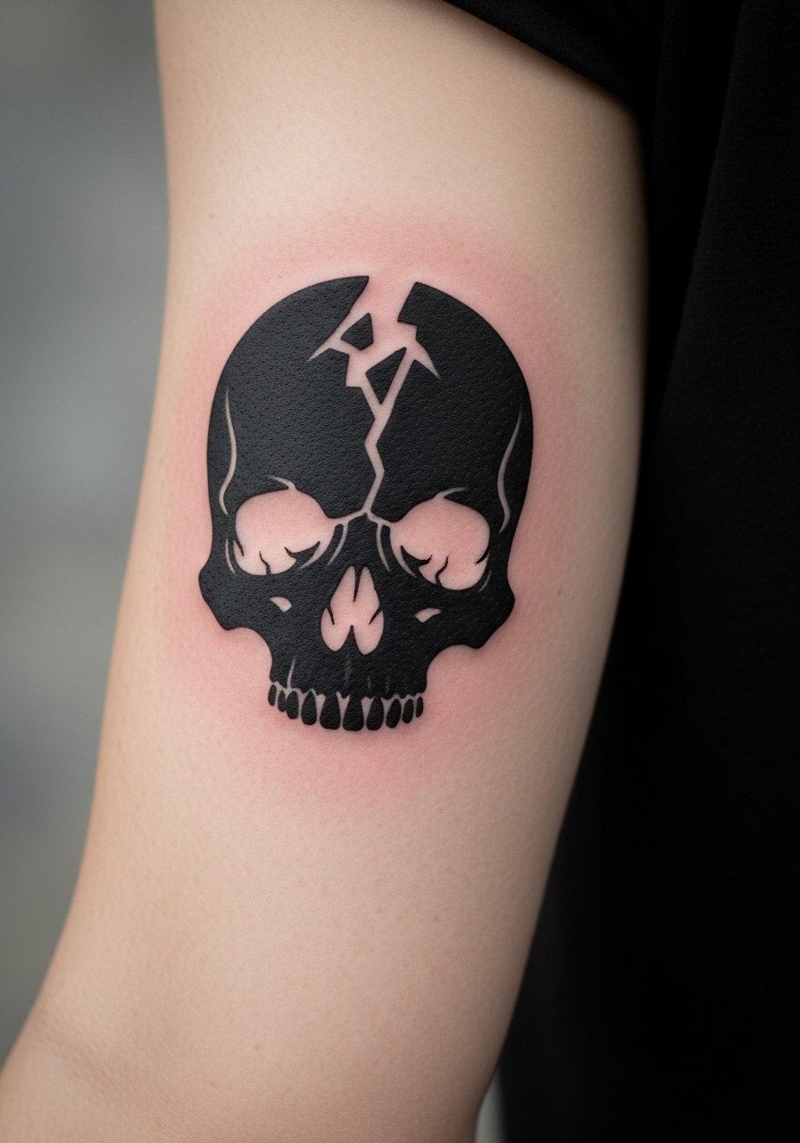
Skull silhouettes in blackwork read bold without internal detail. I advise larger hollows for eyes and nasal cavities so they remain distinct. The most common mistake is tight, tiny sockets that close up and lose the silhouette. Sessions typically finish under two hours and a touch-up at year three can reestablish dark hollows. For visual balance, a short-sleeve vintage tee keeps the arm visible and matches the motif.
20. Checkerboard Panel That Wraps the Arm

A checkerboard needs consistent square sizes so the grid reads as pattern rather than texture. Ask for squares sized to the arm so the pattern respects the curve and avoids distortion. The danger is shrinking squares until they blur into one another. Sessions are straightforward and often completed in a single block. For a casual reveal, a rolled-cuff tee shows the pattern without fuss.
21. Brush Script Initial Reduced to Heavy Blackblock

A single initial done as a heavy black block reads like a crest and is forgiving with age when the counters are open. Tell the artist the exact letterform and ask that they scale it so counters remain visible. Tiny serif details are the usual error because they vanish into blur. Sessions are short, often under an hour, and touch-ups are rarely needed if the spacing is set well. For subtle presentation, wear a casual short-sleeve shirt you can roll to mid-arm.
Frequently Asked Questions
Q: Will solid black panels on the tricep cause more blowout than patterned work?
A: Solid black panels can show blowout if the needle is pushed too deep or if the artist packs too much pigment into thin skin. In my experience, panels on the outer tricep are lower risk compared with inner-arm work because the skin is thicker. Ask about the artist's approach to depth and request a small test patch or a few photos of healed panels in their portfolio.
Q: How should I describe negative-space geometry to avoid it blurring over time?
A: Be explicit about minimum negative widths and spacing in the consult. I tell clients to ask for at least 3 to 4 millimeters of clear negative space in critical areas so the design breathes as the skin settles. Bringing annotated reference images with measurements helps avoid misunderstandings.
Q: Do stipple gradients on the tricep need special aftercare compared with solid blackwork?
A: The aftercare is the same for both, but stipple gradients depend on dot contrast, so mild hydration and avoiding early heavy scabbing are important. The products listed in the Studio Day Picks are intended to protect saturation and reduce scabbing during the first week.
Q: Are inner tricep placements riskier for fine detail than the outer tricep?
A: Yes, inner-arm skin flexes more and can blur very fine detail faster. If you want intricate dot work or thin script choose the outer tricep or agree with the artist on bolder line weights for inner placements.
Q: How often should I expect touch-ups for heavily saturated blackwork on the tricep?
A: Expect to consider a touch-up around year two to four depending on your sun exposure and how saturated you want the black to remain. Dark saturation lasts longer in areas with less friction and less UV exposure, so wardrobe and sunscreen choices affect the timeline.
