Fine line name tattoos look striking fresh, but they do not age the same everywhere. Bold blackwork holds up differently, and the trick is choosing the right letter weight, placement, and negative space so a name still reads clean in five years. These ideas focus on clarity and personality, the sort that sit well under a watch or peek out from a collar, and the first six set up common prep and styling you'll use at consultation.
1. Bold Script Name on Inner Forearm
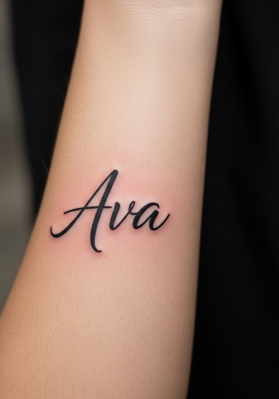
I've seen bold script keep its readability longer than delicate cursive on the inner forearm. Tell your artist you want heavier linework and slightly wider letter spacing so the counters do not close up with time. The session feels steady and tolerable, often under an hour for a short name, though expect a mild burn near the wrist crease. Most mistakes here come from asking for pencil-thin letters that blur by year three. For showing it off, roll up sleeves or pair the piece with a thin chain bracelet that frames the wrist without masking the letters.
2. Block Letter Name Along the Side of the Finger

Finger placements read like jewelry but are high maintenance. Expect faster fading and potential touch-ups at year one or two if you work with your hands. During consultation, specify bold, block-style letters and ask for compact negative space so the letters do not spread into one another. Fair warning, daily washing and friction will strip saturation faster than on the arm. For the session, slip on a soft cotton glove afterwards to keep the area clean while you move through the first day.
3. Script Name Nestled Under the Collarbone

This spot balances visibility with a low blowout risk when done with bold weight. Tell the artist you want the starting and ending letters anchored with small dots rather than flourish that can bleed. Most people misjudge how a curved collarbone shifts when they breathe, so test the stencil with different neck positions. Expect a session that can last 30 to 60 minutes depending on size. For evenings out, pair the name with an open-back dress or a wide-neck sweater to let the script peek through.
4. Single-Word Name on the Ribcage, Sized for Longevity
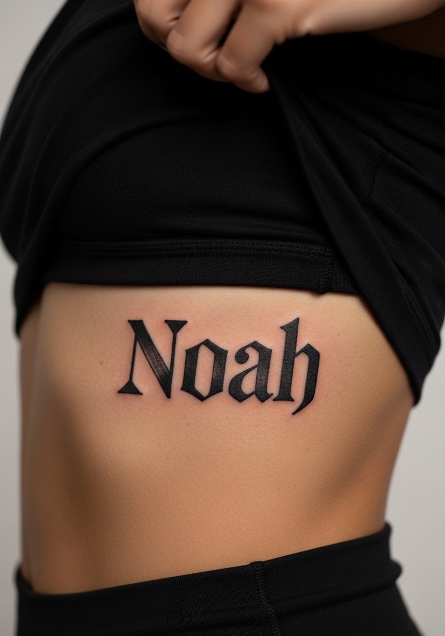
Fine line on the ribs splits artists into two camps. One group argues skin movement and stretch blur thin letters within two years. The other group says with proper depth and spacing, finer work settles fine. I recommend sizing letters slightly larger and using heavier blackwork for names here, especially if you want the text to last. The session can be uncomfortable, a steady 7 out of 10 on many pain scales, so bring loose clothing and plan a longer appointment. During consultation, ask about touch-up timing and how the artist spaces counters to avoid early merging.
5. Vertical Spine Name in Heavy Blackwork
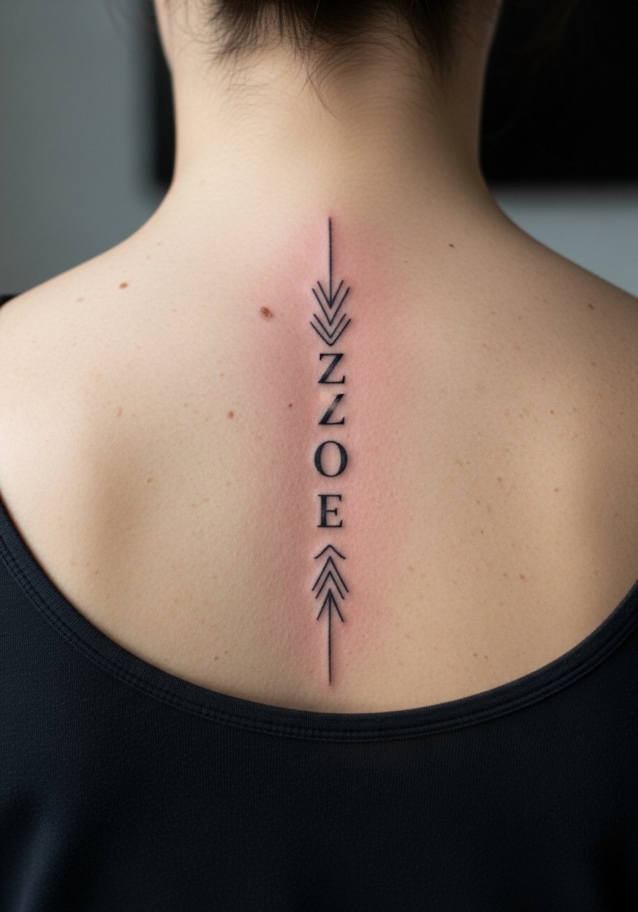
Vertical names on the spine read dramatically and survive time well when letterforms are bold. The common error is squeezing thin script into long runs which becomes unreadable after a few years. Ask for sturdy letterforms and for the artist to check how the name aligns with your spine while you stand and while you bend. Sessions here can be longer because of contouring and positioning. For showing off, open-back tops pair naturally with this placement, and a delicate pendant necklace sits just above the top letter without stealing focus.
6. Name in Negative Space on the Upper Arm
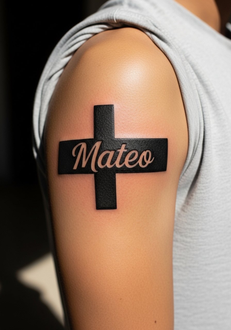
Negative-space lettering lets the skin form the letters, which can be more forgiving than thin lines. Tell your artist you want a clear margin between the black fill and the letter counters to avoid ink migration eating into the name. The session tends to be noisier under the needle but comfortable on the thick arm flesh. A common mistake is shrinking negative space too much, which makes the letters collapse visually over time. For the appointment wear, a loose button-down shirt you can pull aside keeps the artist's access clean and your shoulder relaxed.
Studio Day Picks
The first six placements above include both friction-prone spots and areas that need longer sessions, so a few specific items smooth the appointment and first week.
-
Stencil transfer paper kit. Lets you check lettering placement on skin before the needle hits, crucial for names on the chest and forearm.
-
Topical numbing cream. Applied per instructions ahead of a ribcage or sternum session to ease the first half hour.
-
Thin protective film roll. Keeps finger and wrist names from catching on clothing while the scab stage begins.
-
Fragrance-free gentle body wash. Cleans healing areas without stripping ink on exposed placements covered by the ideas above.
-
Aquaphor healing ointment. A thin layer in the first days helps protect tight linework on the wrist and finger pieces without clogging.
7. Minimalist Cursive Along the Wrist

The wrist shows small tattoos well, but thin script fades quickly with frequent washing. If you want a cursive name here, ask the artist for slightly bolder stem lines and a consistent baseline so letters do not drift with time. Expect a quick session, often under 45 minutes, and plan for lighter aftercare in the product block. To frame this placement daily, a minimalist watch or a narrow cuff sits beside the script and draws the eye without covering the letters.
8. Monoline Name Around the Ankle
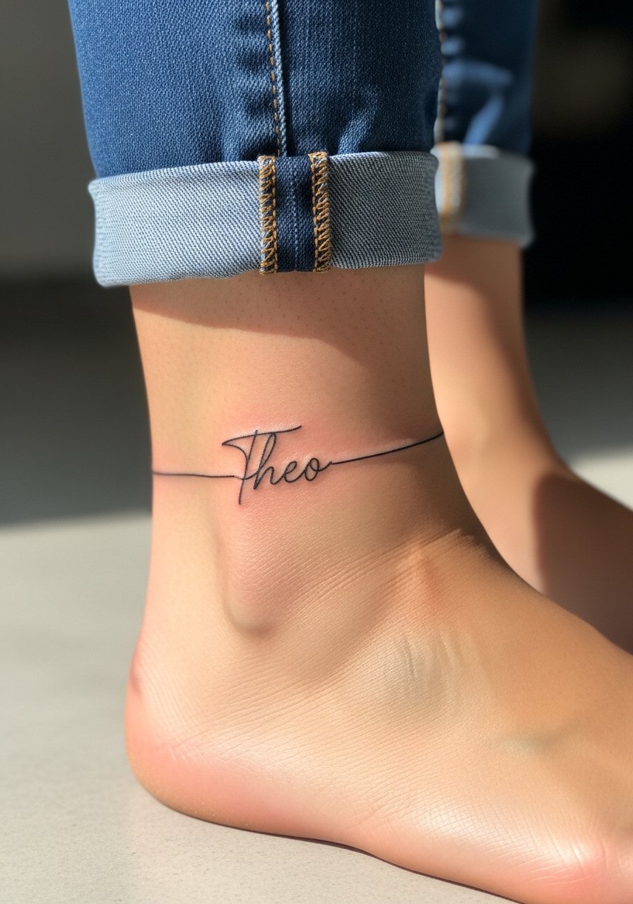
Ankle names are subtle but face abrasion from shoes and socks. Use clean monoline letters with a touch of spacing so the lines do not blur into one another. Ask your artist about how the design will sit when you stand versus when you sit, because skin folds change the way letters align. Sessions are short but require careful aftercare to avoid scabbing under sock friction. For show-off looks, sandals or cropped pants work best, and a threaded anklet can highlight the name without rubbing it.
9. Name in Small Caps on the Upper Bicep
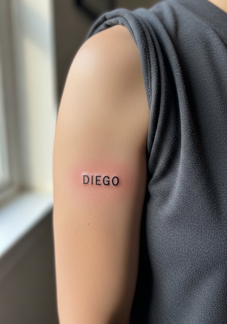
Upper bicep flesh accepts saturation well, which helps small caps stay legible longer than fine scripts. Tell the artist you want slightly wider kerning between letters and solid saturation to reduce touch-ups. The session is usually comfortable, around 30 minutes for a short name. A common error is requesting tiny typeset letters that flatten with age. For casual styling, rolled sleeves and a fitted tee let the piece appear like a band when you move your arm.
10. Bold Serif Name on the Side of the Neck

Neck pieces are visible and sometimes carry social considerations. Serif lettering in bold blackwork holds up better than hairline scripts here. Ask about workplace implications during your consultation and find an artist experienced with neck placements. The session can be quick but sensitive because the skin is thin. For minimal exposure during healing, high collars or scarves help, and afterwards a simple thin hoop earring draws attention away from the letters if you want a softer look.
11. Name Banner on the Upper Back
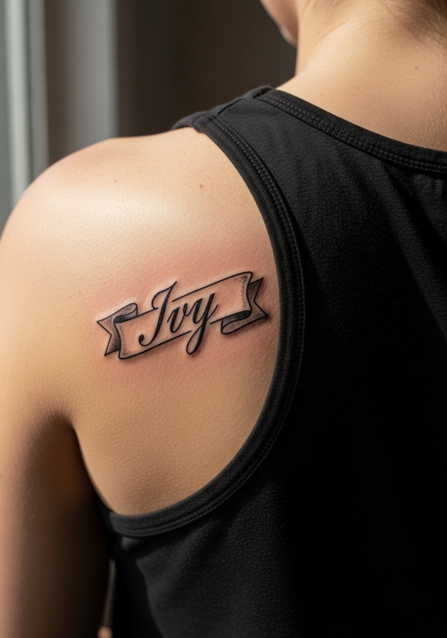
The upper back has thick skin that holds saturated blackwork well, which favors banner-style names. Ask the artist to scale the banner so the letters have breathing room. Sessions can be longer because of reach and shifting positions, and you may need to plan for a friend to drive you home if the appointment runs long. A common mistake is overdoing ornamental fills around the name that date the piece. For evenings out, back-revealing tops frame the banner and a strapless clutch keeps the focus on the upper back.
12. Connected Script Name Along the Calf

Calf pieces age predictably because they avoid constant friction with clothing. A connected script benefits from slightly thicker downstrokes to keep the counters open. Tell the artist where you want the baseline to sit so the name reads properly while walking and sitting. Sessions are comfortable on the fleshy calf and typically under an hour. For seasonal visibility, roll-up shorts or a mid-length skirt shows off the lettering without overexposing the area.
13. Stacked Name and Year in Bold Capitals

Stacked compositions let you combine a name with a date without crowding. Use bold capitals for both lines and request consistent spacing so the year does not read like a smudge later. Common mistakes include packing too many characters in tight vertical space. The session is quick and tends to settle well, but finger motion near the wrist can still affect the lowest characters. Pair this kind of tattoo with a simple leather cuff to frame the stack without touching it.
14. Script Name on the Inner Arm Near the Elbow
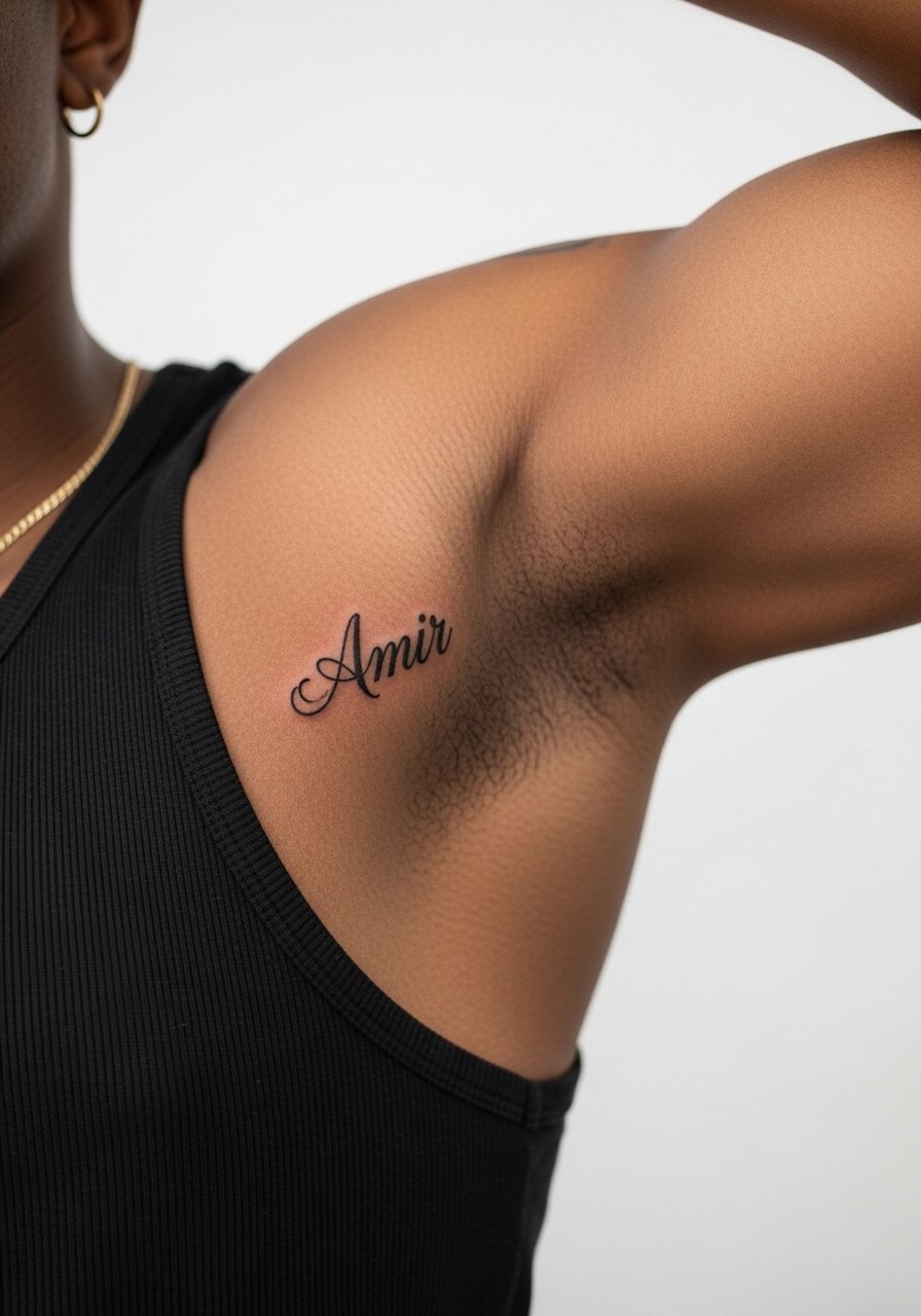
The inner bicep takes ink differently because of softer skin and sweat glands. Artists disagree about longevity here, so explicitly ask about their healed examples. For names, choose slightly larger letterforms and avoid ultra-thin loops that can collapse. Session comfort varies with arm position, so wear a loose top that allows the artist to move your arm. Aftercare is important to avoid stretching during healing. A loose tank top for the appointment makes positioning easier.
15. Block Name Across the Chest Midline
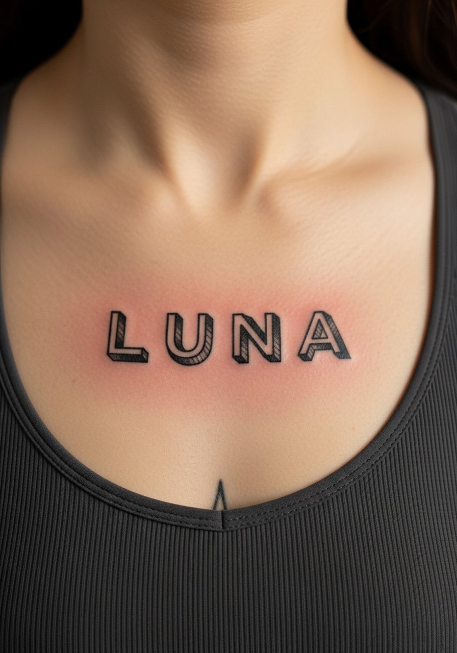
Centered chest names are statement pieces and handle bold blackwork well. Avoid delicate scripts that lose contrast against the chest curve. The session can be uncomfortable because the sternum sits over bone, so expect an intensity higher than an arm session. Tell the artist if you want letters to follow the chest's natural contour or sit strictly horizontal. For outfits, a bandeau top reveals the design cleanly without complicated layers.
16. Sternum Name Rendered with Generous Spacing
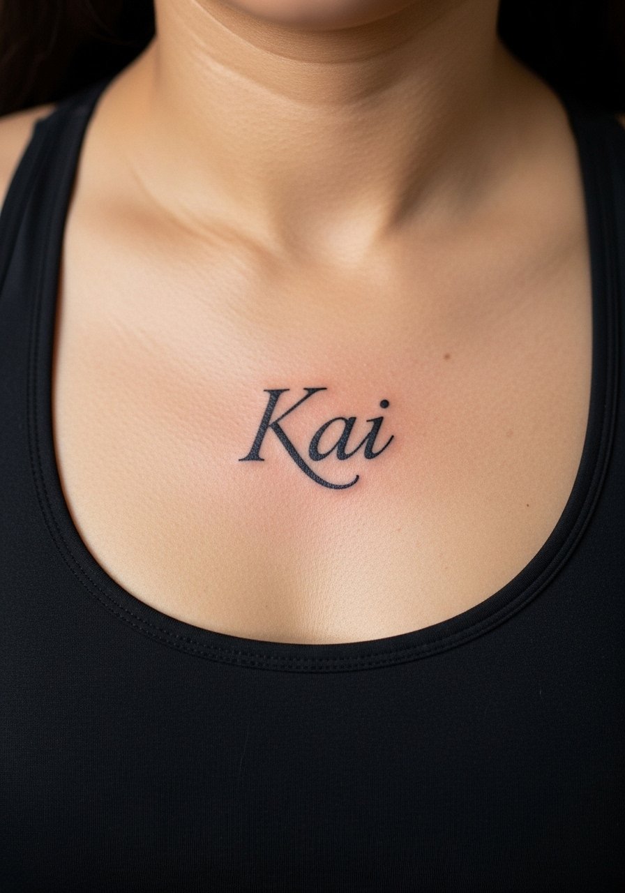
Sternum placements spark a debate among artists. One camp says the tight skin and movement make delicate letters blur quickly. The other camp believes generous spacing and solid weight keep names legible for years. I favor spacing and strong fill for sternum work if longevity matters. The session is sensitive and can take longer because of careful mapping. Be honest about comfort levels during booking and ask for examples of healed sternum names from your chosen shop.
17. Small Initials in Bold on the Behind-the-Ear Skin
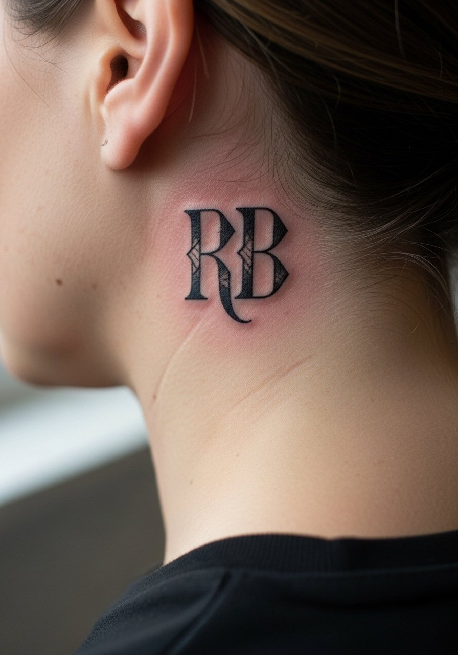
Behind-the-ear placements are intimate and subtle when done as initials. Because of the small canvas, bold, geometric letters outperform fine scripts over time. During consultation, request a stencil check with hair tucked back to ensure visibility matches your expectation. The session is short but near a ticklish area. If workplace visibility is a concern, hair can easily conceal the piece until you choose to reveal it. For session prep, bring a headband to keep hair pulled away cleanly.
18. Name in Heavy Gothic on the Outer Thigh
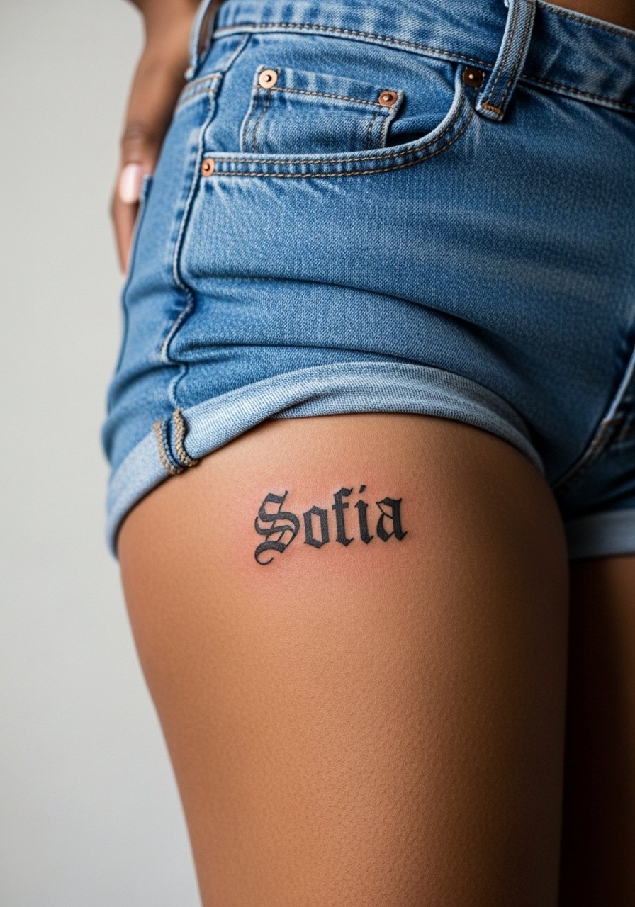
Thigh flesh tolerates saturation well, which suits heavy gothic lettering. Tell the artist if you want the letters to read from top to bottom or left to right so the piece fits your typical clothing choices. Sessions are comfortable and can be longer for larger scripts. The common mistake is cramming ornate gothic letters too small, which makes them illegible as skin settles. For show-off outfits, high-cut shorts or skirts pair naturally, and a high-waisted denim look keeps the tattoo visible without riding over it.
19. Name Wrapped Around the Wrist with Negative Space

A wrapped name reads like jewelry and survives well if the negative space is generous. Ask the artist to mock up how the band sits while your wrist bends so the name does not compress. The session is short but precise work. A frequent error is making the band too tight visually, which makes letters hard to distinguish after healing. For daily wear that complements the piece, a simple watch strap keeps attention on the wrist without rubbing the ink.
20. Tiny Lowercase Name Behind the Ankle Bone

Tiny lowercase names here are elegant but at high risk of fading because of shoe friction. Ask for slightly thicker downstrokes and for the artist to place the letters where socks do not constantly rub. Sessions are quick and usually under 30 minutes. A common mistake is asking for hairline cursive in a friction zone. For the appointment and the first week, wear low-cut socks or sandals and consider a soft ankle sock if you must wear trainers.
21. Name Carved into a Solid Black Band on the Upper Arm
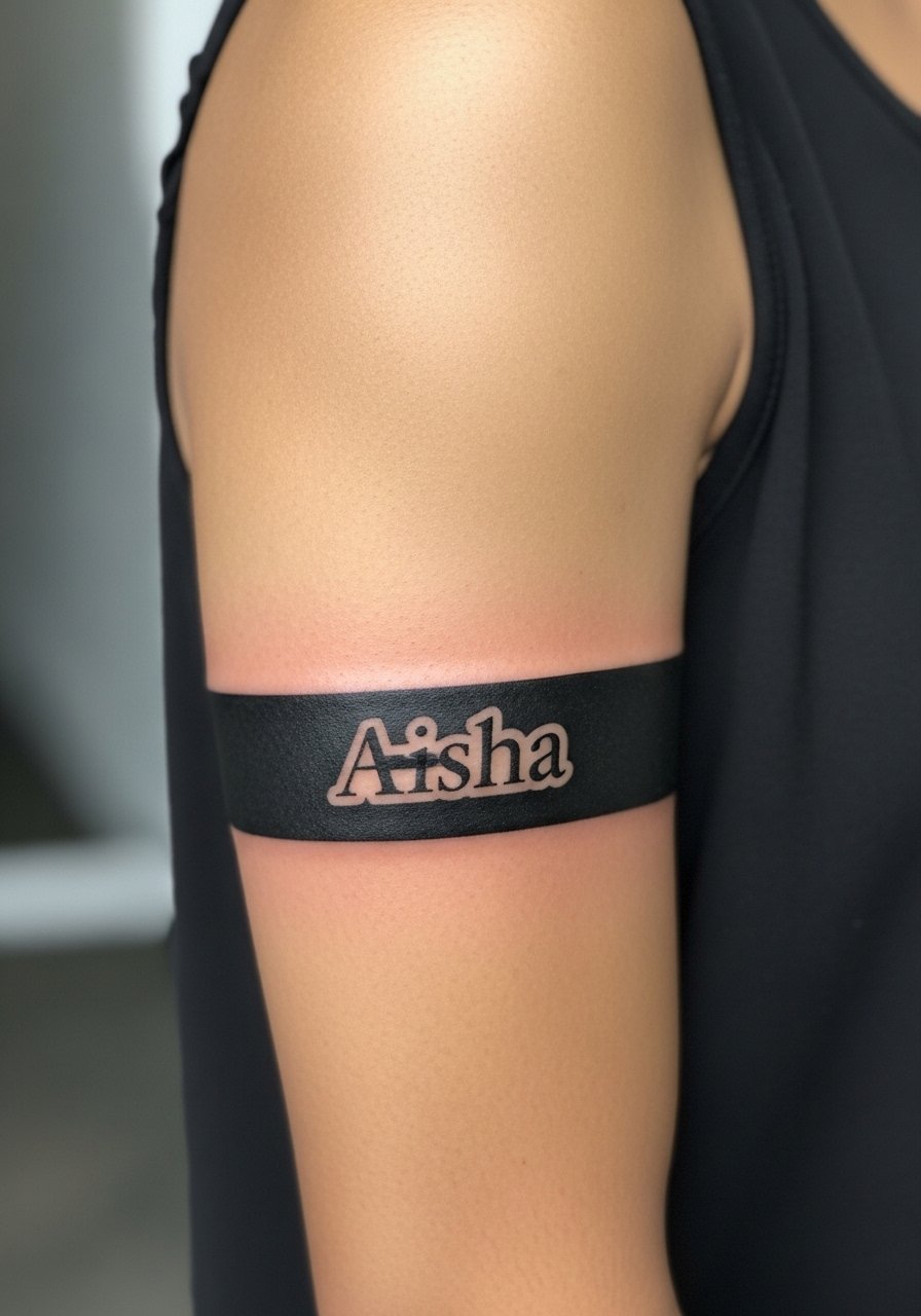
Solid black bands with negative-space names age predictably because the fill creates a stable environment for the letters. During consultation, confirm that the band width allows the name to breathe and that the bands align symmetrically with your musculature. Session time is moderate due to saturation requirements. Avoid adding fine ornament inside the band because it can blur over time. For daily style, a sleeveless linen shirt frames the band cleanly without covering the name.
22. Small Name on the Side of the Thumb
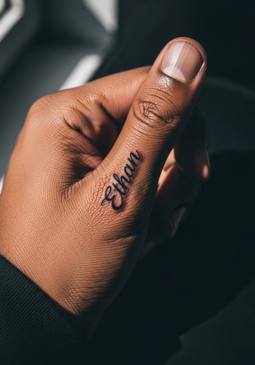
Thumb placements are visible and high wear. For names here, bold sans-serif letters work better than loops. Bring up how the artist plans to space letters because the skin here moves a lot. Sessions are brief but expect faster touch-up needs. A frequent mistake is thinking small loops will stay crisp despite constant hand use. For protection in the first week, a thin thumb sleeve bandage helps avoid scabbing from repeated contact.
23. Interlaced Initials at the Nape
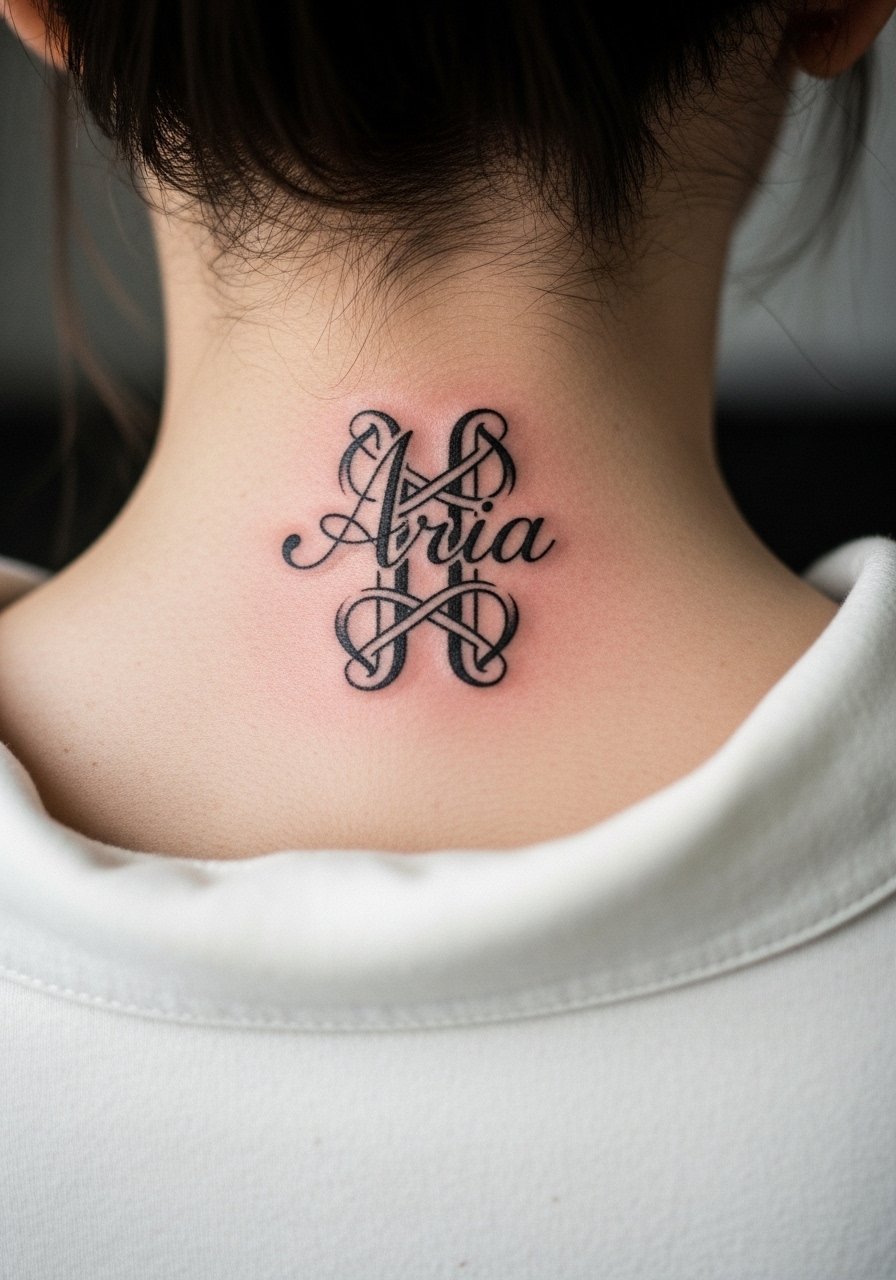
Nape placements hide easily with hair and do well with small, bold initials or names. Ask for a stencil check with hair up so you can see how visible the name will be when styled. Sessions are short and sensitive but manageable. The common error is choosing overly intricate loops that tangle visually in long hair. For the appointment, a scrunchie keeps hair out of the way without pulling the scalp.
24. Name in Tall Narrow Letters Along the Rib Side

Rib-side narrow lettering can look elegant but is subject to the same controversy as other rib placements. One camp warns about stretch and blur, while the other says proper spacing and depth preserve integrity. If you prefer tall narrow forms, increase spacing and favor heavier vertical stems. Sessions are typically more painful and longer than arm work. For session wear, a cropped athletic top makes access easier without exposing more than necessary.
25. Name Along the Lower Back in Bold Tracing
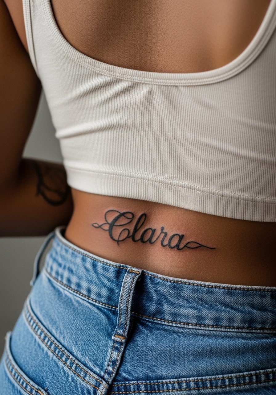
Lower-back names benefit from thick, confident letters that resist migration. Ask that letters follow the natural curve and avoid tight scripts that compress when you sit. Sessions are comfortable but can require position changes. A common mistake is choosing tiny flourishes across the curvature, which can break readability later. A low-profile belt sits above the tattoo when you want to hide it during healing and avoids rubbing the fresh ink.
26. Single-Word Name in Heavy Block on the Hip

Hip placements are discreet and age well if the letters are bold and spaced. Discuss how waistlines and clothing will cover or rub the piece and request placement a touch higher or lower if needed. Sessions are moderate and usually comfortable. Avoid tiny serif details that compress against the waistband. For the session, a pair of high-waisted jeans you can easily lower helps the artist access the hip without full exposure.
27. Bold Name Across the Collar of the Wrist
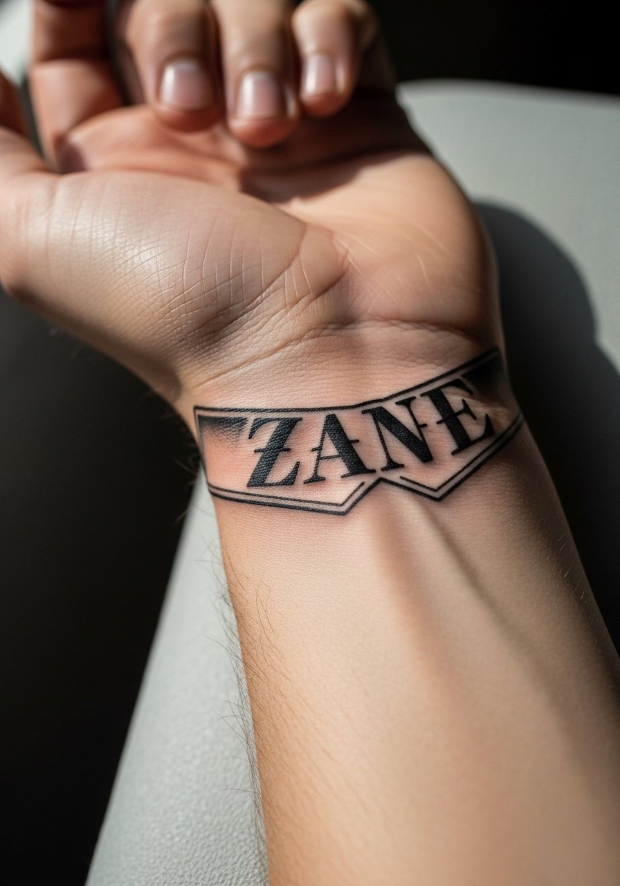
The top-of-wrist collar is a classic place for names and holds up when the letters are heavy and the spacing is clear. Tell the artist to check the stencil in both neutral and flexed positions so the name reads steady when your hand moves. Sessions are quick but precise. The common mistake is asking for tiny ornamental tails that catch on clothing during the scab stage. For an easy display, a slim bracelet sits beside the collar without overlapping the letters.
Frequently Asked Questions
Q: How do bold blackwork names compare to fine-line names for long-term legibility on the forearm?
A: Bold blackwork keeps letter shapes clearer as skin stretches and UV exposure takes a toll. Fine-line names can look crisp when fresh but often need touch-ups sooner. If longevity is your priority, ask for slightly heavier stems and more spacing when you consult with the artist.
Q: Will a name on the ribs need more touch-ups than the same name on an upper arm?
A: It depends. Ribs move with breathing and can cause thinner letters to blur faster. Many artists split into two camps on this, but sizing up and using bolder weight reduces the touch-up timeline. Plan for a longer session and ask to see healed rib examples in the artist's portfolio.
Q: Are finger and thumb name tattoos worth it if I work with my hands?
A: They can be worth it if you accept faster fading and possible yearly touch-ups. Choose bold, simple letterforms and expect abrasion from hand washing and tools. Protect the area in the first weeks and consider a slightly larger scale than you initially imagine.
Q: How should I prepare clothing-wise for a sternum or ribcage name session?
A: Wear something that exposes only the tattoo zone, like a fitted sports bra or a cropped top you can lift easily. These items give the artist clean access and preserve your comfort during a longer session. A zip-up hoodie is handy to throw on afterward without straining the area.
Q: How do I find an artist skilled in bold blackwork lettering without relying on social handles?
A: Use discovery pathways like local shop directories, convention lineups, community threads on forums and Reddit, and hashtag searches that include your city plus "blackwork" or "lettering." Look for healed photos, not just fresh shots, and ask shops for portfolio examples of the exact placement you want.
Q: Will negative-space lettering reduce blowout risk compared with fine-line names?
A: Negative-space letters framed by solid black tend to be more forgiving because the surrounding ink helps preserve edge contrast. They are not blowout-proof, but when spaced properly and executed at the right depth, they often age cleaner than ultra-fine scripts in the same spot.