
Bold blackwork holds up differently than fine line, and that difference matters when you want an arm wrap that still reads crisp after sun, sleeves, and years of life. Heavy saturation and clear negative space make blackwork wraps read like intentional jewelry on the skin rather than a busy pattern that blurs. Below are 17 arm wrap ideas that lean into contrast, spacing, and placement so the design looks deliberate at every distance.
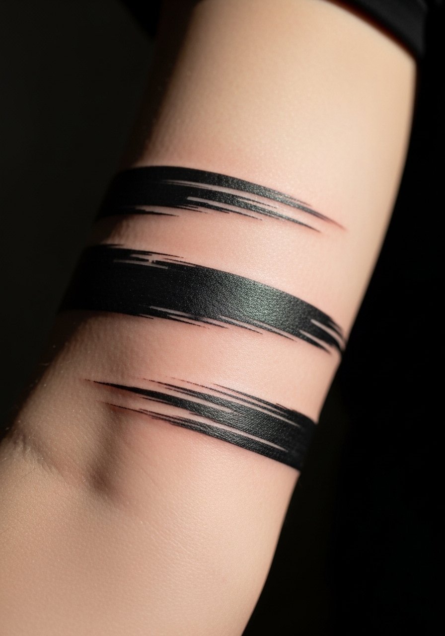
1. Graphic Band Wrap Along Outer Bicep

Start this one with a wide stencil so the artist can balance solid fills with breathing room for the surrounding muscles. I recommend asking for crisp edges and a slightly tapered ending where the band meets the inner arm, that prevents the tattoo from reading like a single blunt stripe over time. Pain is mild to moderate and a single session of 60 to 90 minutes often does it. Common mistake is going too thin for the wrap, which allows blowout to soften the edge in a few years. For wardrobe, pair the outer bicep band with a loose button-down shirt worn with sleeves rolled so the band shows when you move your arm.
2. Stipple-Shaded Botanical Vine That Circles the Forearm
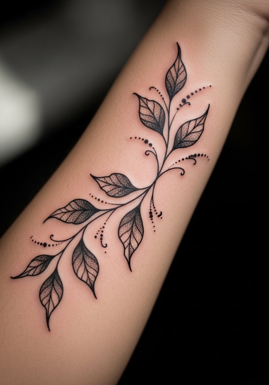
This version uses stipple shading and dot work to suggest volume without heavy solid fills. Tell your artist you want dots that step back from the linework so the negative leaf shapes stay clear at six months and five years. The session feels slow and methodical because dot work needs controlled passes, expect two shorter sittings for larger wraps. A common error is dense stippling next to thin lines, which makes the lines disappear as the dots settle. For showing it off, rolled sleeves or a racerback tank frames the vine without competing with the texture.
3. Interlocking Geometric Bands with Negative Space

Geometric wraps depend on even spacing more than heavy saturation. During consultation, request full-scale stencil wraps so you can check how the geometry reads when you flex. The aging story here depends on scale. If elements are too small the intersections blur at year two. Tell the artist you want at least 3 to 4 millimeters between parallel lines to reduce blowout risk. Pain level is low and a single 90-minute session often suffices. Pair this with a minimalist watch so the geometry and the accessory sit together cleanly.
4. Tribal-Inspired Blackwork Wrap with Cultural Respect

This design nods to traditional motifs while avoiding direct replication of sacred symbols. One sentence to use in consultation is that you want "inspired by" patterns rather than copied cultural emblems. That approach honors origin while giving the piece its own grammar. The most common mistake is asking for authentic ritual designs without discussing context, which can create awkward cultural mismatches. Expect moderate pain if the wrap crosses the inner bicep, and budget a touch-up at year two for saturation refresh. For sessions, wear a loose tank top so the artist can rotate the arm freely.
5. Snake That Coils Around the Forearm with Thick Black Fill
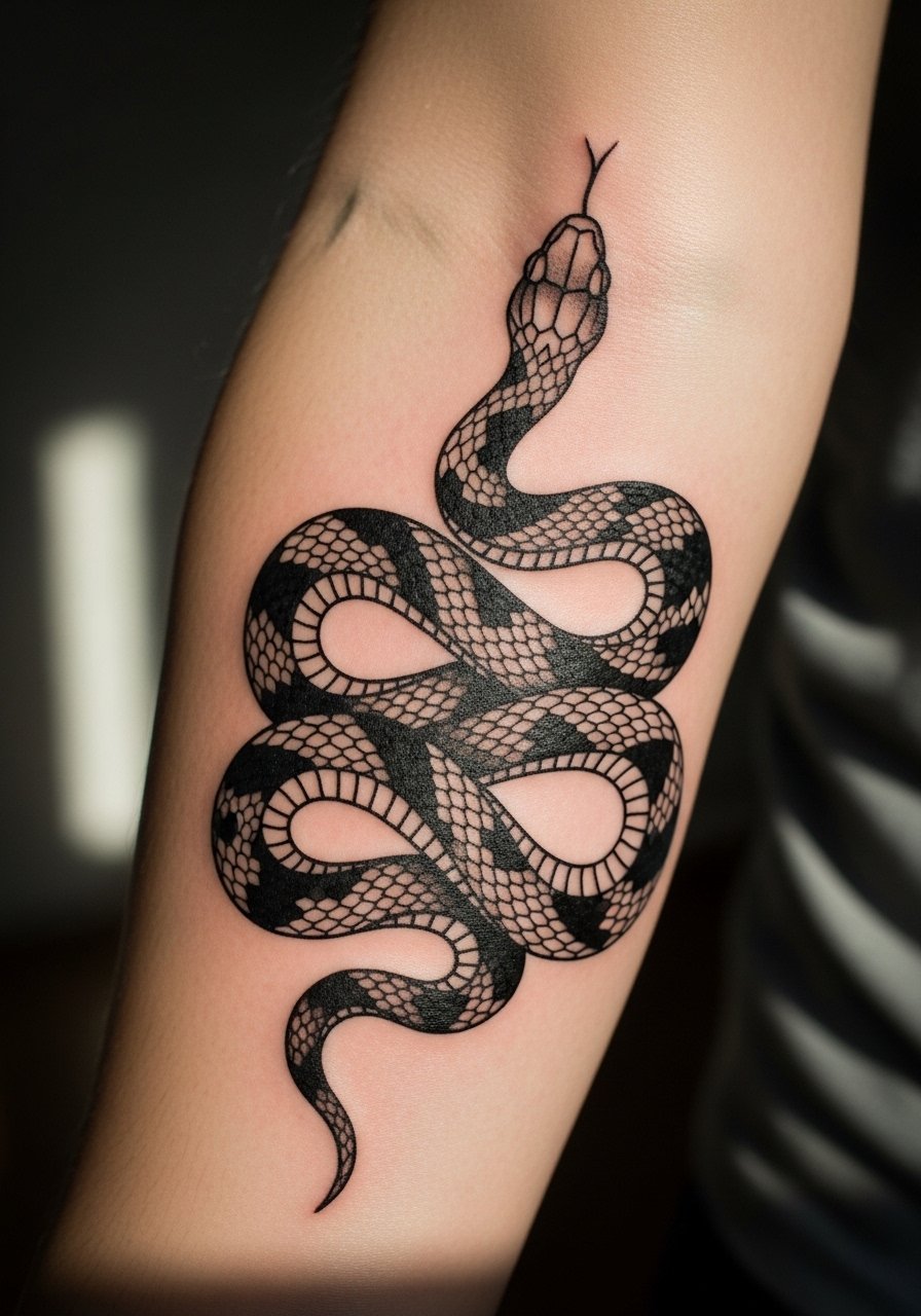
A coiling snake reads well in blackwork because the solid fills hold contrast and the negative space scales give a breathing rhythm. Ask your artist to scale the coils so gaps sit over muscle curves, not joints, which helps the image retain its form when you move. Sessions feel like long linear passes as the artist traces curves, expect one to two sittings depending on size. Common mistake is too many fine internal details inside solid fills, they get lost as the ink settles. To show it off, cuff a short-sleeve shirt or wear a rolled linen shirt so the snake sits visible at the forearm edge.
6. Ornamental Lace Wrap with Bold Outlines
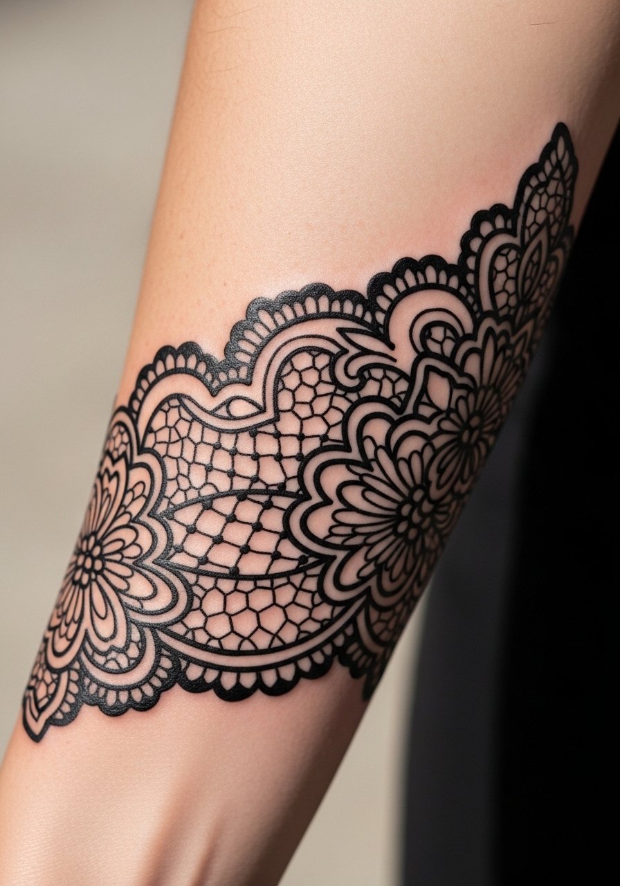
Lace-like wraps look delicate but they rely on bold outlining to survive time. Tell your artist you want the outer contours bold and the internal filigree slightly simplified. Small, intricate filigree ages into muddiness if it sits too close together. Expect moderate discomfort near the wrist and a session of 90 to 120 minutes for a tidy wrap. For evening looks, the piece pairs well with a thin chain bracelet, which echoes the lace without covering the details.
Studio Day Picks
The six arm wraps above test the wrist, forearm, and upper arm in different ways, and a few small items smooth out the session and the first week.
-
Stencil transfer paper kit. Lets you preview how the wrap will follow muscles and ensures bands align before the needle hits skin.
-
Topical numbing cream. Applied before a wrist or inner forearm session eases the sting for sensitive crossings without altering linework when used correctly.
-
Thin protective film roll. Useful for lower forearm wraps that rub against sleeves and desks during the early healing days.
-
Fragrance-free gentle body wash. Cleans the tattooed area without stripping the skin, which helps preserve crisp black edge retention.
-
Aquaphor healing ointment. A thin layer in the first 48 hours helps seal moisture without suffocating heavily saturated blackwork.
7. Negative Space Chevron Wrap That Repeats Around the Arm

Negative space chevrons are a clever way to get visual rhythm while relying on fewer solid fills. Ask your artist to print the stencil and have you rotate your arm in the chair so the chevrons sit symmetrically when relaxed. This design is low to moderate pain and often a single two-hour session. A mistake I see is squeezing too many chevrons into a narrow band, which makes the pattern look busy once the lines soften. Pair with a minimal cuff bracelet to echo the angular pattern without crowding the wrist.
8. Scripted Phrase Wrapped Diagonally with Heavy Black Contrast

When lettering becomes a wrap, letter spacing is the structural decision. Request bold block script with clear negative gaps between words so the phrase remains legible as lines settle. If the letters are too thin, they blur into the surrounding fill at year two. Expect mild discomfort and one short session for a mid-forearm phrase. For placement that sits near the wrist, consider how a watch might cover the last word. For the appointment, a short-sleeve tee gives access while keeping you comfortable.
9. Chain-Link Wrap with High Saturation and Clean Junctions

Chain-link wraps lean on consistent saturation so each link reads as an object. Tell your artist you want the junctions slightly rounded, so movement does not cause the design to look segmented. The main risk is overworking the skin in tight junctions which can provoke scabbing that interferes with saturation. Expect moderate pain if the chain crosses the inner forearm and a one to two session schedule. Pair with a thin leather bracelet for a raw, intentional pairing that frames the links.
10. Mandala-Edge Wrap with Dot Work Border

Mandala-inspired wraps can veer into cultural territory, so ask for motifs that reference the geometry rather than copying sacred symbols. Artists split on this choice. One camp believes traditional mandalas carry spiritual weight and should be used only with direct understanding. The other camp feels geometric mandala motifs can be adapted respectfully. State your intent in the consultation and ask the artist how they approach cultural sensitivity. The dot work border needs careful spacing, and a common error is packing dots too tightly near dense linework.
11. Thick Brushstroke Wrap That Mimics Ink on Paper
This painterly approach relies on irregular, saturated strokes that read like wearable calligraphy. Tell your artist you want variance between heavy fills and thin sweeps so texture survives at six months. The session tends to be dynamic with broad passes and some controlled shading, expect one extended session. A mistake is asking for perfect symmetry, which removes the brushstroke character and makes the piece look like a band instead of an expressive wrap. For evening wear, the piece pairs well with a short-sleeve linen shirt that lets the strokes peek out.
12. Floral Blackwork Wrap with Bold Petal Silhouettes
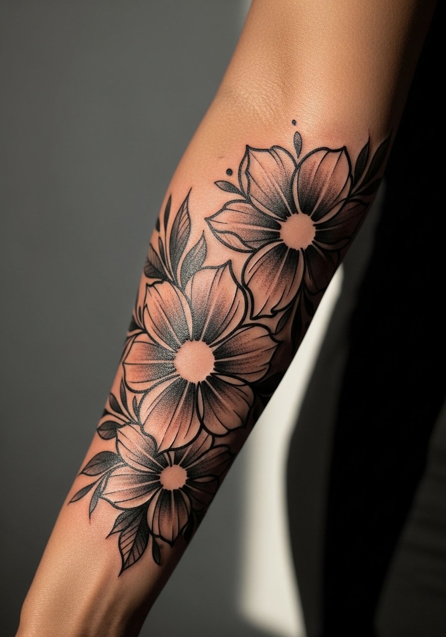
Floral silhouettes survive longer when the petals are blocky rather than detailed. Ask for strong petal shapes and simplified veins so the florals keep their identity as the skin shifts. The lower forearm near the wrist is more likely to need touch-ups because of washing and friction. A typical session is 90 minutes to two hours and expect a touch-up around year two depending on exposure. For showing off, cuff a long-sleeve with a rolled edge or wear a delicate ring set to keep attention on the arm.
13. Architectural Line Wrap That Follows Muscle Contours

Designs that follow anatomy age better because they move with the skin. During the appointment, have the stencil applied with your arm relaxed and with a slight flex to check how the buildings line up when you move. The error I see most is straight-profile designs placed across joint creases where the lines kink when the arm bends. Expect moderate discomfort and a session that requires the artist to adjust the stencil multiple times. For display, a rolled sleeve shirt shows the architectural lines clearly.
14. Celtic Knot Wrap with Heavy Blackwork and Open Gaps

Knots rely on consistent negative space to read. Ask the artist to simplify crossings and to enlarge loops slightly so the pattern keeps its interlaced effect as the ink settles. One mistake is requesting too many overlapping strands in a small area, which turns into a single blot over time. Expect moderate pain and a likely touch-up at one to three years depending on friction from clothing. This pairs neatly with a casual cuff bracelet that mirrors the interlace without obscuring it.
15. Wave and Ocean Motif Wrap with Bold Black Surf Lines
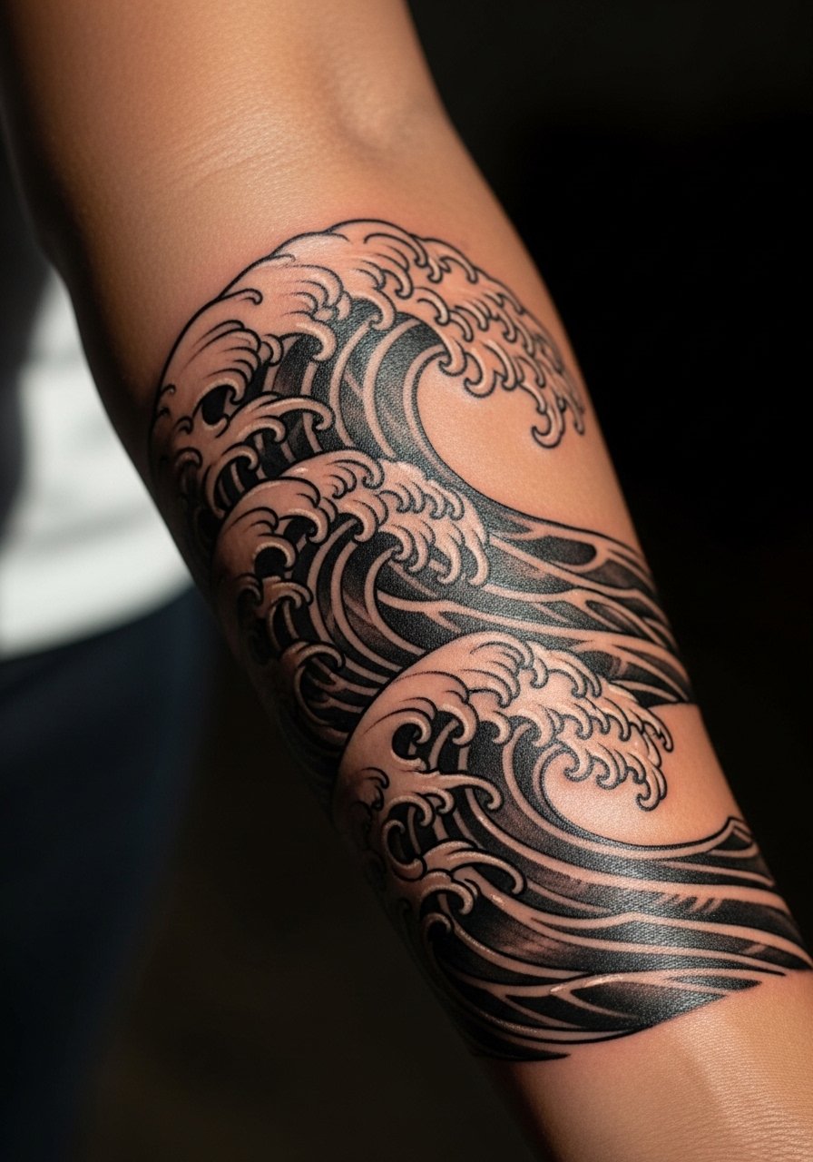
Wave wraps read well in black because motion translates into alternating stroke weight. Tell your artist you want thicker crests and open foam zones so the pattern stays dynamic as it ages. A common mistake is compressing the pattern so that crests overlap, which blurs into a block. Sessions are steady and may include slight shading to suggest movement. For beach days and shorts, pair this with a rolled cuff short that keeps the arm visible and complements the flow.
16. Ornamental Spine Wrap That Travels From Wrist to Elbow

An inner forearm spine wrap sits where movement and friction meet. Expect higher touch sensitivity near the wrist and slightly longer healing. The piece needs clear vertical spacing so the motifs do not compress when the arm flexes. A mistake is placing fine horizontal connectors without room for swelling, which leads to merging lines. Ask for a staged stencil that you can check while seated to ensure alignment. For the appointment, wear a short-sleeve tee you can roll up easily.
17. Abstract Organic Wrap with Large Black Blots and Airy Gaps
This design uses bold, irregular shapes to read sculptural on the arm. It ages well because larger black masses retain contrast compared to tiny motifs. Tell the artist you want intentional gaps, not accidental breaks, so the composition stays balanced as the tattoo heals. One frequent mistake is too many small shapes packed into a small strip, which blends into gray over time. Sessions can be shorter because the work focuses on large fills, and the look pairs with a loose short-sleeve shirt that allows the art to peek out casually.
Frequently Asked Questions
Q: Will heavy blackwork wraps on the inner forearm need touch-ups more often than outer arm pieces?
A: Inner forearm work can face more friction from daily activities and sleeves, so touch-ups are common around year two to four depending on exposure and sun protection. Plan on at least one touch-up in the early years for heavily saturated wraps, and discuss long-term saturation strategy in the consultation.
Q: Are arm wraps with cultural patterns offensive, and how do I approach that respectfully?
A: People fall into two camps. One warns against using direct sacred symbols without clear permission or understanding. The other supports inspired adaptations that acknowledge origin and avoid exact replication. The practical approach is to tell the artist you want a respectful, adapted motif and ask how they handle cultural sources in their work.
Q: How does blackwork compare to fine line for long-term readability on sleeve wraps?
A: From what I have seen, bold blackwork keeps contrast longer than fine line, which can soften into blur by year three. If longevity is your priority choose saturation and strong negative space over very thin hairlines on high-movement areas.
Q: What should I wear to a forearm wrap appointment to make the session easiest?
A: Pick something with easy sleeve access like a short-sleeve tee or a loose button-down you can roll. The goal is clean access without fabric pulling or pressure on the area during the session.
Q: Do blackwork wraps look uniform across different skin tones?
A: Yes, but the visual effect changes. Darker skin tones benefit from larger, bolder shapes and clear negative space, while lighter tones can support slightly finer internal details. Discuss contrast and edge thickness with your artist so the design reads the way you want on your skin.
