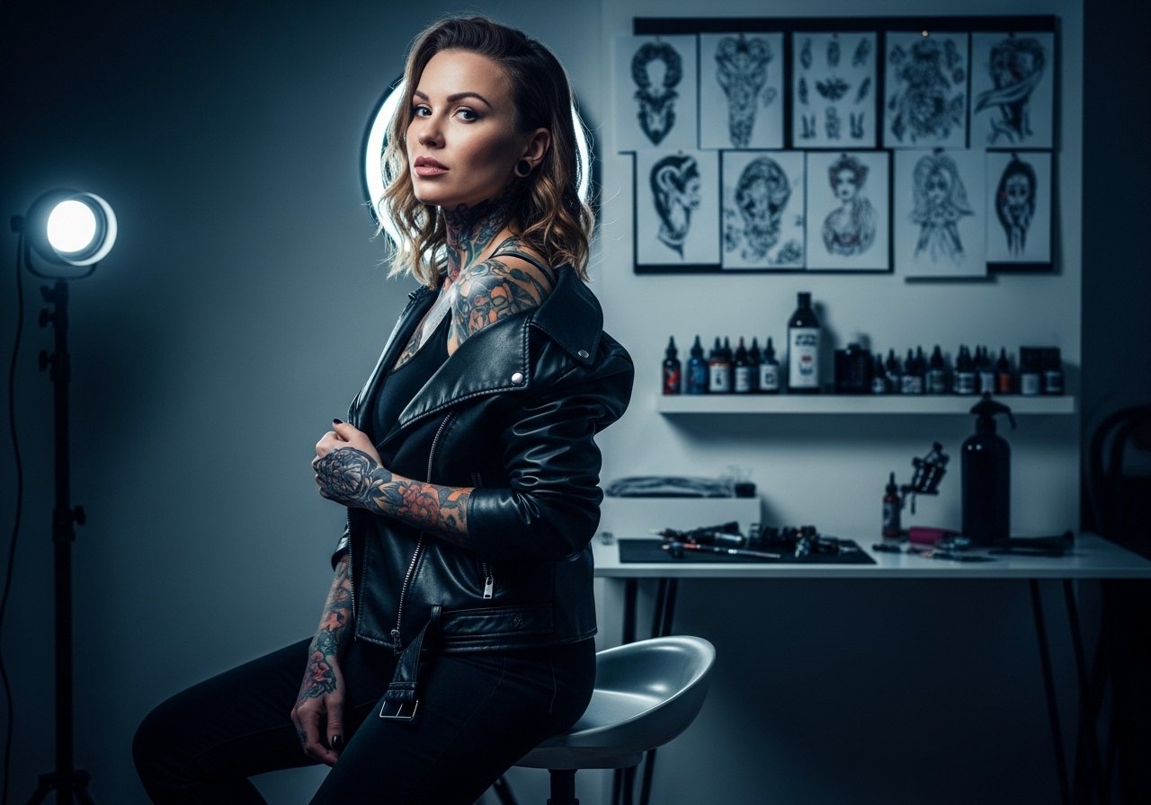
Fine line neck work is everywhere online, but the pieces that still look crisp after a few years are not always the ones that got the most likes. On the nape, hair, sweat, and constant friction change how ink settles. Expect tradeoffs between delicacy and longevity, and practical choices you can make at booking, the session, and during the first week to protect linework. Start with a small design that hides under a ponytail and read the notes before you sit.
1. Fine Line Butterfly on the Upper Nape
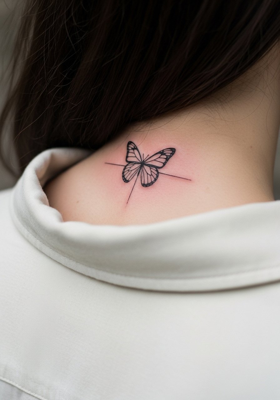
A small fine line butterfly is classic for the upper nape because it reads like a peekaboo detail under hair. I usually recommend 2 to 3 inches and a 1.5 to 2 point line weight so the wings stay crisp past year one. Tell your artist you want single-needle-style detail but not single-needle depth, and ask for slightly more space between tiny veins to avoid line merging. Expect mild itch where hair rubs the scab the first week. For the session wear a high ponytail holder so the artist has clear access and your hair stays up while the area heals.
2. Minimalist Geometric Arrow, Center Low Nape
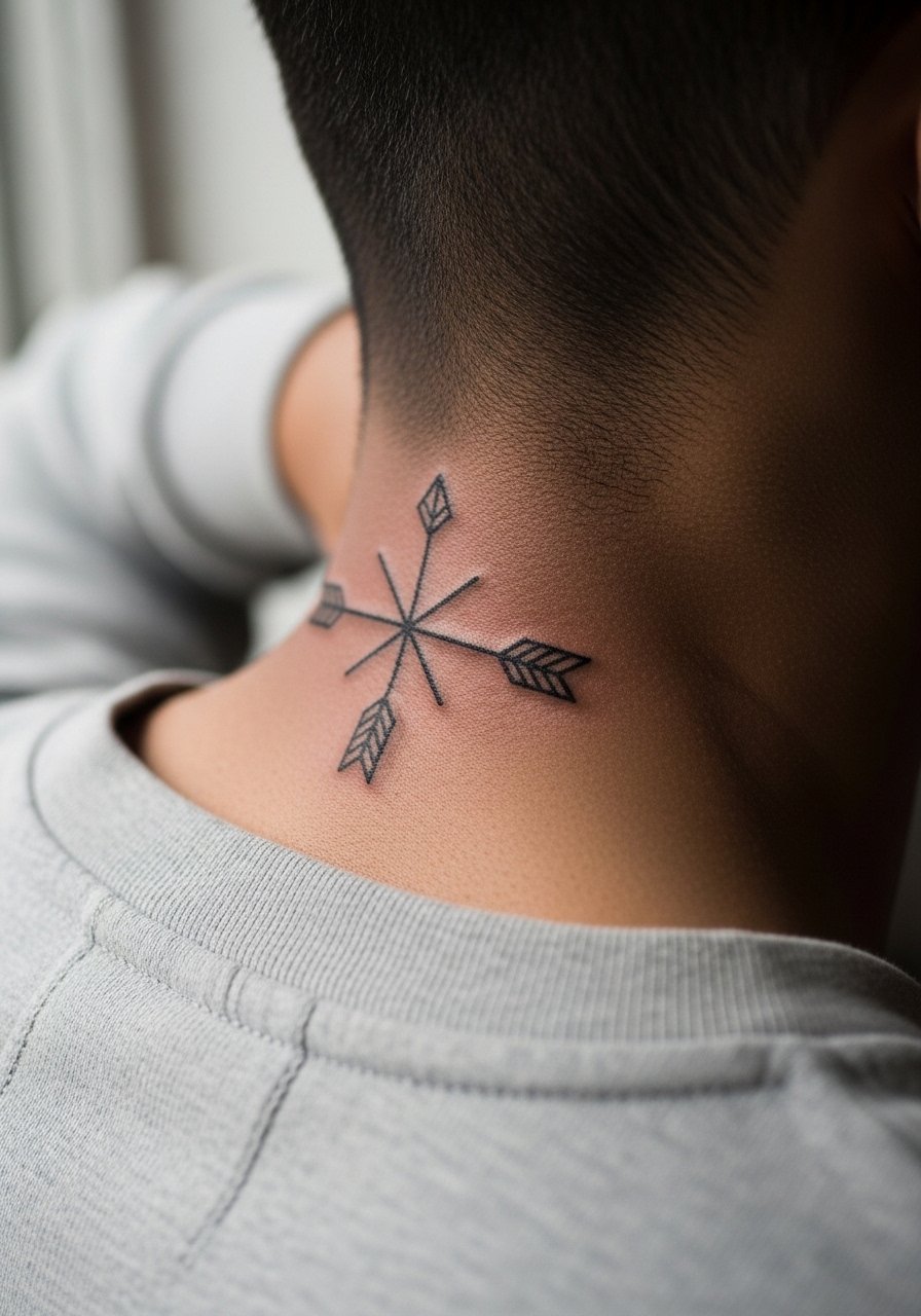
A centered geometric arrow at the low nape is a great first tattoo because the silhouette peeks when you tie your hair. The biggest mistake is scaling it too small. Lines need at least 1.5 to 2 millimeters of visual room to avoid blur later. During consultation, ask for bold line anchors rather than hair-fine points so the shaft keeps its shape. Pain at the nape is moderate; expect a steady vibration feeling during the session that lasts 20 to 35 minutes. For showing it off, pair with an open-back midi dress or a low ponytail for evenings.
3. Small Sunflower Outline, Upper Nape
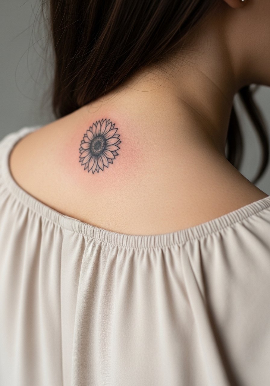
A 2-inch sunflower outline sits nicely where a bun will hide it for work days. Tell the artist you want a slightly thicker outer line and light dot work in the center to avoid early fading on oily skin. The common regret is too-fine petal lines that disappear under sun and product. Plan for a single session around 30 to 45 minutes and a touch-up at year one if you live in humid or sunny climates. For daytime outfits try a silk blouse women ivory to let the nape peek without clashing.
4. Neo-Traditional Wings at the Low Neck Base
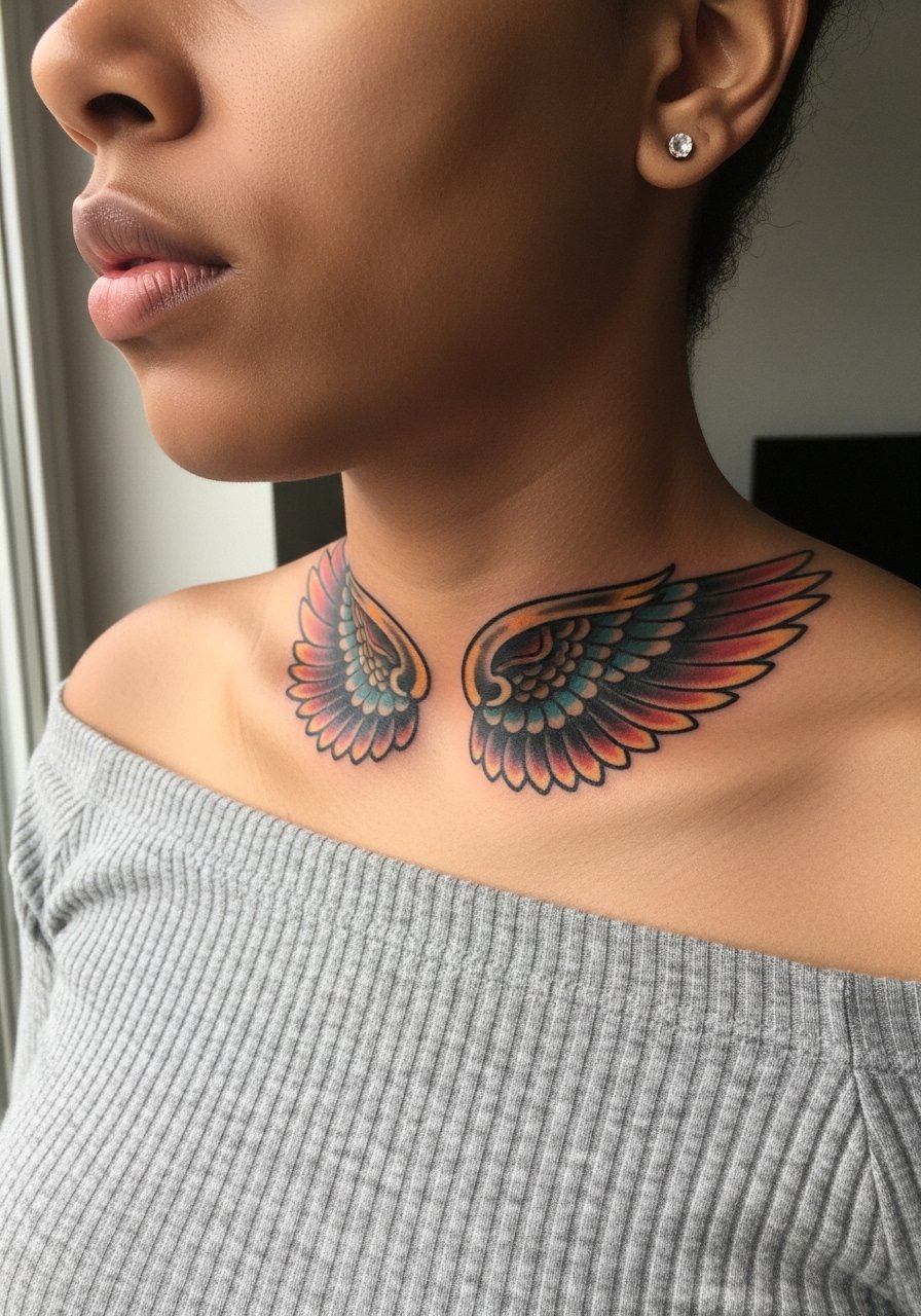
Wings at the neck base play well with shoulder pieces and give a bold graphic when your hair is short. Because this is a wider span, expect two sessions if you want color accents and shading. A common mistake is over-detailing small feathers, which can look muddy as saturation settles. Ask your artist for slightly heavier outlines and controlled color saturation so the piece reads from a distance and still reads clean up close. Low nape sessions are noticeably less fussy than upper nape work. Try showing off the finished piece with an off shoulder top black that frames the wings.
5. Blackwork Mandala, Centered Nape
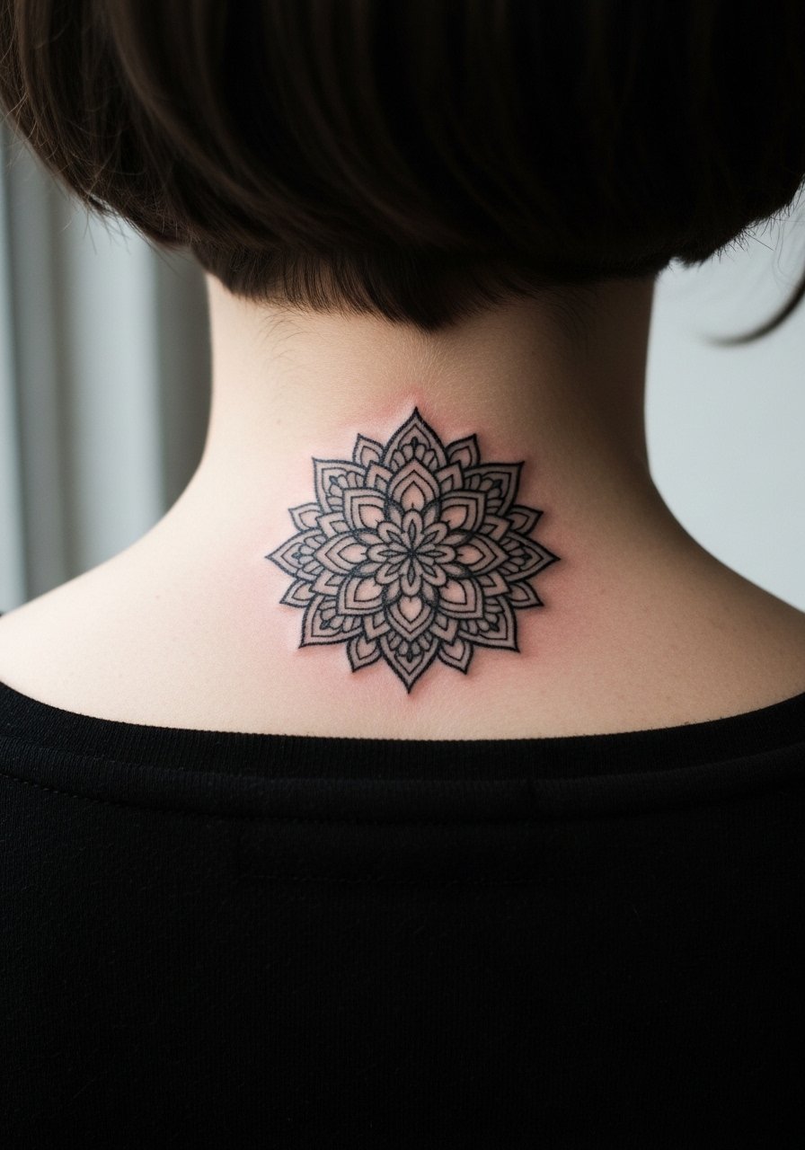
A mandala on the nape is high-contrast and meditative, but it demands spacing and solid blackwork to age well. The main risk is over-dense dot shading packed too tightly in a small circle, which can merge over time. In consultation, request clear spacing between concentric rings and ask whether the artist prefers stipple shading or solid fills in the darkest areas. Expect two sessions for a 3 to 5 inch mandala with touch-ups at year one. For covering hair interference during healing, wear a loose updo or a loose ponytail scrunchie so strands do not stick to the scab.
6. Micro-Realism Feather, Upper Nape
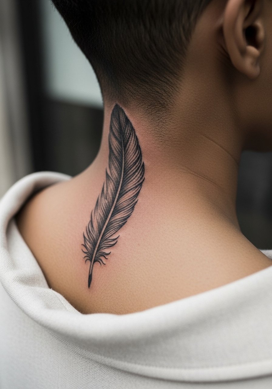
A tiny micro-realism feather reads delicate but is surprisingly durable when the shading is dense enough to survive two years. The mistake people make is asking for ultra-fine wisps that have no saturation. Tell your artist you want photoreal texture but with a tiny core of saturation so the rachis stays visible. Session time is usually 30 to 50 minutes. Expect light soreness and a ticklish feeling where the needle follows grain-like strokes. For session comfort, wear a high ponytail holder and a loose top to give the artist clean access.
Studio Day Picks
A few practical items smooth out appointments for the butterfly, arrow, sunflower, wings, mandala, and feather pieces above.
-
Hustle Butter Deluxe. A lighter balm some people prefer on the nape because it handles sweat better than thicker ointments during warm sessions.
-
Frida breathable film alternative. A thin protective film option that stays put on the sweaty neck without bubbling, helpful for the first 48 hours.
-
Coco butter balm. Gentle for dry winter healing and useful for small decorative lines that get tight scabs.
-
Thin protective film roll. Cuts to size for awkward nape curves and keeps friction low during early movement.
-
Aquaphor healing ointment. A familiar thin-layer option for the first days that many people use on fine line work, especially when sweat is a concern.
7. Watercolor Heart at the Low Neck Base
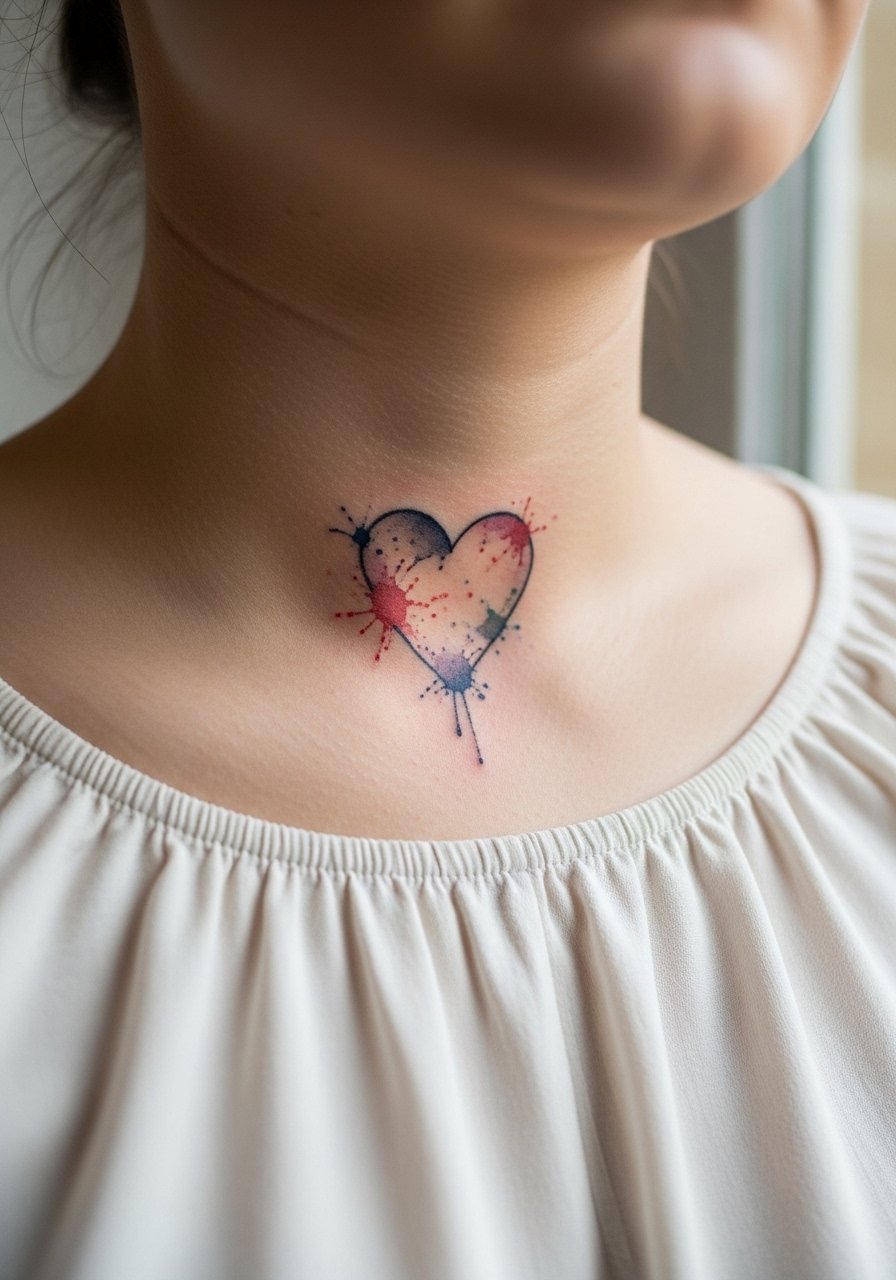
Watercolor at the low neck base is striking when color blends extend softly from a small heart. The downside is color bleed over time and extra touch-ups. If you like watercolor, ask for a slightly bolder outline or ghost-line anchors so the shape maintains contrast as pigments fade. Sessions are short but the first-year touch-up is common for saturation. Low nape pieces can shift with weight change, so place the piece just above where the skin creases. For outfits, an off shoulder top black or a choker frames the color without hiding it.
8. Traditional Rose Outline, Centered Upper Nape

A traditional rose outline holds up because solid linework and selective color age more predictably than thin script. The common error is asking for tiny petal details that need touch-ups. Tell your artist you prefer a confident outline and modest color spots rather than dense micro-detail. Pain is moderate and session time is usually under an hour for a 2 to 3 inch rose. Pair it with a dainty gold chain necklace that sits just above the top of the petals.
9. Ignorant Style Star Cluster, Scattered Nape
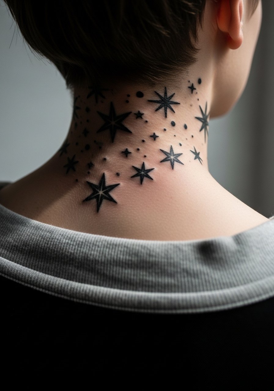
Ignorant style clusters thrive on thick, decisive lines that age like blackwork. They do not ask for subtle shading so blowout risk is lower than with micro-detail. The real mistake is trying to convert a delicate reference into ignorant style without increasing line weight. Ask for the boldest possible outlines and firm black fill where intended. Session times are brief but impactful. For daytime looks, a high ponytail holder and a simple crewneck top let the stars peek through when you want them to.
10. Ornamental Vine Wrapping the Neck Base
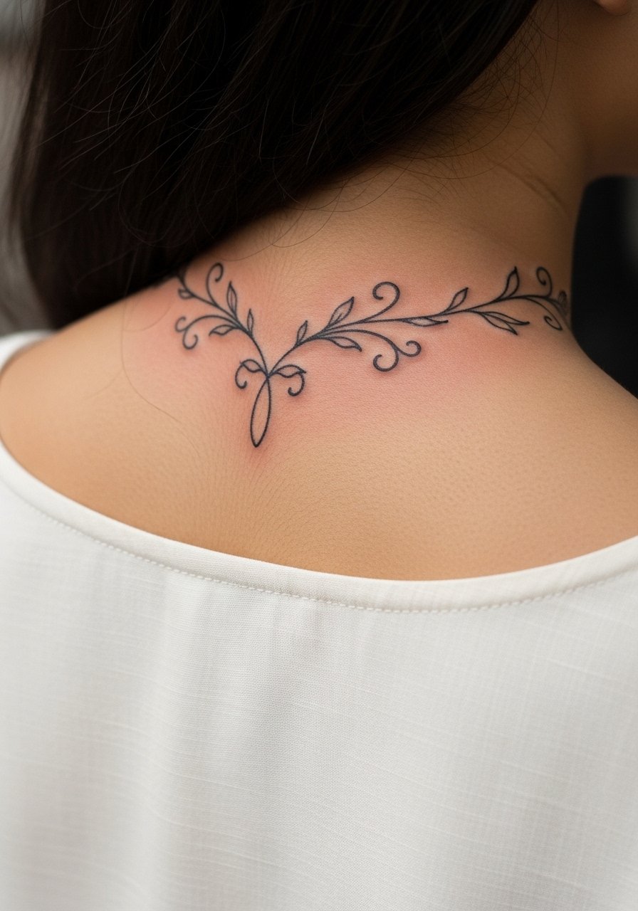
A vine that curves from the spine up to the nape gives motion and pairs with back pieces. I tell people to keep loops a bit larger than on a flat reference so the vine breathes over years. Small tight loops are a recipe for merging. Expect a single session for a 3 to 4 inch curve and a touch-up at year one if you live with heavy sun exposure. For a showing-off outfit, wear a low back dress earth tone or halter that frames the spine extension.
11. Minimalist Moon Phases, Vertical Stack

Moon phases stacked vertically are great for collectors who want a subtle series that hides under hair. The main aging trap is making the crescents too thin. Ask for slightly heavier crescent backs so the negative space holds up. Session time is under 30 minutes and touch-ups are rare if you start with adequate line weight. For everyday wear try a dainty gold chain necklace that sits above the top moon.
12. Black and Gray Angel Wings, Low Nape Span
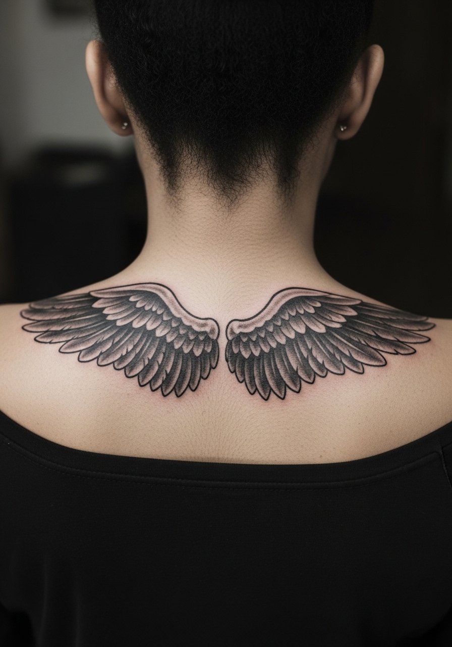
Black and gray wings at the low nape are a go-to for memorial or protective themes because shading gives depth and durability. The mistake is over-softening feather edges in the initial session which blurs later. Ask for crisp feather tips and steady saturation in the shadow areas. This design may need two sessions for even depth. If you want to show it off, pair with a chunky choker necklace or an off-shoulder top that keeps focus on the wings.
13. Scripted Single Word, Center Nape

Script on the nape can be elegant but tiny cursive merges over time if the loops are too small. Ask your artist for slightly more space between letters and to avoid flourishes that collapse into blobs. Tell them the exact font reference and request a stencil preview in the sitting position so you see how it reads under movement. The session is short and pain is mild. For session comfort use a high ponytail holder and a loose top to keep hair away.
14. Micro Dot Work Sun at the Upper Nape

Dot work suns read crisp when spaced well, but dense stippling in a compact space can blur. The consultation tip is to request graduated stippling with open negative space between rings. That keeps the motif readable at year three. Dot work sessions are patient work and may feel like long, repeated tapping, but the result is a soft graphic. For shoes and jewelry, a thin chain pendant necklace sits above the piece without competing.
15. Spine Extension Ornament, From Upper Back Up

Extending a back piece to the nape helps a collection read as a single flow. The frequent error is not testing the spine-to-nape scale on a moving torso. Ask for a vertical mockup with you standing and with a slight bend to check alignment. Expect longer sessions and planning for how the design sits under different clothing. For evening wear a low back dress earth tone highlights the extension cleanly.
16. Side Neck Feather, Slightly Off-Center

Feathers on the side neck are visible with asymmetric cuts and short hair. The key line is where the feather tapers into skin. Ask your artist to keep the spine slightly darker and the barbs airy but not wispy. Side neck work can be itchier during healing because hair moves across it; wear a soft bandana or keep hair pinned for the first week. For outfits, an one shoulder top neutral reveals the side neck and balances the silhouette.
17. Small Constellation Cluster, Upper Nape
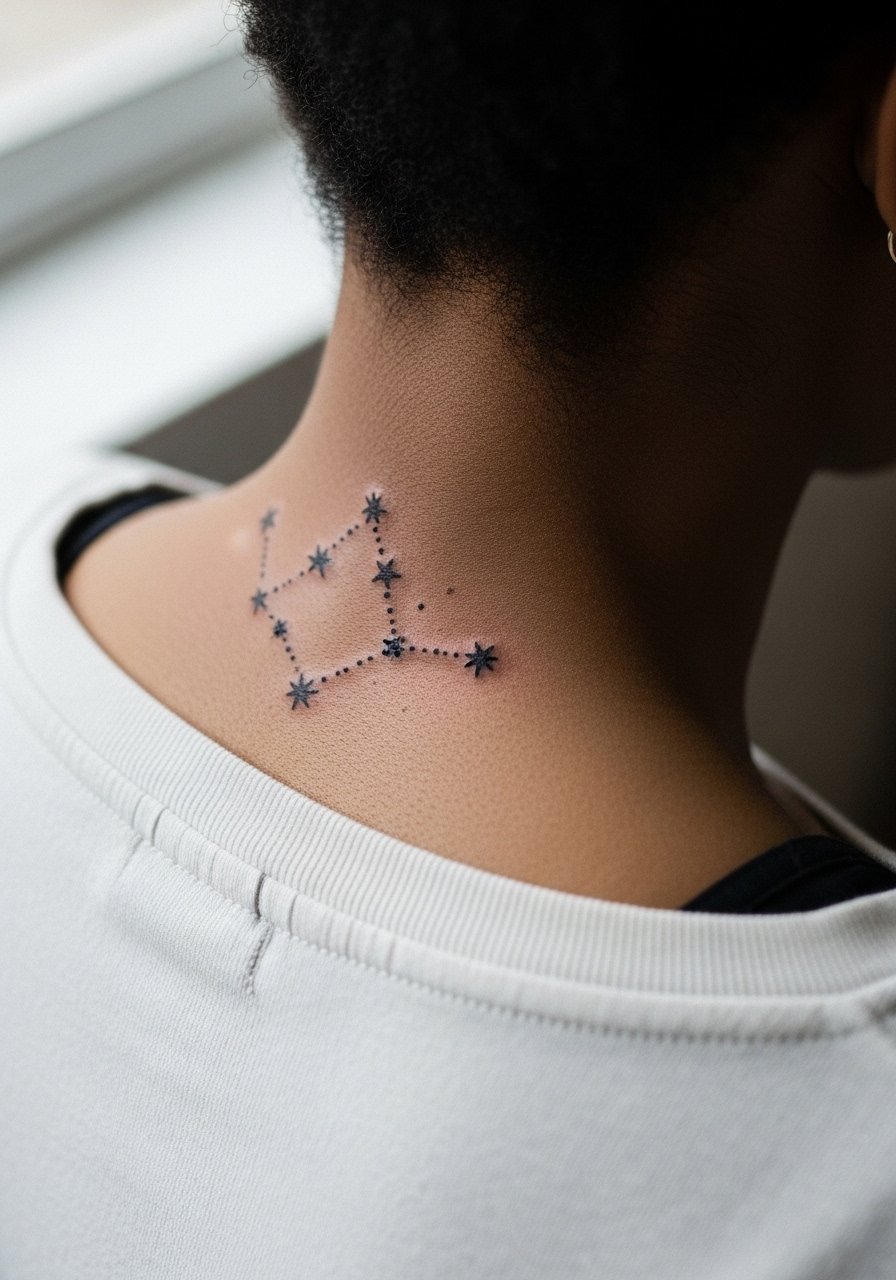
Constellation clusters are subtle but need careful spacing so stars remain distinct. The consultation note is to map each star as a tiny solid dot, not a hairline star. That gives longevity, especially on skin that tans or peels. Healing feels like a tingling tightness in the first three days. For daily wear, a dainty gold chain necklace sits above the cluster without covering it.
18. Tiny Anchor, Low Nape
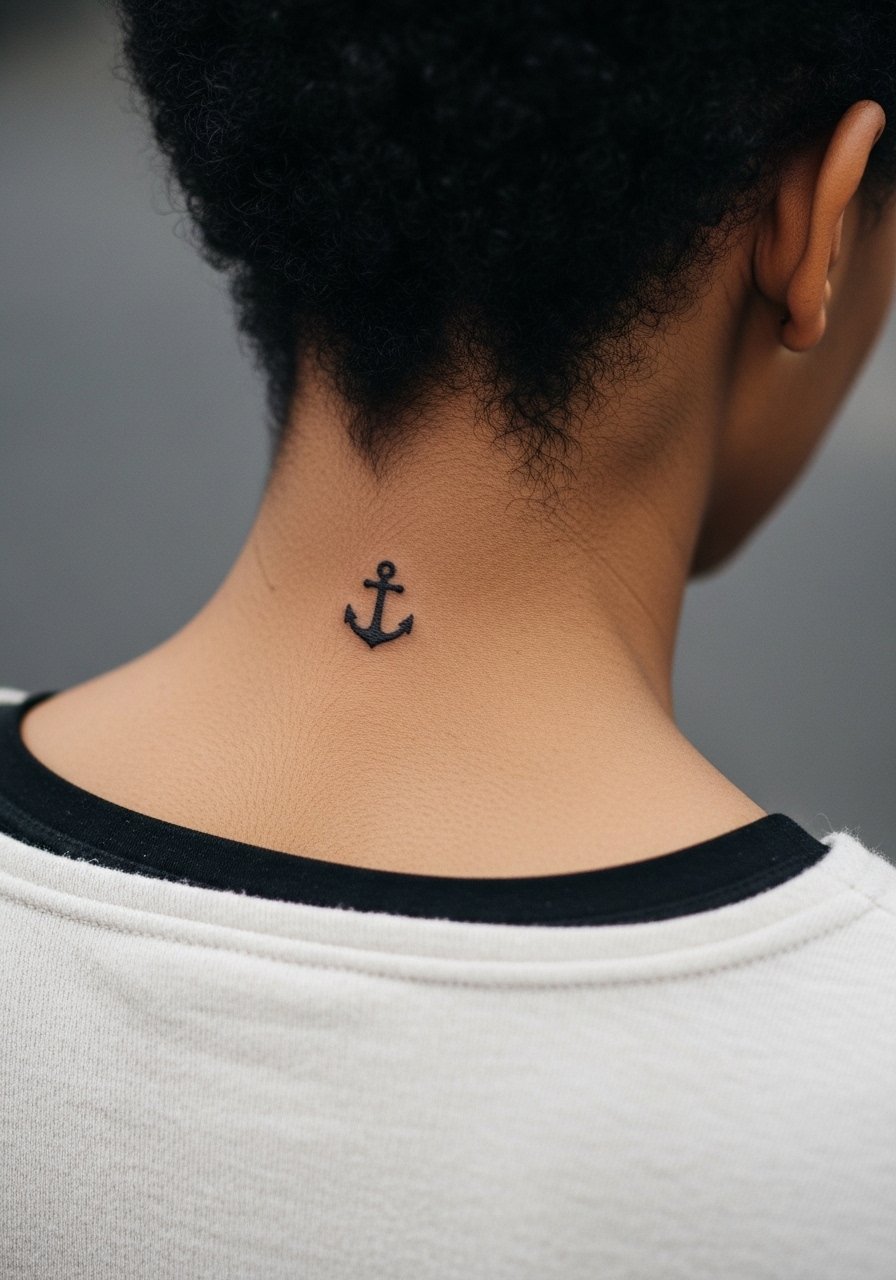
A tiny anchor is a discreet choice that hides under collars and looks crisp when the outline has weight. The usual mistake is a too-thin anchor shaft which vanishes on contact with sun and sweat. Ask for a slightly bolder outline and a little negative space inside the anchor so it reads as a shape. Sessions are quick and tenderness fades fast. For session ease, wear a cropped tank sleeveless so the artist can work without you contorting.
19. Script Coordinates or Date, Centered Nape
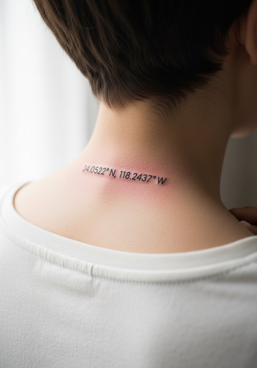
When a tattoo includes numbers or coordinates, the prompt needs exact text so the stencil is precise. Ask for a slightly larger type size than your phone mockup so the digits do not blur. Tight numeric fonts need room to avoid line merging. The session is short and the main follow-up is checking legibility at the one-month mark. If you plan visible clothing, a thin chain pendant necklace sits above the line without overlapping.
20. Small Floral Sprig, Off-Center Nape
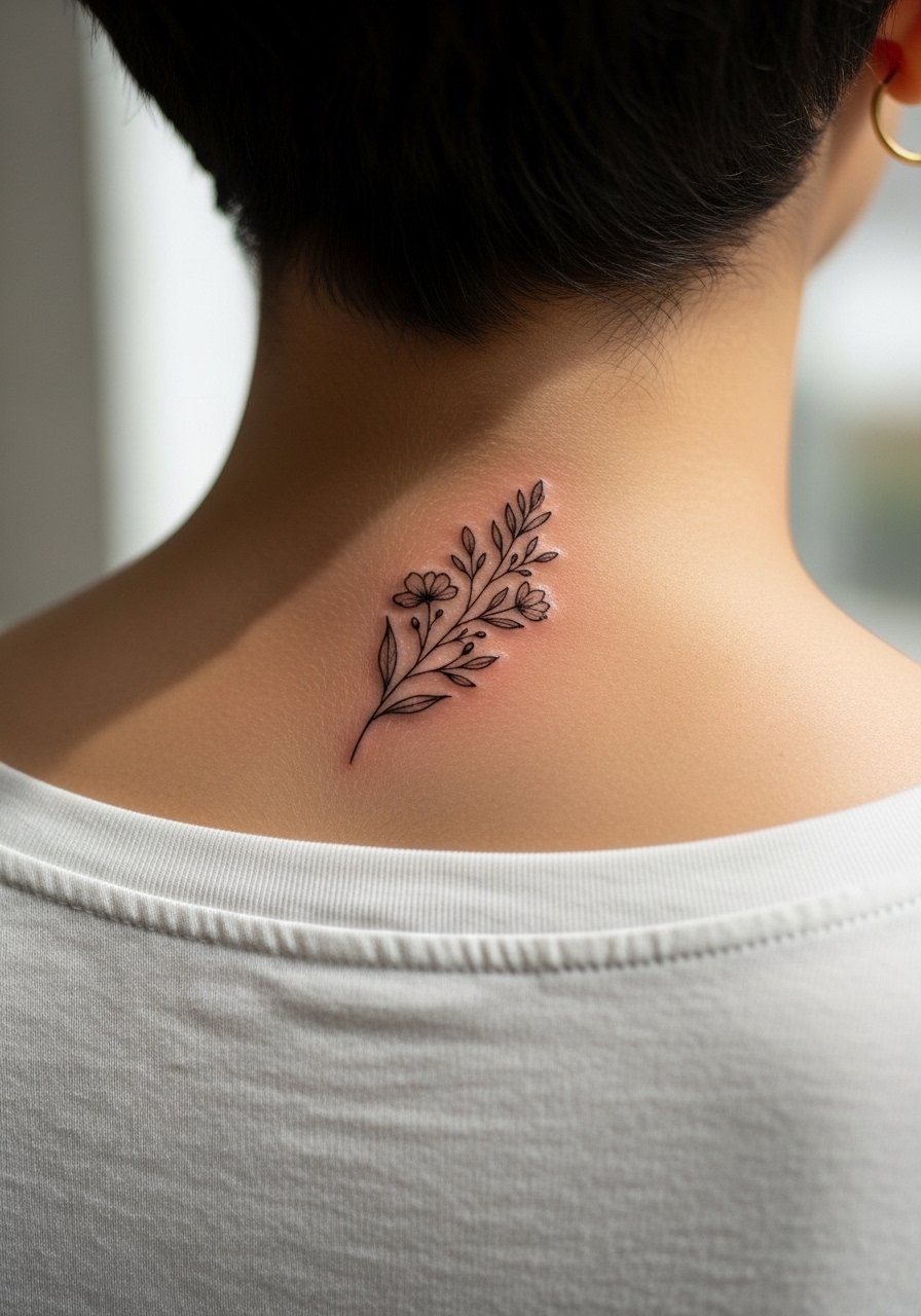
A single sprig curves naturally with neck movement and looks organic under hair. The error is over-detailing the leaves which then soften into a gray smudge. Ask your artist for a clean stem line and modest internal shading rather than micro-veins. Expect a single short session and a likely touch-up at year one if you intentionally keep line weight light. For showing off, a silk blouse women ivory or a half-up hairstyle frames the sprig nicely.
21. Minimal Crescent and Dot Trio, Nape Cluster
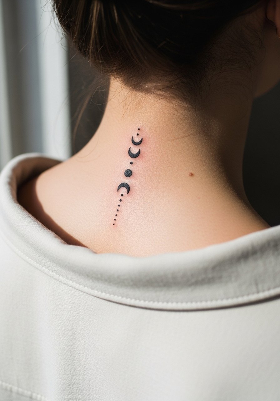
A trio of crescents and dots is quick, discreet, and versatile in placement. The common misstep is spacing them too closely which risks merging. Ask for clear gaps and slightly bolder crescent backs so the negative space reads under motion. Sessions are brief and after the first week the piece will mostly settle. For styling, wear a dainty gold chain necklace above the cluster for subtle layering.
Frequently Asked Questions
Q: Does fine line on the nape fade faster than blackwork, and should I pick bolder lines to avoid touch-ups?
A: Fine line on the nape usually softens quicker than saturated blackwork because the area sees friction from hair and collars. If longevity is your priority, opt for slightly heavier line weight or a bolder outline with fine internal detail. Expect touch-ups around year one to three depending on your skin, sun exposure, and how often hair rubs the area.
Q: Should I use Saniderm or dry healing on a neck tattoo given sweat and movement?
A: Artists are split on Saniderm versus dry healing for the neck. One camp prefers breathable film for sweaty areas to reduce irritation and keep the zone clean. The other camp says dry healing helps scabs form naturally and avoids trapped moisture. From what I've gathered, people with heavy sweating often find a short initial film helpful, then switch to gentle moisturizing.
Q: How do I prevent hair from sticking to a fresh nape tattoo during the first week?
A: Keep hair up in a loose bun, use a soft bandana, or sleep on a clean towel so strands do not glue to the scab. Avoid hair products that leave sticky residues near the area. I recommend a simple high ponytail holder for sessions and the first few nights.
Q: Will a nape tattoo affect professional settings, and where should I place it to hide under workplace rules?
A: Low or upper nape placements that fall under hairlines or under collars are easiest to conceal. A design under 3 inches at the low nape usually hides under a ponytail or collar. If workplace visibility is a concern, choose placement that your usual hairstyles will cover.
Q: How painful is a back-of-neck tattoo compared with other spots, and what helps during the session?
A: The nape is generally moderate on the pain scale because the skin is thin and close to nerve endings. Numbing is accepted by some clients for first-timers and rejected by others who want the full experience. Bring a water bottle, stay relaxed, and discuss breaks with your artist. A pre-session topical numbing option is worth asking about if nerves are high.
Q: I have darker skin. Do blackwork nape pieces photograph differently, and how should I adjust a design?
A: Darker skin tones sometimes need higher contrast and slightly larger negative areas so blackwork does not read muddy in photos. Ask your artist about spacing, and request a healed mockup or reference shots on similar skin tones. A well-saturated outline with clear negative space usually holds up best.