
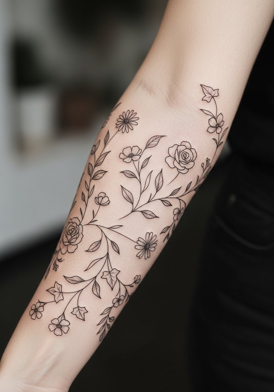
Fine line floral sleeves look delicate in photos, but the reality is more complicated. Trend feeds push ultra-thin petals and wispy stems, and those same pieces often need touch-ups sooner than bolder work. If you want a sleeve that reads abstract and floral while aging with grace, focus on spacing, modest saturation, and placement choices that avoid rapid blur. Below are designs and practical notes that make an abstract floral sleeve last.
1. Abstract Petal Cascade Along the Outer Arm
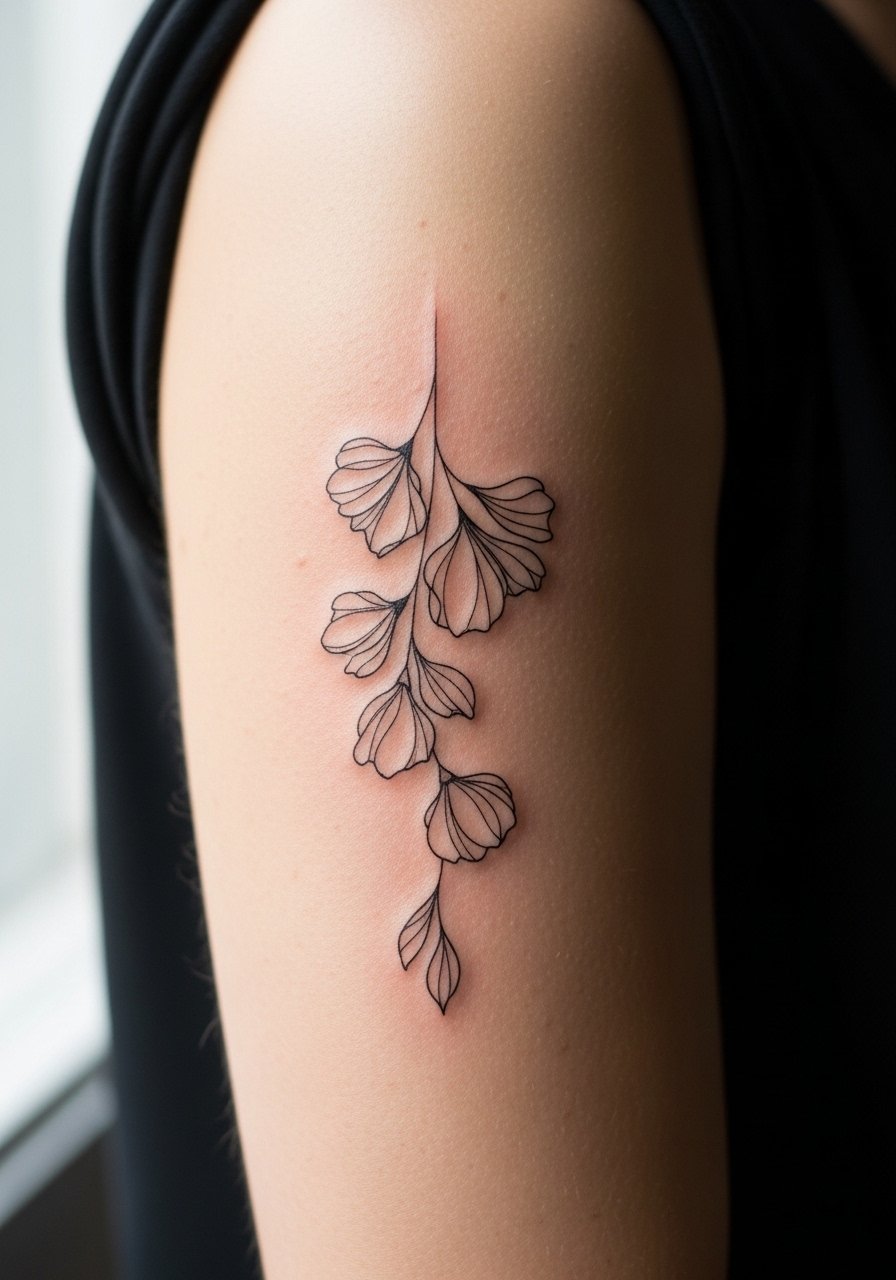
There is something about elongated petals that read as movement from across a room. I recommend this when you want a sleeve that breathes without dense fill. Tell your artist to use varied lineweight and stipple shading to suggest petals rather than fully filling them. Pain is low to moderate on the outer arm and a single three-hour session usually gets a solid half-sleeve started. Common mistake is packing too many overlapping micro petals, which leads to early merging and the need for touch-ups by year three. For showing it off, rolled sleeves or a loose button-down shirt frames the arm without hiding the linework.
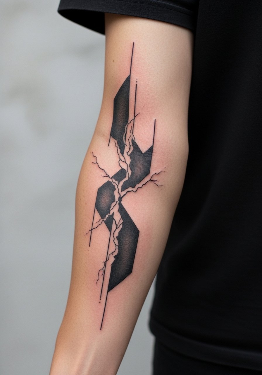
2. Geometric Floral Wrap With Negative Space
When you want an abstract edge, combine geometry and flowers so the shapes create breathing room between motifs. In consultation, ask for repeating negative-space bands to prevent dense saturation that ages into a blob. Forearm placement feels firm under the needle and the session tends to be two to four hours depending on coverage. People often make the mistake of shrinking the geometry too small, which raises blowout risk. Pair this wrap with a minimalist leather cuff watch to keep attention on the pattern and not overwhelm the wrist.
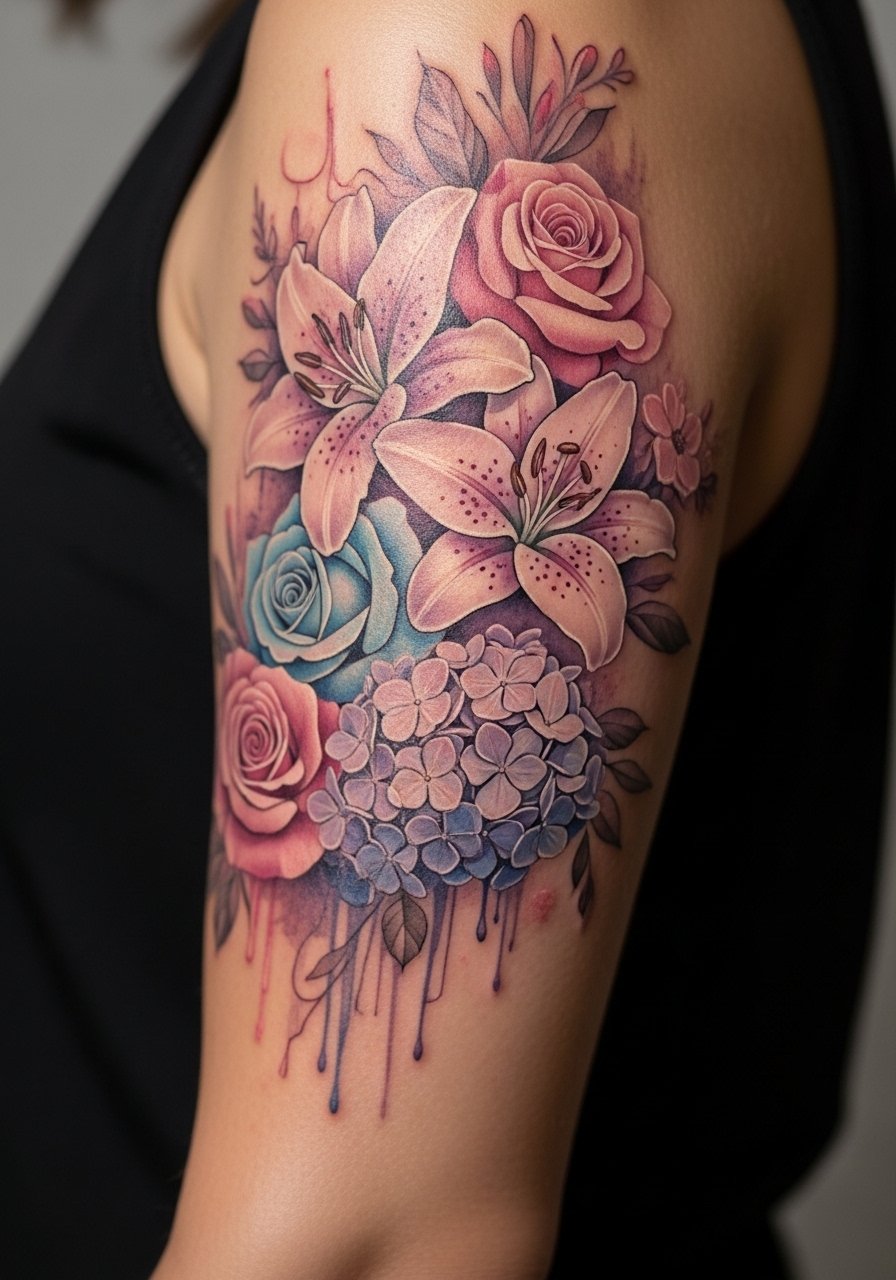
3. Watercolor-Adjacent Floral With Fine Line Anchors
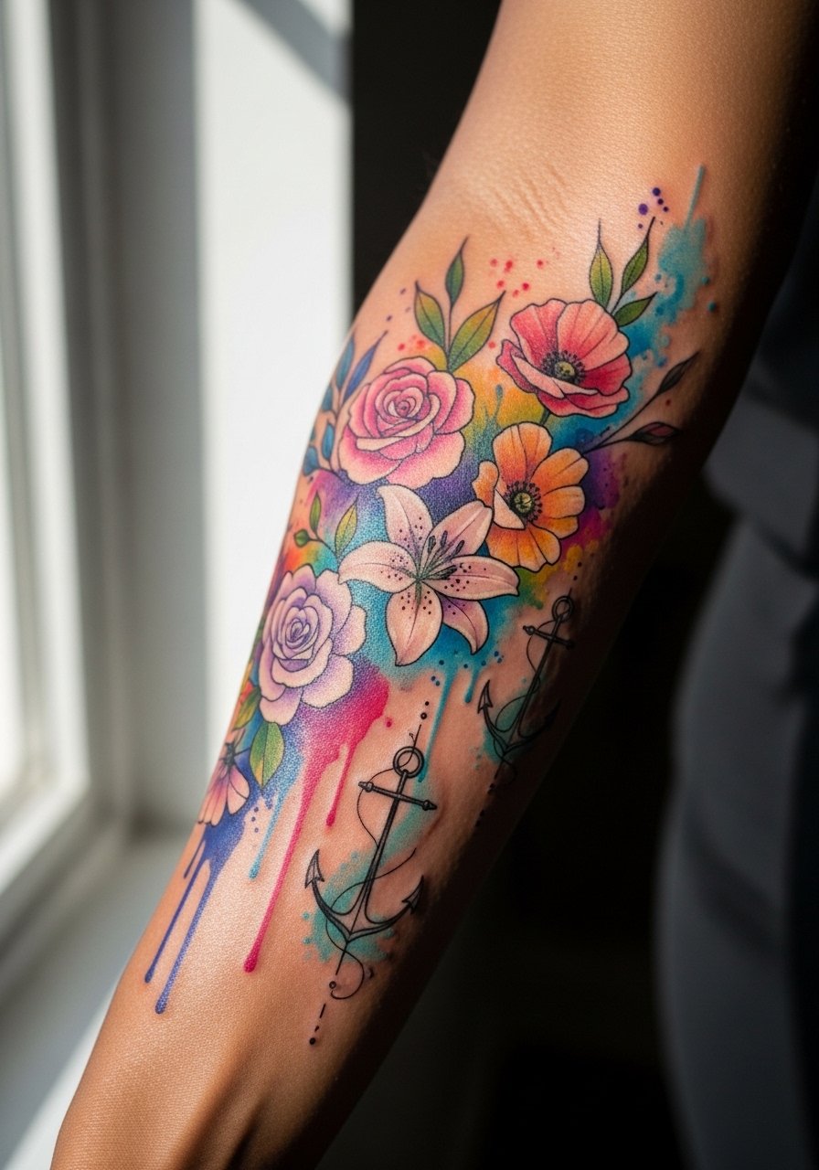
Most watercolor pieces that age poorly are the ones with no strong linework to hold pigment in place. This approach keeps thin black anchors around petals so the wash can soften while the linework keeps form. Expect moderate pain on the inner forearm if the sleeve wraps there. A two-session plan works best, one for linework, one for color saturation. The aging curve shows the wash softening at six months and color settling by year two, with touch-ups often at year four. For the session wear a racerback tank that gives the artist clear access to the lower arm.
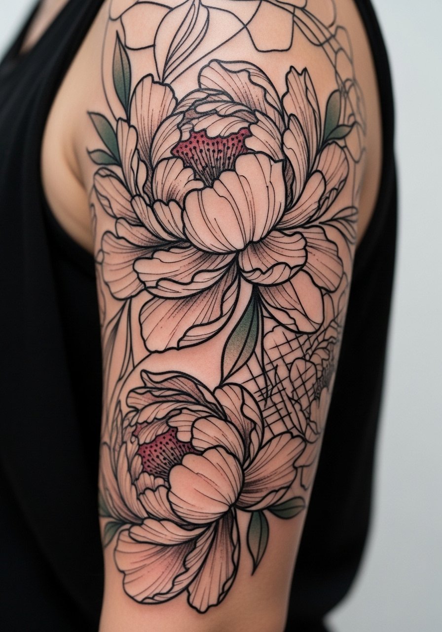
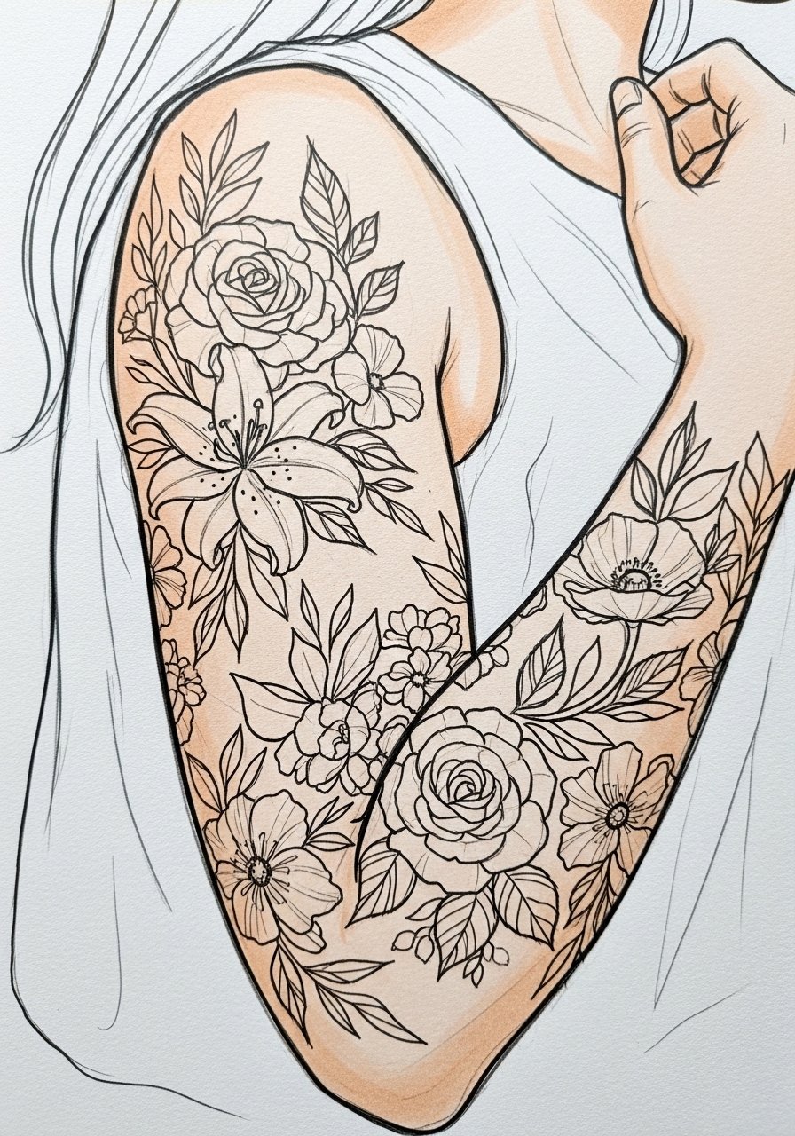
4. Oversized Abstract Rose Blocks for Shoulder-to-Elbow
I've seen oversized floral blocks hold up better than tiny detailed roses on the same canvas. They give the skin room and let saturation age into depth instead of fuzz. Shoulder-to-elbow placement handles saturation well and the chair time for a three-quarter sleeve block is typically four to six hours split across sessions. A common mistake is asking for photo-real petals at too small a scale, which blurs into gray. To show this off, short sleeves or a boat-neck tee keep the shoulder visible without competing with neckline details.
5. Stipple-Shaded Floral Mesh Around the Elbow
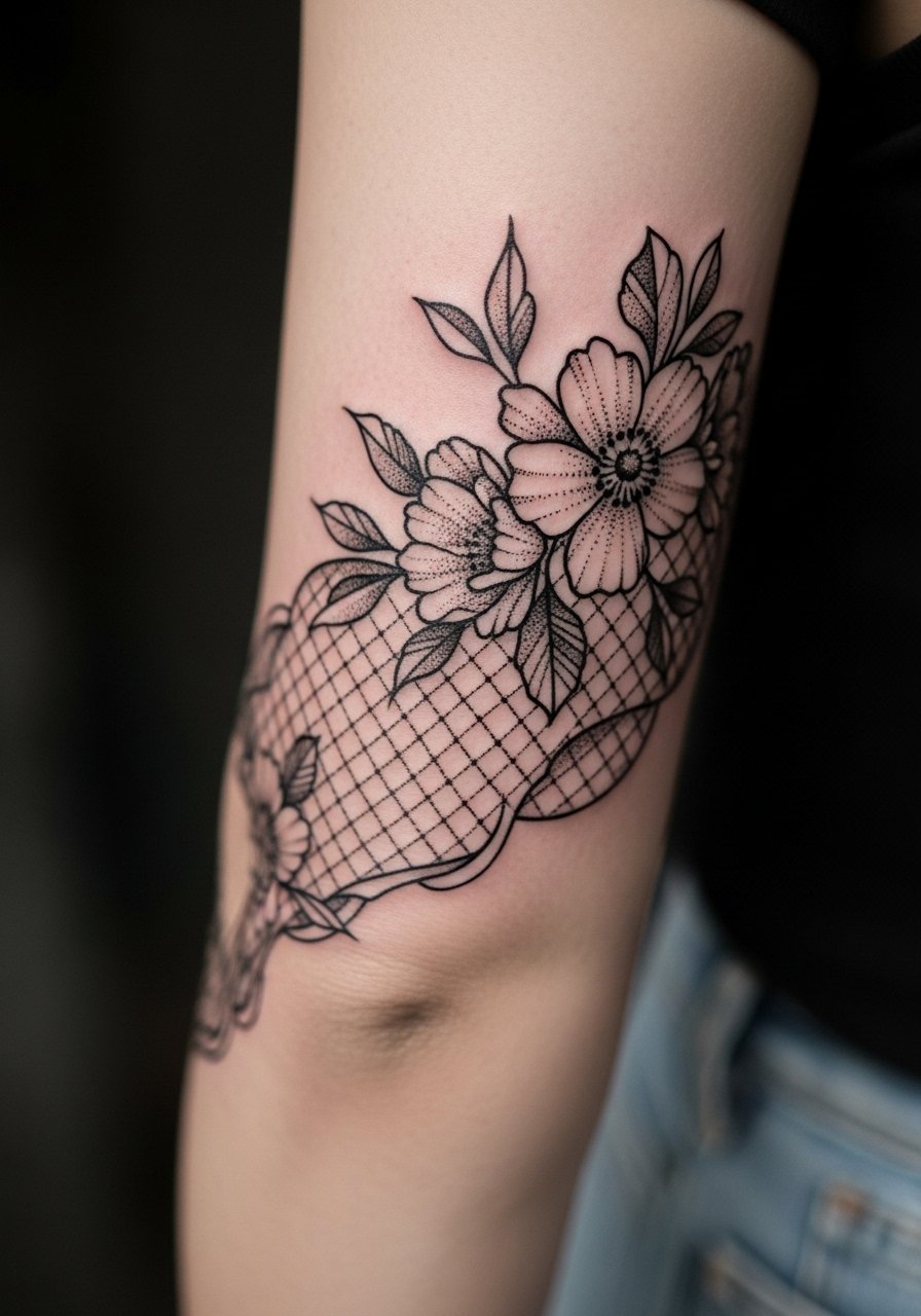
Fair warning, the elbow eats detail if you place delicate linework directly over the joint. This mesh uses stipple shading to suggest petals and texture, and places the densest work on the surrounding skin rather than the crease. Expect a higher pain score at the bony points, and a session split into shorter sittings improves comfort and saturation. The frequent mistake is packing dense fine lines across the crease, which merges quickly. For the session wear a stretchy short-sleeved tee so the artist can move the arm comfortably.
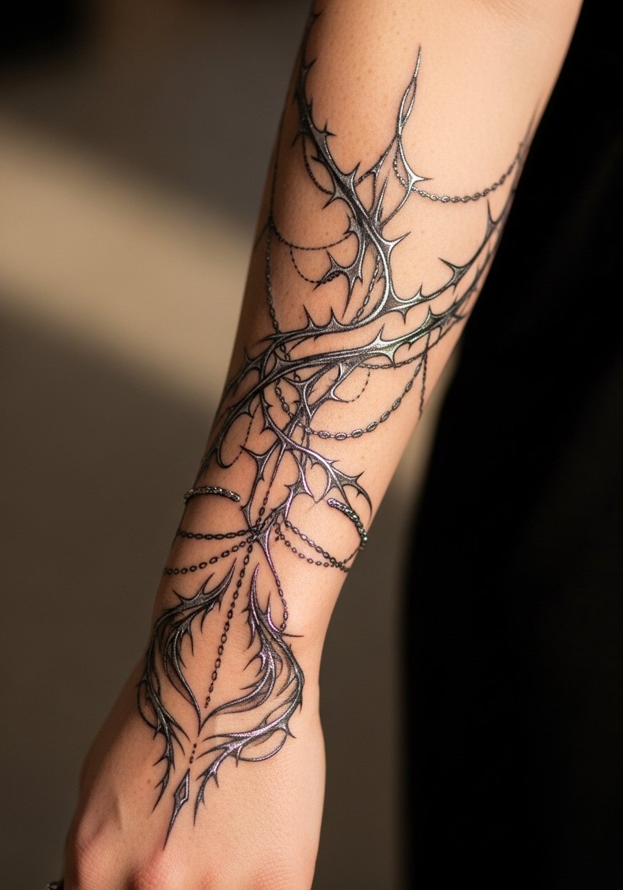
6. Negative-Space Vine Sleeve for Visible Wrapping
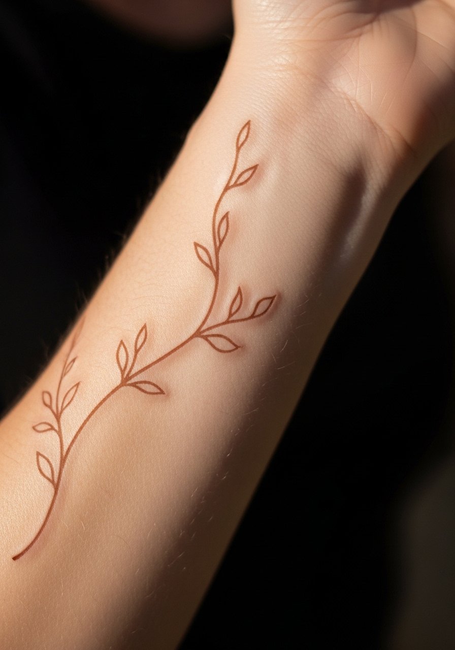
When you want an airy sleeve that still reads from a distance, negative-space vines work because they let the skin act as the background. Pain is low at the wrist but note wrists see lots of friction which affects healed saturation. Sessions are usually short and focused, often two hours for initial layout and linework. A mistake is adding too much small-dot filler near the wrist, which fades unevenly. Pair with a thin chain bracelet when showing it off, the metal sits close without hiding the vine flow.
Studio Day Picks
The outer arm and elbow pieces above need different prep than a full-saturation upper arm. These picks smooth the session and the first week of healing.
-
Stencil transfer paper kit. Lets you test placement and line scale directly on skin so the cascade and wrap ideas land where you expect.
-
Plant-based topical numbing cream. Helps with bony areas like the elbow and wrist when applied per the product directions before the session.
-
Thin protective film roll. Useful for wrist and elbow sleeves that face friction from sleeves and daily movement during the first days.
-
Fragrance-free gentle body wash. Cleans healing sleeves without stripping pigment or irritating sensitive linework near the wrist.
-
Aquaphor healing ointment. Thin layers help retain moisture on fine line sections without clogging small needle channels.
7. Fragmented Petal Sleeve With Bold Anchors
Artists split into two camps over how much anchor is needed for fragmented petals. One camp favors bold anchors to keep petals readable for years. The other camp argues that lighter anchors preserve the abstract feel and can look more contemporary. I tell clients both approaches work if spacing and needle depth match the plan. Expect moderate pain across the forearm and multiple shorter sessions to layer anchors and fragments. The usual mistake is asking for ultra-fine anchors all over, which can wash into blur by year three. For the session choose a sleeveless button tank for easy upper-arm access.
8. Minimalist Floral Outline Sleeve, Wrist Accent
This placement reads restrained because the outline approach uses continuous linework to connect motifs. A consultation note to request even lineweight and slightly larger negative spaces helps longevity. Pain at the wrist is higher and the wrist accent may need touch-ups sooner than the mid-forearm. People often err by squeezing many motifs into the wrist area, which causes early merging. To show this off wear rolled cuffs or a slim chain bracelet so the wrist detail sits in view without being obstructed.
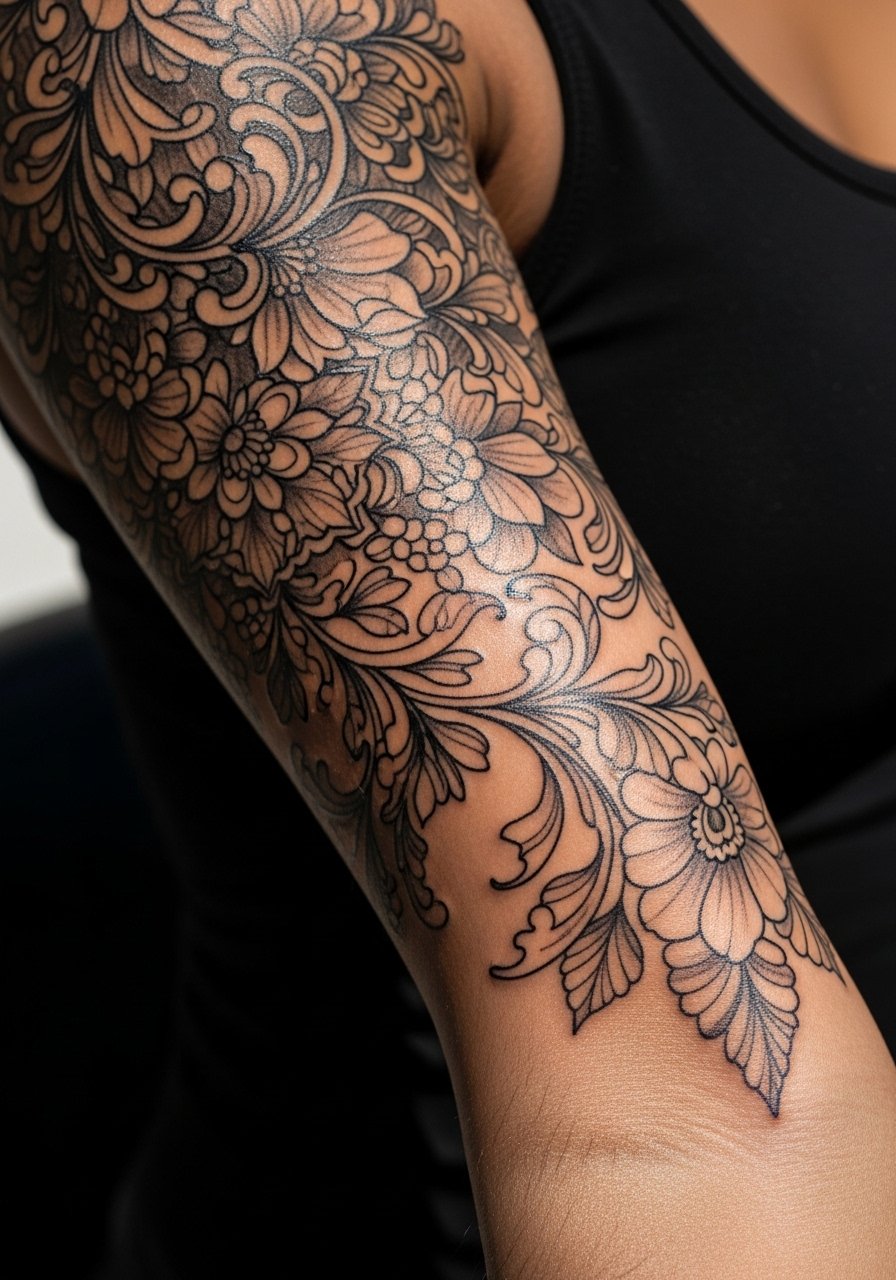
9. Abstract Botanical Sleeve With Color Blocks
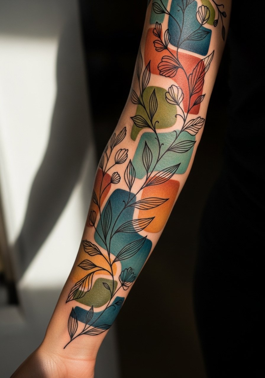
There is a visual impact when sparse color blocks sit behind black linework, they provide depth without heavy saturation. I usually recommend booking two sessions, one for clean linework and one for block color, to let the skin settle in between. Common mistakes include over-saturating small blocks which fade unevenly. Aging shows color softening by two years and linework holding shape if the artist used moderate saturation. For session comfort choose a loose linen drawstring pant if the sleeve reaches the lower arm near the wrist and you need flexible movement.
10. Whip-Shaded Floral Sleeve With Open Spaces
When you sit down with your artist for whip shading, bring clear references showing the exact motion and density you like. Whip shading reads softer than solid fill and it can age with a pleasing texture if not overworked. Expect a few medium-length sessions depending on how much gradient you want. A mistake I see is asking for heavy density in whip areas, which removes the airy quality and leads to early flattening. For showing it off choose short sleeves or a rolled cuff shirt so the shaded gradients remain visible.
11. Collage-Style Floral Sleeve With Script Interplay
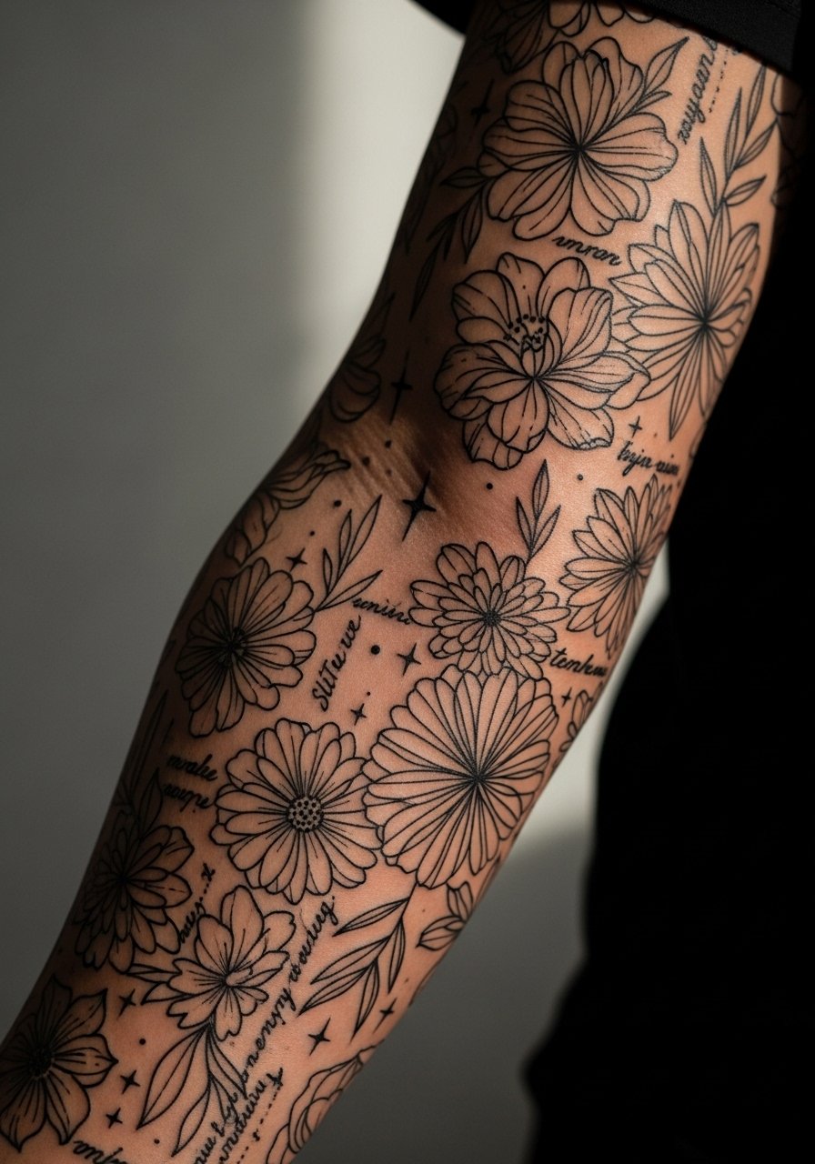
Most collage sleeves read like a mood board when script stitches through florals, and that mix works when the lettering is spaced properly. The inner-arm script needs slightly heavier lineweight to avoid early blurring. Expect moderate pain if the inner bicep is involved and plan a touch-up around year three for the script. A common error is using tiny script that looks crisp fresh but becomes illegible. When showing it off, a thin chain pendant necklace can sit above the cuff without competing with the sleeve.
12. Continuous Vine Sleeve That Flows With Muscle Lines
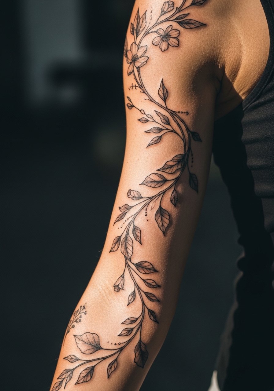
I've seen continuous vine sleeves last best when the design follows natural muscle contours. Tell the artist to map the vine to your movement so the design reads while you bend your arm. Pain varies across the arm and longer sessions are common for full-length flow pieces. People often request perfectly symmetrical vines, which look static on a living arm. For the session wear a loose button-down shirt you can slide aside for shoulder access.
13. Abstract Chrysanthemum Blocks for Durability
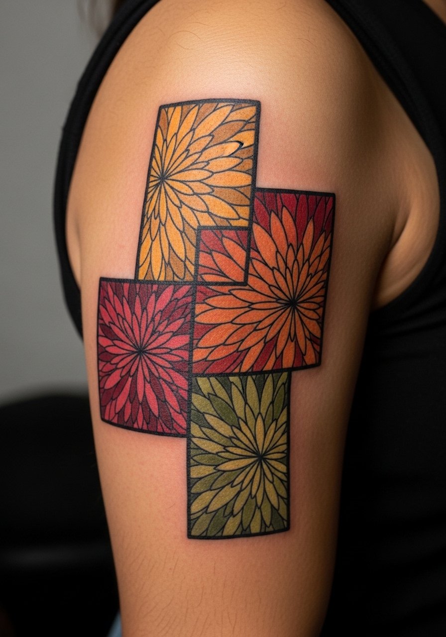
The biggest mistake with chrysanthemum details is doing them too finely when you actually want long-term clarity. Bigger petal blocks with bold anchors age into texture rather than a mud of gray. Outer arm placement tolerates saturation well and sessions often run four hours. Expect touch-up intervals around year five for color refresh. If you are deciding between micro detail and block work, pick blocks for durability. To display this, opt for a cap sleeve tee that reveals the upper arm without distraction.
14. Asymmetrical Floral Sleeve With Metallic Ink Hints
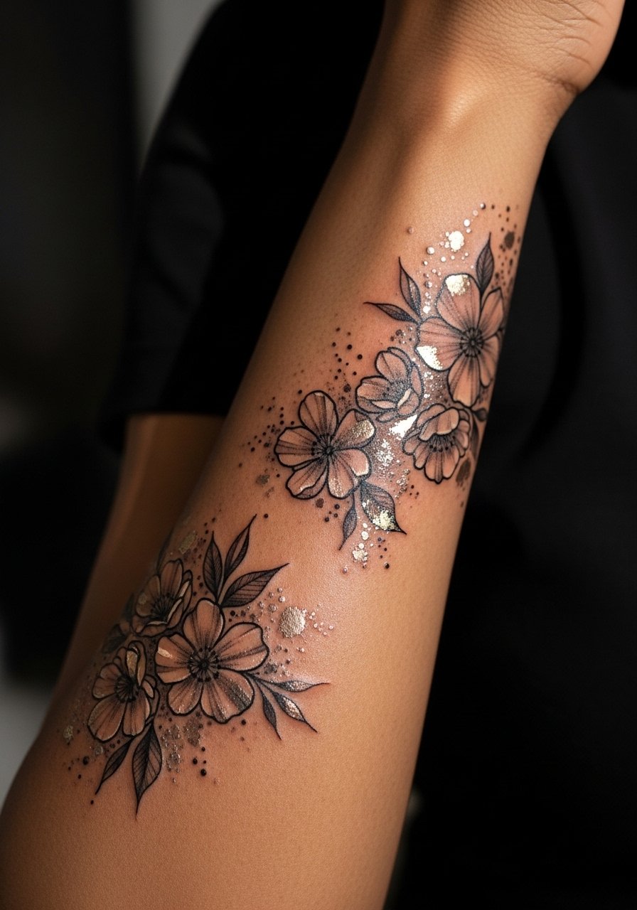
Fair warning, metallic inks can change appearance over time and some artists avoid them for that reason. If you want small metallic accents, ask for them only as highlights rather than the base of a motif. Sessions will include a test patch so you can see how the ink shows against your skin tone. A common mistake is peppering metallic across a whole sleeve, which can read patchy as it fades. For showing metallic highlights, pair the arm with a delicate ring set that catches light in a similar way.
15. Negative Outline Sleeve With Pop Color Accents
People often assume small color accents will behave like full fields, but small pops tend to fade faster unless the artist layers them correctly. Plan for an initial color glaze session and a follow-up top-up. Expect moderate pain at transitional zones like the elbow and wrist. A typical session plan is two appointments to preserve crisp contrast between linework and color. The usual mistake is asking for neon tones that are notoriously fugitive. For comfort during long sittings wear a soft cotton tee you can roll without binding.
16. Layered Petal Collage Using Dot Work
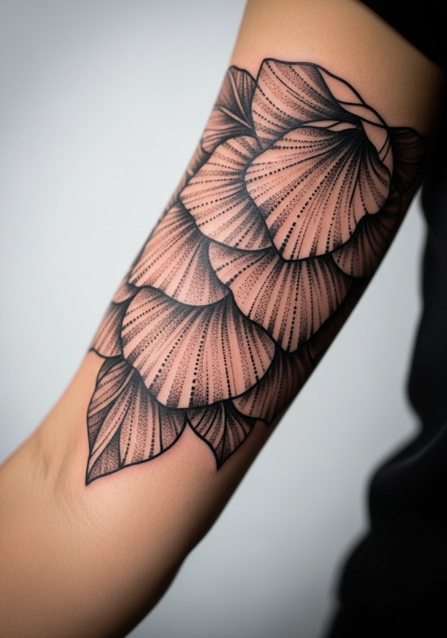
This style reads textured and deliberate because the dot work builds tone rather than relying on solid fills. In consultation ask for defined gradients and spacing so dots do not merge into blotches. Sessions are slow and require patience, often split into several two-hour sittings. Mistakes happen when artists rush density, which can create blotchy areas after healing. To show the texture, wear rolled sleeves or a short cuff sweater that hits just above the work.
17. Fine Line Floral Sleeve That Tests Longevity
Artists are divided about ultra-fine line sleeves. One camp argues tiny linework becomes unreadable after a few years. The other camp says proper depth and spacing can keep it intact longer. I tell clients to expect touch-ups and to plan for slightly bolder line in key anchor points. Fine line sleeves tend to require more frequent touch-ups than bold blackwork, especially on areas with heavy sun exposure. A common mistake is demanding micro detail in high-friction zones like the wrist. For the session, wear a loose drawstring linen pant if the sleeve drags near the hand and you want comfort while seated.
18. Broken Stem Sleeve That Uses Empty Space Strategically
There is a visual calm to a sleeve that purposely leaves big gaps. This broken stem approach ages well because the empty skin keeps the composition readable even as lines soften. Expect moderate pain across the arm and shorter sessions focused on placement and spacing rather than saturation. A frequent error is filling the gaps later, which defeats the original intent. To show the negative space, choose rolled sleeves or a short-sleeved chambray shirt that contrasts with bare skin.
19. Monochrome Gradient Floral Sleeve for Low Maintenance
Most people opt for monochrome when they want lower-maintenance sleeves. The gradient keeps depth without relying on colors that need frequent refresh. Sessions tend to be longer for smooth gradation and may need a touch-up at year four. The big mistake is trying to compress too many tonal steps into a small area, which blurs with time. For the session consider a loose sleeveless shirt to provide the artist with unrestricted arm access.
20. Fragmented Botanical Sleeve With Negative Ink
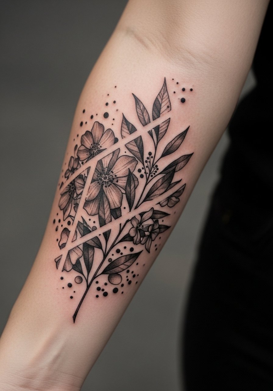
I've seen negative ink used to great effect when artists carve out the petals and leave the skin to define form. It requires confident linework and patience during healing. Pain is low to moderate on the outer arm and sessions are usually staged. A common error is overcomplicating the negative shapes, which pulls focus from the floral intent. Wear a simple bracelet stack when showing it off to add subtle contrast without covering the art.
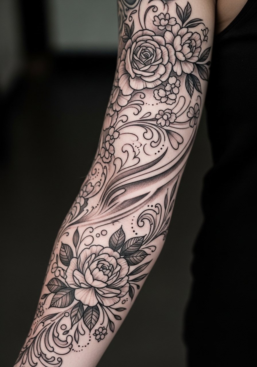
21. Abstract Peony Sleeve With Layered Linework
The mistake people make with peony sleeves is requesting intricate line density at a small scale. Layered linework at a medium scale keeps petals readable and provides options for future color if desired. Expect moderate pain on the upper arm and session times that vary by density. Touch-ups are often needed at year five for heavy line layers. For comfort in the chair choose a lightweight zip hoodie you can remove or re-drape without smudging fresh work.
22. Abstract Vine and Chain Sleeve With Jewelry-Friendly Gaps
Designing a sleeve with jewelry-friendly gaps means planning where bracelets and rings will sit so the art is framed rather than hidden. In consultation, mark where your favorite pieces lie so the artist can leave slight negative zones. Expect moderate wrist sensitivity and plan for shorter sittings if the design wraps the wrist. The usual mistake is not coordinating with existing jewelry. Pair with a stackable ring set that complements the reserved gaps and keeps the overall look balanced.
23. Organic Brushstroke Floral Sleeve That Mimics Paint
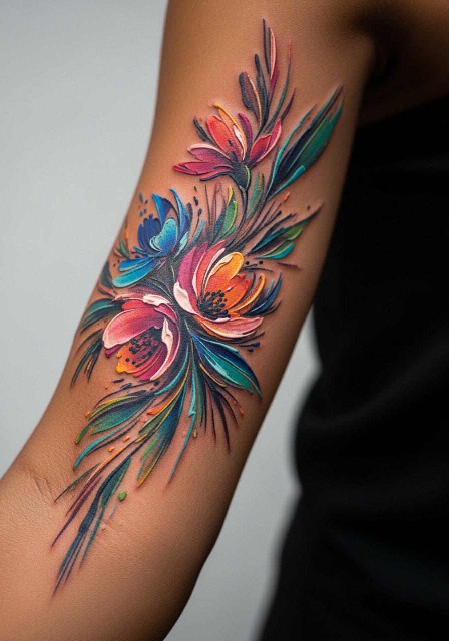
When you ask for brushstroke texture, bring photos that show the exact stroke weight you like. This style benefits from a looser hand and moderate saturation so strokes keep motion after healing. Expect longer sessions to layer strokes and a follow-up touch-up to refine edges. Common mistakes include asking for too many tiny strokes, which blur together later. For the session, choose a soft cotton tee that does not rub fresh ink.
24. Semi-Realistic Floral Sleeve With Abstract Fading Edges
There is a balance between realism and abstraction where petals keep recognizable shape but fade into suggestion at their tips. Ask your artist to plan fading edges with gradual stipple to prevent abrupt loss after healing. Sessions often require two appointments for detail and blending. People mistake heavy contrast for longevity, but soft transitions usually age more gracefully. When showing this style off, short sleeves or a button-up linen shirt keeps the sleeve visible without competing textures.
25. Sketch-Style Floral Sleeve That Looks Hand-Drawn
Most sketch-style sleeves rely on intentional imperfection, and the trick is to ask for varied line pressure so the piece does not read like inconsistent healing. Expect moderate pain across the arm and sessions that layer lines for depth. A frequent error is requesting ultra-fine pencil lines everywhere, which can merge. For comfort in the chair a loose henley top gives the artist access while keeping you warm between sittings.
26. Botanical Tattoo Sleeve That Frames the Collarbone Transition
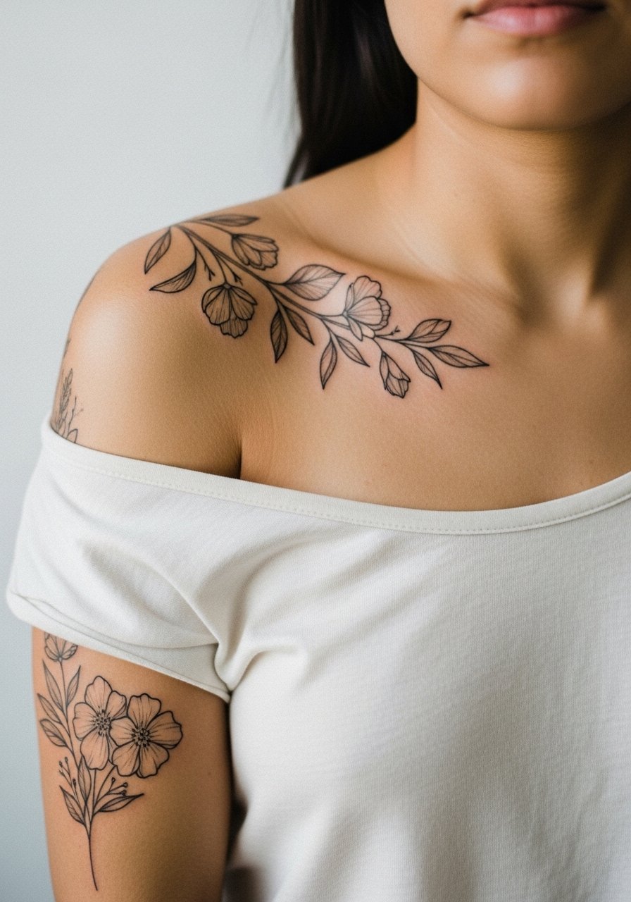
This placement looks best when the sleeve stops deliberately at the collarbone transition rather than wrapping onto the chest. Tell the artist to map where fabric sits so the design flows naturally with clothing lines. Sessions include shoulder access and moderate discomfort near the bone. Mistakes include spilling too much detail onto the chest, which ages differently. For showing the upper transition pick an open-back midi dress or a wide-neck shirt so the shoulder and collarbone area remain visible.
27. Full Abstract Floral Sleeve With Modular Touch-Up Strategy
When committing to a full sleeve, plan a modular touch-up timeline rather than one big redo. I recommend breaking the sleeve into zones and booking touch-ups for the most exposed areas first, typically the forearm and wrist. Sessions are longer and may span months. The frequent mistake is assuming one session will finish everything to a high standard. For long sessions, wear layered comfortable clothing and consider a soft travel pillow in the chair to keep your arm steady and relaxed.
Frequently Asked Questions
Q: Will a fine line abstract floral sleeve need touch-ups more often than bold blackwork?
A: In my experience fine line work generally requires touch-ups sooner because those ultra-thin channels can blur as skin changes. Bold blackwork holds shape longer, but the right plan often mixes both so you get longevity without losing the delicate aesthetic.
Q: How should I prepare clothing-wise for a shoulder-to-wrist sleeve appointment?
A: Wear layers you can shift aside without smudging fresh ink. A loose button-down shirt or a wide-neck shirt works well so the artist has access and you stay comfortable during long sessions.
Q: Do abstract floral sleeves look different on darker skin tones?
A: Yes. Contrast and saturation read differently, so ask for slightly bolder anchors and tested color patches in your consultation. Many artists will do a small test to show how a hue sits against your skin before committing.
Q: Are there placements on a sleeve I should avoid if I want long-term clarity?
A: High-friction zones like the wrist and inner elbow tend to lose micro detail faster. If you want longevity, ask your artist to reserve very fine work for areas that see less abrasion.
Q: How do I find an artist who understands abstract floral sleeve composition without naming specific shops?
A: Look through local studio portfolios in directories, search hashtags for your city plus "abstract floral sleeve," and check convention rosters to see who shows similar work. Conversations at a consultation will reveal if an artist maps negative space and plans durability.
Q: Can I mix watercolor washes and stipple shading in the same sleeve without it looking disjointed?
A: Yes, when the artist plans transitions and uses consistent anchor points. Ask for staged sessions so washes have time to settle before stippling is layered on. That planning keeps the sleeve cohesive over time.
