
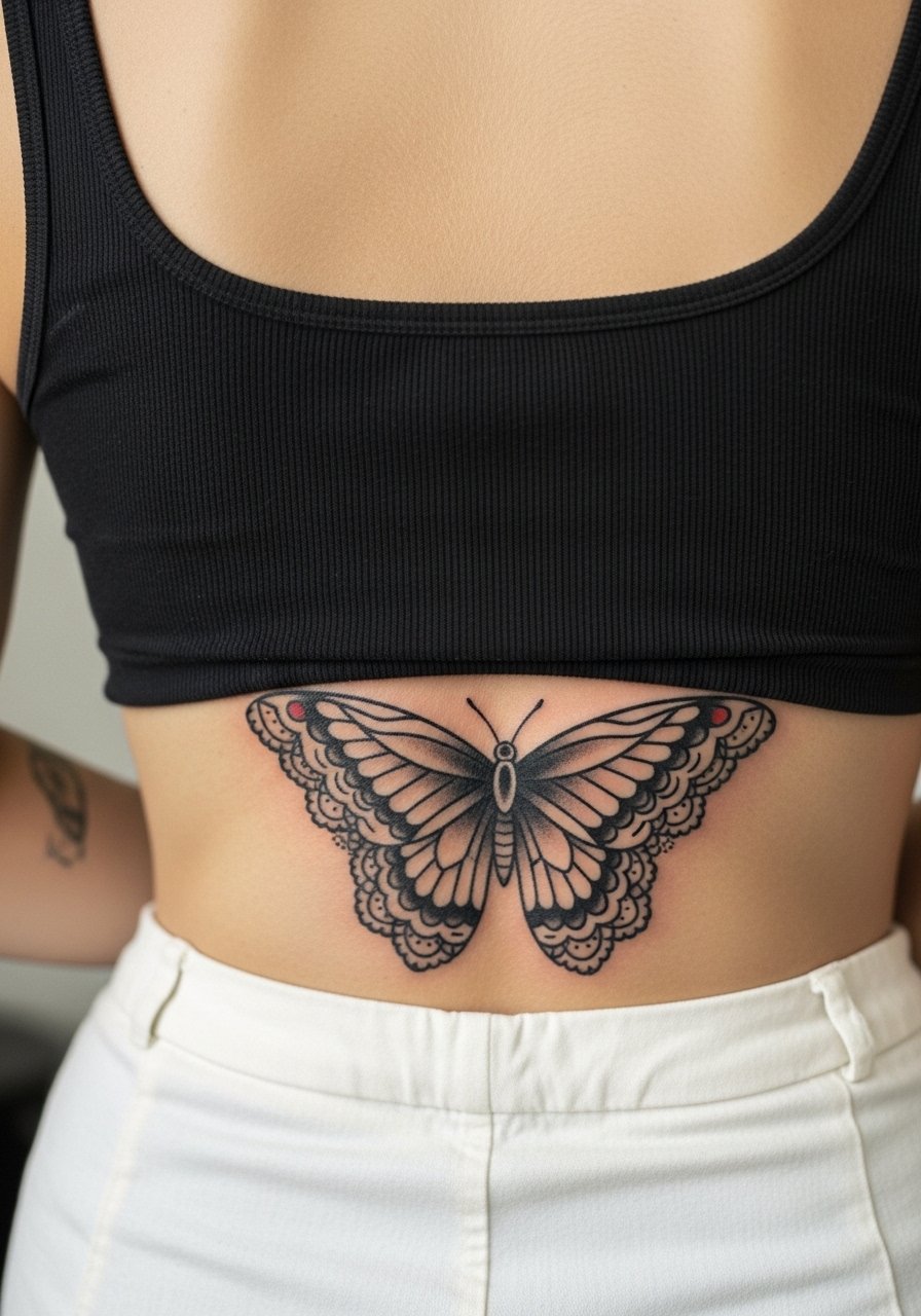
Traditional butterfly back tattoos are a study in contrast. What looks delicate on a flat photo can turn into a blur if the stencil is too small, the placement catches friction while you sleep, or the artist under-saturates the wings. Expect questions about pain on the spine, about aftercare when your back meets sheets, and about how big to go so the pattern still reads in five years. Below are 27 traditional butterfly back tattoo ideas that address those tradeoffs and tell you what to ask at the consultation.
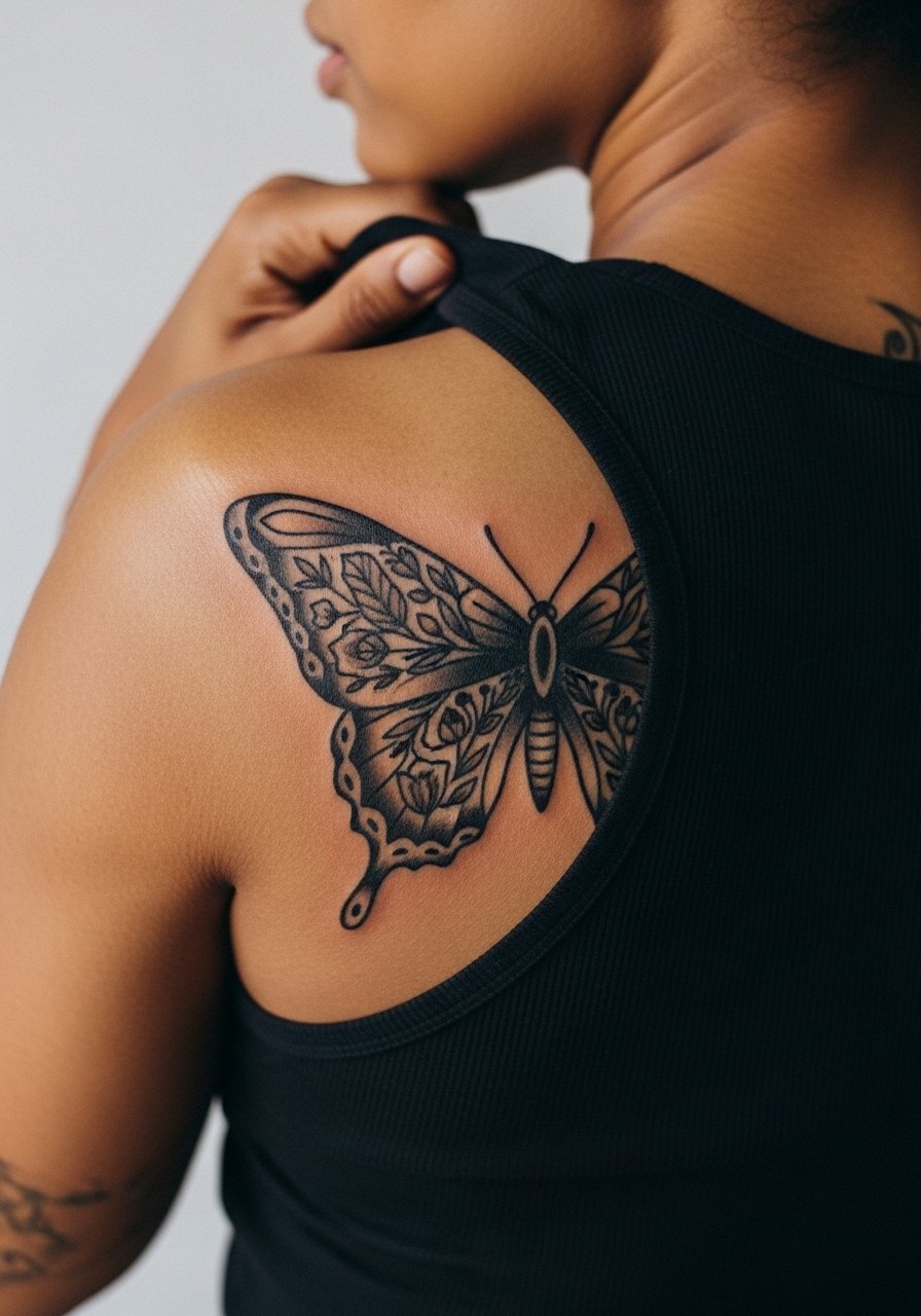
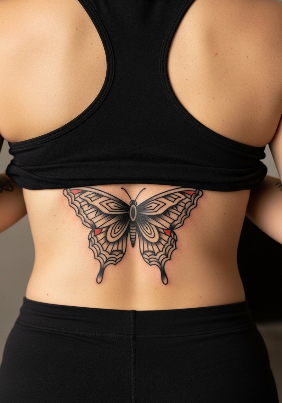
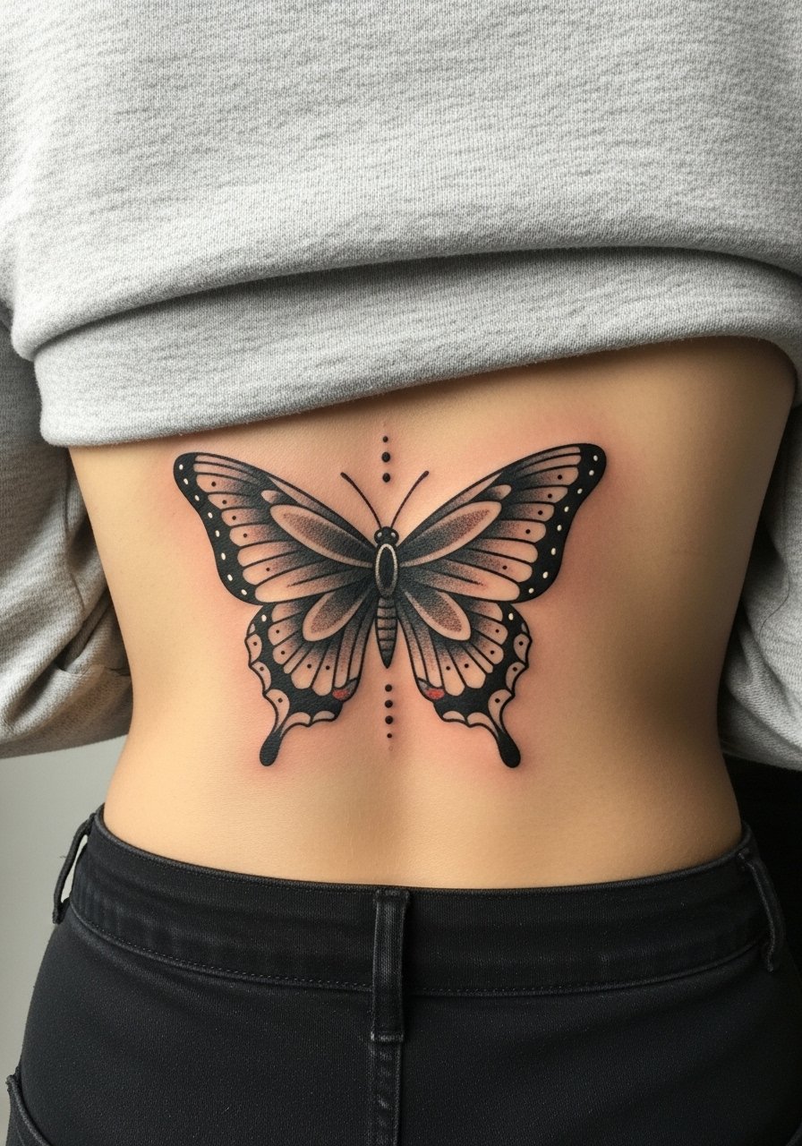
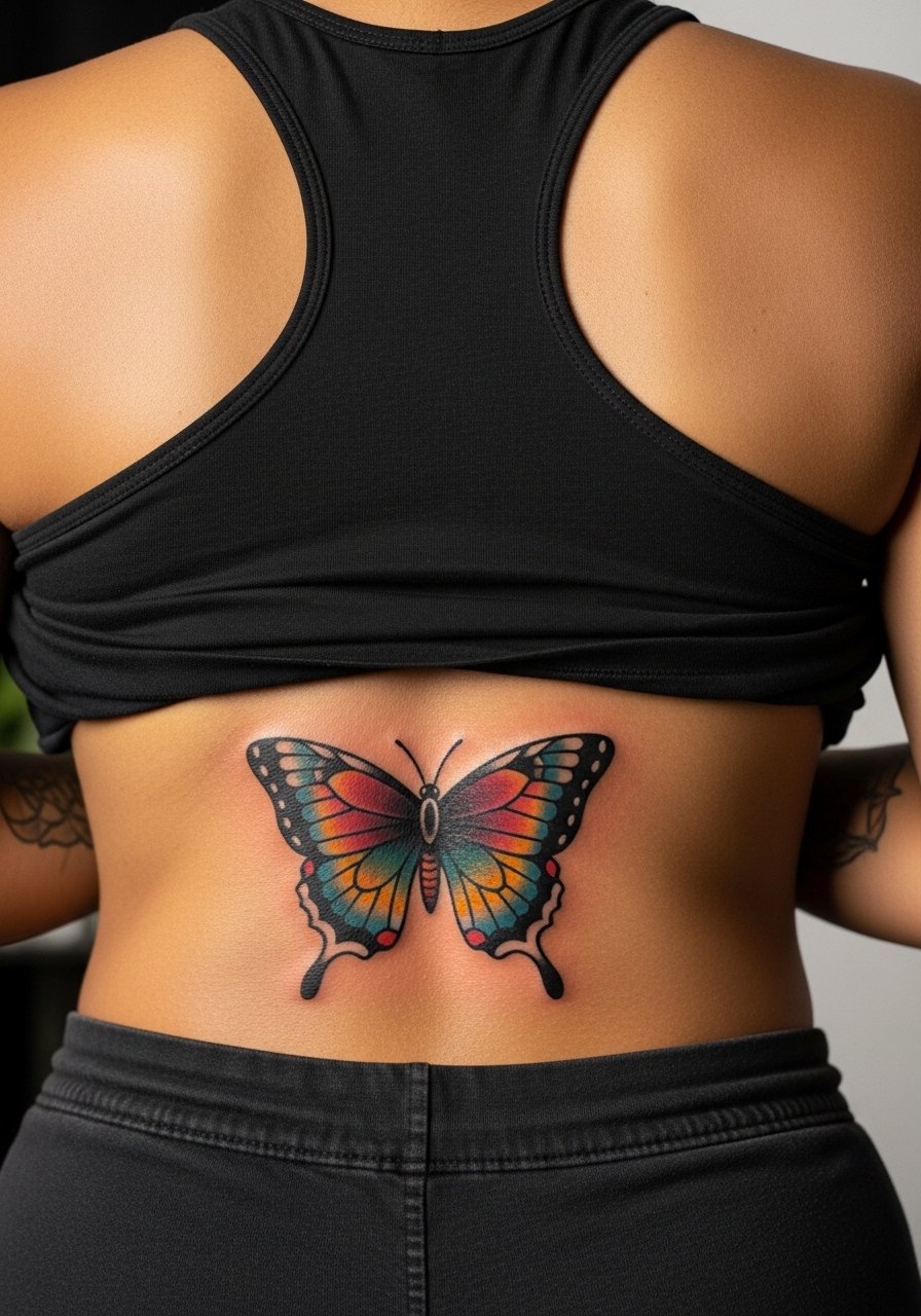
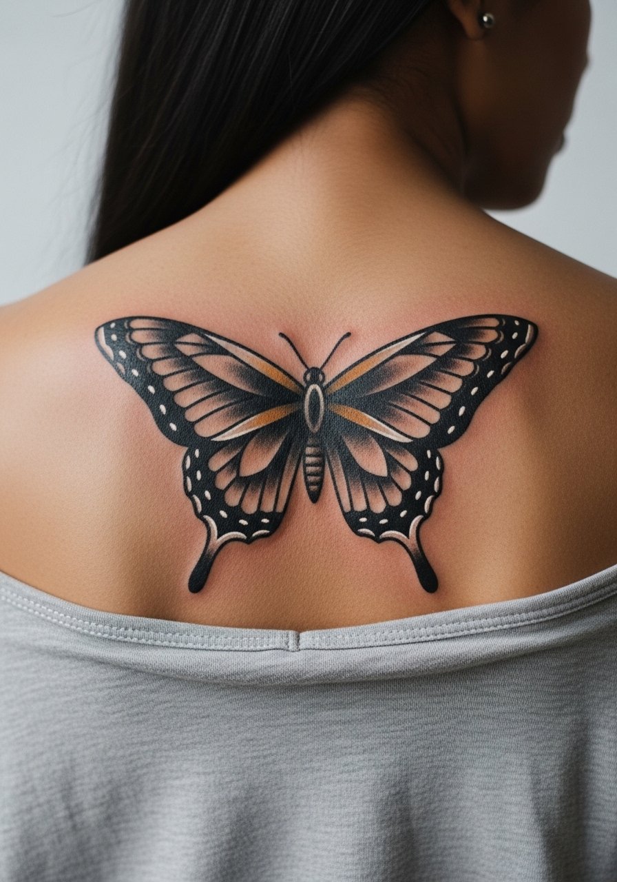
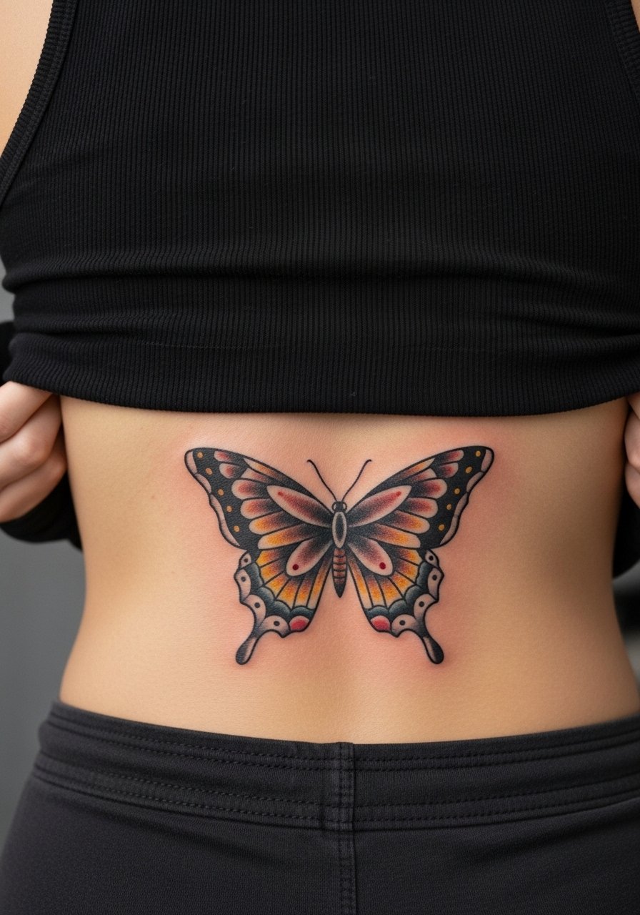
1. Classic Centered Upper-Back Butterfly in Bold Trad Work
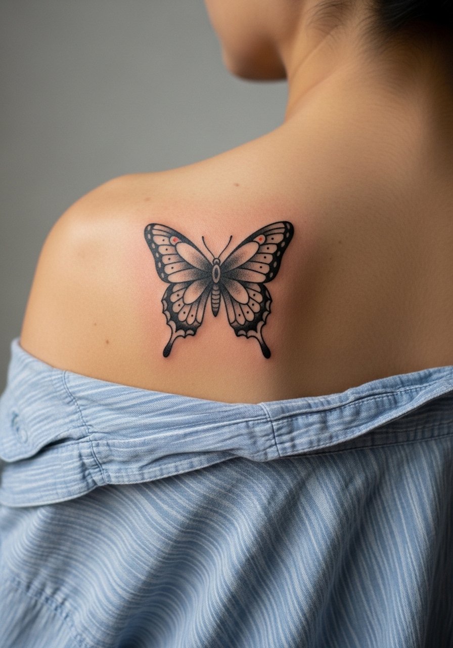
I've seen this centered placement age cleanly when the artist leans into classic saturation and bold linework. Fair warning, the spine can register higher pain near the center, but most people describe it as a steady, manageable discomfort for a single-session piece. Ask your artist for heavier outer outlines and dense color fills to protect the tiny interior details from blurring. The usual mistake is shrinking the wings too much. Make the wings large enough that the antennae and inner dots have breathing room. For showing it off, an open-back midi dress frames the center line without competing.
2. Mirror-Pair Butterflies Across the Shoulder Blades
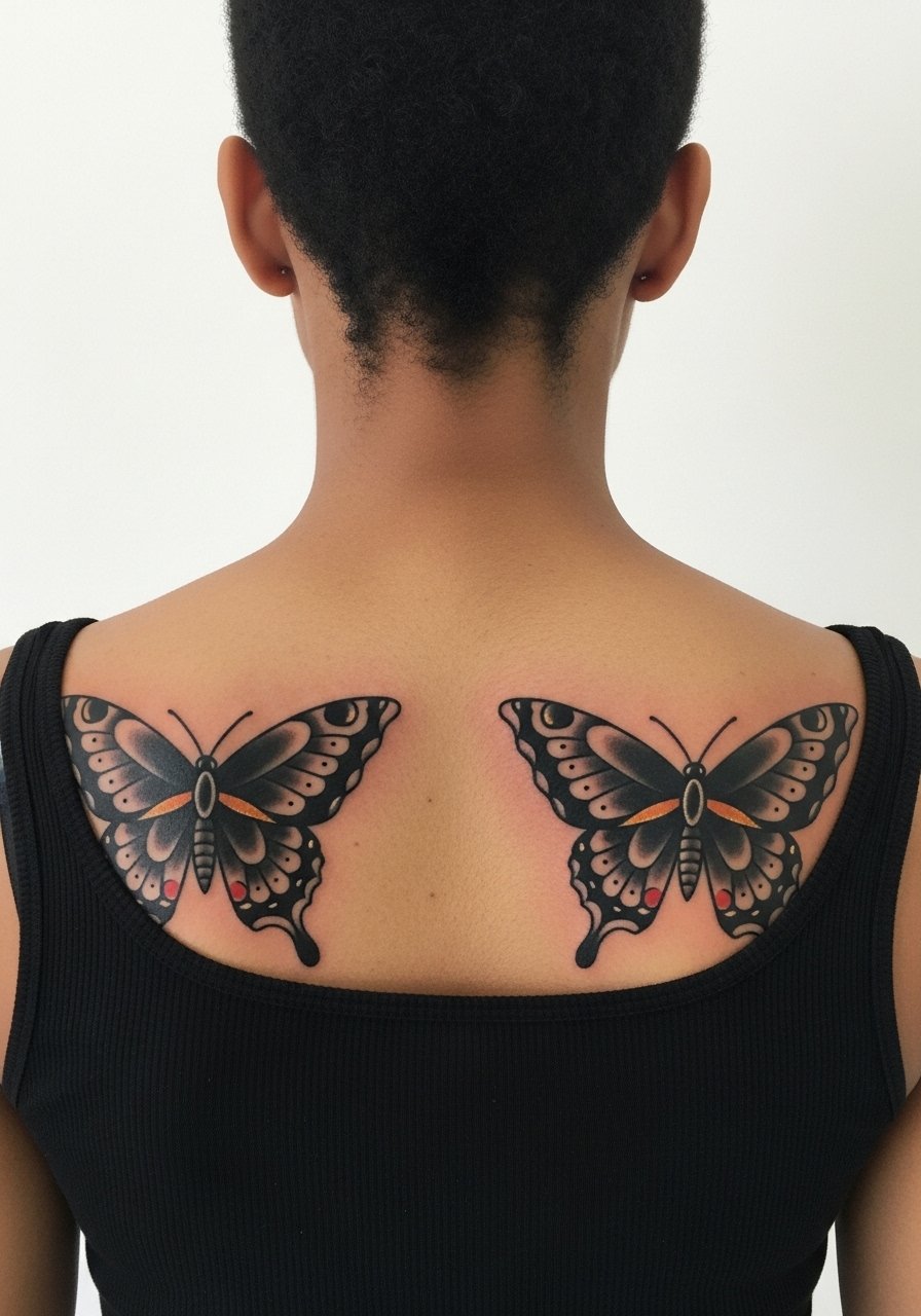
Personal observation: symmetry reads powerful from across a room. This layout spreads the session time but keeps each butterfly large enough to avoid tiny details that age poorly. Tell your artist you want matching wing spans and mirrored antennae so the composition works when you move. A common error is mismatched scale. Expect more time than a single upper-back piece because each side needs full attention for consistent saturation. For session wear, slip into a loose button-down shirt you can pull aside so the artist has clean access.
3. Single Blackwork Butterfly over the Spine
Pain warning: anything centered over the spine tends to feel sharper because of the bone. Still, a single-session blackwork approach reduces the need for multiple color passes. During consultation, ask for dense black saturation with minimal interior linework to avoid tiny lines that blur into each other. The aging benefit here is simple contrast that holds. The typical mistake is over-detailing the wing interiors. Touch-up needs are usually lower than with multi-color pieces because black holds better over time.
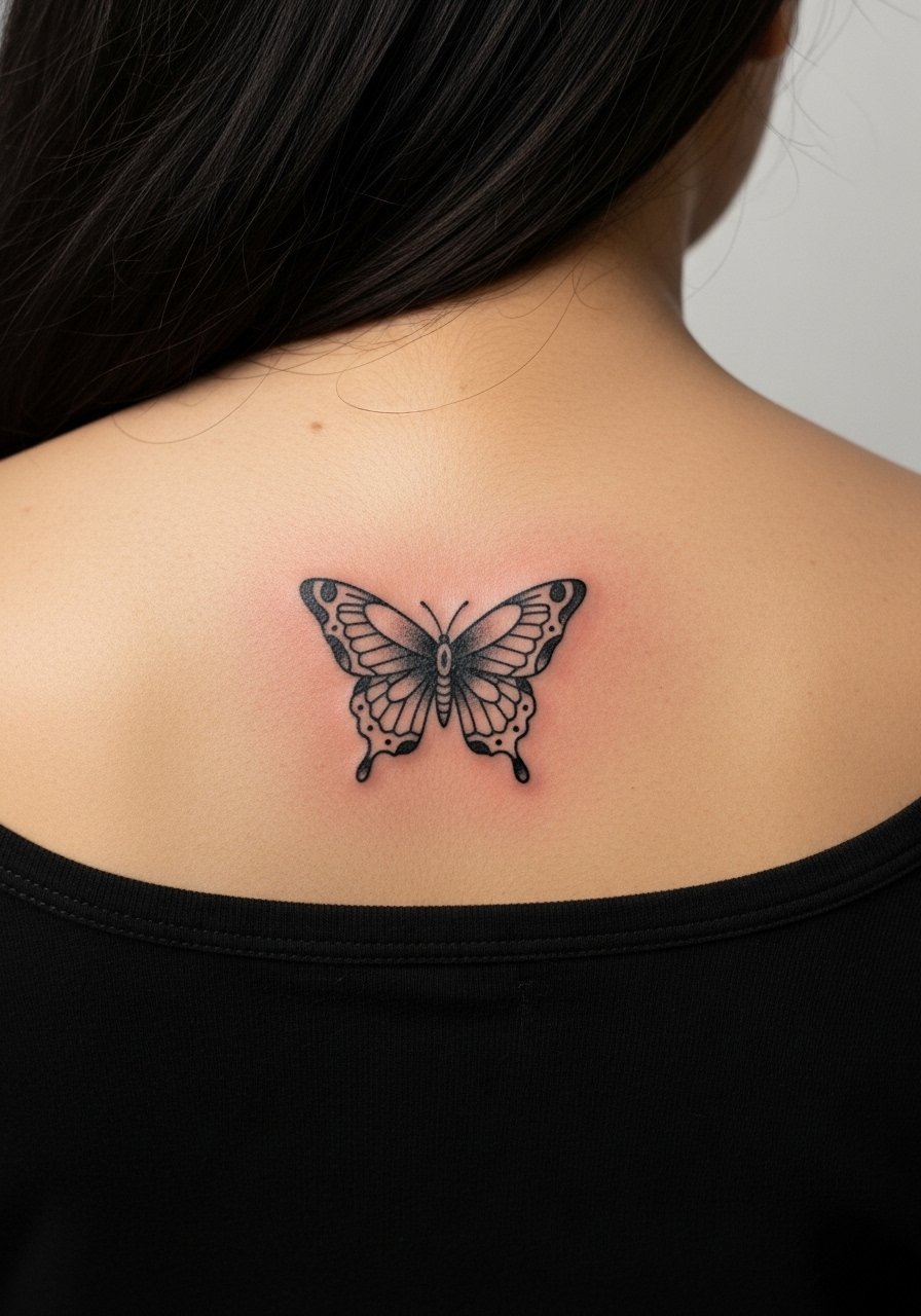
4. Small Flash Butterfly Cluster at the Nape
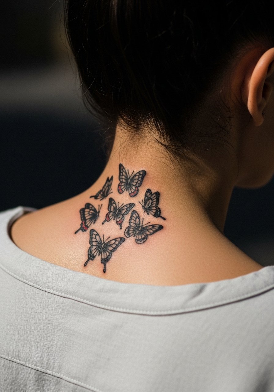
Visual impact lead: tiny clusters at the nape read delicate with hair down and bold with hair up. The nape is a visible spot that heals faster than lower back areas because of airflow, but it can be prone to friction from collars. Tell your artist you want slightly thicker linework than your flash reference so the small wings keep shape at year two. The session is short, but be mindful that sleeping positions might rub the area during the first week. Pair it with a thin chain pendant necklace when you want to draw attention upward.
5. Double-Exposure Butterfly with Botanical Fills
Consultation lead: bring clear references of the exact botanical shapes you want inside the wings and state that you want heavy outlines around the flowers. The risk is that delicate floral stippling inside small wing panels can look muddy over time. Ask the artist for a mix of saturated color and strategic negative space so the flowers keep their form after one to two years. For showing it off, a halter top keeps the upper back visible while keeping the design the star.
6. Full-Back Traditional Butterfly with Banner Script
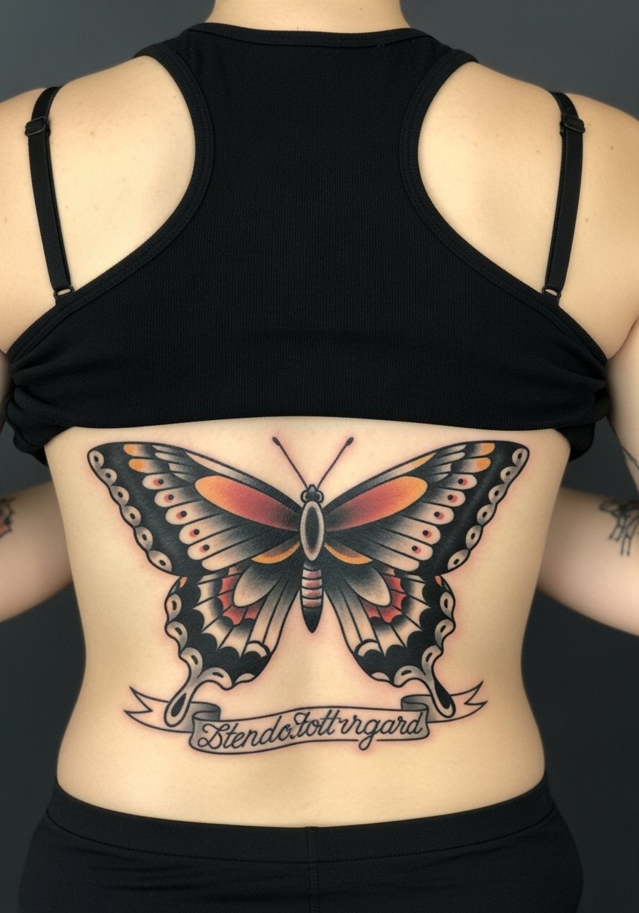
Mistake lead: the biggest error here is crowding the banner with long text. Keep script short and bold so it reads at distance. This full-back layout takes multiple hours or sessions depending on color saturation. Expect higher session time and more aftercare attention because of the length of work. Tell your artist the font size you want in millimeters if possible so the letters survive touch-ups. For evenings out, an open-back gown shows off the scale without competing.
Pack Smart
The diverse upper- and mid-back pieces above ask for slightly different prep and first-week care, so a few studio staples smooth the session and the first healing window.
-
Stencil transfer paper kit. Lets you preview exact placement on your skin, which matters more when a butterfly must sit centered or mirrored.
-
Topical numbing cream. Applied as directed before a long back session eases sharp spine sensations without dulling the whole area.
-
Thin protective film roll. Useful for the first night, especially if your tattoo rubs against sleepwear or straps.
-
Fragrance-free gentle body wash. Cleanses the healing area without stripping saturated color from traditional fills.
-
Aquaphor healing ointment. A thin layer in the first 48 hours keeps heavy black and color saturated while the skin starts to seal.
7. Retro Sailor-Style Butterfly with Sailor Stars
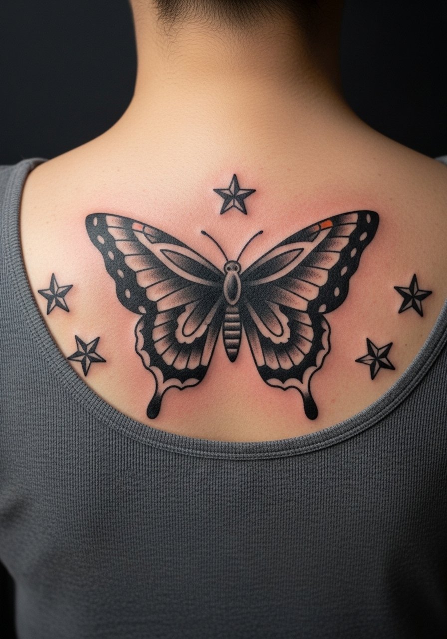
Personal observation: sailor-inspired motifs play well with traditional butterflies because both use bold outlines. For this one, ask for classic color blocks rather than watercolor fills. The usual error is adding tiny stars that get lost. Keep stars larger and allow space between the butterfly and nautical accents. The session feels straightforward because the lines go quickly, but expect slightly longer time for saturated fills. For nights out try a cropped blouse with a low back to let the motif breathe.
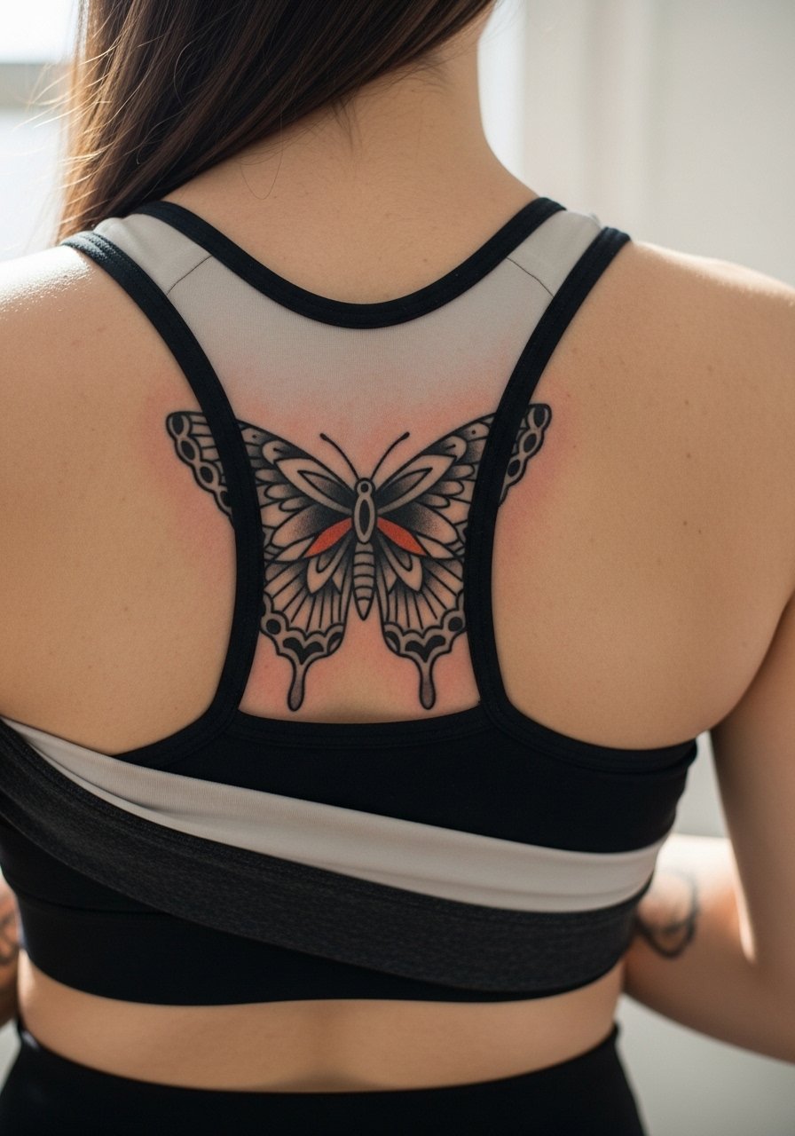
8. Two-Toned Monochrome Butterfly
Aging/healing lead: two-tone work uses contrast rather than color saturation to hold for years. Tell the artist you want stark outer lines and gradual stipple shading inside the wings. The mistake is using too many tiny gradients that flatten. For placement, the upper back is forgiving, but if you move the design lower toward the small of the back expect more stretching with weight changes. Pair with a ribbed tank top when you want a quiet frame.
9. Art Deco Butterfly with Geometric Wings
Mistake lead: the biggest problem with geometric interiors is making them too fine. The lines need breathing room so the shapes do not merge as the tattoo ages. In consultation, show the exact wing pattern and tell the artist you want thicker primary lines around the shapes. The pain is moderate because the mid-back has a bit of padding. For showing it off, a wrap top keeps the back visible and complements the deco angles.
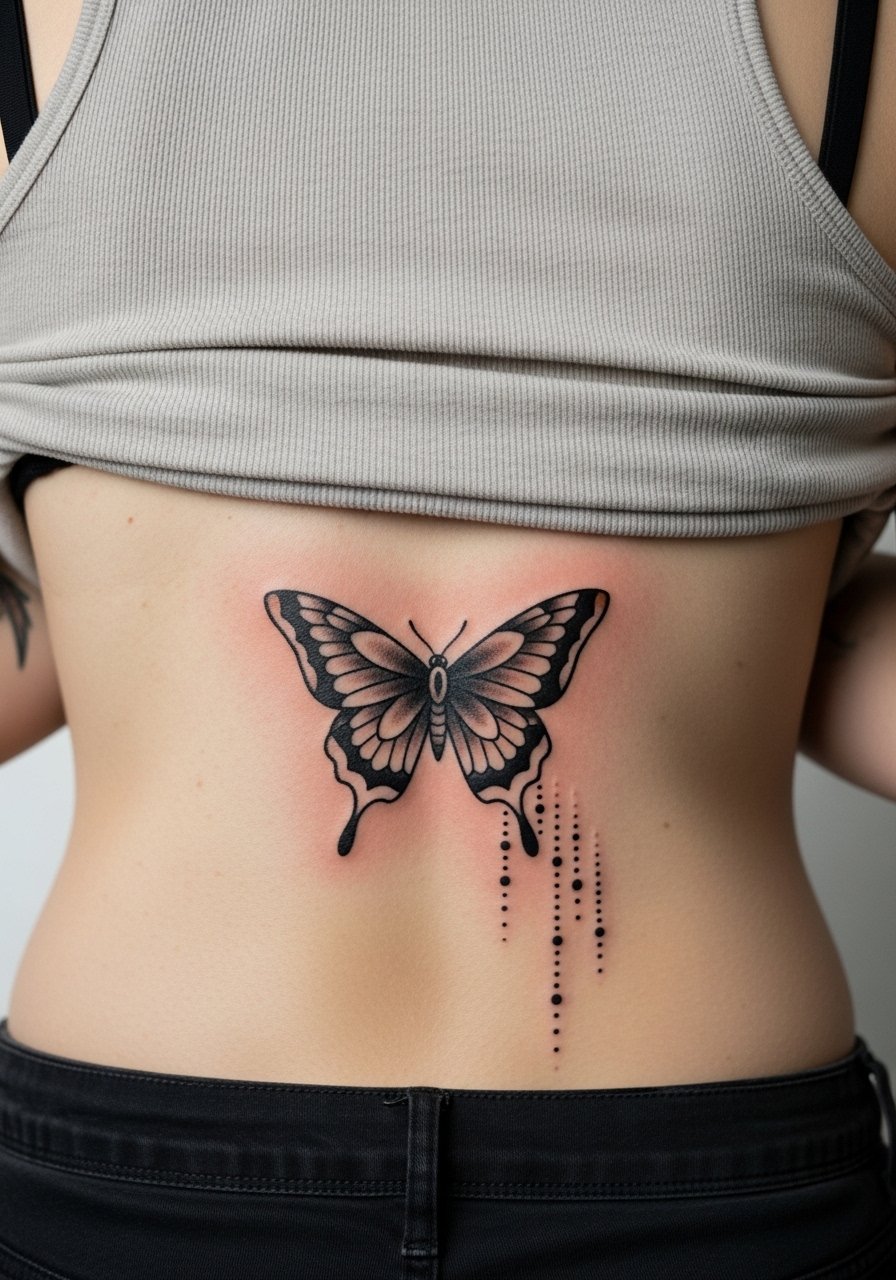
10. Butterfly Spine Ladder: Multiple Small Butterflies Down the Spine
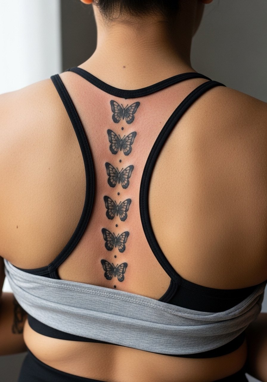
Pain warning lead: repeated work directly over the spine adds up in discomfort because each little piece hits a sensitive strip. The advantage is modularity. You can space sessions and adjust scale if one area needs reworking. A common mistake is packing them too close together. Leave spacing so individual wings retain shape. Expect touch-ups earlier than a single large piece because each tiny butterfly has less pigment per area. Session wear is simple, a zip-up hoodie helps you arrive covered and then reveal the spine for work.
11. Stained Glass Wing Pattern in Traditional Pallette
Visual impact lead: stained glass fills rely on segmented color blocks and heavy black outlines that protect each cell from bleeding. Tell the artist you want small but distinct color compartments and ask for high saturation. The mistake is using washes that blur the cell borders. Over the first year expect slight softening of the interior edges, but the bold outer line preserves overall shape. For styling, an open-back blouse complements the graphic look.
12. Butterfly with Traditional Roses Framing the Lower Back
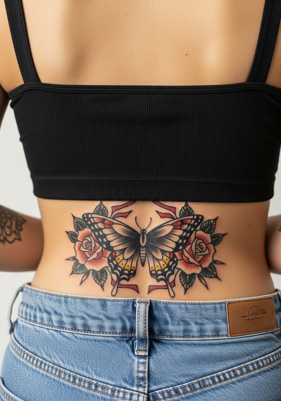
Consultation lead: lower back skin moves and stretches more, so make the roses bold and simplified rather than intricate. Artists sometimes debate whether delicate foliage should go on the lower back. One camp says keep it bold because detail blurs. The other camp suggests skilled stipple shading can hold. Ask specifically about how they handle lower back stretch before you book. For session comfort, wear high-waisted jeans you can lower briefly without shifting too much.
13. Butterfly with Whip Shading and Dot Work Accents
Mistake lead: whip shading gives motion but too many tiny dots inside small wing panels can lose definition. Ask for larger stipple clusters and test patches if you are uncertain. The technique feels lighter on the skin than heavy packing, but it may require a touch-up at year two for areas that sit in friction zones. For relaxed styling try a low-back tank when you want dishy exposure without full reveal.
14. Folk Art Butterfly with Bold Color Blocking
Personal observation: folk motifs thrive when the artist uses flat, saturated fills and unambiguous shapes. The main error is over-detailing corners of the wings with tiny flourishes that do not hold. This style usually needs less frequent touch-up because color sits in larger blocks. For a casual outfit pick a button-down shirt you can slip off one shoulder to let the pattern show.
15. Butterfly with Subtle Metallic Ink Highlights
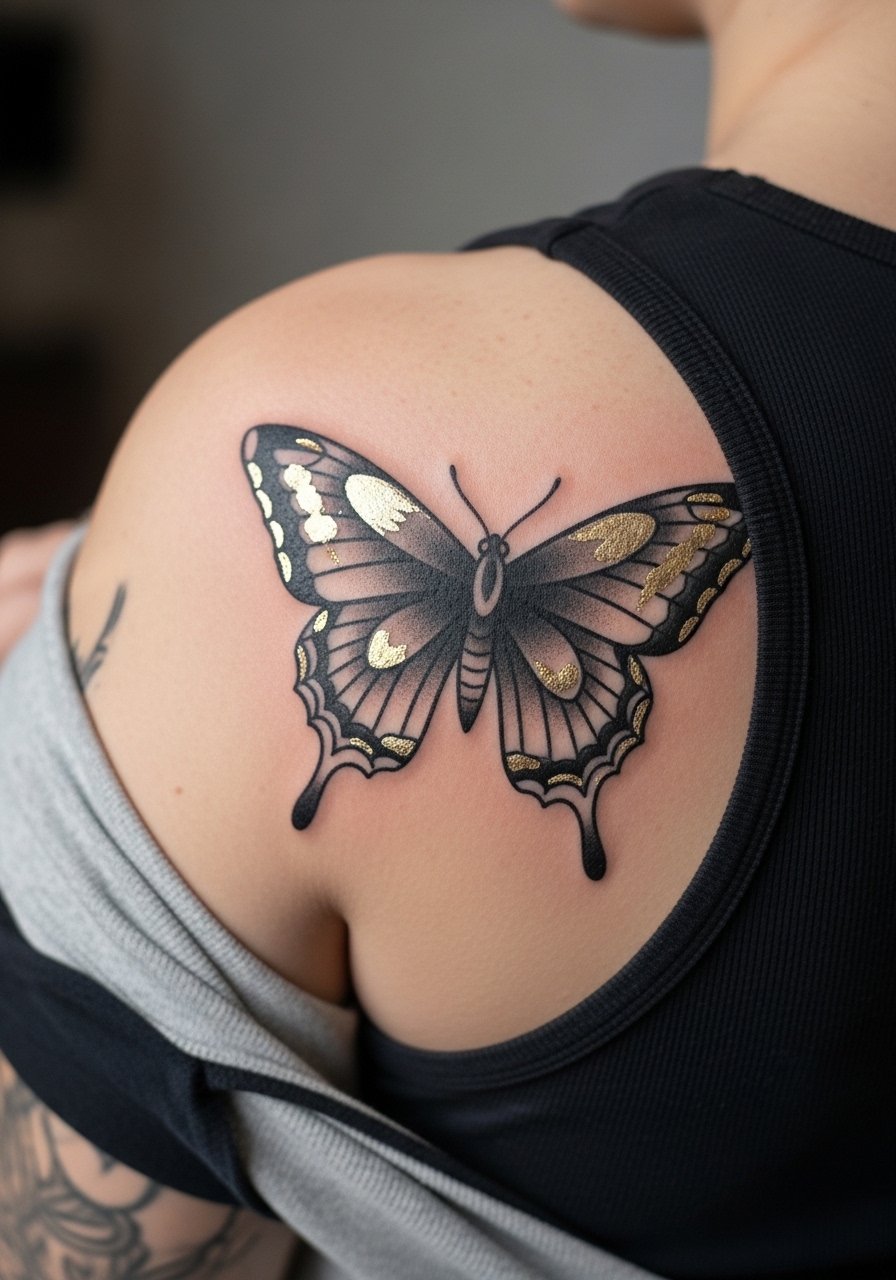
Controversy lead: metallic inks split artists into two camps. One group avoids them because some pigments change or fade oddly under UV. The other group says small, strategic metallics can add sparkle without risk if the artist tests compatibility first. If you want it, request a small patch test and ask how the pigment has held on similar skin tones. Metallics may need touch-ups sooner, so plan accordingly. Pair with an open-back sequin top for nights when you want the shimmer to pop.
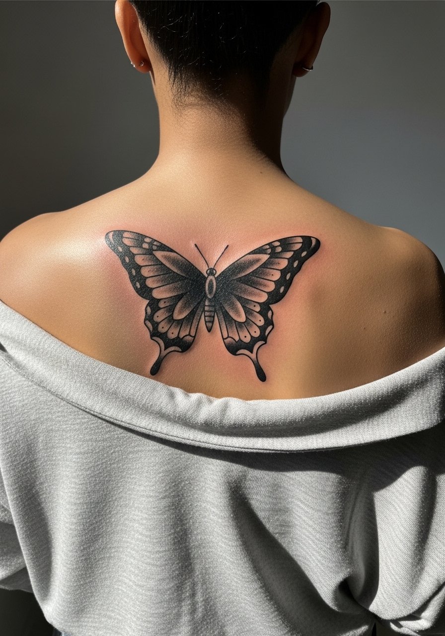
16. Minimalist Traditional Butterfly for the Upper Back Jut
Mistake lead: minimal traditional pieces often die when artists make the lines too thin. Request slightly heavier outer linework and reserve interior details. The appeal is a quick session and low downtime. The aging tradeoff is touch-up at year two because minimal ink has less pigment to withstand fading. For day-of comfort wear a loose tank top to keep access easy for the artist.
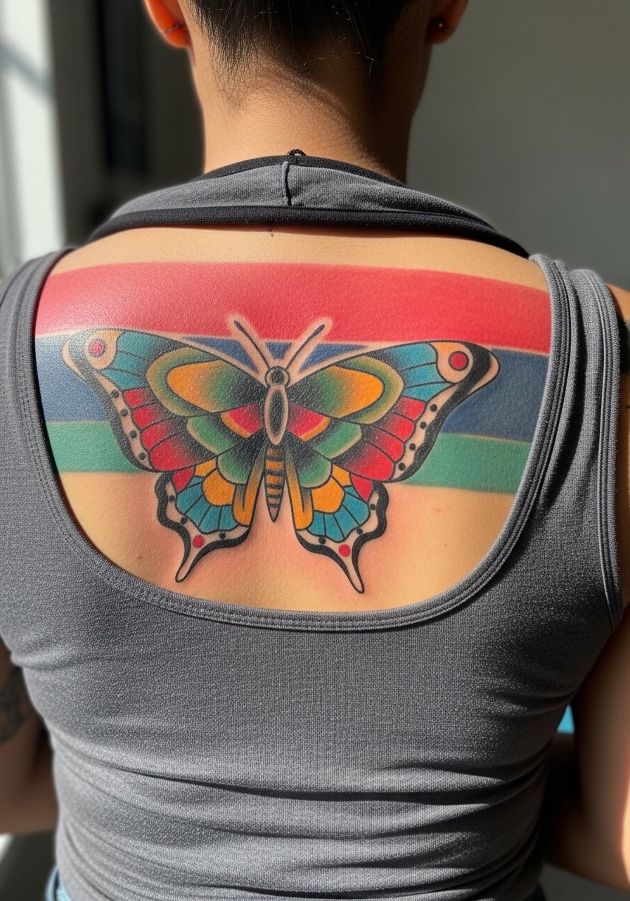
17. Three-Color Traditional Butterfly with Gradient Fills
Visual impact lead: gradients can read rich on healed skin when the artist saturates in layers. The common mistake is trying to blend too many colors in a tiny wing. Keep the palette tight and the gradient transitions clear. Plan for a longer session so the artist can pack color in controlled passes. For evenings, an open-back dress lets the gradient read in full.
18. Butterfly with Lace Border Accent
Consultation lead: lace borders can look delicate, but on a moving area like the lower back you should increase contrast between lace and background. Ask for solid outlines around the lace motifs. The mistake is soft linework that blurs into the skin texture. Expect touch-ups after a couple of years if friction from clothing is constant. For session wear bring high-waisted shorts you can lower briefly without full exposure.
19. Butterfly with Winged Skull Interior Motif
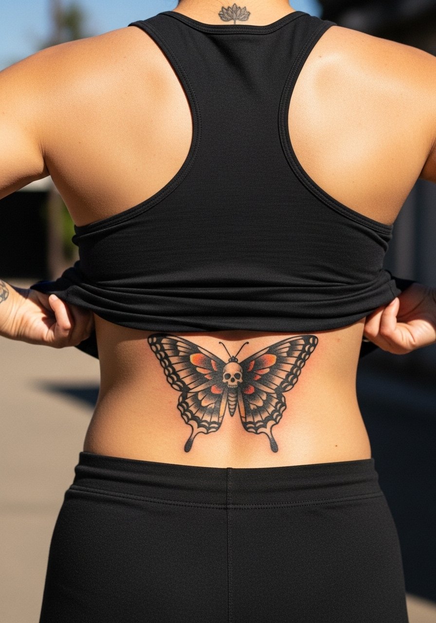
Mistake lead: integrating a secondary motif demands scale clarity. Make the skull bold enough to read but avoid tiny teeth or micro details that do not hold. The session will be heavier if the artist needs to pack darks inside small cavities. For streetwear looks try a cropped hoodie with a low back to contrast the darker interior motif.
20. Butterfly with Traditional Sailor Banner and Coordinates
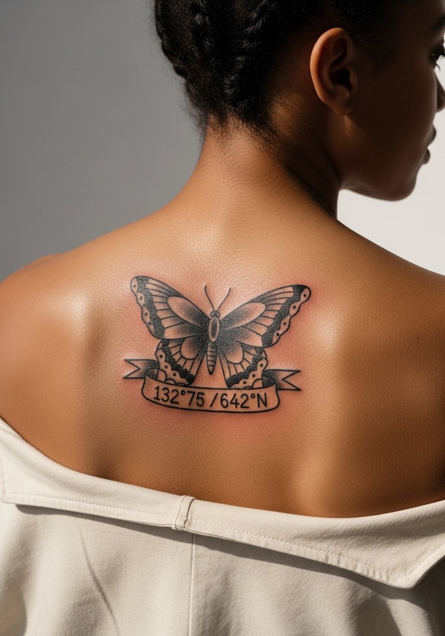
Consultation lead: script and coordinates must be short and bold. Long coordinates or phrases in a narrow banner often blur. Offer the exact text in advance and ask the artist to stencil it in the size you expect. The banner gives composition weight and frames the butterfly. For casual showing off, a strappy tank keeps the tattoo visible without competing.
21. Asymmetrical Butterfly with Trails of Dots
Personal observation: asymmetry brings motion to a static back canvas. The trailing dots need to be spaced so they do not merge over time. Ask for progressively larger dot spacing as the trail moves away from the butterfly. The session is usually quicker for the dot trail but still requires care for consistent stipple density. A low-back bodysuit highlights the asymmetry when you want a sharper silhouette.
22. Butterfly with Traditional Nautical Rope Frame
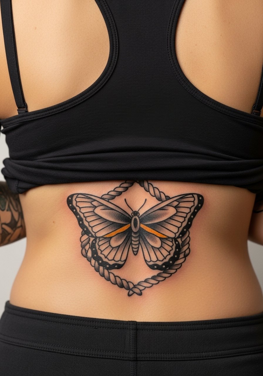
Mistake lead: rope detail can look muddy if the twist lines are too fine. Request stronger contrast between the rope edges. The frame helps the butterfly keep its silhouette if the surrounding skin stretches. Session time is moderate because twist shading requires careful packing. For an outfit that nods to the rope motif try a striped boatneck top.
23. Butterfly with Bold White Highlights for Contrast
Controversy lead: using white highlights divides opinion. One group thinks white keeps contrast and reads well against saturated color. The other group warns that white can yellow or fade quicker. If you want white, ask for it in small, well-placed accents and schedule a touch-up consult at year one. White works best as a finishing touch rather than the primary light source. For an evening look use an off-shoulder top to let the highlights catch the light.
24. Butterfly with Embedded Nautical Compass
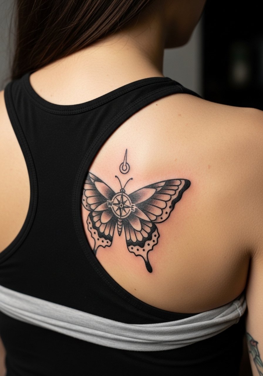
Consultation lead: small compasses need bold cardinal marks to survive aging. Tell the artist exactly how large you want the compass face. The usual mistake is over-detailing the inner compass. Expect this piece to need occasional touch-ups if you spend a lot of time in the sun. For showing it off pick a backless jumpsuit that frames the butterfly and the compass together.
25. Butterfly with Color-Fade Edge for a Vintage Feel
Aging/healing lead: intentional fade at the edges can look vintage and masks real fading later. Tell the artist you want controlled soft edges and strong core saturation so the center holds. The mistake is starting with weak color everywhere, which just looks faded. This style is forgiving and often needs fewer touch-ups because the aged look is built in. For wardrobe go for a slip dress with an open back when you want a soft frame.
26. Butterfly in American Traditional Palette with Anchors
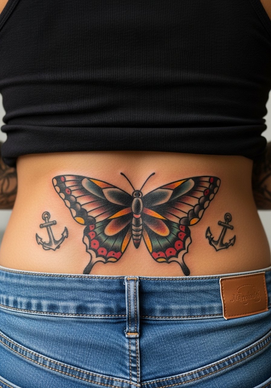
Mistake lead: adding small anchors works only if they are bold. Tiny anchor details often wash out. Lower back placement means clothing friction can be constant, so thicker outlines help preserve the anchor shapes. Expect a slightly longer healing period because the area tends to be covered and warm. For session comfort wear stretchy high-waisted jeans that you can lower briefly.
27. Butterfly Wrap Across the Shoulders like a Cape
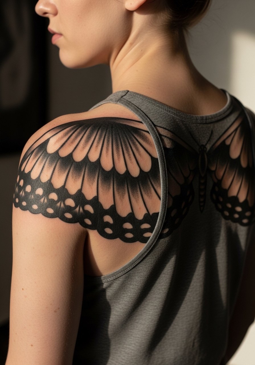
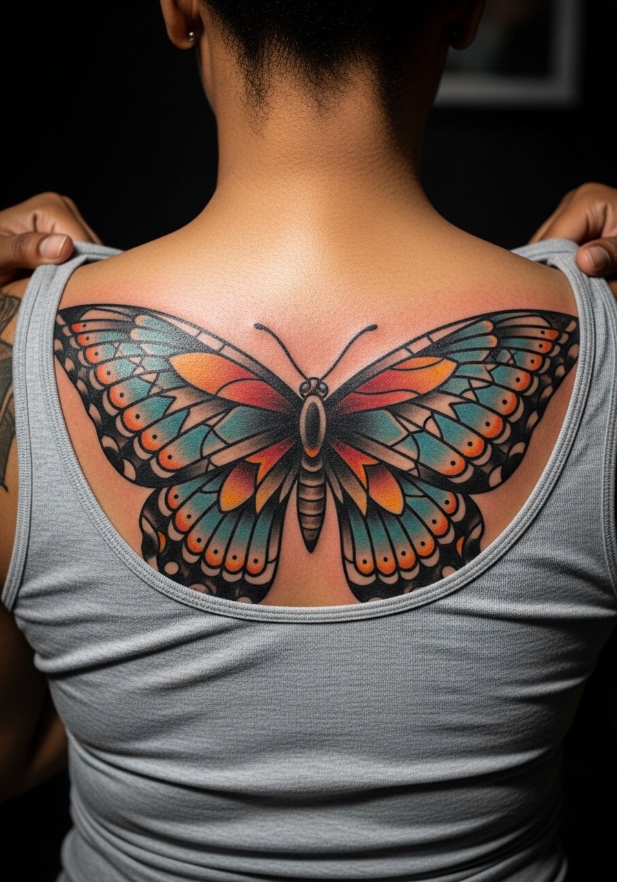
Styling lead: cape-like wings read cinematic and pair best with wide necklines that reveal the full span. Ask the artist to map the wings so they follow your shoulder blades and do not curve awkwardly when you move. The session is longer because of the coverage, but the payoff is a design that reads in motion. A boatneck sweater frames the shoulders without hiding the wings.
Frequently Asked Questions
Q: How painful is a traditional butterfly across the back compared to a smaller single-butterfly near the nape?
A: Pain varies by location. A large back piece usually involves longer, steadier sessions across areas with more muscle and fat, so people describe it as a sustained discomfort that is easier to sit through. Small nape work can feel sharp and high because of the thin skin. Bring a snack and rest between passes for longer sessions, and consider a topical numbing cream if you feel anxious.
Q: Will the detailed floral fills inside wings blur faster than solid color traditional fills?
A: From what I have seen, tiny floral stipple and micro details inside small wing panels tend to soften sooner than broader solid fills. If you want detail, scale up the wings or ask for strategic negative space so the flowers keep their form. Expect touch-ups earlier for intricate interiors, especially in high-friction areas.
Q: How should I prep clothing-wise for a full-back butterfly session?
A: Wear something you can easily remove without dragging fabric across fresh work. A loose button-down or a racerback tank you can pull aside works well. For lower back sessions choose high-waisted bottoms you can lower briefly. Try a loose button-down shirt you do not mind shifting during the appointment.
Q: Do traditional butterflies hold up better than fine-line butterfly tattoos on the back?
A: Artists split into two camps. One group argues bold traditional outlines and saturated fills last longer and keep shape. The other group says fine-line work can hold if it is placed on a stable area and done with the right spacing. In reality it depends on your skin, the placement, and the artist's approach. If longevity is a priority choose heavier outlines and larger scale.
Q: Are there career or professional considerations for visible upper-back butterflies?
A: Upper-back tattoos are easy to hide with shirts and still show in evenings. Lower back or nape pieces can be trickier if your workplace has strict rules. Think about how often you want the design visible and pick placement accordingly. If in doubt, aim for an area that stays covered during work hours.
