
The tattoos that still look crisp after years are often the ones that started simple and respected the skin. Finger sleeves that lean into bold traditional linework and solid saturation tend to outlast micro-detail pieces that sit too small. Plan for spacing, honest line weight, and easy touch-ups and the list below will help you pick a traditional finger sleeve that wears well and still reads when you wave hello.
1. Nautical Star Band Wrapped Around the Proximal Phalanx
A tight nautical star band works as a small sleeve when repeated across the finger. I recommend wider spokes and heavier linework here because the finger skin moves and the thinner points tend to blur. Tell your artist you want bold outlines and saturated fill, not hairline rays. Expect a sharp look at six months and a softer edge by year two, with touch-ups common at year three for heavy use fingers. For showing it off, stack with stackable dainty rings that sit above the tattoo without covering it.
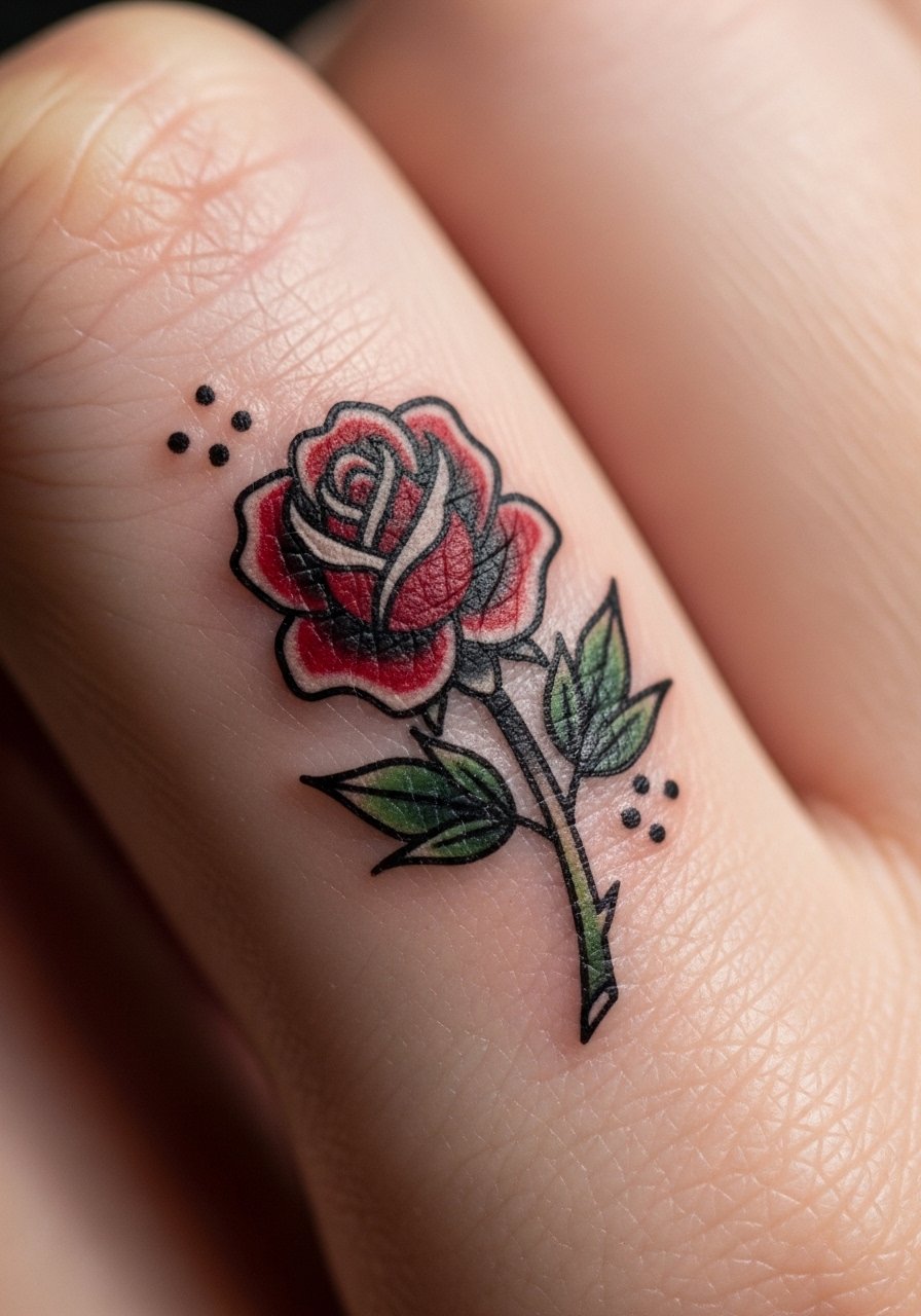
2. Tiny Traditional Rose Column Along the Side of a Finger
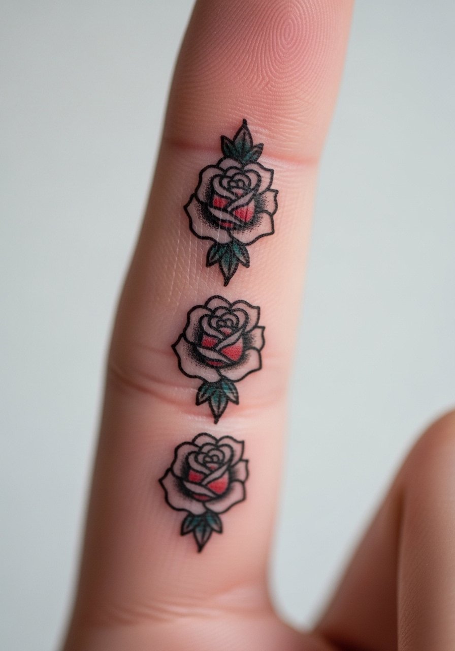
A vertical column of roses uses classic petal shapes and bold shading to read like a miniature sleeve. This placement bites into touch surfaces so expect more rubbing from daily use. Ask for slightly larger petals and clear negative space between blooms so the design has room to age. The session feels quick but the finger will throb more than the forearm. Pair this with a minimalist gold ring worn above the tattoo when you want the art visible without interference.
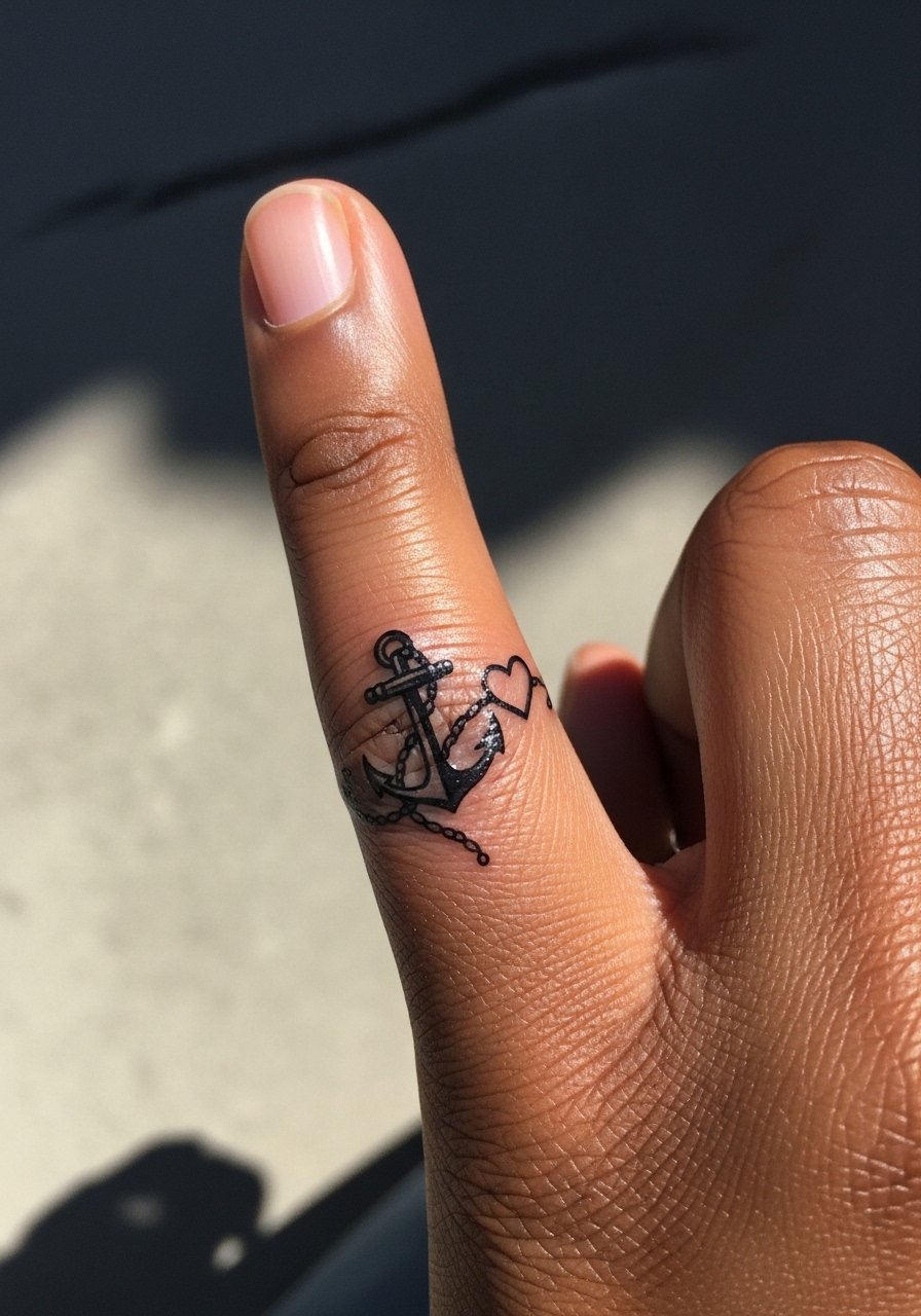
3. Anchor and Rope Wrap That Connects Across Joints
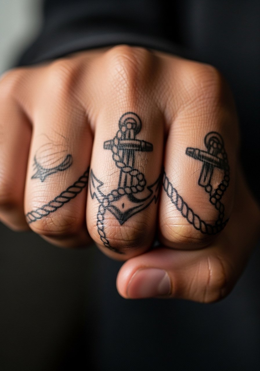
This design splits people into camps on technique. One camp says heavy blackwork and simple shapes last best on jointed skin. The other camp argues that careful spacing and slightly thinner lines give more personality while surviving years. Both positions have merit. If you prefer a clean long life for the piece, lean toward bold outlines and ask your artist how they handle jointed placements. Expect louder fading across knuckles that bend a lot. For sessions where the finger needs to be free, wear a loose button-down shirt you can roll up so the area stays easy to access.
4. Traditional Swallow and Banner Miniature Sleeve
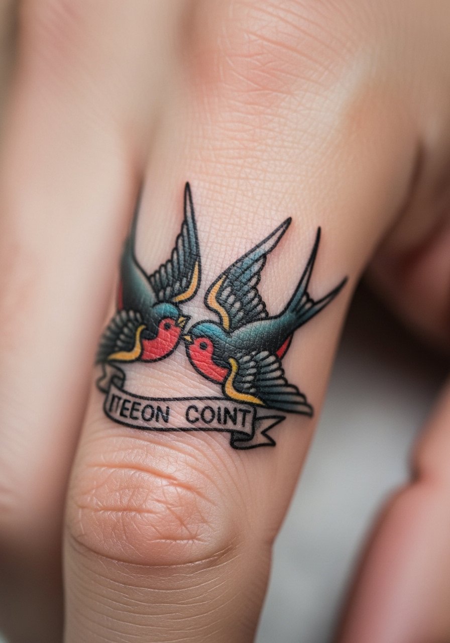
A swallow and banner look classic when executed with thicker linework and clear letter spacing. The common mistake here is crowding the banner text too small. If you want a name or date, choose short text or initials in block letters and ask for open counters so the letters do not merge over time. Pain is moderate and sessions are short. Show it off with short-sleeve shirts or a minimalist watch that leaves the hand exposed and frames the composition.
5. Dagger with Drop of Blood Encircling the Middle Phalanx
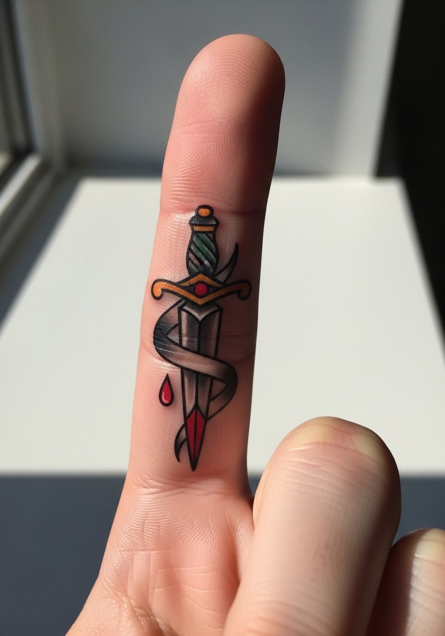
A dagger works as a one-sitter that still reads like a sleeve when the design wraps. Tell your artist you want the blade and guard simplified for clarity. A common aging problem is tiny decorative flourishes that sink together in a year. Keep the blade bold and limit dots and thin filigree. The finger will feel sharp work during inking, and the knuckle area may need a short touch-up at year two. For evenings out, wear a slim gold band ring beneath the dagger so the art remains visible.
6. Chain Link Pattern That Mimics a Tiny Bracelet
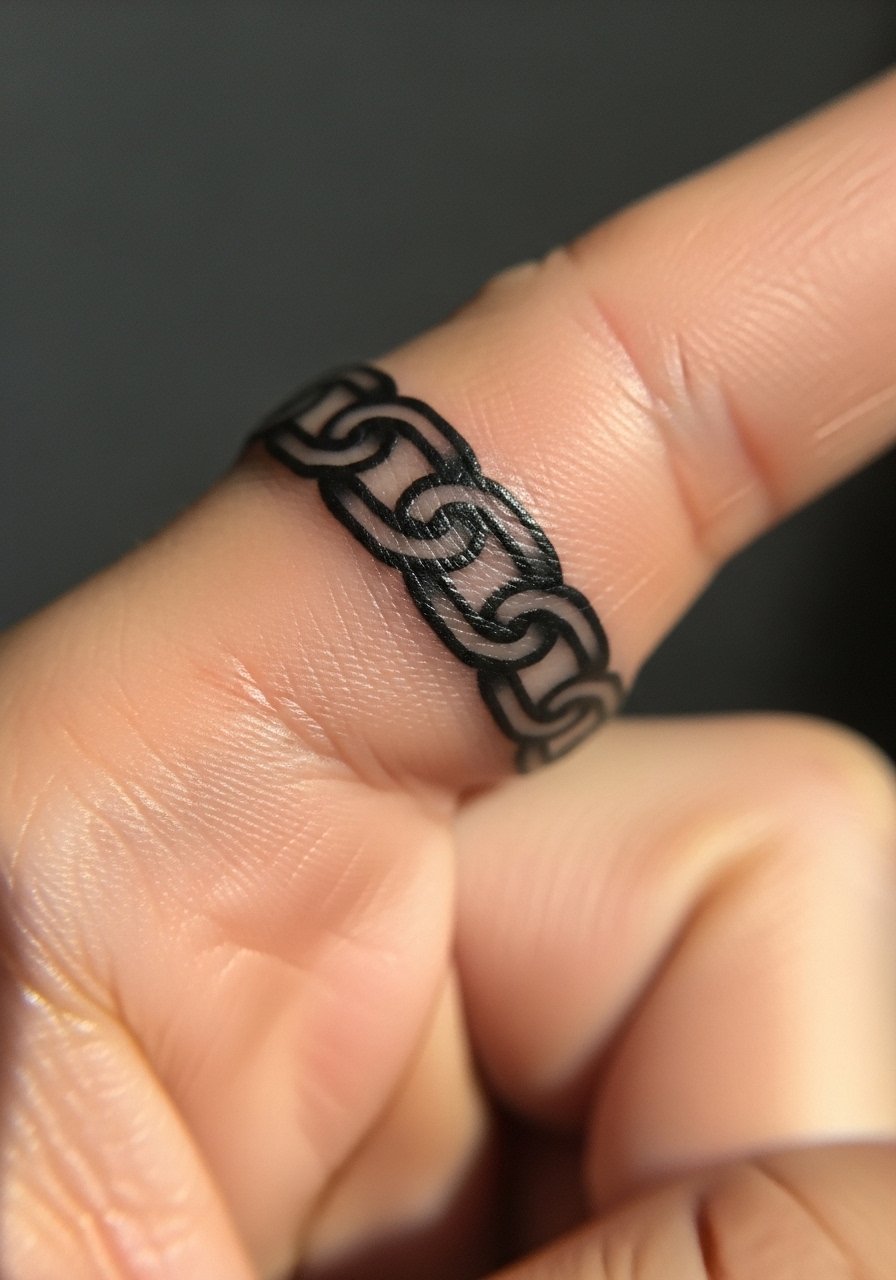
A chain link sleeve translates well because it uses negative space to breathe. The mistake is drawing links too tight to each other. Ask for slight gaps so each link keeps its shape as the lines soften. This style can feel gritty when the artist works near the knuckle, but sessions stay short. It pairs naturally with layered bracelets when you want to hide or reveal the tattoo. A go-to for sessions is a racerback tank so you can move freely before and after the appointment.
Studio Day Picks
The finger and knuckle pieces above rub against daily tasks, so a few targeted items smooth the session and the first week.
-
Stencil transfer paper kit. Lets you check placement precisely on the curved finger surface before the needle touches skin, crucial for wrap and joint designs.
-
Topical numbing cream. Applied as directed about 45 minutes before can take the edge off fingertip sensitivity without blurring outlines.
-
Thin protective film roll. Keeps finger tattoos cleaner during the first days of frequent handwashing and typing.
-
Fragrance-free body wash. Gentle cleansing reduces irritation around tight linework while the skin is sealing.
-
Aquaphor healing ointment. Thin application in the immediate days helps lock in moisture for fine traditional lines without suffocating the skin.
7. Tiny Skull and Rose Cluster on the Index Finger
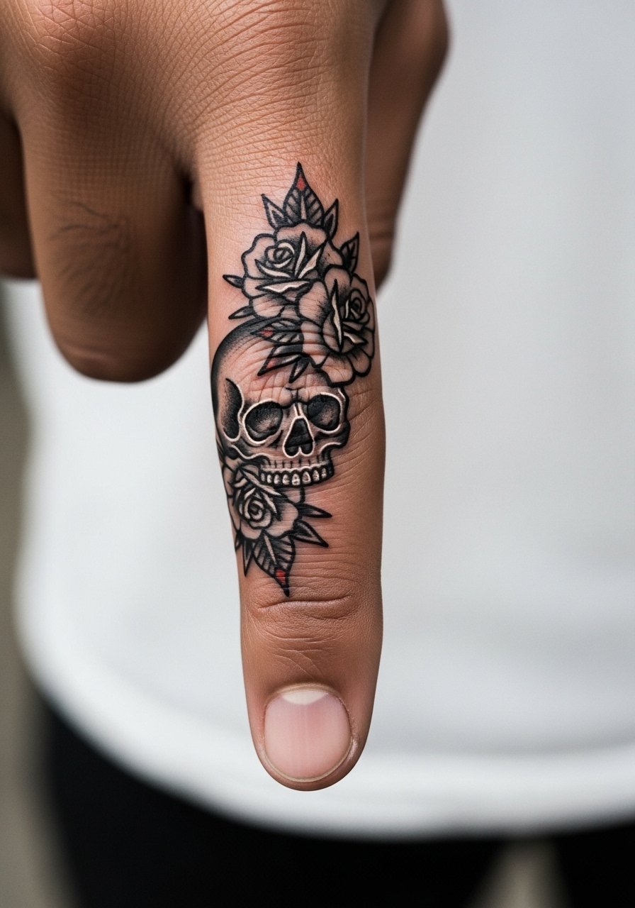
Skull-and-rose clusters balance dark fill with open petals so they read at arm's length. A common error is over-detailing the skull crevices on such a small canvas. Ask for simplified hollows and bold teeth shapes. The index finger sees a lot of contact from gripping items, so plan for a touch-up in year two. For styling, stack with stacked dainty bracelets that stop before the knuckle so the motif remains visible.
8. Classic Heart with Banner Around the Fingertip
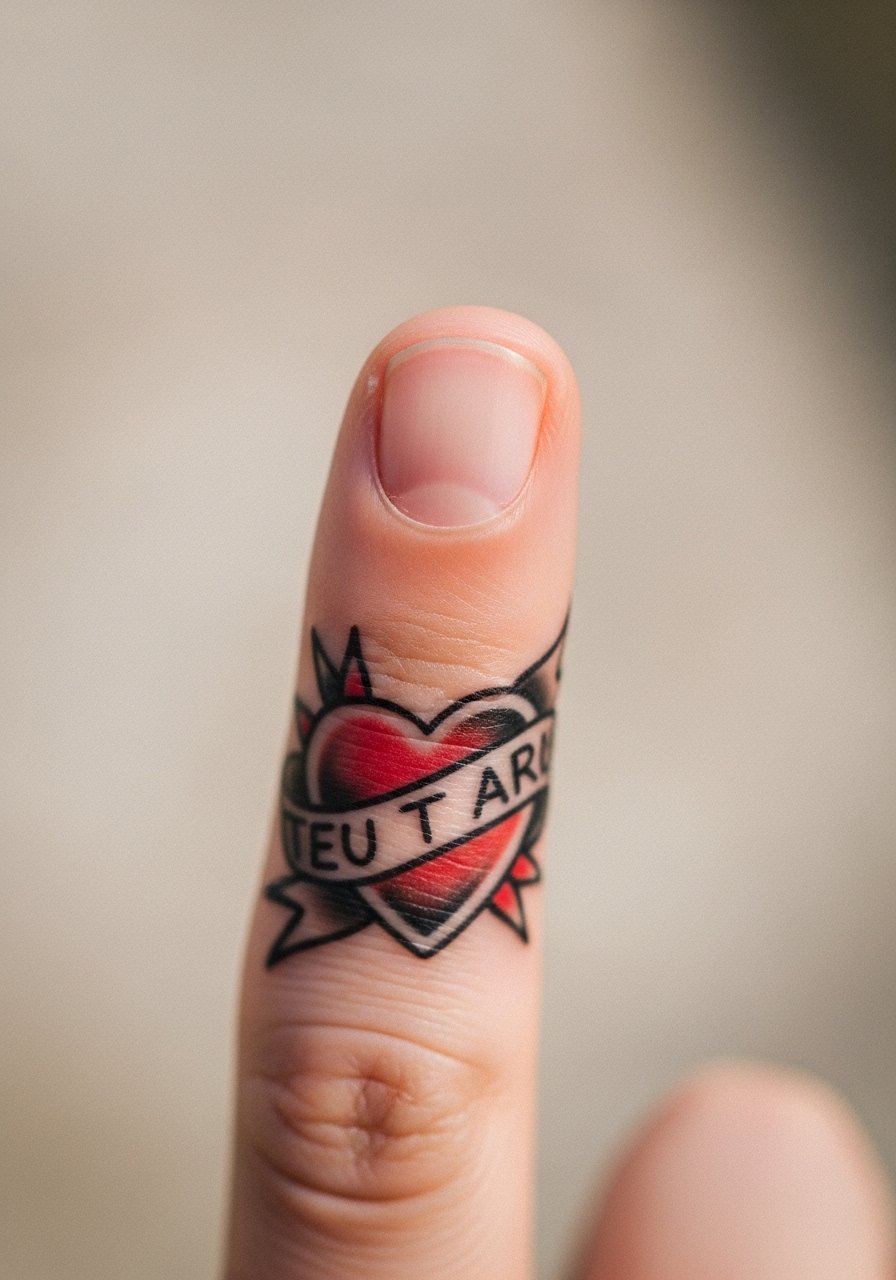
A fingertip heart is bold and readable when inked with thick borders. The tricky part is that the fingertip skin regenerates faster, so ink can fade quicker than on the hand. Ask for saturated color and expect a touch-up window around year one to keep the banner letters crisp. Sessions feel more intense because the tip is sensitive, but they are short. This is a good first finger sleeve for people who want classic imagery without crowding.
9. Anchor Chain and Compass Dot Work Along the Side
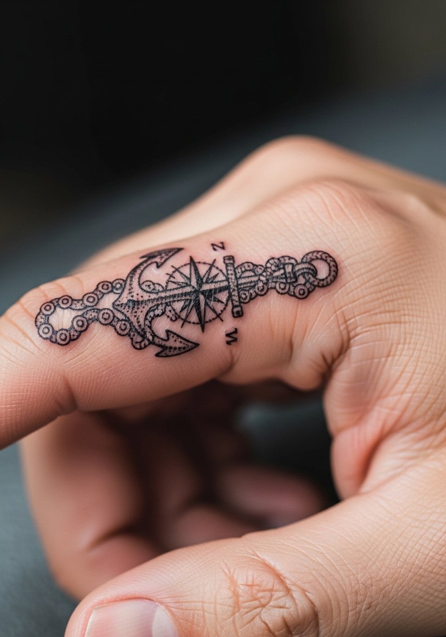
Combining anchor and compass cues gives a miniature sleeve some narrative while keeping the design strong. Dot work can add texture but avoid dense stippling on the knuckle. Ask for dots spaced out and for the compass points to use bold cardinal lines. The side of the finger has less direct abrasion and often ages a touch better. For session ease, bring a loose button-down shirt you can roll up so the area stays easy to reach.
10. Tiny Pin-Up Face in Traditional Shading on the Proximal Phalanx
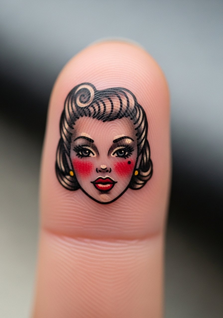
Tiny portraiture on fingers sparks debate. One camp warns that facial detail on small curved skin blurs quickly. The other camp says classic pin-up simplification with high-contrast blocks reads well. Both camps are correct in context. If you want a face, request simplified features, bold lashes, and clear shadow planes instead of tiny gradients. Expect touch-ups by year two if the finger is a high-contact digit. Hand tattoos can affect some workplaces, so consider that before booking.
11. Flame Band That Transitions into a Small Starburst
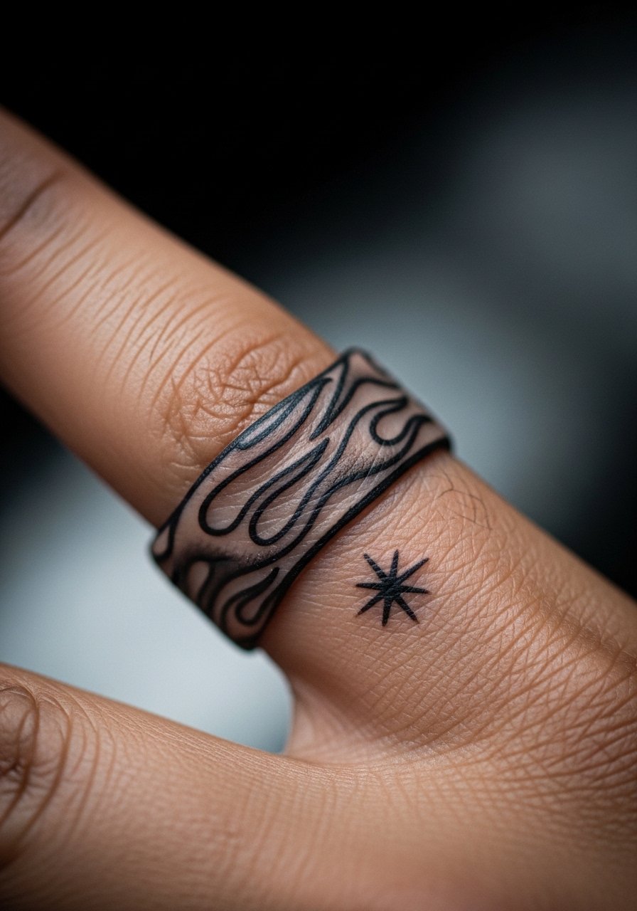
A flame band reads movement when designed with consistent spacing and solid black roots. The common mistake is tapering flames into hairline tips that lose shape fast. Ask your artist for thicker flame ends and clear negative space between flames. The session is brief but the knuckle area will sting more. To emphasize the piece when the weather is warm, choose short sleeves or a short sleeve linen shirt so the hand is visible.
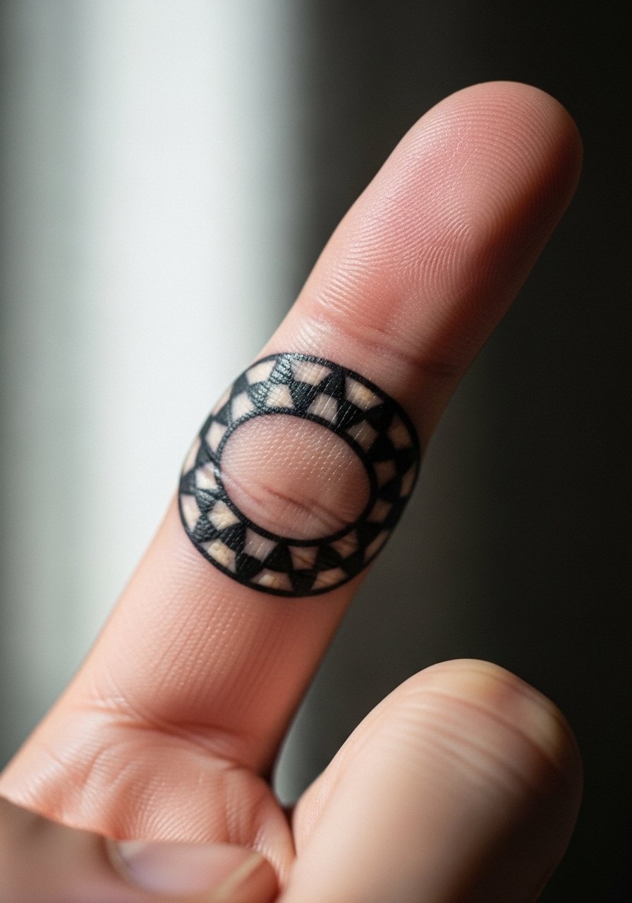
12. Tiny Gemstone with Facet Lines Encircling the Finger
Faceted stones can pop when the facet lines are bold and the central negative space is clear. The error is adding too many internal lines that blur. Keep facets minimal and strong. The ring finger slides into jewelry and pockets, so protect the piece during the first week. For wearing, pair with thin bands that rest below the tattoo so the gem remains the visual focal point.
13. Tiny Ship Wheel with Rope Detail Across the Knuckle
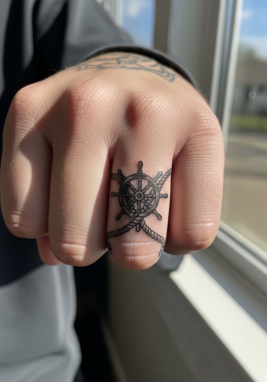
Knuckle-spanning elements need solid anchors so the wheel spokes do not blend. Tell your artist you want thick spokes and simplified rope loops. The knuckle bends expose the work to more mechanical stress so fading is faster. Sessions here are more uncomfortable because of bone proximity, and touch-ups around year two are normal. Pair with a thin chain pendant necklace if you want a subtle balance between hand and neckline jewelry.
14. Traditional Floral Vine That Creatively Uses Negative Space
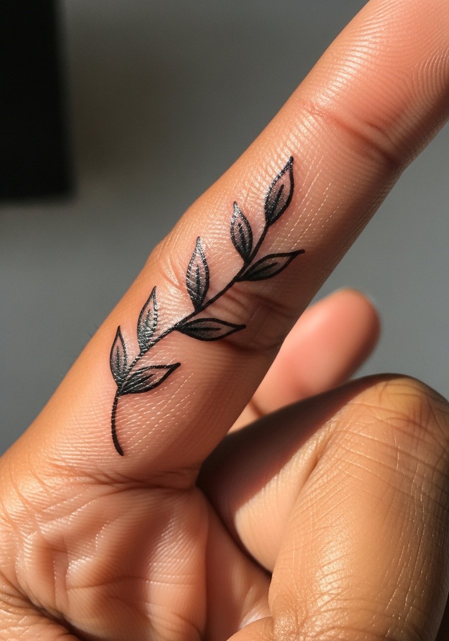
A vine that uses negative space will age better because each leaf can remain legible as the lines soften. The most frequent mistake is filling every gap with dots or micro-shading. Instead ask for open counters and well-spaced leaves. The inner finger sees more sweat and contact, so keep heavier fills toward the outer edge. For sessions, wear a racerback tank so you are comfortable and the artist has clean access.
15. Tiny Bannered Initials Framed by Stars
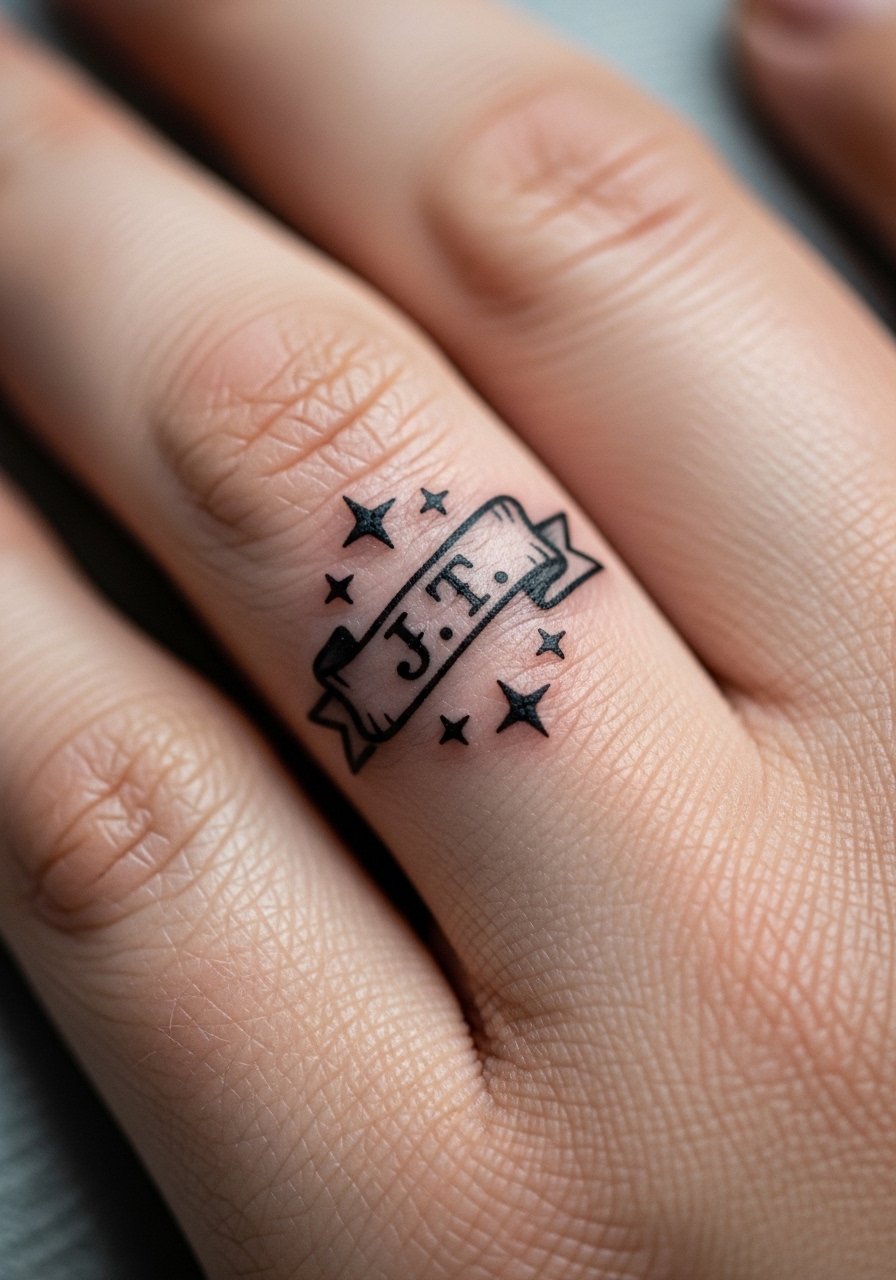
Initials in a banner can be timeless if the letters are bold and the counters are clear. The classic error is choosing script that sits too small. Pick block capitals or two-letter monograms and ask for spacing that reads from a short distance. Expect the banner edges to soften with time and budget a touch-up at year two. This is a discreet option for people who work in customer-facing roles and want minimal visibility.
16. Tiny Traditional Rose with Dot Work Shadowing
Adding sparse dot work can give a floral micro-sleeve texture without heavy shading. The danger is clustering dots too tightly. Tell your artist you want the stippling airy and used only as an accent. The dot work will become softer than the bold outlines, so plan touch-ups for the stippled area sooner than the main lines. When showing it off, pair with a minimalist gold ring worn below the rose.
17. Tiny Anchor and Heart Combo for a Compact Sleeve
Pairing anchor and heart gives a compact story in a small space. The most common mistake is squeezing two motifs together so they compete. Ask your artist to let each symbol breathe by using negative space between them. The finger will see friction from daily wear, and both symbols benefit from slightly heavier outlines. Expect a short session and a likely touch-up by year two if you use that finger a lot.
Frequently Asked Questions
Q: Will traditional bold linework on a full finger sleeve last longer than fine line details?
A: From what I have seen, yes. Bold outlines and saturated fills resist the early blurring that thin lines suffer from on fingers. Fine details can look beautiful fresh but usually need touch-ups sooner, especially across joints and knuckles. Ask your artist about recommended line weight for the specific finger and motif.
Q: How often should I expect touch-ups for finger sleeve work?
A: Plan for an initial touch-up window around 6 to 12 weeks for any small piece, then another likely refresh at year two to three depending on wear. Fingers take more friction and sun than other places, so touch-ups are normal rather than a sign of poor work. If you want less maintenance, choose heavier linework at the start.
Q: Do finger tattoos affect job prospects and how can I minimize that risk?
A: Some industries remain conservative about visible hand tattoos. If this is a concern, place designs on the side of the finger or choose motifs that can be partially covered with rings. For a polished look that stays subtle, pick thin bands or slim gold band rings that slide over artwork when you need to hide it.
Q: Does the knuckle area require a different approach than the proximal phalanx?
A: Yes. Knuckles sit over bone and bend a lot so artists often use stronger blackwork and simplified shapes there. The proximal phalanx can handle slightly more detail, but still needs spacing. Discuss touch-up planning and scar tissue management with your artist before booking.
Q: Are there cultural concerns with traditional symbols on fingers?
A: Some symbols carry cultural weight. If you choose imagery tied to a specific tradition or faith, consider slight variations rather than direct replicas. A respectful conversation with an artist who understands the motif will help you balance authenticity and appropriate use.
