
Fine line Roman numerals are everywhere on feeds right now, and the pieces that still read crisp after years are often the ones planned with spacing and placement in mind, not the ones that looked the sharpest fresh. Think about how a numeral band on the wrist moves with every gesture and how a chest script sits under clothing. The choices below focus on what actually holds up, what to ask your artist, and how to wear the result so the numerals keep reading clean long term.
1. Thin Serif Inner Forearm Roman Numeral
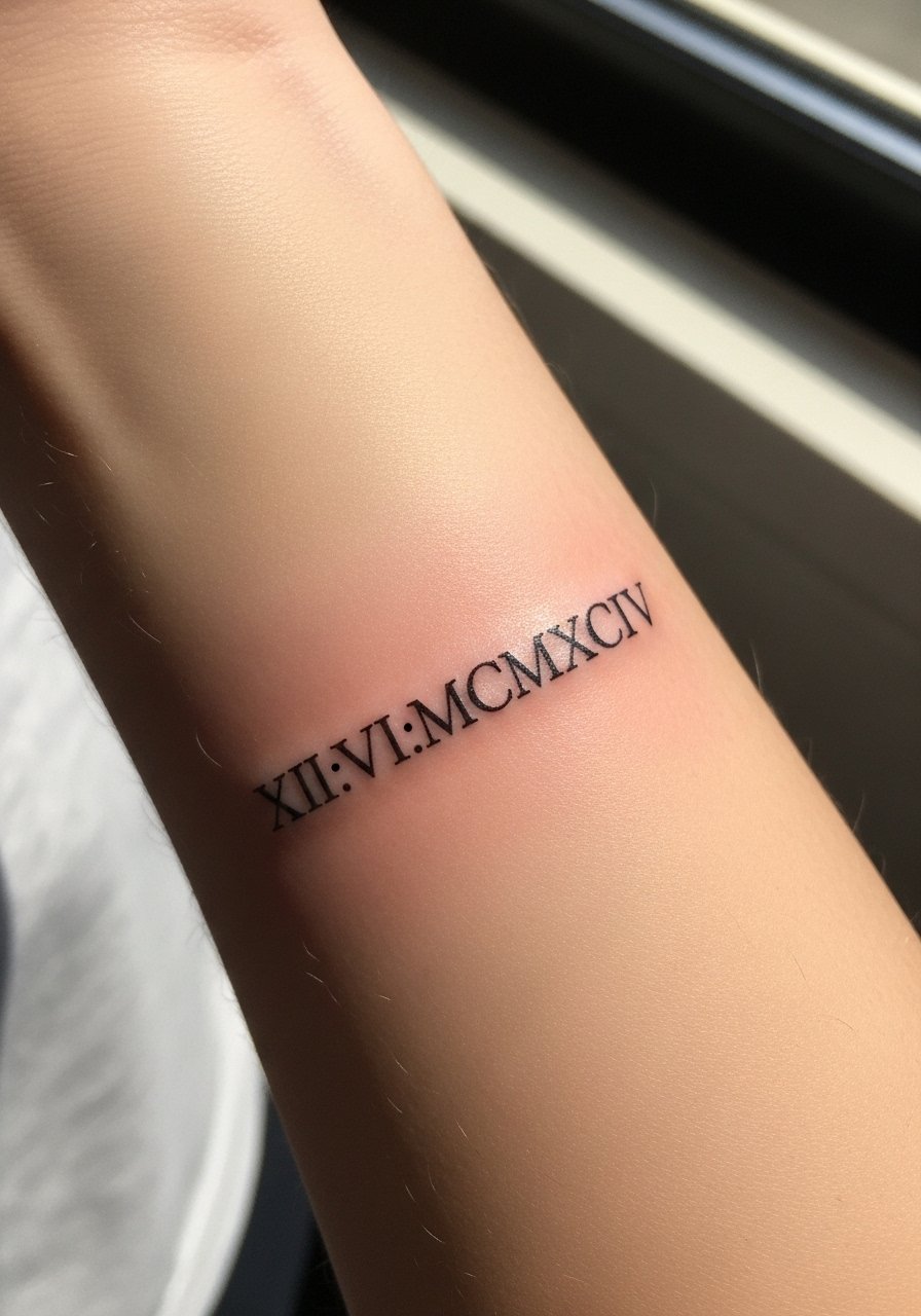
I recommend this when you want readable numerals that age predictably on an area that sees sun and movement. Fair warning about placement pain, the inner forearm is moderate but forgiving, and session time is usually short. Tell your artist you want slightly heavier line weight than the absolute micro look so the counters do not merge by year three. A common mistake is asking for script-thin numerals and then being surprised when the lines soften. At six months the numbers look crisp. At two years expect slight softening. Plan a touch-up around year three for fine line versions. For show-off outfits, roll up a linen long-sleeve to frame the piece without covering it.
2. Stacked Chest Roman Numeral Cluster
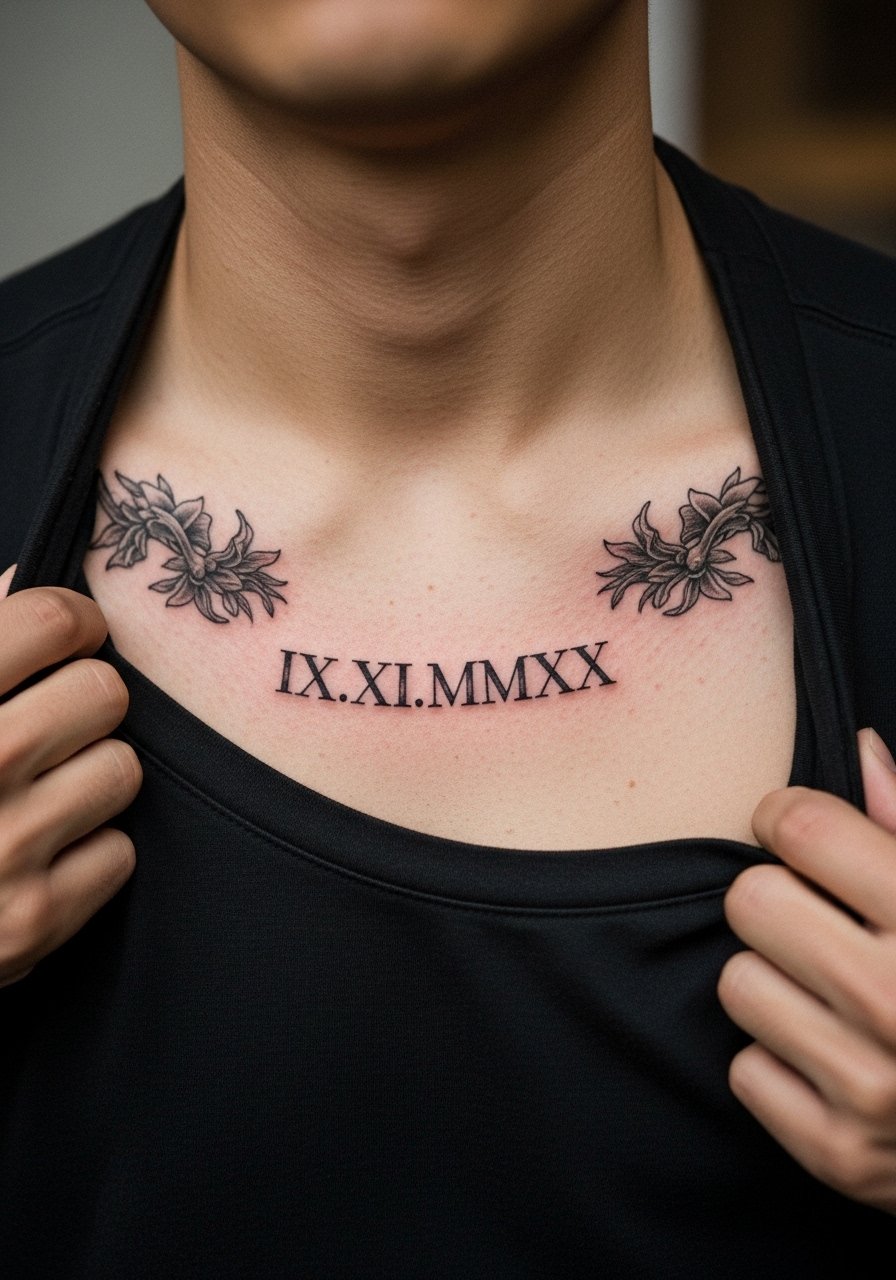
This stacked cluster reads like a small plaque and fits well under a shirt collar. Chest skin moves differently from arm skin so expect a different heal pattern. When booking, ask for slightly more spacing between the digits and for the stencil to be previewed while you try typical collarlines. Most artists will warn that dense stacking on the chest can blur if placed over the sternum or directly on flexible folds. If you want to show this off, an open-collar button shirt pulled aside at the session keeps the area accessible and frames the work in daily wear. Expect a moderate pain level and a possible touch-up at year two for high-contrast clarity.
3. Minimalist Wrist Wrap Numerals
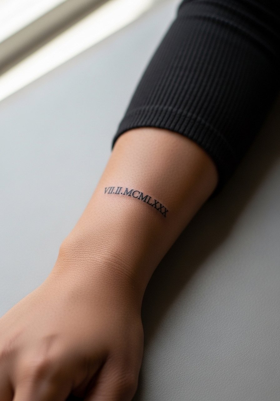
Wrist pieces show quickly and age under constant friction. The wrist is very visible and often exposed to washing and bracelets, both of which affect fine line numerals. I tell friends to choose a slightly bolder serif for wrist wraps rather than hairline strokes. The session feels sharp because the bone is close to the needle. One camp argues tiny wrists should keep numerals tiny to be discreet. The other camp says tiny equals blur and recommends spacing and weight instead. Name both camps out loud in the consultation and ask where your artist stands. For wearing the piece, a thin minimalist watch will sit beside the numerals without crowding them.
4. Vertical Spine-Adjacent Numeral Column
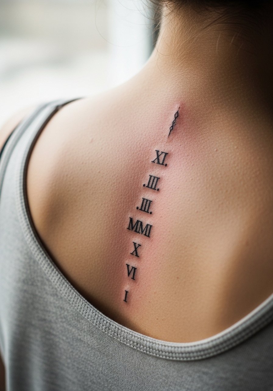
A vertical run along the spine reads architectural and keeps each numeral distinct thanks to natural spacing. The pain is higher along the spine and sessions are longer when multiple numerals stack. Tell the artist you want clear separation between numerals rather than decorative flourishes that can merge over time. Most of the aging risk is from skin stretch and clothing friction at the lower back. For showing this off at night, an open-back top keeps the column visible without exposing more skin than necessary. Expect a touch-up window around year three if you prefer very thin strokes.
5. Ring-Finger Roman Numeral Band
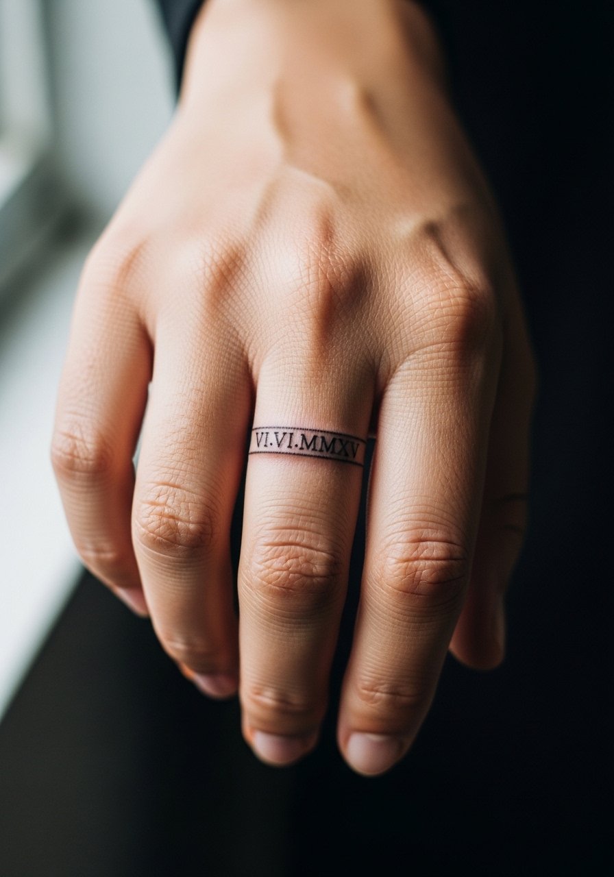
Fingers are notorious for fast fading and occasional distortion. A band of numerals can look elegant fresh and then blur under constant hand use. The biggest mistake is requesting hairline numerals on the finger. I advise slightly bolder stroke and a shallow placement that avoids overworking the skin. The session is quick but rough because of thin skin and bone proximity. Plan for touch-ups more often than for arm work. For daytime wear that highlights this piece without rubbing it, stacked thin daisy chain rings complement the band without causing extra friction.
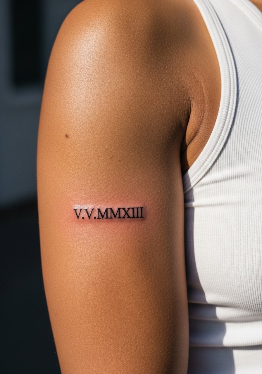
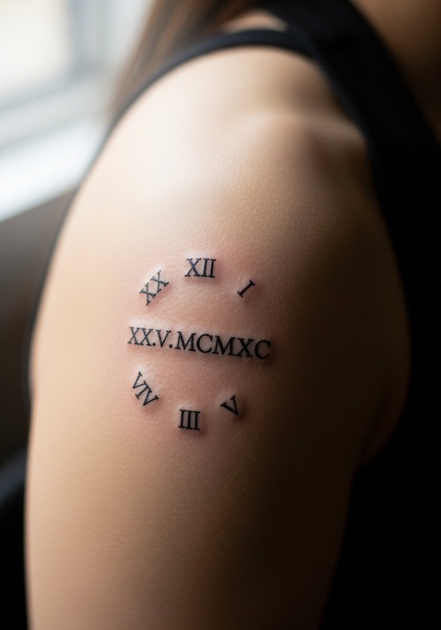
6. Bold Serif Upper Bicep Roman Numeral
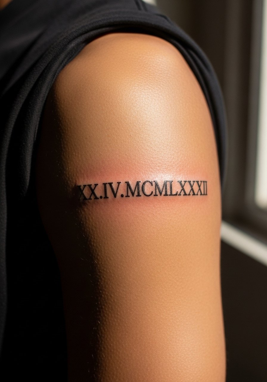
The upper bicep tolerates bolder numerals and higher saturation, which means longevity is strong. This placement is friendly for first-time larger pieces because the skin is thicker and blowout risk is lower. When consulting, specify that you want a classic serif with strong counters and not heavy black fill that ages into a blob. The session feels steady, and swelling is usually mild. At six months the numerals look like a crisp tattoo. At five years you will likely only need color correction if you spent months in bright sun. For session comfort, wear a loose tank top you can pull aside so the artist has clean access.
Studio Day Picks
These upper-arm and hand pieces above need different prep than wrist or chest work, so a few focused items smooth the session and first week.
-
Stencil transfer paper kit. Helps confirm placement on curved areas like the bicep and spine before the needle touches skin.
-
Topical numbing cream. Applied as your artist recommends it can make wrist and rib sessions far more comfortable.
-
Thin protective film roll. Useful for small bands and finger pieces that need a barrier against daily friction in the first 48 hours.
-
Fragrance-free gentle body wash. Cleansers without perfumes reduce irritation for chest and forearm pieces during showers.
-
Aquaphor healing ointment. A thin layer in the initial days helps prevent cracking on thin-line numerals while letting the skin breathe.
7. Collarbone Single Line Roman Numeral
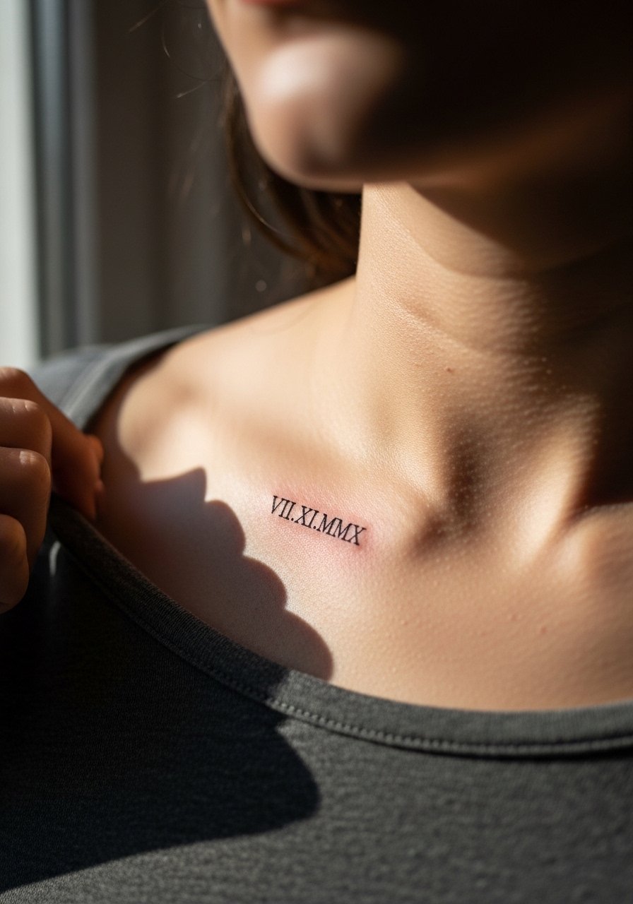
Collarbone numerals sit nicely under shirts and for that reason they often get less sun but more movement. The area can produce sharp-looking results when the artist spaces the numerals to sit with the collarbone contour rather than across it. A common mistake is centering numerals exactly over the bone which creates tension and healing irregularities. At two years the lines usually keep their character if saturation was adequate. For session wear and later show-off, a thin chain pendant necklace can frame the numeral without crowding the linework. Expect a one to two hour visit depending on size.
8. Ribcage Horizontal Roman Date
Fair warning the ribcage is often debated among artists about fine line durability. One camp argues the skin stretch there blurs fine strokes within two years. The other camp says careful depth and spacing let fine line settle well. Name both camps in your consultation and ask which approach your artist uses. The session is painful for most people and typically pauses for breaks. If you want the numerals to age gracefully, avoid ultra-thin hairlines and ask for slightly reinforced counters. Expect the first touch-up between year two and three. For session comfort wear a zip-up hoodie you can move aside without stretching the area.
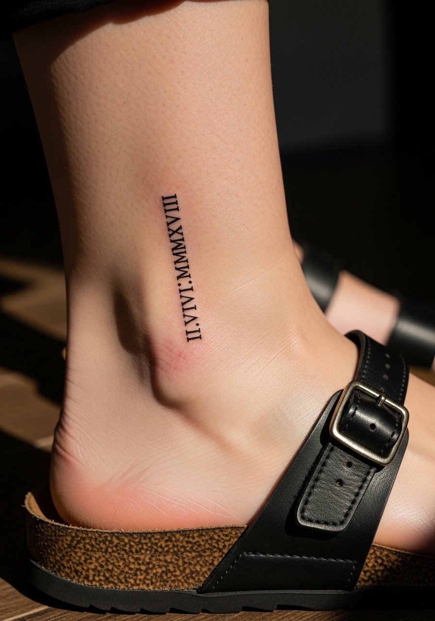
9. Ankle Strap Numeral
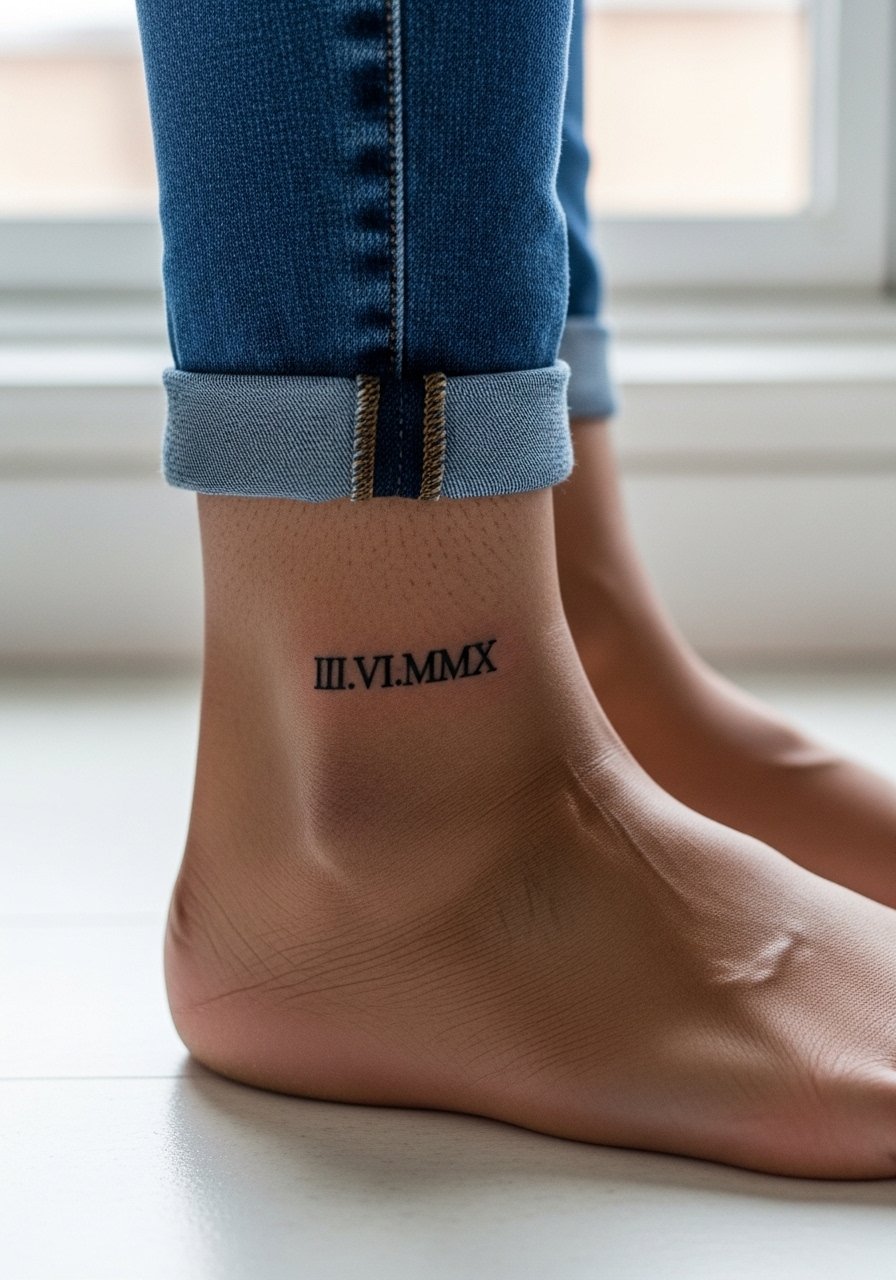
Ankle straps are petite and show during warmer months. The area is thin and prone to faster fading because of shoes and socks rubbing the piece. I tell people to choose numerals with slightly wider counters to preserve legibility. Sessions are short but the aftercare window requires care to avoid constant friction. For show-off looks, wear sandals or roll-up jeans with a pair of low-strap sandals so the numerals are visible without rubbing against fabric every day. Count on more frequent touch-ups than for upper-arm work.
10. Subtle Sternum Roman Mark
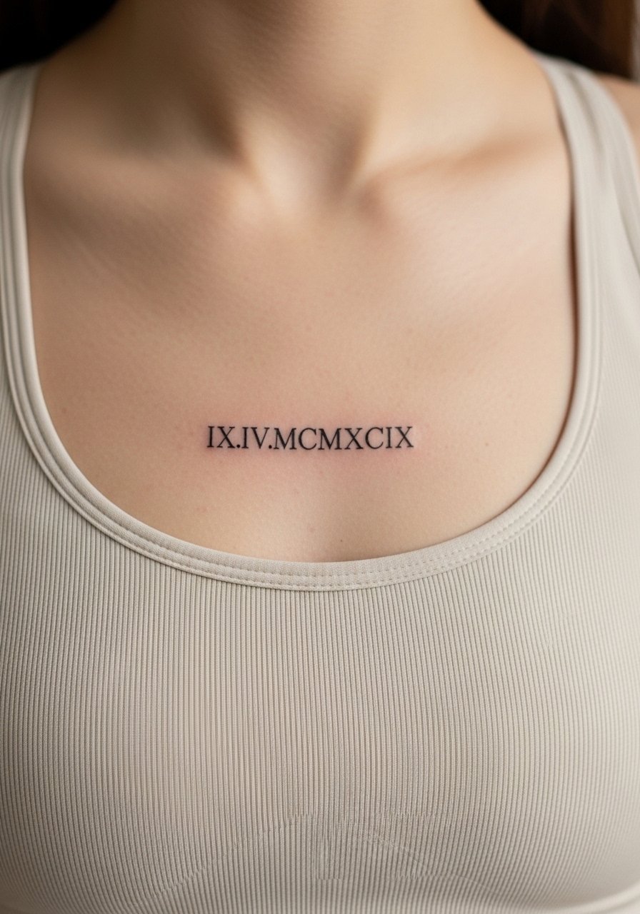
Sternum placement requires careful planning and a specialized approach. The sternum moves with breathing and can be tender during the session. Many artists recommend a sports-bra-level viewing to preview the exact positioning with clothing. A common mistake is placing numerals too close to the fabric line which causes irritation while healing. Expect a higher pain score and a longer session. For the appointment, a fitted sports bra is the easiest way to give access without full exposure. The healed look is elegant, and a small touch-up after one year is normal for fine line work on this skin.
11. Calf Vertical Roman Numeral Line
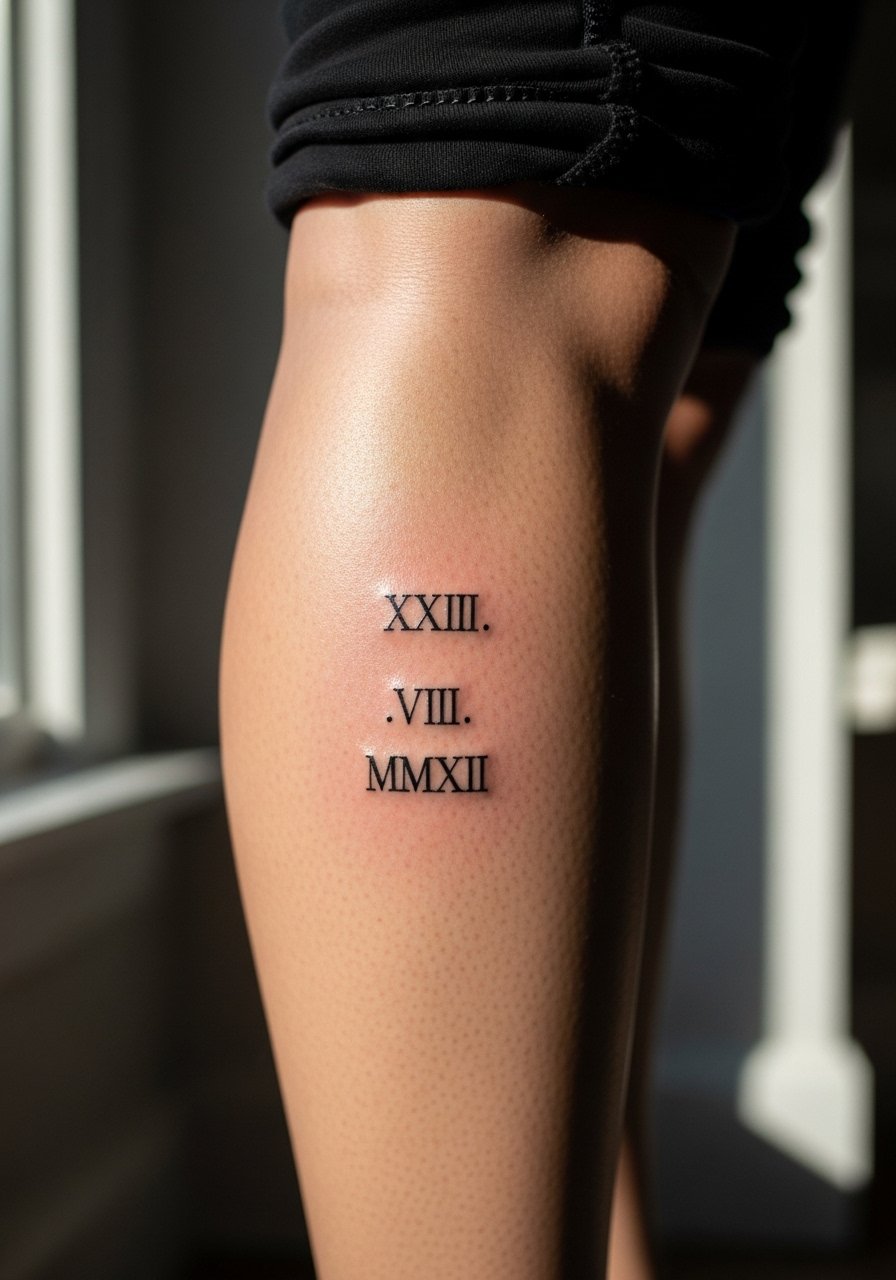
Calf placements are robust and handle heavier saturation, which means numerals can age with less fuss. This spot is excellent when you want a taller vertical column with good legibility over time. Sessions are usually comfortable and healing is predictable unless you run in tight leggings immediately. Tell your artist whether you plan to wear high socks often so they can suggest slightly higher placement to avoid constant rubbing. For showing off the piece casually, pair it with a pair of low-top sneakers and cropped trousers that stop above the numeral band. Touch-ups are rare here if you avoid midday sun exposure.
12. Inner Bicep Commemorative Numeral
The inner bicep is intimate and often heals softer because of movement and sweat. Pain is moderate and sessions may stop for small breaks. If you choose this spot, request slightly more space between numerals and ask for needle depth that avoids overworking. A mistake is asking for extremely tight lettering which can fuse when the arm moves. Healed at six months it looks delicate. At two years the lines can need a touch-up if you wore tight sleeves during the initial weeks. This area benefits from a session wear choice like a loose cotton tank so the artist has clean access without rubbing.
13. Outer Shoulder Roman Circle
The shoulder allows playful layouts because the skin is less likely to distort with motion. A circular or semi-circular arrangement keeps each numeral readable for years when spacing is respected. The most common error is crowding numerals in a decorative pattern that reads as a blob once healed. Ask for mockups draped over your shoulder so you can see how shirts will sit. For daily wear, a loose button-down shirt you can pull aside works well to show or hide the piece depending on the occasion. Sessions are usually short and low on touch-up needs.
14. Collarbone Band That Wraps to Shoulder
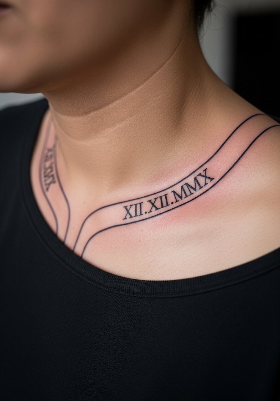
A band that follows the collarbone into the shoulder gives motion to the numerals and reads well under many shirt types. The skin here is slightly mobile so spacing is critical. One mistake is letting a stencil ride too close to the joint where movement will distort the counters. Ask the artist to check the layout with the clothing you intend to wear most. For traveling to the appointment wear a light zip hoodie so you can stay comfortable and move garments aside without ruining the stencil. Expect a two to three hour session depending on band length.
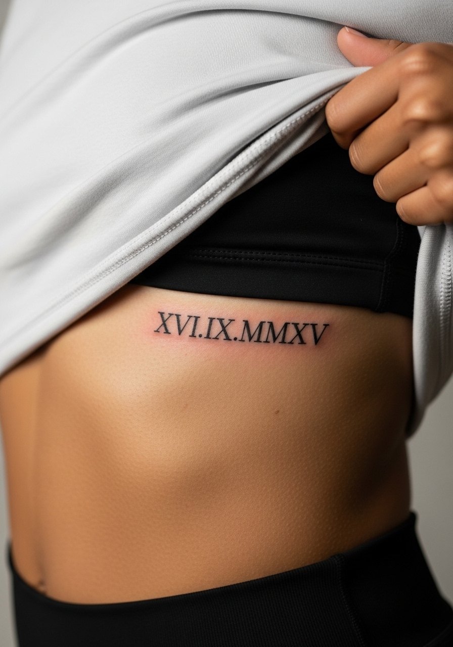
15. Side Rib Elegant Block Numeral
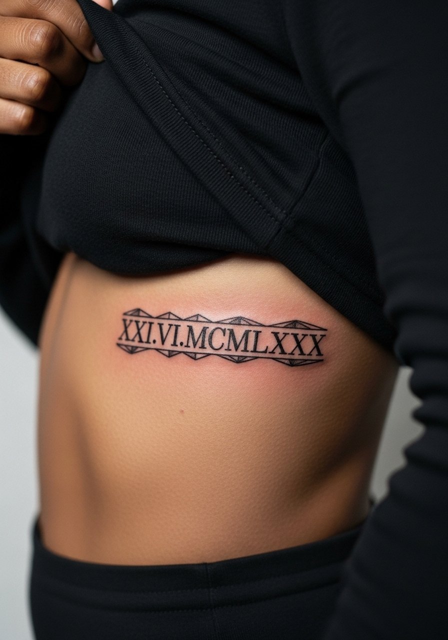
Block numerals in the side rib area look decisive but they require spacing that accounts for breathing and stretch. A key error is squeezing heavy blocks into a narrow panel. That leads to early merging and loss of counters. There are two camps about heavy blocks on flexible skin. One camp prefers thinner numerals to avoid stiffness in movement. The other camp says blocks hold up because they rely on saturation not thin lines. Bring both perspectives into your consult and have the artist show healed examples. For comfort during the appointment wear a crop top or athletic bra that gives access without full exposure. Touch-ups at year two are common if you choose micro spacing.
16. Ankle-to-Foot Roman Sequence
This low-visibility run is great for discrete commemoration but the foot is one of the worst places for longevity. Constant abrasion and shoes make healing tricky. I recommend slightly heavier strokes and expecting multiple touch-ups. The session can sting because of thin skin and proximity to bone. A common mistake is choosing ultra-fine numerals that disappear within a year. For aftercare-friendly wearing during warm months, pick sandals that do not rub the top of the foot and avoid tight socks for the first month. Expect a higher fade rate than arm or calf work.
17. Fine Line Neck Nape Numeral
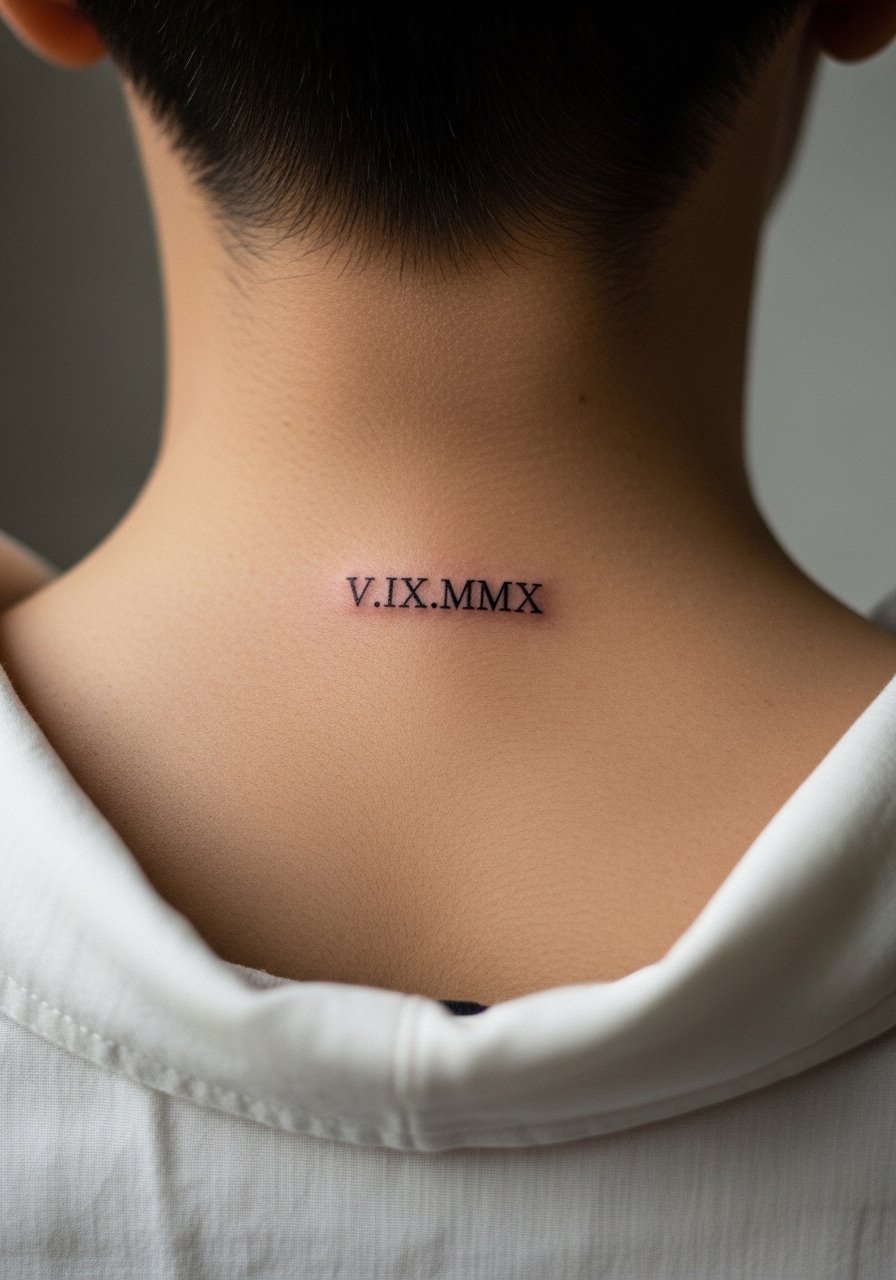
Neck placements are visible and come with professional considerations in some fields. The nape takes fine line work well if the artist spaces numerals to avoid hairline merging. There is a debate in the community about neck visibility and career impact. One group says nape tattoos are discreet and often hidden by hair. The other group warns that any neck work can still affect perceptions in conservative settings. If career fit matters, discuss placement and visibility with your artist and do a placement test with clothing and movement. For session wear pick a wide-neck tee so the collar does not interfere with the stencil.
Frequently Asked Questions
Q: How long do fine line Roman numerals usually stay readable?
A: It depends on placement and line weight. On thicker skin like the upper arm or calf they can remain legible for many years with minimal touch-up. On high-friction spots like fingers, ankles, and the top of the foot expect faster fading and a likely touch-up by year one or two.
Q: Should I pick serif or sans-serif numerals for longevity?
A: Serif numerals with slightly heavier counters tend to hold detail better over time because the small brackets prevent counters from blending. Sans-serif looks modern but often needs bolder execution to avoid early softening.
Q: If I want a tiny wrist numeral, what should I ask my artist in the consult?
A: Ask the artist to show healed wrist examples at two to five years and to set the line weight a touch heavier than the micro look. Also confirm their touch-up policy so you know how they handle natural softening.
Q: Can I get these numerals covered or integrated into a larger piece later?
A: Yes, numerals can be integrated into larger compositions or covered depending on saturation and placement. Heavier saturated numerals are easier to work around if you later decide on a bigger piece.
Q: What should I wear to a ribcage or sternum appointment?
A: Bring clothing that gives access while keeping you comfortable like a fitted sports bra or a zip hoodie that you can move aside. That makes for a cleaner stencil placement and easier breaks during a painful spot.
Q: Are hand and finger numerals worth it if I expect frequent touch-ups?
A: They are worth it if you prioritize visibility and personal meaning over low maintenance. Expect a higher touch-up cadence and be ready to plan for that maintenance if you want them to stay crisp.
