
Fine line tattoos dominate Pinterest right now, and the same pieces that score the most saves can tell a different story a few years later. Color adds personality but also variables, like how pigments sit in different skin tones and where linework should breathe. This list pairs small bursts of color with minimal layouts so the design reads clean at year five, not just on reveal day. Start with the forearm options below and you will see what to ask for in your consultation.
1. Fine Line Botanical on Inner Forearm

I suggest this when you want something personal that translates well into larger pieces later. Fair warning, the inner forearm gets frequent sun exposure, so ask your artist to leave slight spacing between stems for future touch-ups and to use pigment choices that resist migration. The session feels steady, not harsh, and usually completes in a single hour for a tiny sprig. At six months the color will look bright, by two years it will soften, and by five years a touch-up may be useful to restore saturation. Pair this with a rolled-up linen shirt for casual show-off looks during warm months. Rolled-up linen shirt
2. Tiny Watercolor Heart on the Wrist

The wrist is visible and forgiving for tiny color pieces when spacing is respected. Expect the session to sting briefly because the wrist sits over bone, but it finishes fast. A common mistake is asking for a blended wash that is too dense. That causes the pigment to spread and look muddy by year two. For longevity, ask for defined micro dots of color instead of heavy saturation. For the appointment, wear a loose button-down shirt you can pull aside so the artist has clean access.
3. Pastel Dotwork Constellation on the Ribcage

Fair warning, the ribcage rates high on most pain scales. The payoff is excellent if you want a piece that hides under clothing but looks delicate in swimwear. Artists split into two camps on fine line on ribs. One camp says lines blur fast because of movement and stretch. The other says proper depth and spacing keep the work readable. Ask your artist which camp they follow and what needle spacing they prefer. For session wear, pick a cropped top you can shift easily to expose the area for short bursts between breaks.
4. Color-Blocked Geometric on the Outer Forearm
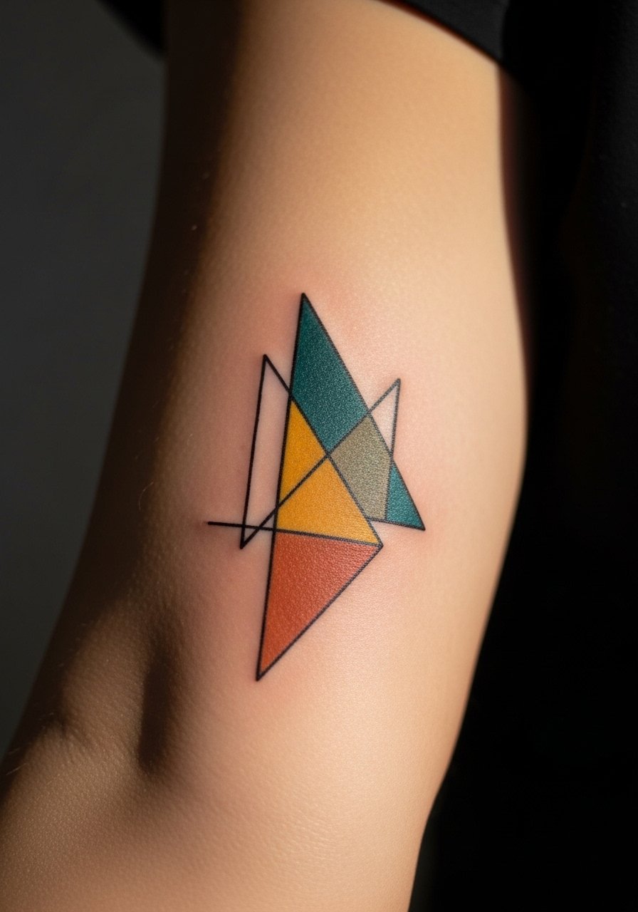
This is a good choice if you want strong visual impact without heavy saturation. The tricky part is crisp edges and consistent saturation inside small shapes. Tell your artist you want slightly larger color fields than the reference so the pigment has room to sit. The outer forearm tolerates touch-ups well. At six months the blocks read clean. At two years you may see softening along the inner edges. Pair this with rolled sleeves or a short-sleeve linen shirt to frame the artwork without crowding it.
5. Micro-Realism Colored Bee on the Shoulder
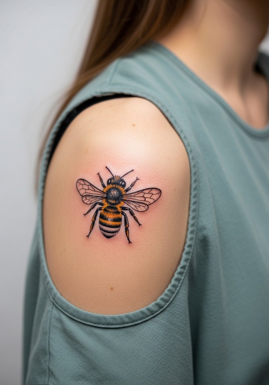
Shoulder placement is forgiving for small color realism. The session is usually quick and feels like a moderate buzz. A common mistake is cramming too much tiny detail into a small area, which ages into a gray blot over time. Ask for selective highlights and restrained saturation so the wing and body silhouette hold up. For showing it off, wear a loose tank top that can be shifted to reveal just the cap of the shoulder.
6. Tiny Rainbow Script on the Collarbone

The collarbone reads as delicate and modern when the lettering is thin with a subtle gradient. The risk is placing the script too close to the bone which makes lines harsh during healing. Ask your artist to space letters slightly and to test ink saturation on a small area first. At two years the gradient may require a light touch-up. This placement pairs well with open-neck shirts for evenings and with a thin chain pendant necklace that sits just above the script.
Pre-Session Essentials
The shoulder, forearm, and collarbone pieces above have different prep needs, and a few small items smooth out the session and the first week.
-
Stencil transfer paper kit. Lets you preview the exact placement and lineweight on skin before the needle touches, which matters for collarbone and forearm script.
-
Topical numbing cream. Applied about 45 minutes before can reduce rib and sternum sensitivity without forcing the artist to work more shallowly.
-
Thin protective film roll. Keeps ankle and finger pieces clean during the first week when friction is highest.
-
Fragrance-free gentle body wash. Cleans healing areas without irritating delicate color washes on the forearm or shoulder.
-
Aquaphor healing ointment. Thin layer for the initial days helps with scabbing and keeps fine line color from flaking off too quickly.
7. Minimalist Color Crescent on the Ankle

Ankle pieces face constant rubbing from shoes and socks. The biggest mistake is over-saturating tiny fills that sit right where daily friction happens. Ask for a slightly thinner color fill and to keep the crescent narrow so the pigment can settle without excessive scabbing. Sessions are short but the first week requires protection from shoe friction. For show-off style, sandals or rolled trousers work best. I like suggesting a pair of minimal leather sandals to keep the area visible without rubbing against fabric.
8. Pastel Line Mountain on the Calf

Calf tattoos sit on flesh that tolerates saturation well. This design benefits from slightly bolder color fields than ultra-fine line because movement can blur the thinnest strokes over time. The session is moderate in length. Expect some soreness when walking the first day. An easy mistake is demanding ultra-fine lines in dense areas. Ask for selective thicker anchors in the design so the silhouette keeps reading at two and five years. For warm-weather outfits, a mid-length casual short frames the calf without covering the piece.
9. Colored Single-Leaf Finger Tattoo
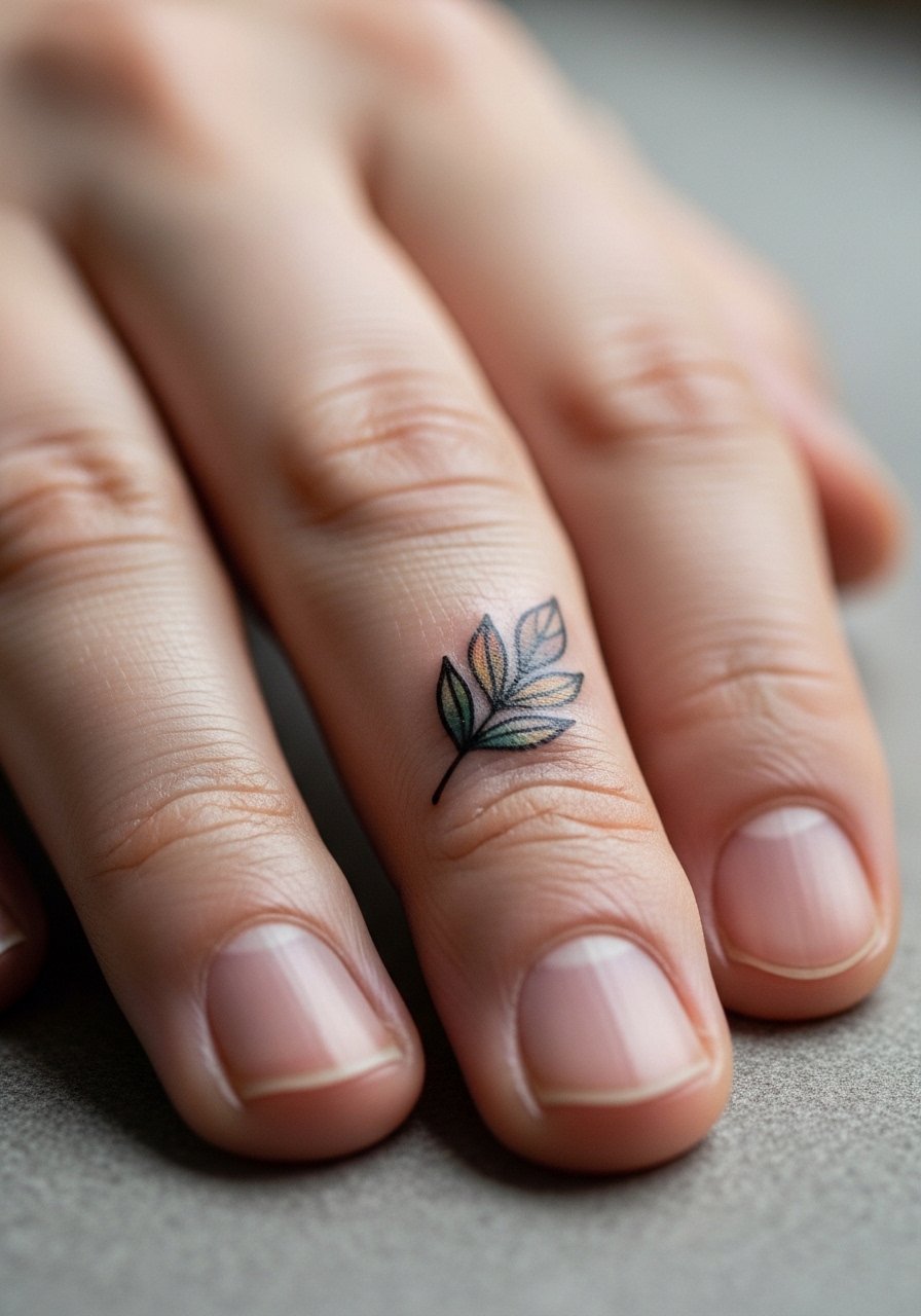
Finger tattoos are trendy, but they age differently because the skin there regenerates rapidly and is exposed to washing. Expect touch-ups around year one or two. The common error is requesting heavy color fills on a narrow canvas. Ask your artist to keep the leaf mostly outline with a tiny wash of pigment. The session is short and sharp. From a career perspective, consider how visible finger ink will interact with workplace policies. For subtle accessories that complement the piece, wear thin stacking rings that leave the leaf visible.
10. Minimalist Colored Wave on the Ribcage
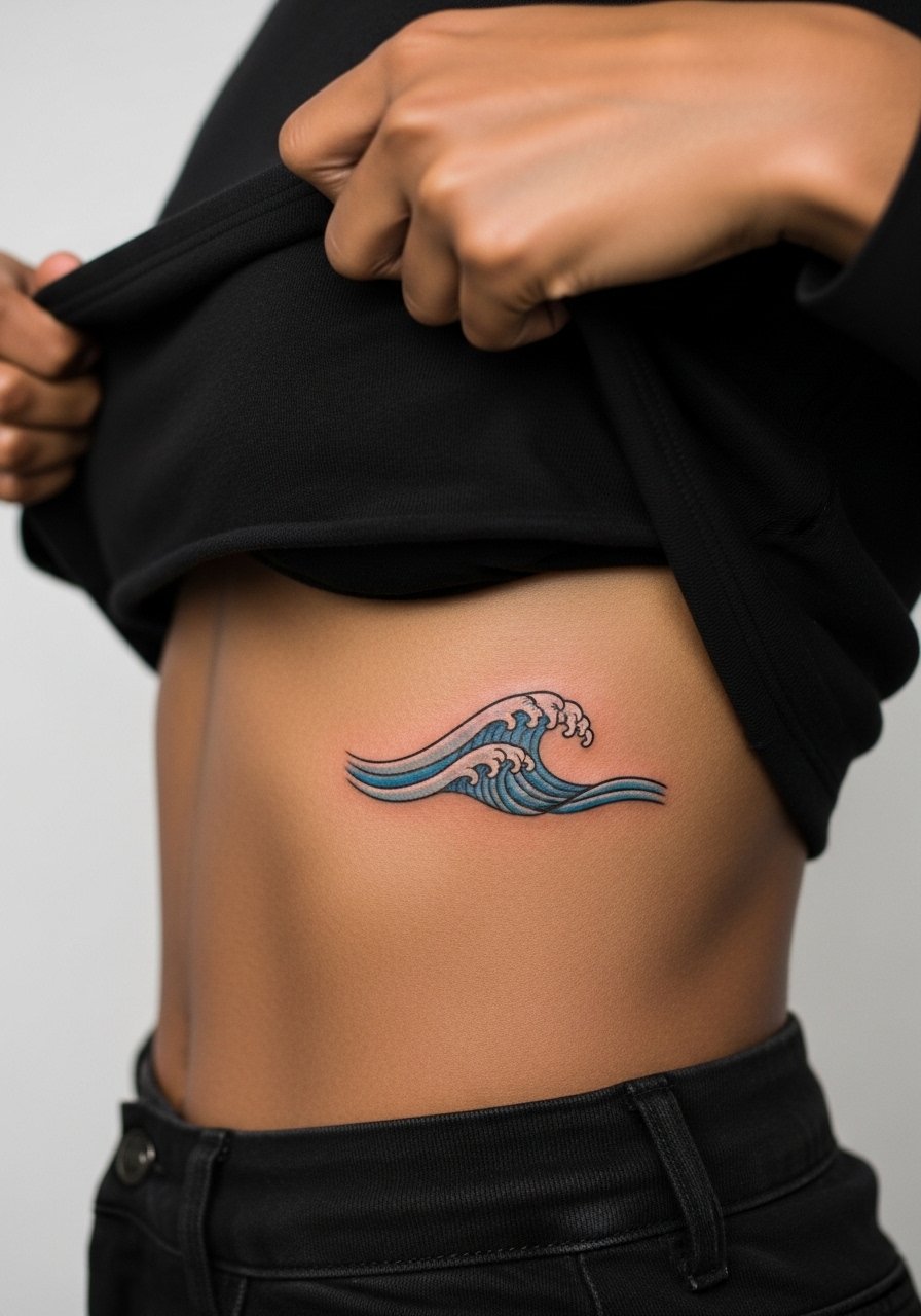
Ribcage sessions are long and can be painful. One real mistake is asking for densely packed watercolor fills there. Movement and breathing cause heavy washes to blur. If you want color, request thin, layered washes and generous spacing in the outline. Artists differ on technique for ribs, so ask about their touch-up policy. Healing can be uneven if friction from bras or waistbands disturbs the area, so wear loose clothing after the session. A fitted sports bra that you can avoid during recovery helps keep irritation down.
11. Tiny Colored Moon Behind the Ear
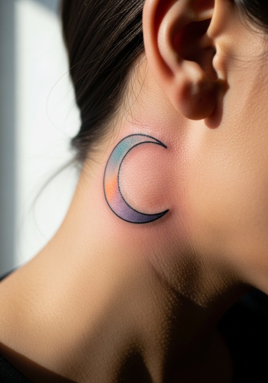
Behind-the-ear tattoos are discreet and show up in certain hairstyles. The skin there takes ink differently because it is thin and near cartilage. A common mistake is asking for heavy saturation that the area cannot hold. Ask for micro dots of color and a soft outline. Sessions are quick but precision matters. If you work in conservative environments, remember this placement can be covered with hair or small accessories. For shorter-term concealment, a slim headband keeps the area out of view while still letting hair look styled.
12. Minimal Koi Accent on the Thigh

Upper-thigh placements let you go a little larger and keep color vibrant because the area is sheltered from sun. The session is comfortable for most people, though longer sessions might require a break. A frequent mistake is choosing too many tiny scales and trying to cram micro realism into a small field. Instead, ask for bold negative space and a single color accent so the image reads even if you add pieces around it later. For session comfort, wear loose shorts or a wrap skirt that can be adjusted easily.
13. Neon Minimal Face Line on the Jawline

Neck and jaw tattoos are highly visible and can have social consequences. The skin there moves with expression, so thin lines need careful spacing. Artists are split on how fine is too fine for the neck. One camp warns that movement blurs fine details quickly. The other camp says careful needle depth preserves clarity. Ask the artist how they manage motion-prone placements. Sessions can be quick but they feel intense. Choose a design with deliberate breathing room and consider how often you want such visible color in professional settings.
14. Delicate Colored Triangle Behind the Ear

This tiny shape works well when you want a pop of color that hides under hair when necessary. The main technical risk is over-saturating the triangle edges which can feather out over time. Ask for a slightly thinner fill and for the artist to feather the borders intentionally. The session is minute. For after-session daily life, a compact hairstyle or loose bun keeps the area partially concealed. A small hair clip or band can help if you prefer to hide it during professional events.
15. Color-Phased Sunrise on the Upper Arm

Upper arm pieces handle color well and age gracefully. The error I see most is asking for very thin gradients in tiny pieces. Gradients need room. If you want a wash of color that reads later, scale the arc up by a quarter inch from what you think you need. Sessions are comfortable and usually finish in one sitting for small arcs. For show-off fits, a rolled sleeve or a short-sleeve tee lets the sunrise peek out without competing with jewelry.
16. Minimal Colored Mandala Fragment on the Sternum

Sternum work requires specialized experience because of curvature and sensitive skin. Some artists recommend avoiding dense mandala detail there. The common mistake is asking for a full disk when a fragment reads cleaner and ages better. Sessions can be series-based and feel intense. For the session, wear a supportive sports bra you can remove or shift easily. Respect the cultural origin if the pattern borrows from sacred geometry by asking the artist about respectful variations rather than direct replication.
17. Color-Pop Tiny Animal Silhouette on the Back of the Arm

The rear upper arm is often shaded and sees limited sun, which helps color hold. A common mistake is asking for micro-detail in a silhouette that will need to read from a short distance. Keep the silhouette simple and use a single pop color to maintain clarity. Sessions are quick and the area is slightly sensitive on the inner edge. For casual display, a sleeveless top or tank works well. I recommend asking how the artist staggers color intensity so saturation looks consistent across darker skin tones.
18. Tiny Color-Accent Arrow on the Wrist
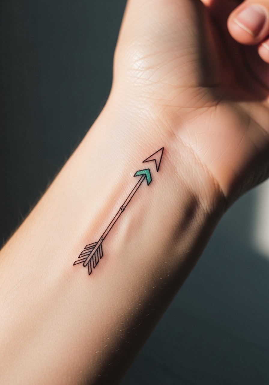
Wrist placements are great for visible tiny accents. The main aging issue is friction from watches and bracelets. Ask your artist to keep the arrow slim but not ultra-thin. A colored chevron at the tip gives personality without requiring heavy fills. Sessions are quick and feel like a sharp vibration at times. For showing it off without rubbing, pair the piece with a minimalist watch that rests above the tattoo and leaves the ink visible.
19. Tiny Pastel Floral on the Toe

Toe tattoos face heavy wear from shoes and water exposure. The common mistake is asking for dense color in such a tiny zone. Expect touch-ups sooner than other placements. Sessions are briefer but the area can be tender. If you travel or walk a lot, plan for extra healing time. For beach and summer looks, choose open shoes. A simple flat sandal keeps the toe visible while reducing pressure on the fresh ink.
20. Minimal Color Band on the Finger
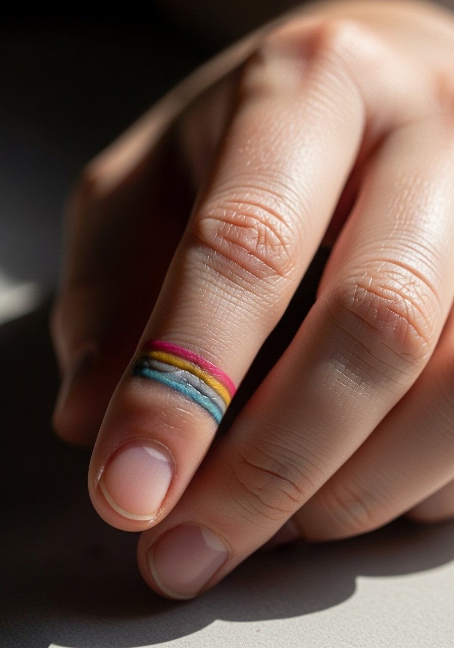
Finger bands are fashionable but wear quickly because of constant hand use. The biggest mistake is expecting a permanent solid band without touch-ups. Ask for a gap in the band or for two thin lines with color between. That approach tends to age better and is easier to retouch. Sessions are short but can be painful at the base of the finger. Consider how often you wash hands at work and plan touch-ups around lifestyle demands.
21. Minimal Colored Spine Dotline

Spine placements create strong verticality and pair well with open-back clothing. The error I see is crowding too many dots close together. Give each dot breathing room so the line remains crisp as the spine moves. Sessions vary in length depending on number of dots. For evenings out, an open-back dress or halter top shows the line without exposing the whole back. Consider asking your artist about spacing options so the piece remains legible at different distances.
22. Tiny Color-Fill Botanical on the Hip

Hip tattoos sit in a protected zone and can hold delicate color well. The common mistake is choosing too many tiny veins and leaves that merge after healing. Request simplified leaf shapes and a single color accent for longevity. Session time is comfortable and allows for a relaxed pace. For recovery, high-waisted bottoms that avoid pressing on the area are helpful. A high-waisted denim short that can be shifted a bit during healing keeps friction to a minimum.
23. Minimal Color-Filled Dotwork Mandala on the Thigh

Thigh placements let you go denser with dotwork because the area tolerates shading well. The common mistake is replicating a full-circle mandala too small. A slightly larger fragment keeps the pattern readable and avoids muddying. Sessions may be longer but are usually tolerable. For showing this off, a swimsuit bottom with a higher cut or high-waisted shorts frames the design nicely. Ask your artist about contrast points so the mandala remains visible across different lighting.
24. Tiny Color Glyph on the Neck Side

Side-neck tattoos are visible and can limit job options in some fields. The skin moves and stretches, so very thin glyphs can blur. Artists disagree about how thin is acceptable there. One camp advises thicker anchors. The other says shallow lines work if spaced well. Ask your artist their preference and show images of healed work on similar placements. Sessions are quick but painful for some. Consider the social cost of a visible neck piece before booking.
25. Minimal Colored Star Cluster on the Upper Back

Upper back placements sit under clothing most of the time which helps color age gently. A frequent mistake is packing too many tiny stars into a small patch. Keep the cluster airy and leave negative space for long-term readability. Sessions are comfortable. For evening wear, open-back tops show the stars without exposing more skin than needed. A simple halter top frames the area while keeping attention on the cluster.
26. Minimal Color Crescent on the Outer Thigh

The outer thigh tolerates larger single-color shapes. The mistake is placing the crescent where jeans or belts will constantly rub it during recovery. Ask the artist to map placement to your typical clothing so it sits where friction is minimal. Sessions can be relaxed and longer. For showing the piece, short skirts or swimwear expose the crescent cleanly. Plan for a few days without tight waistbands after the session.
27. Tiny Colored Symbol on the Hand Side
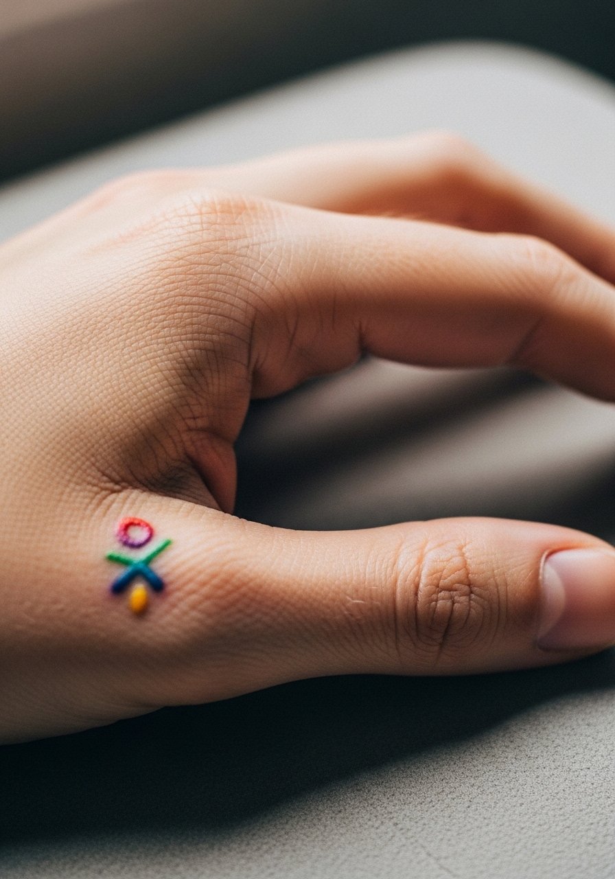
Hand tattoos are extremely visible and prone to early fading. The usual mistake is asking for heavy color fills in a place that sees constant washing and abrasion. Ask for a compact design with minimal fill and accept that touch-ups will likely be needed. Sessions are quick and can be uncomfortable on thin skin. Think through work and lifestyle implications before committing to palm-adjacent ink. For accessories that complement the piece, choose rings that sit clear of the design rather than over it.
Frequently Asked Questions
Q: How long will pastel washes stay visible on light versus dark skin tones?
A: In my experience pastel washes on light skin often read brighter initially, while on medium and dark skin tones they can look subtler but still last if the artist uses slightly denser layering. Ask your artist about pigment choices and how they have seen similar colors heal on clients with your skin tone. A reputable artist will show healed photos rather than just fresh work.
Q: Do I need to expect a touch-up for finger and toe color tattoos within a year?
A: Yes, plan on a likely touch-up within the first year for finger and toe placements. Those areas face constant friction and shedding. Schedule a follow-up conversation with your artist when booking so you understand their touch-up window and fee policy.
Q: Should I choose a fragment of a mandala for sternum work or a full disk?
A: For sternum placements a fragment usually holds better because it follows the natural curve and avoids dense detail that can blur. If you want a full disk, be prepared for longer sessions and possibly later touch-ups. Talk to your artist about scaling the pattern to the sternum shape.
Q: What should I wear to a shoulder or collarbone session to make it easier for the artist?
A: Wear a loose button-down shirt or a tank you can slide off without pulling over your head. A shirt that unbuttons or a racerback tank works well. For reference, a loose button-down shirt is an easy option that keeps you comfortable and gives clean access.
Q: Are there color choices I should avoid for fine line work that needs to age well?
A: Very light pastels can disappear faster, especially on darker skin tones. Instead of relying on the palest shades alone, ask your artist to combine a soft color with a slightly deeper anchor pigment so the design keeps contrast as it fades. Many artists will show healed examples of the exact palette on similar skin tones.
