
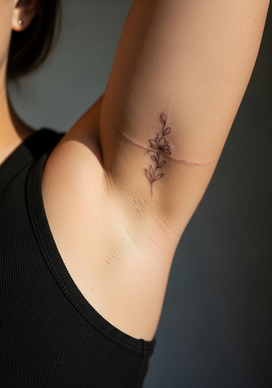
Fine line trends look gorgeous on upload, and the reality is they ask for honest placement planning if you want them to age well. Above the elbow is a sweet spot for visibility and movement, but it also stretches and catches sun in different ways than the forearm. Read the ideas below for bold options that keep detail where it matters, what to tell your artist in the consult, and how the piece will likely look at one year and five years healed.
1. Fine Line Script on the Inner Bicep
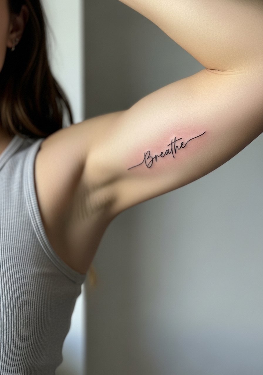
I've seen this placement hold personality better than wrist script because it avoids constant sun and washing. Tell your artist you want slightly heavier single-needle linework with small letter spacing so the letters do not merge as the skin shifts. The most common mistake is asking for too-small cursive; tight loops blur by year three. Session feel is moderate, a five out of ten for most people because the inner arm is sensitive. Expect a quick touch-up around year two for crisp edges. For showing it off, roll a sleeve up or wear a loose tank top that frames the curve of the arm without competing with the lettering.
2. Stipple-Shaded Rose on the Outer Bicep
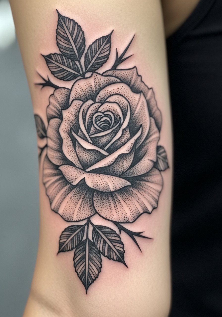
When you want texture without heavy saturation, stipple shading gives depth and ages into a soft gray texture rather than a muddy block. During consultation ask for negative space around the petals and for dots to be spaced so they do not plug up over time. A frequent error is packing dots too densely near the edge, which reads like a smudge after two years. This piece feels like a steady, medium session with careful needle pacing, so expect the artist to pause often for stencil checks. Pair it casually with a rolled-sleeve linen shirt to show the floral detail without overwhelming the design.
3. Bold Blackwork Band Across the Tricep
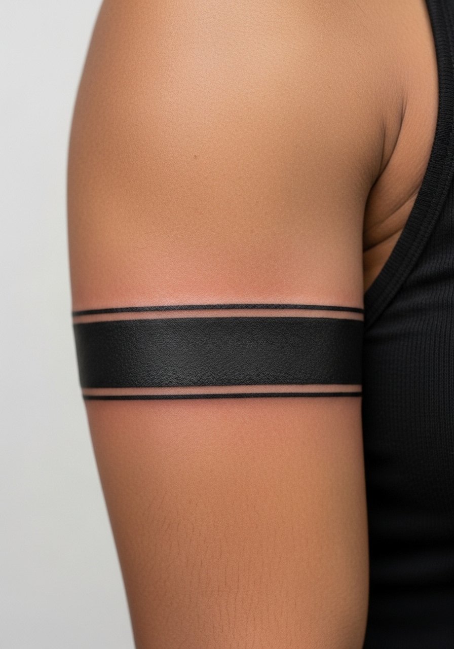
There is something immediate about a thick black band that reads from across a room. For longevity, ask for consistent saturation and an even edge rather than a soft fade into the skin. One camp argues that solid black ages beautifully and becomes part of the body. Another camp prefers negative space accents to avoid a heavy visual block. Both sides have merit. Expect a shorter session for application but plan for touch-ups at the edges in five or more years if needed. Wear a short-sleeve tee to frame the band when you want it visible.
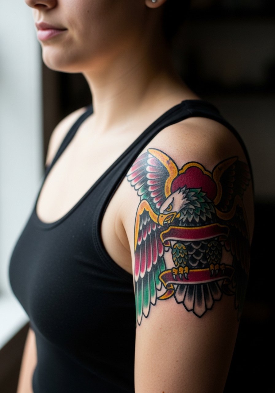
4. Micro-Realism Eye on the Upper Bicep

Most micro-realism pieces require precise needle control and a calm hand. For this placement, ask your artist how they handle tiny whites and soft greys so the small highlights do not disappear. A common mistake is overworking the area to force contrast, which causes excess trauma and longer healing. At six months the detail should be crisp. By two to five years tiny white highlights may fade, and a targeted touch-up keeps the focal points intact. Session feel is tolerable because the outer bicep is less sensitive, but bring a playlist and expect pauses for stencil checks. Show it off with a sleeveless button-down.
5. Geometric Mandala That Wraps the Upper Arm
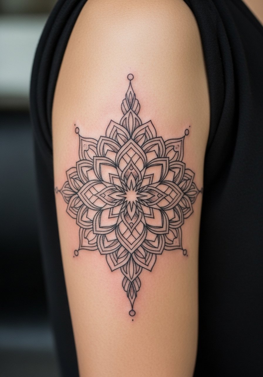
The biggest mistake with mandalas is going too tight in the center. Ask for breathing room in the pattern so lines have spacing to age into definition rather than merge. Artists are split on whether extremely fine mandalas hold on rounded biceps. One group says spacing and modest line weight prevent blur. The other believes too much detail will always soften. Be explicit about scale in your consult. Plan a longer session because symmetry checks take time. Pair the wrap with a flowy short-sleeve blouse that shows the curve of the design when you lift your arm.
6. Tribal-Inspired Blackwork on the Shoulder Cap

Tribal patterns demand respect for cultural origins. If you are drawing from traditional motifs, consider adapting elements rather than copying sacred symbols directly. Tell your artist the cultural lines you want honored and ask about respectful variations. These pieces age well because they use heavy saturation and strong linework, though the edge nearest the bicep can soften with friction from straps. The session is typically medium length and tolerable for most. For showing the shoulder, wear a wide-strap tank that keeps the pattern visible without revealing more than intended.
Studio Day Picks
The above-arm pieces from script and mandala to shoulder work ask for different prep than forearm tattoos, and a few targeted items smooth the session and first week.
- Stencil transfer paper kit. Lets you preview placement on the curved upper arm before the needle hits skin, which is especially useful for wraps and mandalas.
- Cooling gel pads. Helps manage swelling after a longer upper-arm session without interfering with the artist's work.
- Thin protective film roll. Keeps upper-arm pieces clean under shirt straps and during the initial sweat-prone days.
- Fragrance-free gentle body wash. Cleans the healing upper-arm area without stripping color from stipple or micro-realism work.
- Aquaphor healing ointment. A thin layer in the first days keeps delicate script and fine dots from drying into scabs that flake irregularly.
7. Neo-Traditional Portrait on the Outer Bicep
A neo-traditional portrait combines strong linework with selective color to keep a bold read from a distance. In your consult, specify which facial features you want emphasized and avoid tiny facial details that will soften. A common failure is asking for photographic tiny eyes inside a small bicep space. Expect a moderate-to-long session and plan for a color-saturation touch-up at year three or later depending on sun exposure. For showing it off, wear rolled-sleeve shirts that end just above the design so the portrait sits as a focal point.
8. Abstract Line Cluster Above the Elbow

Abstract clusters can read as modern and bold when scaled correctly. Tell the artist you want negative space between the lines to preserve separation over time. The mistake people make is compressing too many lines into a small patch. That causes merging and a loss of intention by year two. Session time is usually short but precise. Pair the piece with a rolled-cuff denim jacket for a casual way to reveal and conceal depending on the day.
9. Single Needle Constellation Trail on the Upper Arm

Constellation trails feel delicate but they are vulnerable to blur if placed where the skin flexes heavily. Ask for slightly heavier anchor points with looser spacing between stars so the composition reads as dots rather than a smudge later. A mistake is peppering tiny stars across a crease zone. Expect a quick session and plan for a touch-up at two to three years. For session comfort, wear a short-sleeve zip hoodie that gives the artist access while keeping you warm.
10. Whip-Shaded Feather Along the Inner Upper Arm

Whip shading creates a soft feathered edge that reads like motion. During the consult, request a gradation that leaves intentional gaps between strokes. The common error is pressing too much density at the feather spine, which clogs the delicate texture. The inner arm is more sensitive so pain is higher and sessions may be shorter to manage comfort. At one year the gradation should still read airy. For showing this gentle piece, a cropped tee or sleeveless top draws attention to the inner curve without distracting.
11. Blackwork Floral Cluster on the Shoulder Blade Edge
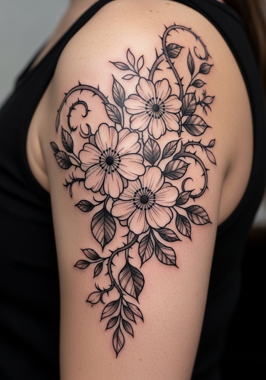
This placement uses the shoulder blade edge as a visual anchor so the floral cluster moves with the shoulder rather than sitting flat. Ask for strong outlines and medium spacing between petals to prevent bleeding where the skin shifts. A typical mistake is tiny ornamental lines near the attachment to the arm that vanish over time. Sessions feel steady and often involve position changes to access the entire curve. Wear a scooped-neck tank you can pull aside for the artist and that frames the cluster for evenings out.
12. Negative Space Chevron Bands Above the Elbow
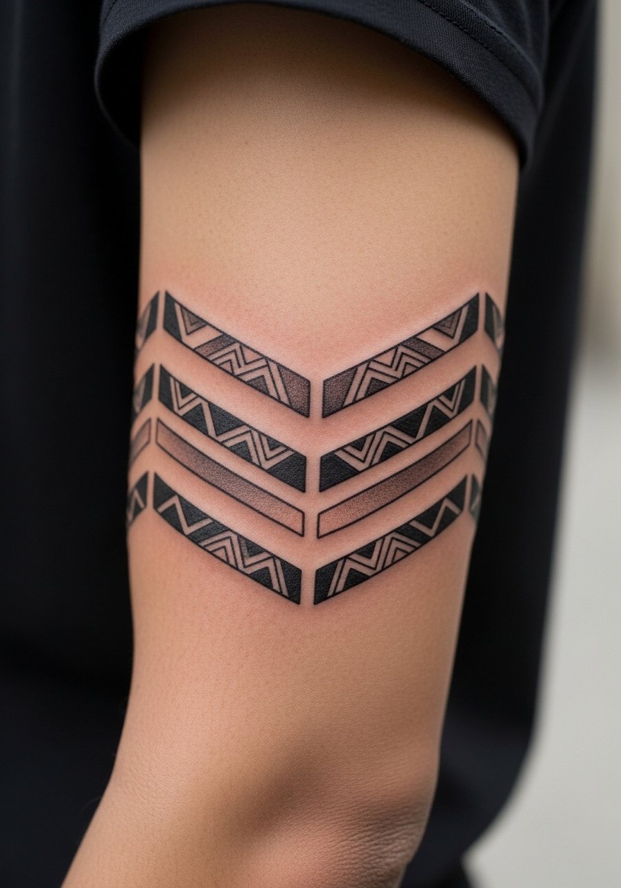
Negative space work relies on strong outlines to preserve the skin areas intentionally left untouched. In your consult stress that the chevrons should not be too thin because the uninked areas can blur into the ink if lines are too tight. A frequent problem is narrow bars that look great fresh but lose definition. This style ages as long as you protect it from high sun. The session is efficient. For a clean reveal, wear a short-sleeve shirt with a neat cuff that aligns with the bands.
13. Scripted Phrase Curving Over the Bicep Peak

Curved script that follows muscle contours reads more intentional than a straight line across the arm. Tell your artist the exact arch you want and have them print a life-size stencil so you can check curvature against flex. The mistake is assuming the digital mockup will sit the same on a rounded muscle. Expect a session where you flex to check placement. At two years, tighter scripts need touch-ups if they sit too close to the seam of the bicep. Pair this with a fitted short-sleeve shirt that lifts slightly when you flex to show the phrase naturally.
14. Botanical Band That Sits Just Above the Elbow

Bands at this level are exposed to friction from shirt cuffs so spacing and line weight matter. Ask for slightly thicker outer stems with airy leaf interiors to maintain silhouette when some edge softening occurs. A common failure is dense leaf detail that disappears by year three. The session can sting more because the area is close to the joint. For wearing and showing the band, choose a 3/4 sleeve shirt you can roll up so the band sits at the cuff line and looks intentional.
15. Dot Work Skull with Halo on the Upper Arm
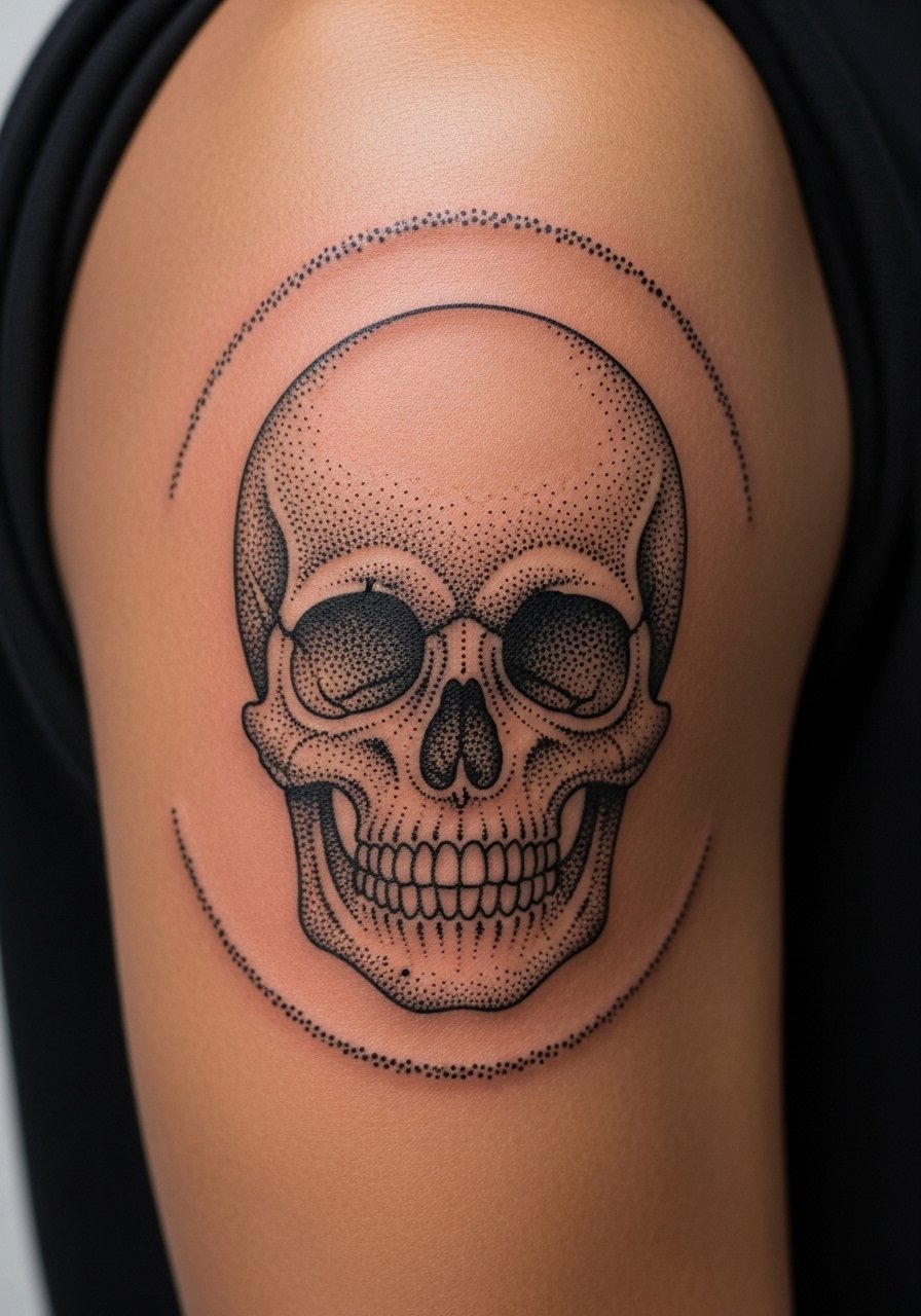
Dot work skulls read graphic when dots are spaced and contrasted against negative space. Tell your artist where you want the densest stipple and where you want air. The mistake is dense stippling near thin edges which clogs and reads muddy as the skin heals. Expect a longer session due to the time stippling takes. Plan a focused touch-up in a few years if the halo softens. For a low-key reveal, wear a short-sleeve henley that frames the skull without drawing attention away from the work.
16. Single-Needle Floral Along the Inner Tricep
Single-needle florals feel intimate and delicate, but the inner tricep is prone to motion and sweat which affects healing. Ask for slightly enlarged flower centers and clear negative spacing in the petals so the motif keeps its shape. The common error is making all petals identical and tiny which causes soft edges later. Sessions may be uncomfortable for some because the inner area is sensitive. For showing this subtle piece, a strappy summer dress or sleeveless top highlights the inner curve cleanly.
17. Chain-Link Band with Small Accent Gem on the Outer Arm
Chain-link work benefits from consistent negative space inside each link so the pattern reads mechanical rather than blurred. During consultation point out how tight you want the links and whether the gem accent should be open space or filled. The most frequent problem is squeezing links together to cram more pattern into a small band. That leads to premature merging. The session time is moderate. For a polished look pair it with a short-sleeve blazer or structured tee that keeps wardrobe lines clean around the band.
Frequently Asked Questions
Q: Will fine line script on the inner bicep blur faster than thicker lettering?
A: Fine line script can blur sooner if the letters are too tight or placed across areas of frequent stretch. Ask for slightly increased spacing and a modest single-needle weight that your artist trusts. Protecting the area from heavy sun in the first year helps retain crispness.
Q: Are stipple and dot-work pieces harder to keep sharp on the upper arm?
A: Dot work holds when the artist spaces dots intentionally and avoids overpacking near edges. These styles require longer sessions and careful needle pacing. Sun protection and occasional touch-ups keep stippling defined.
Q: How should I prepare clothing-wise for a shoulder cap or tricep session?
A: Wear something the artist can easily move aside like a wide-strap tank or a button shirt you can pull off one shoulder. Loose layers help you stay comfortable during longer upper-arm work.
Q: Do mandala wraps need more negative space than they look like on screen?
A: Yes. Dense mandalas often read beautifully on a flat screen but need breathing room in real life because the arm curve compresses elements. Ask for scale tests in the consult and a life-size stencil so you see the final curve.
Q: If I want blackwork that reads bold, is saturation or line weight more important?
A: Both matter, but even saturation benefits from confident, even line weight at the edges. Tell your artist you prefer solid blocks with crisp borders rather than feathered or soft transitions if you want a bold read that ages into a cohesive surface.
